

Furniture Website Design Examples To Inspire You
January 21, 2026
Realtor Website Design: Inspiring Examples for Success
January 26, 2026A news homepage has about three seconds to prove it's worth reading. That's it. The layout, the typography, the speed at which it loads on a phone screen during a morning commute.
The best news website design examples solve problems most readers never consciously notice. They guide your eyes from the lead story to secondary headlines without friction. They handle ad placements, live updates, and responsive layouts across devices while still feeling clean.
This article breaks down real editorial sites, from BBC News and The Guardian to smaller independent outlets, and examines what actually works in their visual hierarchy, mobile design, and page structure. You'll walk away with practical patterns you can apply to your own news site or publishing project.
What Makes a News Website Design Effective
A news website either grabs you or loses you. There's no in-between. The best ones put the biggest story front and center, then guide your eyes through secondary headlines without making the page feel like a cluttered mess.
75% of people judge a company's credibility based on its website design, according to Stanford Web Credibility research. For news outlets, that number probably hits even harder. Readers decide in seconds whether they trust what they're reading.
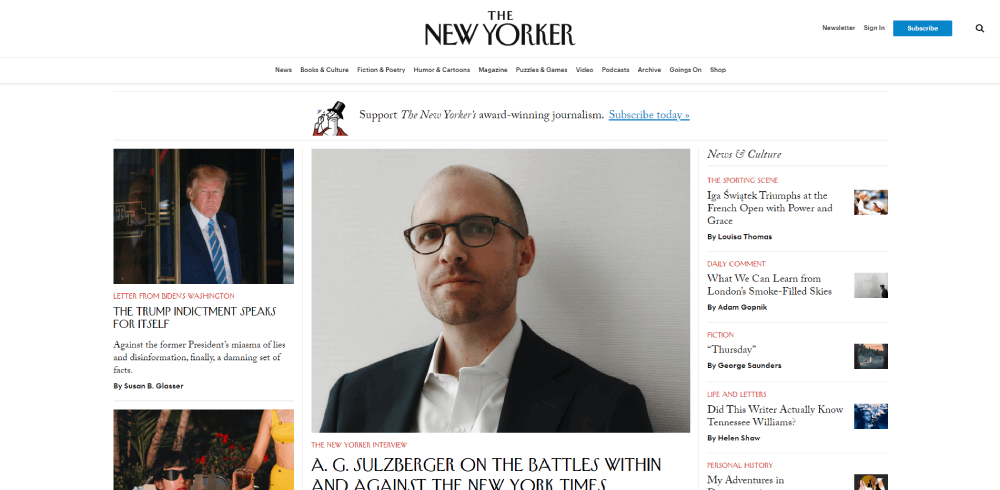
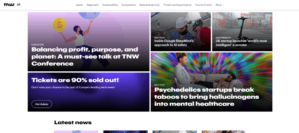
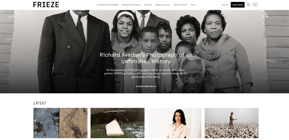
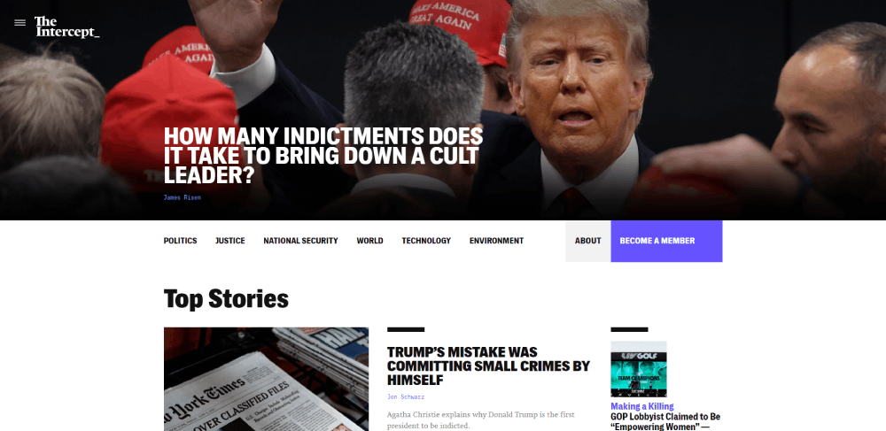
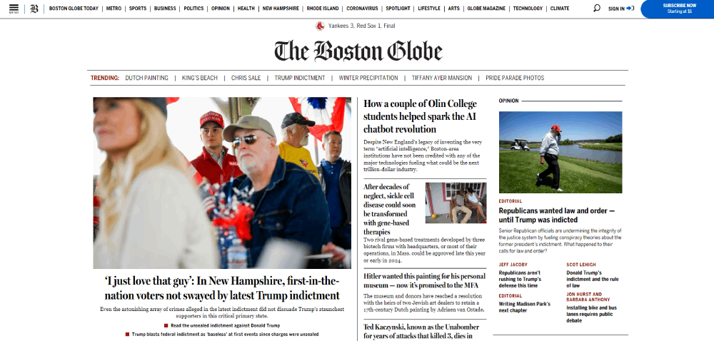
Visual hierarchy does most of the heavy lifting. The Guardian, for example, uses bold section headers and a strict grid layout that separates opinion from reporting at a glance. You know exactly what you're looking at before you read a single word.
Then there's speed. Websites that take over two seconds to load potentially lose 60% of their visitors, according to Hostinger. News sites carry extra weight here because readers expect instant updates during breaking events. A slow-loading homepage during election night? That's a death sentence for traffic.
Responsive news layouts matter just as much. StatCounter data shows mobile devices drove roughly 60% of global web traffic in 2025. Most people read the news on their phones now, not desktops.
And let's not forget the advertising problem. Every news site needs ad revenue, but stack too many banners around your articles and readers bounce. Took me a while to appreciate how tricky this balance actually is. The sites that get it right (BBC News, Reuters) keep ads minimal and non-intrusive. The ones that don't? Well, you've probably rage-closed a few of those yourself.
Good typography in news websites can make or break readability during long sessions. Serif fonts for body text, clean sans-serif for headlines. It sounds simple, but most sites still get this wrong.
News Website Design Examples that Inspire


News Homepage Layout Patterns That Perform Well
Most news homepages fall into one of a handful of layout patterns. Not because designers are lazy, but because certain structures handle high-volume content better than others.
The Hero-Plus-Grid Pattern
This is the one you see everywhere. One large featured story at the top (with a big image or video), followed by a grid of secondary stories below.
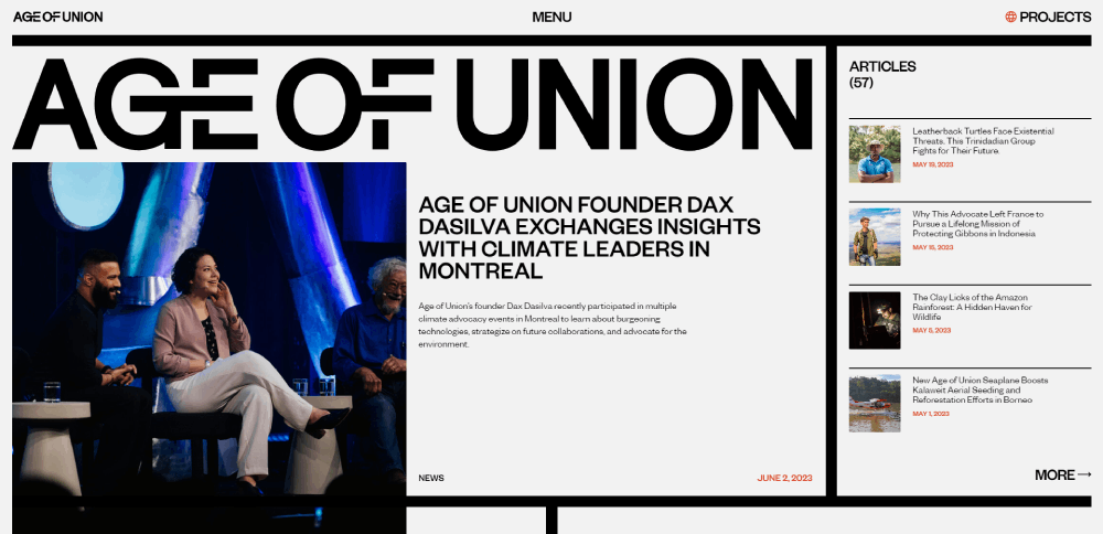
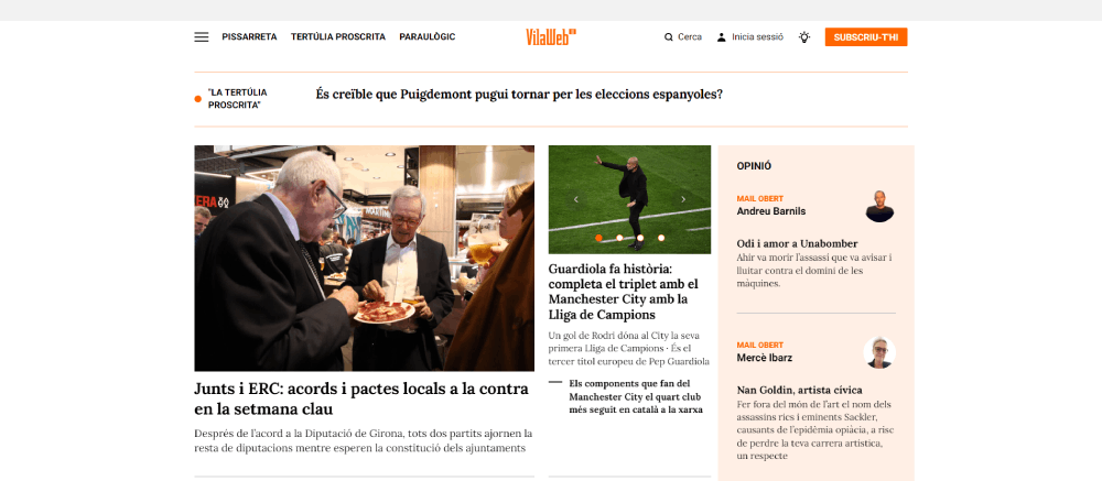
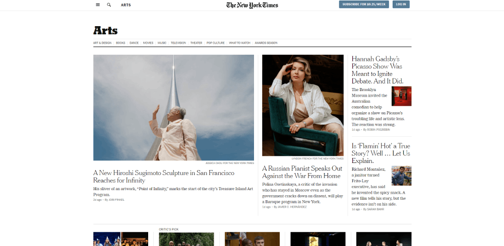
The New York Times, Washington Post, and The Guardian all use variations of this. It works because it solves two problems at once: it tells the reader "this is the most important story right now," and it provides enough secondary coverage that return visitors always find something new.
McKinsey research found that companies with strong design practices grew revenue up to twice as fast as competitors. News sites with clear, intentional homepage layouts see similar engagement benefits over those with disorganized page structures.
Sidebar-Heavy vs. Sidebar-Free Layouts
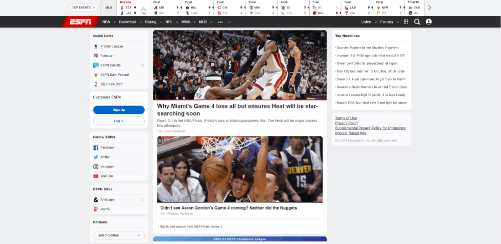
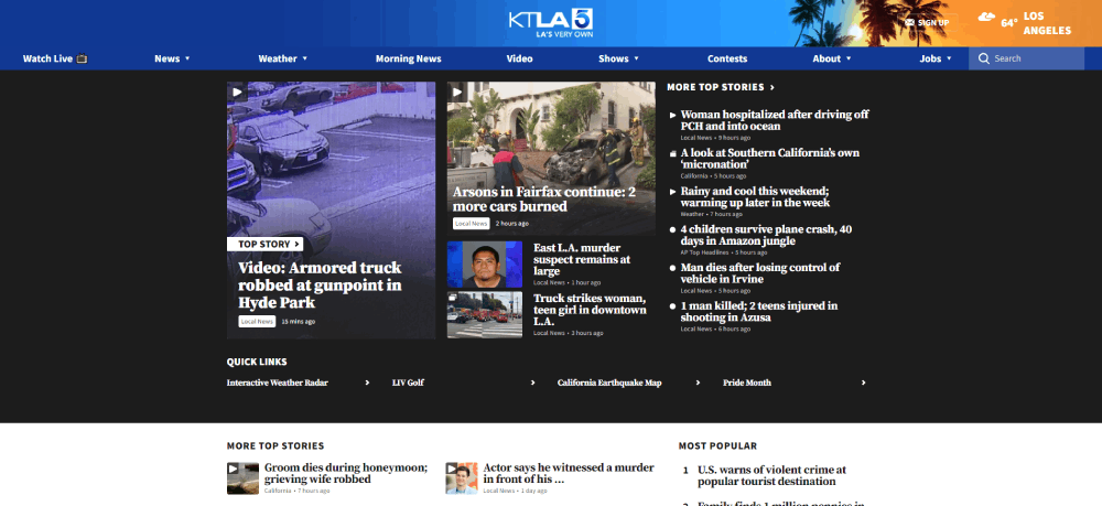
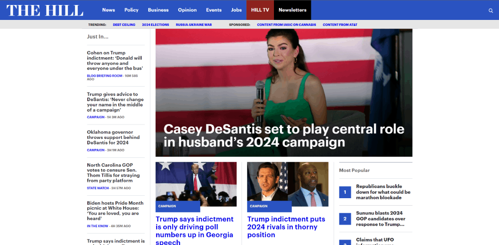
With sidebars: CNN and Fox News still use right-hand sidebars for trending stories, video embeds, and promotional modules. This works on desktop but creates problems on mobile, where sidebars typically get pushed below the main content.
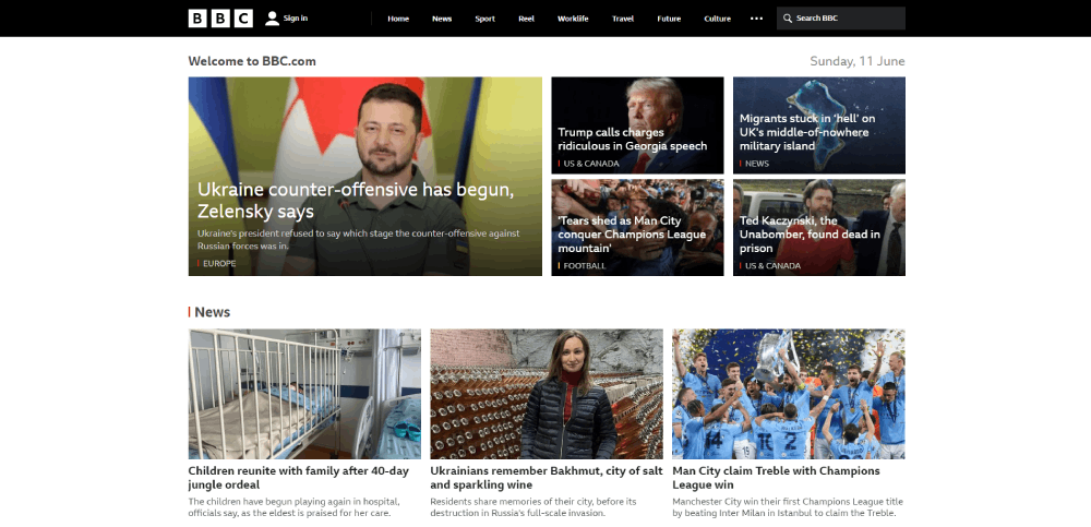
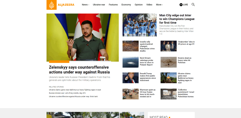
Without sidebars: BBC News and Al Jazeera dropped sidebars entirely. Their layouts expand across the full viewport, using card-based grids that reflow naturally on smaller screens. This approach aligns with mobile-first design thinking, where the mobile experience drives the desktop layout rather than the other way around.
Contentsquare data from 2024 showed media and publishing sites received 66.2% of their traffic from mobile. Sidebar-free layouts handle that traffic better.
Infinite Scroll vs. Paginated Sections
Social media trained people to expect infinite scroll. Some news sites followed suit.
But here's the thing. Most major news outlets still use paginated section fronts. Why? Because infinite scroll makes it harder to find specific sections (Sports, Business, Opinion) and it can destroy page load performance when you're loading 50+ article cards with images.
The compromise most sites landed on: infinite scroll within a single section page, but structured navigation across the top for section jumping. Google News does this well.
Live Update Bars and Breaking News Banners
Sticky navigation plus a breaking-news ticker at the top. CNN pioneered this on broadcast television, and the pattern translated directly to web. The bar stays visible as you scroll, updating in real time during major events.
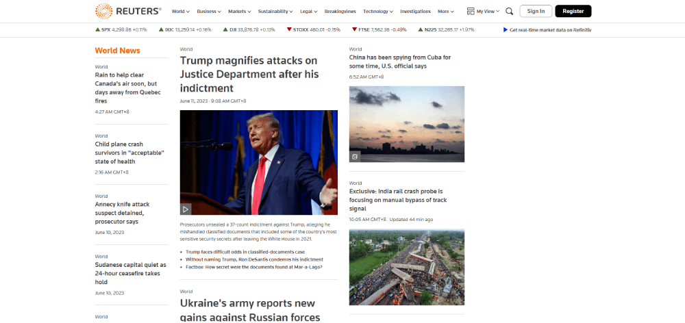
Reuters uses a more subdued version. A small red "BREAKING" label appears next to the headline, rather than a full-width banner. Less dramatic, more functional.
Typography and Color in News Website Design
These are the two things that separate a news site that feels authoritative from one that feels like a template.
Serif vs. Sans-Serif for Body Text
The New York Times uses a custom serif font (NYT Cheltenham) for headlines and a Georgia-based serif for body text. It feels weighty and trustworthy. Over 50 million websites now use Google Fonts, but the biggest news outlets invest in custom typefaces because they know typography defines brand identity as much as the logo does.
The Guardian switched to a proprietary sans-serif typeface (Guardian Egyptian) that blends serif-like warmth with modern readability on screens. It was a deliberate move to feel both traditional and digital-native at the same time.
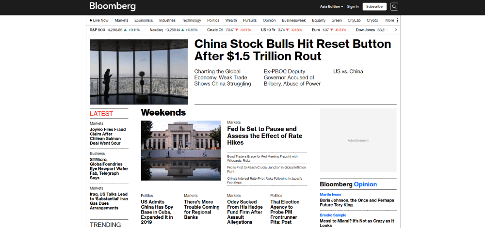
Bloomberg uses a compact, mechanical sans-serif that prioritizes information density. Every pixel of screen space carries data. For their audience (traders, analysts), that's exactly right.
Color Systems That Signal Section Identity
News sites don't just pick a color scheme for looks. Colors serve a functional purpose.
| Section | Common Color Association | Example Publication |
| Politics / Breaking | Red / Deep Burgundy | CNN, BBC, The Guardian |
| Technology | Neon Teal / "Cyber" Blue | TechCrunch, The Verge, Wired |
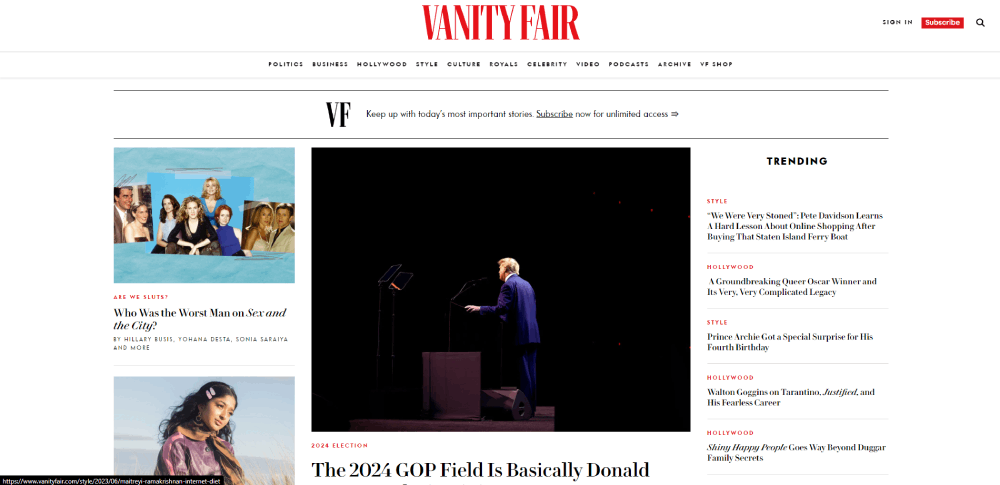
| Opinion / Editorial | Amber / Warm Ochre | The New York Times, The Atlantic |
| Business / Finance | Navy / "Salmon" Pink | Bloomberg, Financial Times |
| Sports | High-Contrast Green / League Colors | ESPN, The Athletic, Sky Sports |
| Lifestyle / Culture | Digital Lavender / Soft Peach | Vogue, Vanity Fair, The Strategist |
The Guardian does this better than most. Their Opinion section uses a warm yellow background that instantly tells readers they're looking at commentary, not reporting. No label needed. The color itself communicates the content type.
Contrast and Accessibility in Practice
WebAIM's 2025 analysis found that 94.8% of website homepages still had at least one detectable accessibility failure. Low-contrast text was the most common issue, affecting 79.1% of pages.
News sites carry extra responsibility here. The audience skews older than most web properties, and readability directly affects trust. Financial Times maintains strict WCAG AA compliance across its entire site. Most smaller outlets don't.
ADA website accessibility lawsuits surged 37% year-over-year in the first half of 2025, with over 2,000 cases filed, according to EcomBack. News publishers aren't the primary targets (eCommerce sites are), but the legal trend is pushing all content-heavy sites toward better accessibility standards.
How News Sites Handle Advertising Without Destroying the Reading Experience
This is the eternal problem. News sites need ad revenue to survive. Readers hate ads. The design challenge is to make both parties tolerable to each other.
Common Ad Placement Zones
Leaderboard banner: Top of the page, full width. Every news site has one. Readers have learned to ignore it (banner blindness is real), but advertisers still pay for the position.
Mid-article units: These get inserted between paragraphs, usually after the third or fourth. The Guardian uses a single mid-article ad that's clearly labeled and spaced away from editorial content. Compare that to some tabloid sites that inject an ad every two paragraphs, making the reading experience miserable.
Sidebar display ads: Only relevant on desktop. These have been declining as more sites go sidebar-free.
Interstitials: Full-screen ads that appear before the article loads. Forbes was infamous for these. They've since toned it down after backlash. Good form design and unobtrusive ad placements consistently outperform aggressive formats.
Paywall Design Patterns
Three main approaches:
Hard paywall: No free articles. The Wall Street Journal and Financial Times use this. Design-wise, the challenge is showing just enough of the article to convince someone to subscribe. The Financial Times fades the text to white below the second paragraph, a visual cue that's become almost universal.
Metered paywall: A certain number of free articles per month. The New York Times does this. Design impact: readers see the full article, but a sticky banner at the bottom tracks their remaining free reads.
Freemium hybrid: Some content free, some behind a wall. The Athletic (now owned by The New York Times) marks premium content with a small lock icon next to the headline. Clean. Clear. No guessing required.
Sites That Get the Balance Right
BBC News runs no ads on its UK site (funded by the license fee). Internationally, it shows minimal display ads. The result? One of the fastest, cleanest news experiences online.
The Guardian takes donations instead of locking content. A yellow banner at the bottom of articles asks readers to contribute. It's unobtrusive, and the design communicates the message without interrupting the reading experience. According to Deloitte and Google research, even a 0.1-second improvement in page speed can boost conversion rates by 8.4%. Keeping ads lightweight directly affects whether donation or subscription prompts actually convert.
Mobile Design Patterns for News Websites
StatCounter data from 2025 shows mobile devices account for roughly 60% of global web traffic. For news sites specifically, Contentsquare found media and publishing get 66.2% from mobile. If your news site isn't designed for phones first, the desktop version is almost an afterthought.
Navigation on Small Screens
Two schools here.
Hamburger menus remain the default. Three lines in the top corner. Tap to reveal sections. The BBC, CNN, and The Guardian all use this pattern because it hides complexity. But there's a known issue: people don't always tap it. Important sections can get buried.
Bottom navigation bars are the alternative. Apple News and Google News apps both use fixed bottom tabs for Home, Following, and Search. This keeps core functions within thumb reach. Mobile UX research consistently shows that bottom-of-screen targets are faster to hit.
Some news apps combine both. A bottom bar for primary navigation and a hamburger for secondary sections. It's more complex to build, but it outperforms either approach alone.
Card-Based Layouts and Swipe Interactions
Cards are the building block of mobile news. Every story gets a rectangular container with a headline, thumbnail, source label, and timestamp. This pattern works because it creates natural tap targets and clear separation between stories.
Google News, Apple News, and Flipboard all rely on cards. The variation comes in density. Google packs cards tight for information-heavy users. Apple News uses larger cards with more white space, closer to a modern website design approach.
Swipe interactions (horizontal carousels for related stories, swipe-to-dismiss for notifications) have become standard in news apps, though mobile sites are still catching up.
Speed Optimization at the Design Level
Google research shows that when mobile page load times increase from one second to three seconds, bounce rates jump by 32%. At six seconds, bounce rates spike 106%.
News sites tackle this through design decisions, not just server-side optimization:
- Lazy loading images below the fold (only load what's visible)
- Compressed hero images that still look sharp on retina screens
- Skeleton screens that show placeholder shapes while content loads
- Minimal JavaScript for above-the-fold content rendering
The Washington Post built an in-house rendering engine called Zeus specifically to reduce page weight. It was an extreme investment, but the results showed. Their Core Web Vitals scores improved significantly after the rollout.
Push Notifications as a Design Consideration
Push notifications aren't just a backend feature. The opt-in prompt is a design element.
Most news sites trigger the browser's default notification request on the first visit. This is terrible UX. Readers haven't decided if they trust you yet, and you're already asking for permission to interrupt their day.
Better approach: wait until the reader has engaged with two or three articles, then show a custom-designed prompt (not the browser default) explaining what kinds of notifications they'll receive. The Guardian and BBC both delay their push prompt this way, and their opt-in rates are reportedly much higher because of it.
Dark Mode and Accessibility in News Web Design
These two features used to be afterthoughts. Now they're baseline expectations. Readers want control over how content looks on their screens, and they have legal grounds to demand it works for everyone.
Which Major News Sites Offer Dark Mode
Nearly 82% of smartphone users prefer dark mode, according to Earthweb's 2024 data. That's not a niche preference anymore.
The New York Times added a dark theme to its mobile app and progressively rolled it out to the web experience. Bloomberg has always leaned dark by default, matching its terminal-style financial data interface.
BBC News and The Guardian still default to light mode with no toggle. For sites with heavy photojournalism, choosing the right color approach gets complicated because images need to look accurate against the background.
WCAG Compliance in Real-World News Design
WebAIM's 2025 Million analysis found 94.8% of homepages still had at least one detectable accessibility failure. Low-contrast text hit 79.1% of those pages.
Missing alt text: Affects 55.5% of pages. For news sites, where images carry editorial weight, this is a major problem for screen reader users.
Skipped heading levels: Found on 39% of pages. News articles with inconsistent heading structure break assistive technology navigation.
Over 2,014 ADA accessibility lawsuits were filed in just the first half of 2025, a 37% jump from the prior year (EcomBack). News publishers aren't primary targets yet, but the trend line is moving toward all content-heavy sites.
Reader-Customizable Layouts
Financial Times lets readers adjust font size directly in the article view. It's a small feature that makes a big difference for older demographics who make up a significant portion of their subscriber base.
Medium popularized the minimalist reading experience with adjustable width, font, and background. Some news outlets have started borrowing that approach for long-form features.
Giving readers control over their display preferences isn't just an accessibility checkbox. It's a retention tool.
News Website Design Tools and Platforms
The tools behind a news site determine what's even possible from a design standpoint. A mid-size newsroom on WordPress faces completely different constraints than The Washington Post running a custom-built CMS.
| Platform | Best For | Typical User |
| WordPress | Flexibility, vast plugin ecosystem | Mid-size newsrooms, independent publishers, marketing sites |
| Arc XP | Enterprise editorial & AI workflows | Global outlets (Le Parisien, The Washington Post, RECORD) |
| Ghost CMS | Clean publishing, native newsletters | Newsletter-first brands, indie journalists, creator businesses |
| Drupal | Complex content & high security | Government bodies, large orgs with dev teams (BBC, Universities) |
WordPress and Its Role in News Publishing
WordPress powers 43.4% of all websites globally, according to W3Techs. Among news and media sites specifically, it runs some of the biggest names: TechCrunch, TIME, and CNN all operate on WordPress VIP infrastructure.
The appeal is straightforward. Thousands of themes, over 60,000 plugins, and a dev community that dwarfs every other CMS combined. For a mid-size newsroom that can't afford a six-figure custom build, WordPress is the obvious choice.
The trade-off? Plugin bloat. Stack too many add-ons and your Core Web Vitals scores suffer. That's a real risk for responsive website builds where speed matters on every device.
Arc XP and Enterprise-Grade CMS Options
The Google News Initiative's CMS assessment called Arc XP "very developer-intensive." Median licensing and hosting fees run $400,000 to $500,000 per year, plus similar costs for implementation.
Arc XP was built by The Washington Post for The Washington Post. It handles complex newsroom workflows, subscription management, and multi-channel distribution. But it requires a dedicated engineering team to maintain.
For smaller organizations, Ghost CMS offers a lighter alternative. It's fast, open-source, and built specifically for publishing. Substack took a different path entirely, turning the newsletter format into its own platform with built-in subscription tools.
Design Tools Used by Newsroom Teams
Figma has become the default design tool across most editorial teams. Its collaborative features let designers, editors, and developers work on page layouts simultaneously.
Adobe XD and Sketch still have users, but Figma's browser-based workflow won the newsroom over. When you're redesigning article templates or prototyping a new homepage layout, real-time collaboration matters more than feature depth.
On the front-end, React and Next.js power most modern news site rebuilds. The Verge's recent site redesign used a React-based architecture specifically to handle their mix of articles, videos, and interactive embeds.
Common Mistakes in News Website Design
The mistakes are predictable. I keep seeing the same ones across dozens of news sites, from small regional papers to outlets that should know better.
Cluttered Homepages
When every story gets treated as "top priority," nothing stands out. The reader's eye has nowhere to land.
Some regional news sites pack 40+ headlines onto the homepage with competing font sizes, mixed image ratios, and no clear visual hierarchy. Compare that to Axios, which rarely shows more than 10 stories at a time. The restraint is the design.
According to Sagapixel, 80.8% of businesses start a website redesign because of low conversion rates. For news sites, the equivalent metric is engagement: time on page, pages per session, return visits.
Inconsistent Mobile Experiences
A desktop site that looks polished but falls apart on a phone. This still happens. A lot.
Mobile bounce rates run between 58% and 60%, roughly 10 percentage points higher than desktop, according to StatCounter data. Part of that gap comes from poor mobile design: menus that don't close properly, images that overflow the viewport, text that's too small to read without zooming.
Building a professional website means testing on actual devices, not just resizing a browser window.
Ignoring Page Speed
Google research shows a one-second delay in load time can reduce conversions by 7%. For news sites, that translates directly to lost pageviews and ad impressions.
Common speed killers on news pages:
- Uncompressed hero images (often 2MB+ on article pages)
- Third-party ad scripts loading synchronously
- Render-blocking CSS and JavaScript
As of September 2025, only about 53% of websites passed all three Core Web Vitals metrics, according to Chrome UX Report data cited by Addy Osmani. News sites with heavy ad loads and large images tend to score worse than average.
Over-Reliance on Stock Photography
Stock photos kill editorial credibility. When a reader sees a generic "business meeting" image on a story about corporate layoffs, they notice. It signals that the outlet didn't invest in original reporting or visuals.
The best news sites, like The New York Times and The Guardian, use photojournalism or custom illustrations. Even simple illustrations integrated into the article layout feel more authentic than stock imagery.
Poorly Designed Article Pages
Here's a pattern I see constantly. A news site has a beautifully designed homepage but article pages that look like an afterthought. Narrow columns, no related stories, tiny social sharing buttons crammed into the sidebar.
Article pages are where readers spend the most time. That's where design effort should concentrate. Proper line length (50-75 characters), generous line height, and a clean reading experience matter more than a flashy homepage.
How to Apply These Design Principles to Your Own News Site
Looking at examples is useful. Actually building something from those observations is a different challenge. Here's how to bridge that gap without overcomplicating things.
Start with a Content Audit
BrightEdge's 2024 survey of 1,840 migration projects found that 63% of site redesigns without pre-launch audits required 8 to 14 months to recover traffic. Median revenue loss hit $47,000.
Before touching any design files, catalog what you have. Which articles drive traffic? Which sections get ignored? What content should be archived versus restructured? A solid website checklist helps you avoid carrying problems into a new design.
Choose a Layout Pattern Based on Publishing Frequency
| Publishing Cadence | Recommended Layout | Why |
| Multiple times daily | Hero + live feed grid | Keeps homepage fresh without manual curation |
| Once daily | Hero + curated grid | Editors control exactly what's featured |
| Weekly or less | Magazine-style sections | Content stays relevant longer; focus on evergreen topics |
A site that publishes 30 stories a day needs an automated content feed. One that publishes twice a week benefits from hand-curated sections and stronger visual presentation per article.
Don't copy The New York Times if your team publishes three articles a week. The layout pattern has to match your content volume.
Set Performance Budgets Early
Define your speed targets before the design phase starts. Not after.
Practical benchmarks:
- LCP (Largest Contentful Paint) under 2.5 seconds
- Total page weight under 1.5MB on article pages
- No more than 3 render-blocking scripts above the fold
Rakuten 24 optimized their Core Web Vitals and saw a 53% increase in revenue per visitor and a 33% higher conversion rate, according to Google's web.dev case study. Performance is a design decision, not just a dev task.
Test with Real Readers
Stakeholder feedback is not user testing. The editor-in-chief's opinion about the homepage layout is valuable, but it's not data.
Run actual usability sessions. Watch five people try to find the sports section. See how long it takes someone to sign up for the newsletter. Record where they tap on the mobile homepage.
Nielsen Norman Group has shown for decades that testing with just 5 users reveals roughly 85% of usability issues. You don't need a massive research budget. You need a screen recorder and five volunteers.
FAQ on News Website Design
What makes a good news website design?
Strong visual hierarchy, fast load times, and readable typography. The homepage should clearly separate breaking stories from secondary content. Mobile responsiveness is non-negotiable since most news traffic now comes from phones.
Which news websites have the best design?
BBC News, The Guardian, The New York Times, and Reuters consistently rank among the best. Bloomberg stands out for financial news. Smaller outlets like Axios and The Verge bring fresh, experimental layouts to editorial web design.
What CMS do most news websites use?
WordPress powers the majority, including TechCrunch and TIME. Larger outlets use enterprise platforms like Arc XP or custom-built systems. Ghost CMS is gaining traction among independent publishers who prioritize speed and simplicity.
How should a news homepage be structured?
Most effective news homepages use a hero-plus-grid pattern. One large featured story at the top, followed by a card-based grid of secondary headlines. Sticky navigation and section labels help readers find specific content fast.
Why is page speed so critical for news sites?
News readers expect instant access, especially during breaking events. A delay of even one second can increase bounce rates by 32%, according to Google. Ad-heavy pages need careful optimization to keep load times under control.
Should news websites use dark mode?
Yes, if the audience expects it. Over 80% of smartphone users now prefer dark mode. Bloomberg uses it by default. Other outlets like The New York Times offer it as a toggle in their mobile apps.
What typography works best for news articles?
Serif fonts for body text remain the standard for long-form reading. Sans-serif works well for headlines and navigation. Custom typefaces, like The Guardian's proprietary font, help establish brand identity beyond the logo.
How do news sites balance ads with user experience?
The best ones limit mid-article ad placements and avoid full-screen interstitials. BBC News runs minimal ads. The Guardian uses a donation model instead of paywalls, keeping the reading experience clean while still generating revenue.
What are common mistakes in news website design?
Cluttered homepages that treat every story as top priority. Inconsistent mobile layouts. Slow-loading pages caused by uncompressed images and heavy ad scripts. Using stock photography instead of original editorial imagery also hurts credibility.
How do I start designing a news website?
Begin with a content audit before any visual work. Choose a layout pattern that matches your publishing frequency. Set performance budgets early, then test with real readers on actual devices before launching.
Conclusion
The strongest news website design examples share a common thread. They prioritize the reader's experience over everything else, from homepage layout to article page readability.
Speed, accessibility, and clean navigation aren't optional anymore. They're the foundation. Sites like BBC News and Reuters prove that performance and editorial design can coexist without compromise.
Whether you're building on WordPress, Ghost CMS, or a custom platform, the principles stay the same. Clear visual hierarchy. Thoughtful ad placement. A mobile-first approach that treats small screens as the primary experience.
Pick a layout pattern that fits your publishing cadence. Set performance budgets before opening Figma. Test with actual readers, not assumptions.
The tools and examples are here. What matters now is execution.


