Examples of Websites with Good Typography
September 23, 2024
Great Website Navigation Examples for Better UX
September 25, 2024Creating a compelling, mission-driven online presence is essential for any non-profit to effectively engage with their audience and drive their initiatives forward. Examining non-profit website examples reveals the key strategies top organizations employ, including efficient donation pages, impact stories, and seamless volunteer signups.
Solid SEO practices are vital; structured data, meta tags, and social media integration help these websites rank higher and reach more people. You'll also find successful sites leverage robust content management systems and donor management software.
In this guide, we'll explore the core elements that make these websites stand out, from inspiring fundraising campaigns to educational resources.
By the end, you’ll understand how integrating these elements can create an impactful online presence for your non-profit. Expect insights on technical SEO, user experience (UX), and how to make your site mobile-friendly and fast.
Ready to dive in? Let’s explore what makes these websites effective and how you can apply these principles to your own project.
Non-Profit Website Design Examples
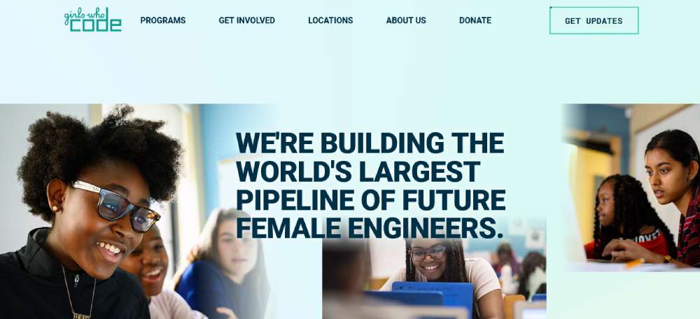
Girls Who Code
Girls Who Code is a game-changer. They're not just closing the gender gap; they're smashing it with Online Fundraising Strategies and Effective Storytelling in Non-Profit Sites. This initiative is a brilliant example of Charitable Organization Digital Presence, showing how Responsive Design for NGOs can empower and engage.
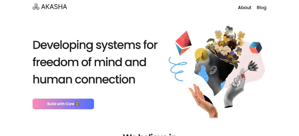
AKASHA Foundation
Imagine a place where technology and humanity intersect. That's AKASHA Foundation for you. Here, Blockchain Technology and Collective Intelligence go hand in hand. Their website is a beacon of Social Cause Web Development, showcasing Mission-Driven Website Content in the realm of non-profit and innovation.
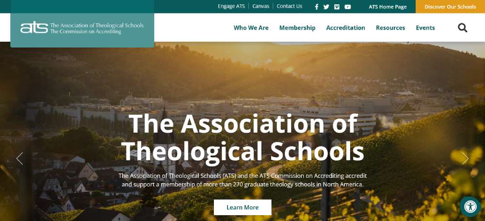
The Association of Theological Schools and The Commission on Accrediting
The ATS and its Commission are all about nurturing faith through knowledge. Their digital presence resonates with SEO Best Practices for Charities, combining Content Strategy for Non-Profits and Philanthropic Organization Site Features to reach hearts and minds across communities.
Bengo
KidSport
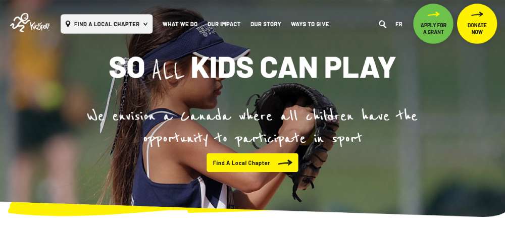
KidSport Canada is where passion for sports meets social responsibility. Their website, decked out in Sports-Related Imagery, is a vibrant example of Non-Profit Online Donation Tools at work. It's a visual journey of how Fundraising Platform Integration can make a real difference.
Naturally Boulder
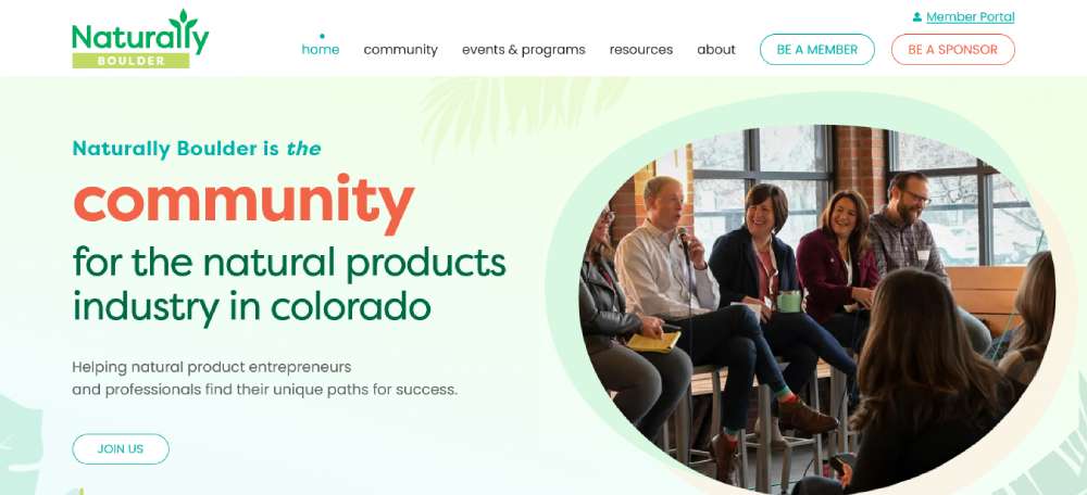
This website, oh, it's a visual treat! The hero banner screams optimism, exactly what Community Service Webpage Design should do. It's an artistic portrayal of Environmental Non-Profit Initiatives, wrapped in serene hues and User-Friendly Website Navigation.
Equal Opportunity Community Initiative (EOCI)
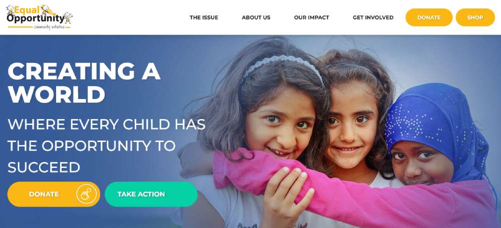
EOCI stands tall in Toronto, championing the cause of vulnerable children. Their website is a perfect blend of Education and Training Resources and Community Engagement Strategies, demonstrating how a non-profit can articulate its mission through Accessible Web Design for Non-Profits.
CrowdRise
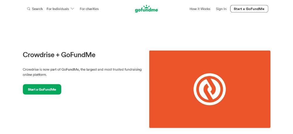
CrowdRise is where personal causes find their wings. As a leading Fundraising Site, it exemplifies Personal Cause Fundraising Strategies. It's the epitome of Non-Profit Crowdfunding Web Design, making the act of giving as easy as a click.
Goodwill Industries of Southwest Florida
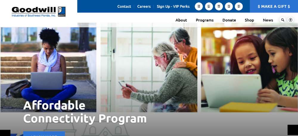
Goodwill's website? It's a masterclass in dual appeal - to beneficiaries and benefactors. The "Careers at Goodwill" link and "Make a Donation" button are textbook examples of Dual Audience Web Design. It's where Vocational Training for Disadvantaged Individuals meets Online Donation Accessibility.
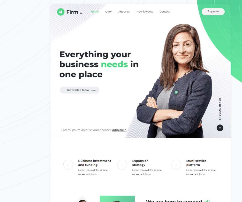
Befirm
Upstream International
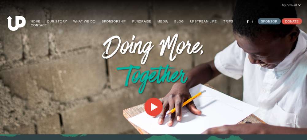
Here's where stunning photography meets clean design. Upstream International’s website is a showcase of Photography in Non-Profit Web Design and Organized Donation Pages. It's about making a visual and functional impact, aligning Visual Communication Strategies with Donor Engagement Techniques.
Cuso International
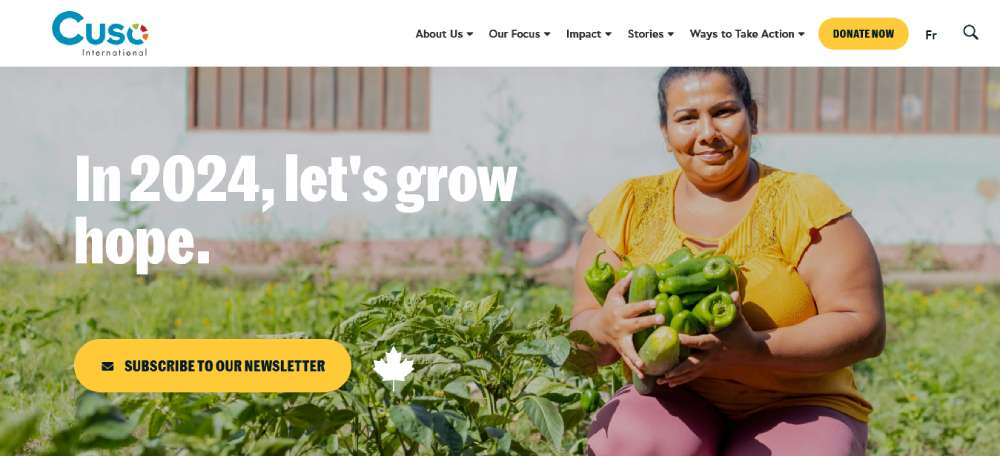
Cuso International's website is a journey across the globe in the fight against poverty and inequality. It’s a beacon of Global Poverty Alleviation Efforts and Educational Program Showcases, wrapped in Cultural Sensitivity in Web Design. It’s where global issues meet local solutions, all on a digital platform.
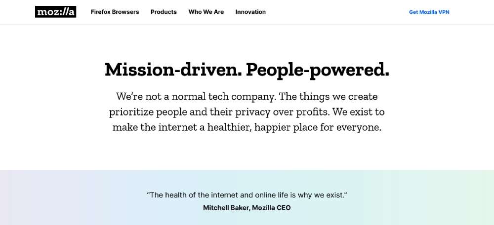
Mozilla
Let's talk Mozilla. This crew's the force behind Firefox, and they're all about the web for everyone. It's not just a browser; it's a statement. They're mixing Digital Literacy with Open-Source Software in the non-profit sphere. It's all about empowering folks online, blending User-Friendly Design with Online Privacy.
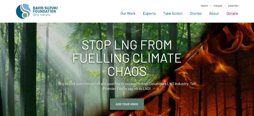
David Suzuki Foundation
The David Suzuki Foundation is on a mission. Climate change, nature restoration, sustainable communities – they're tackling it all. From caribou habitats to youth-led climate actions, they're blending Environmental Advocacy with Sustainable Living. Their site's a showcase of Eco-Friendly Initiatives and Community Engagement.
Bebuddy
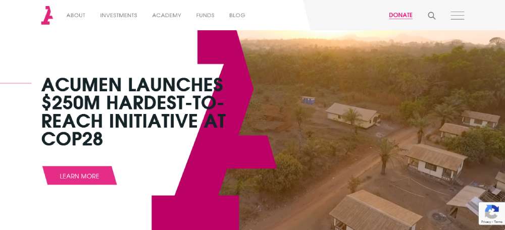
Acumen
Over at Acumen, it's about standing out. That pink/magenta vibe? Totally catches your eye. And the layout? Spacious and inviting. They've nailed the Social Entrepreneurship angle with a touch of Modern Non-Profit Aesthetics. It's class meets cause, wrapped in a Bold Color Scheme.
Feed Ontario
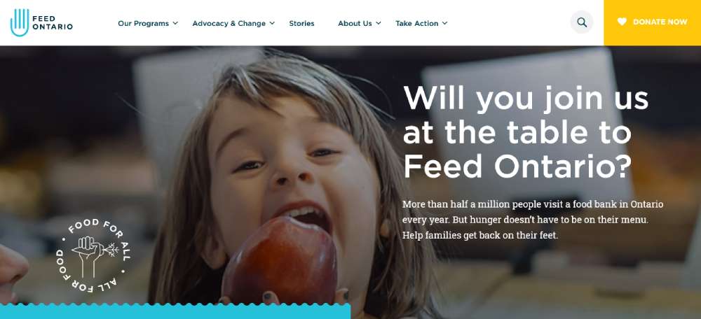
FeedOntario is all about bringing folks together. Food banks, pantries – they're uniting them across Ontario. Their site's a hub for resources, tools, and Hunger Relief Collaboration. It's about quick access and big impacts, showcasing Community Support Networks and Local Resource Sharing.
Small Technology Foundation
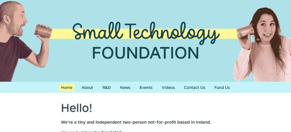
Small Technology Foundation? They're a tiny giant in Ireland. Just two people, but they're making waves. It's all about Independent Tech Advocacy and Minimalist Web Design. Think small but mighty, with a focus on Digital Independence and Grassroots Technology.
World Trade Center Institute
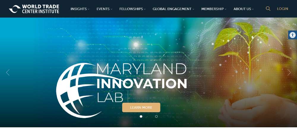
WTCI is a blend of mission and action. They're giving you events, fellowships, memberships, global exchanges – all on their homepage. It's about showing impact, the "Faces of WTCI", and mixing International Trade Education with Cultural Exchange Programs. Their design's a passport to global connections.
Be Nursing Home
Golden Gate National Parks Conservancy
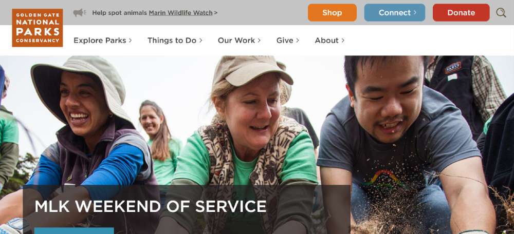
Here's a love letter to nature – Golden Gate National Parks Conservancy. Trails, parks, youth programs, ecosystem conservation, they've got it all. Their site's a journey through Natural Preservation and Community Outreach, wrapped in Scenic Web Imagery and Educational Outreach.
The Metropolitan Museum
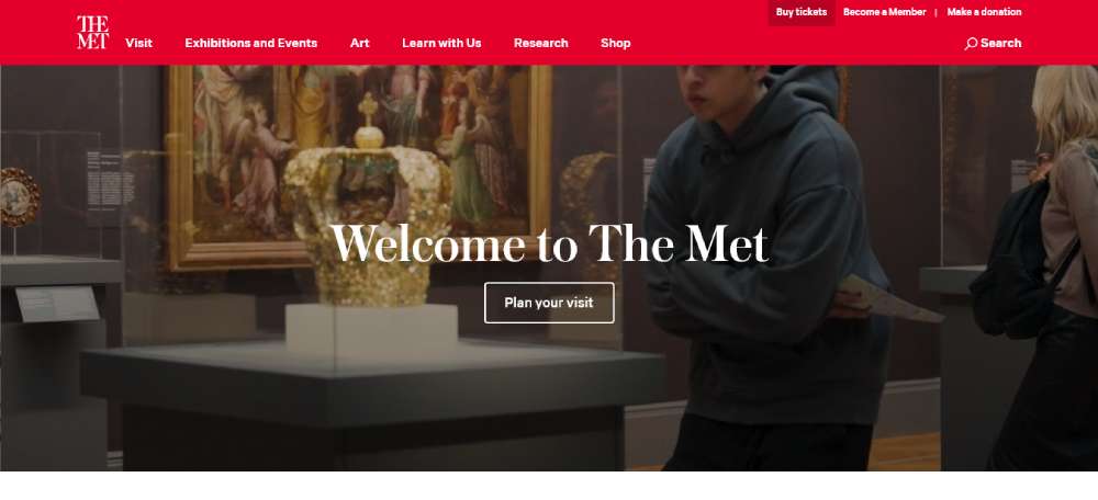
The Met's site? Pure elegance. Clean layout, compact navigation, and that video tour? Stunning. They're blending Artistic Showcase with Cultural Heritage in a digital format. It's about making art accessible, with an Intuitive Donation Page for art lovers everywhere.
MAHUBE-OTWA Community Action Partnership, Inc.
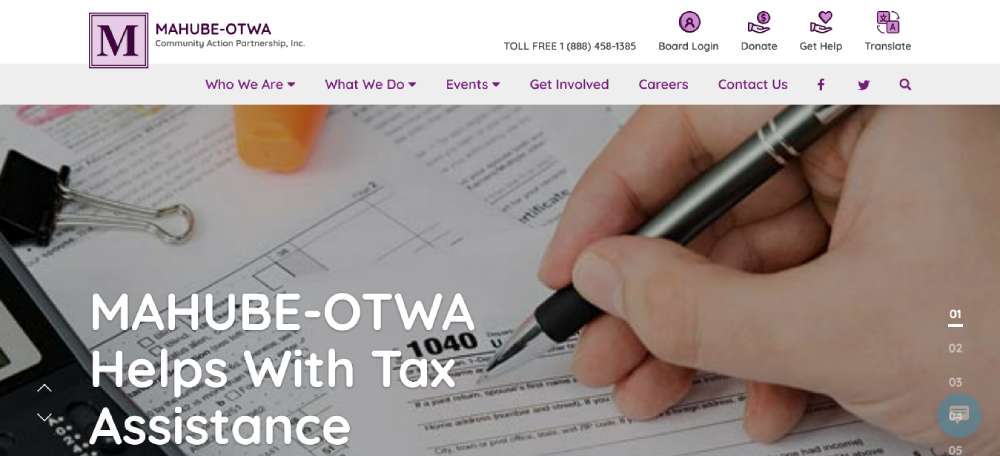
MAHUBE-OTWA? It's all about consistency and accessibility. Purple and white theme, spot-on with their logo. It's a mix of Community Assistance Programs and Professional Non-Profit Branding. Easy navigation, clear call-to-actions – "Board Login", "Donate", "Get Help", "Translate" – they're all about helping people connect and get things done.
Global Plastic Action Partnership
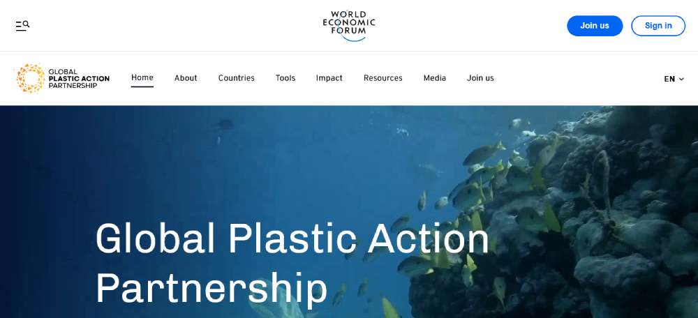
Global Plastic Action Partnership is shaping our world, minus the plastic waste. Part of the World Economic Forum, they're big on sustainable, inclusive action – government, industry, community. It's a blend of Global Sustainability Efforts and Inclusive Environmental Policies, wrapped in a site that's all about Taking Action and Community Involvement.
Befirm2
CARE
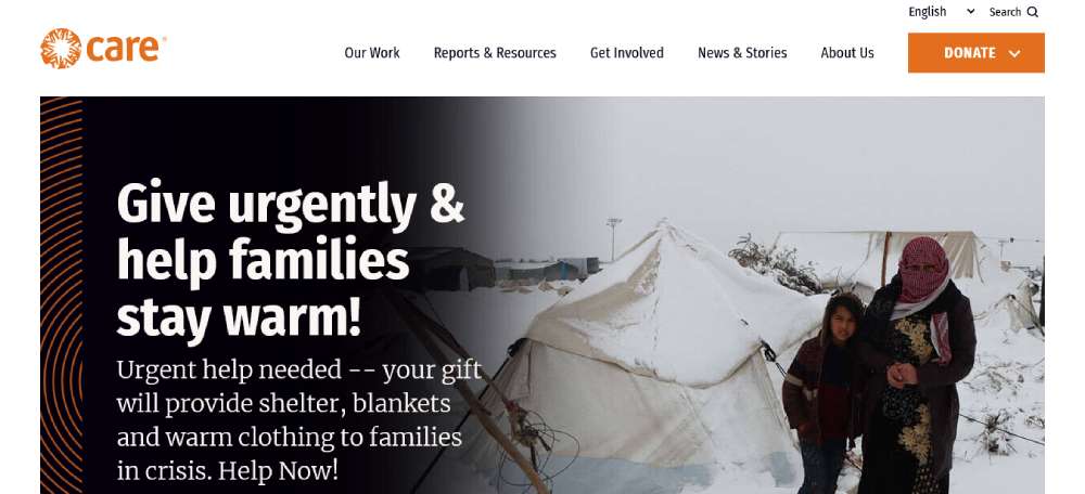
So, CARE? They're all about kicking poverty to the curb and pushing for social justice. Think big - fighting hunger, tackling climate change resilience, shrinking that educational and economic gap, especially for women. It's like they're weaving Global Poverty Alleviation Efforts with Women's Empowerment Initiatives into their mission. Their site? A stellar example of how Non-Profit Website Design Examples should be – informative yet inspiring.
Greenbelt - Essex County's Land Trust
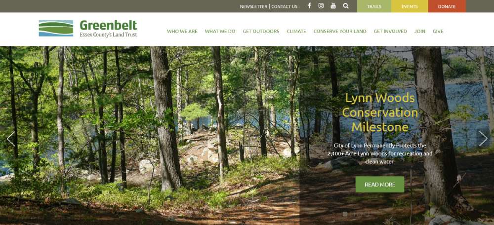
Greenbelt, right? It’s not just about land conservation. Their site's a visual journey – those image sliders, popping colors, super engaging. The menu? A breeze to navigate. Hiking trails, events, donations – it's all there, easy-peasy. They’re nailing the whole Environmental Conservation Web Design vibe, making nature's beauty just a click away.
Law in Action Within Schools
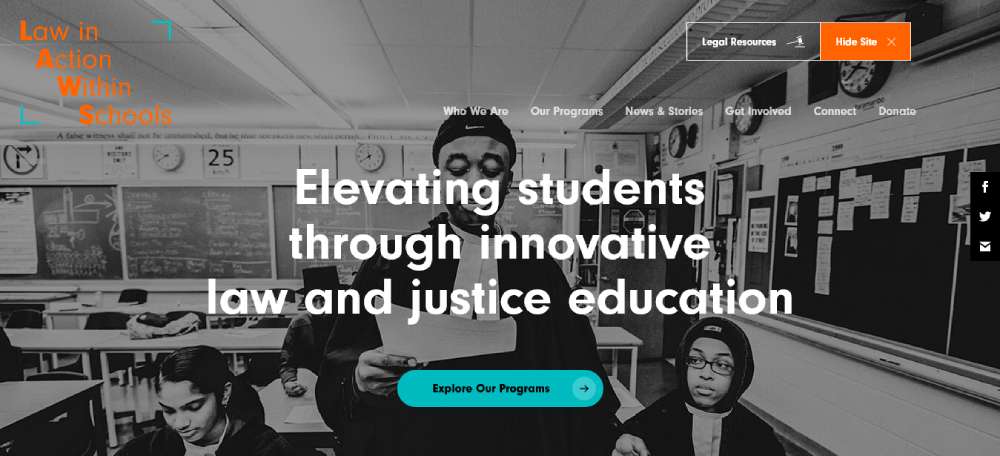
Law in Action Within Schools – LAWS – is making legal education cool in Ontario. Their site? Slick and consistent. Branding? On point. Finding info? No sweat. It’s all about giving high-schoolers a real taste of justice, minus the hassle. They’ve got this Educational Non-Profit Site Design down pat, making the law approachable and, dare I say, fun?
Freedom Service Dogs of America
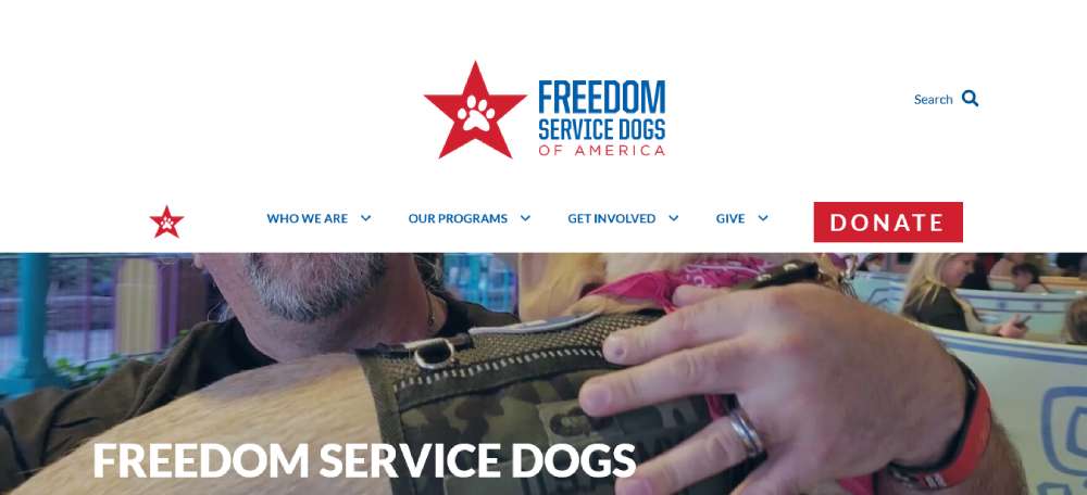
Freedom Service Dogs – heroes on four legs for veterans and folks with disabilities. And guess what? The dogs? Totally free. Their site's a heart-warmer. It’s all about connection, showcasing these amazing service dogs and the lives they're changing. It’s a prime slice of Companion Animal Non-Profit Web Design, making you wanna help, one pup at a time.
Tapestry Capital
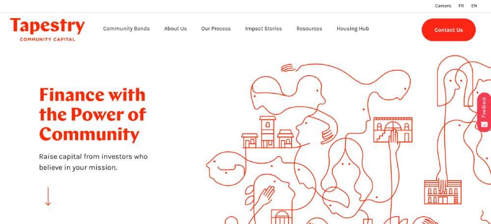
Tapestry Capital? They’re like the financial wizards for nonprofits. Helping orgs get the dough they need for big missions. Their site? Professional yet community vibes. Easy navigation that doesn’t make you scratch your head. They’ve got that Financial Services for Non-Profit Design down, blending trust and accessibility.
Charity: water
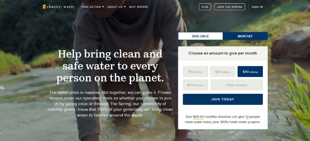
Charity: water is legit changing the game in clean water access. Their homepage? A visual feast. Edge-to-edge vibrant photos, neatly segmented. It’s like stepping into a story, each section a chapter in their water crusade. They’re acing the Humanitarian Aid Website Design, making you wanna dive into their world.
Teach for Canada
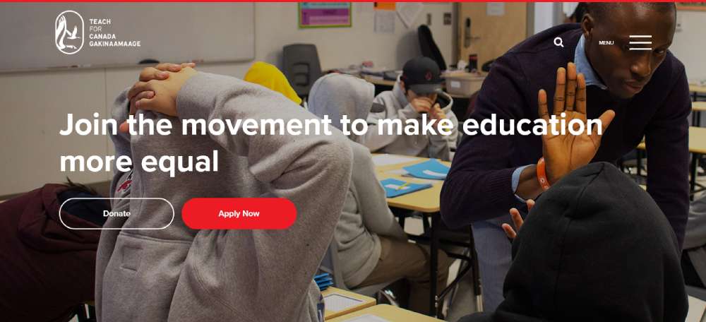
Teach for Canada – they’re shaping the future, one teacher at a time in the north. Their site? A textbook example of Inclusive Education Website Design. It’s all about roping in the right folks, making education equal. Their branding? Spot-on. Makes you feel like joining their mission from the get-go.
SpayMart
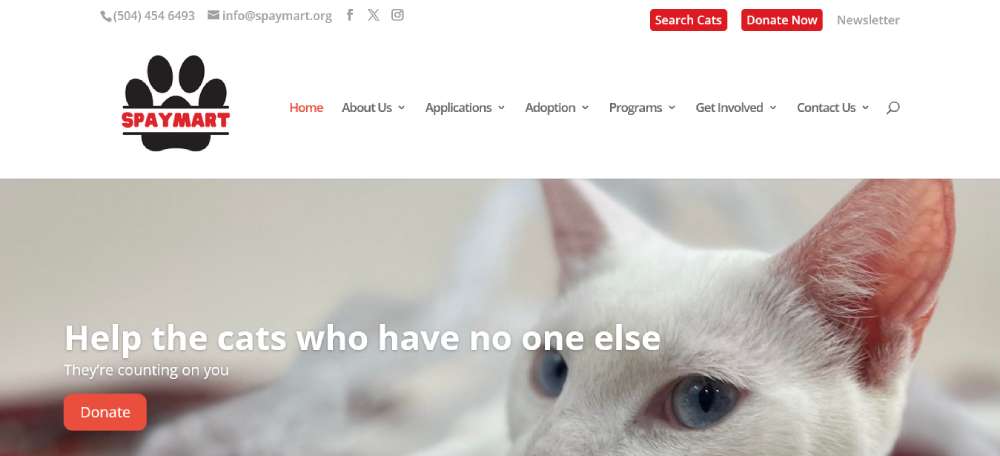
SpayMart – it's all about the felines. And their site? Cuteness overload with kitty pics everywhere. Bright, simple colors that just pull you in. It's like every click on their site nudges you to adopt, donate, or just go “aww.” They’re mastering that Animal Welfare Non-Profit Design, making you wanna be part of their cat-loving crew.
North York Women’s Shelte
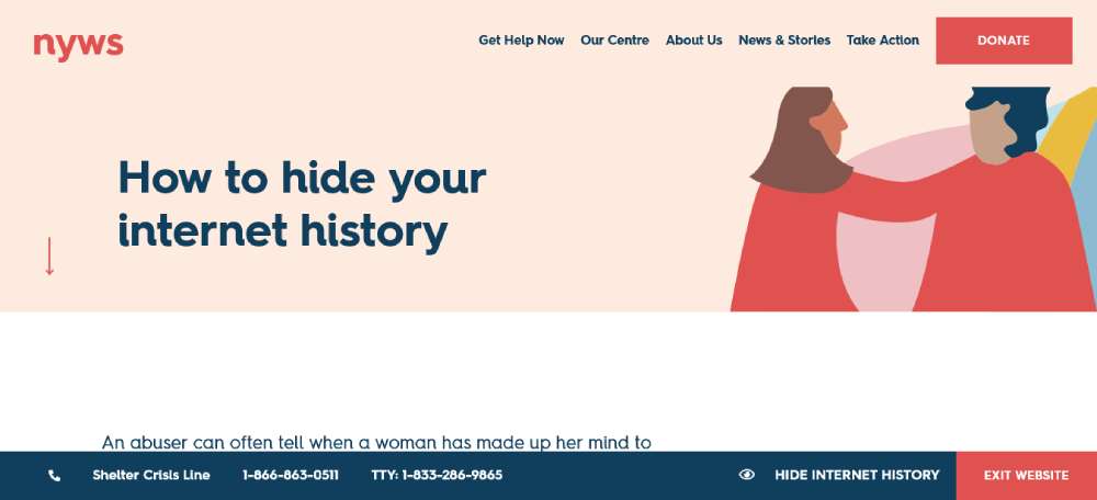
NYWS in Toronto? More than a shelter – it's a haven. For over 35 years, they've been the go-to for women and kids needing to escape violence. Their website? It’s like a warm hug. User-friendly, safe, welcoming. It's Women's Support Web Design at its finest, all about safety and clarity. You can feel the support with each click.
World Wildlife Fund
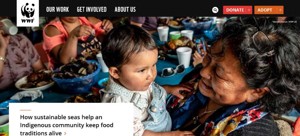
WWF is all about keeping the wild, well, wild. Their website? A goldmine of info on wildlife conservation. The navigation bar is like a treasure map – Our work, Get Involved, About Us, and Places crucial for wildlife. Each hover on the menu is a new discovery, perfectly organized for learning and taking action. It's an ace in Environmental Advocacy Website Design.
Feeding America
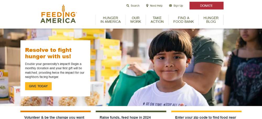
Feeding America – these folks are the superheroes of hunger relief in the U.S. Their site? More than a website, it's a lifeline. Mobile pantries, disaster relief, SNAP assistance – you name it. It’s a standout in Hunger Relief Non-Profit Web Design, making sure no one goes hungry.
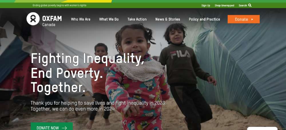
Oxfam Canada
Oxfam Canada – these guys are on a mission for equality, gender justice, and positive change. Their website? It's like an action center, rallying people around elections, global crises, gender justice. It’s Social Justice Advocacy Web Design done right, sparking change with every visit.
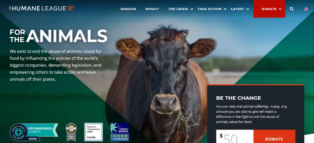
The Humane League
The Humane League? Big hearts for animals. They're pushing the world's biggest food companies for better animal welfare. Their website is more than just a site – it's a campaign hub. Advocacy, education, action – it's all there. It’s Animal Welfare Campaign Website Design that really speaks to the heart.
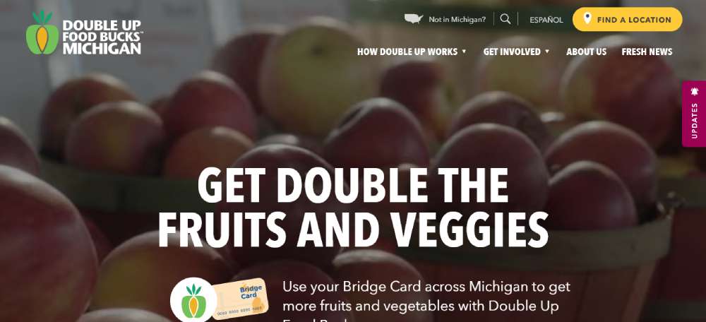
Double Up Food Bucks
Double Up Food Bucks in Michigan is a total game-changer. They’re all about fresh food for the needy, more business for local farmers, and giving local economies a boost. Their website? Visually stunning, super accessible. Plus, their Salesforce Integration for data management? Spot on. It's Community Nutrition Program Web Design at its best.
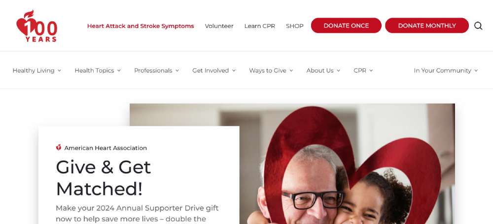
American Heart Association
The American Heart Association is fighting the good fight against heart disease and stroke. Their website? It's an educational powerhouse and a donation magnet. Health info, research, public education – it's all there, user-friendly and engaging. It's Health Advocacy Website Design that's not just informative but lifesaving.
FAQ On Non-Profit Website Design
What makes a good non-profit website example?
Good non-profit websites are easy to navigate, mobile-friendly, and have clear calls to action. They feature impactful mission statements, compelling impact stories, and seamless donation pages. Using structured data and optimized meta tags ensures they rank well in search engines, boosting visibility and engagement.
How can a non-profit website attract more donations?
To attract more donations, integrate donor management software and user-friendly payment gateways like PayPal. Highlight fundraising campaigns and case studies. Effective SEO practices and using keywords like "donate" and "support" in content can also drive higher traffic and conversion rates.
What are common features of successful non-profit websites?
Successful non-profit websites often include volunteer signup forms, event calendars, and annual reports. They utilize social media integration and email newsletters to keep the community engaged. SEO-friendly elements like title tags, header tags, and quality backlinks are also standard features.
How important is mobile optimization for non-profit websites?
Mobile optimization is crucial. A large portion of users will access your site via smartphones. Ensure the user experience (UX) is seamless across all devices to maintain engagement. Mobile-friendly designs, fast loading speeds, and easy navigation contribute to high retention rates and increased donations.
How do non-profit websites use SEO?
Non-profit websites use SEO by incorporating structured data, relevant keywords, and optimized meta tags. High-quality backlinks from respected sources enhance credibility. Regularly updated content, like blog posts and case studies, also helps keep the site relevant and higher in search engine rankings.
What role does content play in non-profit websites?
Content is king. It tells your story, showcases your impact, and engages your audience. Features like impact stories, mission statements, and educational resources provide value. Consistent, relevant blogging improves SEO, keeps visitors informed, and inspires action, like donations or volunteer signups.
Why are volunteer sign-up forms necessary?
Volunteer sign-up forms make it easy for people to engage. They streamline the process, collecting critical information efficiently. Including terms like volunteer, community programs, and outreach programs can attract a more significant number of volunteers, which in turn promotes your non-profit’s activities and initiatives.
How should a non-profit website handle donations?
Effective donor handling includes transparent and secure payment gateways, clear donation tracking, and personalized donor recognition. Make the /donation page/ simple to navigate. Share impact stories showing how donations are used. Follow up with email newsletters** and thank you notes to build lasting relationships.
What is the importance of having a blog on a non-profit website?
A blog adds value by providing regular updates, sharing case studies, and publishing educational resources. It’s excellent for SEO, keeping the site dynamic and engaging. Blogs help in creating a community around your cause, driving more engagements, donations, and volunteer signups.
How can social media integration enhance a non-profit website?
Social media integration amplifies your reach. Embed share buttons and live feeds from platforms like Facebook and Twitter to keep content fresh. It enhances visibility, lets you engage directly with your audience, and drives traffic back to your main site. Integrate to boost your digital outreach efforts.
Conclusion
Examining non-profit website examples reveals that a well-designed site is crucial for increasing engagement, donations, and volunteer sign-ups. Implementing robust SEO practices such as structured data and optimized meta tags ensures better visibility. Essential features include useful content, efficient donation pages, and user-friendly volunteer sign-up forms. Integrate social media and maintain a mobile-friendly design to reach a broader audience.
To summarize:
- Utilize relevant keywords and meta tags to improve search engine ranking.
- Ensure mobile optimization for better user experience.
- Incorporate features like donation tracking, event calendars, and case studies to provide value.
- Embed social media buttons and dynamically engage with your audience.
- Use donor management software to handle donations effectively and transparently.
By integrating these elements, your non-profit website can achieve its full potential in influencing and empowering your community.
If you liked this article about non-profit website design, you should check out these articles also:

