Classy Personal Website Examples and How to Create Your Own
October 11, 2023
Where to Get A Cool Website Header Image and Tips for Choosing One
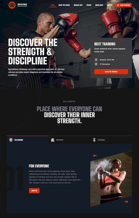
October 11, 2023If you work in the fitness field, you already know how difficult it is to become popular. There are a lot of personal trainers out there who are trying their very best to gain clients by offering their services in gyms. Fortunately, the era of technology comes with many benefits. The most effective mode of attracting customers with minimal effort is using the internet. After just one web search, people can find thousands of personal trainer websites that they can analyze. And, if the website appeals, the analysis might end in a purchase.
People's choices are dramatically influenced by what they read on the web, so a bad reputation online or no reputation at all could affect your career as a personal trainer. To get on top of your game in this space, you must build an image in the online environment and allow people to learn more about you through this channel.
Making a good first impression has never been easier. You just have to build a website that presents you as the best online personal trainer out there. It may sound impossible, but it's not. If you follow the exact steps listed here, your personal trainer website will be leagues ahead of the competition.
What does an ideal personal trainer website look like?
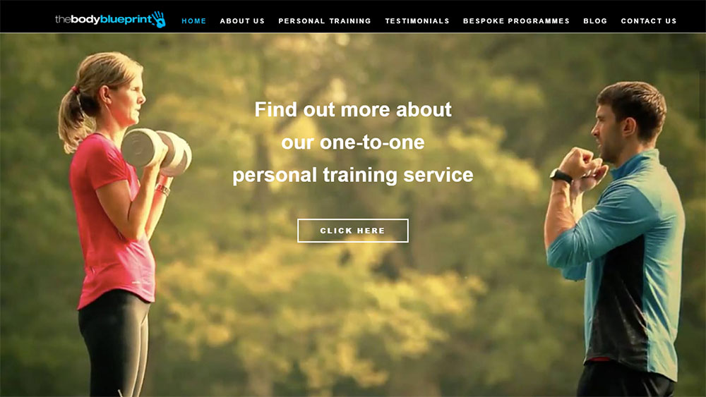
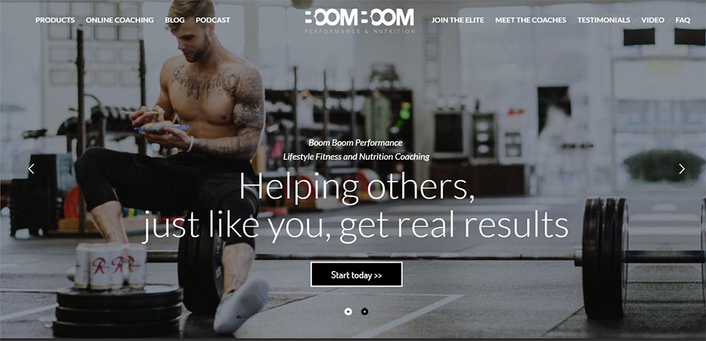
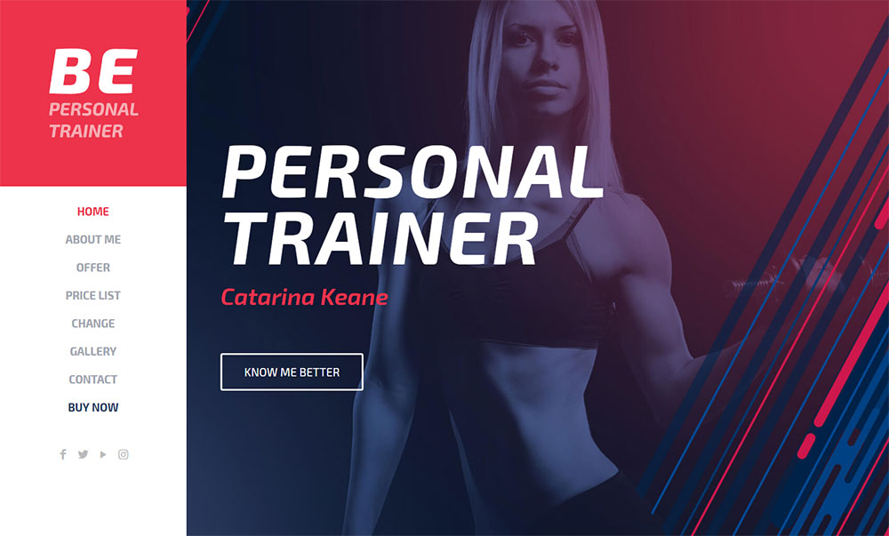
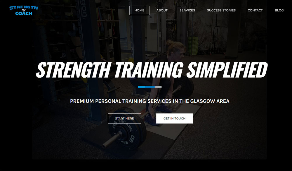
Being a personal trainer is all about communicating with your clients efficiently, either through your website or via a business phone and making them feel comfortable. That is exactly what your personal trainer website should express in its design and functionality. You want to make a great first impression when someone visits the site and – hopefully – make them purchase your services, now or in the future. Personal trainer websites should grab attention from the get-go by featuring memorable copy writing, quality images,and eye-catching visuals.
The aim of a personal trainer website is to attract users and convince them to sign up for personal training services. A poorly-built website will send them away in seconds, while one that is attractive from all standpoints will get clients queuing up for your services. Personal trainer websites should be neatly organized and easy to use, but not too simple either. All elements must be balanced out to generate the wanted reactions.
What types of personal trainer websites exist?
Trainer websites come in a variety of types. A few of them are:
- Focused on clients. This is what you want if your audience is strictly local. You can promote your website in the region you live and meet with clients in person. The goal is to list benefits that are relevant for your local target audience only.
- Focused on the topic. If you are a personal trainer that prefers to deal with certain aspects of fitness, such as building strength or weight loss, it’s important to build a website that is focused especially on that niche.
- Focused on brand. Brand-specific fitness websites include more than just one personal trainer. They focus on the services offered by a company and they list all the trainers who are available for performing a certain type of training. These websites are appropriate for fitness companies rather than individual personal trainers.
How to put together your own personal trainer website
Once you’ve figured out what kind of personal trainer site you need, it’s time to build one for yourself. To start with, you'll need to carefully select a CMS (Content Management System) that enjoy using, choose a template, and start planning the content and services you'd like to share with your audience. Personal trainer websites should contain all of the elements listed here:
Even though there’s not much to say about fitness services, you must use persuasive copy that convinces the audience to choose your services over others. For this, you need to gain the visitors’ trust. Users will only trust a website when it is professionally built and includes all the elements they seek. Hiring a copywriter to create content that is easy to comprehend and respects the tone you would like to transmit to users is probably the best idea. Typos, verbose language, and filler content will only make users question your website’s credibility.
Make the website SEO-friendly
Most of your website’s traffic will come from Google’s search results. To make the website pop on the first page of results, you must pay attention to the SEO aspects of your site. SEO, short for Search Engine Optimization, includes a series of practices that will make Google’s robots (crawlers) perceive your website as authoritative, thus ranking it higher in results pages.
People who own personal trainer websites often overlook this aspect, even though it's extremely important. The way your website looks won’t matter if no one gets to see it. Luckily for people who don’t know much about SEO approaches and what changes they should make, there are plugins that can help you, or you even can hire a company to manage your SEO and digital marketing campaigns. The choice depends on your marketing budget and how much you are willing to spend on a well-built and highly discoverable website.
Establish a brand voice
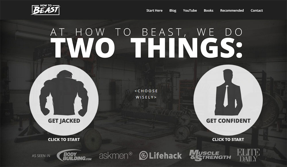
Wondering why should you invest in building a brand if you are an individual personal trainer? Well, all fitness websites should have a brand voice, regardless of how big the team is. Not only companies have a brand. Individuals in the personal training space can, and often should, build their personal brand to help people recognize them easier. The components of your brand should be a catchy name, a memorable slogan, a logo that everyone can notice easily, and a color scheme that you respect all the time to establish a pattern of consistency.
Use email marketing
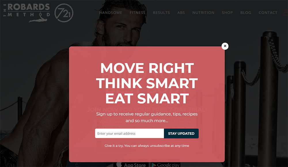
If you can't seem to grow your community as quickly as you'd like, start an email marketing campaign with regular updates and helpful tips around fitness and nutrition. These campaigns help with establishing a relationship between you and your prospective clients. People who sign up on your website do it because they are interested in what you have to offer. Don’t fail them by sharing spammy or low-quality content. Promote your services alongside your branded email marketing content and you will win the hearts and minds of clients sooner than you expected.
Build an online community
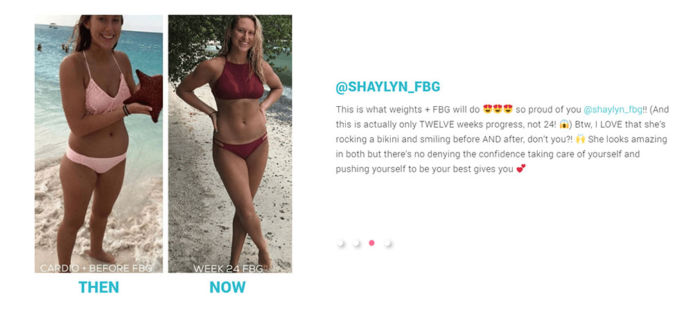
A personal trainer website is also defined by the online community that supports it. People tend to trust websites that have a strong online community, full of people who are pleased with the services provided on the site and who share their experiences. Successful personal trainer websites also benefit hugely from including before and after results from their previous clients on a dedicated testimonials page. In the fitness world, results matter the most, as well as good communication. Be ready to answer any question that people may have regarding your services and make sure to do it quick. People lose interest quickly if they are not treated professionally. If you involve yourself 100% in your community, you will easily gain their loyalty.
Use HQ photos
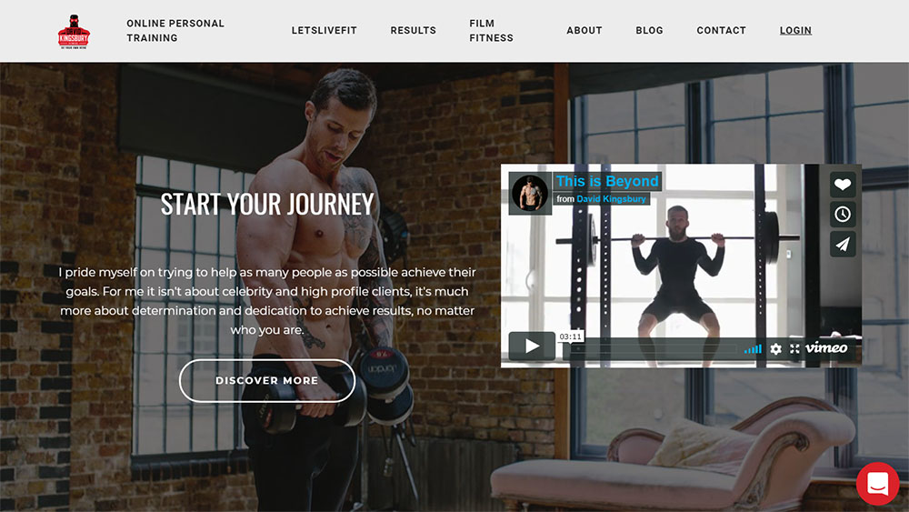
It’s obvious that your personal trainer website shouldn’t contain any type of low-quality content, and that goes for pictures, too. In fitness, people focus on how a person looks, and you should give them something to strive for. Use high-quality photos from the fitness domain, preferably from your past experience or of yourself. Users tend to trust websites that include photos of the owner way more than websites that use HQ stock photos. Hire a photographer from Kijiji or Craigslist and build your own portfolio with photos of yourself and people you’ve worked with in the past.
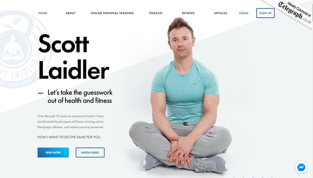
CTA is short for Call-To-Action and it represents a button that is included on the website and encourages someone to do something. They are great for giving your website visitors immediate direction after they’ve accessed the site. Use clearly visible “Sign Up” or “Contact Me” buttons for the best results.
What pages should personal trainer websites contain?
- Home– this is the homepage of your site and should be the most intriguing and interesting page of your website.
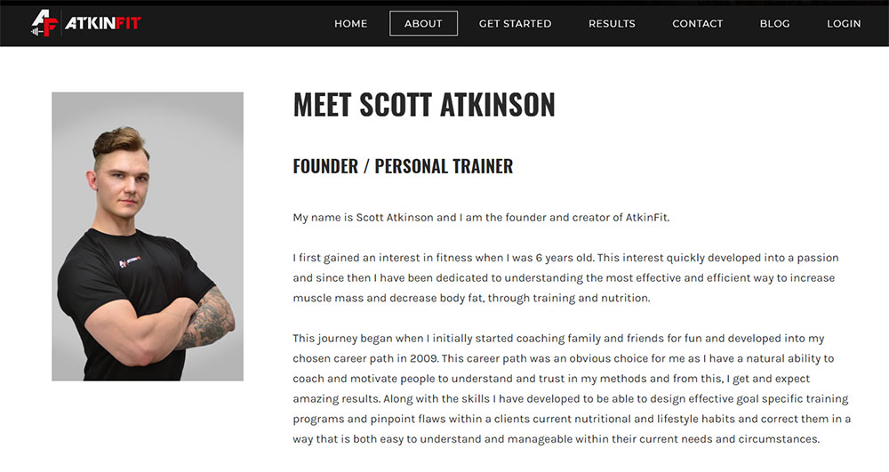
- Team– this page presents the team you are working with or yourself. Look for the best personal trainer bio examples and get your inspiration for building your own. Include your bio here for a better impact on your visitors.
- Services–this page should describe all the services you offer. You can also include a list of prices here. Try to separate the services based on category (e.g. strength training, core training, total body, cardio, etc.)
- Photos–here is where you can include all the before and after photos you’ve gathered over time, as well as some photos of yourself or the gym you are collaborating with.
- Store– here you can include eCommerce functions where people can pay for your services online, using their preferred payment method.
- Booking– this is the second most important page on your website. Here is where people can book a class or a training session. Make it easy to comprehend and responsive for mobile users. Ask for all the information you need for a smooth booking process. And create an integration for an appointment booking app like Glofox or Mindbody to save you some time with the back and forth emailing that you don't really need.
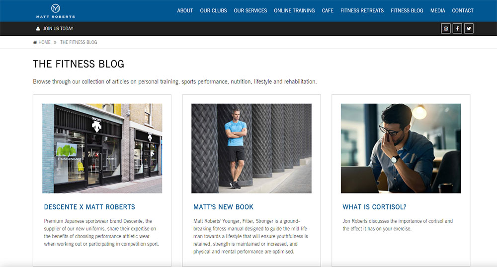
- Blog– to keep visitors engaged, include a blog section where you write about fitness-related topics or tips and tricks that you recommend to your clients.
- Contact– people need to contact you with no trouble, so make sure your contact information is visibly listed on the website.
FAQ on designing personal trainer websites
What should the main focus be when designing a personal trainer website?
Well, mate, the heart of it is user experience. Think about your potential clients. They're probably looking for workout plans, testimonials, maybe a bit of your personal story. So, make it easy for them to navigate, and keep it clean. A cluttered site? That's a no-go. And hey, don't forget to showcase your expertise. It's like designing a gym – everything should be where you expect it to be.
How important is mobile optimization?
Oh, it's huge! I mean, think about it. Everyone's on their phones these days, right? If your site doesn't look good or function well on mobile, you're missing out on a massive chunk of potential clients. It's like trying to train someone without dumbbells. Just doesn't work. So, always ensure your site is mobile-friendly. It's 2023, after all!
Should I include a blog on my personal trainer website?
Absolutely! A blog is a fantastic way to share your knowledge, give fitness tips, and even talk about nutrition. It's a way to connect with your audience and establish yourself as an expert in the field. Plus, it's great for SEO – those search engines love fresh content. Think of it as your daily workout routine, but for your website.
How often should I update my website?
Well, you wouldn't wear the same gym clothes every day, would you? Regular updates keep things fresh. Whether it's new client testimonials, updated services, or even just new blog posts – it keeps your audience engaged. I'd say, give it a good once-over every few months. And always be on the lookout for new trends in web design.
What kind of visuals should I use?
Visuals are like the protein shakes of web design – essential! Use high-quality photos of yourself, your clients, or even your workout sessions. Videos? Even better. They give a real feel of what training with you would be like. And remember, authenticity is key. No stock photos of random people lifting weights. Keep it real, and it'll resonate more.
How can I make my website stand out from competitors?
Ah, the golden question! It's all about your unique selling proposition (USP). What makes you different? Maybe it's your training style, your success stories, or even your personal fitness journey. Highlight that. And design-wise? Stay current, but don't be afraid to let your personality shine through. It's like having a signature workout move – make your site uniquely yours.
Should I integrate social media into my website?
Oh, for sure! Social media is where the party's at. Integrate your Instagram, Facebook, or whatever platform you're active on. It's a great way to show off your community, share success stories, and even post quick workout tips. It's like giving your website visitors a backstage pass to your daily life as a trainer.
How can I optimize my website for local search?
Local search is your bread and butter. Make sure you mention your city or area frequently. Register on Google My Business, and encourage clients to leave reviews. Think of it as word-of-mouth, but online. And don't forget to include local keywords in your content. It's like telling everyone in the neighborhood you're the go-to personal trainer.
What should I avoid when designing my personal trainer website?
Avoid making it too complicated. You don't want to overwhelm visitors. Keep the jargon to a minimum and avoid auto-playing videos or music. And please, no pop-ups every two seconds. It's like someone interrupting your workout – super annoying. Keep it simple, straightforward, and user-friendly.
How can I encourage visitors to take action?
Ah, the call to action! Make it clear and compelling. Whether you want them to book a session, sign up for a newsletter, or download a workout plan – guide them towards it. Use persuasive language, but don't be pushy. It's like being a personal trainer – motivate, but don't intimidate. And hey, a little incentive never hurt.
A quick overview
If you follow all the tips mentioned above, nothing can stop you from dominating your niche. Building personal training websites is easy, but you need to pay careful attention to details. Your website is your virtual business card that may or may not make people contact you after analyzing it. Take your time to build it properly and clients will start coming to you faster than you ever expected.

