


The best FTP client for Mac? It’s among this handpicked selection
October 4, 2023
How to Disable Comments in WordPress: A Quick Guide
October 5, 2023In the last few years, the focus of online businesses has shifted to lowering the bounce rate and enhancing user experience. There are lots of changes going on all the time on the web, so it is a good idea to check the latest trends before you start a new project.
Keep in mind that the days when a company had a website to display necessary information are long gone. Now, businesses use their sites to reach out to their target audience and sell products or services directly.
The first thing that users see when they open a website is the design. It is vital that your site leaves a good first impression, especially on first-time visitors. The design should make it easy for the user to navigate and find all the information quickly.
What is important to remember is that users aren’t going to visit or come back to your website if it is not user-friendly. They’re just going to find another site that they like more and that is it. The good news is that if you invest time and make your website user-friendly, people will be coming back. Some web design best practices can help you while developing your site.

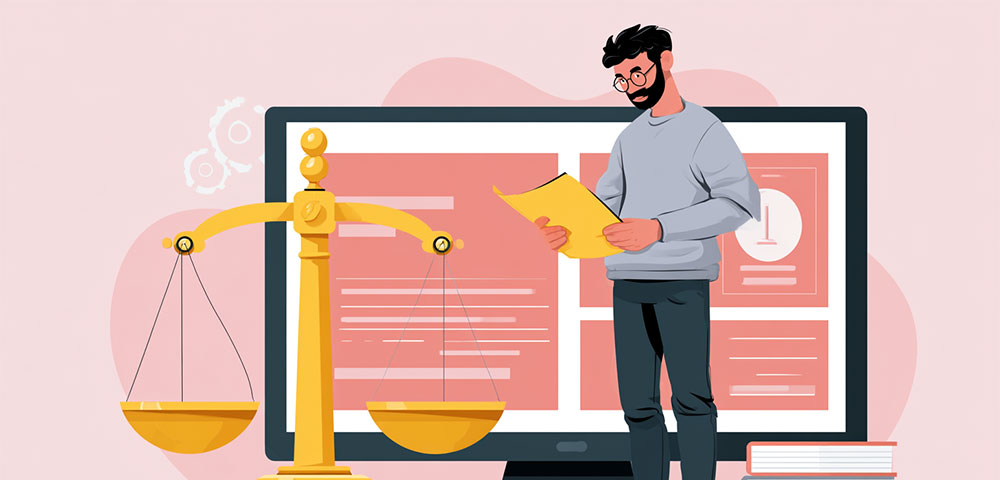
Having good design can impact your conversions and increase your chances of success. While no one model works in all cases, you should aim that your site looks nice and provides as best user experience as possible.
Here are web design best practices that will help you develop a better experience for your visitors:
Website goal
You have to determine what is the purpose of your website and to share it with your developer.
Website running costs
You should aim to have a website that is going to start earning money as soon as possible. Don’t create a complicated site that is going to need a lot of resources to be kept up and running.
Plan for the future
Your website should be SEO friendly since it is going to be very important for your marketing. Your users must be able to find your site quickly on all major search engines which can be done through SEO sprints which is a highly focused and condensed effort to optimize each core pillar within SEO to boost your SEO campaign.
Web design best practices
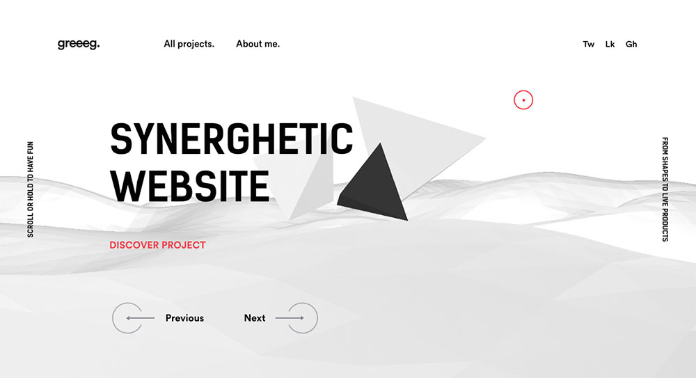
Carefully choose the color scheme
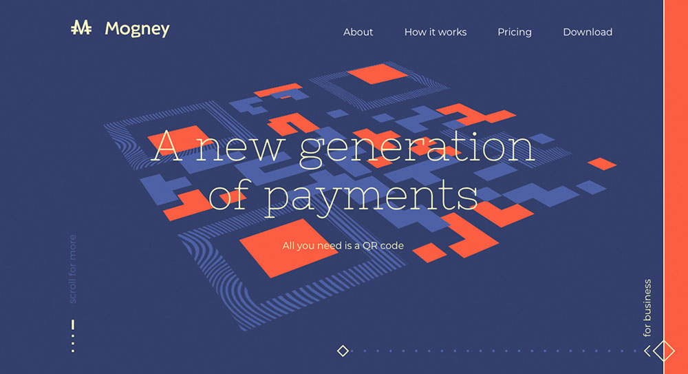
Colors are an essential piece of the puzzle when it comes to design. Finding the right color scheme can be tricky, but if you make it work, it will be worth it. Recent studies have shown that people take up to 90 seconds to decide whether they are going to buy a product. Your website is your product in a way, and the colors that you use will shape the judgment of your visitors.
If you are not sure how to choose colors for your site, you should start with your branding. It is essential that your color scheme complements your logo. For example, if your logo is blue, then you shouldn’t use yellow and red color scheme. The color scheme of your website should complement your logo and the rest of the branding.
Invest in typography
One of the web design best practices is to add interesting typography to your website. Having a unique font on your site could help it stand out in the crowded online space. Finding the perfect font could prove to be tricky (and expensive), but in the long run, it could be worth the trouble.
Make navigation as simple as possible
It is crucial that your visitors can find what they are looking for, once they are on the website. Try to look at the design of your website as a potential visitor. Why are you on the site? Do you need information, specific product or service cost? Figure out who your average visitor is and what they might need.
Whatever your niche might be, the chances are that there is a lot of competition. If you have a good product or service, it would be wrong to lose potential customers over your website.
Smartphones are living up to their name – you can use one to call, send an email and even order food to be delivered to your doorstep. Web design best practices always find a way to use the most out of modern technology.
An excellent example of two approaches to the same thing on different platforms is the phone number. On the desktop, you should list your phone number on the contact page or somewhere where it is constantly visible. However, on a mobile device, you could add a feature that enables the user to start calling you as they click on your number. A similar approach can be applied for email.
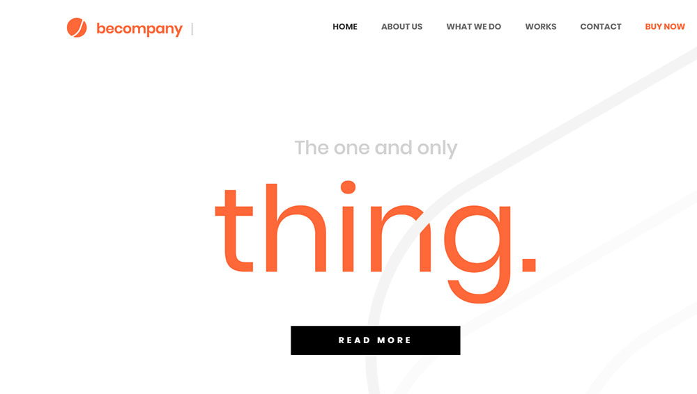
Use visuals to get your message through
Finding good visuals to use on your site could make it easier for users to find out what your business is about. Why explain to your visitors what you do when you can show them?
A great way to engage your visitors right on your homepage is to add images of your products and write something like “buy today” or “delivered to your door”. Your visitors will immediately get the idea about your business, without the need to go through the website. You should explain in detail what is that you do but on other pages.
Use negative space to draw focus on your key elements
When you use negative or white space, you shift the focus of your visitor to the parts of the website that are not empty. If you take the text for example – if there is a lot of lines, all cramped together, it will be much harder for the visitor to read it. However, if you add some white space, like extra padding, lines will be much easier to understand.
You should always aim to provide the best possible user experience to all your visitors. However, it is not possible to enable the same user experience on both mobile and desktop. With that in mind, there are some web design best practices you can use to get the best of both worlds.
Keeping the site accessible to users on mobile usually involves having less text than usual. Regardless, if you want to keep all your text, you can put the most important info on the top or hide some parts in tappable areas. You can write all the text with headlines and add a button near the title to show users that there is more info to be found.
What you get out of this is that user can get the most important info at a glance, while those that are interested can find out more.
Use grids to balance out all elements
The idea behind using grids is to make your website and its contents easier to the eye. Horizontal and vertical rulers (that make the grid) will help youorganize components, graphics and text better.
Columns are a good example. Arranging your text that way improves readability while making the website look cleaner.
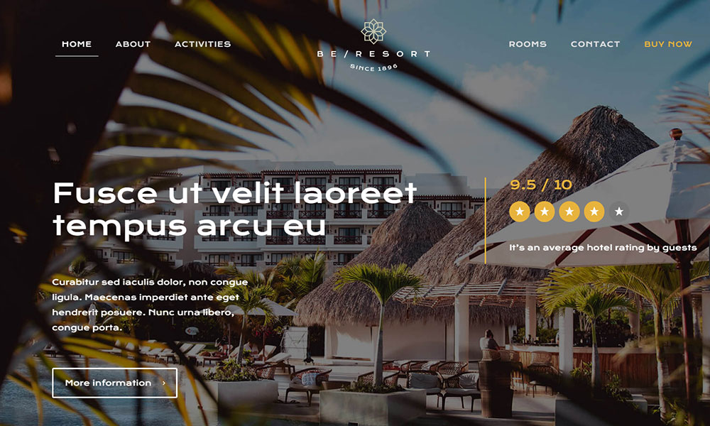
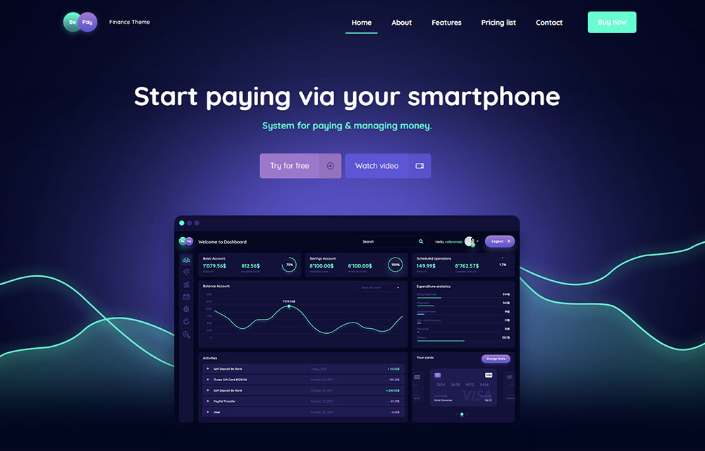
All graphics are important

If you want your website to leave a good impression, find the graphics that show best what your company is all about. Your design doesn’t depend on the images you choose, but it could damage the overall look.
Try to find some images that are free to use, if you don’t have your own. If this doesn’t work, many websites sell amazing photos online. Invest some time (and possibly money) into graphics; they are an essential component of your site.
FAQ on web design best practices
How do you ensure a website is responsive?
Ah, the age-old question! So, when we're talking about responsive design, it's all about making sure your website looks and functions well on all devices, from desktops to smartphones. The trick? Use flexible grids, fluid images, and media queries. And always, always test on different devices. Remember, it's not just about shrinking content, but rearranging it to fit smaller screens. It's like giving your website a tailored suit for every occasion.
What's the deal with website loading speed?
Alright, so here's the thing: nobody likes waiting. If your website takes forever to load, folks will bounce. To keep your site speedy, optimize your images, use browser caching, and consider a content delivery network (CDN). Also, minify your CSS and JavaScript. It's like decluttering your digital closet. The faster your site loads, the happier your visitors will be. And happy visitors? They stick around.
How important is user experience (UX)?
UX is the bread and butter of web design. Think of it this way: if your website was a restaurant, UX would be the taste of the food. It's all about understanding your users' needs and designing with them in mind. Simple navigation, clear call-to-actions, and intuitive layouts are key. Always put yourself in the user's shoes. If they're lost or frustrated, they'll leave. So, make their journey smooth and enjoyable.
Should I be using a grid system?
Oh, absolutely! Grid systems help keep your content organized and aligned. It's like having a blueprint for your website. By using a grid, you ensure consistency and balance in your design. It's not just about aesthetics, though. Grids make your content more readable and accessible. So, whether you're going for a 12-column layout or something more unique, grids are your best friend in web design.
How do I choose the right color scheme?
Colors, colors everywhere! But which ones to pick? Start with your brand's identity. Your colors should reflect your brand's personality and message. Use tools like color wheels or palettes to find complementary shades. But remember, less is often more. Stick to 2-3 primary colors and maybe a few secondary ones. And always consider contrast, especially for readability. It's like picking the right outfit – you want to make a statement, but not scream.
What's the best way to optimize images?
Images can be a double-edged sword. They make your site look fab, but they can also slow it down. To optimize, first, choose the right file format (like JPEG for photos and PNG for graphics with transparency). Then, compress them without losing quality. Tools like TinyPNG or ImageOptim can be lifesavers. And always use descriptive alt text. It's not just for SEO; it's for accessibility too.
How do I make my website accessible?
Ah, a crucial question! Web accessibility means making your site usable for everyone, including those with disabilities. Use semantic HTML, provide text alternatives for non-text content, and ensure keyboard functionality. Also, be mindful of color contrast and font sizes. Think of it as building a ramp alongside stairs – you're making sure everyone can get in and enjoy what you offer.
Should I prioritize mobile design?
In today's world? Heck yeah! With so many folks browsing on their phones, mobile design is a must. It's not just about shrinking your desktop design, but reimagining it for smaller screens. Prioritize essential content, use touch-friendly buttons, and keep it simple. Remember, on mobile, less is more. It's like packing for a trip – you only bring what you truly need.
How often should I update my website's design?
Web design isn't a set-it-and-forget-it thing. Trends change, and so do user expectations. I'd say give your site a fresh look every 2-3 years. But also, make small tweaks regularly based on user feedback and analytics. It's like redecorating your home – sometimes, you just need a fresh coat of paint or a new piece of furniture to liven things up.
What role does content play in web design?
Content is king, baby! Your design should always serve your content, not the other way around. Good content is clear, concise, and compelling. And your design should amplify that. Use typography, spacing, and visuals to enhance readability and engagement. It's like setting the stage for a play – the design sets the mood, but the content is the star of the show.


