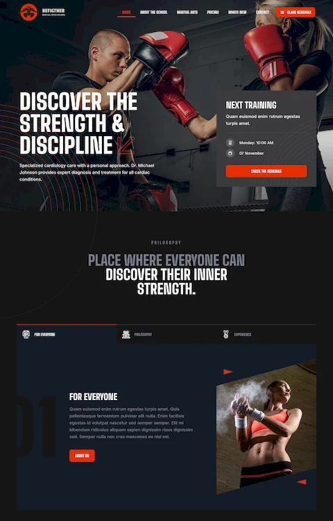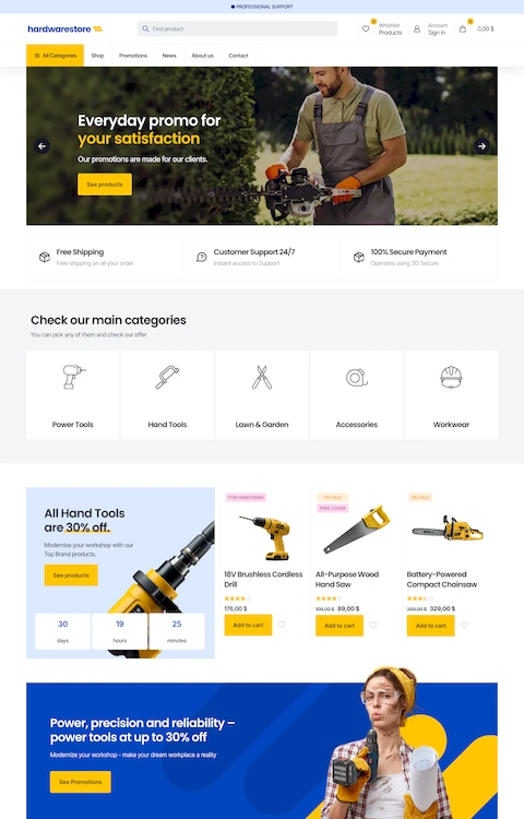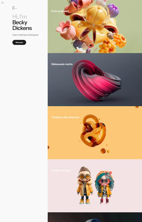
Examples of Responsive Website Templates That Work
August 14, 2025
Examples of Professional Website Templates for Any Brand
August 16, 2025Your pizza might be incredible. But if your website looks like it was built in 2010, customers order from someone else.
The best pizza website design examples prove that hungry visitors convert when ordering feels effortless. Three clicks to checkout. Appetizing photography. Mobile-first layouts that load fast.
Major chains like Domino's and Pizza Hut spend millions perfecting their online ordering systems. Local pizzerias can learn from them without the budget.
This guide breaks down what actually works: menu displays, visual design patterns, color choices, and ordering flows that turn browsers into buyers.
Real examples included. Steal what works for your pizzeria.
What is Pizza Website Design
Pizza website design is the process of building web interfaces for pizzerias, delivery services, and pizza franchises.
It covers menu presentation, online ordering systems, location finders, and brand visuals that communicate quality.
Unlike generic restaurant sites, pizza websites prioritize speed. Customers want to order fast, customize toppings, and track delivery.
The best pizza shop websites balance appetizing food photography with conversion-focused layouts. Every element serves a purpose: get the order placed.
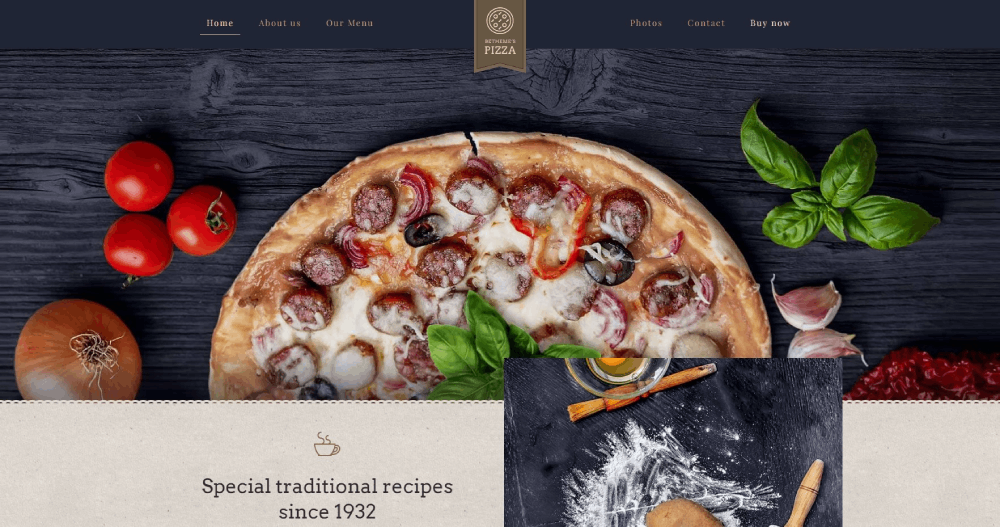
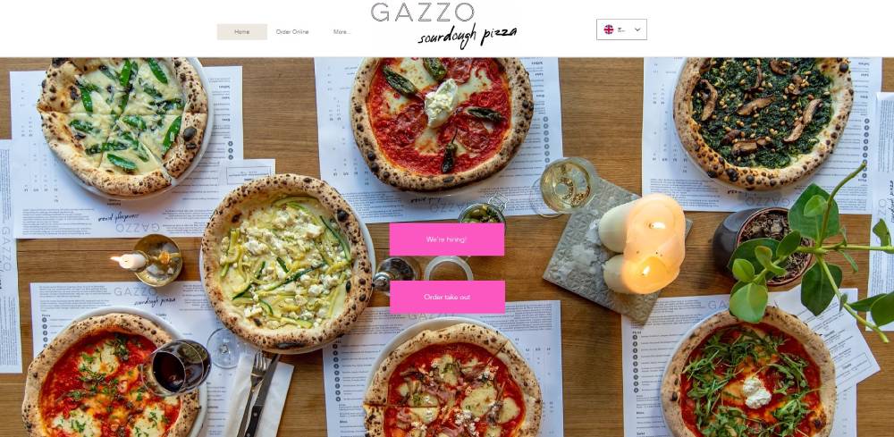
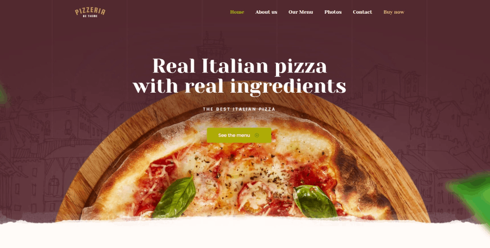
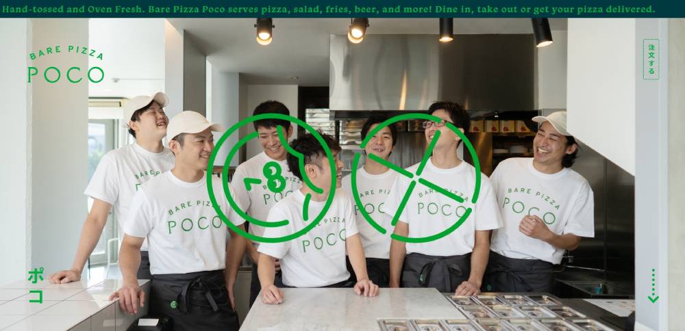
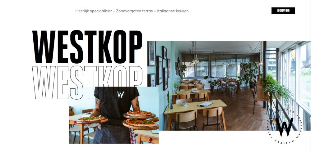
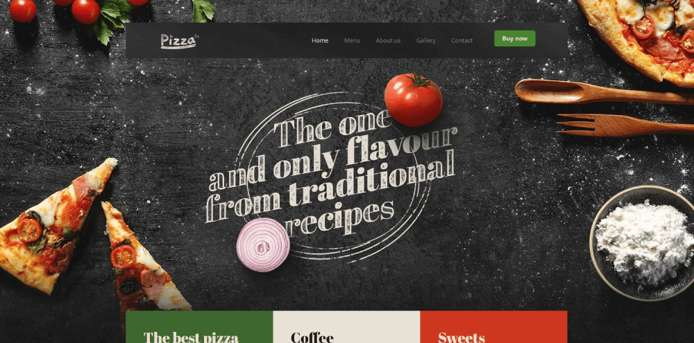
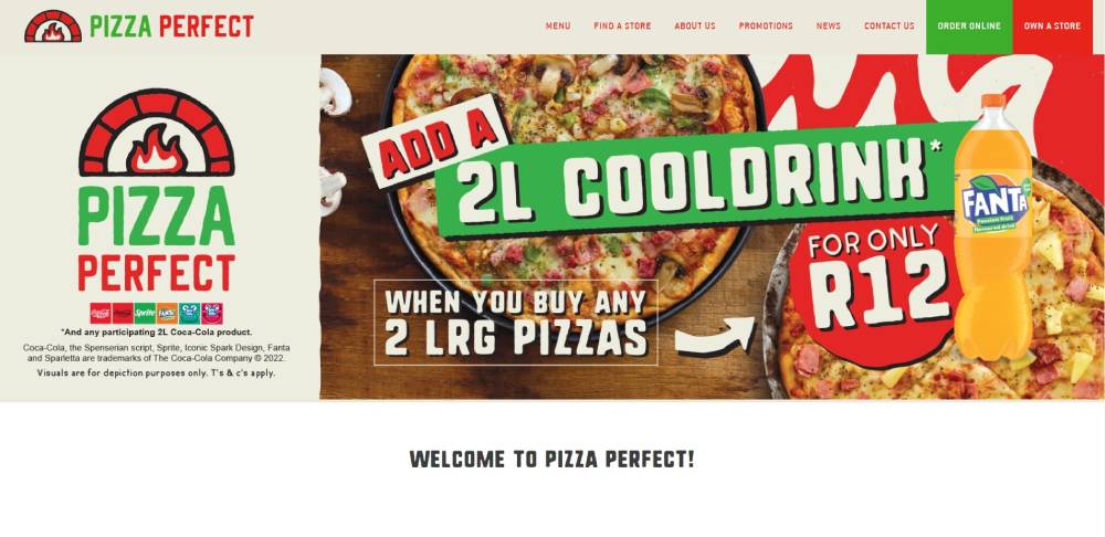
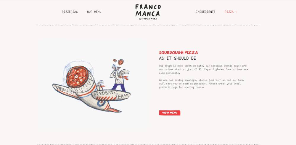
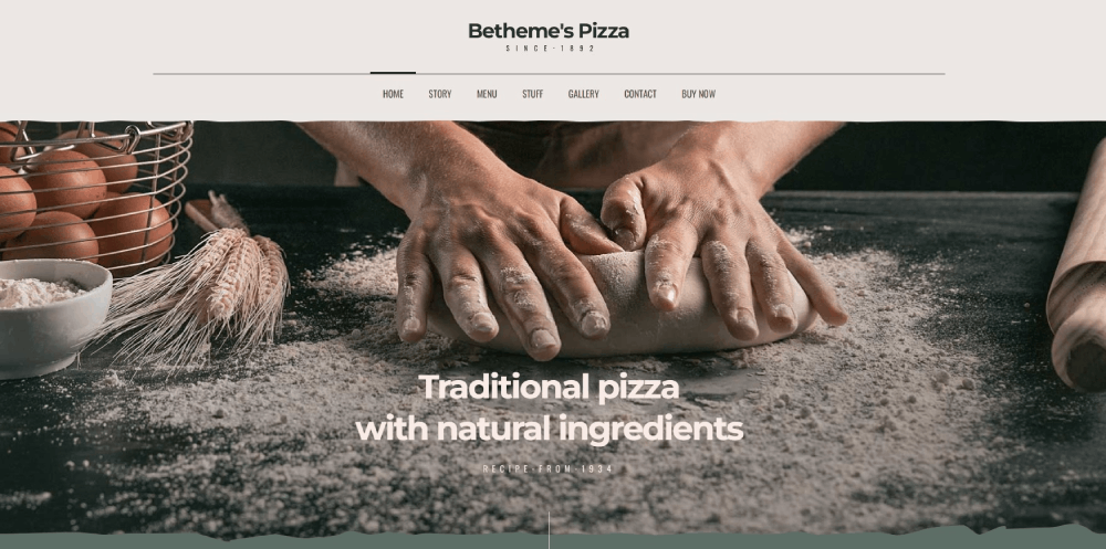
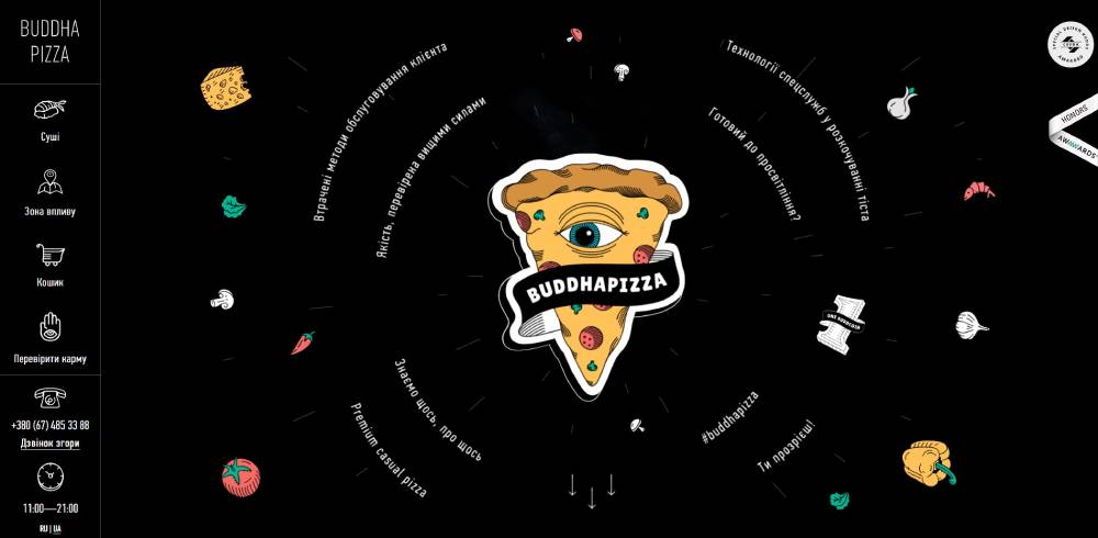
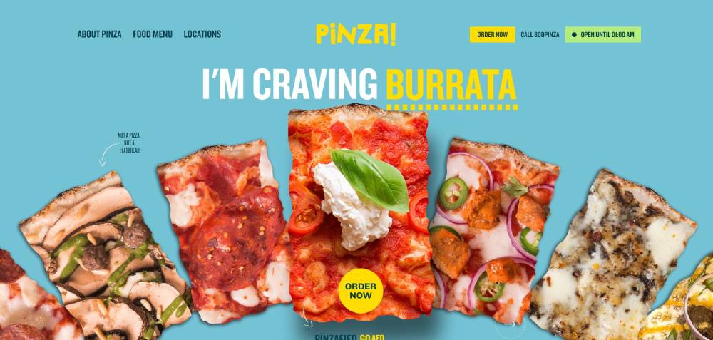
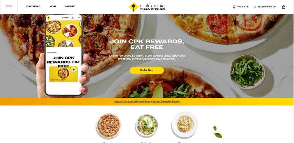
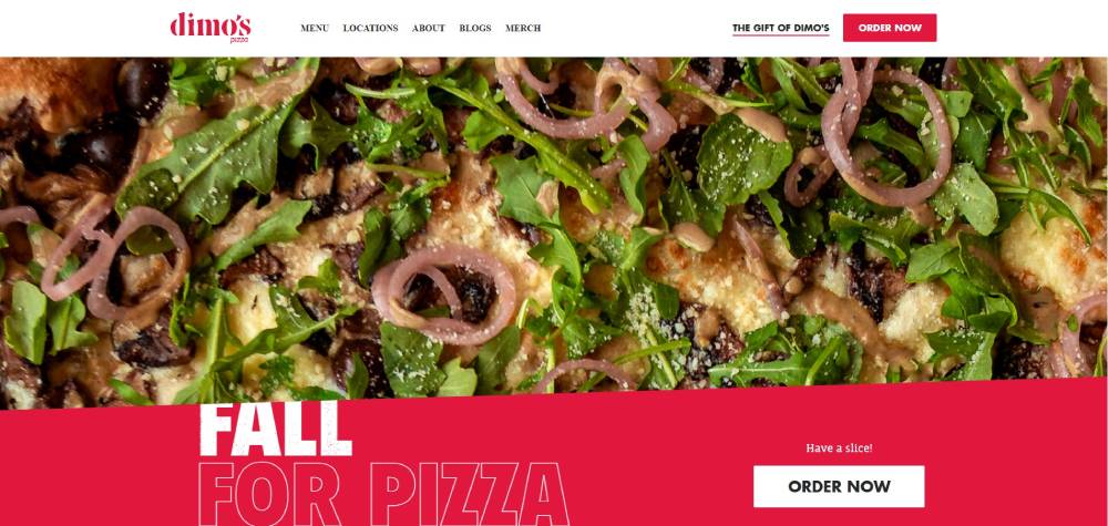
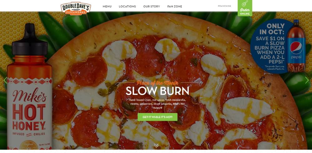
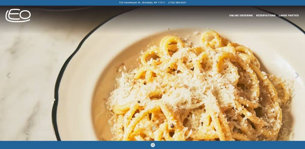
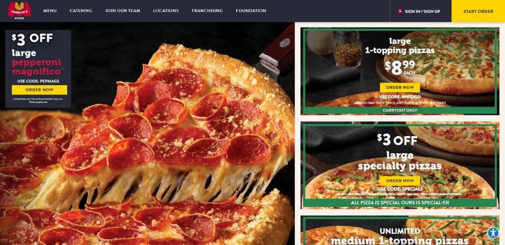
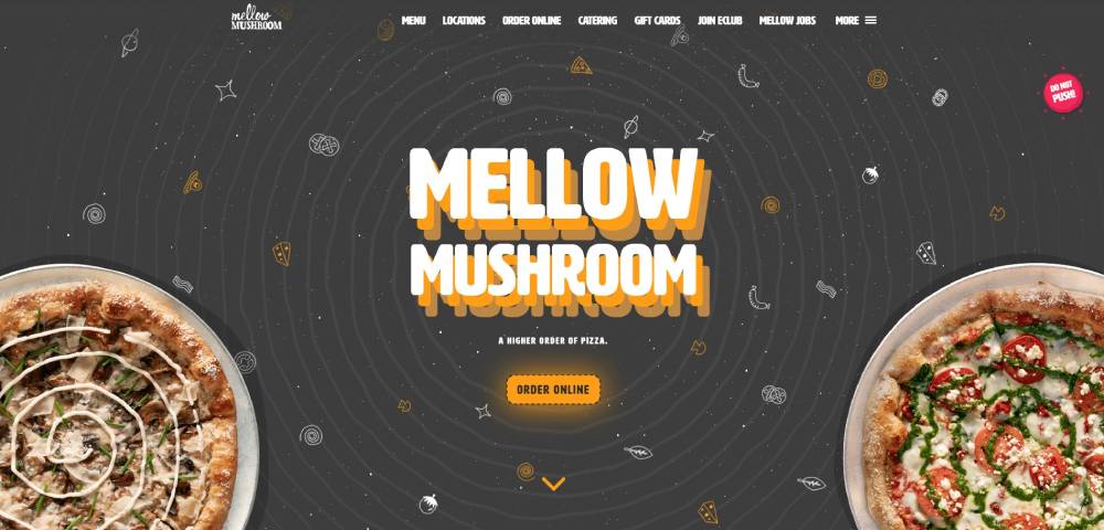
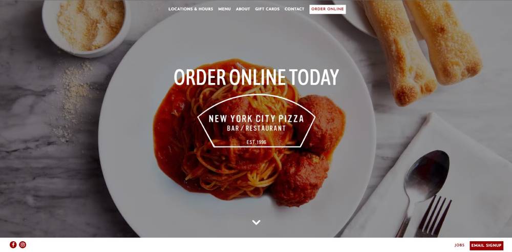
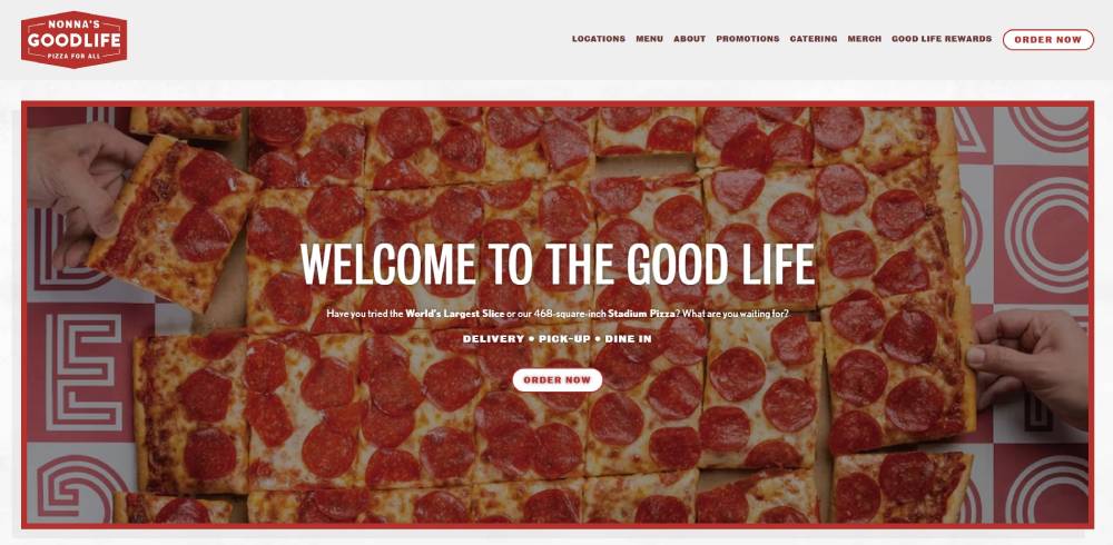
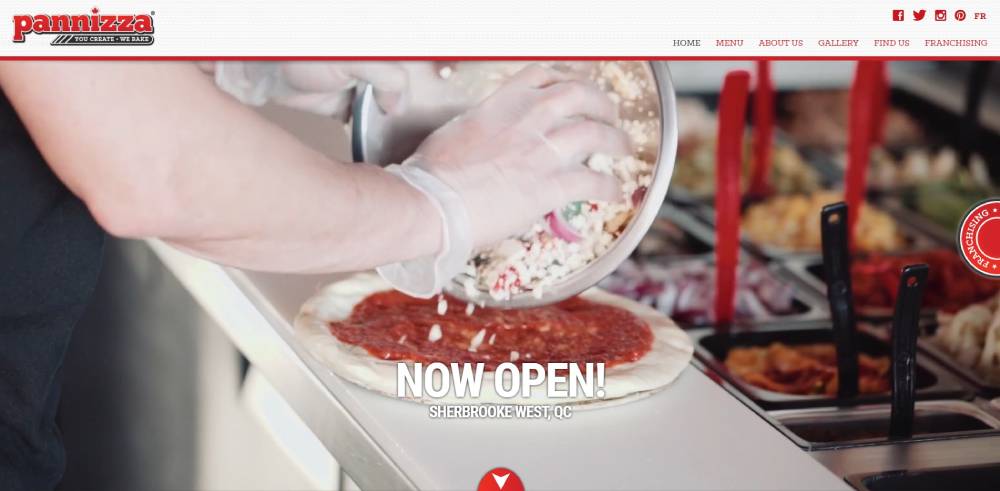
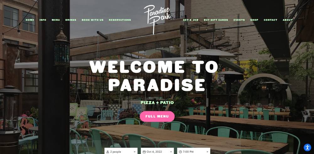
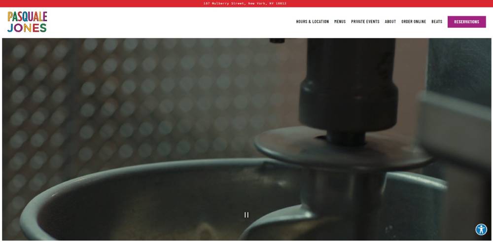
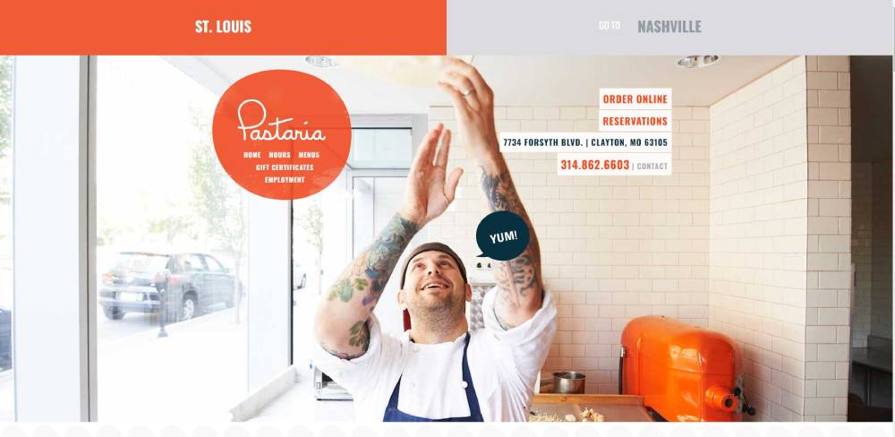
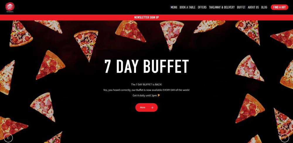
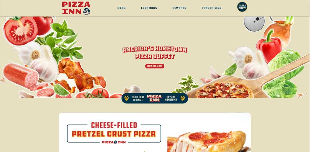
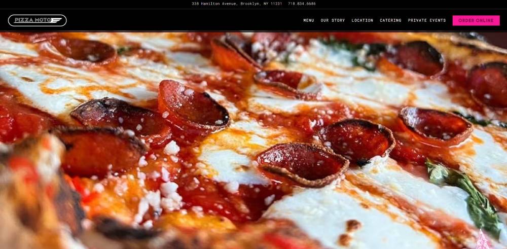
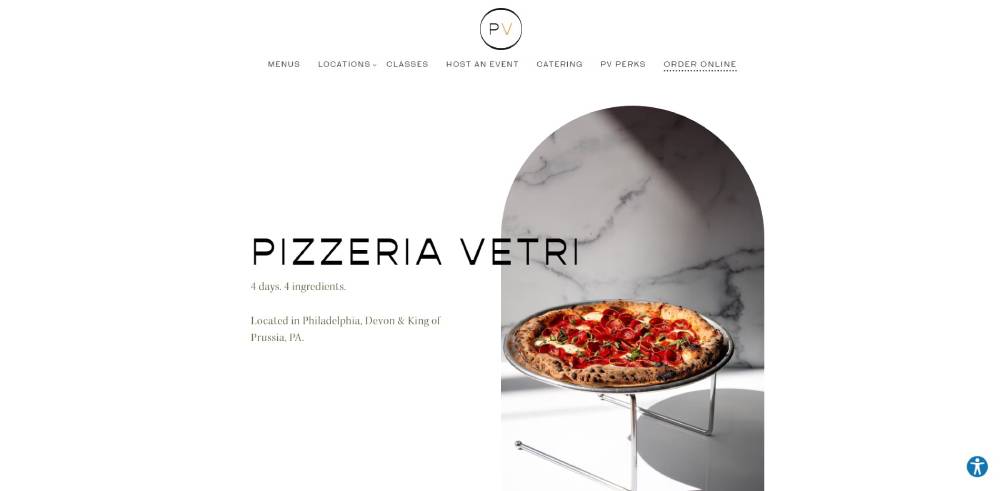
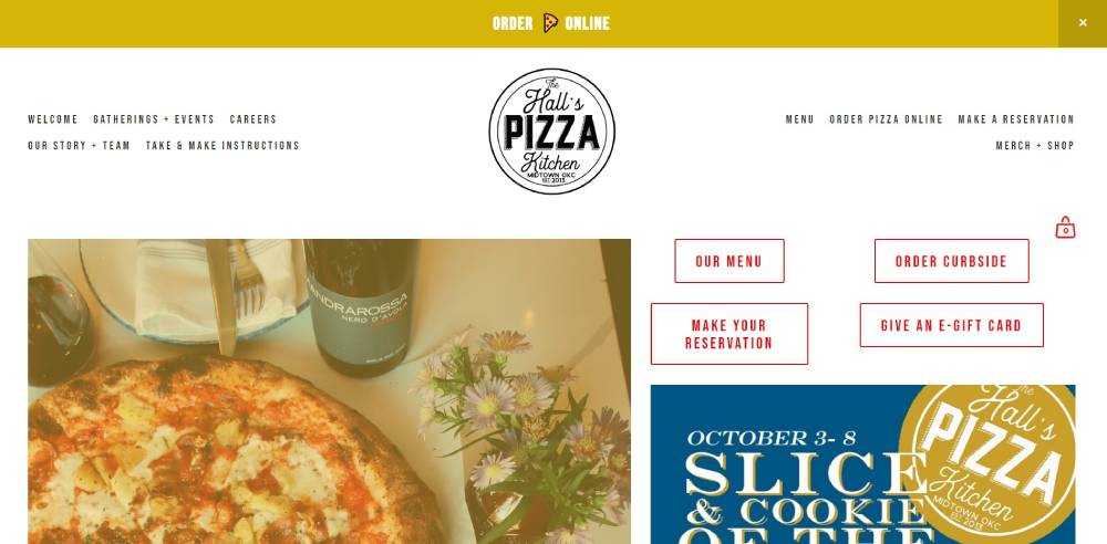
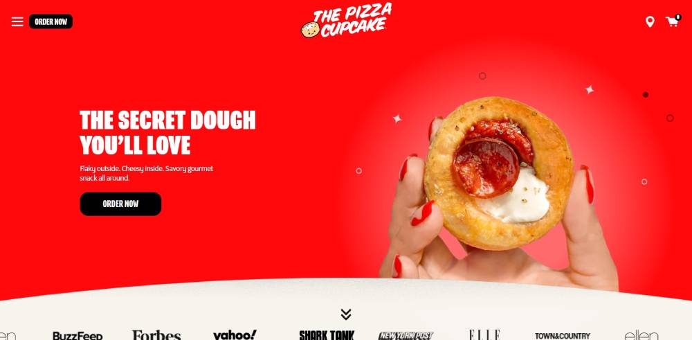
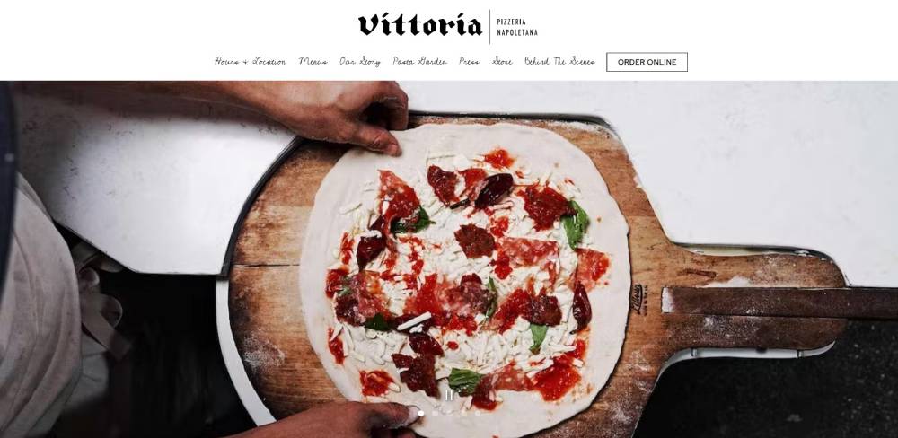
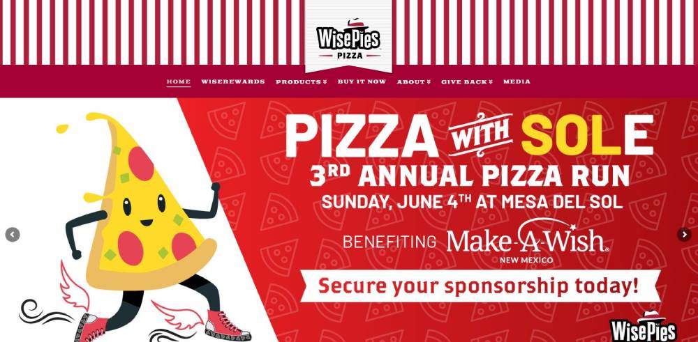
Pizza Website Design Examples
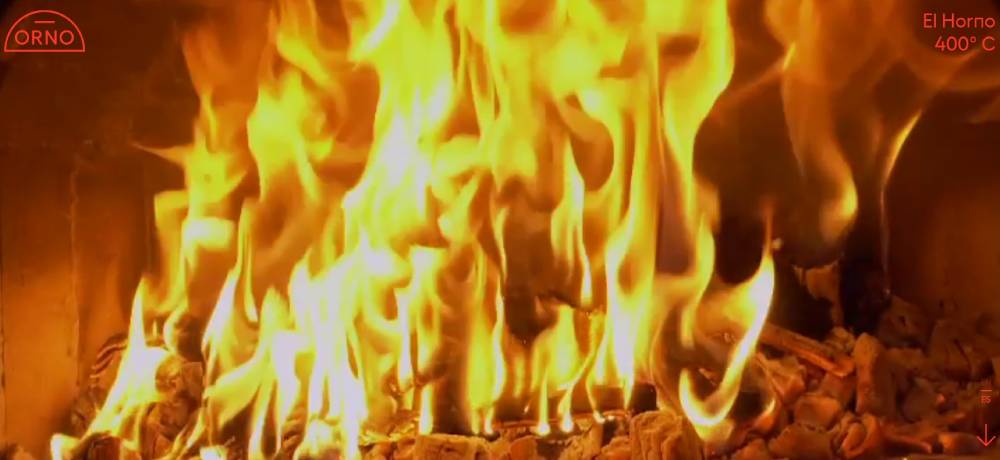
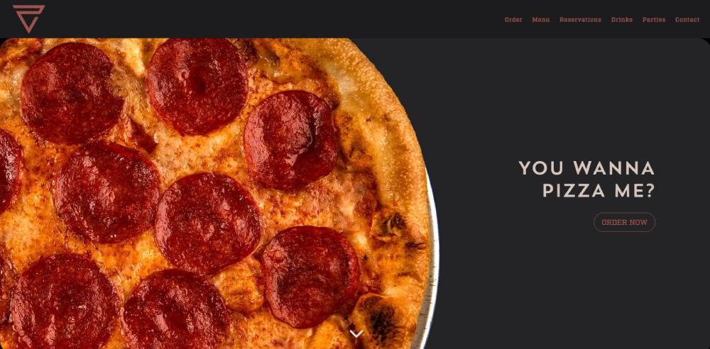
Orno Pizzeria
How Does a Pizza Website Differ from Other Restaurant Websites
Pizza sites need customization builders that let customers pick crusts, sauces, and toppings in real time.
Most food websites display static menus. Pizza ordering demands interactive selection tools.
Delivery radius calculators matter more here than for dine-in restaurants. Customers enter their address before browsing the menu.
Real-time order tracking is expected. Domino's set that standard years ago; now everyone competes with it.
The checkout process runs faster. Pizza customers make quick decisions. Three clicks to checkout is the target.
What Makes a Pizza Website Design Effective
Effective pizza web design converts hungry visitors into paying customers through clear navigation, fast load times, and prominent order buttons.
Mobile responsiveness is non-negotiable. Over 60% of pizza orders come from smartphones.
Which Visual Elements Increase Pizza Orders
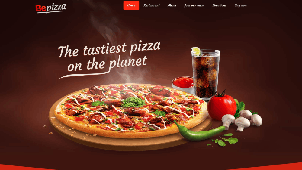
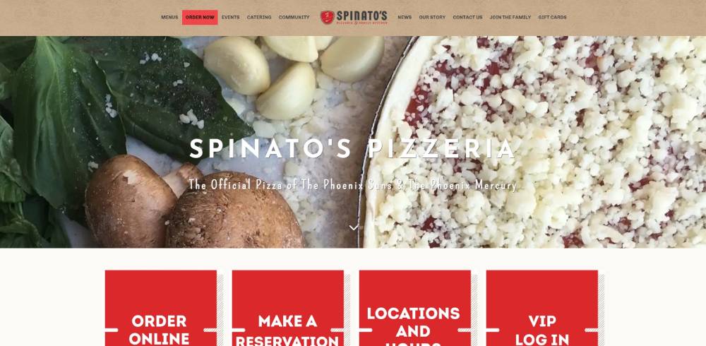
The hero section needs a full-width pizza image with steam, cheese pull, or fresh toppings visible.
Warm colors like red, orange, and yellow trigger appetite; most pizza chains use these in their color schemes.
White space around menu items prevents visual clutter. Let the food breathe.
High-quality food photography shot from above or at 45-degree angles performs best. Skip the stock images.
What Navigation Patterns Work Best for Pizza Ordering
Sticky headers keep the order button visible during scrolling. Users never lose sight of the call to action button.
Menu categories need clear separation: pizzas, sides, drinks, desserts. Check how successful website navigation examples handle this.
Cart preview widgets show order totals without page refreshes. Reduces abandonment.
Mobile website menu design should use thumb-friendly tap targets. Bottom navigation works better than hamburger menus for ordering apps.
What Typography Works Best for Pizza Website Menus
Menu readability directly affects order completion rates. Typography choices signal brand personality while maintaining scannability.
Sans-serif fonts dominate modern pizza sites. They render clearly on mobile screens at small sizes.
Font pairing matters: bold display type for headings, clean body fonts for descriptions and prices.
Size hierarchy guides the eye: item names largest, descriptions medium, prices smallest but still legible.
Avoid script fonts for menu items. They look elegant but slow down scanning. Customers want to find pepperoni fast.
Check websites with good typography for inspiration on pairing display and body fonts effectively.
How Should Pizza Websites Display Pricing and Deals
Price anchoring works well for pizza menus. Show the large size first; medium and small feel like savings.
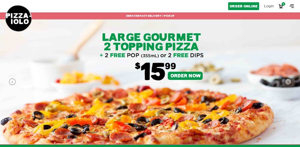
Deal cards need visual hierarchy: discount percentage largest, original price struck through, new price in bold.
Limited-time offers create urgency. Countdown timers on promotional banners push faster decisions.
Upsell placement matters. Suggest breadsticks during pizza selection, drinks at checkout. Strategic timing increases average order value.
Bundle pricing outperforms a la carte for most pizzerias. "Meal deals" convert better than individual item purchases.
Study how pricing page layouts handle tier comparisons; similar principles apply to pizza combo displays.
What Mobile Design Patterns Do Pizza Websites Use
Thumb-zone optimization places order buttons in the lower third of mobile screens. Easy reach, more taps.
Mobile menu builders use swipe gestures for topping selection. Faster than dropdown menus.
Tap targets need 44x44 pixel minimum. Smaller buttons cause mis-taps and frustration during customization.
Checkout simplification reduces form fields to essentials: address, payment, delivery notes. Autofill handles the rest.
Responsive websites adapt layouts automatically, but pizza sites often build separate mobile experiences for ordering speed.
Bottom navigation bars keep cart access persistent. Users check totals constantly during ordering.
Which Color Schemes Appear on Pizza Website Designs
Red dominates pizza branding. It triggers appetite and urgency. Domino's, Pizza Hut, Papa John's all use it.
Orange color palettes appear frequently as secondary tones. Warmth without the intensity of pure red.
Yellow accents suggest freshness and energy. Works well for highlighting deals and new menu items.
Black backgrounds create contrast for food photography. Some premium pizzerias adopt dark themed websites for upscale positioning.
White space between sections prevents visual overload. Crowded layouts kill appetite appeal.
Accessibility matters: sufficient contrast ratios between text and backgrounds help colorblind users navigate menus.
How Do Pizza Websites Build Trust with New Customers
Customer reviews integrated into product pages build credibility. Star ratings near menu items influence selection.
Food safety badges and health certifications belong in the footer or about page. Visible but not intrusive.
Delivery guarantees ("30 minutes or free") reduce purchase anxiety. Clear refund policies help too.
Real photography beats stock images every time. Customers spot generic pizza photos instantly.
Contact visibility matters. Phone numbers in headers, physical addresses in footers. Proves you're a real business.
Check how testimonial page designs showcase social proof; apply similar patterns to review sections.
What Photography Styles Work for Pizza Website Headers
Overhead shots showcase full pizzas with all toppings visible. Best for menu thumbnails.
45-degree angles capture cheese pull and crust texture. More appetizing for hero images.
Steam and motion blur suggest freshness. The pizza just came out of the oven.
Dark backgrounds make colors pop. Red tomatoes, green basil, golden cheese stand out dramatically.
Consistent lighting across all menu photography creates professional cohesion. Mixed lighting looks amateur.
Ingredient close-ups work for quality messaging. Fresh mozzarella, hand-stretched dough, imported tomatoes.
Which WordPress Themes Suit Pizza Restaurant Websites
Flavor theme includes built-in menu management and WooCommerce integration for online ordering.
flavor theme comes with reservation systems, location maps, and gallery layouts ready to customize.
flavor theme runs lightweight for fast mobile loading. Speed matters for hungry customers.
flavor theme supports multi-location pizzerias with separate pages per store. Franchise-friendly.
flavor theme costs between $59-79 depending on extended licenses. One-time purchase, updates included.
flavor theme fits the criteria outlined in professional website design standards for restaurant businesses.
What Does a Pizza Website Cost to Build
DIY template sites cost $150-500 annually including hosting and domain. Platform fees vary.
Custom designs from agencies run $3,000-15,000 depending on features and ordering system complexity.
Third-party ordering integration adds $50-200 monthly. Toast, Square Online, and ChowNow charge transaction fees too.
Ongoing maintenance averages $100-300 monthly for updates, security, and menu changes.
Photography investment pays off. Professional food shoots cost $500-2,000 but dramatically improve conversion rates.
Budget template sites work for single-location shops. Multi-location franchises need custom builds with API integrations.
Review your requirements against a website checklist before committing to any platform or agency.
FAQ on Pizza Website Design
What makes a good pizza website design?
A good pizza website loads fast, displays menus clearly, and completes checkout in three clicks or fewer.
Mobile responsiveness is critical since most orders come from phones. Appetizing food photography and prominent order buttons drive conversions.
How much does a pizza website cost to build?
DIY template sites cost $150-500 yearly. Custom designs from agencies run $3,000-15,000 depending on ordering system complexity.
Add $50-200 monthly for third-party ordering integration through platforms like Toast or ChowNow.
Which website builder works best for pizza shops?
Wix and UpMenu suit most local pizzerias with built-in ordering features. WordPress with WooCommerce offers more flexibility but requires technical knowledge.
Squarespace works for upscale positioning; Shopify handles merchandise well.
What colors convert best on pizza websites?
Red triggers appetite and urgency, which explains why Domino's, Pizza Hut, and Papa John's all use it heavily.
Orange and yellow accents add warmth. Black backgrounds make food photography pop for premium brands.
How do I add online ordering to my pizza website?
Integrate platforms like GloriaFood, ChowNow, or Square Online. WordPress users can install WPCafe plugin.
Wix includes native restaurant ordering. Most solutions charge transaction fees between 2-5% per order.
What pages should every pizza website include?
Essential pages: homepage with hero image, full menu with prices, online ordering system, location finder, contact information, and about page.
Optional but valuable: catering page, loyalty program signup, and customer reviews section.
Should pizza websites use video backgrounds?
Video backgrounds showing pizza preparation can increase engagement but slow load times significantly.
Use them sparingly on desktop only. Mobile users need fast-loading pages. Check websites with video background for implementation ideas.
How important is mobile design for pizza ordering?
Over 60% of pizza orders happen on smartphones. Poor mobile experience means lost sales.
Thumb-friendly buttons, simplified checkout, and fast page loads are non-negotiable for user friendly website standards in food delivery.
What photography style works best for pizza menus?
Overhead shots showcase full pizzas with all toppings visible. 45-degree angles capture cheese pull and crust texture.
Consistent lighting across all images creates professional cohesion. Real photos outperform stock every time.
How do major pizza chains design their websites?
Chains prioritize speed and simplicity. Domino's perfected the Pizza Tracker; Pizza Hut emphasizes deals; Papa John's highlights quality.
All use websites with good UI principles: clear navigation, prominent ordering, and consistent branding throughout.
Conclusion
These pizza website design examples share common patterns: fast page load speeds, clear menu displays, and checkout flows that respect customers' time.
Whether you run a local pizzeria or manage a franchise, the fundamentals stay the same. Prominent order buttons. Appetizing photography. Mobile-first thinking.
Domino's didn't become the delivery leader by accident. Their website works because every pixel serves the conversion goal.
Start with a solid website layout and build from there. Test your checkout process on phones. Add delivery tracking if possible.
Your restaurant website template matters less than how you use it. Keep navigation simple, photography real, and ordering frictionless.
Hungry customers don't wait. Make sure your site doesn't make them.


