Lawyer Website Design Examples That Build Trust
January 4, 2026Simple Website Design Examples for Modern Businesses
January 4, 2026Over 460 million people listen to podcasts worldwide. Most of them find new shows through search engines, not just Spotify or Apple Podcasts.
That makes your podcast website the single biggest growth tool you are probably ignoring.
A well-built podcast site does more than host episodes. It builds your brand, captures email subscribers, ranks in Google, and gives listeners a reason to stick around between releases.
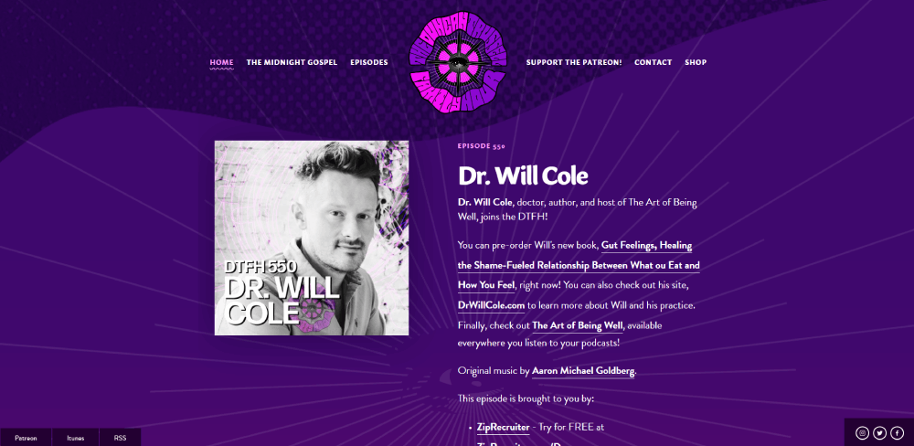
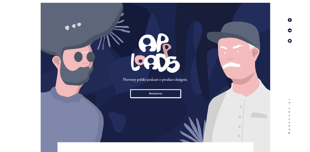
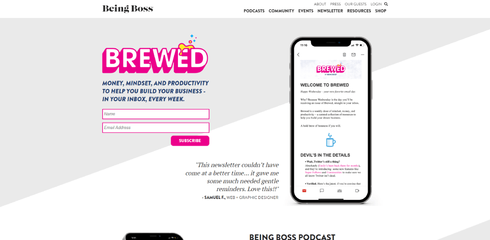
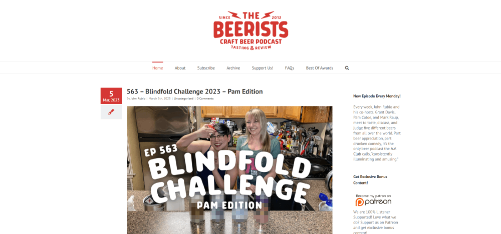
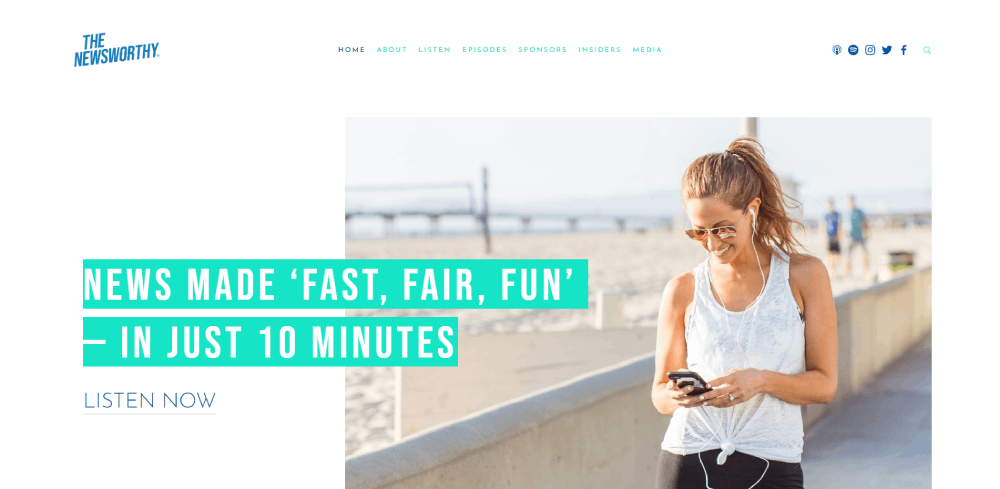
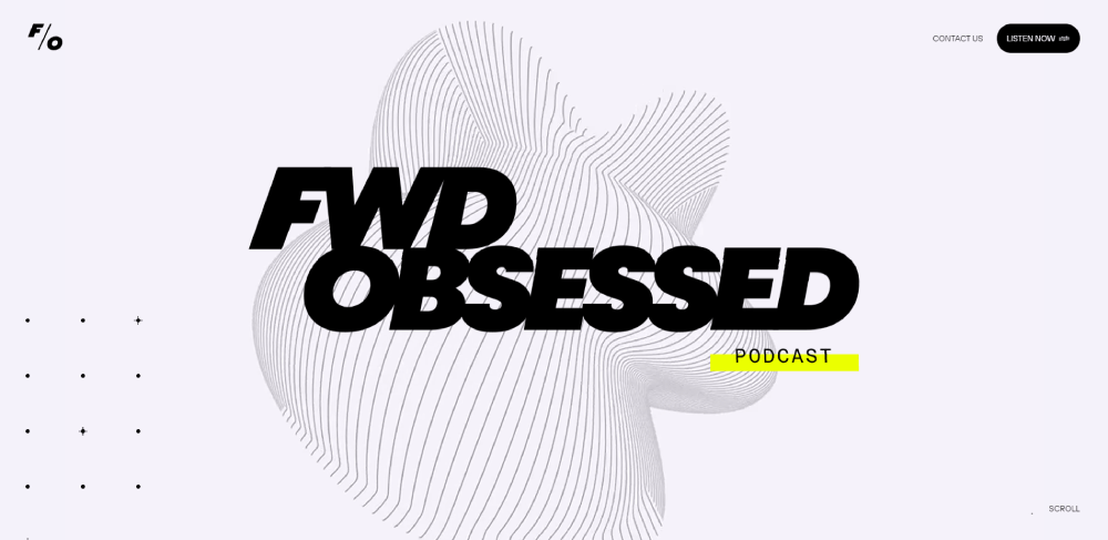
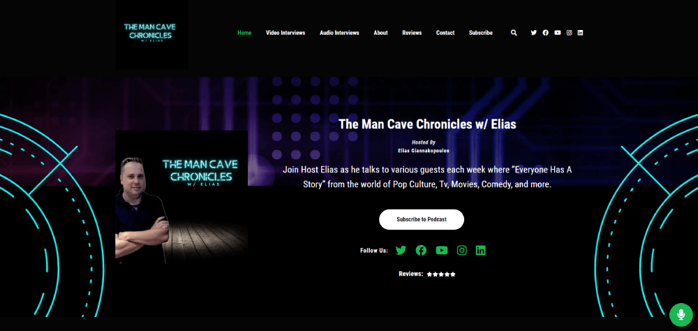
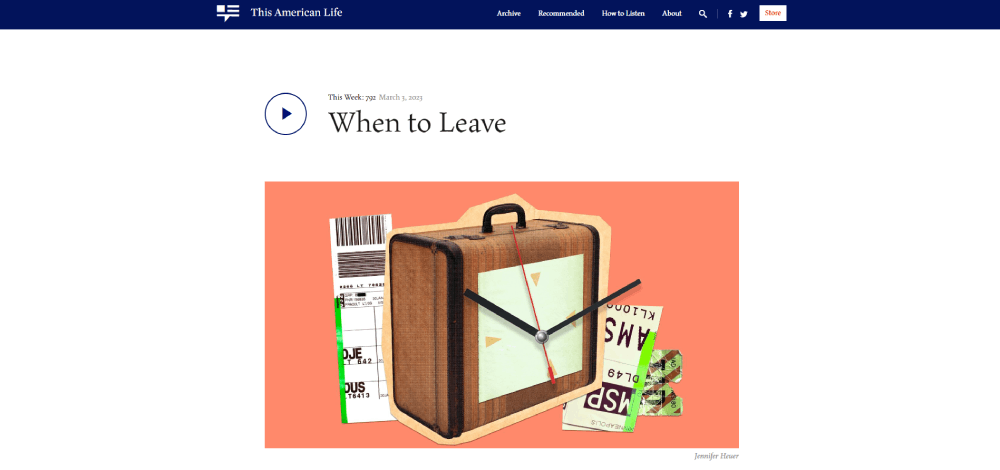
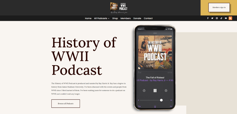
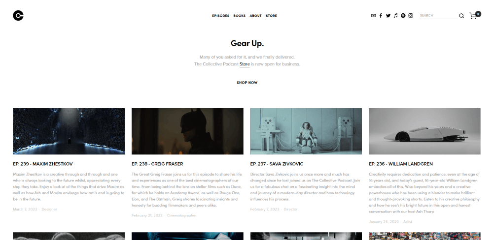
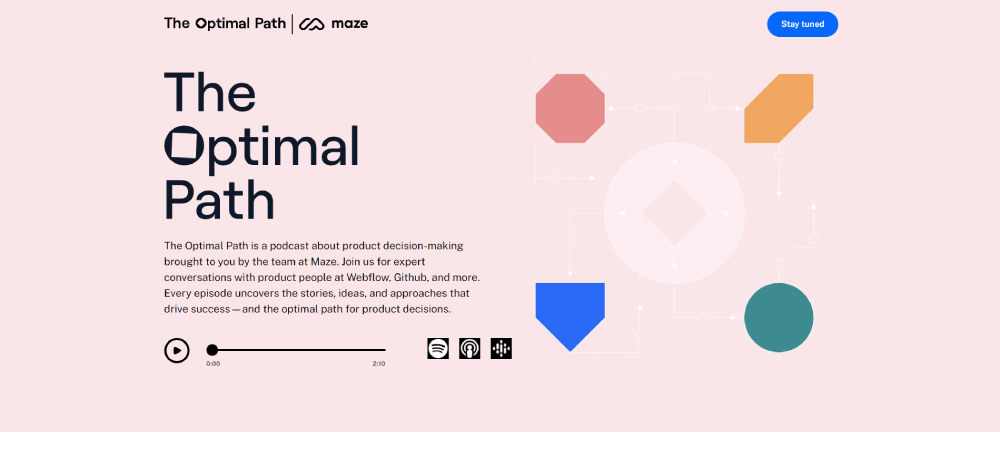
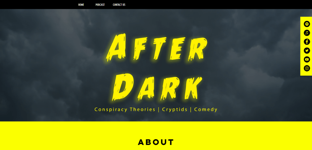
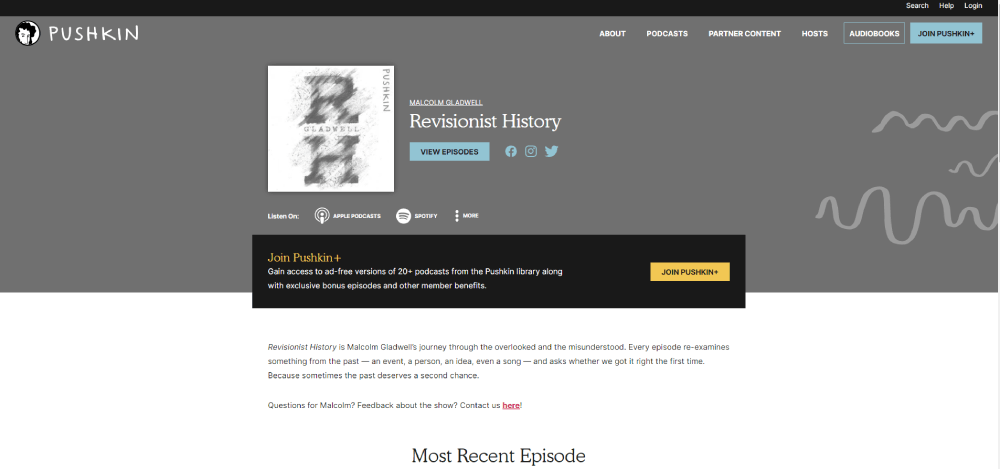
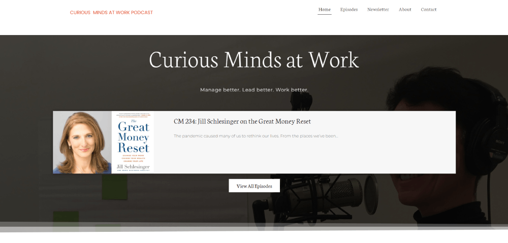
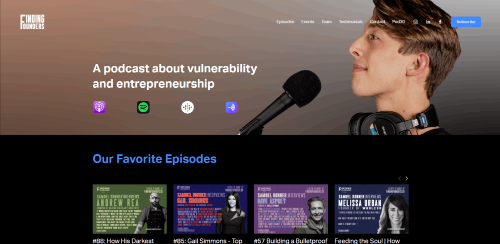
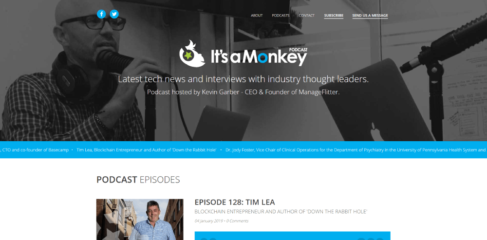
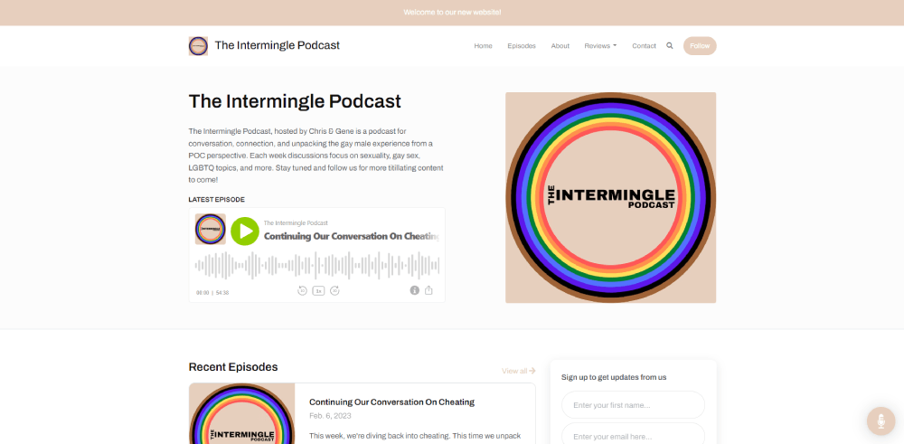
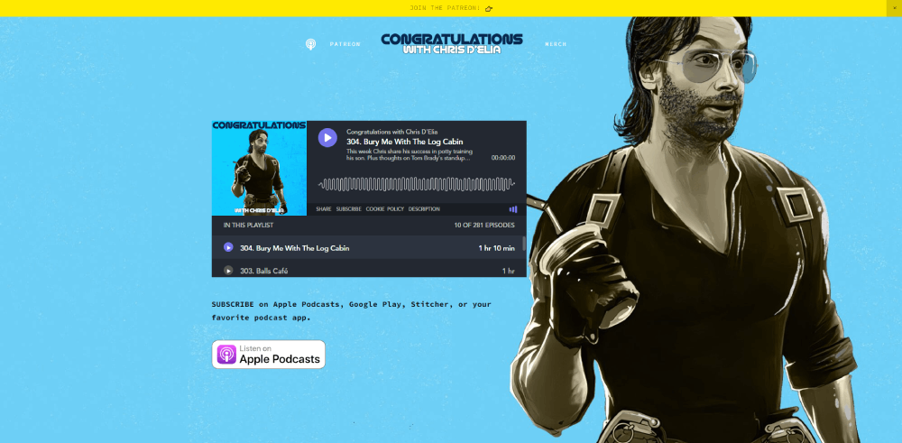
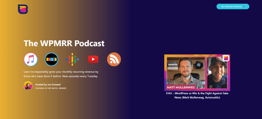
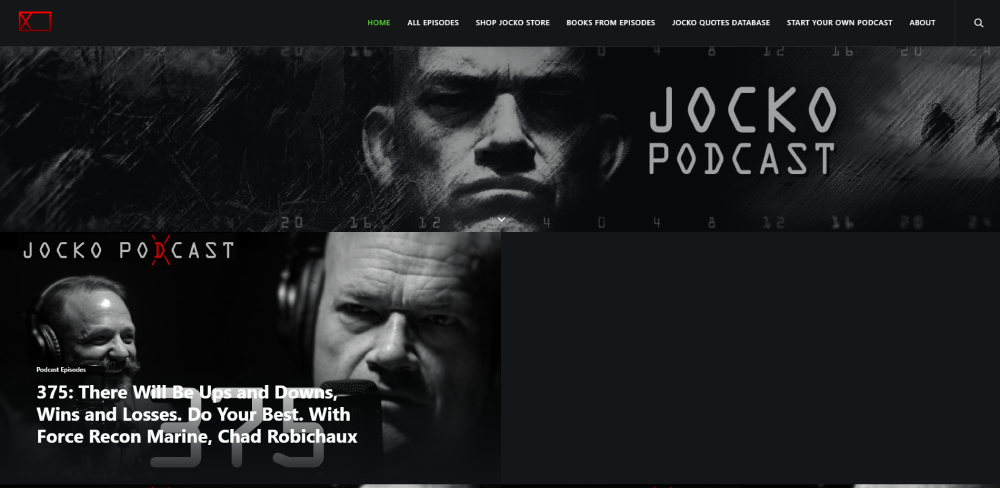
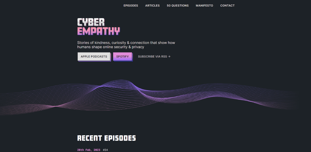
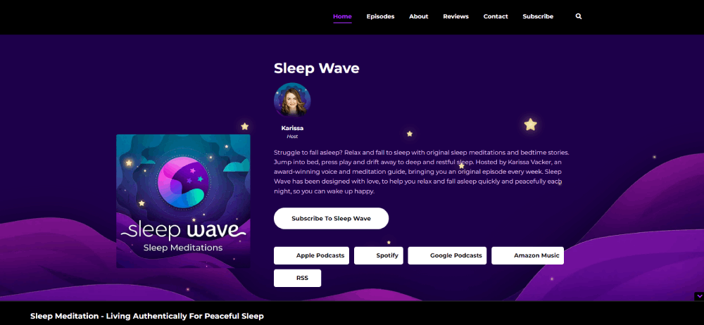
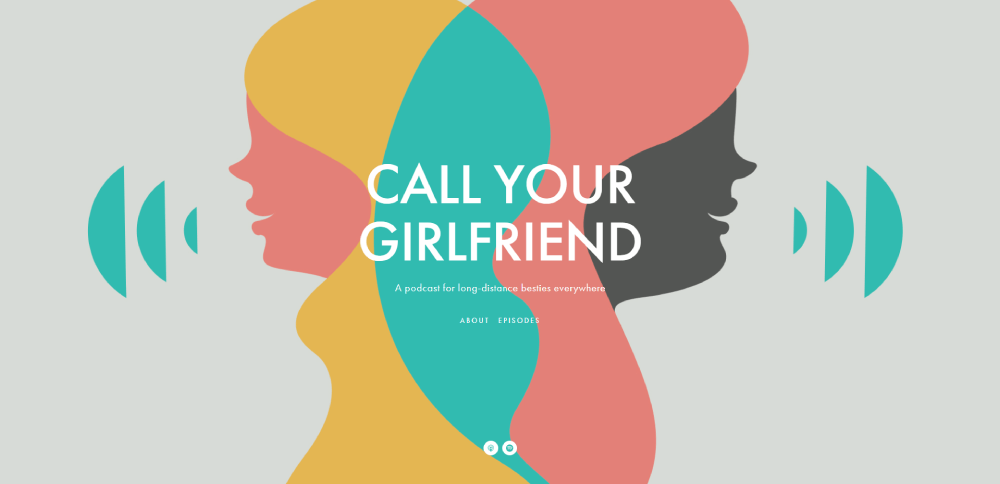
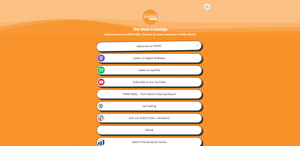
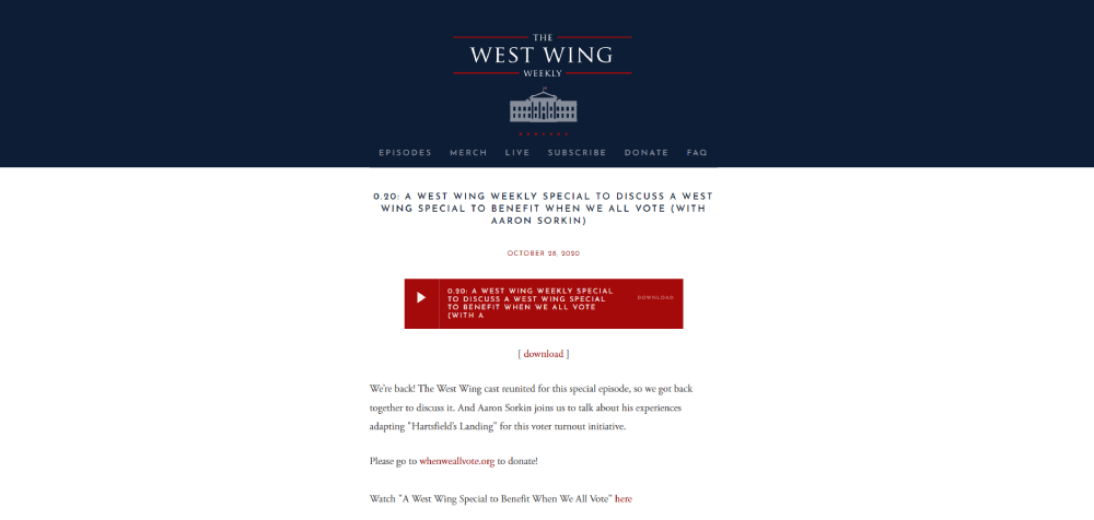
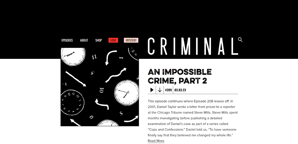
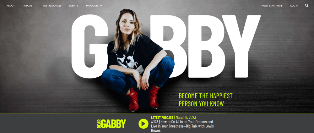
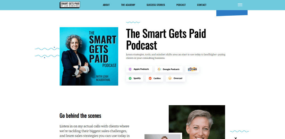
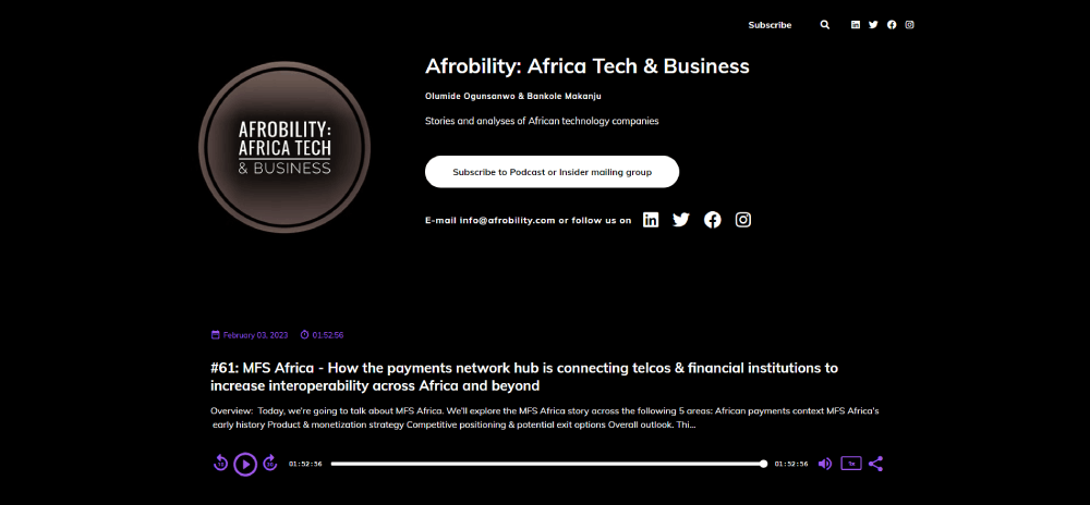
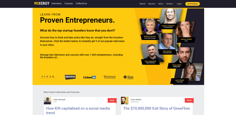
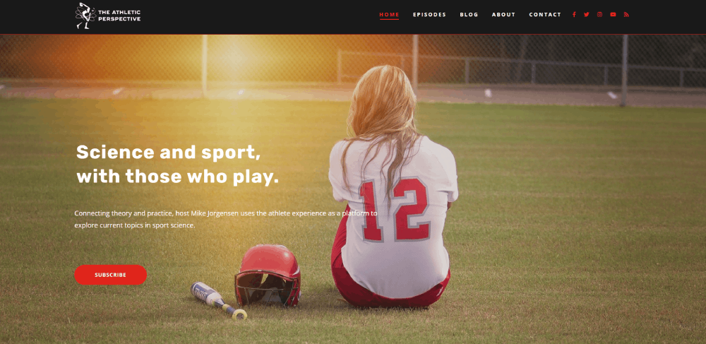
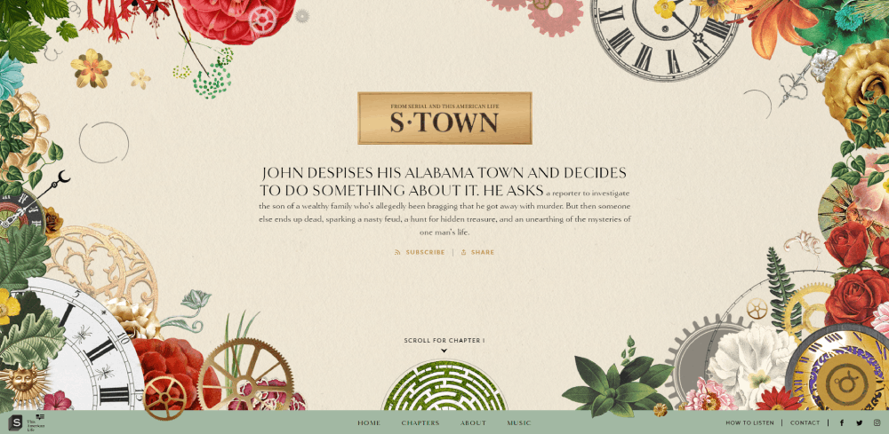
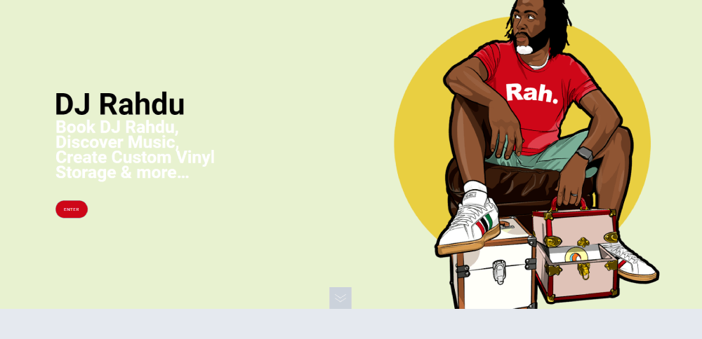
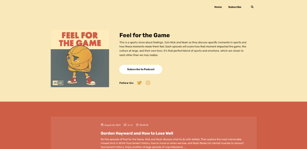
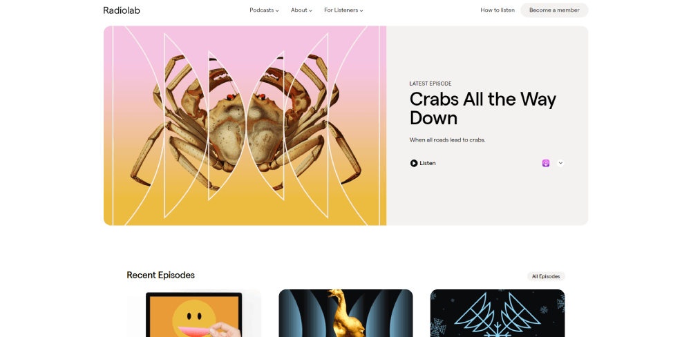
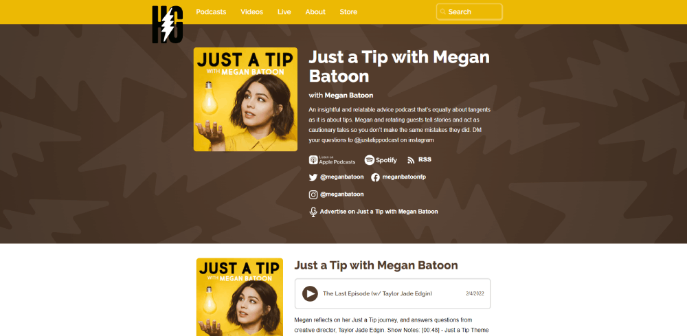
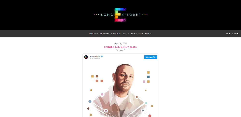
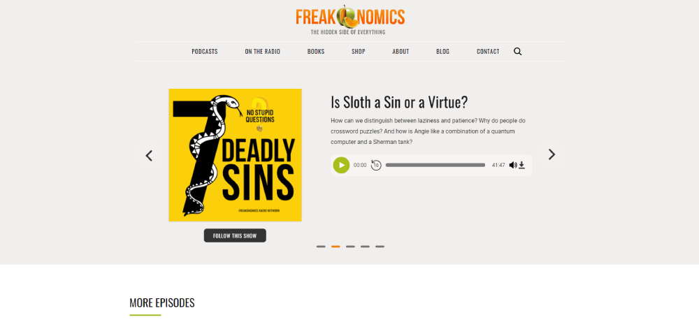
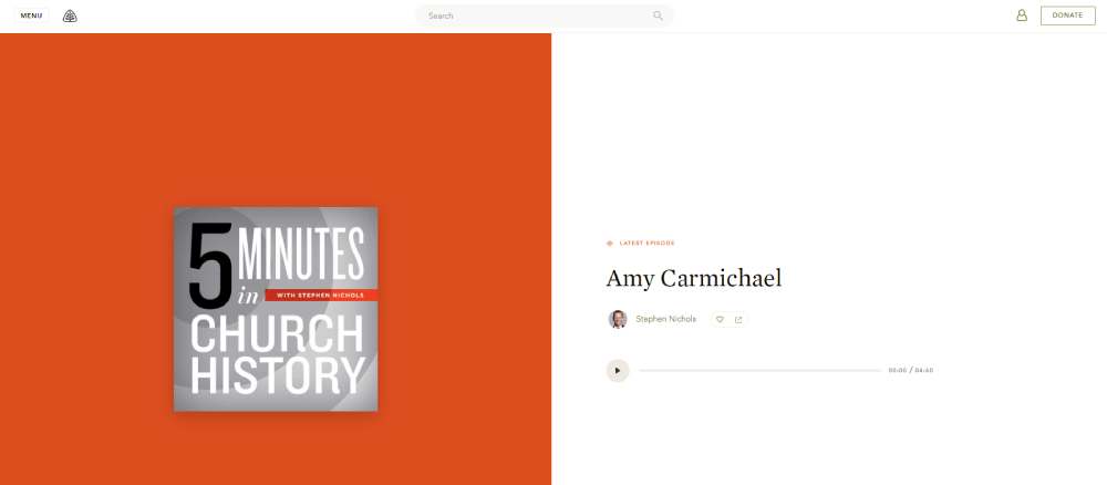
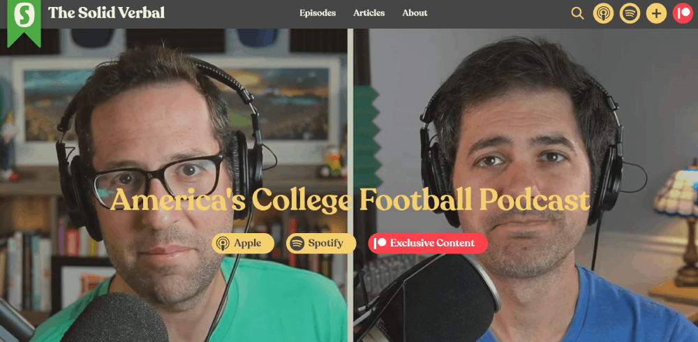
This collection of podcast website design examples breaks down 15 real sites, from true crime hits to business shows and indie productions. You will see what works, what does not, and which design choices actually move the needle on listener engagement and audience growth.
What Is a Podcast Website
A podcast website is a dedicated online space where listeners can stream episodes, read show notes, and connect with the host or hosts behind the audio content.
It sits outside platforms like Spotify, Apple Podcasts, and YouTube. You own it. You control the branding, the layout, the listener experience.
Most podcast directories give you a profile page. That page shows your cover art, an episode list, and maybe a short description. Nothing else.
A podcast site goes further. It houses transcripts, guest bios, blog posts tied to episodes, email signup forms, and merch stores. Some podcasters use it as their entire content hub, pulling in video clips, social proof, and community features.
The site also gives you a direct line to your audience. No algorithm sitting between you and the people who actually listen to your show.
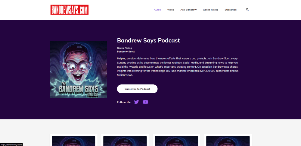
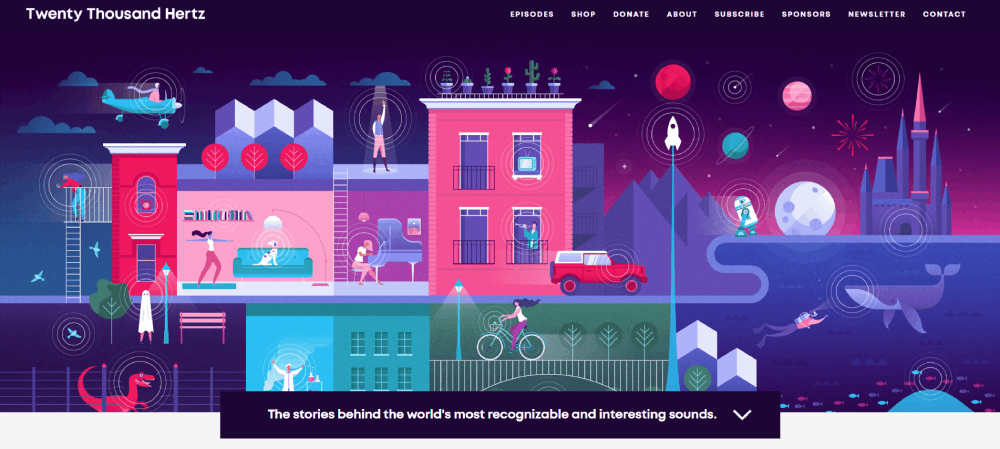
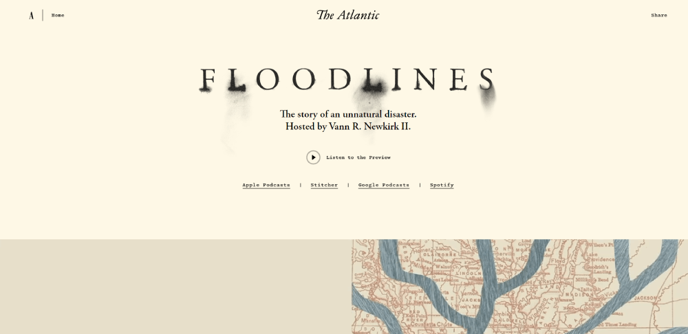
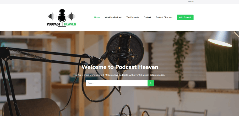
Great Podcast Website Examples
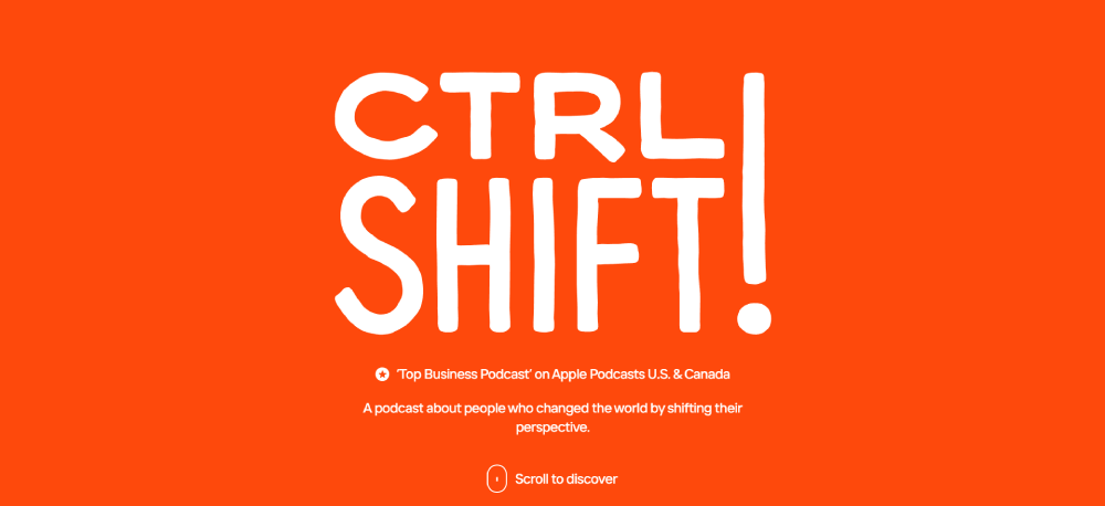
CTRL SHIFT!
Why Does a Podcast Need Its Own Website
Relying only on Apple Podcasts or Spotify means you are renting space on someone else's platform. If the algorithm shifts or a platform changes its policies, your discoverability drops overnight.
A website puts you in control.
Search engines index your episode pages, show notes, and transcripts. That means people searching for topics you cover can find your podcast through Google, not just through a podcast app. Around 73% of U.S. podcast listeners discover new shows through internet searches.
There is also the email list factor. Podcast apps do not let you collect email addresses. Your website does. And an email list is the one audience channel that no platform can take away from you.
Here is what a podcast website makes possible that a directory profile cannot:
- Full episode transcripts that search engines can crawl and rank
- An RSS feed integration that pushes new episodes to every directory automatically
- A merch store or Patreon link for monetization
- Guest pages with bios, photos, and links back to each appearance
- Show notes with timestamps, resources, and related content
- Newsletter signup forms to build a direct subscriber base
Podcasters who treat their website like an afterthought usually struggle with listener growth outside their existing audience. The ones who build a proper site tend to compound their reach over time.
What Makes a Good Podcast Website Design
Before looking at specific examples, it helps to know what separates a well-built podcast site from one that just exists.
Good podcast website design comes down to a few concrete things. The site loads fast. The audio player works without friction. The layout makes it obvious what the show is about within seconds. And the whole thing looks just as good on a phone as it does on a desktop screen.
These are the criteria used to evaluate every example later in this article.
How Does Layout Affect Listener Experience
A cluttered podcast homepage loses visitors fast. The best sites use a clean website layout with a clear visual hierarchy: podcast name, latest episode, subscribe links, then everything else.
Generous white space between sections helps visitors scan without feeling overwhelmed. Think of it like the difference between a tidy desk and a pile of papers.
What Role Does an Audio Player Have on a Podcast Site
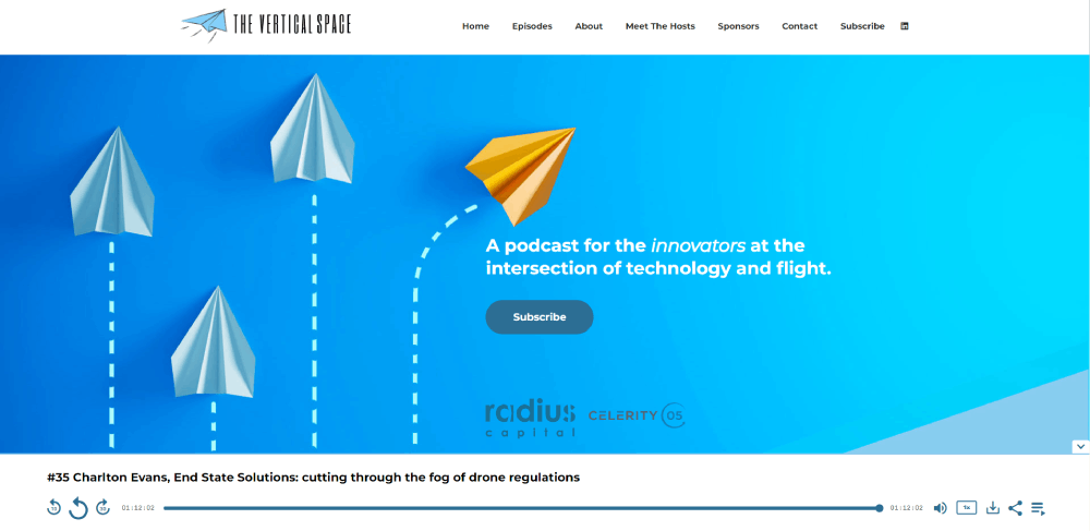
The embedded audio player is the single most important functional element. If visitors cannot hit play within a few seconds of landing on the page, the site has failed at its primary job.
Sticky players that follow the listener while they scroll through show notes or browse other episodes perform best. They keep playback going while the visitor explores the rest of the site.
How Do Color Scheme and Typography Set a Podcast Brand Apart
A strong color scheme does two things at once: it communicates the show's personality and it keeps the interface readable.
True crime podcasts lean toward dark palettes. Business and self-improvement shows often go brighter. Comedy podcasts tend to use bold, saturated colors.
Pairing the right colors with solid typography choices makes or breaks the visual identity. Large, legible fonts for episode titles. Smaller weights for descriptions. Consistent sizing across every page.
Why Is Mobile Responsiveness Critical for Podcast Websites
More than half of all podcast listening happens on mobile devices. If the site breaks on a phone screen, or the audio player gets cut off, or the text is too small to read, people leave.
A responsive website adapts its layout to any screen size. Buttons stay tappable, navigation stays accessible, and the player stays functional regardless of the device.
What Features Should Every Podcast Website Include
Looking at the examples above, a pattern emerges. The best podcast sites share a core set of features that serve both listeners and search engines.
Skip any of these and you are leaving growth on the table.
- Embedded audio player with sticky playback across pages
- RSS feed connection that syncs new episodes to all major directories
- Episode archive with search and category filtering
- Subscribe and follow buttons for Spotify, Apple Podcasts, YouTube, and others
- Individual episode pages with unique URLs
- Show notes with timestamps and linked resources
- Full or partial episode transcripts
- Guest pages with bios and episode links
- Email newsletter signup form
- Social sharing buttons on every episode page
- Contact form for listener feedback, guest pitches, or sponsor inquiries
- Merch or Patreon integration for monetization
How Does an Episode Archive Improve Discoverability
Every episode page with its own URL is a separate entry point from search. Pair that with show notes, guest names, and topic-specific text, and you give Google hundreds of indexable pages over time.
Add search and filter options (by date, topic, or guest) and returning listeners find what they want faster. New visitors land on the exact episode that answers their query.
What Subscribe and Follow Buttons Should a Podcast Site Display
At minimum: Spotify, Apple Podcasts, and YouTube. Add Google Podcasts, Amazon Music, Pocket Casts, and Overcast if your audience uses them.
Place these buttons in the header, on every episode page, and in the website footer. Repetition matters here because different visitors land on different pages.
Why Do Show Notes and Transcripts Matter for Search Visibility
Audio content is invisible to search engines. Google cannot listen to your episodes and index what was said.
Show notes and transcripts fix that. They turn every episode into a text-rich page that search engines can crawl, understand, and rank. Podcasters who publish detailed show notes consistently see stronger organic traffic growth than those who post just a title and a play button.
FAQ on Podcast Website Design Examples
What should a podcast website include?
An embedded audio player, episode archive with search functionality, subscribe buttons for Spotify and Apple Podcasts, show notes, transcripts, guest bios, an email signup form, and social sharing buttons. Merch or donation links help with monetization.
What is the best platform to build a podcast website?
WordPress and Squarespace are the most popular choices. Dedicated podcast website builders like Podpage, Beamly, and Captivate offer podcast-specific features out of the box. Your choice depends on how much customization you need.
Do I really need a website for my podcast?
Yes. Podcast directories limit your branding and give you zero access to listener data. A website lets you collect emails, rank in Google through show notes and transcripts, and control your brand identity completely.
How much does a podcast website cost?
Free options exist through Podpage and Anchor. Squarespace plans start around $16 per month. A custom WordPress build ranges from $500 to $5,000 depending on design complexity, plugins, and whether you hire a developer.
What makes a good podcast homepage design?
A clear hero section with the podcast name and value proposition. The latest episode with a visible play button directly below. Subscribe links, featured episodes, and an email signup placed before the visitor needs to scroll far.
Should a podcast website have a blog?
It helps. Blog posts tied to episode topics give search engines more pages to index. They also let you expand on ideas from the show. Took me a while to realize this, but blog content compounds traffic over time.
How do I make my podcast website rank in Google?
Publish full episode transcripts, write detailed show notes with relevant keywords, create individual episode pages with unique URLs, and build an internal linking structure between related episodes. Site speed and mobile responsiveness matter too.
What podcast websites have the best design?
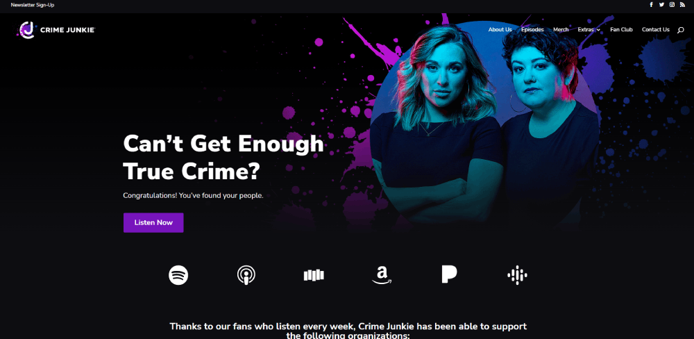
Crime Junkie, Twenty Thousand Hertz, Freakonomics Radio, and The Friday Habit stand out. Each uses clean layouts, strong branding, functional audio players, and smart CTA placement that keeps listeners engaged across pages.
Should I use a sticky audio player on my podcast site?
Absolutely. A sticky audio player lets visitors keep listening while browsing show notes, guest pages, or other episodes. Without one, playback stops every time someone navigates to a different page on your site.
How do I add my podcast to my website?
Connect your RSS feed from your hosting provider (Buzzsprout, Libsyn, Transistor, or similar) to your site. Most podcast website builders and WordPress plugins pull episodes automatically. Embed players directly on individual episode pages.
Conclusion
These podcast website design examples prove one thing clearly. The best podcast sites are not complicated. They are focused, functional, and built around the listener.
A sticky audio player, clean episode archive, working RSS feed integration, and visible subscribe buttons for platforms like Spotify and Apple Podcasts cover the basics. Add transcripts and detailed show notes, and your site starts pulling organic traffic from Google on its own.
Whether you build on WordPress, Squarespace, or a dedicated podcast website builder like Podpage, the platform matters less than the execution.
Pick a layout that fits your show's personality. Keep the podcast homepage tight. Make it dead simple to hit play.
That is what separates a podcast site that grows from one that just sits there.


