

Amazing Colorful Websites With Vibrant Color Schemes
March 14, 2025
Top Examples of Real Estate Landing Pages
March 16, 2025Your SaaS landing page has a few seconds to make an impression. That's the average attention span of today's web users, and within those critical seconds, visitors decide whether to sign up or bounce.
For software companies, effective SaaS landing pages aren't just digital storefronts, they're conversion machines that transform curious visitors into paying customers. The difference between a good and great landing page can mean thousands in monthly recurring revenue.
This guide breaks down what makes high-converting SaaS landing pages work. You'll learn:
- Core elements every successful software landing page needs
- Design principles that keep visitors engaged
- Copy techniques that speak directly to user problems
- Testing strategies to continuously improve conversion rates
- Real examples from companies seeing double-digit conversion improvements
Whether you're launching a new product or revamping an existing page, these practical strategies will help you build pages that actually convert.
Examples of SaaS Landing Pages
Unbounce
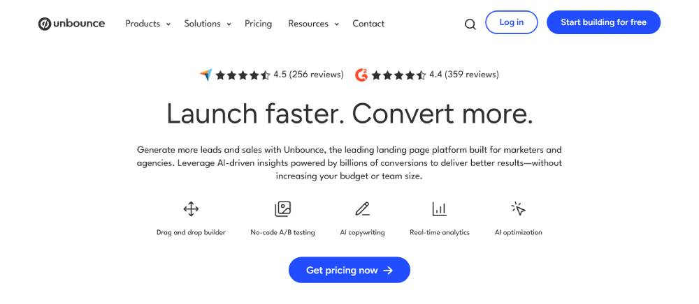
Clean modular layout with strong contrast between sections. The hero section uses a split-screen approach with product visuals on the right. Bold typography hierarchy guides users through value propositions first, then features. Their color palette combines deep blues with accent colors that highlight CTAs effectively. Navigation is minimal yet comprehensive, allowing quick access to key product areas without overwhelming new visitors.
Runway
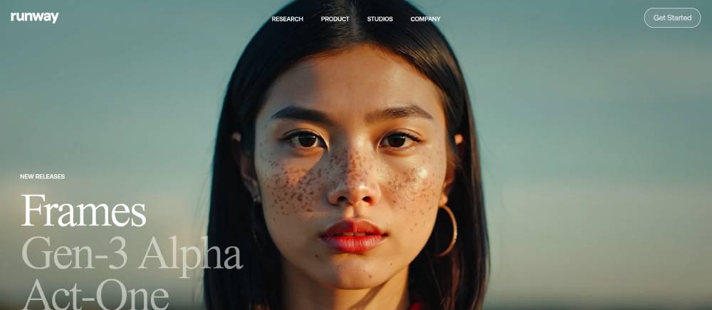
Dark theme creates dramatic backdrop for AI-generated visuals. The page structure breaks conventional grid patterns, with diagonal elements adding visual interest. Content blocks alternate between full-width sections and narrower columns. Typography pairs sans-serif headers with monospace details, reflecting the technical yet creative nature of their AI tools. Subtle animations reveal content as users scroll, creating a sense of discovery.
Frankli
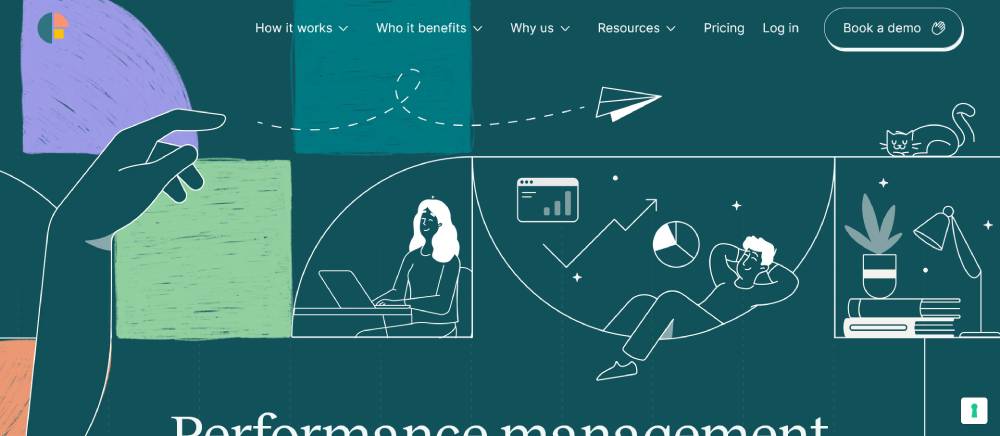
Warm color palette with soft gradients creates an approachable feel for HR software. The page uses rounded corners and subtle shadows consistently across UI elements. Content is arranged in a clear hierarchy with substantial whitespace between sections. Illustrations are simplified and stylized, matching the brand's friendly tone. The page balances text and visual elements well, preventing cognitive overload while explaining complex HR concepts.
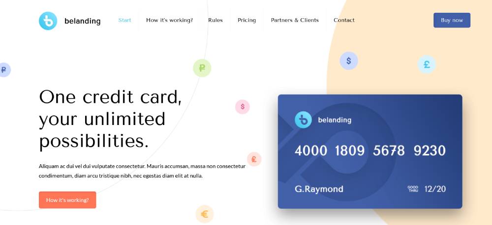
Be Landing 4
Chargetrip
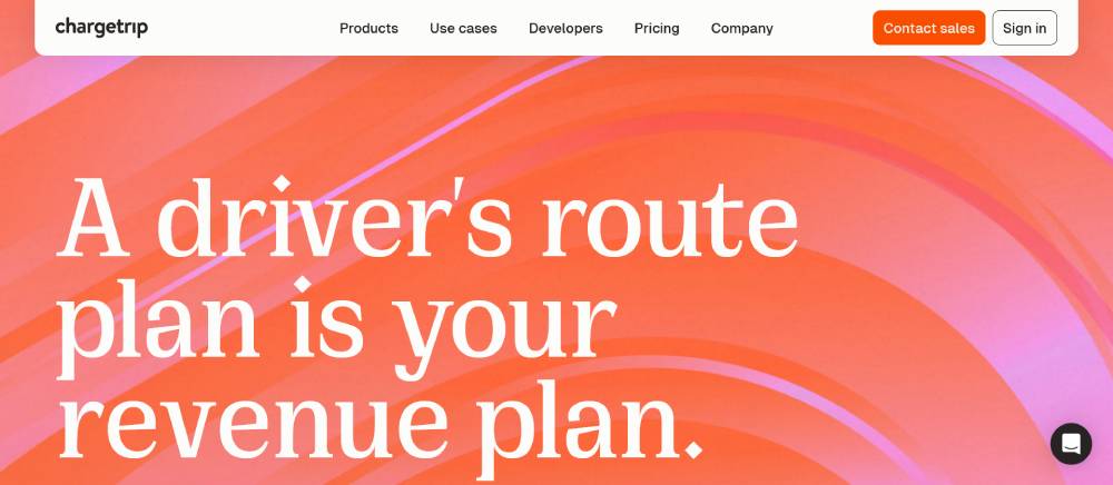
Minimalist design with strategic use of negative space. The layout employs a card-based structure to compartmentalize different API features. Interactive elements use subtle hover states rather than flashy animations. Typography is clean and technical, primarily using a single sans-serif family with weight variations for hierarchy. The overall design communicates reliability and precision, appropriate for a routing API platform.
Profound
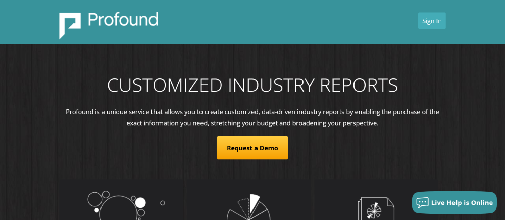
Bold typography dominates the visual hierarchy with extra-large headers. The design uses a simple two-tone color scheme with occasional accent colors for important elements. Page sections are clearly delineated through background color changes. Image selection focuses on real people using the product rather than abstract illustrations. Navigation is streamlined with a focus on driving users toward free trial conversion.
Laravel Cloud
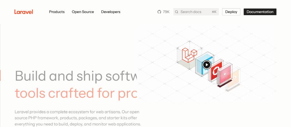
Distinctive red accent color stands out against neutral backgrounds. The page structure follows a logical progression from problem to solution to implementation. Code snippets are displayed with syntax highlighting, speaking directly to developer audience. Typography is crisp and highly readable, even for technical documentation sections. Navigation includes contextual links that change based on the section, helping users find related resources.
Origin
Horizontal scrolling sections break conventional vertical scanning patterns. The design employs parallax effects subtly to create depth without distracting from content. Typography pairs serif headlines with sans-serif body text, creating a premium feel. Color usage is minimal but impactful, with a focus on product visuals rather than decorative elements. Navigation is contextual, changing based on user scroll position.
Osmo
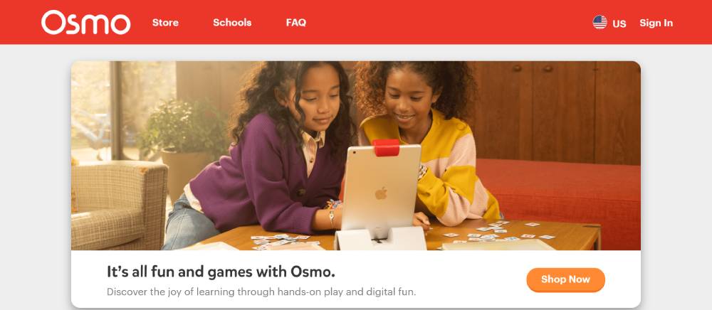
Playful design elements reflect the educational product's audience. The layout uses irregular shapes and overlapping elements to create a sense of exploration. Image selection focuses on showing the product in use by children. Typography is rounded and friendly, matching the brand's approachable positioning. Color usage is vibrant but controlled, with sections clearly delineated through background changes.
Be Landing 2
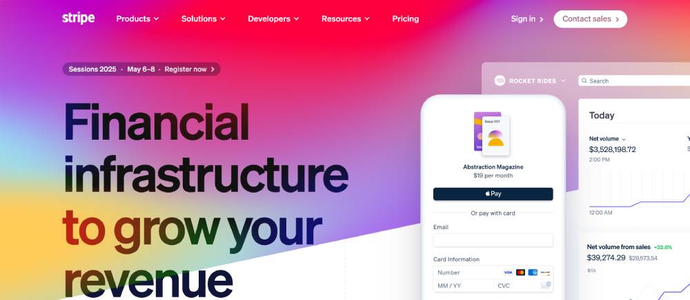
Stripe
Gradient backgrounds create depth and visual interest without overwhelming content. The page structure alternates between content-heavy and visually-focused sections. Animation is used strategically to demonstrate product functionality rather than just for decoration. Typography is exceptionally clean with perfect spacing and alignment. Code examples are presented alongside visual explanations, accommodating different learning preferences.
Grammarly
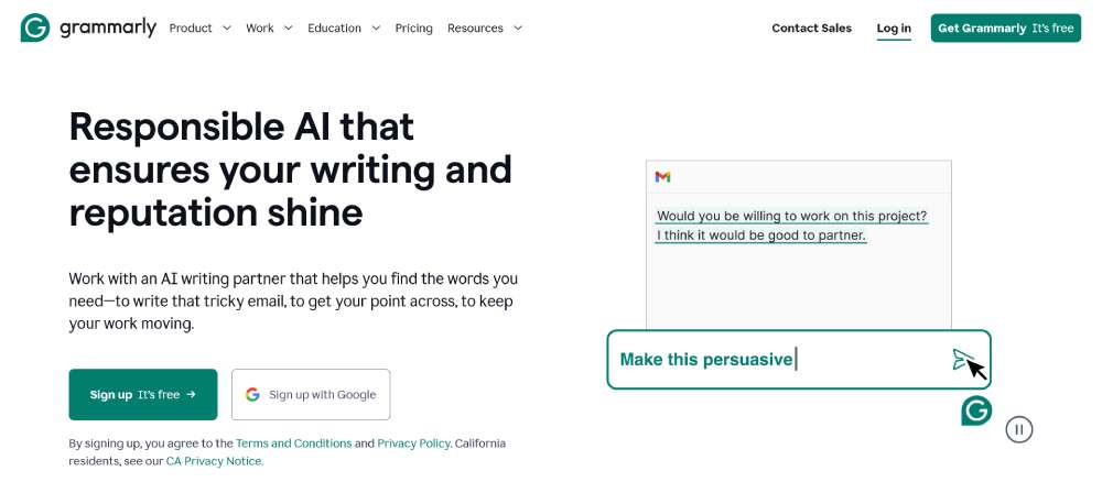
Before/after comparisons demonstrate the product's value directly. The design uses a clear visual path with directional cues guiding users through the page. Typography choices reflect the writing-focused product, with excellent attention to readability. Color usage employs a distinctive green that's become synonymous with the brand. The layout adapts intelligently across devices, prioritizing different content based on screen size.
Superhuman
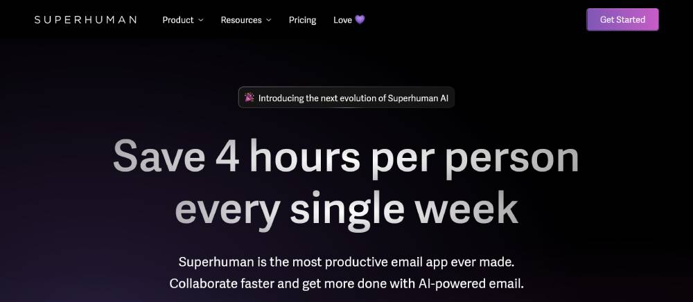
Minimalist black and white design with limited color accents creates a premium feel. The page employs unusual scroll behaviors that reveal content in unexpected ways. Typography is exceptionally refined, using custom letter-spacing and careful size progression. Product screenshots are presented in contextual environments rather than in isolation. Social proof is integrated throughout rather than isolated in a testimonial section.
Airtable
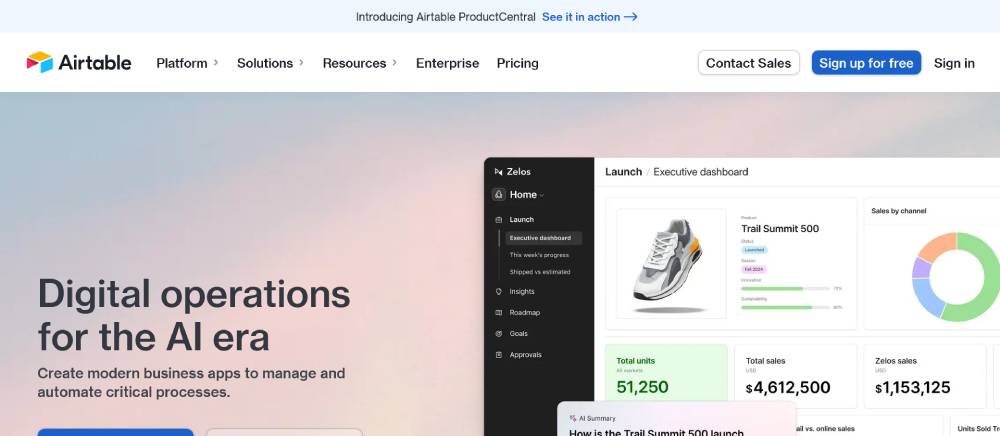
Modular content blocks can be visually rearranged based on campaign focus. The design uses a component-based approach that maintains consistency while allowing flexibility. Typography combines geometric sans-serif for headers with more readable options for body text. Color usage extends beyond the core palette when showing different use cases. Interactive elements allow users to explore product features without leaving the page.
HeadshotPro
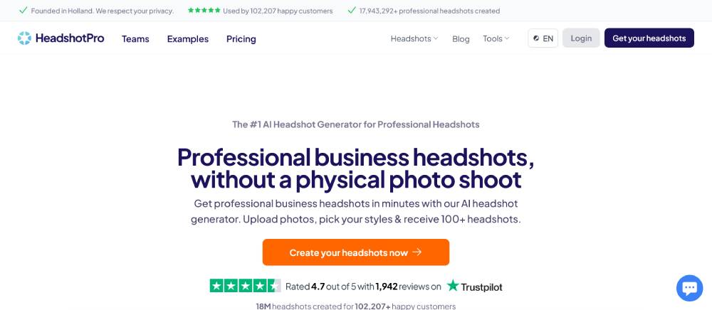
Before/after galleries showcase AI capabilities effectively. The layout places output quality front and center rather than technical explanations. Typography is modern yet professional, avoiding overly trendy styles that would date quickly. The color scheme uses subtle photography-inspired tones rather than bright tech colors. User flow is exceptionally clear, with a strong focus on conversion through progressive disclosure of features.
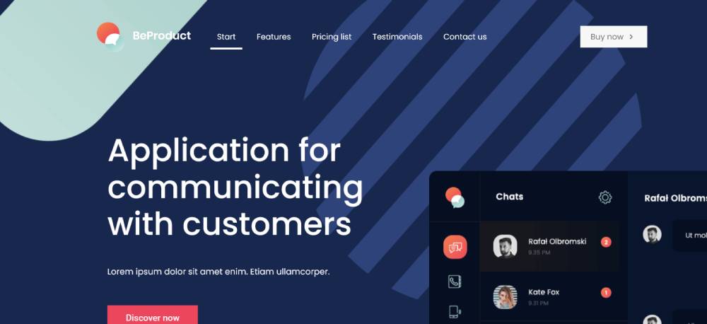
Be Product 4
Perspective Funnels
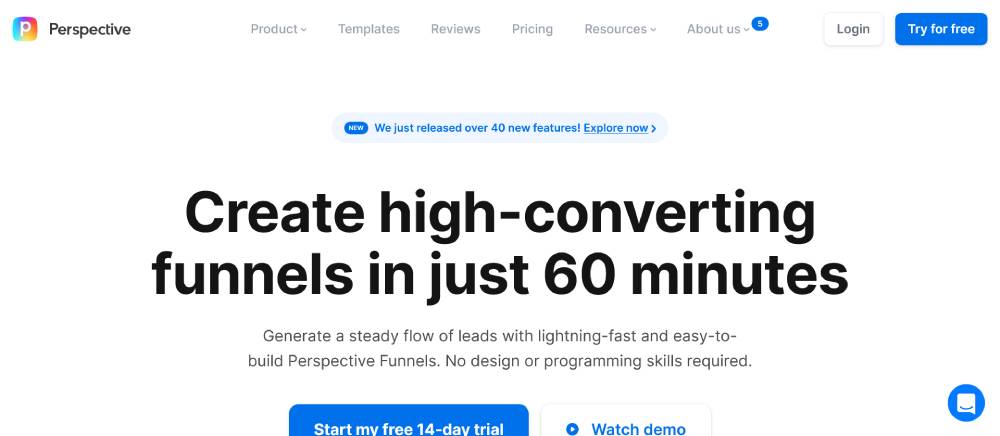
Interactive diagrams explain complex concepts visually. The page structure uses a narrative flow that builds understanding progressively. Typography pairs display fonts for major headlines with highly readable options for explanatory text. Background patterns add texture without competing with foreground content. The design effectively balances explaining a complex product while maintaining visual simplicity.
Rewind
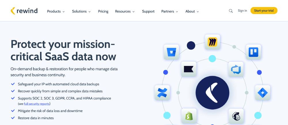
Section transitions use subtle animations that reinforce the backup and recovery concept. The layout employs clear visual hierarchy with primary and secondary content areas. Typography choices create clear distinction between product names, features, and explanatory content. Color usage combines a trusted blue base with accent colors that highlight different product offerings. Integration logos are presented cleanly, building credibility through association.
Workable
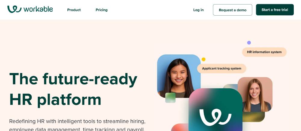
Dashboard previews are shown in context of actual usage scenarios. The design balances professional appearance with approachable elements. Typography is consistently applied across different content types, creating cohesion. Color usage differentiates product areas while maintaining brand consistency. Page sections follow a logical progression from problem awareness to solution to action, matching the buyer journey.
Polymer
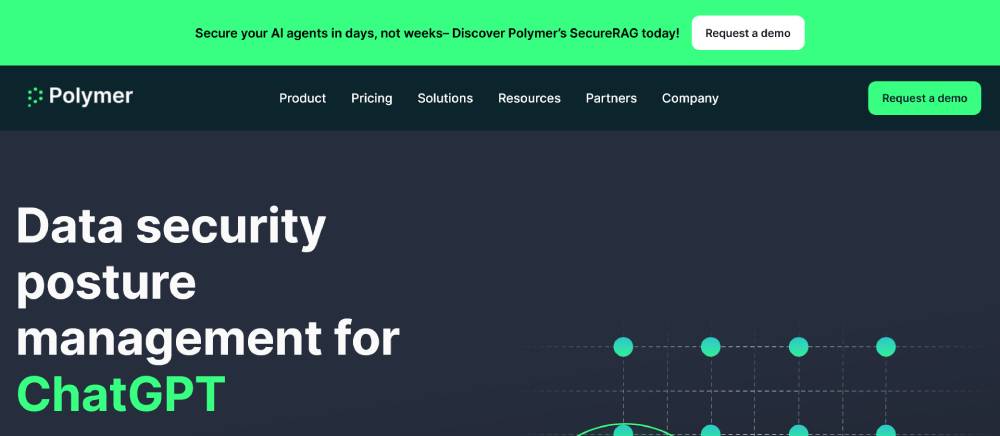
Data visualization examples demonstrate the product's capabilities directly. The layout uses a systematic grid that creates alignment across different content types. Typography pairs geometric display fonts with highly readable body text. Color usage is restrained but strategic, highlighting key data points and interactive elements. The design effectively communicates technical capabilities while remaining accessible to business users.
Antimetal
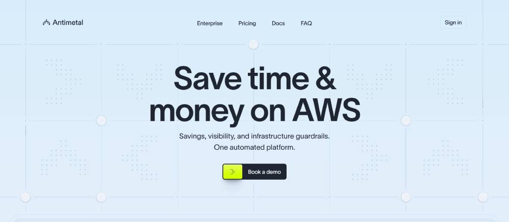
Terminal-inspired design elements speak directly to the developer audience. The layout uses asymmetrical arrangements that create visual interest while maintaining readability. Typography combines monospace elements with sans-serif text for a technical yet modern feel. Dark mode design with strategic use of accent colors reduces eye strain for developer users. Code examples are presented with realistic syntax highlighting rather than simplified versions.
Specify
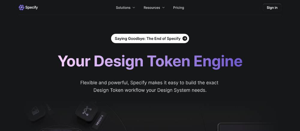
Design system elements are showcased throughout the page, demonstrating the product's purpose. The layout employs careful spacing and alignment that reflects the product's focus on design consistency. Typography uses a single versatile family with multiple weights for differentiation. Color application demonstrates accessible combinations while maintaining visual appeal. Interactive elements show rather than tell how the product streamlines design workflows.
FAQ on SaaS Landing Pages
What elements should a high-converting SaaS landing page include?
A successful SaaS landing page needs several critical components working together. Start with a compelling headline that addresses your target audience's main pain point. Include a clean, benefit-driven value proposition that explains what your software does in simple terms.
Feature sections should highlight your product's key advantages with screenshots or videos showing the software in action. Customer testimonials provide essential social proof that builds trust.
Your page should also contain:
- Clear pricing information
- Frictionless sign-up process
- Mobile-responsive design that works on all devices
- Strong call-to-action buttons strategically placed throughout
- Technical specification highlights for more analytical prospects
Remember that visual hierarchy design matters significantly—guide visitors' eyes to the most important elements first.
How long should my SaaS landing page be?
The ideal length depends on your software's complexity and price point. For simple, low-cost tools, shorter pages with minimal friction often work best. For enterprise solutions with higher price tags, longer pages that address multiple objections become necessary.
What matters most is answering all potential questions a prospect might have before signing up. Each section should move visitors closer to taking action. Some B2B software conversion pages extend quite long, addressing various stakeholder concerns, while showing plenty of use cases.
Track scroll depth to see where visitors lose interest. If people rarely reach the bottom of your page, consider trimming content or reorganizing your most compelling elements earlier.
How can I improve my SaaS landing page conversion rate?
Improving conversion rates requires systematic testing rather than guesswork. Begin by analyzing user behavior patterns through heat maps and session recordings to identify drop-off points. Look for form abandonment metrics to spot friction in your sign-up process.
A/B testing elements like headlines, CTAs, and form fields often yields the biggest gains. Sometimes small changes to button colors or copy can significantly impact your free-to-paid conversion ratio.
Focus on:
- Simplifying your registration process
- Adding targeted social proof near decision points
- Testing different value proposition displays
- Improving page load performance
- Creating specific landing pages for different traffic sources
Cloud software marketing is constantly evolving, so continuous optimization is crucial for maintaining good results.
Should I require credit card information for free trials?
This question sparks heated debate among SaaS marketers. Requiring credit cards creates higher-quality leads and better free trial conversion tactics—users who provide payment information are more committed. However, it dramatically reduces initial sign-ups.
Consider your specific business model and customer acquisition cost calculations. If you have a short sales cycle and straightforward product, a no-card-required approach might work best to maximize your top-of-funnel metrics. For complex products with longer onboarding sequences, requesting payment information can filter for serious prospects.
Many successful companies implement a freemium model presentation, offering basic features without payment while reserving premium capabilities for paid tiers.
How important is mobile optimization for SaaS landing pages?
Extremely important, even for business software. While many assume B2B purchases happen exclusively on desktops, research shows that decision-makers frequently begin their research on mobile devices. Your mobile-responsive pages need to deliver an equally compelling experience across all devices.
Enterprise solution portals must load quickly and display critical information clearly on smaller screens. Pay special attention to:
- Text readability without zooming
- Button sizes for easy tapping
- Form usability on touchscreens
- Menu navigation simplicity
- Proper spacing between clickable elements
Mobile optimization directly impacts your overall conversion path analysis and can significantly affect your marketing qualified leads generation.
What role do testimonials play on SaaS landing pages?
Testimonials are powerful social proof integration tools that address the inherent risk in adopting new software. They work by showing potential customers that others—preferably similar to them—have successfully implemented your solution.
Effective testimonial showcases include:
- Specific results with measurable outcomes
- Names, titles, and companies when possible
- Photos or videos for authenticity
- Industry-specific use cases
- Testimonials that address common objections
Place customer stories strategically throughout your page, especially near calls-to-action where visitors might hesitate. For enterprise software sales, case studies with ROI calculator tools can be particularly effective in demonstrating concrete value.
How should I structure my pricing on a SaaS landing page?
Your pricing table layout should be transparent and aligned with your target audience segmentation strategy. Most successful SaaS companies present 3-4 pricing tiers with clearly differentiated features.
Highlight a recommended plan to guide decision-making. Use annual billing options with savings percentages to encourage longer commitments that improve customer lifetime value projection.
For B2B service marketing, consider these pricing page elements:
- Feature comparison tables that clearly show differences between plans
- User or storage limits for each tier
- Enterprise custom pricing for larger organizations
- Money-back guarantees to reduce perceived risk
- FAQ section addressing common pricing questions
Always test different pricing presentations, as this significantly impacts your customer acquisition funnels.
What call-to-action strategies work best for SaaS landing pages?
Effective CTAs go beyond generic "Sign Up" buttons. They should be benefit-driven and create urgency. CTAs like "Start Your Free 14-Day Trial" or "Get Started—No Credit Card Required" directly address common objections.
Button placement matters as much as wording. Place primary CTAs above the fold but also strategically throughout the page as visitors learn more about your product. Use contrasting colors that stand out from your page design.
For digital service enrollment, consider:
- Primary and secondary CTA variations
- Button click-through rates tracking for optimization
- Action-oriented, first-person language
- Removing navigation from landing pages to focus attention
- Testing different benefit statements near buttons
Remember that visitor hesitation points often occur right before clicking a CTA, so address concerns nearby.
How much information should I ask for on my SaaS landing page forms?
Form field optimization is crucial—every additional field reduces completion rates. For initial sign-ups, collect only what's absolutely necessary to get users started with your product. Usually, this means email, name, and password.
For hosted application trials of more complex products, progressive profiling works well. Gather basic information upfront, then collect additional details as users engage with your product. This creates a frictionless sign-up process while still gathering necessary information.
B2B tools might require more information to qualify leads properly. In these cases, clearly explain why you need each piece of information and how it benefits the user (like enabling certain features or personalization).
How can I measure the effectiveness of my SaaS landing page?
Beyond basic conversion metrics, implement comprehensive analytics to understand your page's performance. Track the entire user journey from first visit through sign-up completion rates and eventual paid conversion.
Key metrics to monitor include:
- Traffic source attribution to determine which channels drive quality leads
- Engagement measurement like time on page and interaction with key elements
- A/B test results for iterative improvements
- User onboarding sequences completion rates
- Customer acquisition cost compared against lifetime value
For cloud-based solutions, track how quickly new users reach their "aha moment"—the point where they experience your product's core value. This often predicts long-term retention better than initial conversion metrics alone.
Conclusion
SaaS landing pages serve as the critical junction between curious prospects and committed customers. They transform visitor interest into tangible business results when properly executed. Building pages that convert isn't magic—it's methodical.
Start small. Test often. Learn continuously.
The most successful web application sign-ups don't happen by accident but through deliberate optimization based on user data and behavior patterns. Remember that effective pages speak directly to your target audience's pain points while showcasing your solution's unique benefits. Track your button click-through rates, analyze heat maps, and refine your approach based on what the numbers tell you.
As remote software access continues growing in importance, your digital product onboarding becomes even more critical to business success. The investment in creating thoughtful, conversion-focused design pays dividends through improved customer acquisition metrics and reduced costs. Your landing page isn't just a website component—it's a strategic business asset worth perfecting.
If you enjoyed reading this article about SaaS landing pages, you should read these as well:


