How to Design Medical Websites
August 8, 2016
Is WordPress Design Changing?
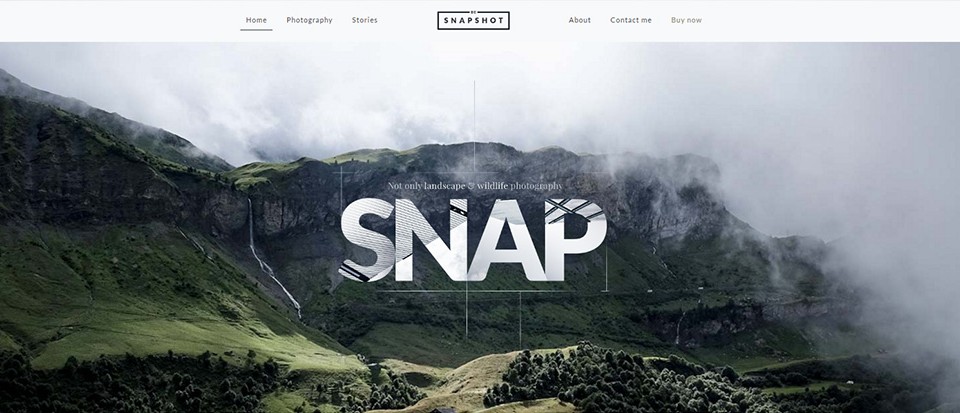
September 5, 2016A hero image is a term used to describe an oversize image placed at the top of a website, or on its home page. It is typically a high-resolution photo or a graphic, although a more recent trend is to use videos or animations.
The use of a hero image is a popular web design trend because of its ability to quickly capture and engage users. It can provide an initial glimpse of what a business is or does, or what a website is all about.
A hero image typically covers the full width of a page. It may be accompanied with a unique value proposition (UVP), a brief summary of information or services offered, or a call to action. A call to action on a home page may be nothing more than an “Enter” button that invites the user to discover how the hero image relates to the site’s offerings.
Tips on Choosing the Best Hero Image
To choose the best hero image for your website, you must first decide on the function(s) it is to perform.
- To tell a story – A hero image sets the premises for user perceptions of the entire site, communicates to a user what to expect, and encourages the user to explore further. The image is often accompanied by a UVP.
- To attract and Engage – A good hero image attracts users’ attention, and encourages them to linger awhile to see what the site has to offer. First impressions are crucial. Your site’s header or hero image must, in a second or two, convince a user to explore further.
- To enhance conversion rates – Finding the best of several images can best be accomplished through A/B testing. A/B test results may indicate that one of them stands out well above the rest – which is the one you want to pick.
Factors to consider:
- Size, Compression, and Resolution – Image size is important, but don’t forget to take file size into account. High resolution is a must. A low-res image will be much less effective.
- Contrast – Text must be easily readable, and neither blend into, or take away from, the image. Tint and/or fade effects are helpful. Drop color from branding elements; so they won’t compete with the image.
- Responsiveness – Make certain your hero image, including the accompany text, displays correctly on mobile devices. If not, its effectiveness in attracting users will be diminished.
- Minimalism – Minimalistic images can impart a powerful message. Your hero image does not have to be plain, but try to avoid a busy or cluttered look.
- Special effects such as tint, fade, and animation can add a lot to a hero image, but don’t overdo action or movement. A transparent overlay on a hero image can help to shift a user’s focus to the main message.
Examples of hero images in pre-built websites
Pre-built websites are becoming increasingly popular. They present web designers with working concepts that allow them to focus on what really matters in web design.
The 12 Be home pages featured here should give you a good idea of how you might customize any one of them to fulfill your design requirements. These pre-built websites also demonstrate how effective hero images can be in engaging site visitors.
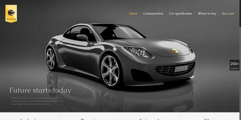
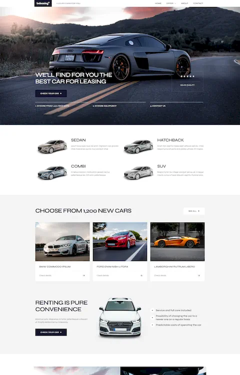
Be Car
This hero header conveys a sense of elegance and luxury. It gives a hint and a promise of what the website’s content will reveal.
Be Music
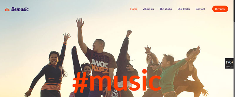
This hero image is filled with action. It clearly communicates who the intended audience is.
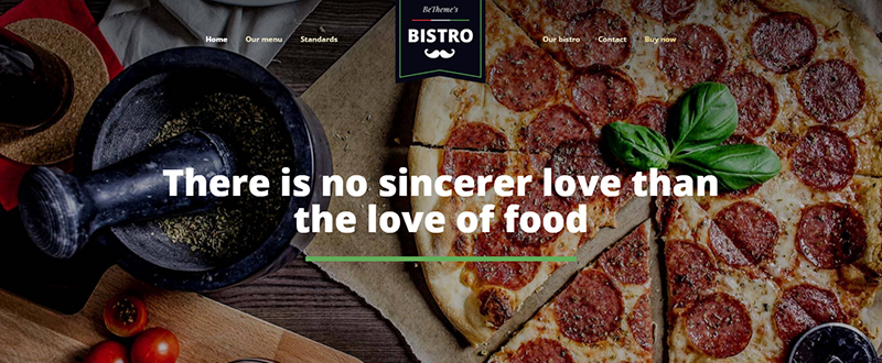
Be Bistro
For a pizza lover, this hero image is indeed powerful. Notice how the transparent image overlay helps the message to stand out.
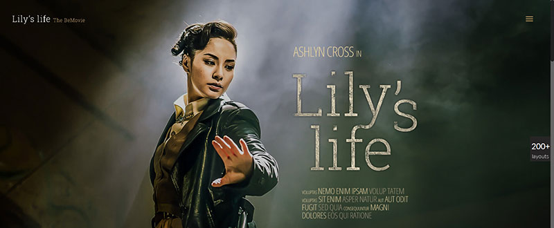
Be Movie
Here, the hero image is in perfect conceptual consensus with the text (the movie’s title). Note how the dreamy atmosphere places the protagonist in a position of prominence.
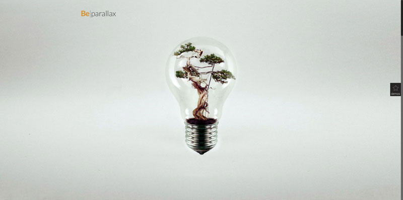
Be Parallax
This hero image is cool, minimalist, and impressive. It reflects several popular design trends; including an effective use of white space.
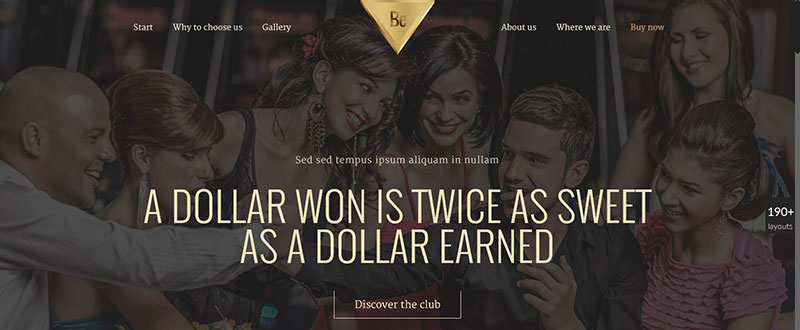
Be Casino
This home page promises fun and laughter. The hero image is darkened, but powerful. The human element builds up a relationship with the user.
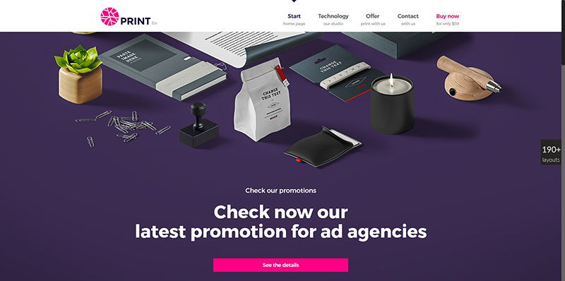
Be Print
This cool, beautifully organized image that shows the print shop’s products, points to a professionally-run business that sells quality products.
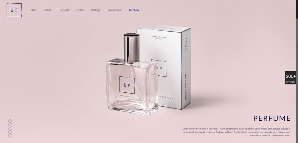
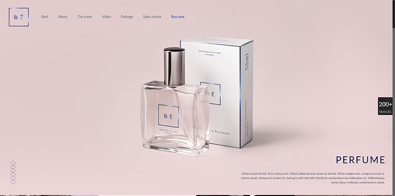
Be Perfume
This hero image, with its distinctly minimalist design, is clean, to the point, and conveys a feeling of luxury.
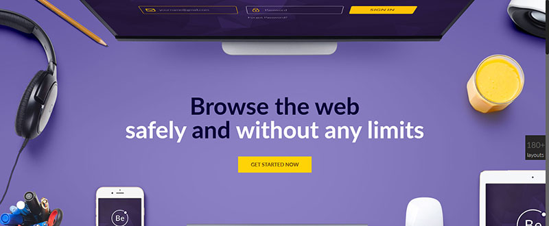
Be VPN
This home page illustrates how an otherwise formal corporate image can include a touch of lighthearted humor. A glass of juice does not look out of place at all.
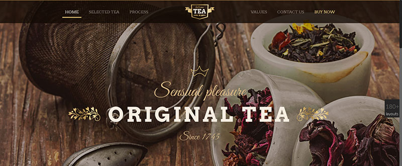
Be Tea
This pre-built website is intended for a tea shop. Note how the elegant, vintage typography perfectly fits in with the message the image imparts.
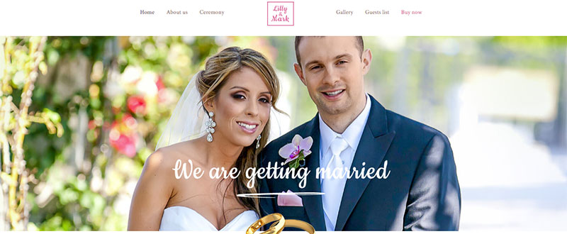
Be Wedding
This pre-built website for weddings offers another example of how it is possible to achieve an excellent image and typography match.
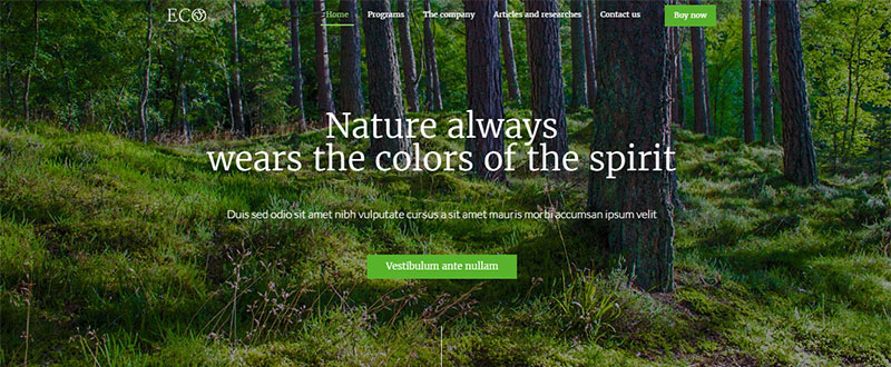
Be Eco
The hero image conveys the ecological initiative behind this website. This high-resolution picture of a forest provides an excellent path to connect the user with nature.

