Great Plastic Surgery Website Design Examples
January 6, 2026
Dietitian Website Design Examples That Build Credibility
January 7, 2026Your website books weddings while you sleep. Or it doesn't.
The difference comes down to design decisions that either build trust or create friction.
Engaged couples spend an average of 3-4 seconds deciding whether to scroll or bounce. Your wedding photographer website design determines which happens.
This guide breaks down real examples from working photographers using platforms like Showit, Squarespace, and WordPress.
You'll see what makes their portfolio galleries convert, how they structure pricing pages, and which booking systems actually work.
Whether you're building your first photography website or redesigning an existing one, these examples show exactly what separates sites that book from sites that don't.
What is a Wedding Photographer Website
A wedding photographer website is a professional portfolio site built to showcase wedding photography services, image galleries, pricing information, and booking systems.
These sites function as the primary sales tool for wedding photography businesses.
Unlike generic portfolio sites, wedding photographer websites integrate client testimonials, engagement session galleries, and online proofing systems into a single client-facing platform.
The core purpose: convert engaged couples browsing for photographers into booked clients through visual storytelling and streamlined inquiry forms.
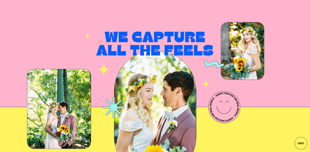
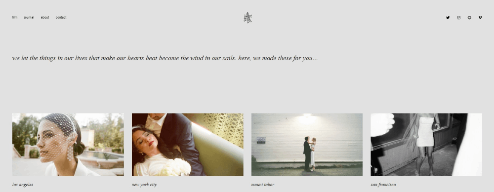
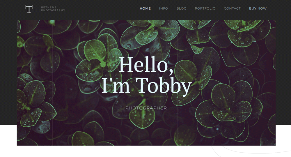
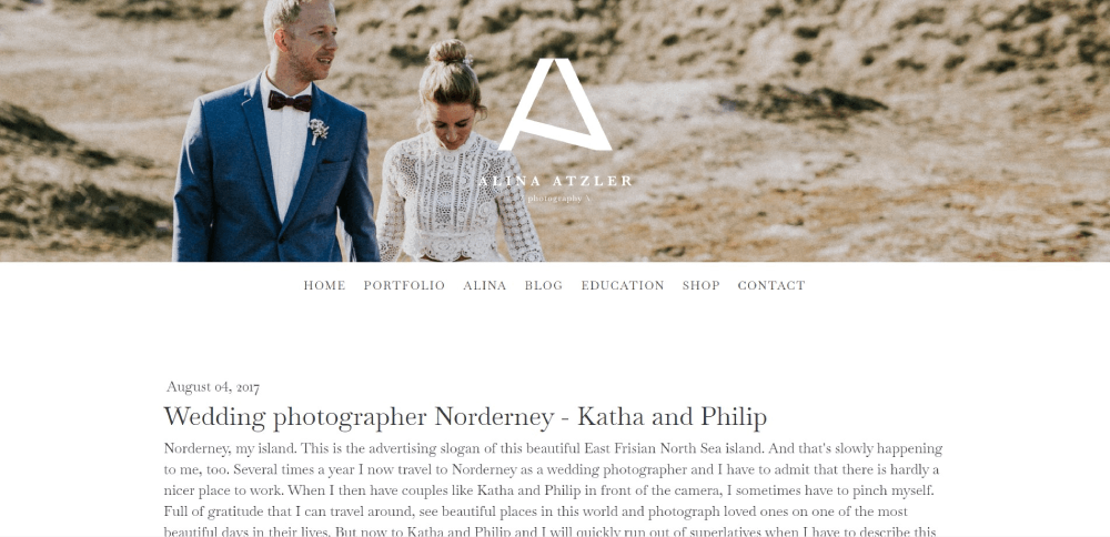
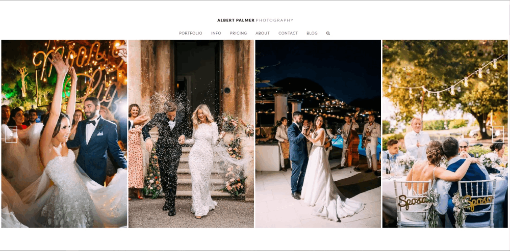
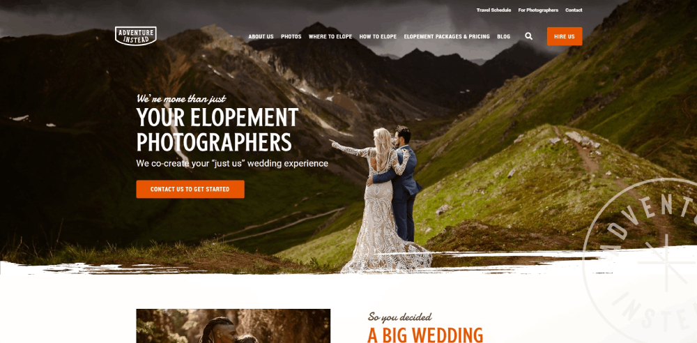
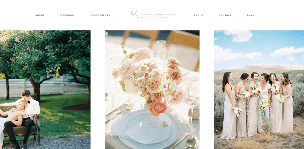
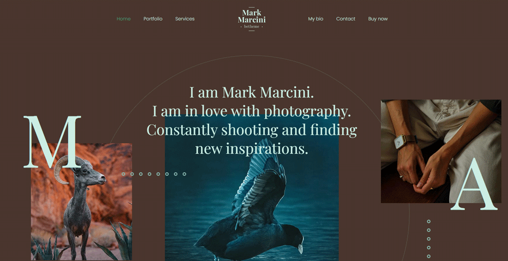
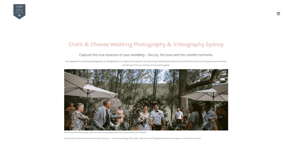
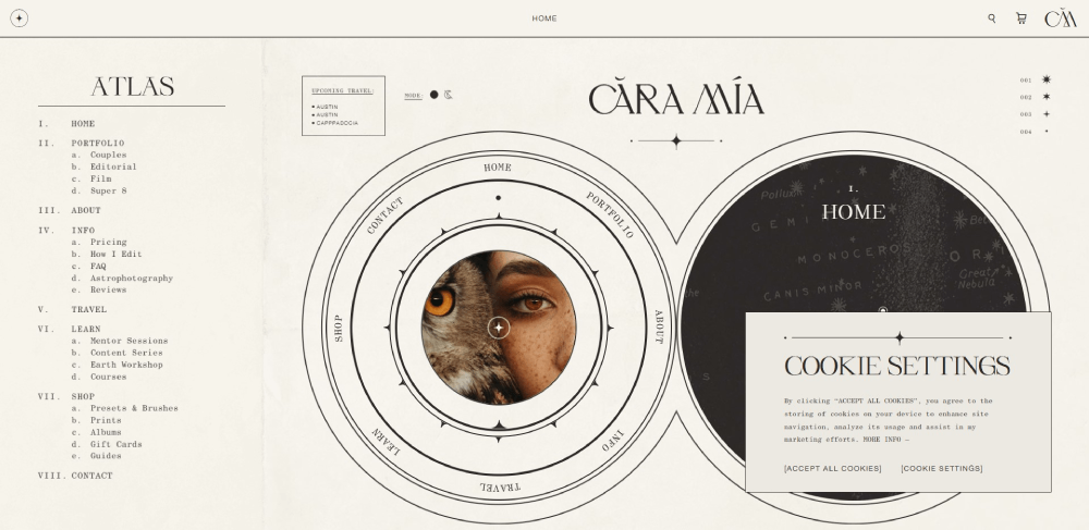
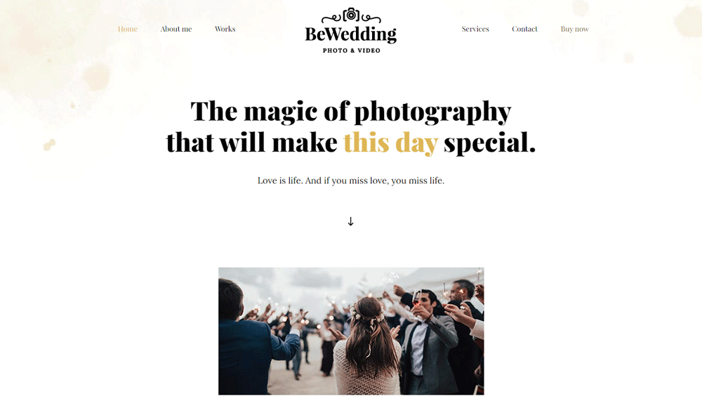
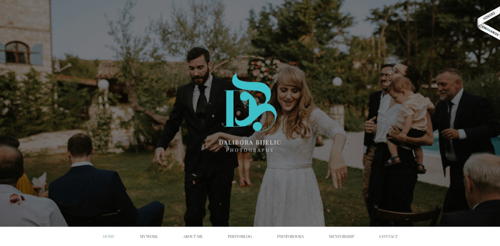
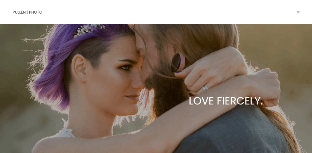
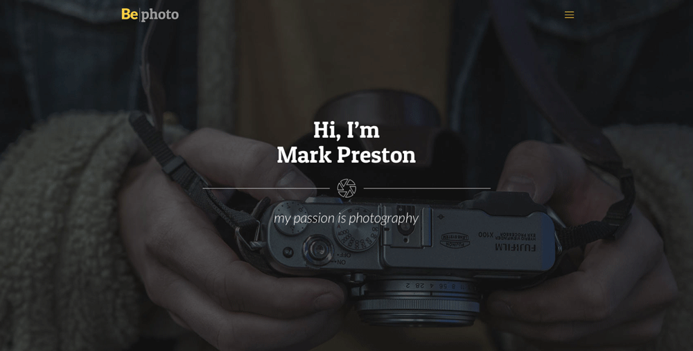
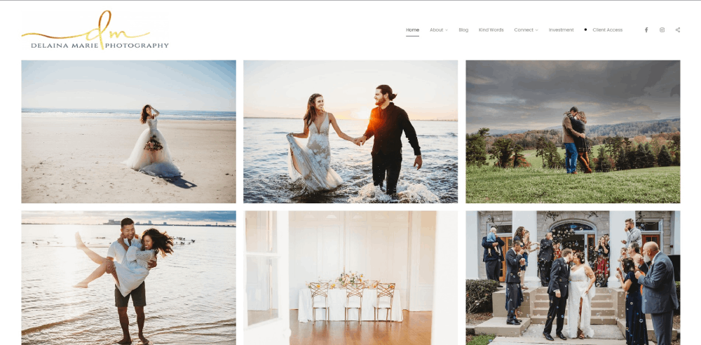
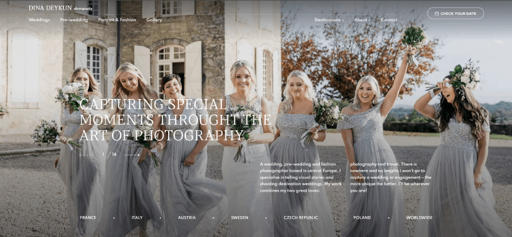
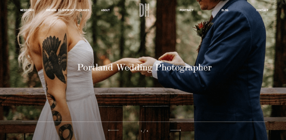
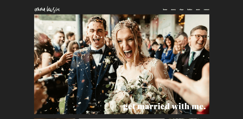
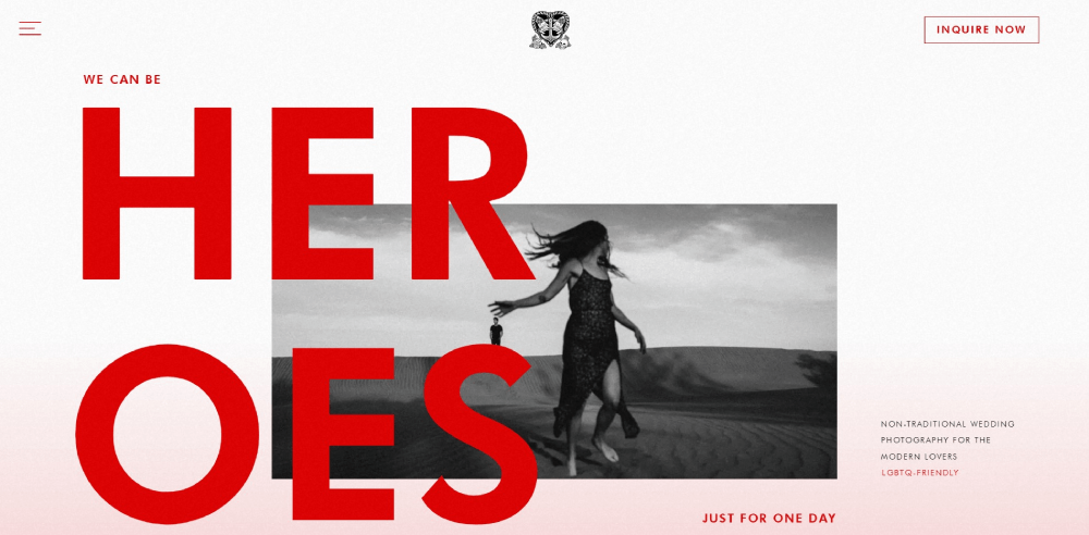
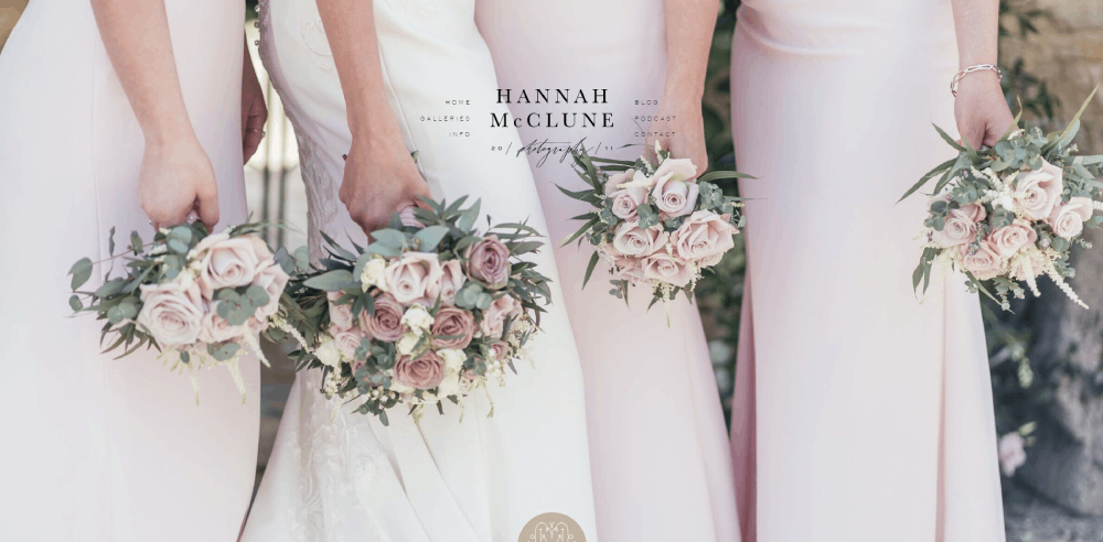
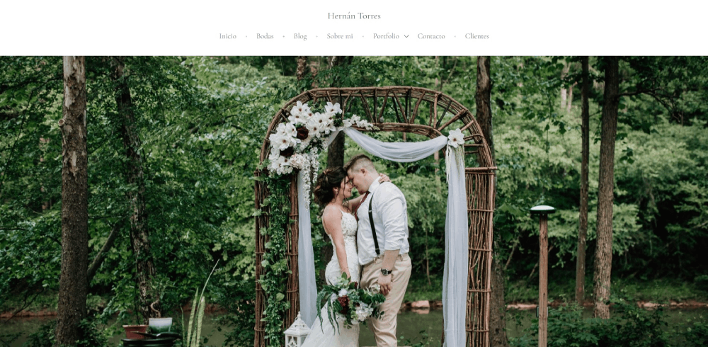
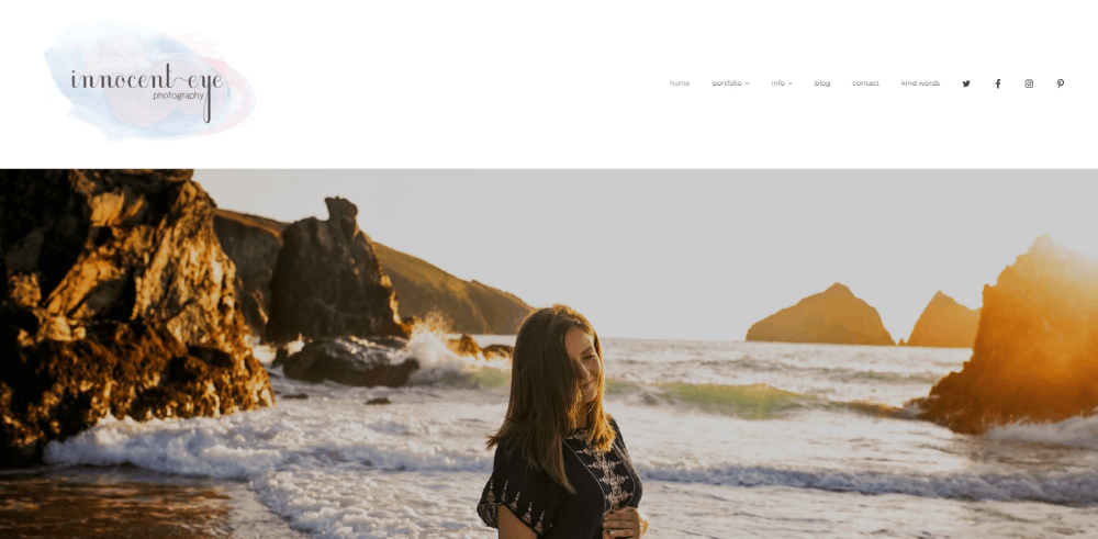
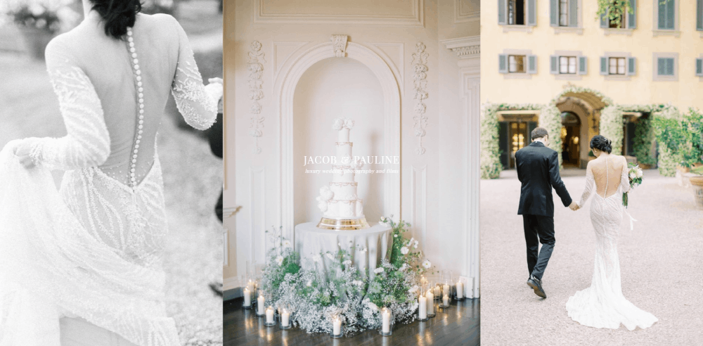
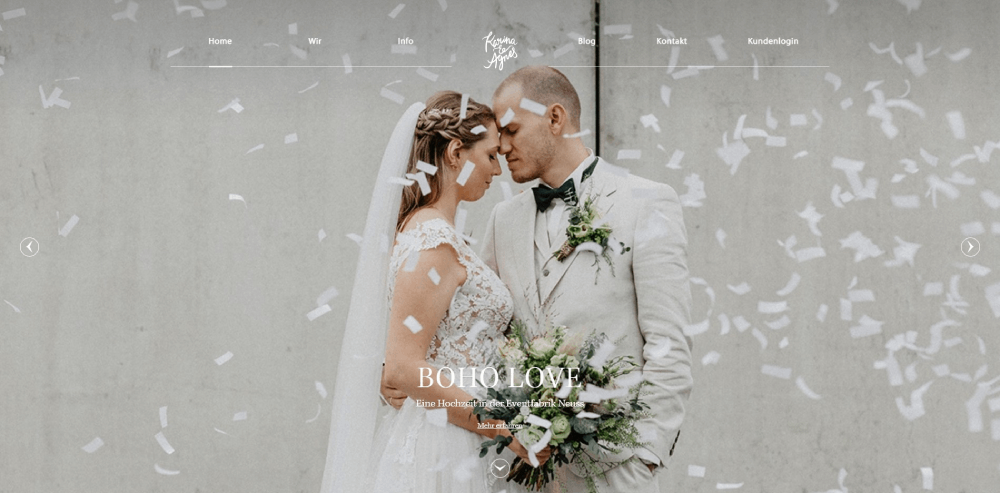
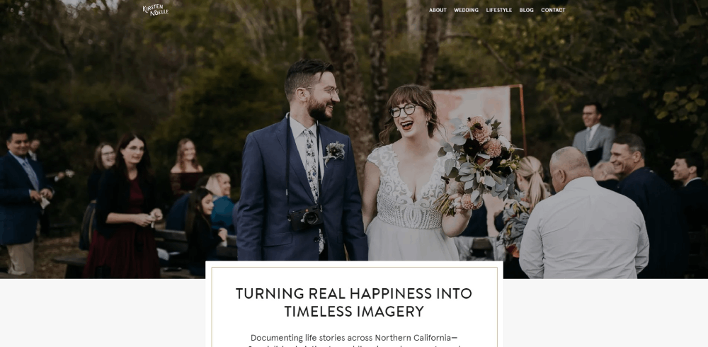
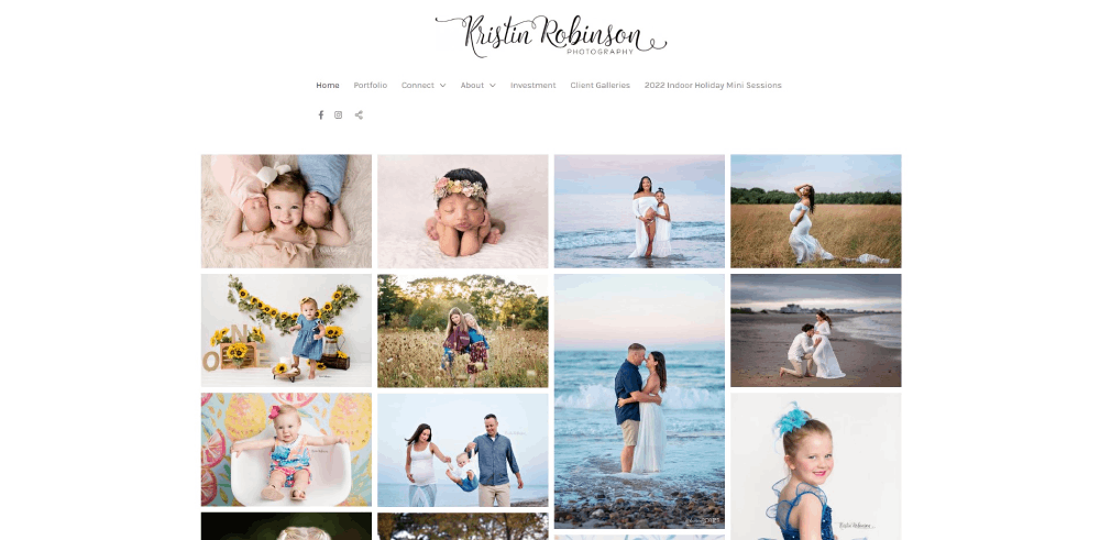
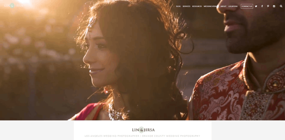
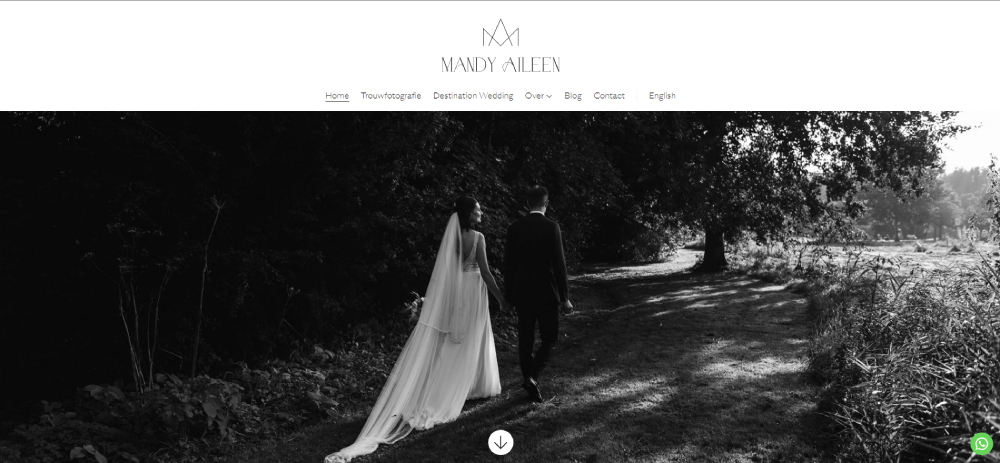
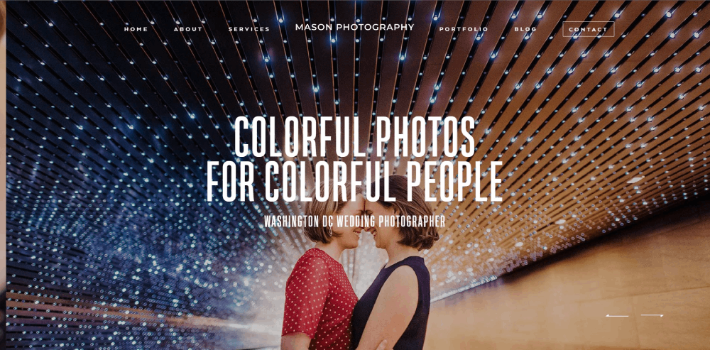
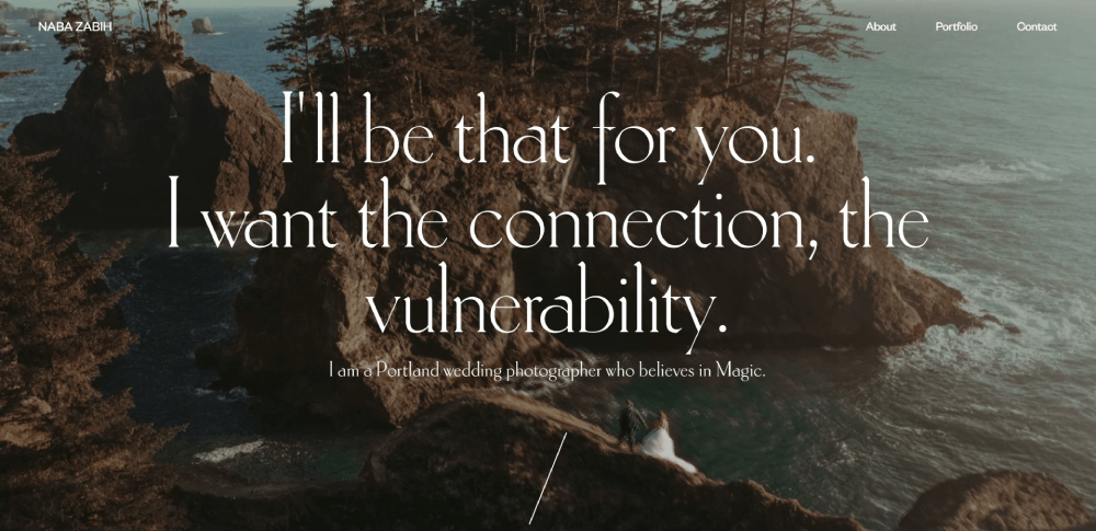
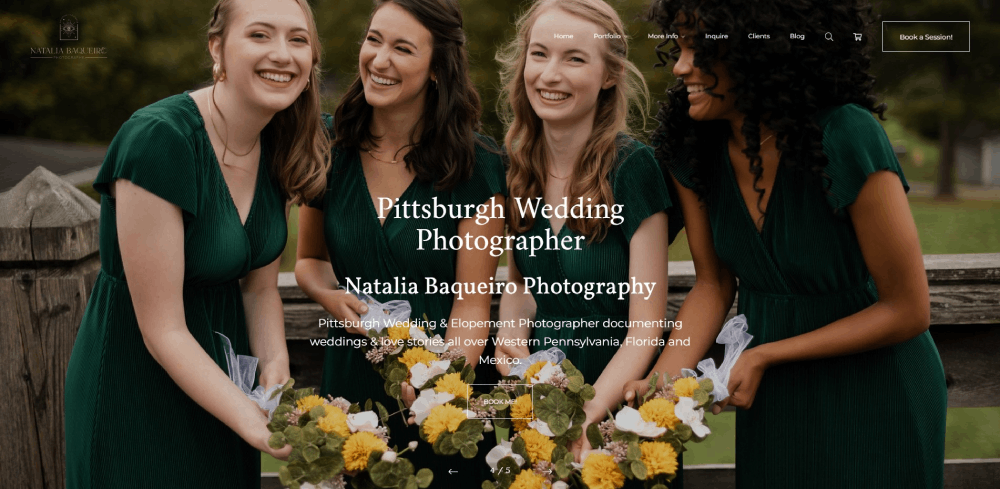
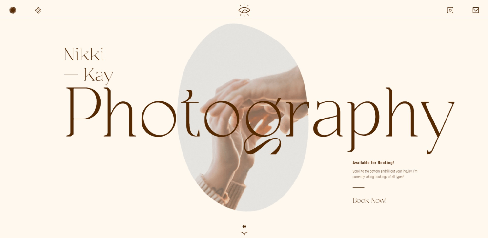
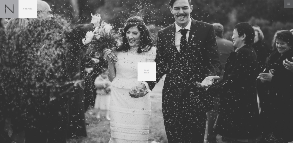
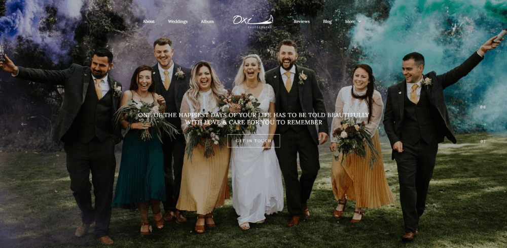
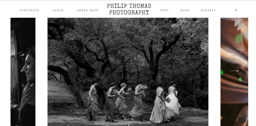
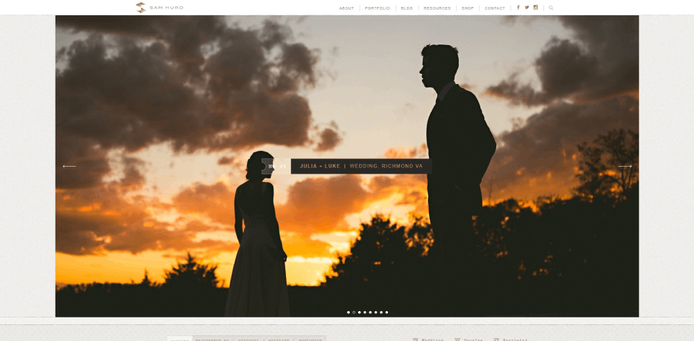
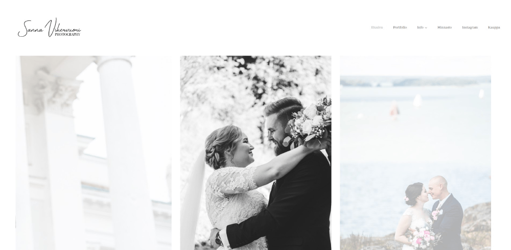
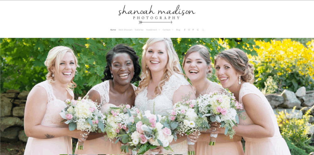
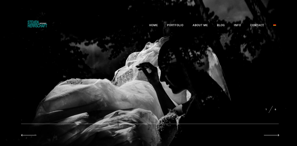
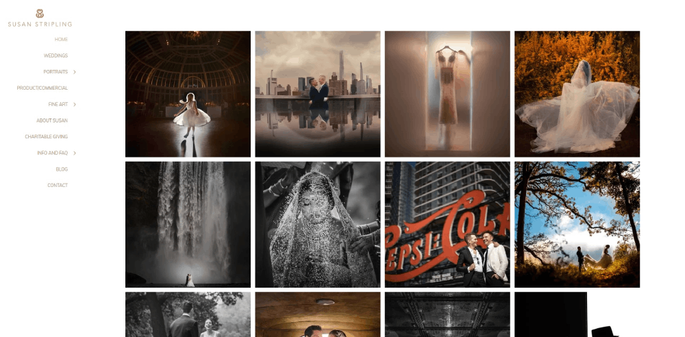
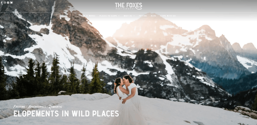
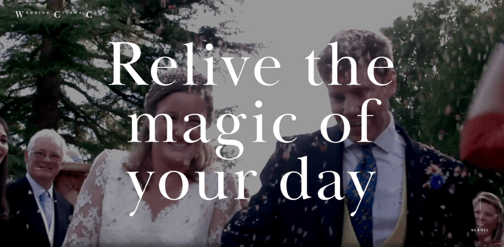
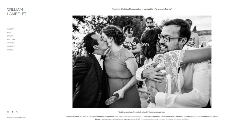
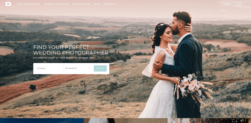
Wedding Photographer Website Design Examples
A Fist Full of Bolts
How Does a Wedding Photographer Website Differ from Other Portfolio Sites
Standard portfolio sites display work. Wedding photographer websites sell an experience.
The emotional weight of wedding photography demands a different approach than commercial or product photography portfolios.
Key differences include:
- Dedicated venue photography displays organized by location type
- Integrated session booking calendars with deposit payment systems
- Investment guide pages replacing standard pricing lists
- Blog integration showcasing full wedding day narratives
- Vendor collaboration sections linking to wedding planner websites and florist websites
Commercial photography studio websites prioritize technical capabilities. Wedding sites prioritize connection and trust.
What Makes a Wedding Photographer Website Design Effective
Effective wedding photography websites balance visual impact with conversion optimization.
The best sites load fast, display images beautifully, and guide visitors toward the contact form without friction.
What Homepage Elements Convert Visitors into Inquiries
The hero section determines bounce rates within three seconds; use a full-screen slideshow featuring your strongest work.
Place a call to action button above the fold linking directly to your client inquiry form.
Include a testimonial slider mid-page and service package previews before the footer.
What Gallery Layout Works Best for Wedding Photography
Grid layouts with lightbox functionality outperform single-column designs for wedding galleries.
Optimal image count: 25-40 photos per wedding gallery; more creates decision fatigue, fewer feels incomplete.
Use white space between images to let each photograph breathe.
What Navigation Structure Do High-Performing Wedding Photographer Websites Use
Top-performing sites use simplified website navigation with five to seven menu items maximum.
Standard structure:
- Portfolio (or Galleries)
- About
- Investment (or Pricing)
- Kind Words (or Reviews)
- Contact
- Blog
Avoid dropdown-heavy website menus that hide content from engaged couples scanning quickly.
What Design Features Increase Wedding Photography Bookings
Conversion-focused design separates profitable wedding photography businesses from those struggling to fill their calendar.
Three elements drive inquiry rates: social proof placement, contact form optimization, and strategic pricing visibility.
How Do Client Testimonials Affect Booking Rates
Wedding photographers with visible testimonials on their homepage see 30-40% higher inquiry rates than those hiding reviews on a separate page.
Pair each testimonial with a wedding photo from that client's gallery; text-only reviews feel generic and unverifiable.
What Contact Form Fields Generate More Inquiries
Shorter forms convert better: name, email, wedding date, venue, and a message field.
Every additional field reduces completion rates by approximately 10%; skip phone numbers unless you actually call leads.
Add a budget range dropdown to pre-qualify inquiries without scaring away prospects with exact pricing.
Where Should Pricing Information Appear on Wedding Photographer Websites
Two camps exist: full transparency with an investment guide page, or "inquire for pricing" to force contact.
Luxury photographers often hide pricing to filter tire-kickers; mid-range photographers benefit from starting-at prices that set expectations upfront.
How to Structure a Wedding Photographer Website Gallery
Gallery structure affects both user experience and image loading speed.
Poor gallery organization loses potential clients before they reach the contact page.
What Image Resolution Displays Best on Wedding Portfolio Sites
Export images at 2048px on the long edge with 70-80% JPEG quality; larger files slow loading without visible quality gains on most screens.
Use lazy loading and a CDN like Cloudflare for faster delivery across geographic locations.
How Many Images Should Each Wedding Gallery Contain
Portfolio galleries: 25-40 images maximum per wedding.
Client delivery galleries through Pic-Time, PASS Gallery, or ShootProof: 400-800 images depending on coverage hours.
What Order Should Wedding Photos Appear in a Portfolio
Lead with your strongest image, not chronological order; front-load emotional moments, detail shots, and venue photography that showcases your style.
End with a powerful closing image that leaves visitors wanting to see more.
What Mobile Design Considerations Apply to Wedding Photographer Websites
Over 70% of engaged couples browse wedding vendors on mobile devices first.
Test every page on iPhone and Android before publishing; what looks perfect on desktop often breaks on smaller screens.
Critical mobile optimizations:
- Tap-friendly buttons (minimum 44px height)
- Simplified navigation with hamburger menu
- Compressed images for cellular data
- Click-to-call phone number in header
- Sticky contact button on scroll
Squarespace and Showit handle mobile first design automatically; WordPress requires manual responsive testing with each theme update.
How Do Wedding Photographer Websites Handle Online Booking
Modern wedding photography businesses integrate CRM tools for seamless client management from inquiry to final gallery delivery.
What Calendar Integration Options Exist for Wedding Photographer Sites
HoneyBook, Dubsado, and 17hats offer embeddable calendars showing available wedding dates directly on your contact page.
Tave and Studio Ninja provide similar functionality with stronger automation for follow-up sequences.
Sprout Studio combines gallery delivery with booking management in one platform.
How Do Deposit Payment Systems Work on Photography Websites
Most CRM platforms integrate Stripe or PayPal for retainer collection; typical wedding photography deposits range from $500-2000 or 25-50% of the package price.
Signed contracts and deposits can happen entirely online through automated workflows in Light Blue Software or Dubsado.
What SEO Considerations Apply to Wedding Photographer Website Design
Search visibility matters because engaged couples search "wedding photographer + city name" thousands of times monthly.
Basic optimization multiplies organic traffic without paid advertising costs.
How Do Image Alt Texts Affect Wedding Photography Site Visibility
Alt text tells search engines what your images contain; use descriptive phrases like "bride and groom first look at Chicago Cultural Center wedding" rather than "IMG_4523."
Include venue names, cities, and descriptive wedding terms naturally.
What URL Structure Works for Wedding Photographer Portfolio Pages
Clean URLs improve both user experience and search rankings:
- Good: /portfolio/chicago-wedding-photographer/
- Bad: /gallery?id=4523&category=weddings
Create location-specific portfolio pages targeting each city or venue you want to rank for; blog posts covering individual weddings build long-tail search traffic over time.
What Distinguishes Luxury Wedding Photographer Website Designs from Standard Designs
Luxury wedding photographer websites communicate exclusivity through design restraint rather than flashy effects.
Common characteristics of high-end wedding photography sites:
- Generous luxury color palettes with muted tones (ivory, champagne, sage, charcoal)
- Serif typography for sophistication; Google Fonts like Cormorant Garamond or Playfair Display
- Fewer images displayed larger rather than crowded grids
- Editorial-style blog layouts resembling print magazines
- Hidden pricing requiring personal consultation
- Destination wedding galleries organized by country
Standard wedding photographer sites often overwhelm with too many images, competing fonts, and busy layouts that signal volume over exclusivity.
The luxury website approach works best for photographers charging $8,000+ per wedding; budget-friendly photographers benefit from warmer, more approachable designs with visible pricing.
Study filmmaker websites for cinematic inspiration; many luxury wedding photographers adopt similar visual languages with moody color grades and dramatic imagery.
Consider hiring branding agencies for complete identity development if repositioning toward the luxury market; DIY rebrands rarely achieve the cohesion that justifies premium pricing.
FAQ on Wedding Photographer Website Design
What is the best platform for a wedding photographer website?
Showit offers the most design flexibility for wedding photographers, with WordPress blogging built in. Squarespace works well for beginners. WordPress with themes like ProPhoto or Flavor theme suits photographers wanting full control over SEO and customization.
How much does a wedding photographer website cost?
Expect $200-500 annually for DIY platforms like Squarespace or Format. Custom WordPress builds with premium themes, quality hosting through WPEngine, and CRM tools like HoneyBook or Dubsado push total costs to $1,000-3,000 per year.
How many images should I display on my photography portfolio?
Display 25-40 images per wedding gallery on your portfolio. Lead with your strongest work, not chronological order. Client delivery galleries through Pixieset or Pic-Time can include 400-800 images separately from your main photographer website.
Should I show pricing on my wedding photography website?
Mid-range photographers benefit from showing starting prices to pre-qualify leads. Luxury photographers often hide pricing to encourage direct contact. Include a budget dropdown on your inquiry form to filter prospects without publishing exact package rates.
What makes a wedding photographer website convert visitors into clients?
Fast loading speed, visible testimonials on the homepage, clear contact forms with minimal fields, and strategic placement of clean gallery layouts. Mobile optimization matters since 70%+ of engaged couples browse on phones first.
How do I organize galleries on a wedding photography website?
Create separate galleries by wedding type (elopements, destination, local venues) or style (editorial, documentary, romantic). Use a grid layout with lightbox functionality. Include venue names and locations for better search visibility on each gallery page.
What CRM tools integrate with wedding photographer websites?
HoneyBook, Dubsado, 17hats, Tave, and Studio Ninja all integrate with major website platforms. These tools handle contracts, invoicing, session booking calendars, and automated follow-ups. Sprout Studio combines client management with gallery delivery in one system.
How important is mobile design for wedding photographer websites?
Critical. Over 70% of engaged couples browse vendors on mobile devices. Test every page on iPhone and Android. Ensure tap-friendly buttons, compressed images for fast loading, and a simplified navigation structure that works on smaller screens.
What colors work best for wedding photographer websites?
Neutral palettes (white, ivory, soft gray, black) let your photography stand out without competing colors. Luxury photographers favor muted tones like champagne or sage. Avoid bright colors that clash with diverse wedding imagery across your galleries.
How do I improve SEO for my wedding photography website?
Write descriptive alt text for every image including venue names and cities. Create location-specific portfolio pages targeting your service areas. Publish blog posts about individual weddings with relevant keywords. Use clean URL structures without random numbers or parameters.
Conclusion
These wedding photographer website design examples prove that booking more weddings starts with intentional design choices.
Platform selection matters. Showit, Squarespace, and WordPress each serve different needs and budgets.
But the platform alone won't save a poorly structured site.
Focus on what actually converts: fast image loading speed, visible client testimonials, streamlined inquiry forms, and mobile responsive layouts that work on every device.
Integrate tools like HoneyBook or Dubsado for seamless booking workflows. Use Pic-Time or Pixieset for professional gallery delivery.
Study sites that book consistently. Borrow their navigation structure, gallery organization, and pricing page placement.
Your photography sells itself. Your website just needs to get out of the way and let couples fall in love with your work.
Start building.

