


The Best Florist Website Design Examples
October 4, 2025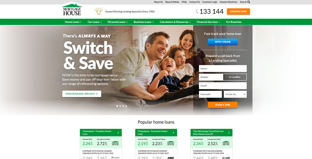
The Top Mortgage Websites Design Examples
October 9, 2025Your accounting firm's website is either building trust or breaking it. There's no middle ground.
Most accountant website design examples you'll find online look the same: stock photos of calculators, generic blue color schemes, buried contact forms.
That's a problem when potential clients judge your credibility in under a second.
This guide breaks down what actually works for CPA firms, bookkeepers, and tax professionals building their online presence.
You'll see real examples from firms that get it right, learn which design elements convert visitors into leads, and understand why certain layouts fail.
Whether you're launching a new accounting website or redesigning an outdated one, these principles apply.
What is Accountant Website Design
Accountant website design is the process of building online platforms for CPAs, bookkeepers, and accounting firms that communicate financial services clearly while generating qualified leads.
These sites need to do three things well: establish credibility, explain services, and convert visitors into clients.
Unlike retail websites focused on transactions, accounting sites prioritize trust signals and professional presentation.
A certified public accountant handling someone's taxes or audits needs a site that feels secure from the first click.
The best accountant websites balance clean aesthetics with functional features like client portals, document upload systems, and appointment scheduling.
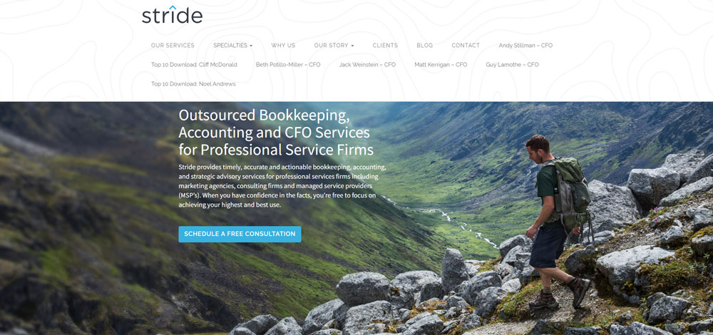
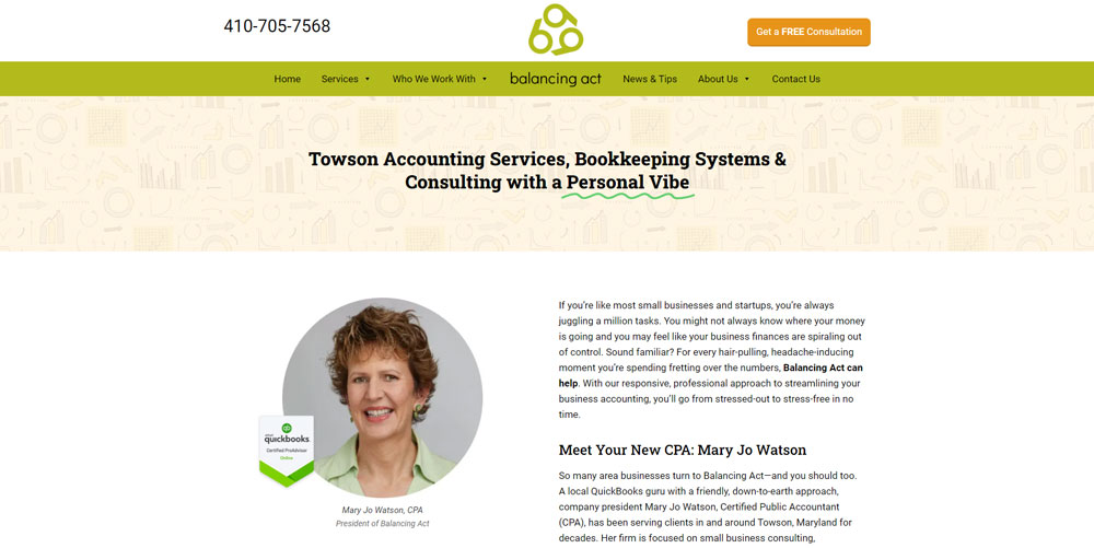
Accountant Website Design Examples
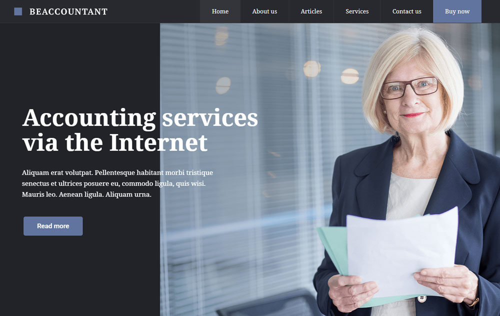
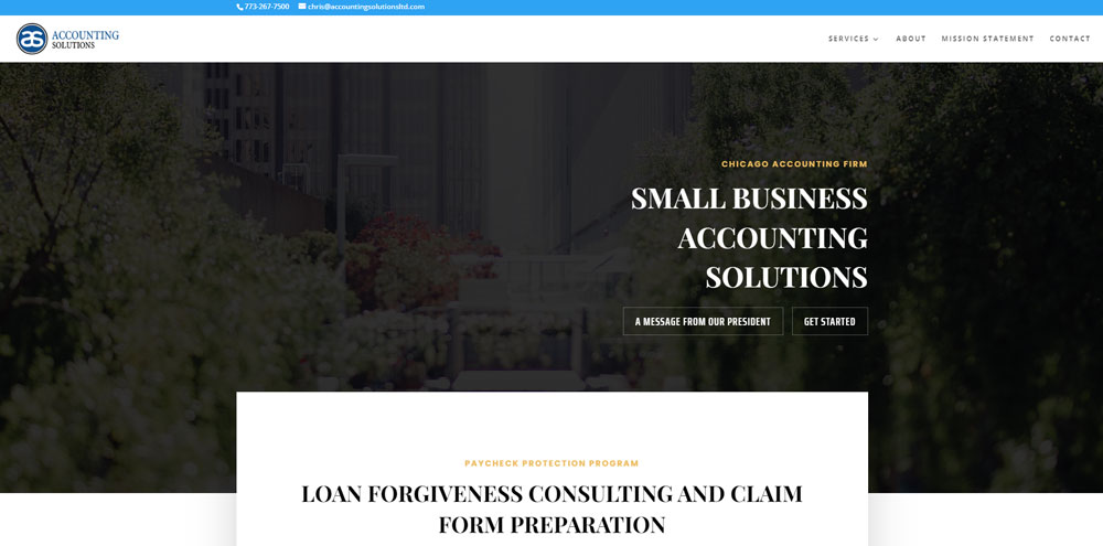
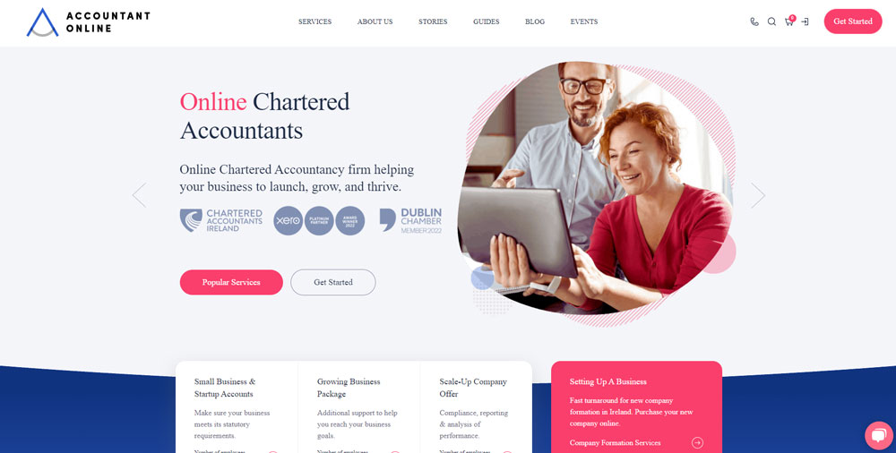
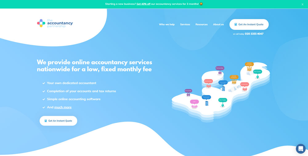
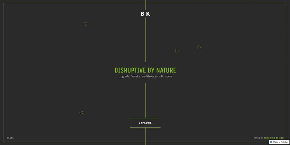
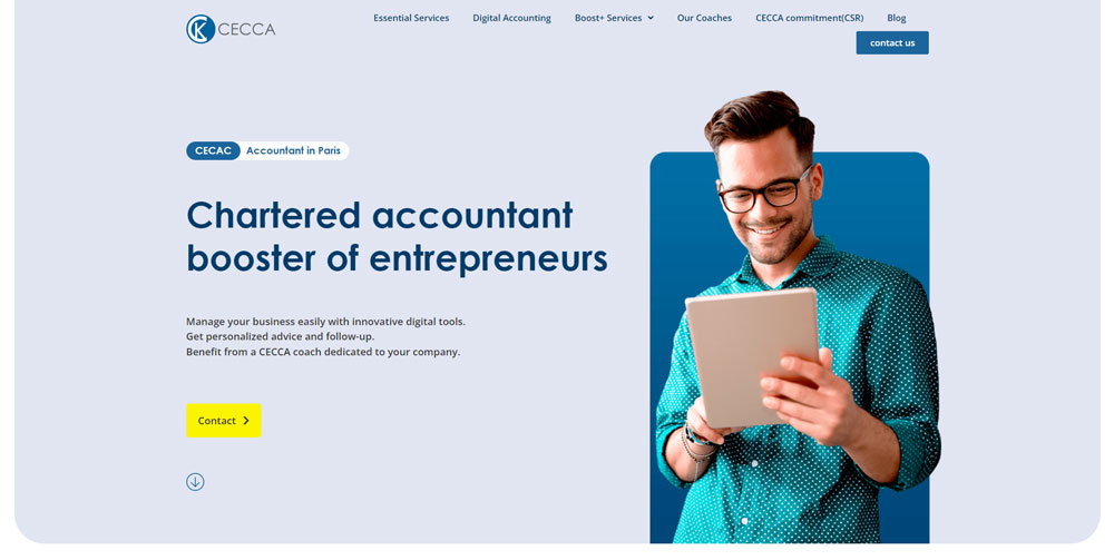
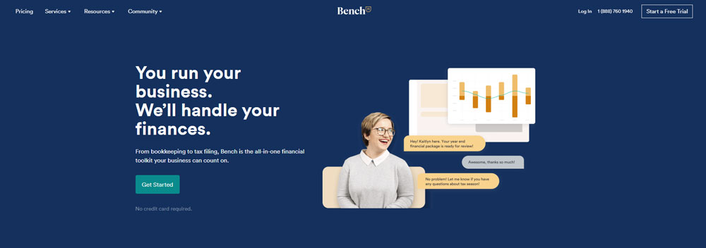
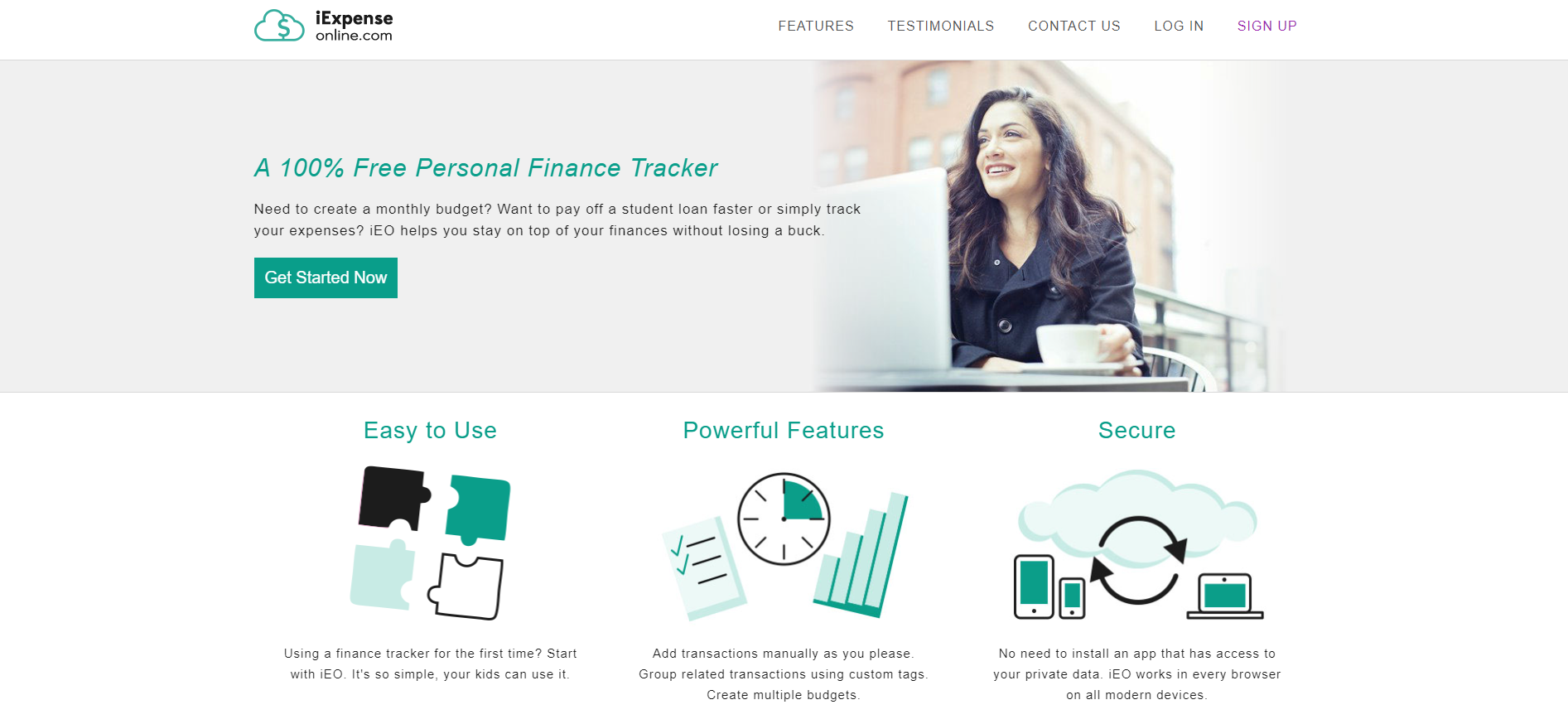
AccountingBox


Why Does Website Design Matter for Accountants
Your website is often the first impression potential clients have of your accounting practice.
A poorly designed site signals carelessness. Not exactly what you want when handling financial data.
Studies show visitors form opinions about a website within 50 milliseconds. That's faster than reading your firm name.
Trust matters more in accounting than almost any other industry.
People share sensitive information: tax returns, business financials, personal income. The site needs to feel safe before they'll share anything.
Good design directly impacts lead generation for CPAs. Sites with clear navigation and visible contact information convert at higher rates than cluttered alternatives.
Mobile responsiveness isn't optional anymore. Potential clients search for accountants during commutes, lunch breaks, coffee runs.
If your site breaks on a phone screen, you've lost that client to a competitor with responsive websites.
What Are the Key Features of Professional Accountant Websites
Professional accounting firm websites share common characteristics that separate them from amateur attempts.
These features work together to create credibility and drive conversions.
What Makes a Homepage Effective for Accounting Firms
The hero section needs a clear value proposition, not generic stock photos of calculators.
Include your primary CTA above the fold; most visitors won't scroll to find your contact button.
How Should Service Pages Be Structured
Each service gets its own page: tax preparation, bookkeeping, audit services, payroll processing.
Structure matters for both users and search engines. List specific deliverables, not vague promises.
What Role Does Mobile Responsiveness Play
Over 60% of searches happen on mobile devices.
Your accounting website must adapt to different screen sizes without breaking layouts or hiding important elements.
Touch-friendly navigation, readable fonts without zooming, fast loading times. These aren't bonuses. They're requirements.
How Do Client Portals Work on Accountant Websites
Secure client portals let users upload documents, view statements, and communicate with your team.
Integration with QuickBooks, Xero, or FreshBooks streamlines the workflow.
SSL certificates are mandatory. Display security badges prominently to reinforce data protection.
How Do Leading Accountant Websites Handle Trust Signals
Trust signals separate successful accounting websites from forgettable ones.
Visitors need reassurance before sharing financial information with strangers.
What Types of Testimonials Work Best
Video testimonials outperform text. Real faces build connection faster than quotes attributed to initials.
Include specific results when possible: "Saved our business $47,000 in tax liability" beats "Great accountant!"
A dedicated testimonial page can showcase longer case studies while keeping service pages focused.
How Should Credentials and Certifications Be Displayed
List your credentials clearly:
- CPA license and state registration
- AICPA membership
- QuickBooks ProAdvisor certification
- Xero Gold Partner status
- Enrolled Agent designation from the IRS
Place badges in the footer or about page. Don't clutter the homepage with twenty certification logos.
Link to your Better Business Bureau profile if you have good standing.
What Design Elements Convert Visitors on Accounting Sites
Conversion-focused design turns passive visitors into active leads.
Every element should guide users toward contacting your firm.
Where Should Call-to-Action Buttons Be Placed
Primary CTAs belong above the fold, in the header, and at natural stopping points after service descriptions.
Effective call to action buttons use action-oriented language: "Schedule Free Consultation" works better than "Submit."
Sticky headers keep contact options visible during scrolling.
How Does White Space Affect User Experience
Cramped layouts feel chaotic. White space gives content room to breathe.
Accounting involves complex information. Visual breathing room prevents cognitive overload.
Sites with good UX typically feature generous margins, clear section breaks, and intentional negative space between elements.
What Design Mistakes Do Accountant Websites Make
Common errors tank credibility and conversion rates simultaneously.
Avoiding these mistakes matters as much as implementing best practices.
Why Does Generic Stock Photography Hurt Credibility
Everyone recognizes those staged handshake photos and calculator close-ups.
Generic imagery signals generic service. Bad design choices like overused stock photos make your firm forgettable.
Use real team photos, office shots, or custom illustrations instead.
How Does Too Much Text Affect Service Pages
Walls of text don't get read. They get skipped.
Service pages need scannable content: bullet points, clear headers, short paragraphs.
Save detailed explanations for downloadable PDFs or consultation calls.
How to Choose Colors for an Accounting Website
Blue dominates accounting websites for good reason: it signals trust, stability, professionalism.
Navy, slate, and corporate blue appear across Deloitte, PwC, Ernst & Young sites.
Green works for environmentally-focused firms or those emphasizing growth and prosperity.
Avoid trendy palettes that clash with financial services expectations. A pink color palette works for beauty brands, not tax preparation.
Accent colors should highlight CTAs without overwhelming the conservative base palette.
Consider these proven combinations:
- Navy blue with gold accents
- Dark gray with green highlights
- Slate blue with white space dominance
- Forest green with cream backgrounds
What Navigation Structure Works for Accounting Firms
Simple navigation beats clever navigation every time.
Standard menu structure for CPA firm websites:
- Services (dropdown with tax, bookkeeping, audit, advisory)
- Industries (if you specialize)
- About (team, credentials, history)
- Resources (blog, calculators, guides)
- Contact
Keep primary navigation under seven items. Cognitive load increases with every additional option.
Sticky headers ensure contact information stays visible during long page scrolls.
The website footer handles secondary links: privacy policy, sitemap, social profiles, office locations.
How Should Accounting Websites Display Pricing Information
Pricing transparency builds trust but creates challenges for custom-quoted services.
Three approaches work:
Option 1: Full Transparency
List exact prices for standardized services. Works for bookkeeping packages, tax prep tiers, payroll processing.
A clear pricing page reduces tire-kicker inquiries and qualifies leads automatically.
Option 2: Starting-at Ranges
"Tax preparation starting at $350" sets expectations without boxing you in.
Useful when complexity varies significantly between clients.
Option 3: Consultation-first Model
No public pricing. All quotes customized after discovery calls.
Common for enterprise accounting, advisory services, complex audit work.
Whatever approach you choose, make the next step obvious. Don't leave visitors guessing how to proceed.
Building Your Accounting Website
Platform choice impacts long-term flexibility and maintenance costs.
WordPress powers most accounting websites due to flexibility, plugin ecosystem, and SEO capabilities.
Squarespace and Wix offer simpler setup but less customization for client portal integration.
Consider these technical requirements:
- SSL certificate (mandatory for any site handling financial data)
- GDPR and privacy compliance features
- Integration with Calendly or similar scheduling tools
- Google Analytics for tracking visitor behavior
- Fast hosting with CDN support
Don't build on a platform that can't grow with your practice.
A user friendly website starts with the right foundation.
Mobile-first design, fast load times, accessible navigation. Get these right before worrying about fancy animations or parallax scrolling websites effects.
Your accounting website represents your firm 24/7. Make sure it works as hard as you do.
FAQ on Accountant Website Design
What makes a good accountant website?
A good accountant website combines clear service descriptions, visible trust signals, mobile responsiveness, and easy contact options. It loads fast, displays credentials prominently, and guides visitors toward scheduling consultations without confusion or unnecessary clicks.
How much does an accounting website cost?
Basic WordPress sites start around $2,000-5,000. Custom designs with client portal integration run $10,000-25,000. Enterprise CPA firm websites from agencies like those building for Deloitte or KPMG can exceed $50,000 depending on complexity and features.
Which platform works best for CPA websites?
WordPress dominates due to flexibility, SEO capabilities, and plugin options for client portals. Squarespace suits smaller practices wanting simplicity. Wix works for solo bookkeepers. Avoid platforms that limit SSL integration or secure document uploads.
What pages should an accountant website include?
Core pages include: homepage, services (tax preparation, bookkeeping, audit), about/team, industries served, resources/blog, and contact. Larger firms add client portals, career pages, and location-specific landing pages for local SEO targeting.
How do I build trust on my accounting website?
Display CPA credentials, AICPA membership, and QuickBooks or Xero certifications visibly. Add client testimonials with specific results. Include team photos instead of stock images. Show SSL security badges and link to your Better Business Bureau profile.
What colors work best for accounting websites?
Blue remains the dominant choice because it signals trust and stability. Navy, slate, and corporate blue appear across major firms like PwC and Ernst & Young. Green works for growth-focused messaging. Avoid trendy palettes that undermine professionalism.
Should accountants include pricing on their website?
Depends on your services. Standardized offerings like tax prep or monthly bookkeeping benefit from transparent pricing. Complex advisory work typically requires custom quotes. Starting-at ranges work well for setting expectations without limiting flexibility.
How important is mobile responsiveness for accountant sites?
Critical. Over 60% of searches happen on mobile devices. Google prioritizes mobile-friendly sites in rankings. Potential clients search during commutes or breaks. If your site breaks on phones, those visitors go to competitors with responsive designs.
What features convert visitors on accounting websites?
Prominent CTAs above the fold, sticky contact buttons, live chat options, and Calendly integration for scheduling. Clear service explanations with specific deliverables. Testimonials featuring measurable results. Simple form design with minimal required fields.
How often should I update my accountant website?
Review quarterly at minimum. Update team changes immediately. Refresh blog content monthly for SEO benefits. Check mobile performance after platform updates. Tax season pages need annual revision. Outdated copyright dates and staff photos damage credibility fast.
Conclusion
The best accountant website design examples share common traits: clear navigation, visible credentials, and conversion-focused layouts that turn visitors into clients.
Your accounting firm website doesn't need flashy animations or trendy designs. It needs to communicate expertise and build trust fast.
Focus on what matters: mobile responsiveness, secure client portals, prominent CTAs, and authentic testimonials from real clients.
Skip the generic stock photography. Invest in real team photos and custom visuals that reflect your practice.
Whether you choose WordPress, Squarespace, or a custom build, prioritize user experience over aesthetics.
A clean website that loads quickly and answers client questions will outperform a beautiful site that confuses visitors every time.
Start with the fundamentals. Test with real users. Iterate based on Google Analytics data.
Your website works around the clock. Make sure it represents your firm well.


