How to Fix the “Request Entity Too Large” Error
June 23, 2024
Visual Composer vs. WPBakery vs. BeBuilder
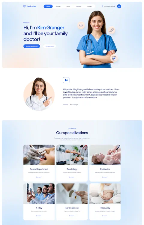
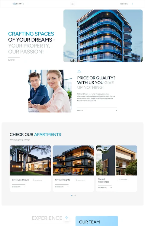
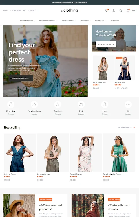
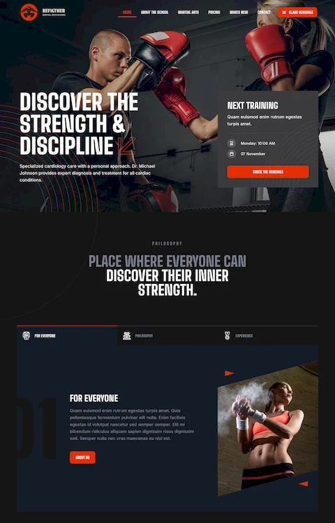
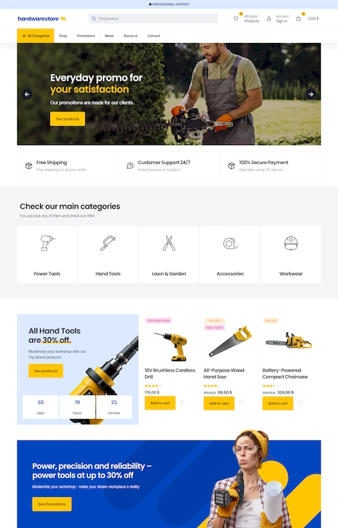
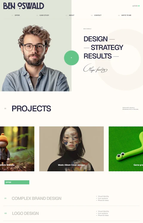
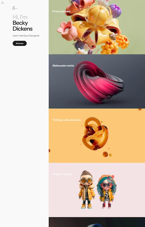
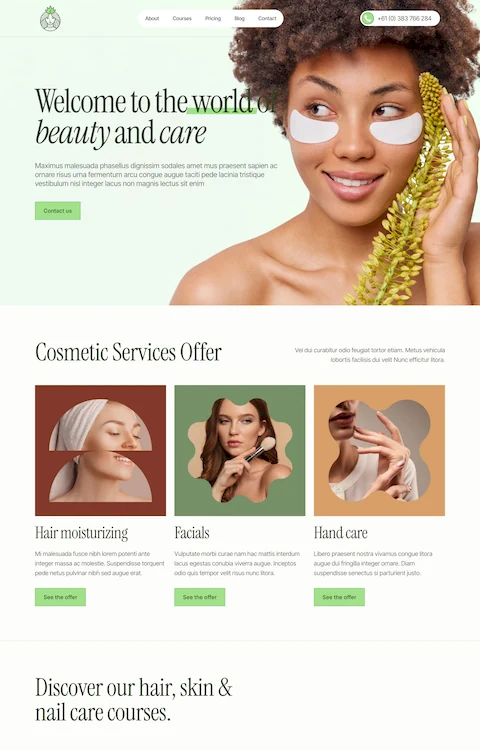
June 24, 2024Imagine a digital canvas where artistry and technology converge, crafting an experience that captivates the mind and soul. Welcome to the realm of aesthetic website design examples—a world where every pixel tells a story.
Creating a visually stunning website is not just about beauty; it’s about innovation, engagement, and functionality. Whether you're seeking inspiration for a minimalist user interface or a responsive masterpiece, there’s a wealth of ideas just waiting to be explored.
In this article, you will discover inspiring examples of elegant website themes, exploring how top designers seamlessly integrate elements like color theory, typography trends, and CSS animations to create visual masterpieces.
By the end, you’ll understand the principles behind visual hierarchy, master the use of interactive features, and gain profound insights into creating a professional UX design.
Let’s dive into the art of web design and transform the ordinary into the extraordinary.
Aesthetic Website Design Examples
Mixd
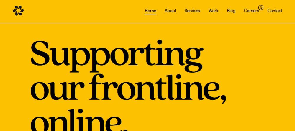
Mixd is a user-centered digital agency dedicated to the public sector, offering accessible and sustainable website design. With a focus on the NHS and public services, Mixd specializes in user research, UX design, web accessibility, and WordPress development. Their approach ensures websites are fast, inclusive, and WCAG-compliant, supporting vital public services online.
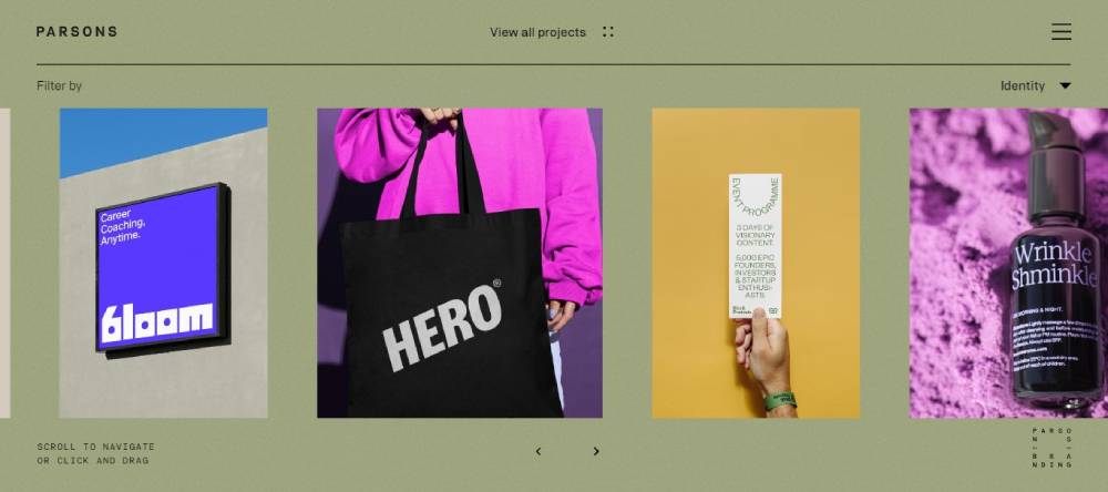
Parsons Branding
Parsons Branding is a holistic brand consultancy that merges strategic development with exceptional design. Specializing in identity and brand strategy, they create experiences that connect people. Their projects span various sectors, offering bespoke branding solutions that reflect the unique values and visions of their clients.
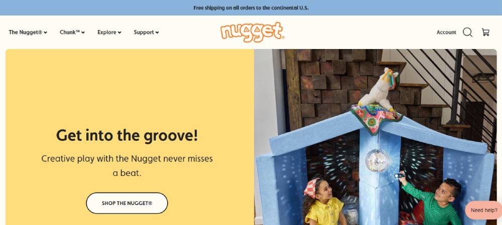
Nugget
Nugget transforms playtime with functional, aesthetic play furniture. Known for the Nugget® Play Couch, their products are designed to inspire creativity in kids and adults alike. With a variety of vibrant colors and configurations, Nugget play furniture is easy to clean, fun, and highly rated for imaginative play.
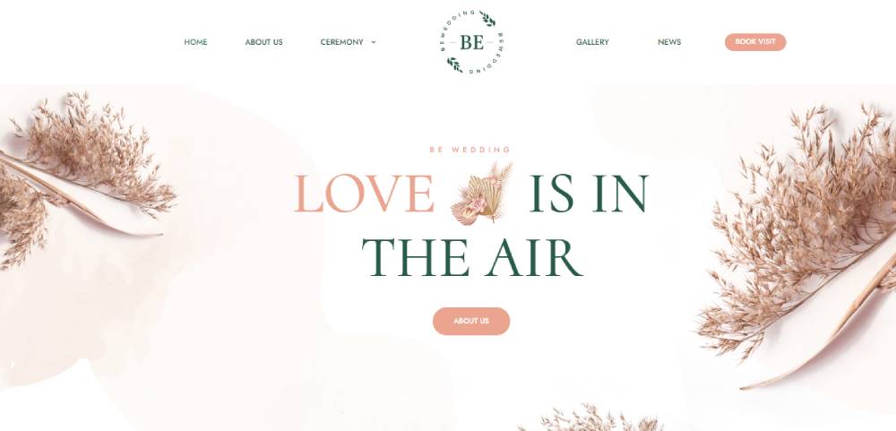
Bewedding3
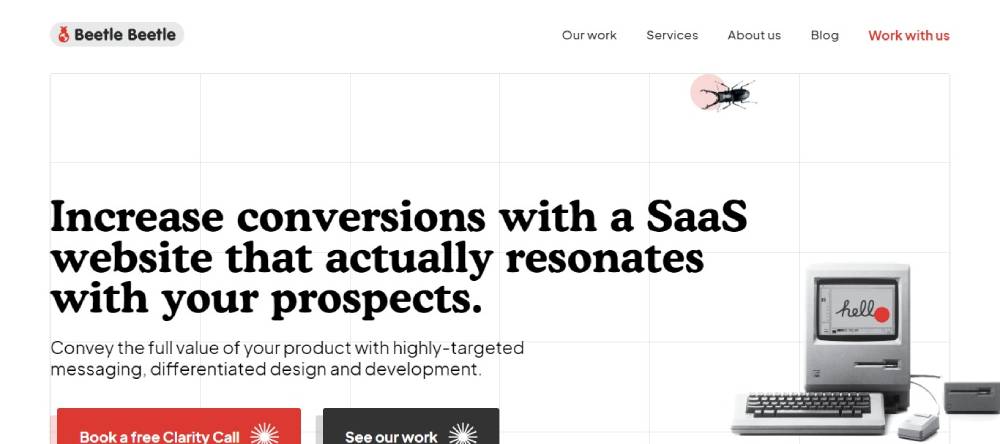
Beetle Beetle
Beetle Beetle revamps websites for B2B SaaS products, focusing on high-conversion designs and clear messaging. They help SaaS companies increase MRR by refining their web presence. With a track record of transforming over 50 SaaS websites, they specialize in turning visitors into loyal customers through expert design and development.
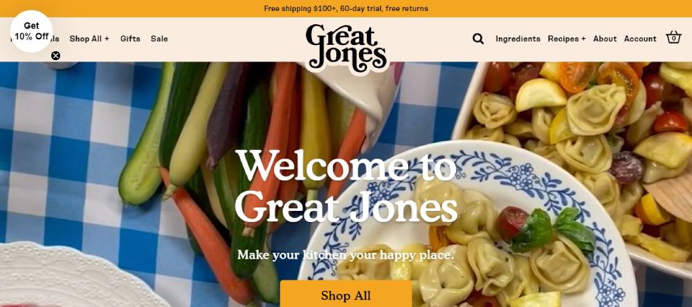
Great Jones
Great Jones offers stylish and functional cookware, including cast iron, ceramic, and stainless steel pieces. Their products, like the Dutch Baby and Holy Sheet, are designed to add a touch of color and innovation to any kitchen. Great Jones combines aesthetic appeal with practical performance for everyday cooking needs.
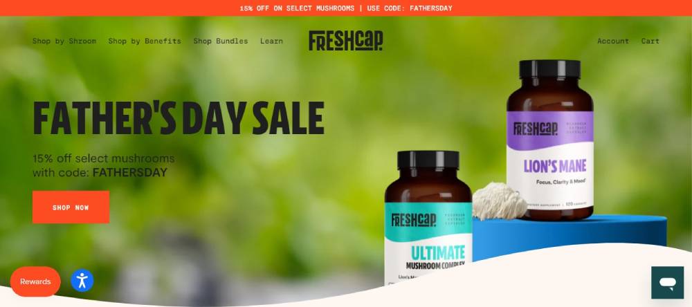
FreshCap
FreshCap harnesses the power of functional mushrooms, offering a range of extracts and supplements. Their products, like the Ultimate Mushroom Complex and Lion's Mane Capsules, are crafted for health, immunity, and cognitive support. FreshCap prides itself on quality, using organic, analytically tested mushrooms to ensure potent benefits.
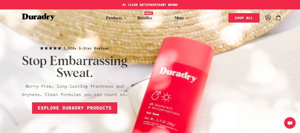
Duradry
Duradry provides a comprehensive solution for excessive sweating with their 3-step system, including antiperspirant sticks, minimizing gels, and body washes. Endorsed by dermatologists and praised by users, Duradry offers clean, effective ingredients to keep you dry and confident. Their products promise fast results and long-lasting protection.
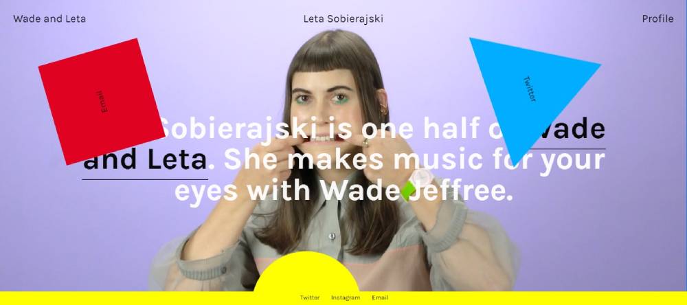
Leta Sobierajski
Leta Sobierajski is a multidisciplinary designer who blends traditional graphic design with photography, art, and styling. Working alongside Wade Jeffree, Leta creates visually striking projects that span murals, installations, and collaborations with brands like Google and Adobe. Her unique approach results in captivating and memorable designs.
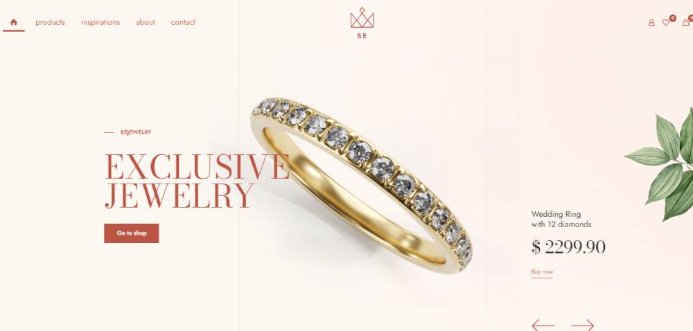
Bejeweler2
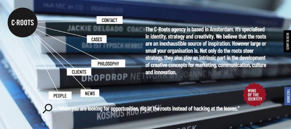
C-Roots
C-Roots, based in Amsterdam, specializes in identity, strategy, and creative concepts for marketing, communication, and innovation. They believe in drawing inspiration from an organization's roots to steer strategy and develop compelling creative solutions. C-Roots is dedicated to uncovering deep-seated potential and opportunities for their clients.
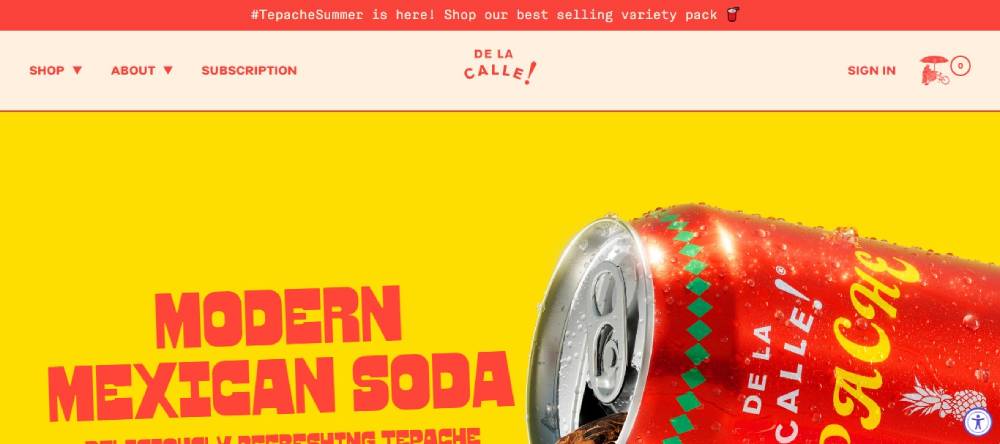
De La Calle!
De La Calle crafts Tepache, a traditional Mexican soda made from organic pineapples. This modern take on a classic beverage is low in sugar, fermented, and under 50 calories. With flavors like Pineapple Chili and Tamarind Citrus, De La Calle offers a refreshing, health-conscious alternative to conventional sodas.
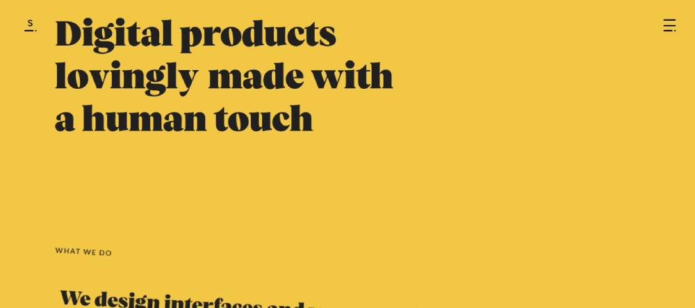
Sennep
Sennep is a digital product studio that creates interfaces and user experiences that build trust, joy, and brand loyalty. With expertise in award-winning design and solid processes, they collaborate with clients to supercharge in-house product teams. Sennep's projects include Steasy, LUMI, and Google's Ho Jeng Ar, showcasing their innovative approach to digital brand experiences.
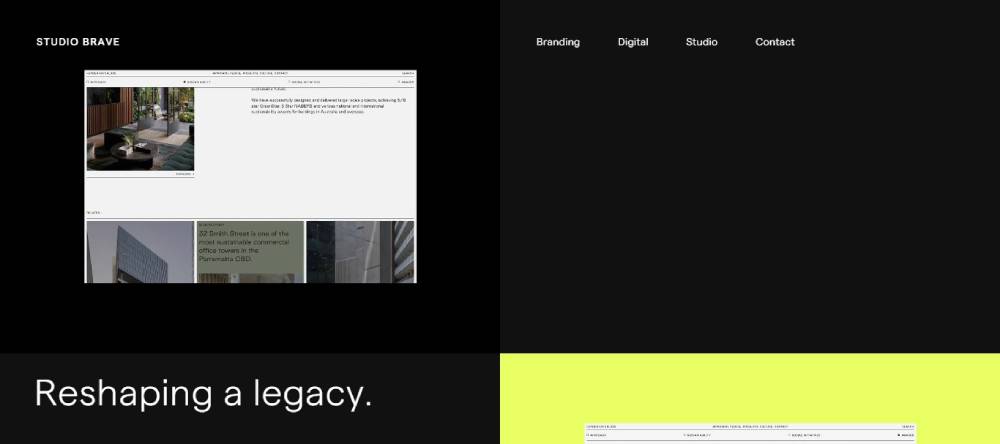
Studio Brave
Studio Brave, based in Melbourne, builds influential brands through strategic branding and design. With over 16 years of experience, they transform businesses by combining passion with purpose. Their projects span various sectors, reshaping legacies, creating cultural hubs, and reimagining opera for everyone.
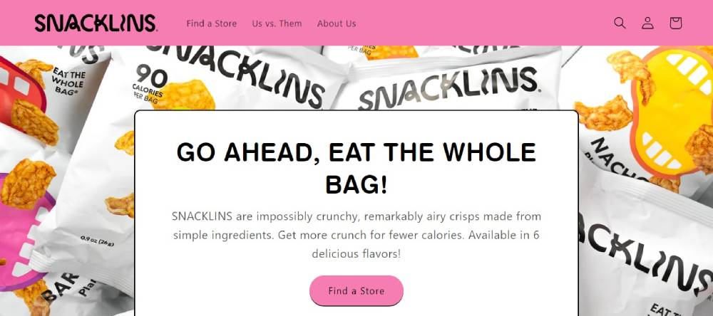
Snacklins
Snacklins offers impossibly crunchy and remarkably airy crisps made from simple ingredients. Available in six delicious flavors, including Sea Salt & Vinegar and Barbeque, Snacklins provides more crunch for fewer calories. Their snacks are perfect for guilt-free indulgence, encouraging you to eat the whole bag.
Kati Forner
Kati Forner Studio is a full-service branding and design studio based in Los Angeles. They create elevated brands through identity, strategy, and creative design. Their projects include collaborations with brands like Soundmint, CauseMedic, and Edge of Ember, reflecting their expertise in bringing brands to life with a distinct visual identity.
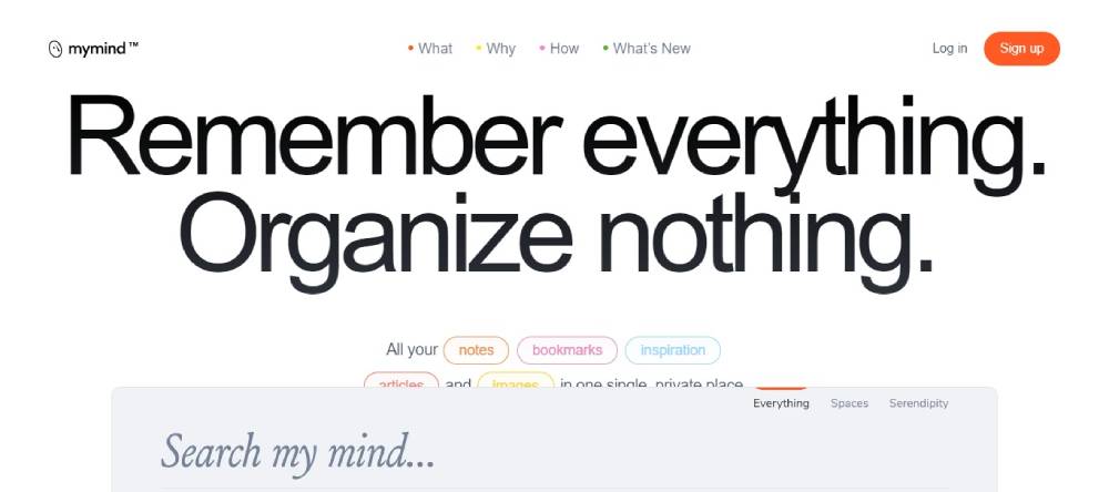
MyMind
MyMind is a private space for saving notes, images, quotes, and highlights, enhanced with AI for effortless organization. It eliminates the need for filing or tagging, offering a seamless way to remember everything. MyMind provides a personal, distraction-free environment for capturing and recalling important information.
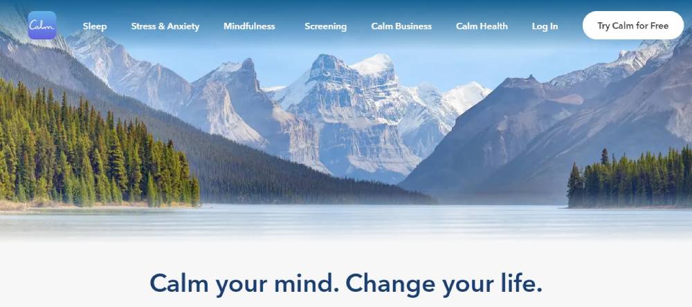
Calm
Access to the page was denied. If you encounter issues, report it at WebPilot's support. Calm is known for its meditation and relaxation app, offering a range of resources to help users manage stress, improve sleep, and enhance overall well-being through mindfulness practices and guided meditations.
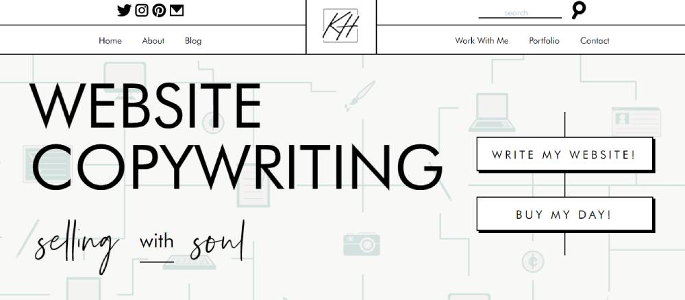
Kayla Hollatz
Kayla Hollatz is a Minneapolis-based website copywriter and brand strategist. She specializes in creating impactful stories and conversion-focused strategies for creative entrepreneurs and small businesses. Kayla's services include website copywriting, blog content creation, and email marketing, all designed to enhance brand voice and drive results.
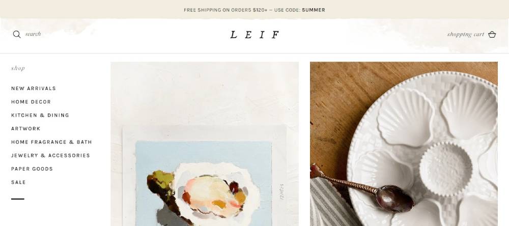
LEIF
Leif offers a curated selection of home goods, personal care items, and lifestyle products that blend aesthetics with functionality. Their collections are designed to bring beauty and comfort into everyday life, featuring unique and artisanal pieces that reflect a sense of style and well-being.
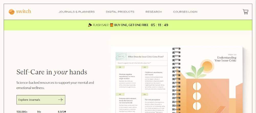
Switch
Switch Research provides resources and tools to support mental health and personal development. Their platform offers evidence-based programs, courses, and content designed to help individuals improve their well-being, manage stress, and build resilience through practical and accessible strategies.
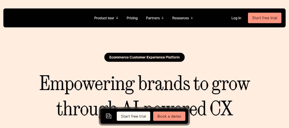
Gorgias
Gorgias is a customer support platform that integrates with e-commerce stores to provide seamless and efficient customer service. With features like automated responses, multi-channel support, and detailed analytics, Gorgias helps businesses enhance customer satisfaction and streamline support operations.
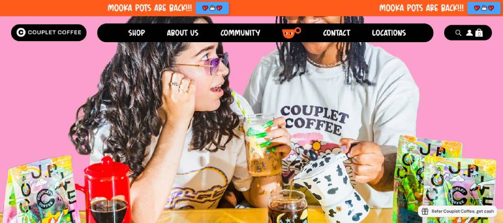
Couplet Coffee
Couplet Coffee makes specialty coffee approachable and fun, with an emphasis on inclusivity. Their coffee beans come from family-run farms, offering blends like The Blissful Blend and Single Origin Peaceful Peru. Couplet also offers merchandise and brewing equipment, aiming to make great coffee accessible to everyone, free from pretentiousness.
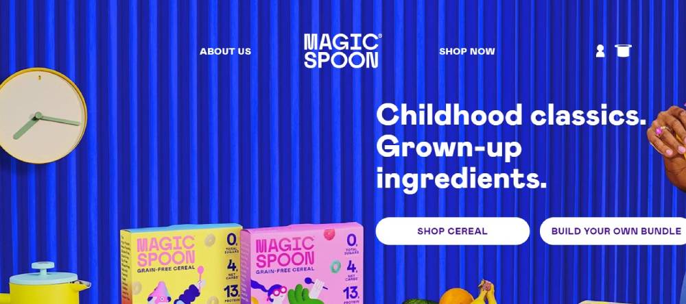
Magic Spoon
Magic Spoon offers high-protein, low-carb cereals that cater to health-conscious consumers. With nostalgic flavors and a commitment to quality ingredients, Magic Spoon cereals are a guilt-free indulgence. Their products are designed to provide a nutritious and satisfying breakfast option without sacrificing taste.
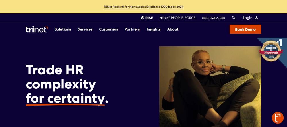
Zenefits
Zenefits simplifies HR for small and medium-sized businesses with an integrated platform for managing benefits, payroll, and compliance. Their user-friendly software helps businesses streamline administrative tasks, ensuring compliance and enhancing employee experience. Zenefits aims to make HR processes more efficient and accessible.
FAQ On Aesthetic Website Design
What makes a website design aesthetic?
Aesthetic website design is about harmony. It combines color palettes, balanced layouts, and typography trends to create visual appeal.
It’s not only beauty but also functionality; smooth user interface design and interactive features contribute to an engaging user experience.
How important is color theory in web design?
Color theory is pivotal; it influences mood and user actions. It helps in creating contrast and drawing attention to key elements. By understanding color palettes and their psychological impact, designers can craft visually compelling and responsive web designs.
What are some popular trends in web design today?
Current trends include minimalist website templates, CSS animations, and parallax scrolling sites.
Modern web design leans towards simplicity and clean visual hierarchy to ensure both elegance and clarity. Using a grid system layout enhances this structured approach.
How can I make my website look more professional?
Professional website aesthetics are achieved through clean design, effective web architecture, and a user-friendly layout.
Utilizing typography trends, consistent color palettes, and intuitive navigation design are key. Tailored website mockup can help preview and refine your site’s professionalism.
What are the best tools for web design?
Top tools include Sketch and Figma for designing and prototyping. Google Fonts and Typekit offer extensive font libraries. CSS frameworks like Bootstrap and Tailwind CSS simplify styling. These tools ensure a seamless web development process.
What is the role of typography in website aesthetics?
Typography trends significantly impact readability and user engagement. The right font styles create mood and hierarchy. Consistency in font family and sizes, paired with ample white space, ensures text remains legible and enhances overall design aesthetics.
How do I improve the user experience on my website?
Enhance user experience by focusing on responsive design, clear navigation design, and fast page load speed.
Integrate interactive features like hover effects and modal windows. Tools like Google PageSpeed Insights and Hotjar can help optimize user interaction.
What are some inspiring examples of aesthetic website design?
Check platforms like Behance, Awwwards, and Dribbble for creative site layouts and web design portfolios.
These sources showcase beautiful web pages and can spark ideas for your professional website aesthetics. Look for your niche-specific web design principles.
How do I choose the right color palette for my website?
To choose the right color palette, consider your brand’s persona. Tools like Adobe Color can help. Colors should align with your site's purpose—clean web designs benefit from subtle tones, while bold sites may go for vivid, contrasting hues. Always test for visual appeal.
What are key principles behind visually appealing websites?
Successful visually aesthetic websites follow principles of visual hierarchy, alignment, and contrast. Balancing white space and content density ensures clarity.
Consistency in design elements like icons, color palettes, and typography helps create a cohesive and engaging visual experience.
Conclusion
Endless possibilities lie within the realm of aesthetic website design examples. These visual masterpieces are not merely about appearances; they’re built on a foundation of functional artistry. Each intricate detail, from responsive design to the use of typography trends and color theory, serves a purpose.
Exploring examples from platforms like Behance and Awwwards, you can unearth techniques that seamlessly integrate user experience with clean web designs. Crafting an elegant, responsive site relies on principles of visual hierarchy, interactive features, and creative site layouts. The journey doesn’t end with beauty; it converges with optimal performance tools and web development best practices.
Absorb the elements of web design portfolios, embrace the potential of color palettes, and understand the power of typography. These components collectively create a digital landscape that is not only visually stunning but deeply engaging. Elevate your approach; transform the mundane into the extraordinary with insights from the most inspiring and elegant website themes.
If you enjoyed reading this article on aesthetic website design, you should check out these articles also:

