

Stunning Writer Website Design Examples to Copy
September 4, 2025
Conference Website Design Examples That Impress
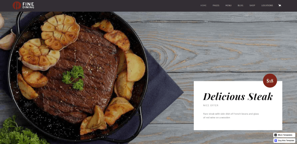
September 6, 2025A restaurant can serve the best food in town and still lose customers to a competitor with a better website.
Harsh? Maybe. But these food website design examples from brands like Sweetgreen, Milk Bar, and Eleven Madison Park prove that digital presence directly impacts reservations and orders.
Your website is often the first taste customers get of your brand.
This guide breaks down what actually works in culinary web design. You'll see real restaurant website templates, menu page layouts, and online ordering interfaces that convert hungry browsers into paying customers.
From fine dining to food delivery platforms, these examples show how high-quality food photography, intuitive navigation, and mobile-first design come together to drive results.
What is Food Website Design
Food website design is the practice of creating web interfaces for restaurants, cafes, bakeries, food blogs, and culinary brands.
This design category covers menu page layouts, reservation system integration, online ordering interfaces, and food photography display.
The goal is converting hungry browsers into paying customers through appetizing visuals and smooth user experience.
Whether you run a fine dining establishment or a quick service restaurant, your digital presence shapes first impressions before anyone tastes your food.
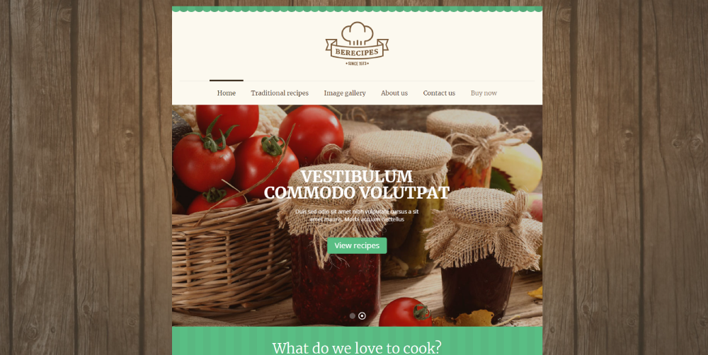
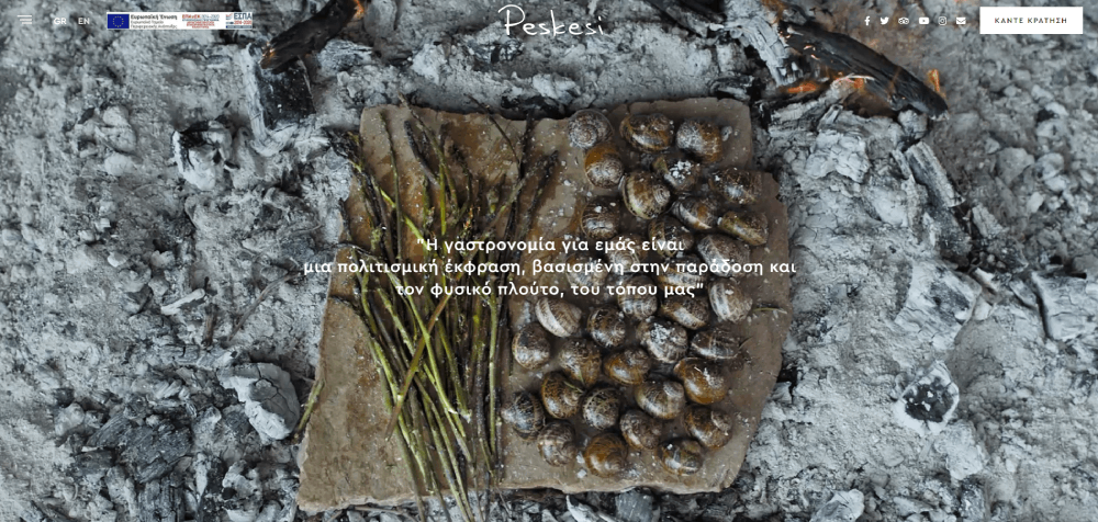
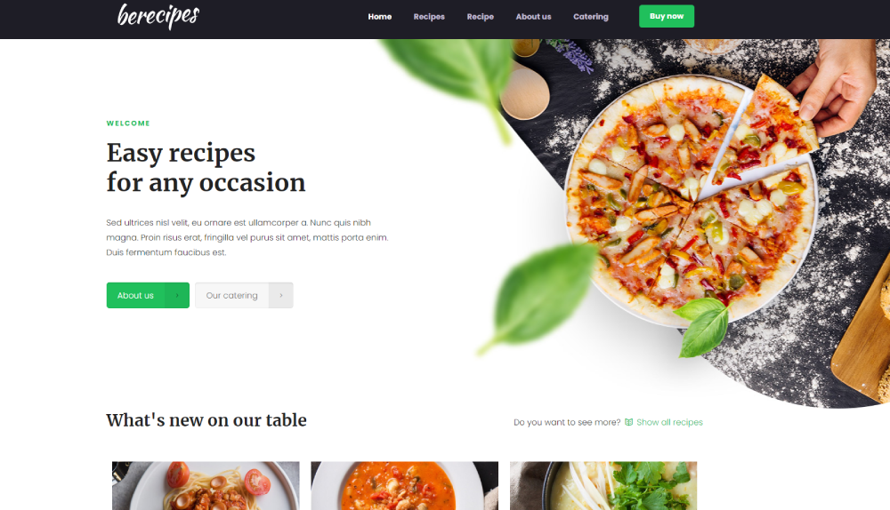
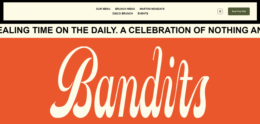
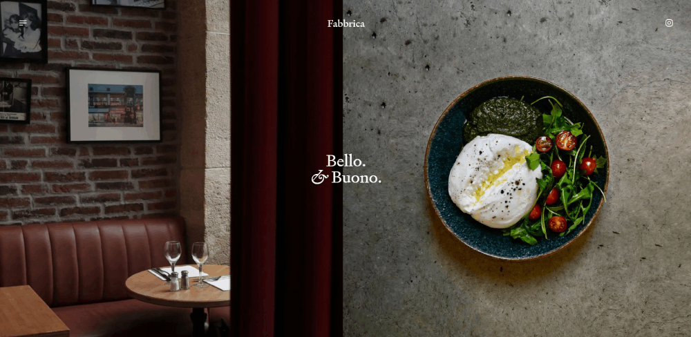
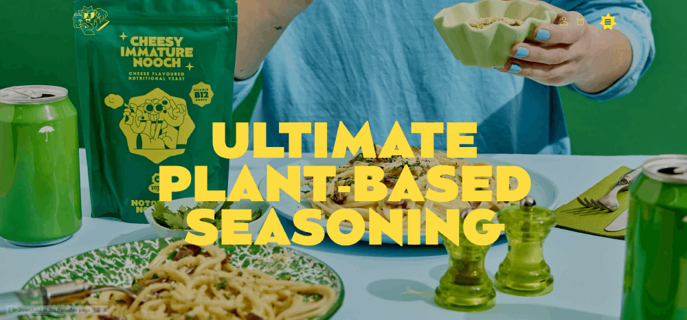
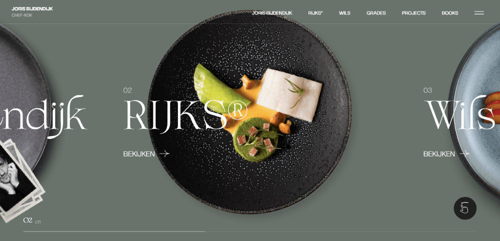
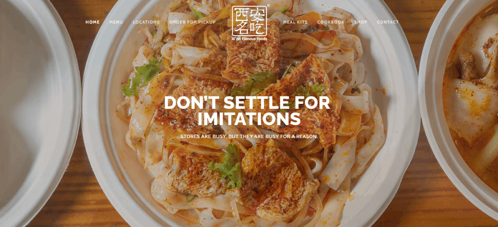
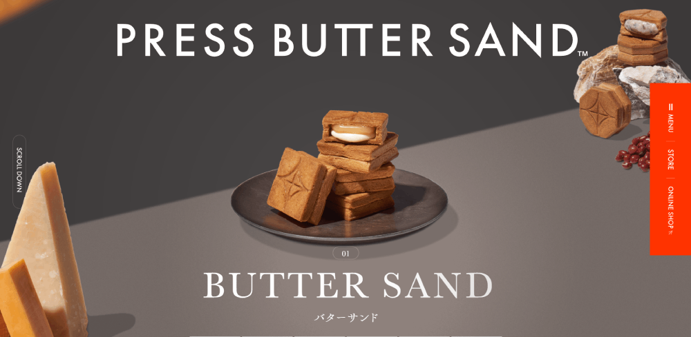
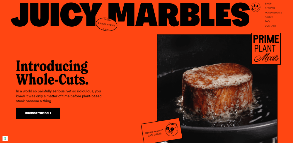
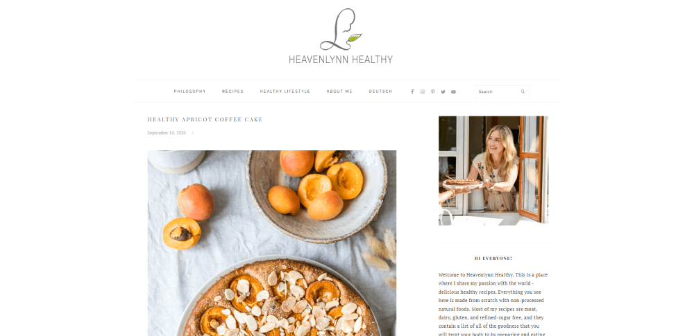
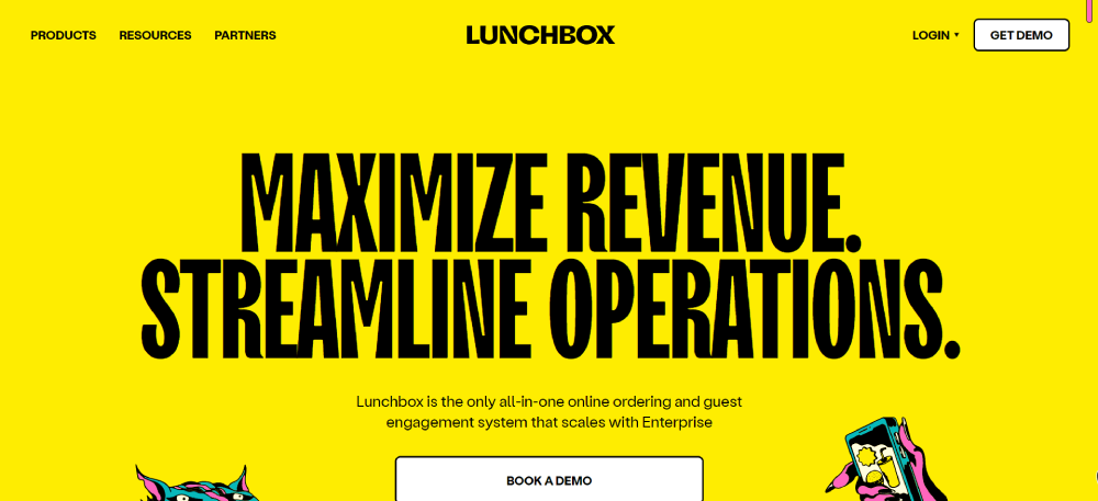
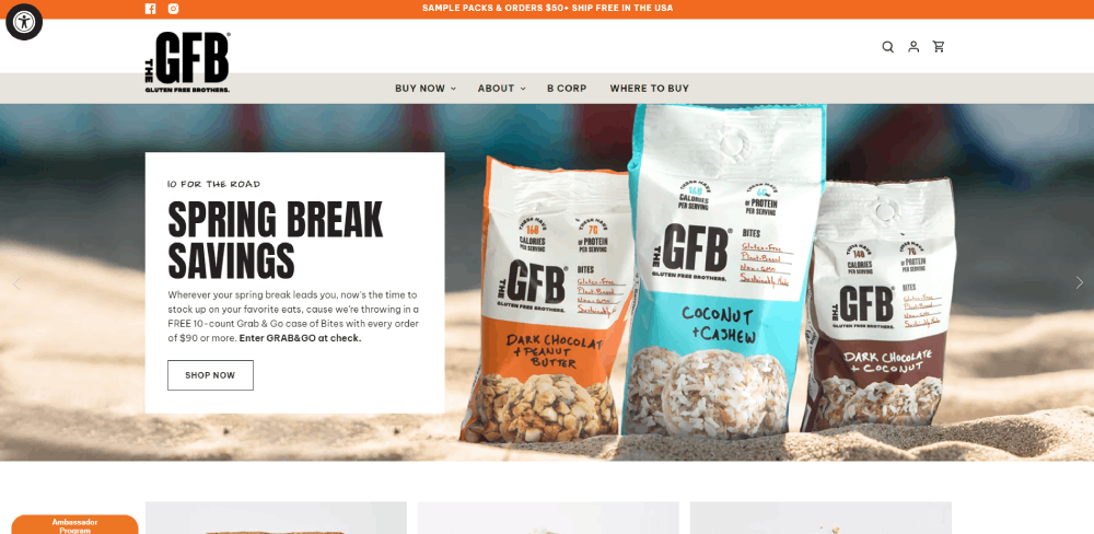
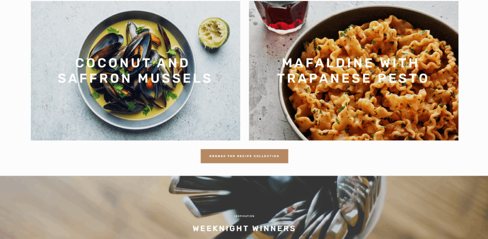
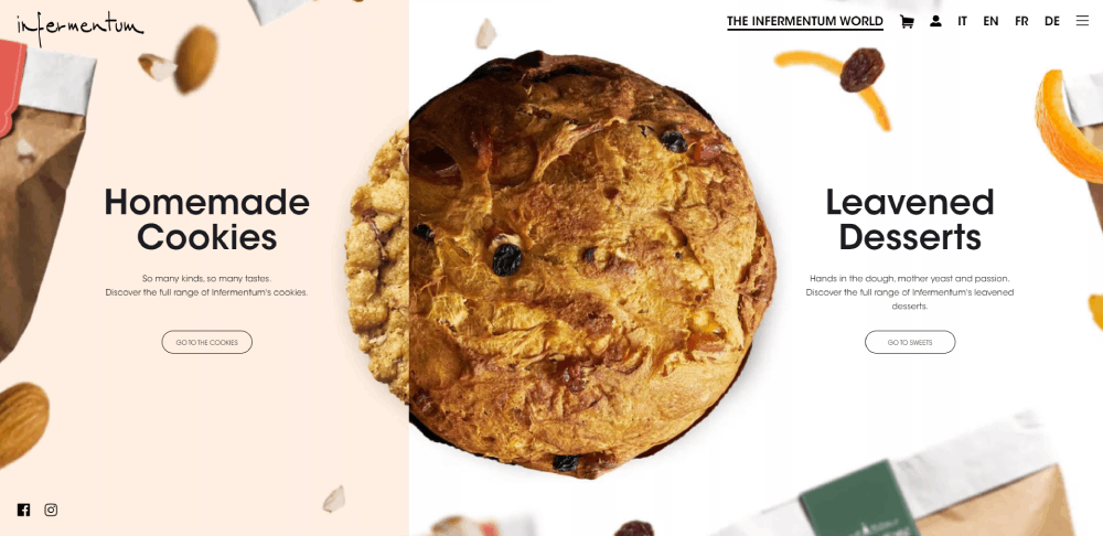
Food Website Design Examples
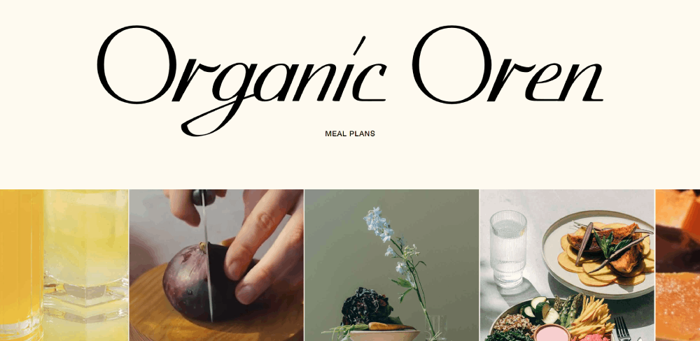
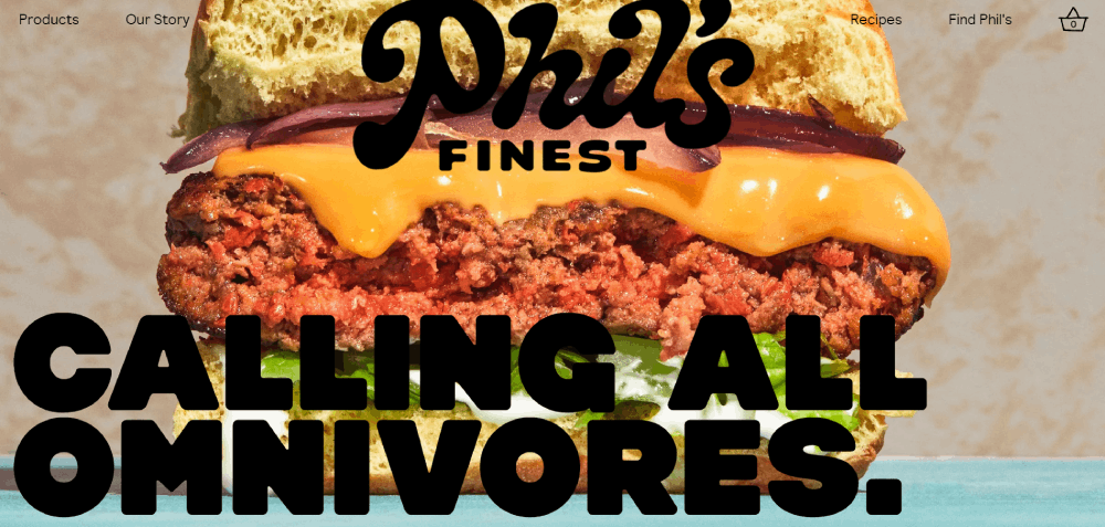
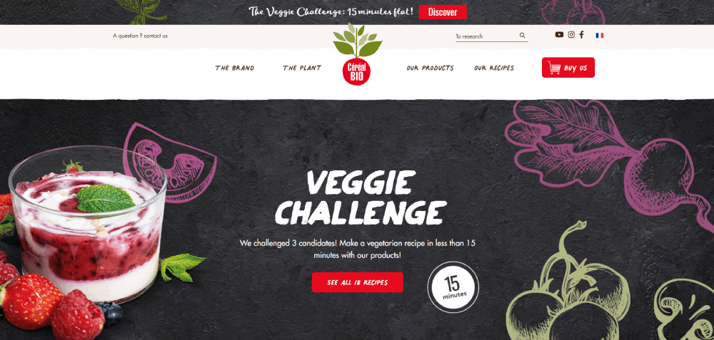
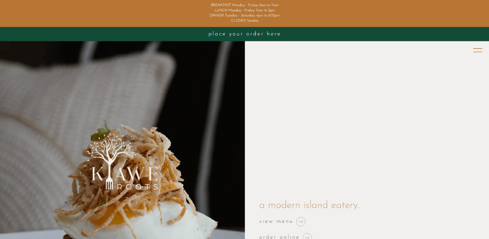
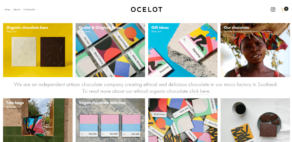
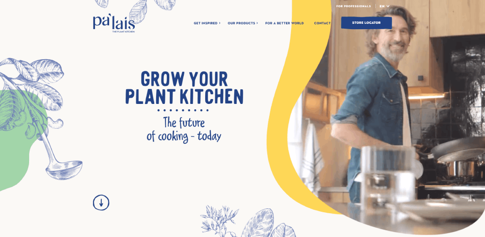
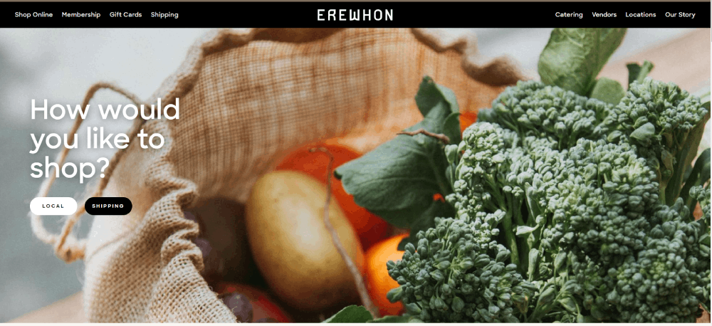
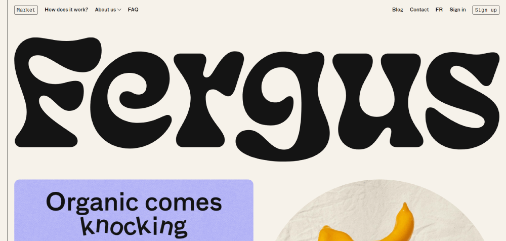
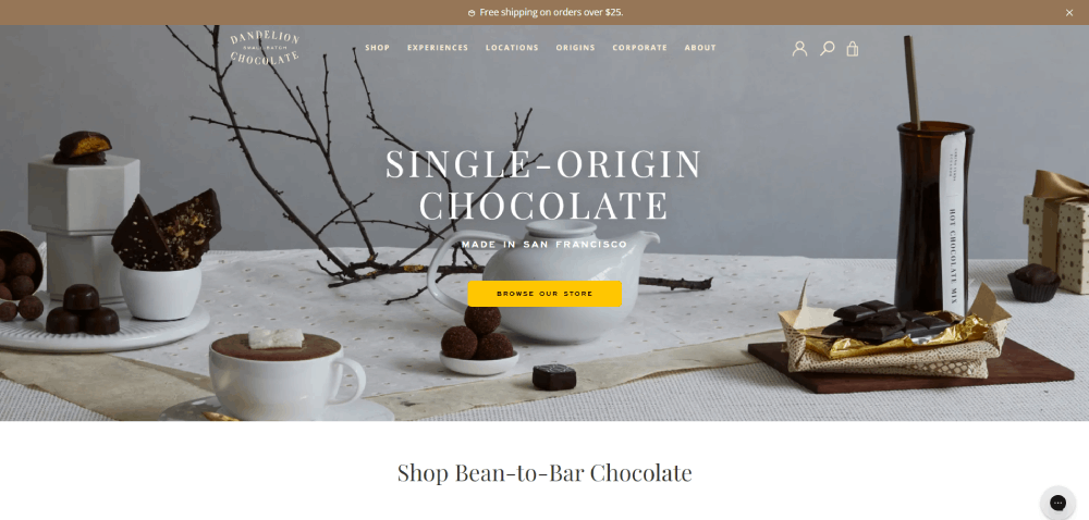
Organic Oren

How Does Food Website Design Differ from Standard Web Design
Standard web design prioritizes information delivery. Food website design prioritizes appetite stimulation.
Every layout decision serves one purpose: making visitors hungry enough to take action.
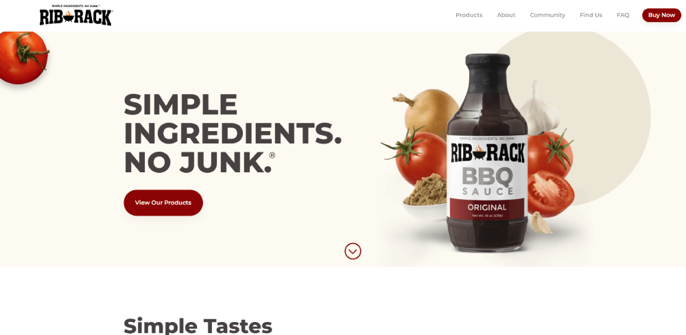
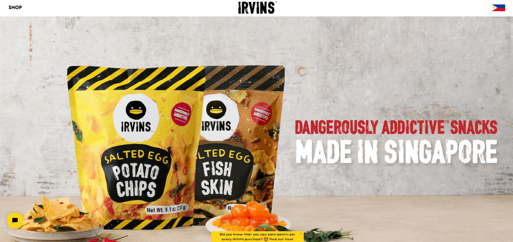
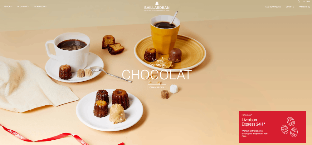
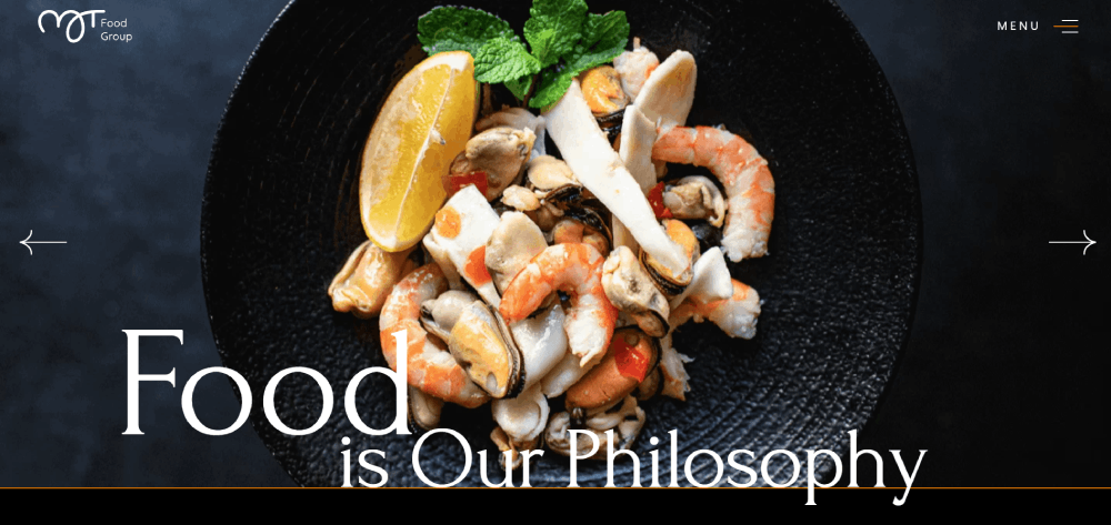
Visual-First Approach with Food Photography
High-quality food imagery dominates the hero section.
Unlike technology websites or SaaS websites where text leads, culinary sites let photos do the selling.
Conversion Paths Unique to Food
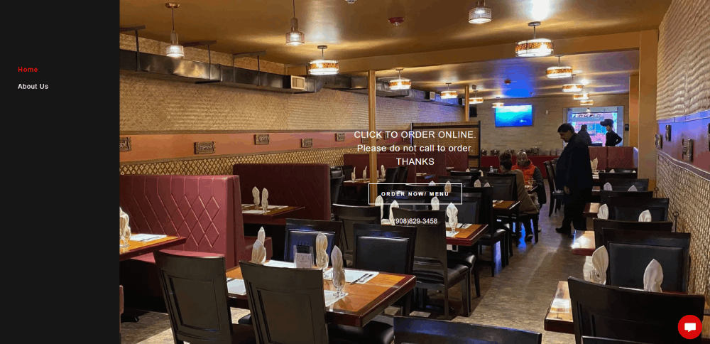
Restaurant websites need OpenTable or Resy integration, not lead forms.
Food delivery platforms require DoorDash and Uber Eats connectivity, not email signups.
The call to action buttons say "Reserve a Table" or "Order Now," never "Learn More."
Mobile-First Requirements
Over 70% of restaurant searches happen on phones.
Someone standing on the sidewalk, looking for dinner nearby. Your mobile first design either captures them or loses them to the next listing.
Location-Based Functionality
Google Business Profile integration is non-negotiable.
Maps, directions, hours, phone numbers. All visible without scrolling.
Menu Presentation Formats
PDF menus are dead. They don't work on mobile, can't be indexed by search engines, and frustrate users.
Card-based digital menu presentation with category tabs, dietary filters, and scannable price alignment works better.
What Makes a Food Website Design Effective
Effective culinary website design balances aesthetics with functionality.
Pretty pictures mean nothing if nobody can find the reservation button.
High-Quality Food Photography
Professional shots with proper lighting, styling, and composition.
Smartphone photos scream amateur hour. Invest in a food photographer or learn the craft yourself.
Images should load fast despite their quality. Compress without losing appetite appeal.
Clear Navigation and Menu Structure
Good website navigation examples show sticky headers with three to five main options maximum.
Menu, About, Locations, Order, Contact. That's it.
The website menu structure should mirror how people actually think about your business.
Mobile Responsiveness
Responsive websites adapt to every screen size without breaking layouts or hiding key information.
Test on actual devices. Emulators lie.
Fast Page Load Times
Google PageSpeed Insights and GTmetrix are your friends here.
Every second of delay costs conversions. Food sites are image-heavy, which makes optimization tricky but critical.
Reservation and Ordering Integration
OpenTable, Resy, Toast POS, Square Online. Pick one that fits your operation.
The booking flow should take three taps maximum from homepage to confirmation.
Brand Consistency
Your color scheme should match your physical space.
Fine dining? Darker palettes with gold accents. Cafe websites lean warmer, more casual.
Typography choices matter too. Script fonts for elegance, sans-serif for modern fast-casual vibes.
What Color Schemes Work Best for Food Websites
Color theory plays a bigger role in food design than most other industries.
Wrong colors kill appetite. Right colors trigger cravings.
Warm Colors for Appetite Stimulation
Red, orange, yellow. These stimulate hunger on a psychological level.
There's a reason fast food brands use these almost exclusively. Check orange color palettes and yellow color palettes for inspiration.
Neutral Backgrounds for Photography
White, cream, soft gray.
Let the food be the hero. Backgrounds should support, not compete.
Brand-Specific Palette Choices
Health-focused brands lean green. Bakery websites often use warm browns and creams.
Pizza websites favor red and Italian flag colors. Ice cream websites go pastel.
For upscale establishments, a luxury color palette with deep burgundy or navy builds sophistication.
How to Structure a Restaurant Menu Page
The menu page layout is where most restaurant websites fail.
Too much information crammed into too little space. Or worse, a PDF that nobody can read on mobile.
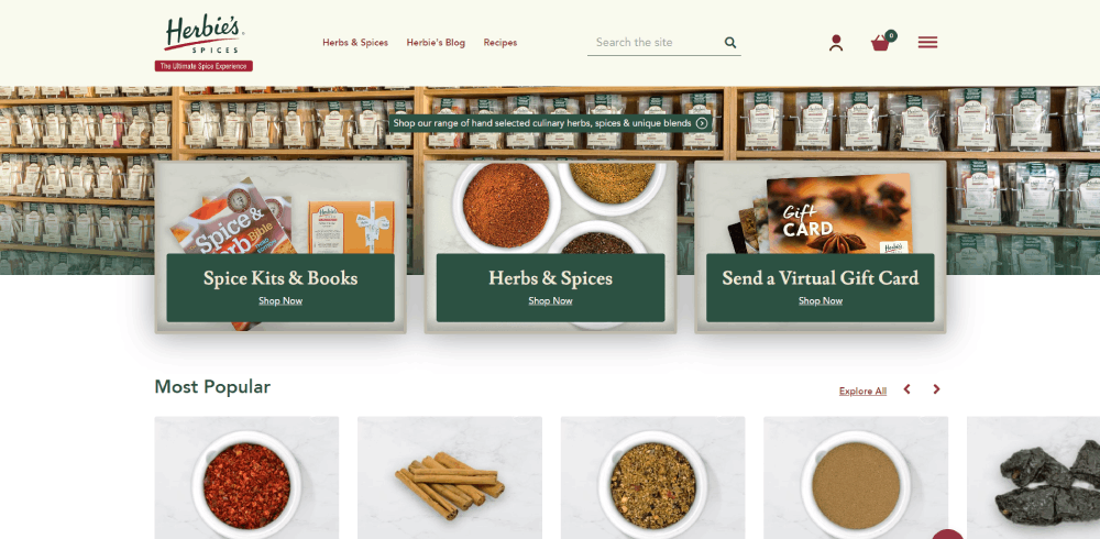
Card-Based Layouts
Each dish gets its own card with photo, name, price, and description.
Scannable blocks beat long scrolling lists every time. Similar approach works for product websites too.
Category Navigation
Tabs for appetizers, mains, desserts, drinks.
Sticky header keeps categories visible while scrolling through items.
Price Alignment and Typography
Right-aligned prices in a clean column. Dollar signs optional but consistency mandatory.
Good typography means readable font sizes, proper line spacing, and contrast that works in dim restaurant lighting.
Dietary Information Display
Icons for vegetarian, vegan, gluten-free, nut allergies.
Filter options let customers narrow down choices instantly. Don't make them hunt through descriptions.
What Reservation Systems Integrate with Food Websites
Reservation system integration separates professional restaurant sites from amateur ones.
The booking experience should feel native, not like a clunky third-party redirect.
OpenTable Integration
Industry standard for fine dining and upscale casual.
Widget embeds directly into your site. Customers book without leaving your domain.
Resy Integration
Preferred by trendy, high-demand restaurants.
Cleaner interface than OpenTable. Better mobile experience for younger demographics.
Custom Booking Solutions
Toast POS and Square Online offer built-in reservation features.
Less brand recognition but more control over the experience and customer data.
Third-Party Widget Options
Yelp reservations, Google Reserve, Facebook booking.
Multiple touchpoints mean more chances to fill tables. Just keep the primary CTA on your own site.
Common Mistakes in Food Website Design
Seen too many restaurant sites make the same errors.
Avoid these and you're already ahead of most competitors.
Poor Photography Quality
Blurry smartphone shots with bad lighting kill appetite instantly.
Either hire a professional food photographer or learn proper techniques. No middle ground here. The difference shows in conversion rates.
Cluttered Menu Layouts
Everything competing for attention means nothing gets attention.
Refer to web design principles for hierarchy and spacing. Bad design examples show exactly what to avoid.
Missing Mobile Optimization
Desktop-first thinking in a mobile-first world.
Test your site on actual phones. Walk around your neighborhood trying to order from your own website. You'll find the problems fast.
Slow Loading Times
Beautiful images mean nothing if they take eight seconds to load.
Compress everything. Use modern formats like WebP. Lazy load below-fold content.
Hidden Contact Information
Address, phone number, hours. These should be visible on every page.
Footer at minimum. Website footer design matters more than most people realize for restaurants.
How Much Does a Food Website Cost
Website cost varies wildly based on approach and requirements.
Budget accordingly for your situation.
Template-Based Solutions
- Squarespace: $16-49/month
- Wix: $17-35/month
- WordPress hosting + theme: $10-30/month plus $50-200 one-time theme cost
Total first-year investment: $200-800 for DIY approach.
Custom Design Projects
- Freelance designer: $2,000-10,000
- Web design agencies: $5,000-25,000+
- BentoBox managed service: $99-249/month
Quality correlates with price, but not always linearly. Review portfolios before committing.
Ongoing Maintenance Costs
- Hosting: $10-50/month
- Domain renewal: $10-20/year
- SSL certificates: Often free with hosting
- Updates and security: $50-200/month if outsourced
Photography updates, menu changes, seasonal content. Budget for ongoing work, not just launch.
Track performance with Google Analytics. Know what's working and what needs adjustment.
FAQ on Food Website Design
What makes a good food website design?
A good food website design combines high-quality food photography, clear navigation, fast page load times, and mobile responsiveness. The layout should guide visitors toward booking reservations or placing orders within three clicks maximum.
Which platform is best for restaurant websites?
BentoBox is purpose-built for restaurants with built-in reservations and ordering. Squarespace and Wix work well for smaller budgets. WordPress offers maximum flexibility but requires more technical knowledge to maintain properly.
How much does a restaurant website cost?
Template-based solutions cost $200-800 annually. Custom designs from freelancers run $2,000-10,000. Web design agencies charge $5,000-25,000+ depending on complexity. BentoBox managed service costs $99-249 monthly with everything included.
What colors work best for food websites?
Warm colors like red, orange, and yellow stimulate appetite psychologically. Neutral backgrounds (white, cream, gray) let food photography shine. Health-focused brands use green palettes while bakeries favor warm browns and creams.
Should restaurant menus be PDF or HTML?
HTML menus always. PDFs don't work on mobile, can't be indexed by Google, and frustrate users. Card-based digital menus with category tabs, dietary filters, and scannable pricing convert better and rank higher.
How do I add online ordering to my restaurant website?
Integrate Toast POS, Square Online, or ChowNow for direct orders. Connect DoorDash, Uber Eats, or Grubhub for third-party delivery. BentoBox and Wix include native ordering features. Keep the checkout under three taps.
What reservation system should I use?
OpenTable is the industry standard for fine dining. Resy appeals to trendy, high-demand restaurants with cleaner mobile experience. Toast and Square offer built-in booking for those wanting more control over customer data.
How important is mobile optimization for food websites?
Critical. Over 70% of restaurant searches happen on phones. Someone standing on a sidewalk looking for dinner decides in seconds. Your mobile experience either captures that customer or loses them to competitors.
What pages should a restaurant website include?
Homepage with hero image, Menu page with digital layout, About page with story and team, Locations with maps and hours, Contact with phone and email, and Reservations or Order page prominently featured.
How do I make my food photography look professional?
Use natural lighting or proper studio setup. Style dishes with garnishes and complementary props. Shoot from multiple angles (overhead for flat dishes, 45-degree for height). Hire a food photographer if budget allows. Compress images for web without losing quality.
Conclusion
These food website design examples prove that digital presence directly impacts your bottom line.
Whether you're building a fine dining site with Resy integration or a fast casual page connected to DoorDash, the fundamentals stay the same.
Prioritize appetizing photography. Keep menu page layouts scannable. Make reservation systems and online ordering interfaces impossible to miss.
Mobile responsive design isn't optional when most customers search on phones.
Start with platforms like Squarespace, Wix, or BentoBox if coding isn't your strength. Invest in professional food imagery before fancy animations.
Test your site on real devices. Watch where visitors actually click using Google Analytics.
Your restaurant website should make people hungry, then immediately show them how to satisfy that hunger. Everything else is secondary.


