

Google Chrome plugins and extensions for designers
October 13, 2023
The Best Web Design Books You Should Buy
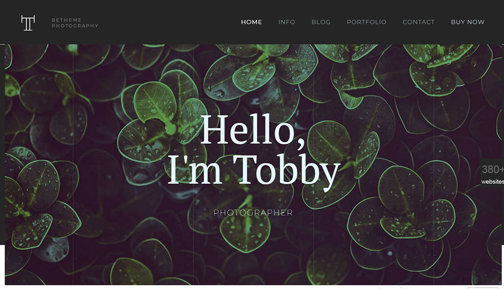
October 15, 2023It’s not easy to create photographer websites. It differs greatly from the usual organization or user websites. Normal websites tend to have a consistent layout built of a header, navigation menu, occasionally a sidebar, and a footer.
However, when it comes to photography portfolios, the limit does not exist. If you don’t want a header, footer, or navigation bar, then don’t include it. You’ll gain plenty of attention if you’re creative without straying away from your site’s main goal.
When someone from an organization or an art director visits your website, they’ll want to instantly find out what your strengths are. For example, they’re searching for someone who’s best at portraits, not a general photographer who shoots the occasional portrait alongside shots of architecture, sport, food, and reportage. Users need to be instantly aware of your selling points upon entering your site.
Attempting to be everything to everyone will get you nowhere for several reasons. Your specialty gets watered down, therefore users won’t be able to tell what you’re good at.
After figuring out your specialty, describe it in a way that’s easily understood by all. There are plenty of well-understood terms and skill sets regarding genres such as architecture, food, product, reportage, lifestyle, and portraiture.
You need to showcase work that will get your specialty across to your users. Lifestyle photography websites, for example, should feature an outstanding lifestyle image as their first image seen by visitors.
If corporate lifestyle is your sub-specialty, make sure your galleries make that clear. SEO and client understanding will benefit from the phrase “lifestyle photographer” being used in your About page and page titles. Naming your gallery “lifestyle” is a must.
Build an Appealing Homepage That Isn’t Extravagant
Homepages usually generate the most traffic and they act as a first impression of your online personality. Steer clear of overusing flashy effects or pages that are too crowded. Your photos need to be smacked down in the middle. Avoid anything that draws attention away from them.
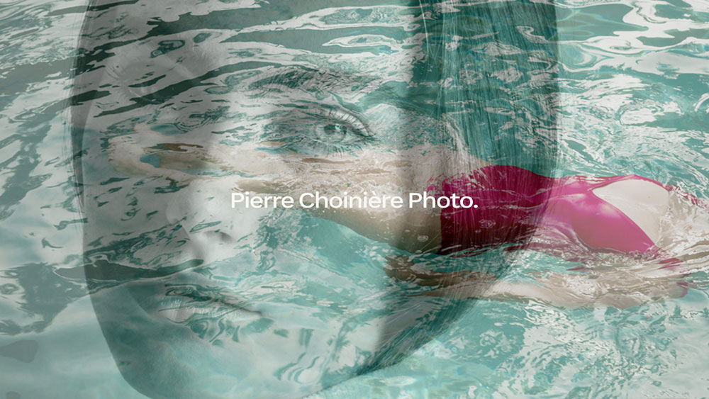
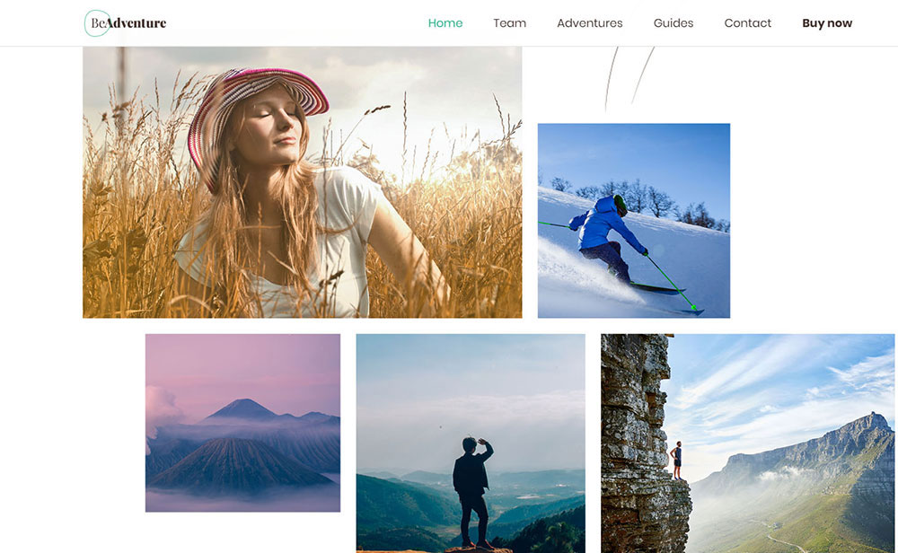
Check out James Ridle‘s homepage. There’s no scrollbar or any kind of actual content except for navigation links to inner pages and a large image.
This photographer website has a clean but vibrant logo. It contrasts wonderfully with the background and is captivating. There’s nothing flashy on this website, but the experience is similar.
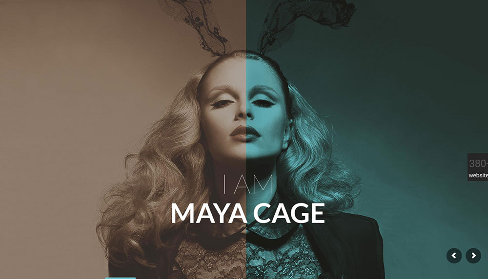
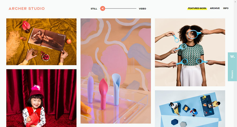
Sam Docker‘s online photography portfolio is a more dynamic example as it consists of a full-screen image slideshow.
The website’s logo is front-and-center, with the size adapting to the browser window. This impressive photography website offers a usable and modern experience.
As you scroll down, content is loaded by navigation links via Ajax. The horizontal layout flows naturally, with everything being easily accessible.
What makes these examples interesting is that they captivate your attention without relying on patterns or specialized graphics. It should be enough to clue in visitors as to what they should do with the combination of a recognizable brand and good images.
Minimal photography websites usually consist of one main background color (white is usually the best choice for photography websites) and one, maybe two accent colors. Use small color patches to guide the attention of users towards the page’s important parts.
Keeps thing simple as too many color splashes will clutter your page. The fewer elements your page has, the more important color usage becomes. What color palette you use and how much you use it will make or break your photography site
Clear Navigation
Keeping things simple will help you put the most important things first, and users will have a more pleasant browsing experience.
Learn how to thoughtfully narrow down the choices your visitors have and guide them through your website, keep your graphics and navigation as simple as possible, and only emphasize your page’s most important parts.
Think of any form of navigation:
- clear calls-to-action (what’s the next spot that should be visited?)
- fast navigation between photos (keyboard controls and left/right arrows)
- browsing in and out of galleries with speed
- contact information that can be quickly accessed
- accessing the site’s important areas in no more than 2 clicks
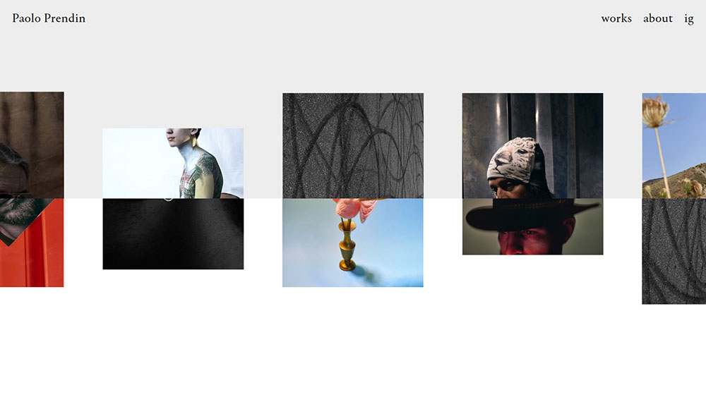
Your specialty needs to be clearly conveyed through your galleries. Part of this is describing your work with accurate and helpful gallery titles.
Vague gallery names such as “places,” “people” and “things” should be avoided. Users aren’t searching for a “places” or “things” photographer; they’re searching for anarchitectural or product photographer.
Make a single specialty the focal point of your galleries and limit image quantity to 30 per gallery. Their names should clearly indicate what will be found when you open them. Vague names such as “gallery one,” “projects” or “featured” are out of the question. Users won’t know to expect and their main question will be unanswered, and that is, “What is this photographer best at?”
Acknowledge Your Target Demographic
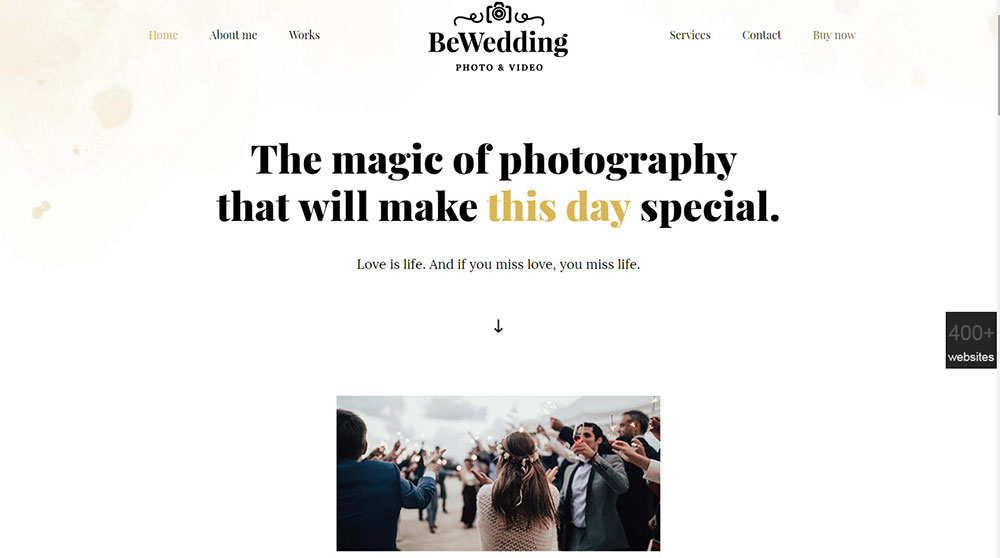
Your target demographic needs to be reflected by your portfolio, be that agencies in search of commercial shoots, or couples in search of wedding shoots.
Weddings tend to have a lot of white in them mixed with a lot of sunshine and lovely flowers. Therefore, your portfolio needs to remind people of a wedding. Think of wedding photographer websites that tend to be clean, white, and user-friendly.
If you take photographs of families and children and families, include some kid-friendly elements. Users should be reminded of your target subject or event when visiting your website.
The best photographer websites emphasize location, so don’t forget to include the area where you live or are able to provide services.
You can infuse your website with your personality through glimpses of your life and natural language. The best place for creativity is your About page.
A great About page will provide a quick summary of what you specialize in and where you shoot, and will then make it clear why you should be hired. Good examples will give glimpses of your personality without being too sentimental or wordy. Headshots are also a must!
Music and portrait photographer Zack Arias uses his About page to approach things head-first, answering the “can you trust me?” question in an informative yet entertaining way while summarizing his achievements and personality. The first two paragraphs include crucial details such as a long client list.
Another way of adding allure to your website and making it interesting is to begin posting brief photography-related articles.
Blogs benefit SEOs in a massive way, but what’s more important is that they help visitors form a personal connection with you.
Publishing new articles on a frequent basis along with snippets of your newest photography projects will help gain your visitors’ trust and ensure that they regularly return to check for updates. Google will follow their lead.
Simplified Typography
You can no longer ignore the growing importance of mobile browsing. In fact, Google ranks sites based on their mobile-friendliness. This is even more important for photographer websites as a higher level of user interaction is required (for buying photos, changing slideshow images etc.). The best photography websites deal with this successfully by resizing content and images as required.
Watermarking Isn’t A Worry
You don’t need to secure your copyright through watermarks. If your image is used without your permission, proof that you took that image is all you need to sue for damages. It is not your burden to inform thieves of copyright laws.
But what if legitimate users want to use your images to track you down?
A great option is to use the IPTC metadata that’s embedded to your image to include your contact details, or you can even use the filename. This allows legitimate users who found your image via external sources such as Google Image Search to get in touch with you about licensing it for use.
The best photographers will regularly update their website with quality content (articles, images) because they have enough success and resources to do so. However, it’s also true that they owe their success to their frequent updates. And maybe to having a good booking app that makes it easier for their prospects to contact them.
Even if you haven’t updated your website for a while (maybe it’s been a long time since your last project), you should be at least rotating some of your homepage content to give your site a fresh look. Why not occasionally place past projects into the spotlight again?
These are some of the most crucial features of the best photographer websites. Try them out and aim to meet the same level of quality for photography website design, which will definitely boost your organization.
FAQ on photographer websites
What's the main purpose of a photographer's website?
Well, you see, a photographer's website is like their digital portfolio. It's where they showcase their best shots, tell their story, and connect with potential clients. Think of it as their online business card. It's essential for attracting new business and letting the world see their unique perspective.
How much does it cost to set up a photography website?
Ah, the golden question! Costs can vary wildly. You've got free platforms, and then there are those fancy custom-built sites that can run into the thousands. But on average? Expect to spend a few hundred bucks to get something professional-looking with all the bells and whistles. Remember, it's an investment in your brand.
Should I go DIY or hire a professional for my site?
Great question! DIY platforms like Wix or Squarespace are user-friendly and can look pretty slick. But if tech isn’t your jam or you want something truly unique, hiring a pro might be the way to go. They can tailor everything to your style and needs. It's all about what you're comfortable with and your budget.
How often should I update my portfolio?
You know, in the world of photographer websites, staying fresh is key. I'd say, whenever you've got some killer new shots or a significant project, get it up there! At a minimum, give it a refresh every few months. Keep it lively and current.
What should I include in my 'About Me' section?
Ah, the "About Me" – it's more than just a bio. It's where you share your passion, your journey, and what makes you, well, you. Talk about your style, your inspirations, and maybe even a quirky fact or two. Let people get to know the person behind the lens.
How do I optimize my site for search engines?
SEO, my friend! Use relevant keywords, like "wedding photographer in [city]" or "editorial photography." Make sure your images have alt tags, and your site is mobile-friendly. And don’t forget about quality content – blogs, articles, anything that adds value and keeps visitors engaged.
Is it essential to have a blog on my photography site?
It's not a must, but man, it can be a game-changer. A blog lets you dive deeper into your shoots, share stories, and offer tips. Plus, it's great for SEO. If you've got the time and love to write, I'd say go for it!
How can I protect my images from being stolen?
Watermarks and low-res uploads are your buddies here. Also, there are plugins and tools that disable right-clicking. But remember, while these methods deter casual downloaders, determined folks can still find ways. So, always keep your original high-res shots safe and sound.
Should I display my pricing on the site?
Ah, the age-old debate. Some photographers swear by it, saying it filters out folks who aren't in their budget. Others prefer to keep it hush-hush until they chat with a potential client. There's no right answer. It's all about what feels right for your business model.
How can I encourage visitors to book me?
Engagement is the name of the game. Use compelling call-to-actions, showcase testimonials, and maybe even offer a special promo for first-timers. Make the booking process smooth and straightforward. And always, always show off your best work. First impressions count!
If you enjoyed reading this article about the best photographer websites, you should read these as well:


