
How to increase the WordPress memory limit
May 24, 2026Finance Website Design Examples to Ignite Your Creativity
May 30, 2026Your agency's website is your most scrutinized pitch deck. Prospective clients arriving with a six-figure branding budget will judge your strategic thinking, visual identity, and credibility within seconds of landing on your homepage.
The best branding agency website design examples do more than showcase a creative portfolio. They convert qualified leads, communicate positioning, and demonstrate the exact brand thinking clients are paying for.
This guide breaks down real examples from agencies like Pentagram, Wolff Olins, Koto, Collins, and Ragged Edge, covering:
- What separates effective agency sites from beautiful ones
- Typography, color, and navigation decisions that signal market positioning
- CMS choices, animation patterns, and Core Web Vitals benchmarks
- Regional design differences across U.S., U.K., and European agencies
What Is Branding Agency Website Design?
Branding agency website design is the practice of building a site that sells the agency itself. Not just displays its work, but actively converts prospective clients who arrive with a specific problem: we need our brand sorted.
That makes the brief fundamentally different from a general portfolio site or a corporate homepage.
A graphic designer's portfolio shows skills. A branding agency website has to show strategic thinking, positioning, and the kind of results that justify a $100K+ engagement. Those are very different jobs.
3 components define every effective branding agency site:
- Brand narrative clarity: a visible point of view, not a list of services
- Portfolio proof: case studies that show process and outcomes, not just finished visuals
- Positioning statement: who the agency serves, and what they do that competitors do not
This separates branding agency website design from what most people call "creative agency portfolio design." The visual identity showcase matters, but it is always in service of a business argument, not artistic expression for its own sake.
92% of people consider well-designed websites more trustworthy, and 75% of users judge a company's credibility based on web design alone (Renderforest, 2025). For an agency selling design services, that bar is existential. A sloppy agency site is not just a missed opportunity. It is a contradiction.
Branding Agency Websites To Check Out
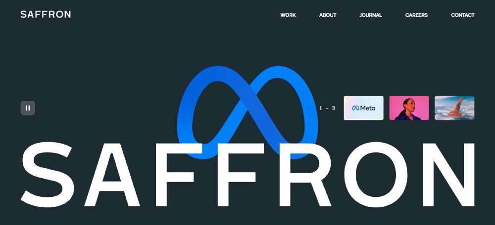
Saffron Brand Consultants
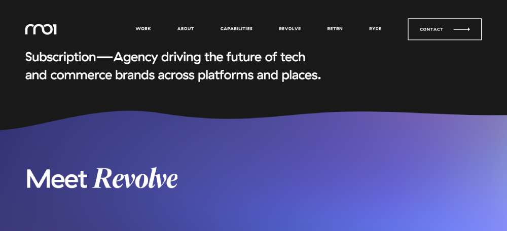
RN01
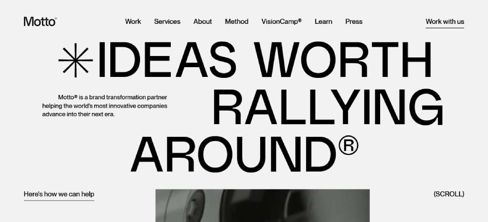
Motto
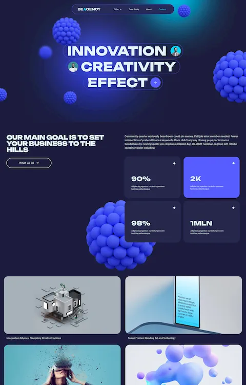
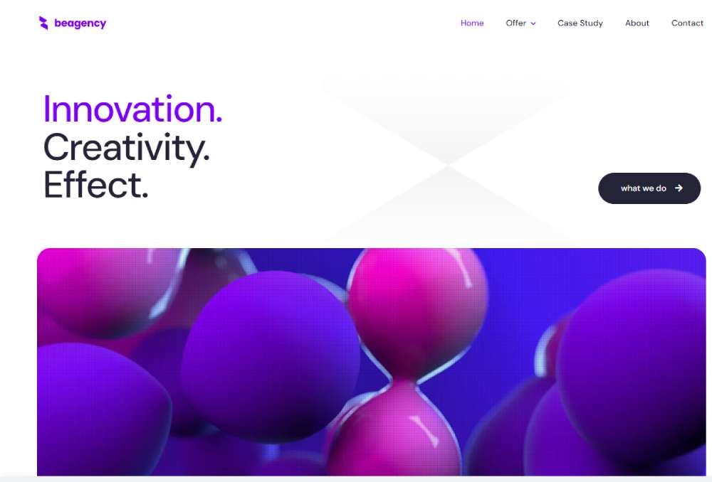
BeAgency8
Our Own Brand
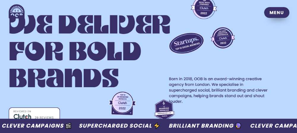
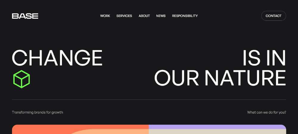
BaseCreate
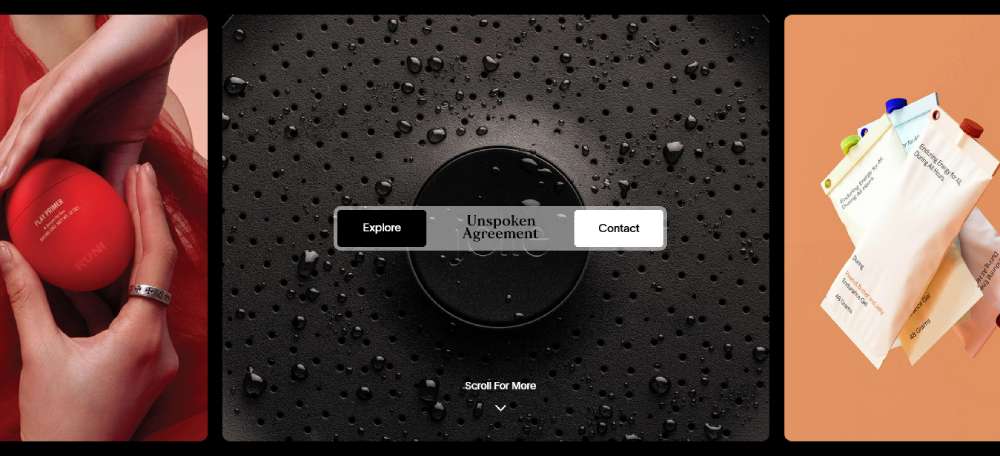
Unspoken Agreement - Branding
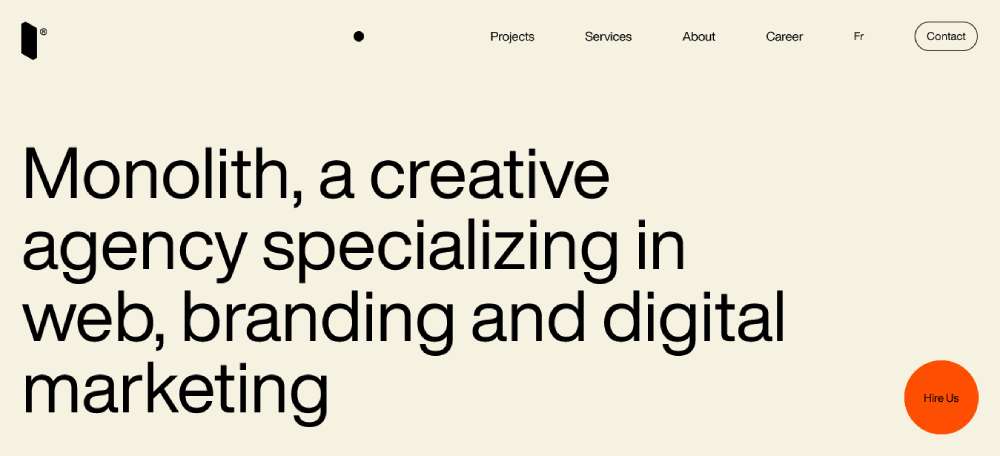
Monolith
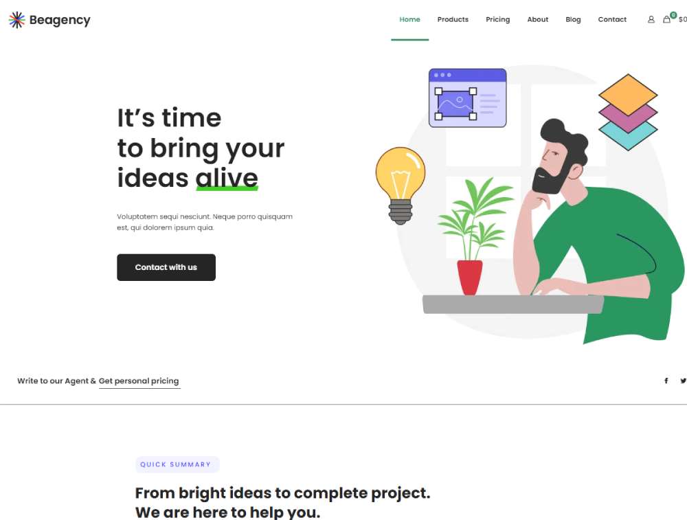
BeAgency7
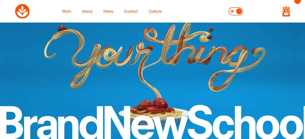
Brand New School
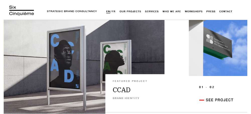
Six Cinquième
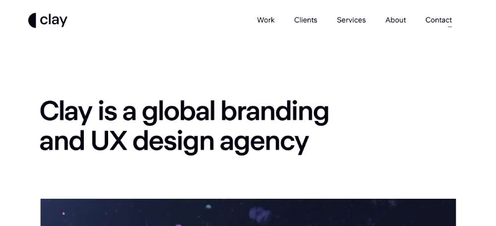
Clay
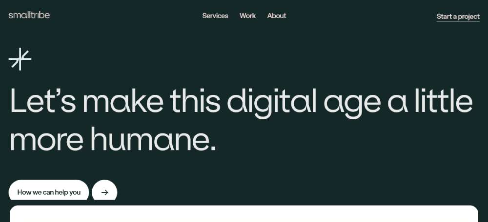
smalltribe
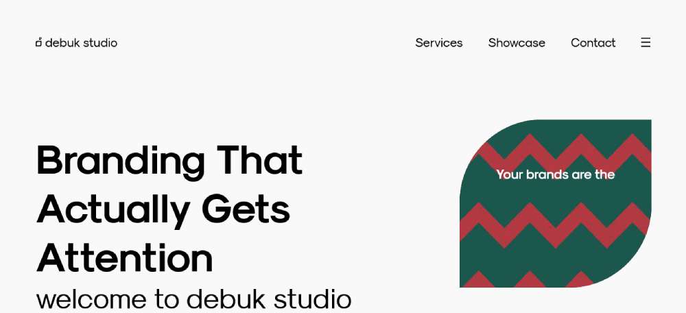
Branding And Web Design Studio
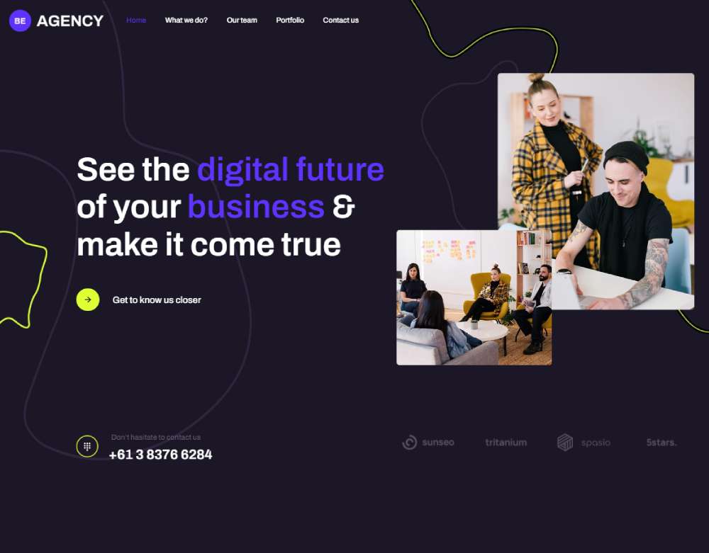
BeAgency6
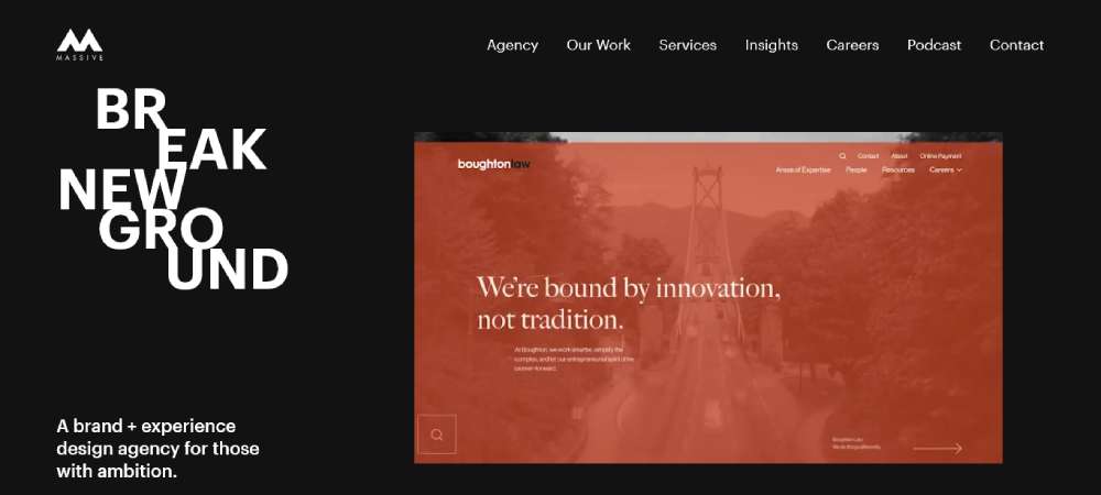
Massive Media
Brave Branding Atelier
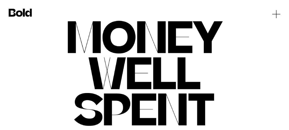
Elk Creative
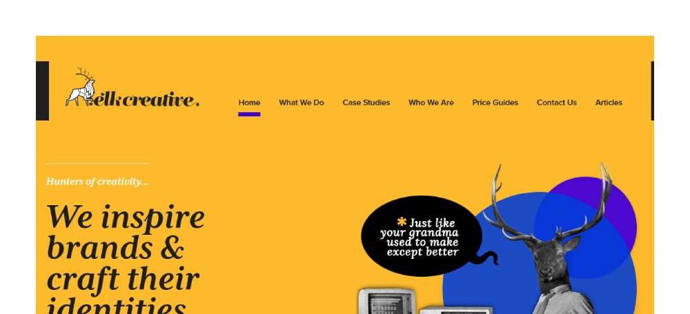
RoAndCo
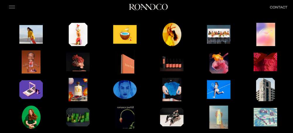
BeAgency5
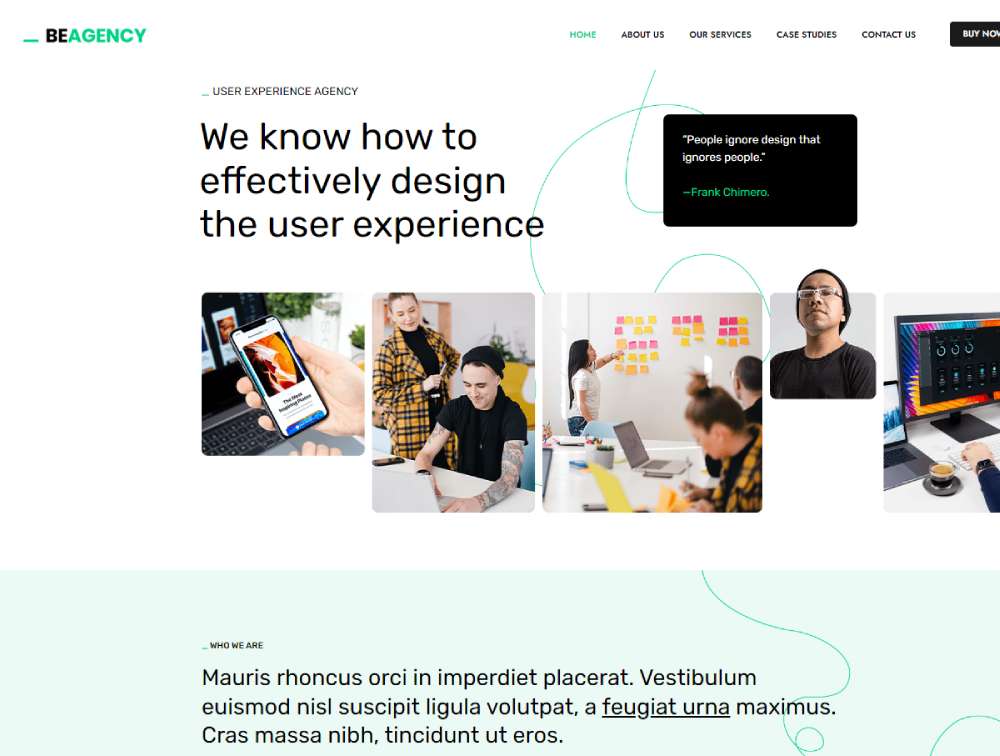
FVM
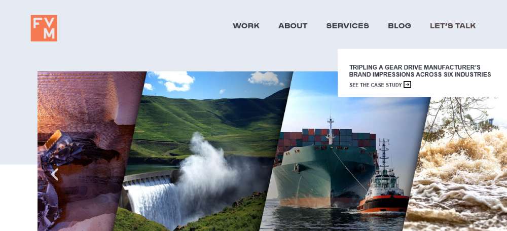
Mars Branding
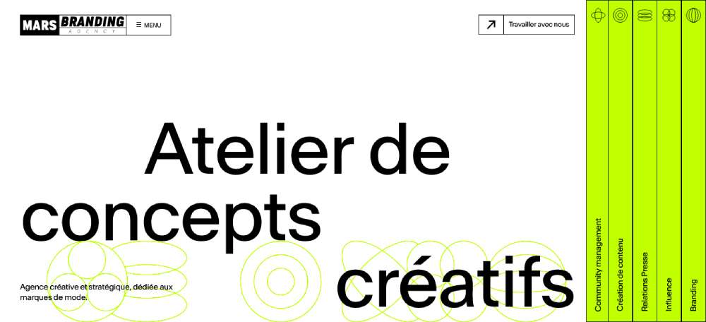
Pact Studio
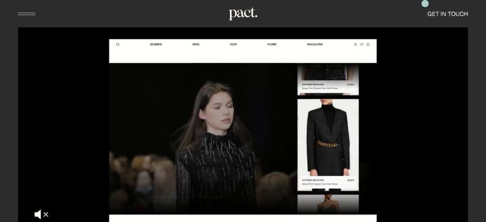
Disruptive Brand Agency
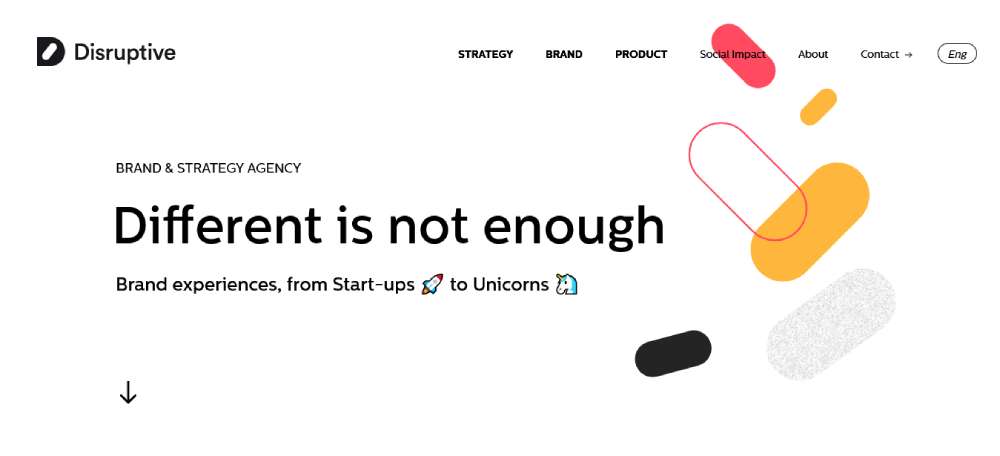
BeAgency4
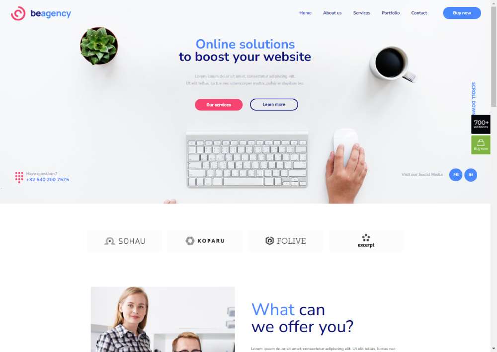
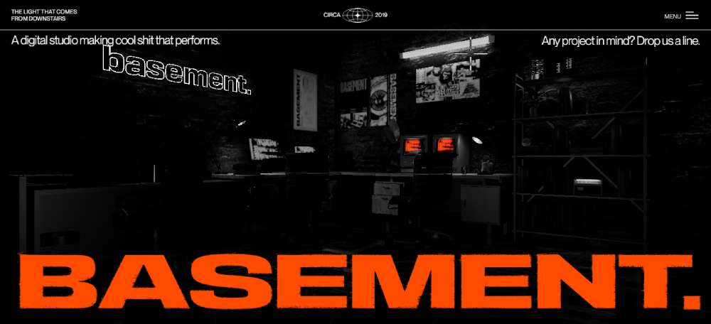
Basement Studio
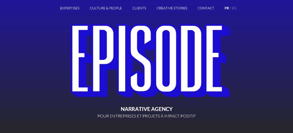
Episode
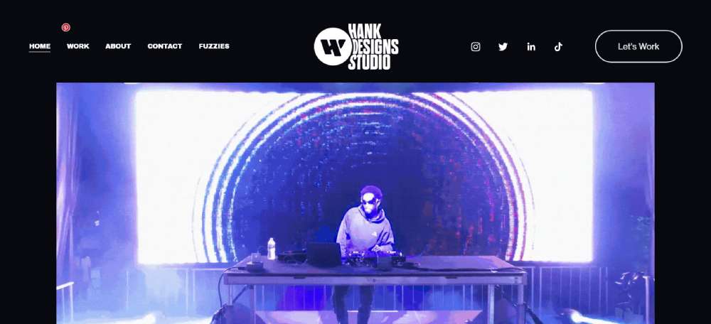
Hank Designs
New Portfolio Brand Designer
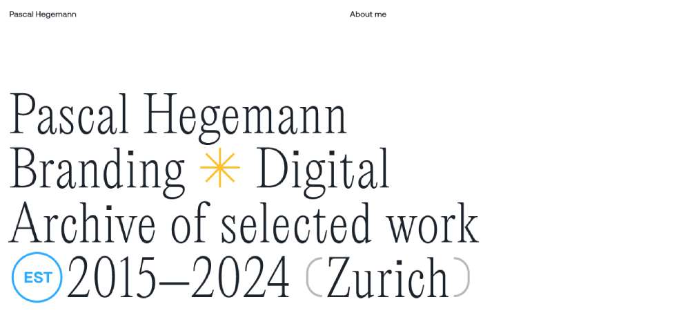
BrandLoyal
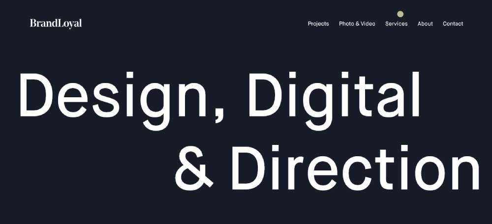
REMJND Branding Agency
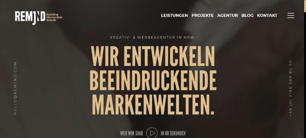
Exo Ape
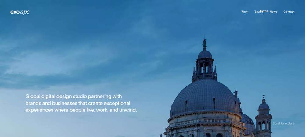
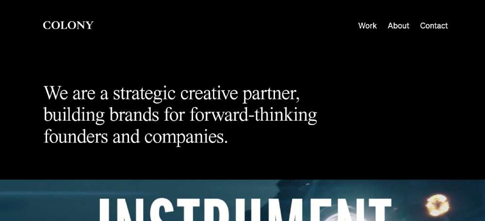
Colony
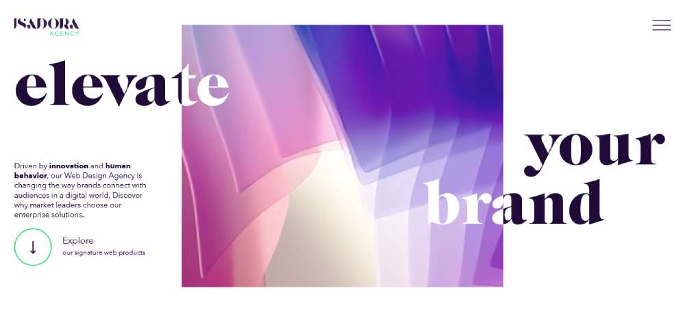
Isadora Agency
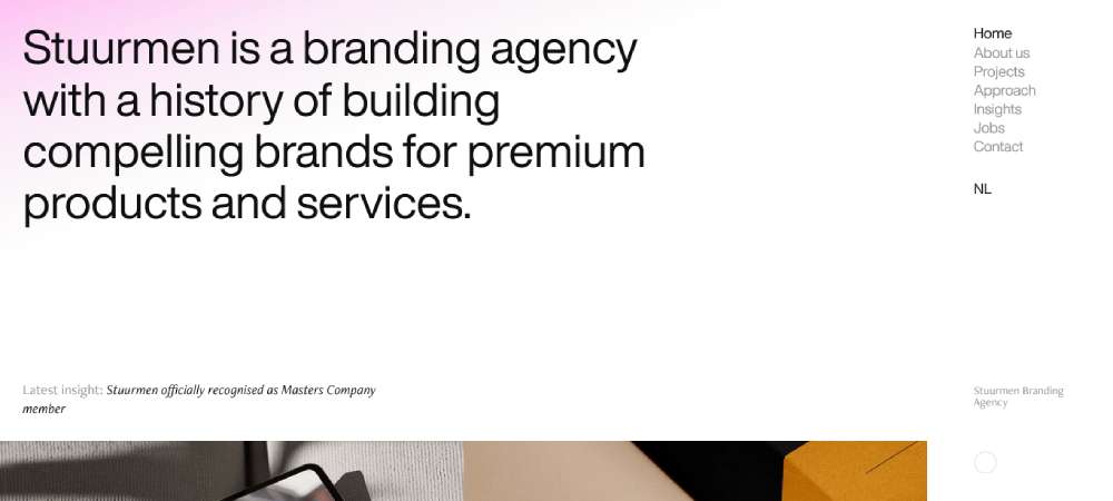
Stuurmen Branding Agency
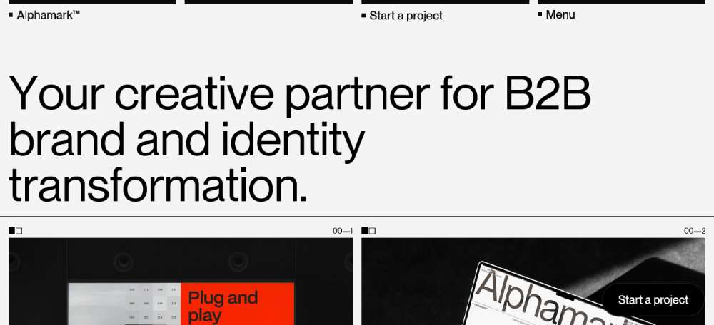
Alphamark
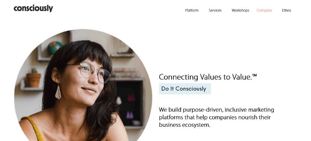
Consciously
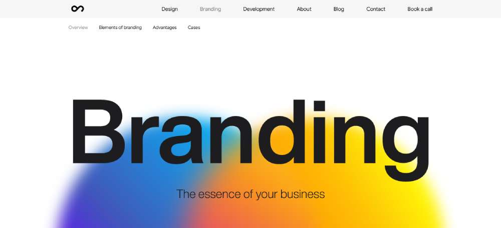
Outcrowd Branding
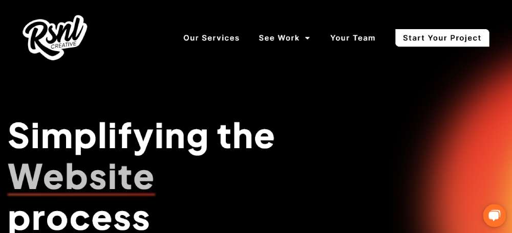
RSNL Creative
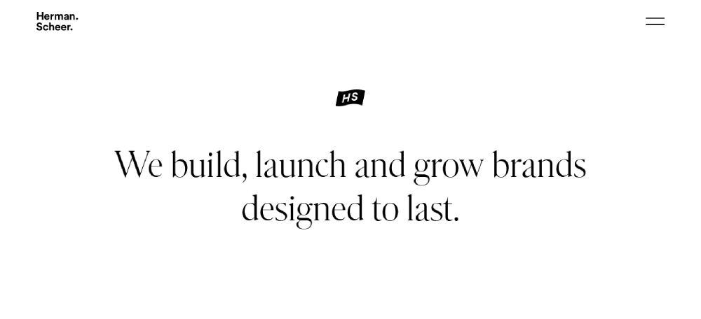
Herman-Scheer
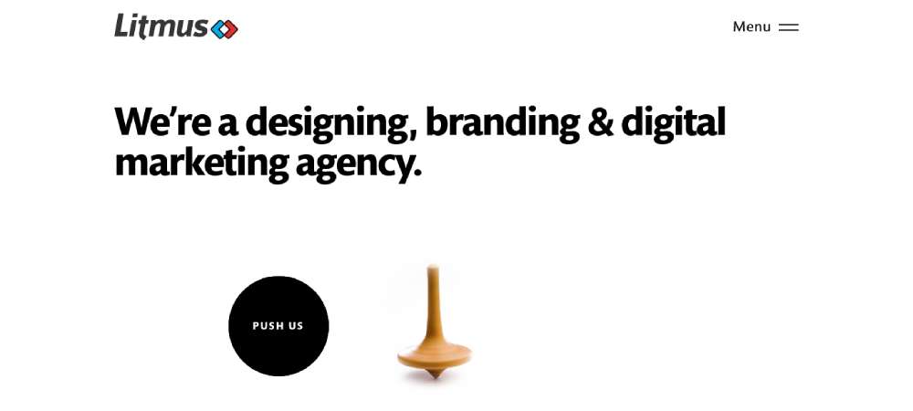
Litmus Branding
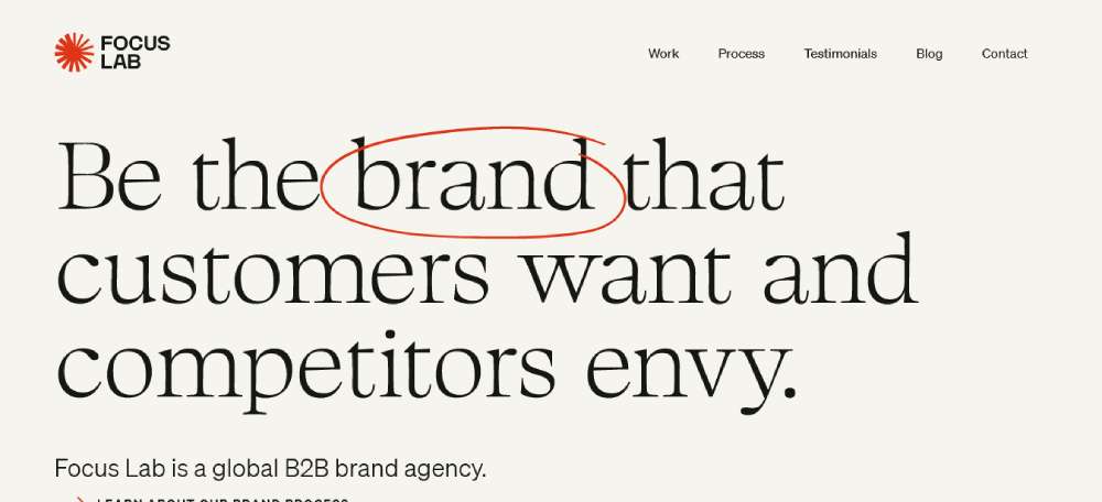
Focus Lab
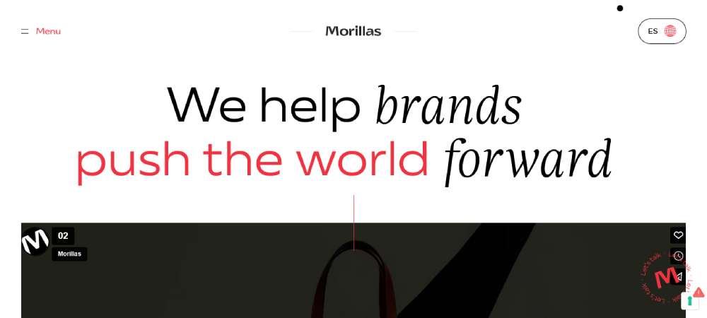
Morillas Branding Agency
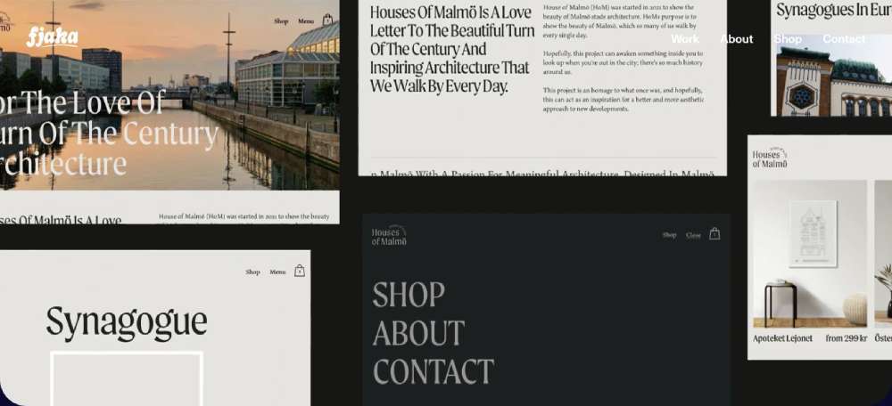
Fjaka
Grow
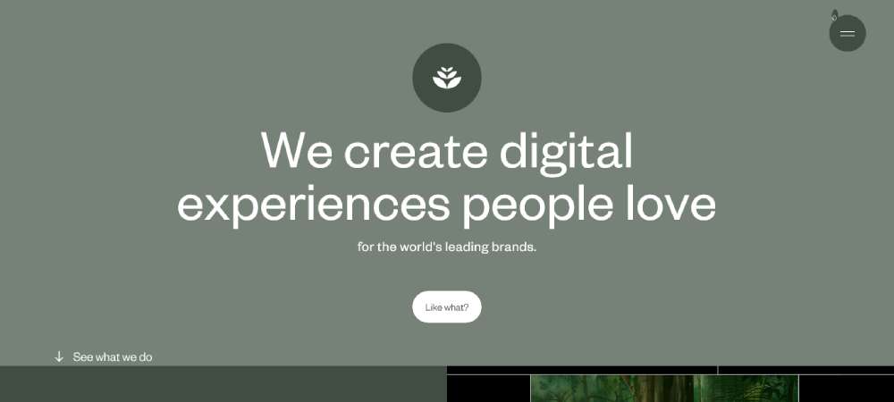
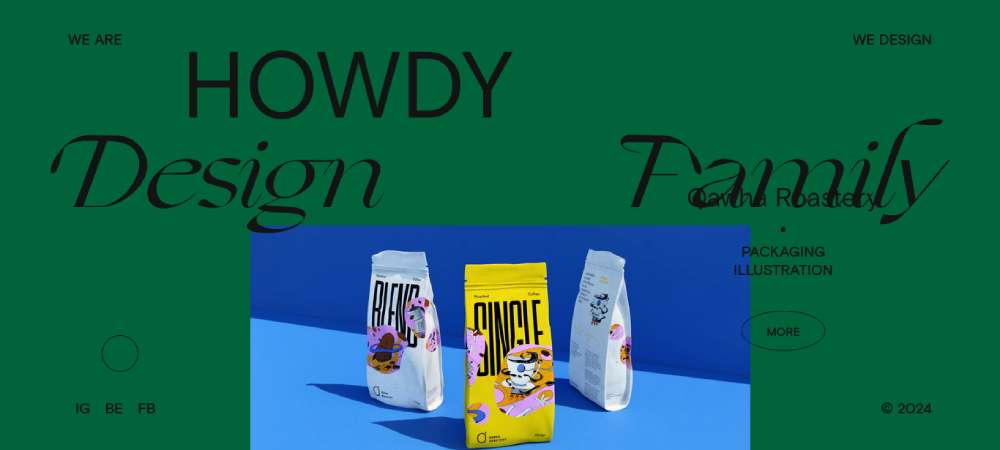
Howdy
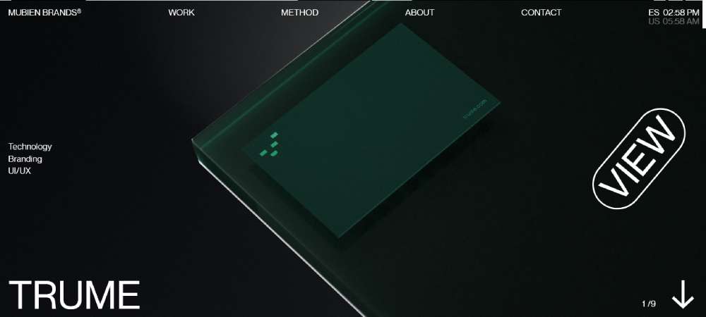
Mubien Brands
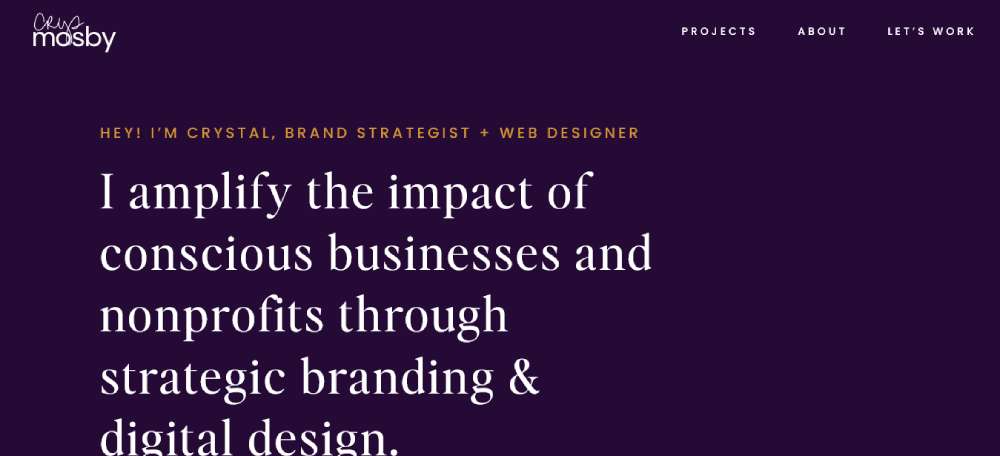
Crystal Mosby
Brand Da Branding Agency
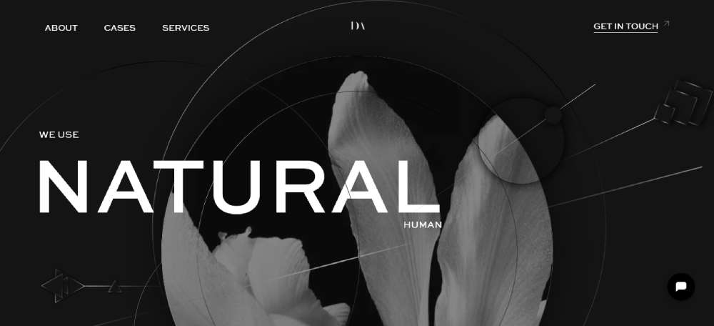
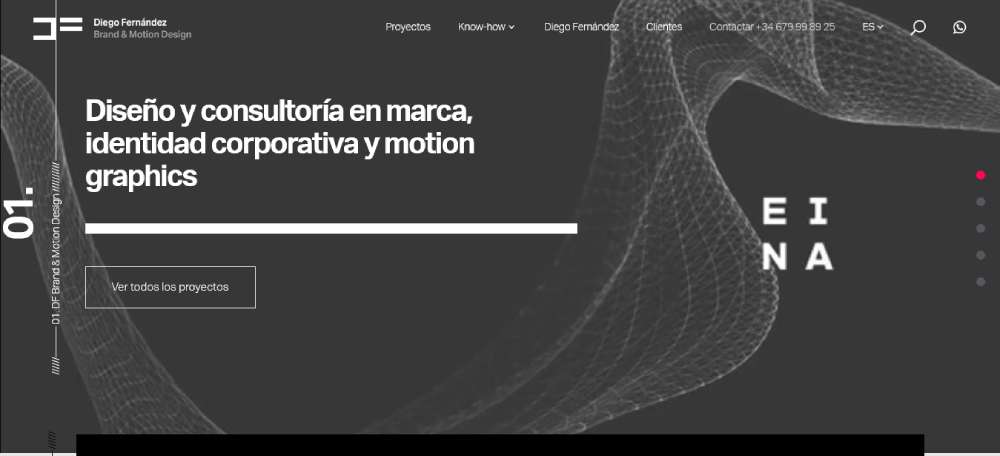
Diego Fernández
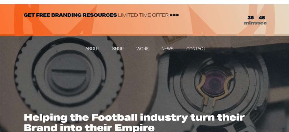
JAX Branding
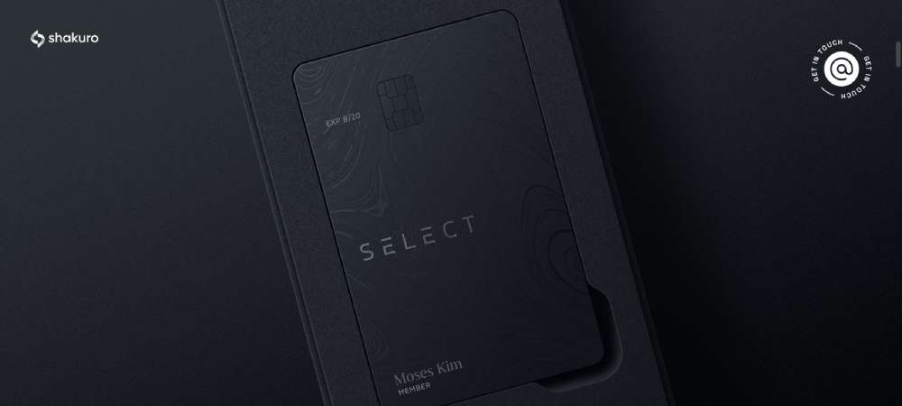
Identity & Branding
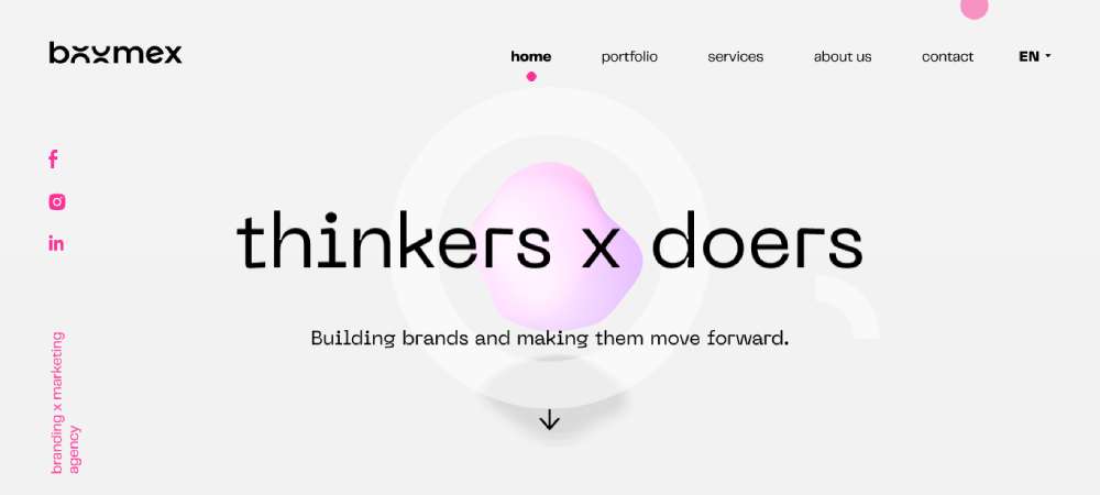
BOOMEX | BRANDING X MARKETING
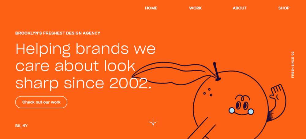
OrangeYouGlad
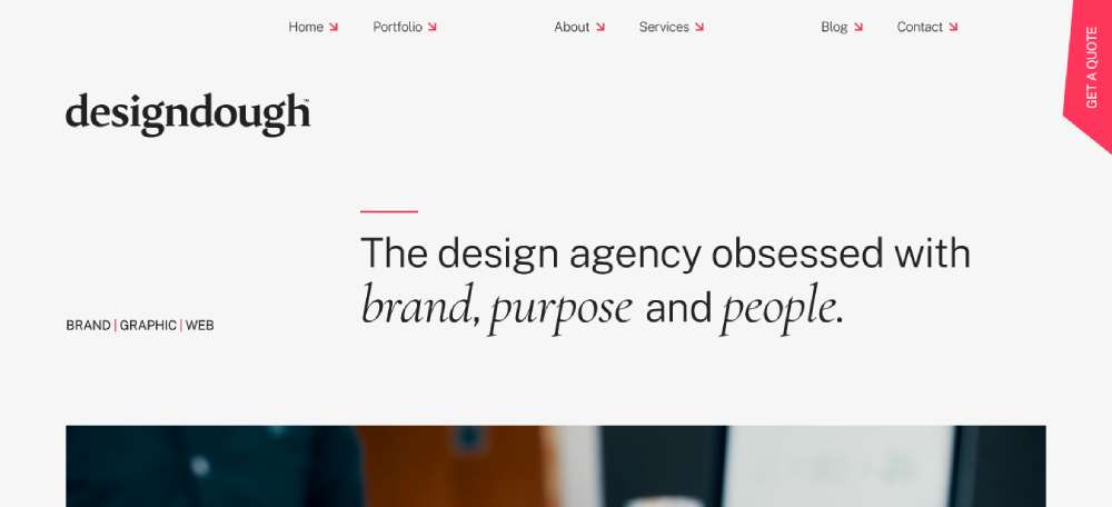
Designdough
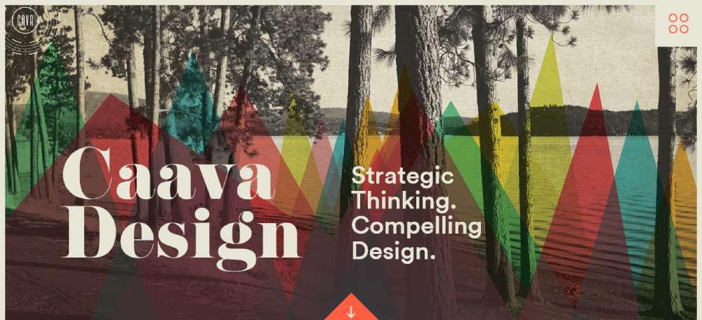
Caava Design
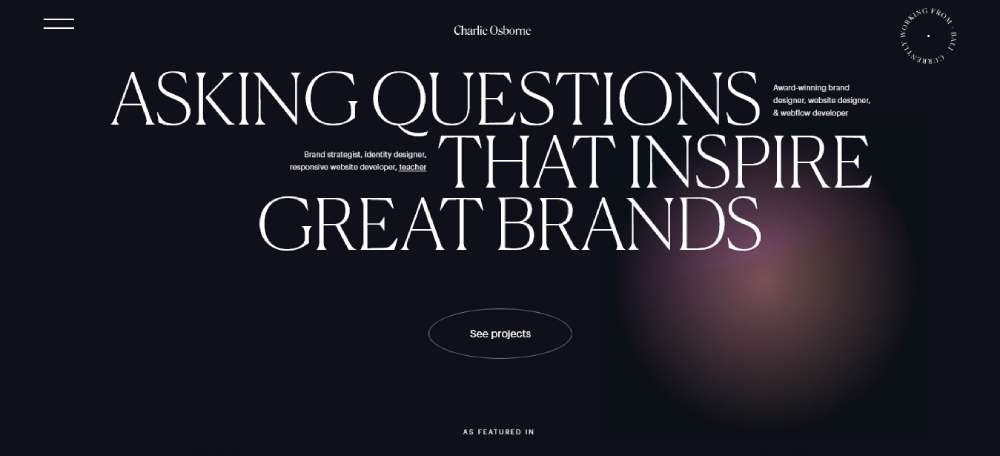
Osborne Branding
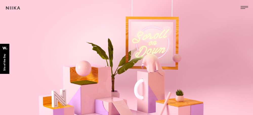
Niika
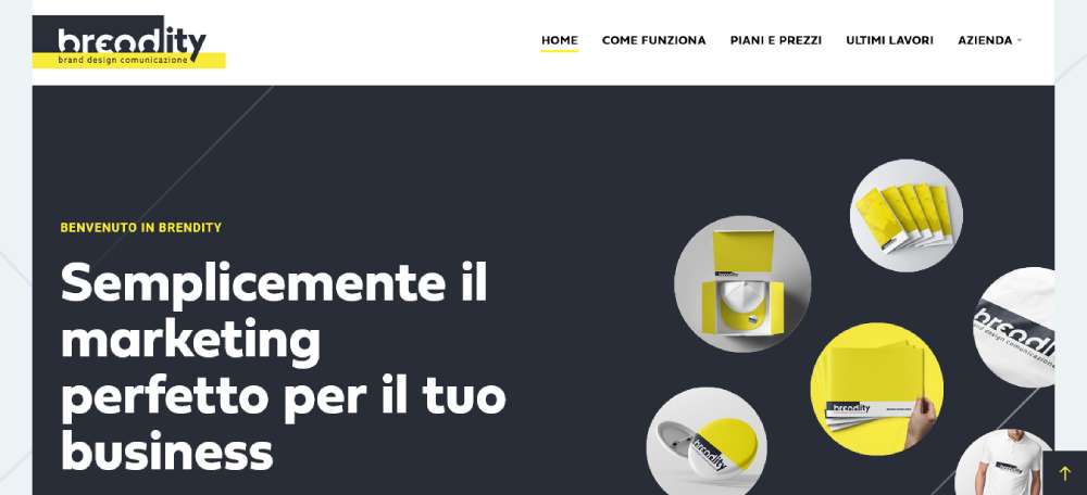
Brendity
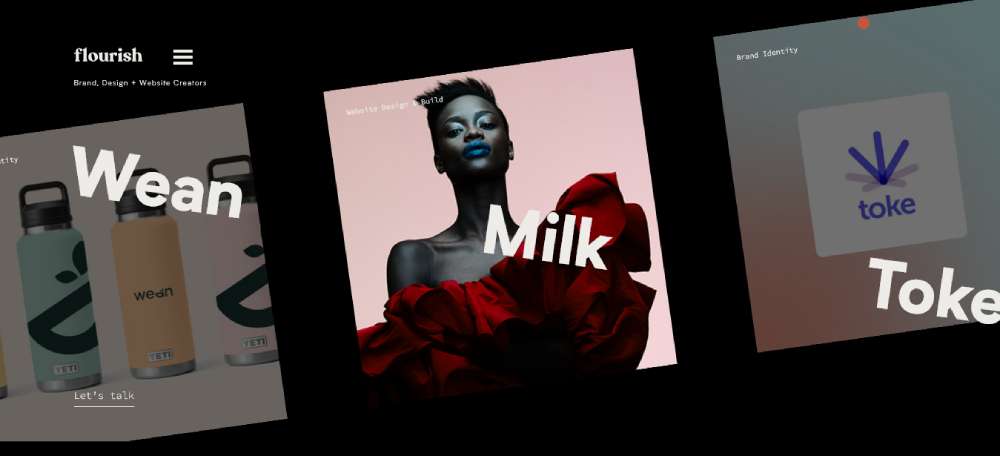
Flourish
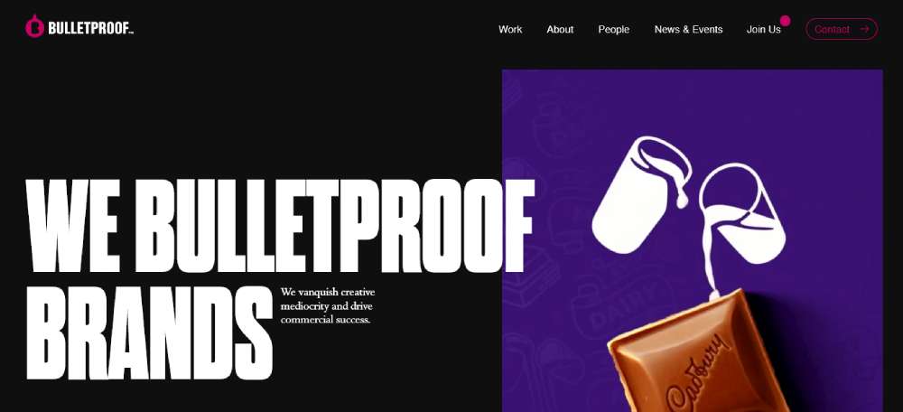
Bulletproof
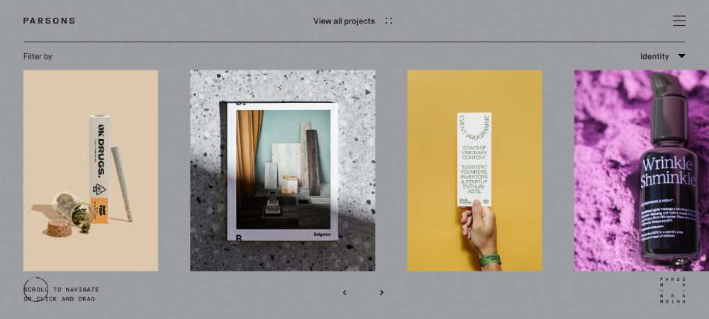
Parsons Branding
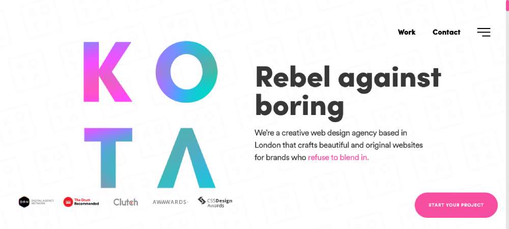
Kota
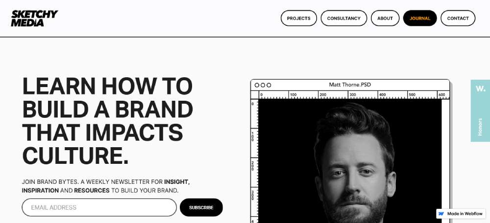
Sketchy Media
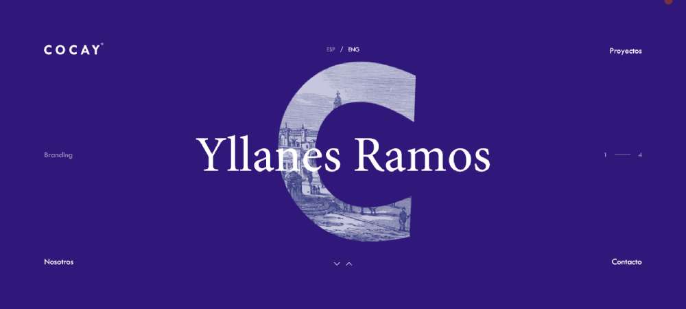
Cocay Branding
BE7 BRAND AFFECTION AGENCY

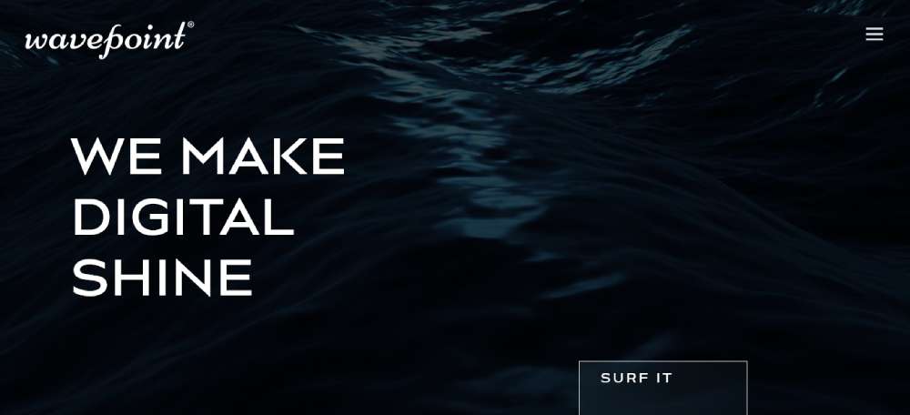
Wavepoint
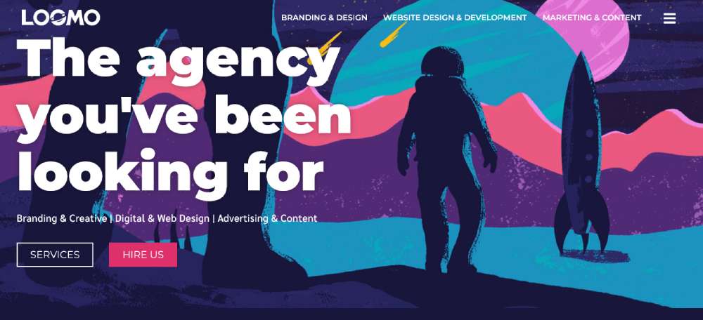
Loomo
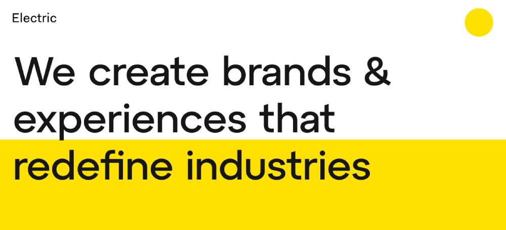
Electric
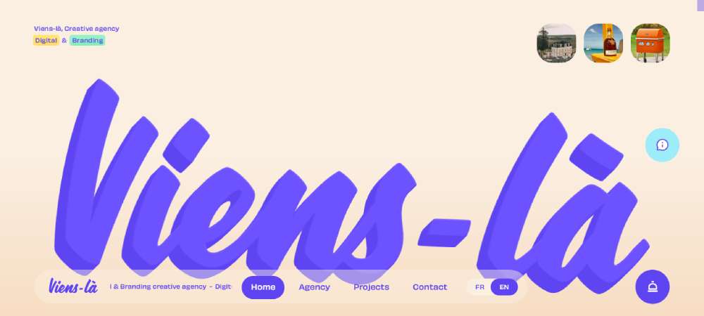
Viens-la
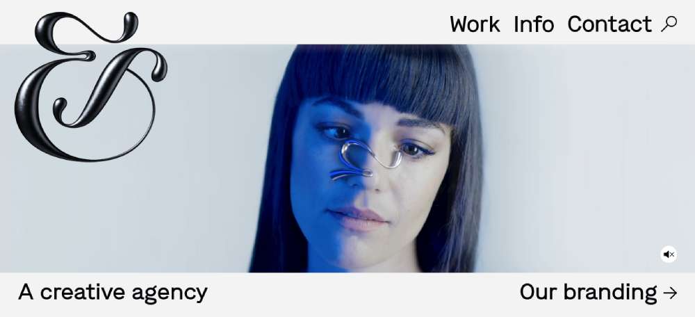
&Walsh
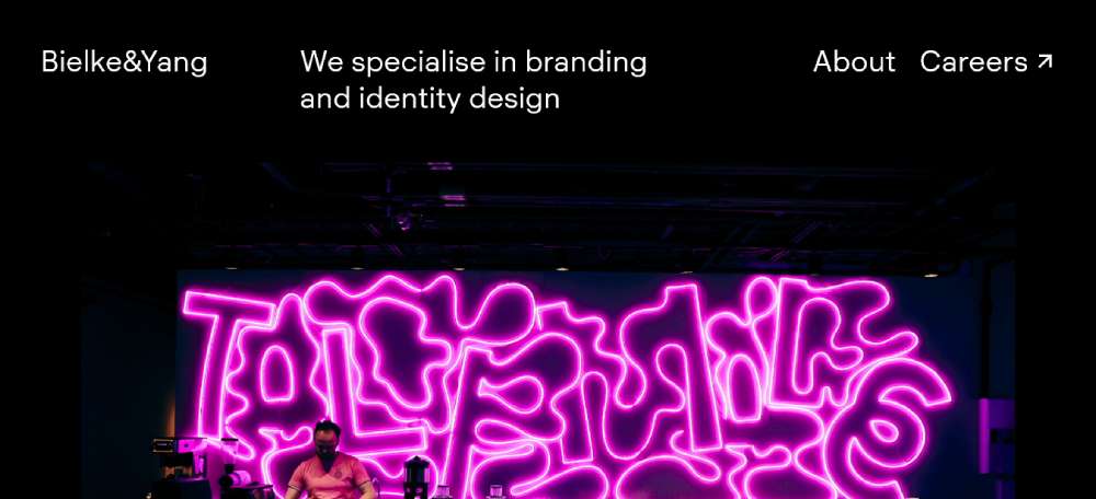
Bielke&Yang
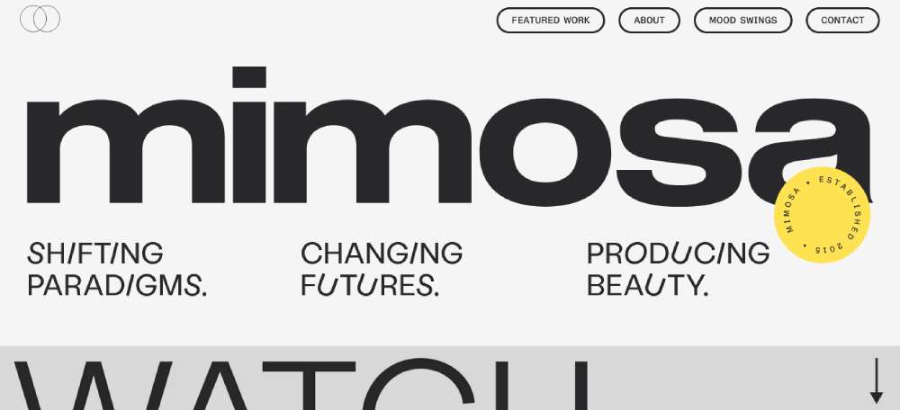
mimosa
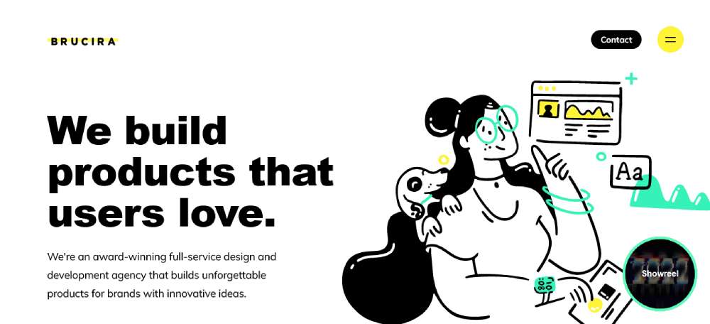
Brucira
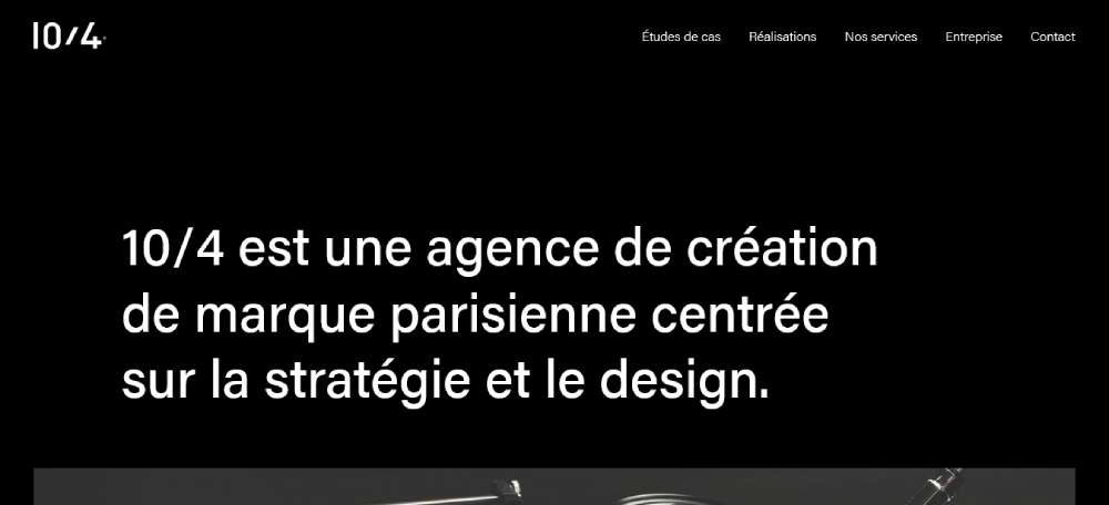
10/4
What Makes a Branding Agency Website Design Effective?
Users form a judgment about a website in 50 milliseconds (Hostinger, 2025). That is faster than a blink. For a branding agency, those first milliseconds carry extra weight because the prospect is specifically evaluating your taste and judgment before they read a single word.
Effectiveness is not about aesthetics alone. It is about the site doing its job: converting qualified leads into conversations.
How Above-the-Fold Messaging Affects Client Conversion
The above-the-fold section has one job: communicate who you serve and what you deliver. Not who you are. Not how long you have been around.
38% of users leave a website immediately if the content or layout is unattractive (Renderforest, 2025). That bounce happens before they ever reach a portfolio piece.
What the best agency homepages do above the fold:
- State a positioning claim, not a tagline ("Brand strategy for B2B tech companies scaling Series B to IPO")
- Show one strong visual that demonstrates the quality of the work
- Provide a single, clear CTA (usually "View our work" or "Start a project")
What most agency sites do instead: a vague headline like "We Build Brands That Matter," a hero image that looks like stock photography, and three CTAs competing for attention. That approach loses the visitor before a case study is ever seen.
Why Case Studies Outperform Portfolio Galleries
A portfolio gallery shows the output. A case study explains the thinking. Prospective clients at the decision stage care about thinking.
Case study vs. portfolio gallery:
| Format | What It Shows | Best For |
|---|---|---|
| Portfolio gallery | Visual output, style range | Early-stage discovery, style matching |
| Case study | Process, problem, outcome | Late-stage evaluation, budget justification |
| Hybrid (gallery + case link) | Visual hook + depth on demand | Most agency website structures in 2025 |
BB Agency reported a 27% lift in conversion rates across all traffic sources after restructuring their site around outcome-led case studies rather than image grids (Colorwhistle, 2024). The format of the case study mattered as much as the quality of the work inside it.
A standard high-performing case study structure used by agencies like Wolff Olins and Collins follows 3 stages: problem framing, process documentation, and measured outcome. Photographs of process work (sketches, workshops, testing) signal real experience rather than polished post-production output.
How Do Top Branding Agencies Present Their Case Studies Online?
The case study page is where an agency either closes a prospect or loses them. It is the deepest point of engagement before a sales call. Getting the structure wrong here is expensive.
Standard high-performing case study structure used by Wolff Olins, Collins, and Koto:
- Problem framing (1-2 paragraphs, client context and specific challenge)
- Process documentation (photography of work sessions, iteration examples, thinking steps)
- Outcome with metrics (brand recall, market share, revenue data, or engagement shift)
Ramotion's case study for Puzzle.io reported 15% month-over-month growth and engagement improvements across 2,300+ businesses after a UX-focused website redesign (Ramotion, 2024). That specificity is what separates a convincing case study from a visual portfolio entry.
What the data looks like versus what agencies publish:
| Metric Type | Published By | Impact on Prospect Trust |
|---|---|---|
| Brand recall lift % | Strategy-led agencies (Wolff Olins, Interbrand) | High: shows measurable brand thinking |
| Revenue or conversion delta | Digital-first agencies (Focus Lab, Collins) | Very high: directly justifies agency fee |
| Visual output only | Most agencies | Low: does not differentiate from competitors |
The question of gating is real. Some agencies (Pentagram, Landor) publish full case studies freely. Others (some mid-market agencies) gate detailed process documentation behind a contact form. The free approach generates more organic visibility and trust. The gated approach generates qualified lead data. Both can work. Depends on the agency's existing brand recognition.
What Typography and Color Decisions Define Branding Agency Websites?
Typography is the first signal a prospect receives about an agency's design sensibility. Before they read the headline, they have already assessed the typeface. That judgment happens in those same 50 milliseconds.
Dominant Typeface Categories in 2025
Two type categories dominate the top tier of branding agency sites in 2025.
Editorial serifs: typefaces like Canela and Freight signal cultural authority, publishing heritage, and premium positioning. Common on agency sites targeting luxury, lifestyle, and consumer categories.
Geometric sans-serifs: Favorit, GT America, and similar cuts signal clarity, modernity, and technological confidence. More common on agencies serving tech, SaaS, and B2B clients.
Most top-tier agencies use one typeface family on their own site, sometimes with a single serif/sans pairing. Using 3 or more typefaces on an agency homepage is generally a trust signal going the wrong direction.
Color Palette Decisions and Positioning Signals
22% of first-time website visitors pay attention to bright colors, but 21% will exit if colors feel too extreme (Clutch, 2025). For branding agencies, that margin is tight.
What color usage signals at the agency level:
- Monochromatic or near-black palette: premium, restrained, high-end (Pentagram, Koto London)
- Bold, saturated color: energy, consumer-brand thinking, startup positioning (Red Antler, Collins)
- Neutral with one accent: the most common choice, works across most client categories
Most enterprise-targeting agencies use 2 or fewer colors on their own homepage. White space carries the visual weight. The work provides the color. Agencies that flood their own site with color often work with consumer brands where visual boldness is the product. The palette choice is not aesthetic preference. It is a market positioning decision.
How Do Branding Agency Websites Handle Navigation and Information Architecture?
Navigation structure on a branding agency site is a positioning signal before it is a usability decision. The number of items in the top nav tells a prospect something about how the agency thinks about complexity.
Most top-tier agencies run 4 to 5 top-level nav items. The standard model: Work, About, Services (sometimes), Thinking or Journal, Contact.
Flat vs. Deep Navigation Structures
Flat navigation (3-4 items, no dropdowns) is the choice of agencies confident that their work will guide the user. Deep navigation (5+ items with sub-menus) signals either a large service catalogue or uncertainty about what the client needs to see first.
Navigation patterns by agency type:
- Legacy enterprise agencies (Pentagram, Landor): flat, minimal, partner or discipline-led
- Growth-stage boutiques (Koto, Ragged Edge): 4-item flat nav, strong CTA in top-right
- Full-service digital-first agencies: deeper nav, service dropdowns, more decision paths
Pentagram's navigation structure is genuinely unusual. Rather than a standard services or work menu, the top nav routes users through individual partner portfolios. It works because the partners themselves are the product. That logic does not transfer to most agencies, but it demonstrates how structure can carry a brand argument without any copy.
CTA Placement and Conversion Path Design
3 CTA placements appear consistently across high-performing branding agency sites: top-right corner of the nav, end of featured case studies, and the footer.
The top-right CTA is almost always "Start a project" or "Work with us." Specific, action-oriented, low-friction. Not "Get in touch" and not "Contact us." The verb choice matters. "Start" implies forward motion. "Get" implies asking for something.
Sticky navigation CTAs appear on roughly half of top branding agency sites. They help on longer case study pages where a prospect might spend 4 to 6 minutes reading before deciding to reach out. The link to an agency landing page that converts a prospect often comes from a case study, not the homepage. That is where the decision happens.
What Animation and Interaction Patterns Appear on Leading Branding Agency Sites?
Animation on a branding agency site is a double-edged decision. Done well, it demonstrates technical capability and brand personality. Done poorly, it delays the content a prospect came to see and signals that the agency prioritizes style over function. Prospects notice both.
Scroll-Triggered vs. Page-Load Animations
Page-load animations create an immediate impression but carry real risk. A loading screen that runs more than 1.5 seconds increases bounce rate measurably. Each additional second of load time causes a 4.42% drop in conversion rates (Eleken, 2024). That is a real cost for agencies using heavy intro animations to signal craft.
Scroll-triggered animations are the safer choice for most agencies. They reveal content progressively as the user engages, which rewards attention without punishing slower connections.
Most common animation approaches across leading branding agency sites:
- Text reveal animations on headline type (scroll-triggered, CSS or GSAP-powered)
- Image fade-ins on case study thumbnails
- Cursor customization (Koto, DesignStudio, and several boutique studios use custom cursor designs)
- Horizontal scroll sections for project showcases
GSAP (GreenSock Animation Platform) and Three.js are the 2 dominant animation libraries in agency builds in 2025. GSAP handles most scroll-based and transition animations. Three.js appears on sites where 3D elements or WebGL experiences form part of the brand identity showcase.
When Animation Creates Friction Instead of Credibility
A branding agency that builds a heavily animated homepage for itself is essentially running a live demo. If it breaks, lags, or slows on a prospect's laptop, the demo has failed.
Agencies with animation-heavy sites and strong Lighthouse performance scores do exist, but they are the exception. Most sites with significant Three.js or WebGL elements score below 70 on mobile performance. For agencies selling to enterprise clients who review sites on corporate laptops with network filters, that is a practical problem.
The honest rule: animation should match the agency's actual client deliverables. An agency that builds interactive brand experiences for consumer apps can justify a complex animated site. An agency that primarily delivers visual identity systems and brand guidelines probably cannot, and a cleaner, faster site will convert better.
How Do Branding Agencies Position Themselves Through Website Copy?
Landing pages with a clear headline convert at a 21% higher rate than those without one (Jeremymac, 2025). For a branding agency, the headline is not just a conversion tool. It is a public declaration of what the agency believes about brand building. Get it wrong and the prospect already has doubts before seeing a single piece of work.
Homepage copy on a branding agency site is the most self-referential test in the industry. An agency that cannot write a convincing positioning statement for its own brand is going to struggle to write one for a client.
Headline Structures That Work vs. Headlines That Don't
Outcome-led headline: "We've rebranded 3 of the FTSE 100. Here's what that looks like." Specific, verifiable, confident.
Philosophy-led headline: "Great brands start with honest thinking." Positioning, no proof. Works for established agencies with recognizable client names directly below.
Audience-led headline: "Brand strategy for B2B SaaS companies scaling past Series A." Niche, direct, self-selecting. Focus Lab uses this approach and it is the reason their site qualifies leads before they submit a form.
The weakest pattern is the mission statement masquerading as a headline: "We Build Brands That Matter." Zero specificity. No prospect can tell if they are the right client for that agency or not.
How About Page Copy Signals Pricing Tier
Personalised CTAs convert 202% better than standard CTAs, and the same logic applies to About page messaging (Embryo, 2024). Vague About pages signal vague service scope, which invites price negotiation rather than positioning confidence.
3 things agencies use on About pages to signal budget range without stating a number:
- Client name-dropping by revenue tier ("We work with Series B companies and global consumer brands")
- Team size and structure ("Our 12-person strategy team" vs. "Our team")
- Geographic scope language ("Across New York, London, and Berlin" vs. "Working with clients worldwide")
Wolff Olins' About page focuses entirely on the type of organizational problem they solve, not on years in business or service list. That is a deliberate choice that pre-qualifies the enterprise clients they want and filters out smaller engagements that don't fit their model.
What Page Speed and Technical Standards Do Top Branding Agency Websites Meet?
Only 48% of mobile sites pass all Core Web Vitals as of 2024 (Unlighthouse, 2025). For design-led agencies building complex, animation-heavy sites, that number is almost certainly lower. The irony is real: agencies selling design credibility often have some of the worst-performing sites in their competitive set.
Google's bounce rate data reinforces why this matters. Bounce rate increases 32% when load time goes from 1 to 3 seconds, and 90% at 5 seconds (Google, via Unlighthouse, 2025). A prospect who bounces from a slow agency homepage never sees the work that might have won the project.
Core Web Vitals Performance Across Agency Sites
The 3 Core Web Vitals metrics that affect agency site rankings and user experience in 2025:
| Metric | What It Measures | Common Agency Site Issue |
|---|---|---|
| LCP (Largest Contentful Paint) | Load speed of main content | Unoptimized hero video or large image |
| INP (Interaction to Next Paint) | Responsiveness during session | Heavy JavaScript blocking main thread |
| CLS (Cumulative Layout Shift) | Visual stability | Fonts loading late, shifting layout elements |
INP replaced FID as a Core Web Vital in March 2024. Globally, 77% of mobile pages achieve a good INP score under 200ms (2025 Web Almanac). That benchmark is harder to hit on sites with complex scroll animations and Three.js elements, which many premium agency sites use.
Technical Choices That Protect Performance on Design-Heavy Sites
Agencies that balance strong Lighthouse scores with visual ambition tend to make 3 specific technical decisions.
WebP image format: compression without visible quality loss, directly improving LCP on image-heavy portfolio pages.
Deferred JavaScript: non-critical animation scripts load after core content, protecting INP and reducing main-thread blocking.
CDN delivery: content delivered from edge nodes closest to the visitor reduces time-to-first-byte, which Lighthouse measures as a diagnostic signal even though it is not directly a Core Web Vital.
Next.js has become the dominant framework choice for agencies wanting performance control with design flexibility. Its server-side rendering and image optimization components handle the technical heavy lifting while allowing full creative freedom on the front end.
How Do Branding Agency Websites Differ by Market and Region?
North America holds 45 to 50% of the global branding agencies market, with Europe at 30 to 33% (Business Research Insights, 2025). Those two markets dominate agency website design conventions globally, but the design languages they use are measurably different.
The differences are not aesthetic preferences. They reflect what each market's clients expect to see when evaluating a potential agency partner.
U.S. Agency Website Conventions
American branding agency sites lead with proof and outcomes. ROI framing appears in headlines, case study summaries include revenue data where available, and the tone skews direct.
Collins (New York) and Wolff Olins (New York office) both frame their work around business transformation language rather than design language. The site copy at that level sounds like a pitch deck, not an art statement. That is intentional. Their clients are CMOs and C-suite executives, not creative directors.
Typical U.S. agency site structure: outcome-led hero, 3-5 featured case studies with metrics, about page with client roster, single CTA repeated throughout.
U.K. and European Agency Website Conventions
British agencies like Ragged Edge and Koto use editorial tone and typographic-led design. The homepage copy often reads like a manifesto. Visual hierarchy carries more of the argument. The copy is confident but less explicitly ROI-focused than American counterparts.
European agencies outside the U.K. (Base Design in Brussels, EdenSpiekermann in Berlin, Mucho in Barcelona) build sites that function across multiple languages and cultural contexts. Their design vocabulary tends toward neutrality, clean layout, and restrained color, which travels well across markets without cultural reinterpretation.
Key regional difference between U.S. and European agency sites:
| Dimension | U.S. Agencies | European Agencies |
|---|---|---|
| Copy tone | Outcome-led, business-focused | Editorial, philosophy-led |
| Case study framing | Revenue and metric-heavy | Process and narrative-heavy |
| Visual approach | Bold, consumer-brand energy | Typographic, restrained, scalable |
| Language handling | English-only, rarely localized | Often multilingual or language-neutral |
Neither approach is inherently better. The U.S. model converts faster in markets where clients want to justify budget quickly. The European model builds longer-term trust in markets where process and cultural fit matter more in the decision.
What CMS and Technology Stacks Power Branding Agency Websites?
The CMS an agency chooses for its own site is a signal about how it thinks about content, updates, and technical debt. It also reveals something about the agency's relationship with its own web developer or development partner.
Most prospects never see the CMS. But the agency's ability to update content quickly, publish new case studies, and keep the site current depends entirely on it.
Platform Choices Across Agency Tiers
Webflow is the most common choice among boutique and growth-stage branding agencies in 2025. It gives non-developer team members the ability to update content and build new pages without engineering support. The trade-off is ceiling: complex multi-site setups, advanced SEO control, and highly custom backend functionality push past what Webflow handles cleanly.
Craft CMS is the preferred choice for agencies that need multi-site setups, complex content structures, or granular SEO control. It requires developer involvement for setup and customization, but offers full architectural freedom. Many mid-to-large agencies use Craft CMS with a headless front end built in Next.js or Nuxt.
Fully custom builds (no CMS or bespoke CMS) appear at the highest tier. Pentagram's site, for example, does not follow any standard CMS pattern. The trade-off: content updates require developer involvement, which slows the publishing cycle significantly.
| Platform | Best For | Common Agency User |
|---|---|---|
| Webflow | Fast launch, design flexibility, self-managed updates | Boutique agencies, growth-stage studios |
| Craft CMS | Complex content, multi-site, advanced SEO | Mid-size to large agencies |
| Next.js (headless) | Performance-first, full custom front end | Tech-led or developer-heavy agencies |
| Custom build | Unique site experiences, maximum creative control | Top-tier legacy agencies |
Why Several Agencies Choose Webflow Despite Its Limits
The honest answer: internal team capability. A branding agency's core staff are strategists, designers, and writers, not developers. Webflow lets those people publish case studies, update the homepage hero, and add new team members without filing a ticket or waiting for a development sprint.
Flowout became a Webflow Creative Awards finalist in 2024 by building high-quality branding sites for clients including Sequoia Capital's incubator. The platform's ceiling is higher than most people assume when used by skilled designers with performance optimization in mind.
The decision between Webflow and a custom build usually comes down to one question: how often does the team need to update the site independently? Monthly updates favor Webflow. Quarterly or less, a custom build becomes more defensible.
How to Apply Branding Agency Website Design Principles to Your Own Agency Site
Everything above is only useful if it changes a decision. This section is about the specific decisions to make before designing or redesigning an agency site, not about aesthetics.
Landing pages built for lead generation at top performers convert at 5.31% or higher (Growleads, 2025). Most agency sites convert well below that because they were designed to impress, not to convert. Those are different briefs.
Five Decisions to Make Before Design Begins
Start here. Skipping these leads to a site that looks great but does not bring in the right clients.
- Positioning: who is the site for, exactly? "Mid-size B2B tech companies" is a positioning. "Any company that needs branding" is not.
- Portfolio selection: choose 5 to 8 projects that show depth in the target positioning, not 20 projects that show range across every category.
- CTA path: decide the one action you want every visitor to take. Then build the entire site to lead there.
- Copy tone: outcome-led or philosophy-led? That choice drives every headline on the site.
- Platform: who will update the site after launch, and how often? That answer determines whether Webflow, Craft CMS, or a custom build makes sense.
Common Mistakes Agency Sites Make
Most redesigns fix visual issues and leave the structural problems intact. The visual problems are rarely what loses clients.
Too much self-referential copy: pages that talk about the agency's process, values, and awards rather than the client's problem and the outcome the agency delivers. Clients care about their brand, not the agency's philosophy.
No clear conversion path: multiple CTAs competing for attention ("See our work" and "Learn about us" and "Get in touch" and "Read our blog" all above the fold). Landing pages with a single CTA convert 70% more than pages with multiple CTAs (Marketing LTB, 2025).
Portfolio that shows range instead of depth: 25 projects across 12 industries signals a generalist. 6 projects in 2 industries signals expertise. For most agencies, expertise wins more work.
Measuring Whether the Site Is Actually Working
3 metrics matter for an agency site. Everything else is vanity.
Inquiry rate: what percentage of visitors submit a contact form or project inquiry? Anything below 1% on qualified traffic is a conversion problem, not a traffic problem.
Time on case study pages: if prospects are spending less than 90 seconds on a case study, the case study is not doing its job. Either the content is too thin or the layout is not guiding them through the story.
Return visits before inquiry: most qualified agency prospects visit 2 to 3 times before making contact. If analytics show almost no return visits, the site is not memorable enough to bring people back. That is a positioning and content problem, not a design problem.
For a broader look at how other design agency websites structure their digital presence, studying examples outside your own competitive set often reveals patterns that are invisible when you only look at direct competitors.
The site itself is the pitch. Agencies that treat it that way, and design every element around converting the right client, get more inquiries from better-fit prospects than agencies that treat the site as a portfolio archive. That gap compounds over time.
FAQ on Branding Agency Website Design
What makes a branding agency website different from a regular creative portfolio?
A branding agency site is a conversion tool, not just a visual showcase. It communicates strategic positioning, demonstrates process depth through case studies, and actively qualifies prospective clients before they ever submit a contact form.
How many portfolio pieces should a branding agency feature on its website?
5 to 8 case studies is the standard for high-performing agency sites. Fewer, stronger projects signal expertise and focus. A grid of 25 projects across 12 industries signals a generalist, which makes budget justification harder for the client.
What is the best CMS for a branding agency website?
Webflow works well for boutique agencies that need design flexibility and self-managed content updates. Craft CMS suits agencies with complex multi-site setups. Fully custom Next.js builds appear at the top tier, where maximum creative control outweighs update convenience.
Which branding agency websites are considered the best examples in 2025?
Pentagram, Wolff Olins, Collins, Koto Studio, Ragged Edge, DesignStudio, Focus Lab, and Red Antler are consistently cited. Each demonstrates distinct brand positioning through homepage structure, case study depth, typography choices, and navigation logic.
How important is page speed for a branding agency website?
Very. Bounce rate increases 32% when load time goes from 1 to 3 seconds. Only 48% of mobile sites pass all Core Web Vitals as of 2024. Heavy animation and WebGL elements on agency sites frequently push performance scores below acceptable thresholds.
What typography do top branding agency websites use?
Two categories dominate. Editorial serifs like Canela and Freight signal premium, cultural positioning. Geometric sans-serifs like GT America and Favorit signal clarity and tech confidence. Most top agencies use one typeface family, sometimes with a single serif and sans pairing.
Do branding agency websites need case studies or is a portfolio gallery enough?
Case studies outperform galleries at the decision stage. A gallery shows visual output. A case study shows strategic thinking, process documentation, and measurable outcomes. Prospects evaluating a $100K+ engagement need proof of thinking, not just proof of taste.
How do U.S. and European branding agency websites differ in design approach?
U.S. agency sites lead with ROI framing, outcome-led copy, and metric-heavy case studies. European agencies, particularly U.K. studios like Ragged Edge and Koto, favor editorial tone, typographic-led layouts, and philosophy-first homepage messaging that builds trust more gradually.
What animation tools do leading branding agency websites use?
GSAP (GreenSock Animation Platform) handles most scroll-based transitions and text reveals. Three.js appears on sites with WebGL or 3D elements. Cursor customization is common among boutique studios. The risk: heavy animation frequently hurts Core Web Vitals scores on mobile.
What metrics should an agency track to know if its website is working?
3 metrics matter: inquiry rate from qualified traffic, time spent on individual case study pages, and return visit frequency before first contact. Single-CTA pages convert 70% better than multi-CTA layouts, making conversion path simplicity the most actionable starting point.
Conclusion
This conclusion is for an article presenting branding agency website design examples that go beyond aesthetics, covering how agencies like Pentagram, Koto Studio, and Focus Lab turn their digital presence into a client acquisition tool.
The patterns are clear. Case study depth, positioning-led copy, and deliberate typography choices separate high-converting agency sites from those that simply look good.
Navigation structure, CMS choice, and Core Web Vitals performance are not afterthoughts. They are signals that prospects read before they ever book a call.
Whether you are building a boutique creative studio site or redesigning an established brand consultancy web presence, the principles stay the same: position first, prove second, convert third.
The best agency website is not the most beautiful one. It is the one that brings in the right clients.