

Great Looking Websites With A Calm Color Palette
March 17, 2026
Custom Variation Swatches in WooCommerce: How to Implement Modern Product Variations in the Betheme
March 18, 2026Your website is your first sales conversation. For IT companies, it's also a technical credibility test that starts before anyone picks up the phone.
The best IT company websites do more than list services. They build trust in under five seconds, guide visitors toward a clear next step, and prove technical competence through design and performance alone.
This guide breaks down real examples from enterprise firms like Accenture and IBM, mid-size players like Datadog and Cloudflare, cybersecurity leaders like CrowdStrike and Palo Alto Networks, and managed service providers competing at the local level. You'll see what their homepages, service pages, and pricing structures actually look like, and what patterns you can apply to your own IT company website design.
What Makes an IT Company Website Effective
Users form an opinion about your website in 0.05 seconds. That's it. Stanford research confirms that 75% of visitors judge a company's credibility based on website design alone.
For an IT services company, this snap judgment is even more punishing. If your site loads slowly or looks outdated, potential clients assume your technical work is sloppy, too.
A Portent study found that B2B sites loading in 1 second convert 3x more visitors than sites loading in 5 seconds. For IT companies selling technical expertise, that gap between fast and slow is the gap between winning and losing a deal before anyone picks up the phone.
Service Positioning Above the Fold
The homepage needs to answer three questions instantly: what you do, who you serve, and why someone should care.
Most IT company websites fail here. They open with vague taglines like "Empowering Digital Transformation" that could belong to any firm on the planet. The best ones get specific.
Cloudflare's homepage, for example, leads with a clear product statement and a visible hero section that communicates speed, security, and scale in under five words. No mystery. No corporate fog.
Trust Signals That Actually Work
Case studies outperform every other trust format. A 2025 CMSWire survey found that 67% of US customer experience leaders say detailed case studies are the most effective content for building trust.
Client logos matter, but only when they're real and recognizable. Certifications like SOC 2, ISO 27001, and AWS Partner badges give visitors a reason to keep scrolling instead of bouncing.
Security badges specifically increase conversions by 42%, according to Loopex Digital's 2026 research. For cybersecurity and managed IT companies, this is non-negotiable.
Technical Performance as a Credibility Test
Here's the uncomfortable part. Nearly 70% of consumers say page speed affects their willingness to buy from an online business (Digital Silk). If you sell cloud infrastructure but your own site takes 6 seconds to load, you've already lost.
Vodafone ran an A/B test and found that a 31% improvement in loading performance led to 8% more sales and 11% more cart-to-visit conversions. Small speed gains, big revenue shifts.
| Trust Element | Impact on Conversions | Best For |
| Security badges (SSL, SOC 2) | +42% conversion lift | Cybersecurity, SaaS |
| Client logo bars | Builds social proof | Consulting, enterprise IT |
| Case study pages | 67% say most effective for trust | MSPs, IT consulting |
| Page speed under 2s | 3x higher conversion vs 5s | All IT company types |
IT company website design examples
Make It Pop
Deta Space

Sonos
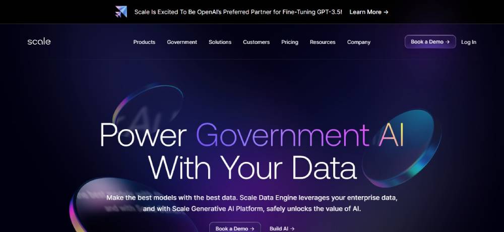
Scale AI
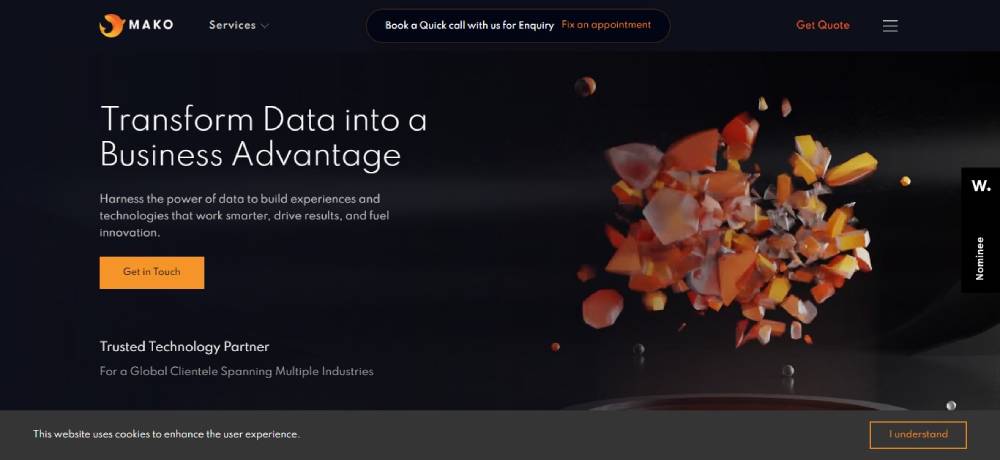
Mako IT Lab
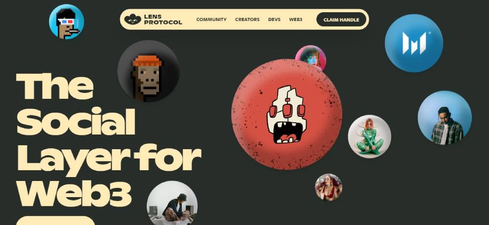
Lens Protocol
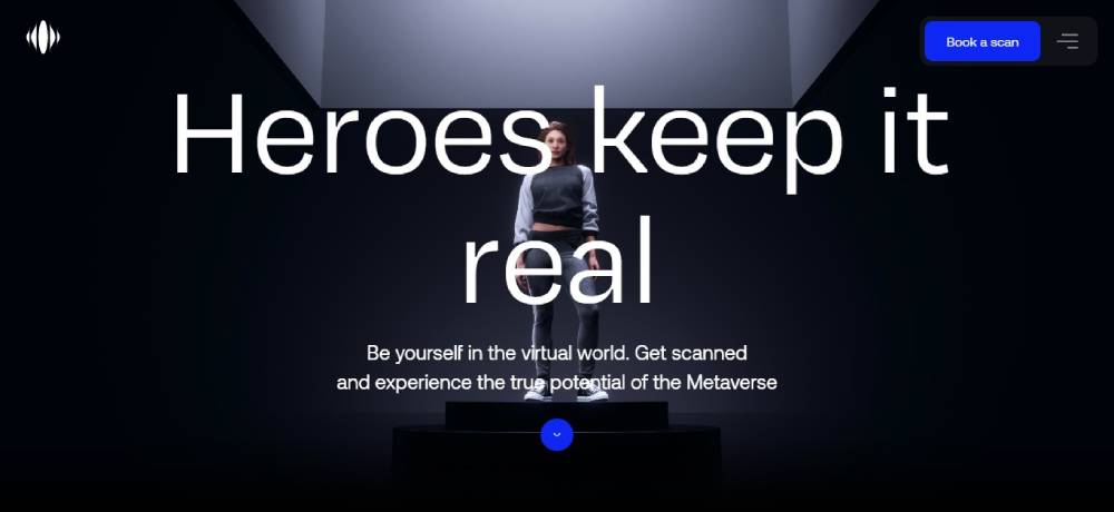
Metahero
Clearbit
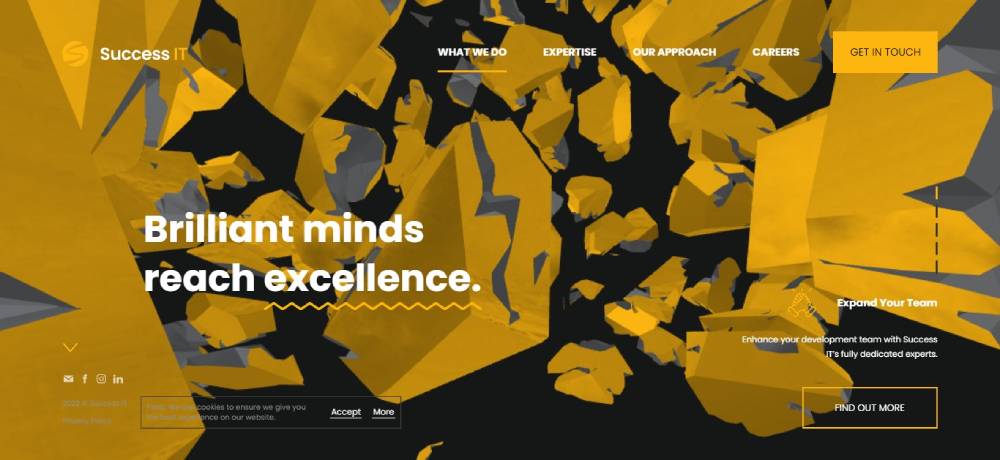
SUCCESS IT
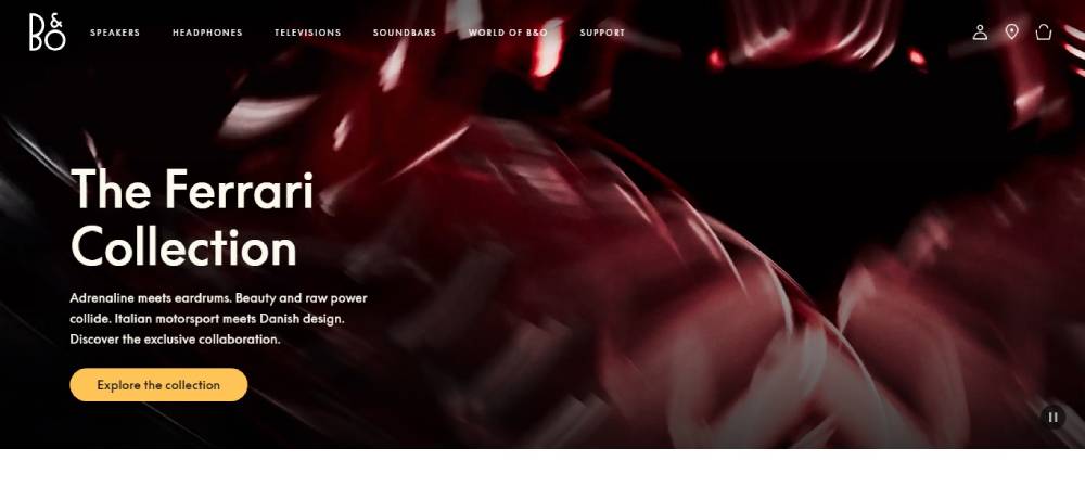
Bang & Olufsen
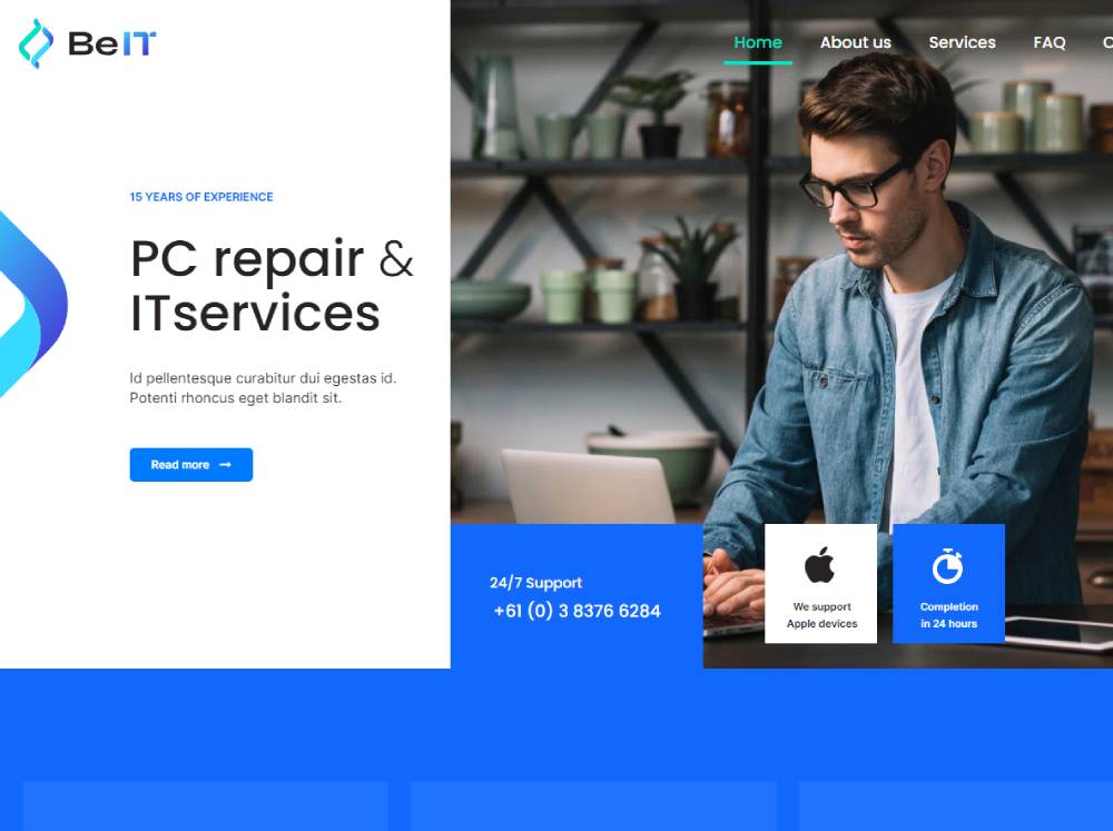
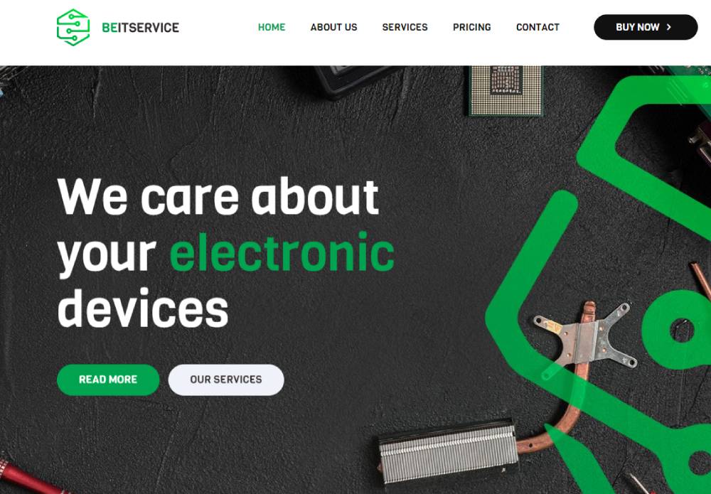
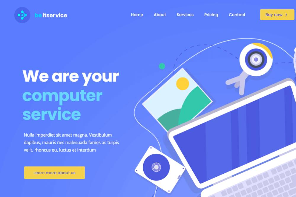
Be It
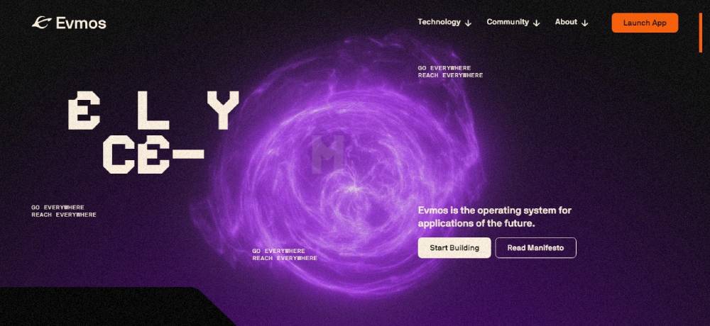
Evmos
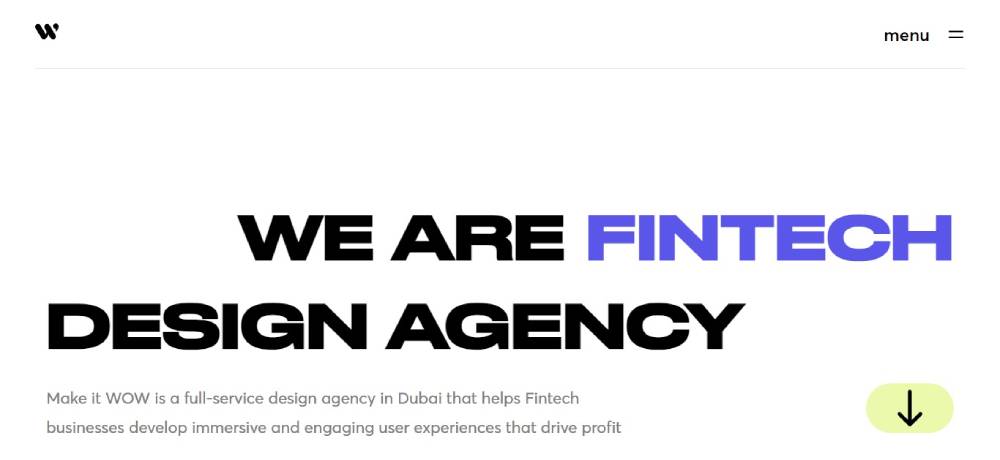
Make it WOW
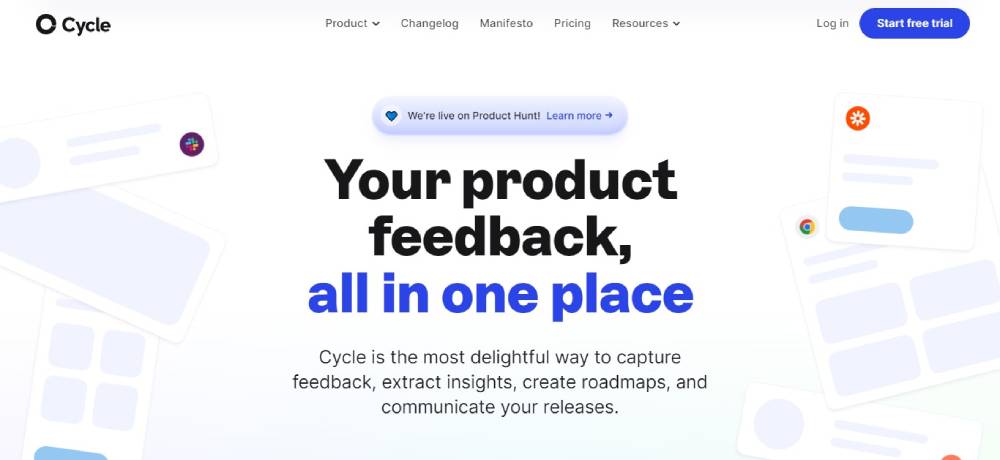
Cycle
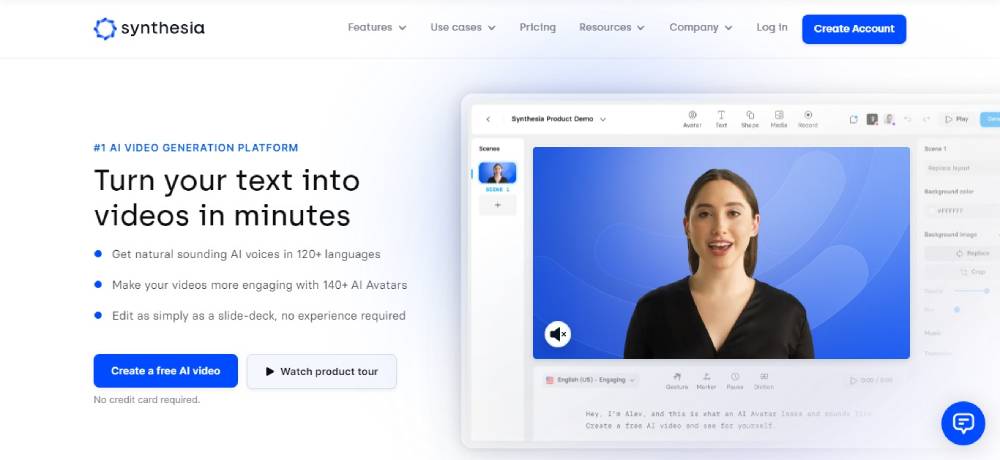
Synthesia
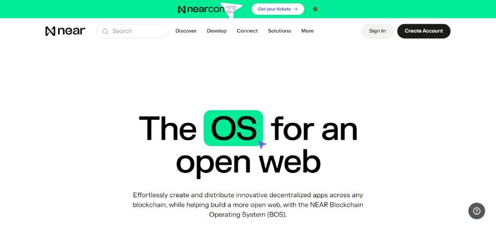
Near
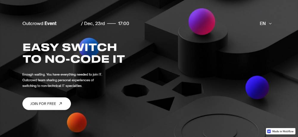
Switch To IT
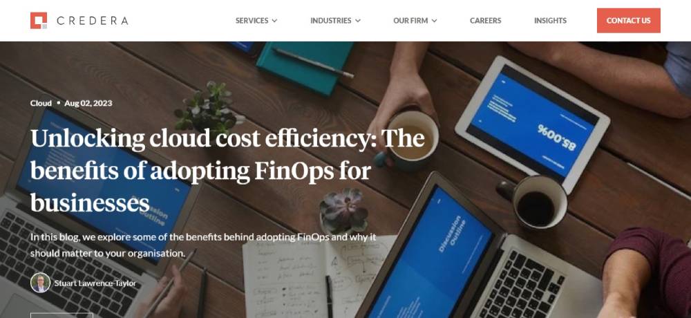
Credera
Be Itservice 5
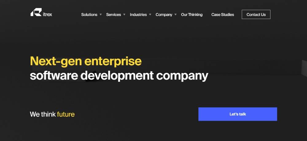
Itrex Group
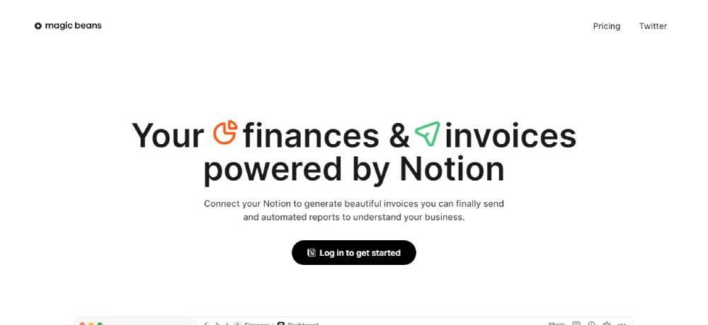
Magic Beans
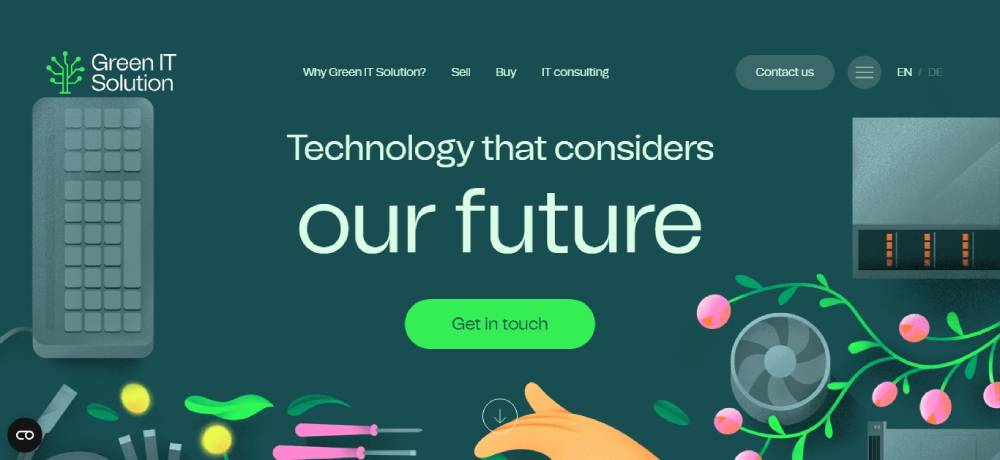
Green IT
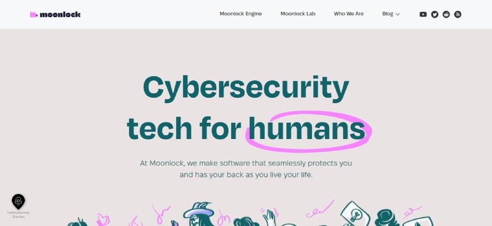
Moonlock
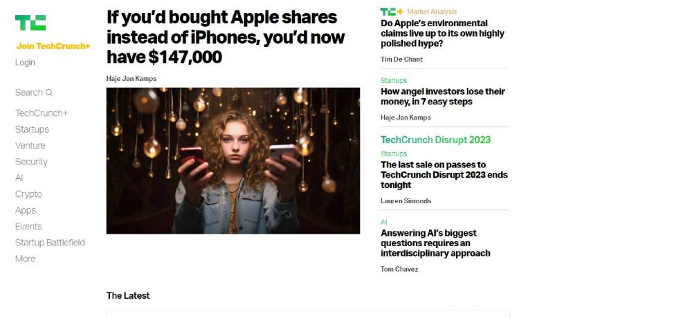
TechCrunch
Be Itservice3
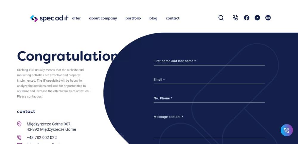
Spec Od IT
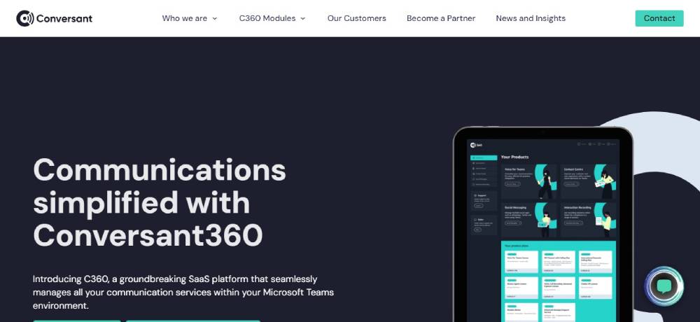
Conversant Technology
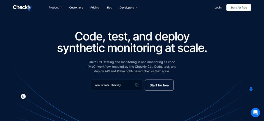
Checkly
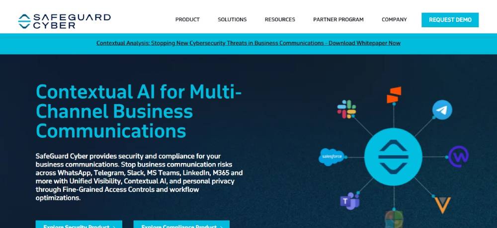
Safeguard Cyber
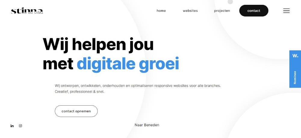
Stinna IT
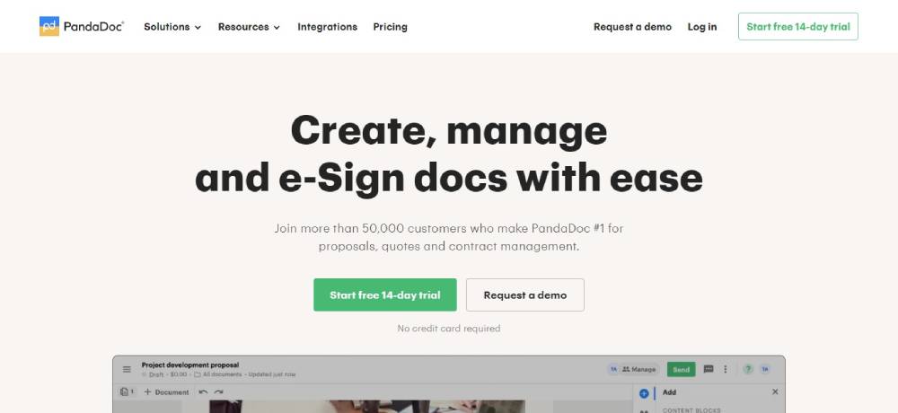
PandaDoc
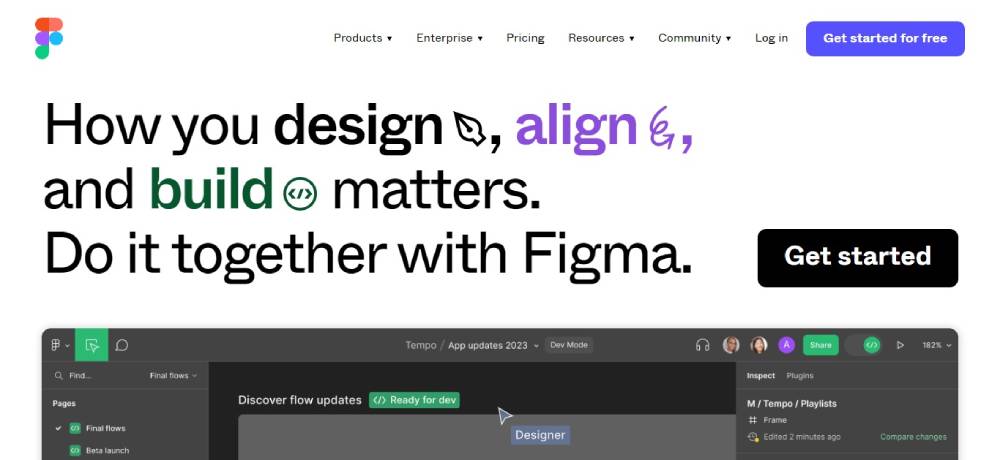
Figma
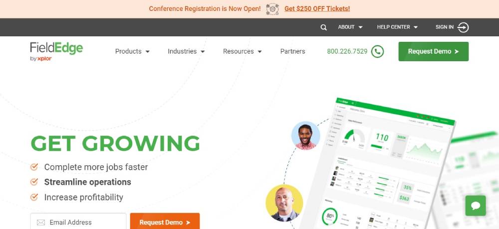
FieldEdge
Be Itservice2
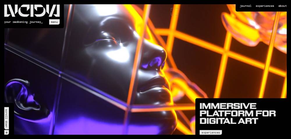
LVCIDIA
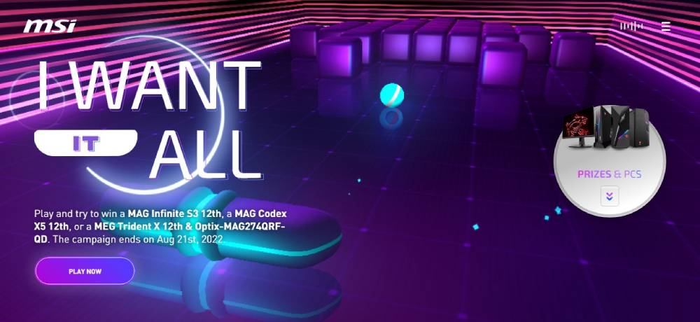
MSI - I Want It All
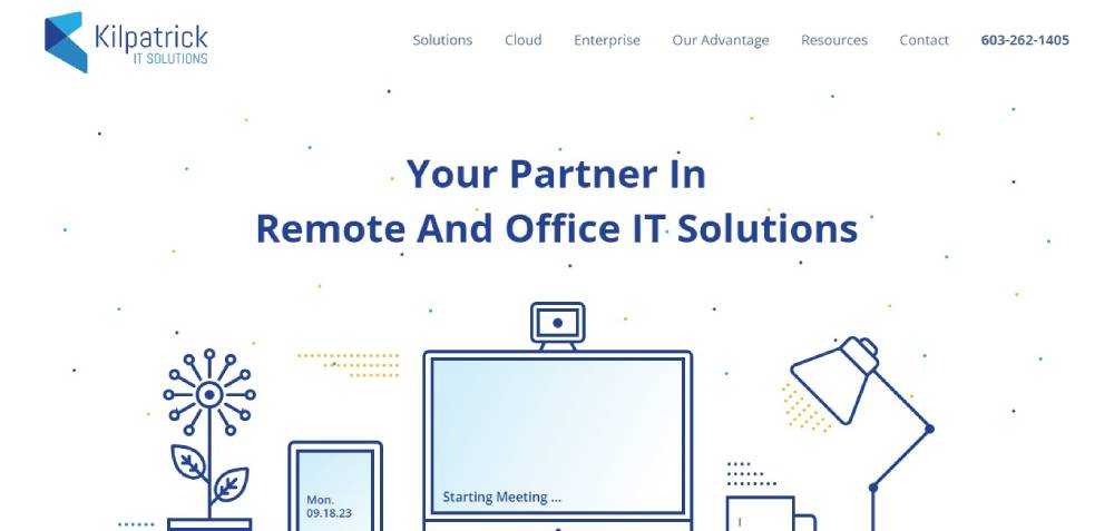
Kilpatrick IT
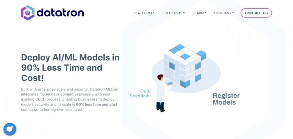
Datatron
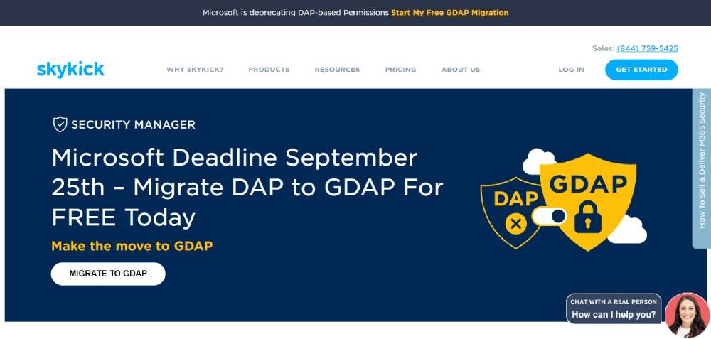
Skykick
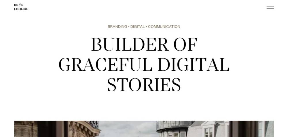
Belle Epoque
Limelight
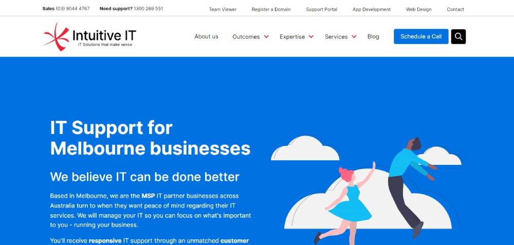
Intuitive IT
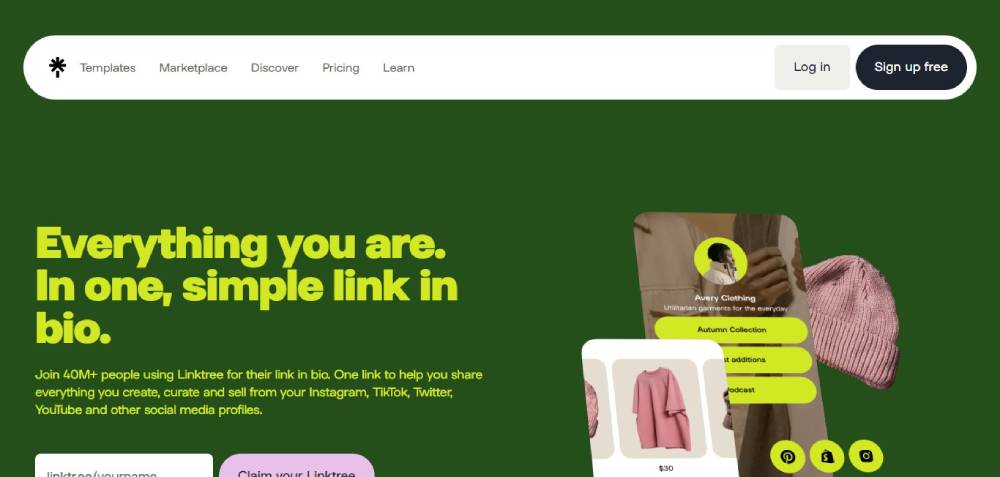
Link Tree
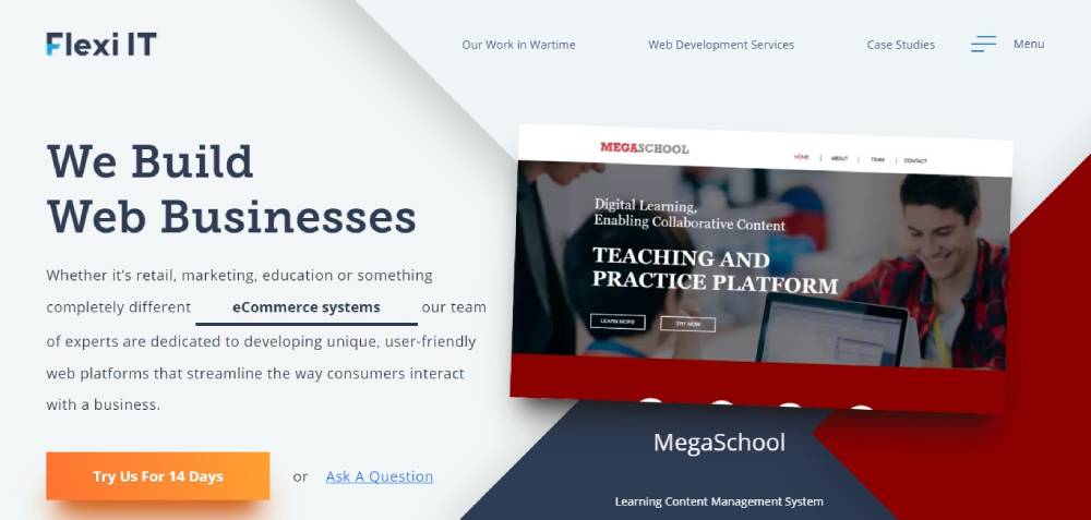
Flexi IT
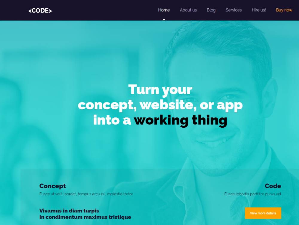
Be Code
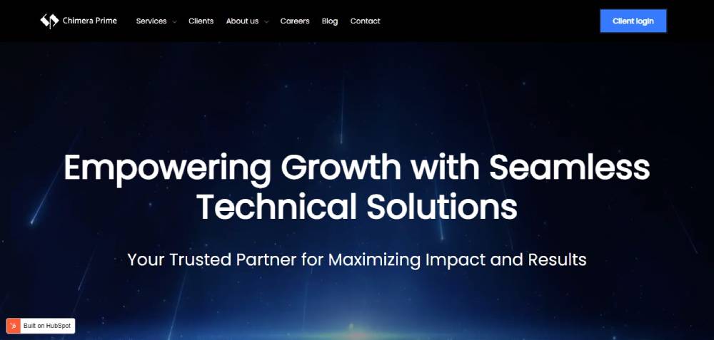
Chimera Prime
Ronas IT
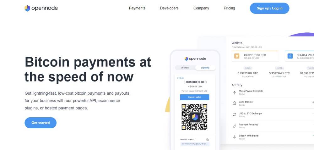
OpenNode
vTrail Map
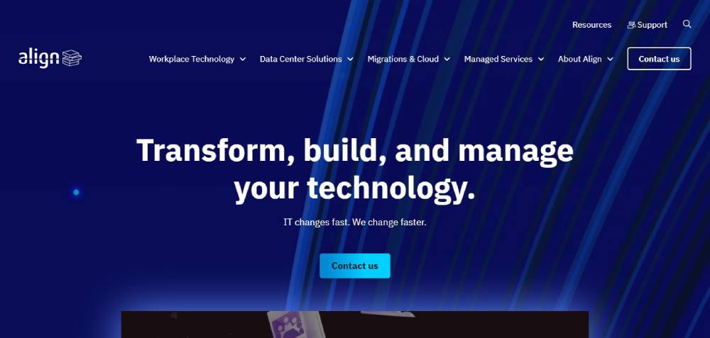
Align
PR-IT
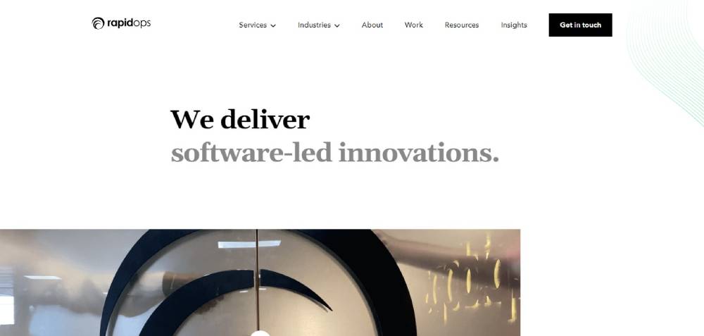
Rapidops
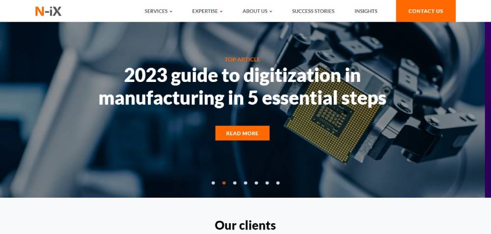
N-iX
Cisco
Jit Team

Intuit Mint
IT Ukraine Association
FitBit
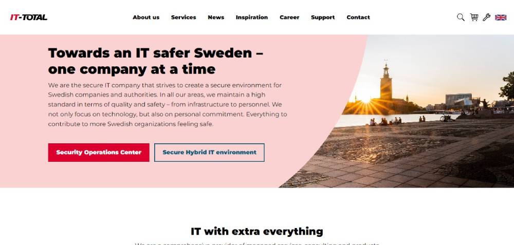
IT-Total
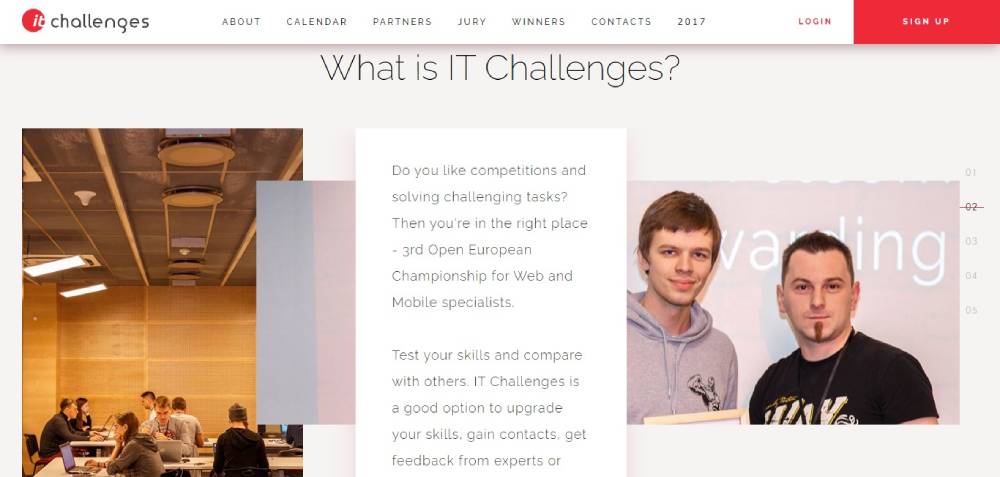
IT CHALLENGES
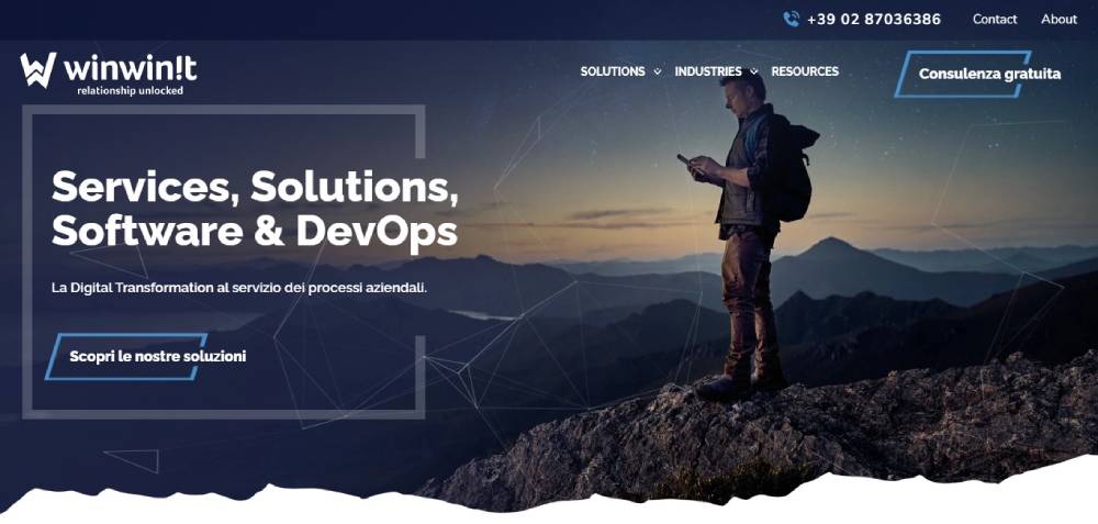
WinWinIT
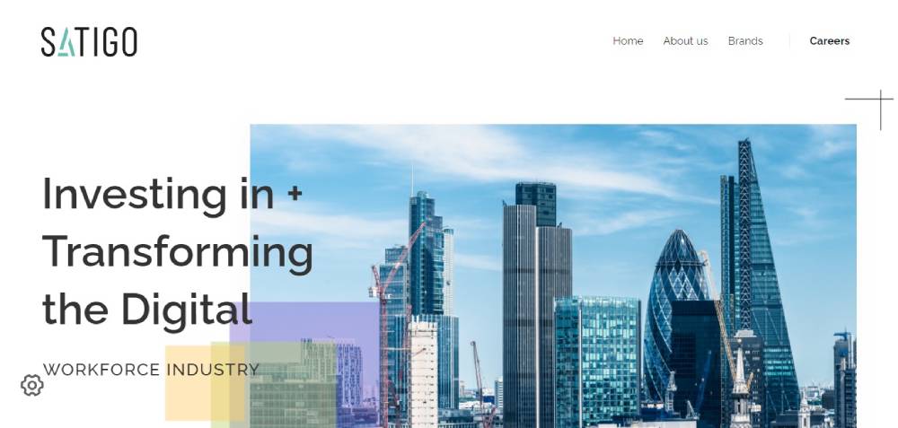
SATIGO
Namecheap
Mentel
VMware
Stelfox IT Recruitment
Meltano
Bridgeline Digital
DocuSign
Dropbox
Enterprise IT Company Websites That Set the Standard
Enterprise IT firms have a specific problem: they offer dozens (sometimes hundreds) of services. The website has to organize all of that without burying the visitor in menus.
Accenture, IBM, and Infosys each handle this differently. And those differences reveal a lot about what works at scale and what smaller firms can actually steal for their own sites.
How Accenture Structures Global Service Lines
Accenture's website serves clients in over 40 industries across 120 countries. That's a lot of content to organize. Their approach? Industry-first website navigation paired with a persistent search bar.
The homepage rotates thought leadership content (research reports, case studies, executive insights) above the fold. It treats the site more like a business publication than a brochure.
This works because Accenture's buyers are C-suite executives who respond to authority signals, not flashy product demos. Your mileage may vary if you're a 20-person MSP in Ohio.
IBM's Developer-Plus-Enterprise Approach
IBM splits its audience clearly. One path leads to enterprise solutions (Watson, Cloud Paks, consulting). The other leads to developer resources, documentation, and open-source tooling.
This dual-track architecture is something mid-size IT companies rarely attempt, but it's worth studying. If your company sells both to technical users and business buyers, forcing everyone through the same funnel wastes time.
IBM also keeps its product pages dense with technical specs, pricing calculators, and comparison tables. That level of transparency is rare in enterprise IT, and it builds trust faster than any marketing copy could.
What Smaller Companies Can Actually Borrow
You don't need Accenture's budget to steal their ideas. Three patterns translate well to smaller IT firms:
- Industry-specific landing pages: Even a 10-person IT firm can create separate pages for healthcare, finance, and manufacturing clients. Infosys does this at massive scale, but the principle works at any size
- Thought leadership on the homepage: A blog post or whitepaper rotating in the hero section positions you as more than a vendor
- Clear audience segmentation: "For enterprises" vs. "For SMBs" in the main website menu reduces bounce rates by getting people to the right content faster
Mid-Size IT Company Websites with Strong Design
Mid-size IT companies often have the hardest design challenge. They're too big to look scrappy, too small to look corporate. The sweet spot is a site that feels polished without feeling impersonal.
Datadog, Cloudflare, and HashiCorp all sit in this space. Their websites punch well above what you'd expect given their team sizes relative to IBM or Accenture.
Product-Led Websites vs. Service-Led Websites
This is probably the most important design decision an IT company makes, and most skip right past it.
Product-led sites (Datadog, HashiCorp) center the homepage around the product itself. Screenshots, interactive demos, embedded dashboards. The website is the sales pitch.
Service-led sites center the homepage around outcomes and expertise. Testimonials, case studies, certifications. The website is a trust machine.
Mixing these two approaches without thinking about it is how you end up with a homepage that confuses everyone. Took me a while to see this pattern clearly, but once you do, it becomes obvious which path fits your business.
| Approach | Homepage Focus | CTA Style | Best For |
| Product-led | Screenshots, demos, features | "Start free trial" | SaaS, DevOps tools |
| Service-led | Case studies, team, certifications | "Get a quote" | IT consulting, MSPs |
| Hybrid | Product overview + client results | "Book a demo" | Platform companies |
Interactive Demos and Product Previews
Datadog embeds live-looking dashboard previews directly on its homepage. You don't have to sign up for anything to see what the product actually looks like in action.
This is a small thing that makes a big difference. Unbounce data shows that landing pages with fewer than 10 elements convert at roughly twice the rate of pages with 40+ elements. Focused, visual, simple.
HashiCorp takes a different angle. Their site uses clean white space and code-style typography to appeal directly to infrastructure engineers. No stock photos of people pointing at whiteboards. Just product clarity.
IT Consulting Firm Websites That Build Trust Fast
Consulting is a trust sale. Your website isn't closing deals. It's opening doors.
The average B2B website conversion rate is about 1.8%, reflecting long, multi-step decision paths (Loopex Digital). For IT consulting, where contracts can run into six or seven figures, the website's only job is to make someone feel confident enough to book that first call.
Case Study Page Layouts That Convert
Thoughtworks structures each case study with a clear problem-solution-result format. No fluff. The reader knows within 10 seconds what the challenge was, what was done, and what the outcome looked like.
Slalom takes a slightly different approach, layering in client quotes and project photography. Both work. The important part is having real case studies at all (you'd be shocked how many consulting firm sites skip them entirely).
A few patterns from the best consulting case study pages:
- Headline states the result, not the service ("Reduced cloud costs by 40%" beats "Cloud Migration Services")
- Client logo visible above the fold
- Specific numbers and timelines, not vague claims
The Role of People Pages
Team pages are conversion tools, not vanity projects. When someone is about to hire a consulting firm, they want to know who'll actually show up. Capgemini features consultant profiles with bio links, publications, and areas of expertise.
This aligns with what Google calls E-E-A-T (Experience, Expertise, Authoritativeness, Trustworthiness). Putting real humans with real credentials on your site is one of the simplest ways to build authority. And yet, most IT consulting websites bury their team page three clicks deep or skip it entirely.
If your testimonial page shows client quotes and your team page shows real faces, you're already ahead of 80% of mid-market consulting firms.
Cybersecurity Company Websites and How They Communicate Risk
Cybersecurity sites operate under different rules. The visual language has to say "we take security seriously" without falling into tired tropes (green Matrix text, hooded figures at keyboards).
The best ones, CrowdStrike, Palo Alto Networks, SentinelOne, treat design as a trust signal that's just as important as any product feature.
Dark Themes and the Visual Language of Security
CrowdStrike uses its signature red against dark backgrounds to create urgency and authority. SentinelOne leans into high-contrast neon gradients. Palo Alto Networks keeps things a bit more corporate with structured dark mode web design and deliberate whitespace.
Dark interfaces aren't just an aesthetic choice here. In cybersecurity, dark surfaces make data visualizations (threat maps, attack timelines, dashboard metrics) stand out with more precision. The design is functional, not decorative.
That said, the trend is shifting a bit. Companies like Wiz and Okta use light, clean interfaces to signal approachability, especially when selling to non-technical buyers like compliance officers and CFOs. Your design mood should match your buyer persona, not your industry stereotype.
Threat Intelligence as a Marketing Asset
Content hubs double as SEO machines and trust builders. CrowdStrike's threat intelligence reports rank for hundreds of security-related search queries and simultaneously prove the company's technical depth.
PwC's 2025 Global Digital Trust Insights survey found that 66% of tech leaders rank cyber risk as the top priority for their organization. When prospects search for threat data and land on your research page, they're already pre-qualified.
This is one area where smaller cybersecurity firms can compete directly with the giants. Publish original threat research. Produce annual reports. Create a resource center that makes your site a destination, not just a brochure. Most cybersecurity company technology websites that rank well follow exactly this playbook.
Dashboard Screenshots and Product Visualization
SentinelOne and CrowdStrike both embed product UI screenshots throughout their marketing pages. These aren't mockups. They're real interface images showing actual threat detection panels, alert timelines, and response workflows.
This builds confidence in a way that bullet-point feature lists never will. When a CISO sees an actual dashboard with real data visualizations on your website, they can picture themselves using it. That mental shortcut from "looks good" to "I'd actually use this" is where conversions happen.
MSP and IT Support Company Websites
Managed service providers operate in a completely different world than enterprise IT. Your clients aren't Fortune 500 CTOs. They're small business owners who need someone to keep their email running and their data backed up.
The MSP market hit roughly $500 billion globally in 2025 (MSPAlliance). CompTIA reports that 93% of organizations using MSPs say they improved overall operational efficiency. That's a compelling stat to lead with on your homepage.
What MSP Homepages Get Wrong
I've reviewed hundreds of MSP websites over the years. The same mistakes show up over and over.
Overloaded homepages. Listing 15 services above the fold with no hierarchy. Everything feels equally important, which means nothing feels important.
Stock photo overuse. The same headset-wearing woman appears on every third IT support site. Original graphics drive 20% more engagement than stock photos according to web design research. Swap the generic images for screenshots of your actual monitoring dashboards or photos of your real team.
Buried contact info. If a small business owner has a server down, they don't want to fill out a six-field form design that asks for company size and annual revenue. A phone number, a chat widget, and a simple contact form. That's it.
Local IT Companies vs. National IT Companies: Different Website Needs
A local MSP in Cleveland has very different site requirements than a national provider like Connectwise or Datto.
Local trust signals matter more: Google review integration, service area maps, response time guarantees ("On-site within 4 hours"), and local business association memberships.
National MSP sites need scalability signals: SOC dashboards, compliance certifications, multi-location client maps, and best consulting websites style case studies with measurable outcomes.
According to Datto's 2024 State of the MSP report, the majority of MSPs primarily serve businesses with 25 to 50 employees. If that's your audience, your website should feel accessible and straightforward. Skip the enterprise jargon. Talk like a human being who fixes computers and keeps networks secure.
| MSP Type | Key Website Elements | Common Mistakes |
| Local/regional | Service area map, Google reviews, phone number in header | Hiding contact info, generic stock photos |
| National | SOC dashboards, compliance badges, client case studies | Trying to serve too many audiences at once |
| Vertical-focused | Industry-specific landing pages, compliance details | Not differentiating from generalist competitors |
Building a user friendly website for an MSP doesn't require a massive budget. It requires clarity about who you serve, what you do, and how fast someone can reach you when things break.
SaaS and Cloud IT Company Websites
SaaS and cloud companies face a design challenge that traditional IT firms don't. The website isn't just marketing material. It's often the first step of the product experience itself.
PipelineRoad's 2024 research found that pricing is the second most visited page on 80% of SaaS websites. That single stat tells you where to invest your design energy.
Product-Led Website Architecture
Atlassian builds its entire site around product ecosystems. Jira, Confluence, Trello, Bitbucket, each has its own micro-site with dedicated feature pages, documentation portals, and community forums, all connected through a shared navigation structure.
GitLab takes a different route. Their site functions almost like a software website and documentation hub combined, targeting developers who want to read specs before they sign up for anything.
Freshworks splits the difference. Their homepage highlights multiple product lines (CRM, ITSM, customer support) while keeping the entry point simple with a unified "Start free trial" CTA across every product.
Pricing Page Structures That Reduce Friction
According to TrustRadius 2025, 62% of B2B buyers disqualify vendors who don't show pricing before they talk to sales. If your pricing page hides everything behind a "Contact Us" button, you're filtering out most of your prospects.
Three patterns from top-performing SaaS pricing pages:
- Three tiers max: Research shows this reduces decision fatigue by 40% and lifts conversions by about 23%
- Highlight one plan: Marking a tier as "Most Popular" anchors the buyer's attention
- Annual/monthly toggle: Defaulting to annual billing increases annual plan adoption by 19% (InfluenceFlow, 2024)
The average SaaS pricing page converts 3 to 5% of visitors. Top performers hit 7 to 10%, according to Unbounce's 2025 Conversion Benchmark Report.
IT Company Website Homepage Patterns That Work
After looking at dozens of IT company sites across enterprise, mid-market, SaaS, MSP, and cybersecurity categories, a few homepage formulas keep showing up. Not because they're trendy. Because they convert.
Hero Section Formulas
Sweor reports that 70% of small business websites lack a clear call to action on their homepage. That's an insane number when you consider that clear CTAs can boost conversion rates by up to 161% (Sender, 2025).
The best IT company homepages follow a pattern that's simple but disciplined:
| Element | Purpose | Common Mistake |
| Headline (6-10 words) | States what you do, not who you are | Vague taglines ("Your Digital Partner") |
| Subheadline (1-2 lines) | Explains the benefit for the visitor | Repeating the headline in different words |
| Primary CTA | Drives one action (demo, trial, contact) | Multiple competing CTAs above the fold |
| Visual or Video | Shows the product or team | Generic stock imagery |
Cloudflare's call to action button placement is a good reference. One clear "Sign Up" button in the hero, no competing links, and a product animation running in the background that shows what the dashboard looks like.
Social Proof Placement
Client logos below the hero section. This pattern is almost universal among high-performing B2B technology sites. Loopex Digital research shows that reviews placed near CTAs increase conversions by 34%.
Atlassian shows customer counts ("Over 300,000 customers worldwide"). Datadog displays recognizable enterprise logos. HashiCorp features ecosystem partner badges from AWS, Microsoft Azure, and Google Cloud.
The key is specificity. "Trusted by thousands" is weak. "Used by 4 of the Fortune 10" is strong.
Mobile-First vs. Desktop-First Design
In 2024, mobile devices accounted for over 60% of global web traffic (Hostinger). And yet, Loopex Digital's 2026 data shows 81% of websites still perform poorly on mobile UX.
For IT companies, the calculus is slightly different. Most B2B decision-makers still browse on desktop during work hours. But they often do initial research on mobile, during commutes, between meetings, at conferences.
A responsive website design isn't optional. Companies that adopt responsive platforms report 62% sales increases according to DesignRush. The question isn't whether to build for mobile. It's whether to start there and scale up, or start on desktop and scale down.
Common Design Mistakes on IT Company Websites
Knowing what works is only half the picture. The other half is knowing what tanks your credibility, your conversions, and your search rankings.
These aren't theoretical problems. I've seen every single one of these on live IT company websites within the past year.
Jargon-Heavy Copy
Unbounce found that landing pages written at a 5th to 7th grade reading level convert 56% higher than pages written at an 8th to 9th grade level, and more than double the rate of professional-level writing.
IT companies are the worst offenders here. Homepage headlines like "End-to-end orchestration of your hybrid multi-cloud infrastructure" mean nothing to the buyer who just needs their servers to stop crashing.
Write for the person signing the check, not the engineer reviewing the architecture. Those are usually two different people with very different vocabularies.
Homepages That Try to Say Everything
More page elements = fewer conversions. Unbounce data shows that pages with fewer than 10 elements convert at roughly twice the rate of pages with 40+ elements.
The temptation for IT companies is understandable. You offer managed IT, cloud migration, cybersecurity, helpdesk support, backup and disaster recovery, and VoIP. You want every service visible on the homepage. But listing everything with equal weight makes nothing stand out.
Pick your top 3 services. Feature those prominently. Link the rest from a services page. Your homepage is a funnel entrance, not a brochure. If you're stuck on how to structure this, studying good UX patterns from outside your industry can help break the habit.
Ignoring Page Speed
A B2B site loading in 1 second converts 5x more visitors than one loading in 10 seconds, according to Portent.
When an IT solutions provider (someone who literally sells infrastructure and cloud services) has a slow website, the message is devastating. It says: "We can't even optimize our own site. Why would you trust us with yours?"
Run Google PageSpeed Insights on your homepage right now. If your score is below 80, fix it before you spend another dollar on ads or content. Speed issues are often the lowest-cost, highest-impact fixes available.
Missing or Generic Calls to Action
"Learn More" and "Submit" aren't calls to action. They're placeholders that someone forgot to replace.
Sender's 2025 CTA research shows that specific, action-oriented CTA copy can boost conversions by up to 161%. "Get Your Free Network Assessment" beats "Contact Us" every time. "See Our Pricing" beats "Learn More" every time.
| Weak CTA | Better CTA | Why It Works |
| Submit | Get My Free Audit | Specific outcome, personal language |
| Learn More | See How It Works | Action-oriented, curiosity-driven |
| Contact Us | Talk to an Engineer | Human, role-specific, builds confidence |
| Click Here | Start Your Free Trial | Tells the user exactly what happens next |
How to Evaluate an IT Company Website Before Redesigning Yours
Before you rebuild anything, study what's already working. Competitor analysis isn't about copying. It's about understanding what your market expects and where the gaps are.
Gartner's 2024 Digital Buying Report found that 61% of B2B buyers prefer a rep-free buying experience. Your website is your sales process now. Treat the redesign like you'd treat a sales strategy overhaul, not a creative project.
Tools for Competitive Website Analysis
Google PageSpeed Insights: Free. Gives you Core Web Vitals scores for any URL, yours or a competitor's.
Screaming Frog: Crawls up to 500 URLs for free. Shows site structure, broken links, page titles, and metadata. Perfect for understanding how a competitor organizes their information architecture.
BuiltWith: Reveals the tech stack behind any website. CMS, analytics tools, marketing automation, hosting provider. If a competitor's site is fast and clean, BuiltWith tells you what's running it.
Google Search Console: For your own site, this shows which pages rank, what queries drive traffic, and where your mobile usability problems live.
What to Look at Beyond Visuals
Most people evaluate competitor websites by opening the homepage and saying "looks nice" or "looks dated." That tells you almost nothing useful.
Dig deeper:
- How many clicks does it take to reach a service page from the homepage?
- Does the site have a blog, resource center, or thought leadership hub?
- What does the internal linking structure look like?
- Are case studies accessible or buried?
Use Baymard Institute's UX methodology as a framework. Their 2024 research shows that UX-driven improvements can lift conversion rates by 20 to 35%.
Prioritizing Changes by Impact
You don't need to redesign everything at once. In fact, you probably shouldn't.
A smarter approach follows this order:
- Messaging first: Rewrite your homepage headline, subheadline, and primary CTA. This is the cheapest change with the biggest impact on conversions
- Structure second: Fix navigation, page hierarchy, and internal linking. Check your website layout against competitors who rank above you
- Visual polish last: Colors, fonts, imagery. These matter, but less than most people think
Benchmark against 3 to 5 direct competitors, not aspirational enterprise companies. If you're a 15-person MSP, comparing yourself to IBM's website is a waste of time. Compare yourself to the MSP in the next city that's winning the same deals you're losing.
Before you commit to a full website redesign, run a quick audit using the tools above. Measure where you stand on speed, structure, and messaging clarity. Then prioritize fixes by potential revenue impact, not by how exciting they are to the design team.
FAQ on IT Company Websites
What makes a good IT company website?
A good IT company website loads fast, communicates services clearly above the fold, and includes trust signals like case studies, client logos, and certifications. Technical performance matters doubly here because visitors judge your competence by your own site's speed and design quality.
Which enterprise IT companies have the best websites?
Accenture, IBM, and Infosys consistently rank among the strongest. Each takes a different approach to organizing complex service lines. Accenture leans into thought leadership, IBM splits paths for developers and enterprise buyers, and Infosys segments by industry vertical.
How much does an IT company website cost to build?
Costs range from $5,000 for a basic MSP site to $75,000 or more for enterprise-level builds with custom integrations. The biggest variable isn't design. It's content strategy, information architecture, and how many service pages need to be created.
What pages should an IT company website include?
At minimum: homepage, services overview, individual service pages, case studies, about/team page, and contact. SaaS companies also need a pricing page and documentation portal. MSPs should add a service area page with local trust signals.
How do cybersecurity companies design their websites differently?
Cybersecurity firms like CrowdStrike and SentinelOne often use dark-themed designs with high-contrast data visualizations. The visual language signals technical depth. Lighter themes (Wiz, Okta) work when the audience is less technical, like compliance officers or CFOs.
Should an IT company website show pricing?
For SaaS and cloud products, yes. Research shows 62% of B2B buyers disqualify vendors who hide pricing. For custom IT consulting or managed services, showing starting prices or pricing frameworks reduces friction without locking you into specific numbers.
What CMS do most IT companies use for their websites?
WordPress powers the majority of small to mid-size IT company sites. Enterprise firms often use HubSpot CMS, Contentful, or custom builds. SaaS companies frequently choose Webflow for its design flexibility and fast deployment without heavy developer involvement.
How often should an IT company redesign its website?
Most IT companies benefit from a full redesign every 2 to 3 years, with ongoing content updates monthly. If your Core Web Vitals scores are dropping, competitors have redesigned recently, or your conversion rate has plateaued, it's probably time.
What's the average conversion rate for IT company websites?
IT and managed services websites average around 1.5 to 1.8% conversion rates, according to FirstPageSage. That's below the B2B average of 2.9%. Improving page speed, CTA clarity, and adding case studies are the fastest ways to close that gap.
How do I make my IT company website stand out from competitors?
Skip the stock photos and generic taglines. Use real project screenshots, specific client results with numbers, and original team photography. Most IT websites look identical. Specificity in copy and visuals is what creates separation in a crowded market.
Conclusion
The best IT company websites examples share a common thread. They prioritize clarity over complexity, speed over spectacle, and trust signals over empty marketing promises.
Whether you're building a managed service provider site targeting local SMBs or a SaaS platform competing with Atlassian and Freshworks, the fundamentals stay the same. Fast load times. Specific CTAs. Real case studies with measurable outcomes.
Your homepage layout, service page structure, and pricing page transparency all feed into how visitors perceive your technical credibility. A slow, cluttered site tells prospects everything they need to know, and none of it is good.
Start with messaging. Fix your page speed. Add genuine social proof. Then worry about the visual polish. The IT companies winning online right now aren't the ones with the biggest design budgets. They're the ones who made every page answer one question clearly: why should I trust you?


