

Wedding Photographer Website Design Examples That Are Awesome
January 6, 2026
Manufacturing Website Design Examples You Shouldn’t Miss
January 7, 2026Most registered dietitian websites look the same. Soft greens, a stock photo of avocado toast, and a "Book Now" button buried somewhere below the fold.
The sites that actually convert visitors into clients do things differently. They combine clear messaging, strong dietitian website design, and booking functionality that makes scheduling a consultation feel effortless.
This collection of dietitian website design examples breaks down what real nutrition practices, from private practice RDNs to group coaching platforms, are doing right with their online presence. You will see specific layout choices, color palettes, platform comparisons across Showit, Squarespace, and WordPress, plus the design mistakes that cost dietitians new clients every week.
What Is Dietitian Website Design
Dietitian website design is the process of building a registered dietitian's online presence with a layout, color palette, and content structure that attracts potential clients and converts them into booked consultations.
It covers everything from homepage structure and service page organization to booking integration and mobile responsiveness.
Most nutrition practice websites run on platforms like Showit, Squarespace, WordPress, or Webflow. Each handles things differently. Showit gives full drag-and-drop control. Squarespace offers polished templates out of the box. WordPress provides flexibility through plugins. Webflow sits somewhere between code and visual editing.
A dietitian website is not just a digital business card. It is the primary client acquisition tool for any private practice, whether the dietitian offers virtual nutrition counseling, in-person sessions, group coaching, or digital products like meal plans and courses.
The site needs to communicate credentials (RDN, LD, CSSD), specialty areas (gut health, sports nutrition, eating disorders, PCOS), and a clear path from landing on the homepage to booking a consultation.
Dietitian Website Design Examples
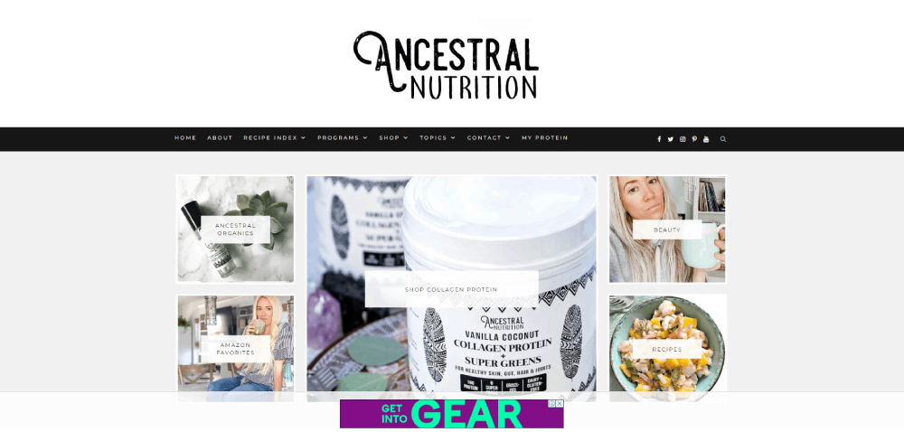
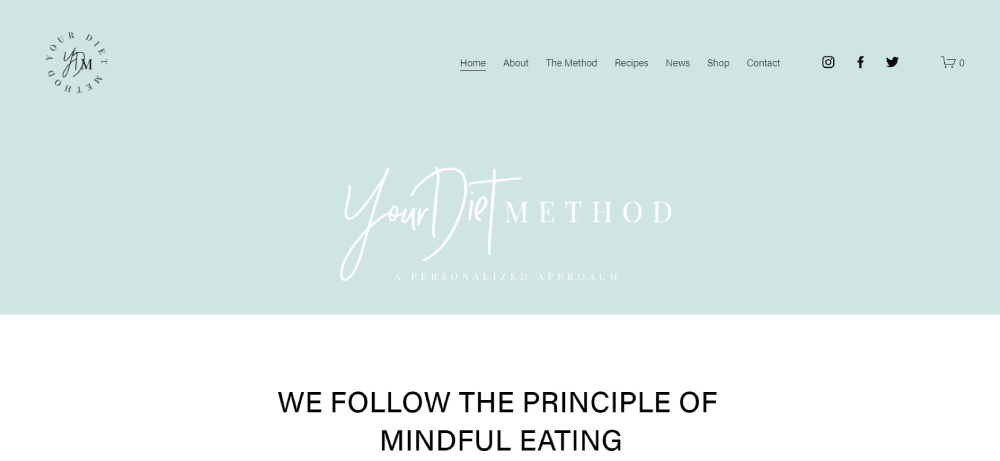
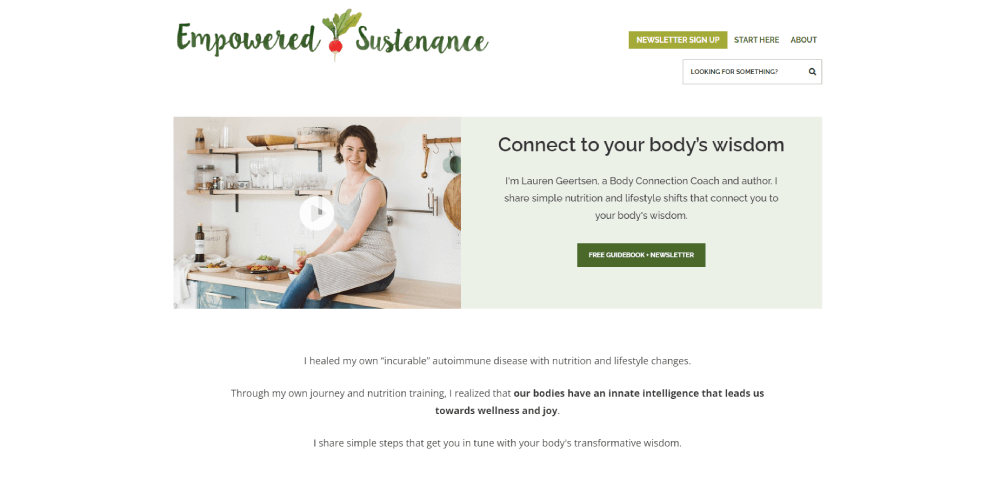
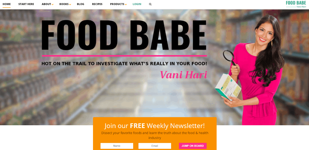
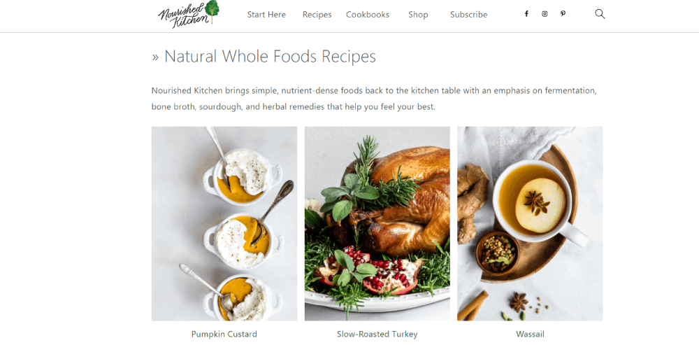
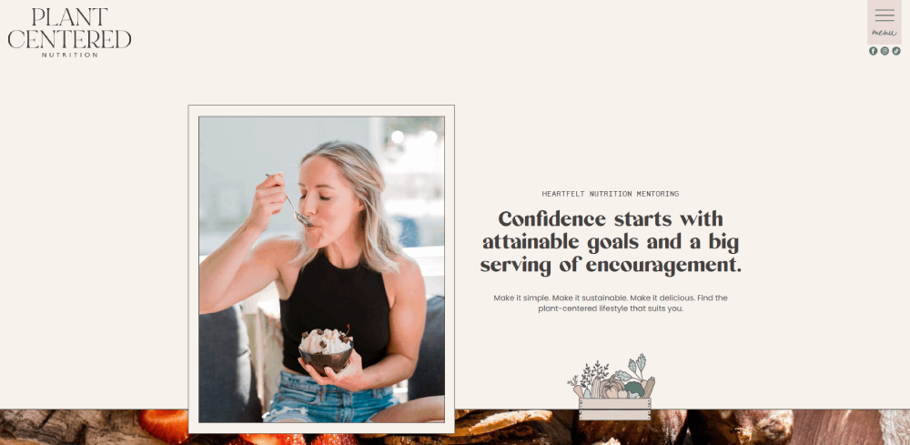
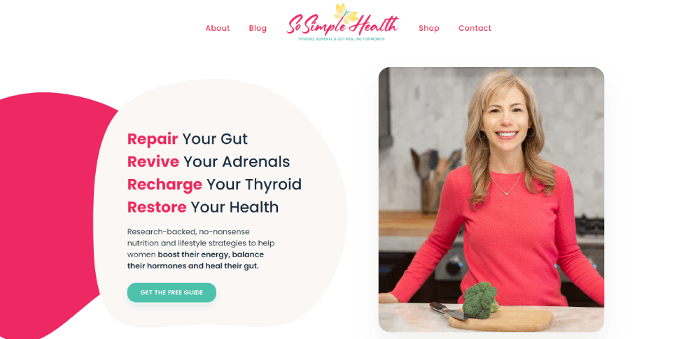
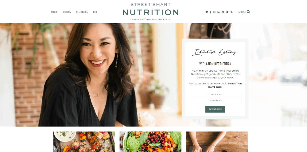
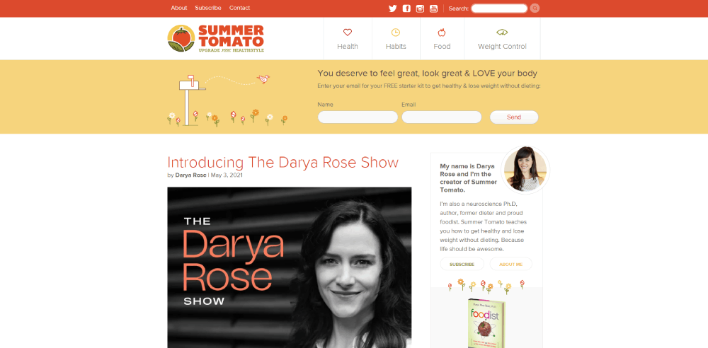
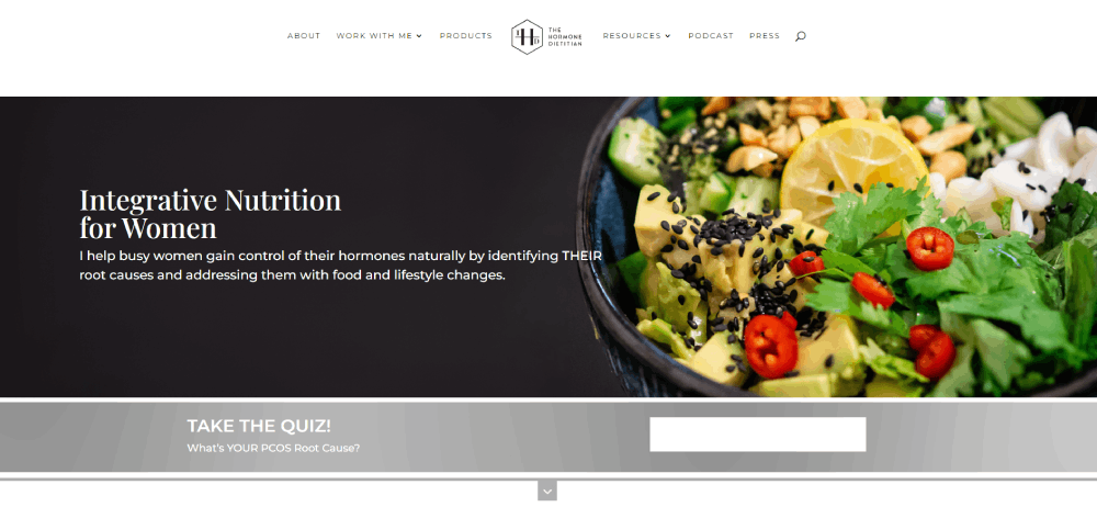
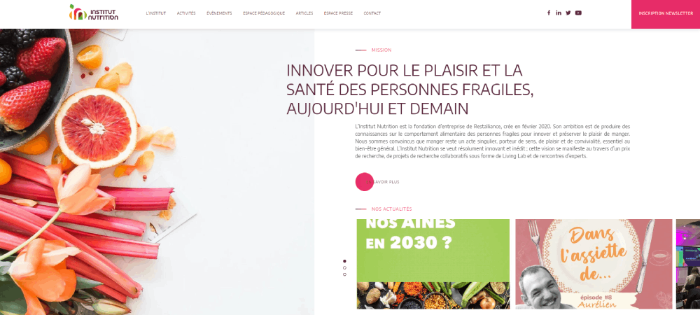
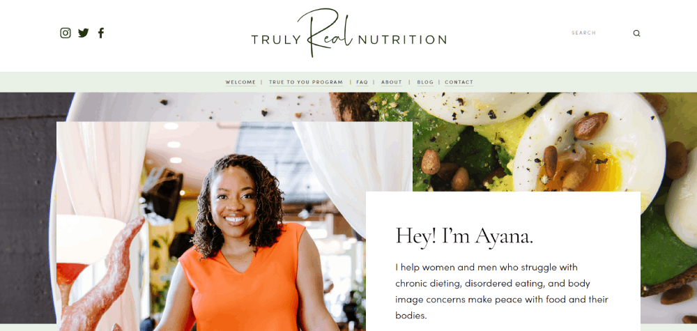
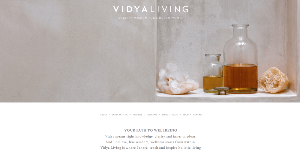
Ancestral Nutrition
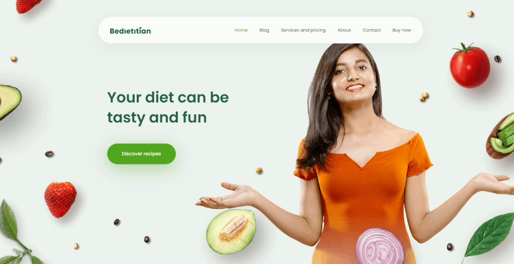
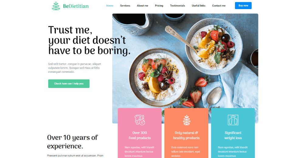
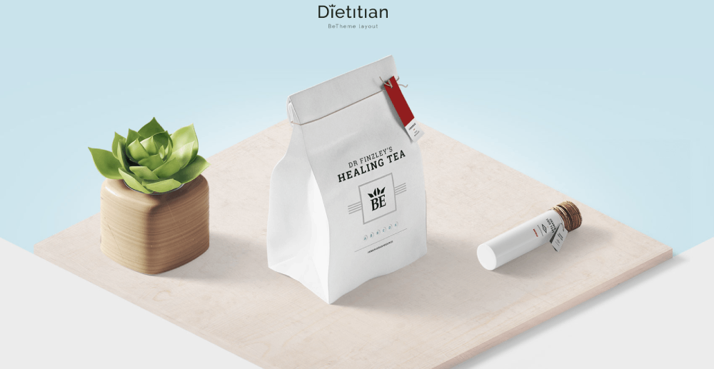
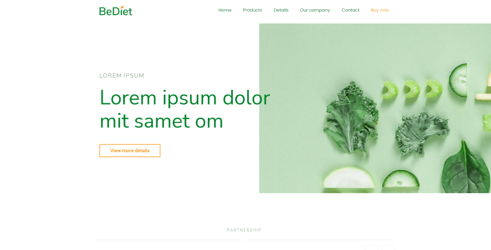
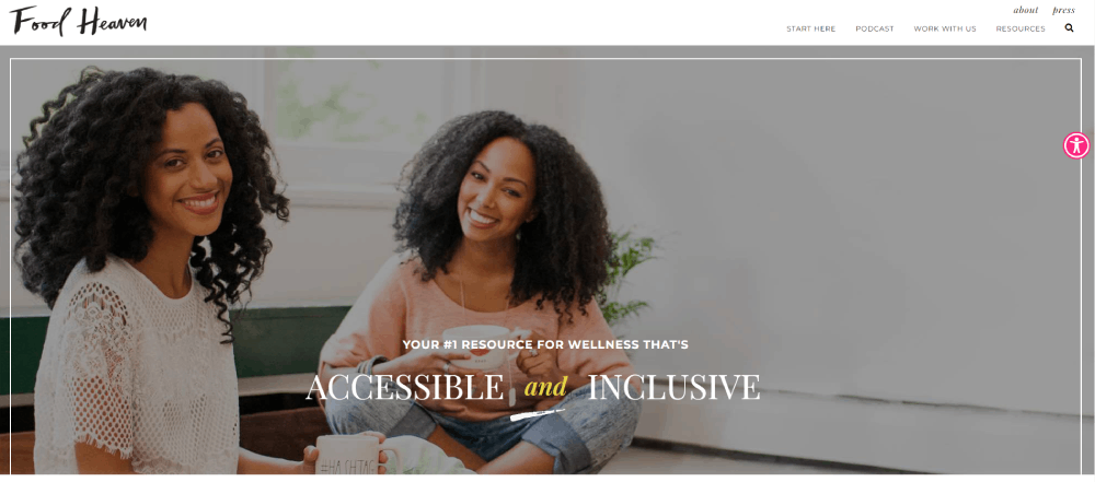
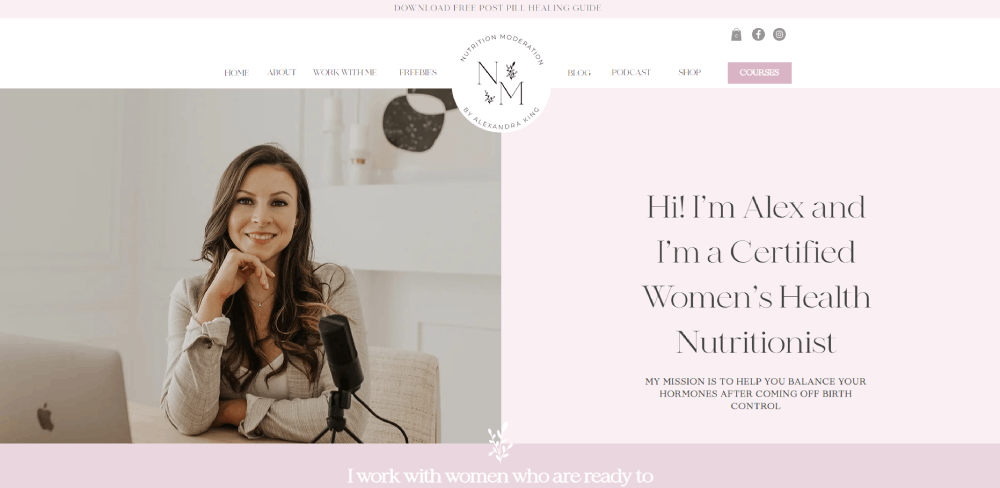
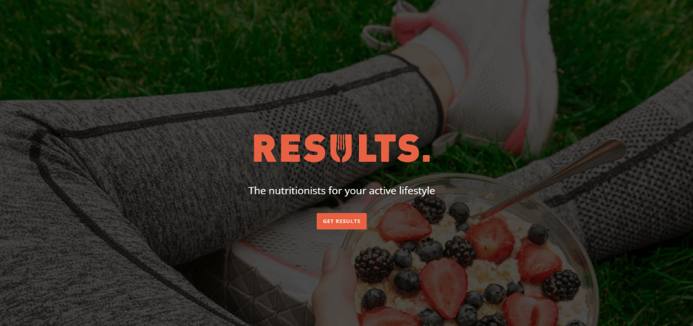
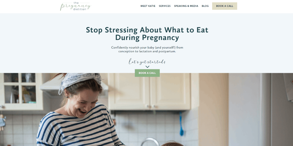
Be Dietitian 3
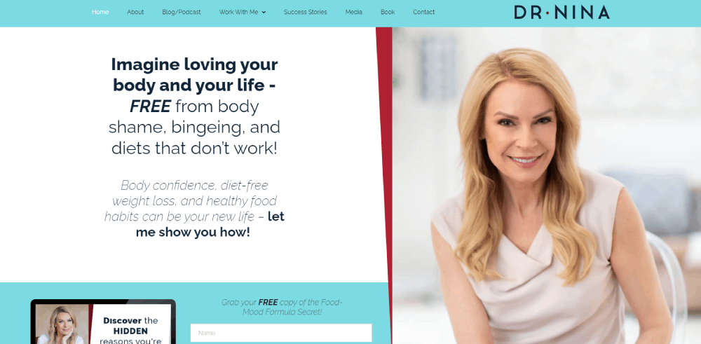
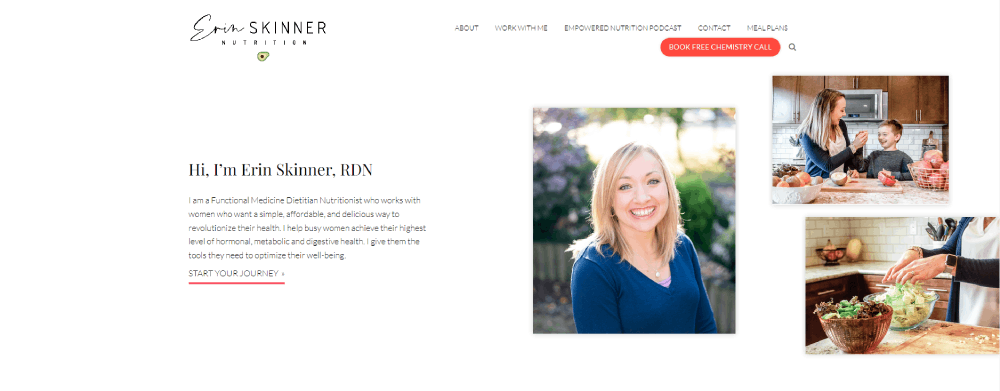
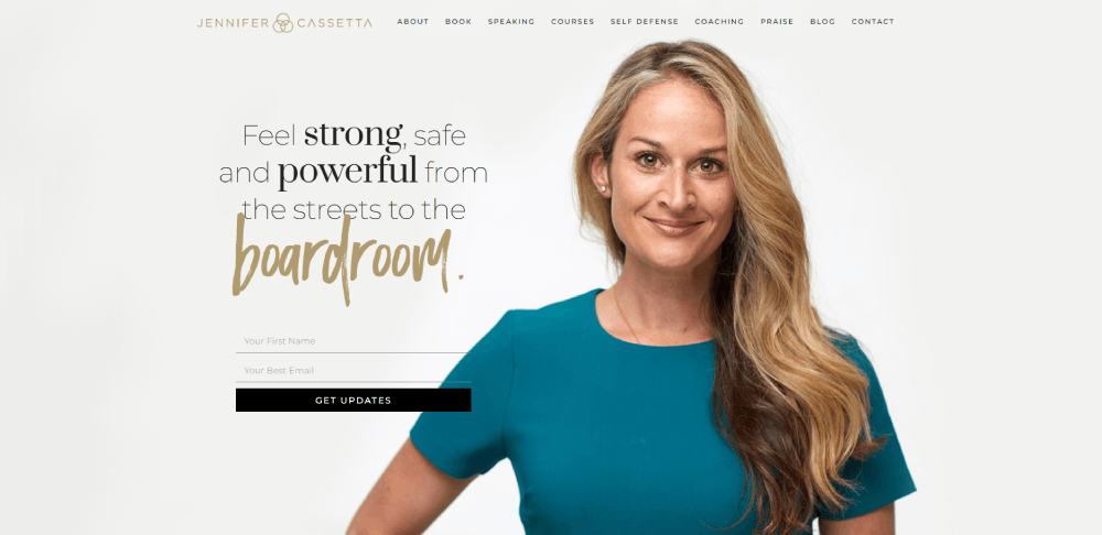
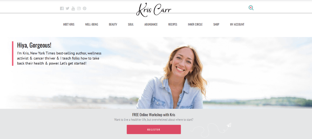
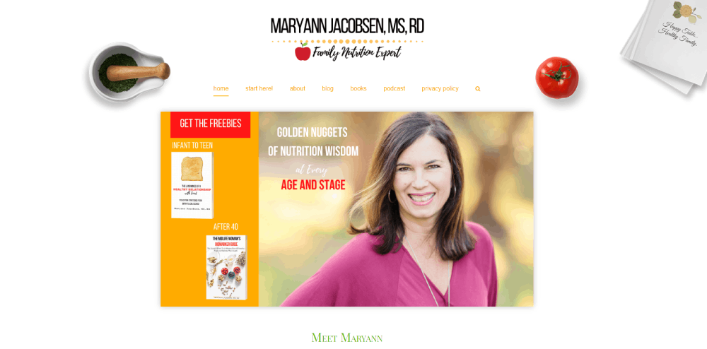
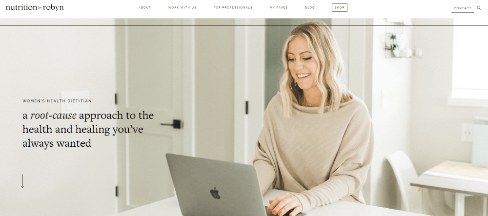
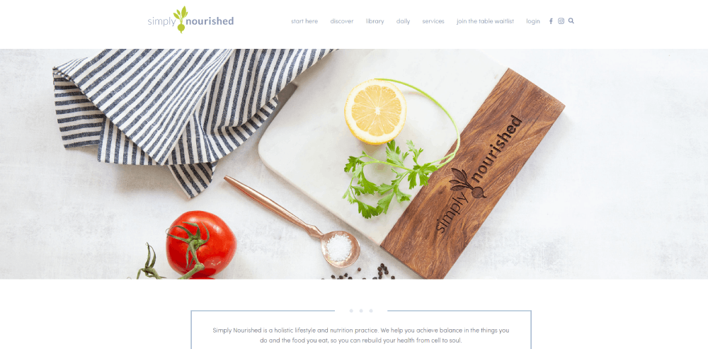
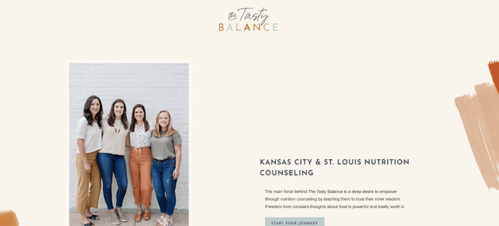
Maryann Jacobsen
Why Does Website Design Matter for Dietitians
People decide whether they trust a health professional's website in about 50 milliseconds. That first impression comes entirely from design.
A cluttered layout with mismatched fonts and stock photos of salads does not build confidence. A clean, professional website with visible credentials, real photography, and a clear booking path does.
Think about what happens when someone Googles "registered dietitian near me" or "nutritionist for IBS." They click a result, see the homepage, and make a snap judgment. If the site looks outdated, loads slowly, or buries the booking button three clicks deep, that visitor leaves.
Mobile compatibility matters more than most dietitians realize. Over 60% of health-related searches happen on phones. A site that looks great on desktop but breaks on mobile loses more than half its potential clients before they even read a word.
The Academy of Nutrition and Dietetics lists thousands of registered dietitian nutritionists. Standing out requires more than credentials. It requires a site that feels trustworthy from the first scroll.
Conversion rate depends on design decisions. Where you place the call-to-action button, how you display testimonials, whether your services page explains pricing, all of it directly affects whether someone books or bounces.
What Makes a Good Dietitian Website
Before looking at specific examples, it helps to know what separates a good dietitian website from a forgettable one. The criteria below are what actually move the needle on client trust and bookings.
How Does Layout Affect Client Trust
The hero section is the first thing visitors see, and it sets the tone for everything. A strong homepage puts a clear headline, a professional photo of the dietitian, and one visible CTA above the fold.
Simple website navigation keeps visitors from getting lost. Three to five menu items is the sweet spot for most nutrition practice sites.
What Role Does Color Palette Play in Nutrition Websites
Most successful dietitian sites lean toward soft greens, warm neutrals, and muted blues. These signal health, calm, and approachability. A green color palette works particularly well for nutrition brands because of its natural association with fresh food and wellness.
Bolder palettes work too. Alix Turoff's site uses saturated colors that feel energetic and confident. The key is consistency across every page, from the header down to the footer.
How Do Call-to-Action Buttons Improve Conversions
A single, high-contrast CTA button placed above the fold on the homepage outperforms scattered buttons every time. "Book a Free Consultation" converts better than vague labels like "Learn More" or "Get Started."
Two CTA buttons in the top navigation (one for existing clients to log in, one for new clients to book) is a pattern Culina Health uses well. Placement and color contrast matter more than clever wording.
What Content Should a Dietitian Homepage Include
A strong dietitian homepage covers these elements without overwhelming the visitor:
- Headline stating who you help and with what
- Professional photo (not a stock image)
- Brief practice overview with credentials visible
- Services summary with links to the full services page
- Client testimonials or a link to a dedicated testimonial page
- Blog excerpts showing expertise in the dietitian's specialty
- Booking widget or scheduling link (Calendly, Practice Better, SimplePractice)
That is it. No lengthy mission statements. No auto-playing videos. No pop-ups blocking the screen before the visitor has read a single line.
What Website Platforms Do Dietitians Use
Platform choice shapes everything about a dietitian's website, from how it looks to how easy it is to update. Most nutrition professionals end up on one of four or five platforms, and each has clear strengths and tradeoffs.
How Does Showit Compare to Squarespace for Dietitians
Showit gives full visual control with drag-and-drop editing. Every element can be placed exactly where you want it, pixel by pixel. It integrates with WordPress for blogging, which means you get creative freedom on the front end and a solid content management system for articles and recipe pages.
Squarespace is faster to set up. Templates look polished immediately, and the built-in booking, email collection, and e-commerce tools work without plugins. The tradeoff is less design flexibility. You are working within the template's structure.
Showit is better for dietitians who want a fully custom look. Squarespace is better for those who want something clean and functional without hiring a designer.
Is WordPress Still a Good Option for Nutrition Websites
WordPress powers a huge percentage of nutrition websites, especially those with large blog archives or complex booking setups. The plugin ecosystem handles almost anything: scheduling through Calendly or Practice Better, email marketing through Mailchimp or Flodesk, payment processing through Stripe.
The downside is maintenance. Updates, security patches, plugin conflicts. Took me a while to accept that WordPress sites need regular attention or they break. For dietitians who want to set it and forget it, this is not the best fit.
When Should a Dietitian Choose Webflow
Webflow sits between code and visual design. It produces clean, fast-loading sites with precise layout control, but there is a learning curve.
If a dietitian plans to hire a designer or has some technical comfort, Webflow produces sites that tend to load faster than WordPress and offer more flexibility than Squarespace. It handles responsive design well, with separate controls for desktop, tablet, and mobile layouts.
FAQ on Dietitian Website Design Examples
What platform is best for a dietitian website?
Showit and Squarespace are the most popular choices among registered dietitians. Showit offers full design control with WordPress blog integration. Squarespace provides polished templates with built-in booking and e-commerce tools, making it faster to launch without hiring a designer.
How much does a dietitian website cost to build?
A DIY site on Squarespace or Wix runs $150 to $500 per year. Custom dietitian website design from a professional ranges from $2,000 to $8,000 depending on page count, booking integration with tools like Practice Better or Calendly, and brand identity work.
What pages should every dietitian website have?
At minimum: homepage, about page with RDN credentials, services page with session details, a testimonial section, and a contact or booking page. A blog and resource library help with search visibility and demonstrate nutrition expertise to potential clients.
What colors work best for nutrition websites?
Soft greens, warm neutrals, and muted blues are the most common. These signal health and approachability. Bolder palettes work too if they match the dietitian's brand personality. Consistency across every page matters more than the specific colors chosen.
How do I add online booking to my dietitian site?
Most dietitians use Calendly, Practice Better, or SimplePractice. These tools embed directly into Squarespace, WordPress, and Showit pages. Place the booking widget on your homepage and services page so visitors can schedule without extra clicks.
Should a dietitian website include pricing?
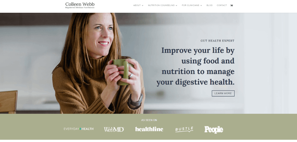
Transparent pricing builds trust and filters out clients who are not a good fit. Colleen Webb Nutrition lists package details and costs clearly. If full pricing feels uncomfortable, listing a "starting at" range still helps visitors decide before reaching out.
How important is mobile design for dietitian websites?
Over 60% of health-related searches happen on phones. A mobile responsive nutrition site with tap-friendly buttons, compressed images, and readable text is not optional. Sites that break on mobile lose more than half their potential client base immediately.
Do dietitians need a blog on their website?
A blog helps with search visibility and positions the dietitian as an authority in their specialty area. Recipe pages, condition-specific guides, and nutrition education content drive organic traffic. It also gives visitors a reason to return between appointments.
What makes a dietitian website convert visitors into clients?
A clear headline stating who you help, visible credentials, one strong call-to-action above the fold, client testimonials, and a simple booking path. Culina Health and Alix Turoff both demonstrate this with different visual approaches but the same conversion logic.
Can I build a dietitian website myself without a designer?
Yes. Showit and Squarespace both offer templates built for health and wellness professionals. Platforms like Webflow require more technical comfort. Start with a template, customize it with your own photography and brand colors, and add a booking tool.
Conclusion
These dietitian website design examples prove one thing clearly. The sites that win clients are not the fanciest. They are the ones where every page, every button, and every line of copy serves a specific purpose.
Whether you build on Showit, go with a Squarespace template, or invest in a custom Webflow project, the fundamentals stay the same. Show your credentials. Make booking simple. Let your nutrition specialty speak through the design itself.
Culina Health, NourishRX, and Alix Turoff all look completely different from each other. But they share the same foundation: clear homepage messaging, visible RDN credentials, mobile responsive layouts, and a booking path that takes seconds, not minutes.
Pick two or three examples from this list that match your private practice goals. Study what they did with their services page, their testimonial placement, their color choices. Then build something that feels like you.


