Designing Technology Related Websites
October 4, 2016
How to Create an Effective Web Design Brief Template
November 8, 2016Wireframes, Mockups, Prototypes – What’s the difference? You probably know, but not everyone does. Each serves a purpose; but since there is some overlap, and since the names for these three very different design aids are sometimes used interchangeably, some confusion as to which is used for what is understandable.
- A wireframe is a low-fidelity, barebones blueprint. While often lacking in aesthetics, a good wireframe explains how content will be grouped, and how information is structured. A wireframe can also provide the basic UI interaction visuals.
- A mockup typically provides a mid-to-high fidelity representation of the end product. Its focus is primarily upon the appearance, although attention is also paid to basic functionality. A mockup can provide a good idea of the look, and a rough idea of the feel, of a proposed design.
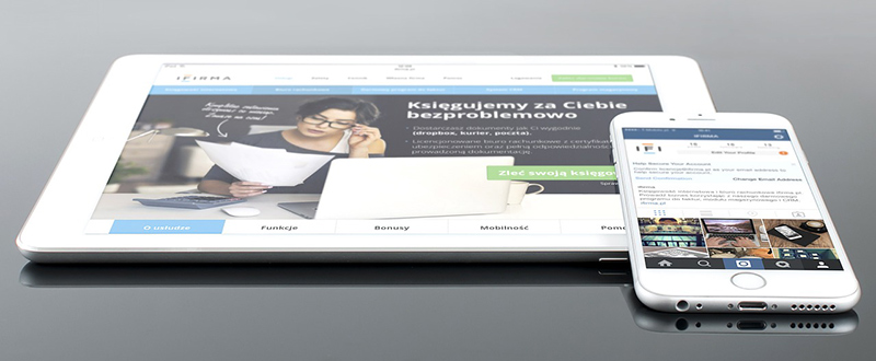
A mockup is often used during the design stage following the use of wireframes, and preceding the use of prototypes.
- A prototype can be a low- to high-fidelity representation of the product. It typically includes both the functionality and the finer UI design details. A late-stage prototype allows users to experience actual content, interact with the UI, and predict and solve real or potential usability problems.
Pros and Cons of Using UI Mockups in Web Design
A software UI mockup can be anything from a paper sketch to a digitally constructed, semi-functional UI model. It usually provides a static, visual representation of the website, and while basic functionality can be represented, interactions are generally absent.
The Pros of Employing Mockups
- A mockup can encourage you to design with purpose. The visually reliable impression of your product it can present allows you to fit the pieces of the puzzle together by showing the bigger picture. A mockup helps you organize details wisely, unmask what isn’t fitting, and assess the visual hierarchy between elements.
Preparing a mockup helps you establish the spatial relationships between UI components, and establish a visual hierarchy. Clients and stakeholders are therefore placed in a position of being able to provide meaningful feedback, long before the design is finalized; saving both time and resources.
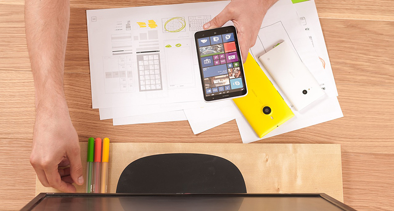
An overall picture provides a useful perspective.
- Mockups help you gain confidence in your design before moving on, or moving into development. They are especially important as design aids when you are working with multiple screens, and their use can be essential in ensuring the development team is on the same page as the design team.
- Digital mockups encourage communication and collaboration. Collaboration during the design process is essential if you want to save time and increase productivity. It is especially vital when a project is particularly large or complex and cross-functional teams are at work.
The Cons of Using Mockups
- Mockups are typically employed during design at a stage that is usually not an easy one for most clients to understand. While a mockup is a step closer to the final product than a wireframe, the proposed interactivity is not yet there and must be explained to the client.
Clients and stakeholders have a tendency to expect more from a mockup, such as a fully-clickable design than it is capable of delivering.
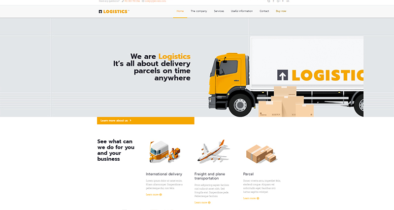
The Be Logistics Pre-built Website is Clear and Simple for Any Client to Follow
- Going from wireframe, to mockup, to prototype, during design makes sense, yet using too many design aids, like using too many cooks, can spoil the broth. You still want to create the basic outline of your design (wireframe), and still want a working prototype to show your client.
Do you really need to produce a mock-up? Or, can you simply skip to a low-fidelity, or even high fidelity prototype, if a prototype can be built just as quickly as a mockup?
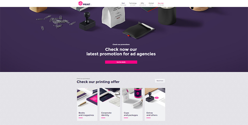
Implementing the branding and inserting the client’s content is all that is needed for this pre-built website destined to a print shop to look like the real thing.
- High fidelity gives clients and stakeholders the visual confirmation they need. A static mockup that is not to scale can be confusing and distracting. Its inherently flat design cannot always provide what is needed in terms of promoting visualization of the final result, and conveying the ideas and concepts that underlie the design itself. The level of fidelity needed is simply not there in flat file representations.
Pre-built Websites – The New Prototypes
Wireframe? Mockup? Prototype? Are all three really necessary, or might it be possible to skip a couple of steps without compromising the quality of the final result?
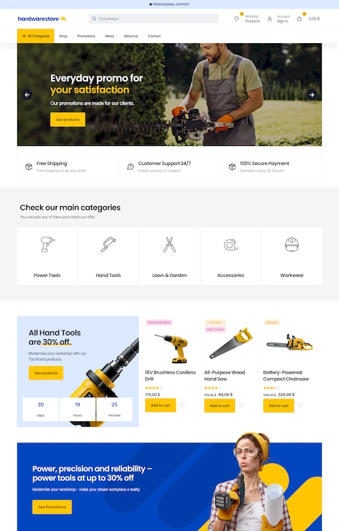
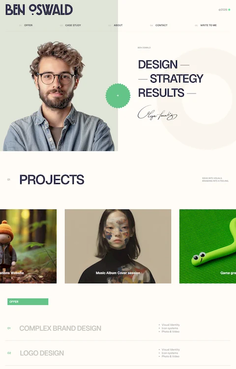
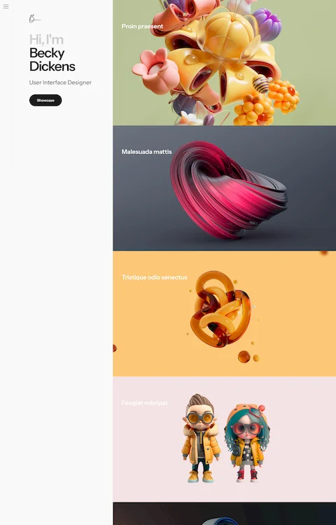
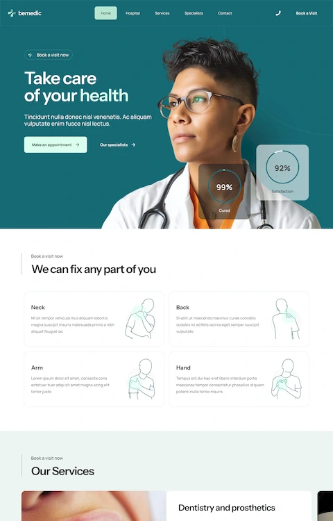
The answer to this lies in pre-built websites. Pre-built websites are closer to the prototyping stage and make it possible to skip wireframes and mockups altogether, because:
- The client is given an easy-to-understand layout to work with and comment on.
- The client can be given an opportunity to experiment with the actual UI of the future product.
- The client can browse the pages, observe special effects and interactions, and verify the overall architecture of the website.

When you prioritize the information, you’ll have improved communication with a client.
Pre-built websites give you the opportunity to open up an easier channel of communication with a client by placing greater emphasis on content and branding, and providing your client with an easy-to-grasp picture of where the design is headed, and how the initial requirements are being satisfied.
Pre-built websites are also quick to work with, modify, and customize. They are more than layouts; they are sophisticated design tools that make it possible for you to immediately respond to a client’s feedback or a request for a modification. With 220+ of these pre-built websites at hand, you should experience little difficulty in finding a solution to your client’s website needs – and your prototyping needs as well.


