


The Best Interior Design Website Templates For Stylish Portfolios
March 19, 2026
Impressive Animated Websites and Tools to Create Similar Ones
March 23, 2026Your esports website is often the first thing sponsors, fans, and potential recruits actually judge you on.
The global esports audience is projected to hit 640.8 million viewers by the end of 2025. With that kind of scale, competitive gaming web design has become serious business.
Finding strong esports website design examples to learn from isn't always straightforward. The best ones bury their design decisions in plain sight.
This article breaks down real org sites, tournament hubs, media platforms, and publisher portals - covering what works, what doesn't, and the tools behind them.
What Makes a Good Esports Website Design
Esports websites have to work harder than most. The audience is fast, opinionated, and knows when something feels off.
The global esports market hit $3.7 billion in 2025 and is projected to reach $25.4 billion by 2035 (Future Market Insights). That kind of growth puts real pressure on orgs to have a digital presence that matches the scale of the industry.
So what separates sites that work from those that don't?
Visual identity and brand consistency
Color: Most top esports sites lean dark. Black or near-black backgrounds with a single neon or high-contrast accent color. It's not just aesthetic — it works well on OLED screens and reduces eye strain during long sessions.
Typography: Condensed sans-serifs dominate. Tight, heavy, aggressive. The kind of fonts that feel like they belong on a jersey or a billboard, not a corporate brochure. In 2025, custom typefaces have become a bigger part of how orgs separate themselves visually (SologoAI, 2025).
Hierarchy: The best sites make it immediately clear where to look. Roster. Schedule. Shop. News. Usually in that order, depending on the org's revenue priorities.
Performance and structure
Around 54.4% of global web traffic now comes from mobile devices (Statista, 2024). Esports audiences skew younger, which means even more mobile browsing than average.
Sites that ignore this pay for it. Mobile users are five times more likely to abandon a task if a site isn't mobile-optimized (Financesonline). That's a lot of potential merch buyers bouncing before they get to checkout.
Beyond mobile, the fundamentals matter: fast load times, clean navigation, and a layout that doesn't fall apart on a 13-inch laptop. A well-structured website navigation is often what makes or breaks the first-time visitor experience on competitive gaming sites.
Content depth vs. content clutter
There's a real tension in esports site design between showing everything and showing the right things.
Team orgs need to surface match results, roster updates, tournament schedules, sponsor placements, and a shop - sometimes all above the fold. The sites that handle this well use clear zones and visual weight to guide attention.
The ones that don't? You know them. The homepage looks like a loading screen that never finished.
88% of users won't return after a bad website experience (Digital Silk, 2024). For esports orgs trying to build recurring fan engagement, that stat matters more than most realize.
Esports Website Design Examples
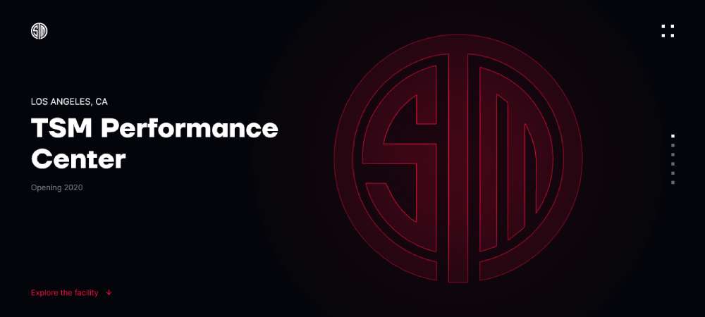
Team Solomid Esports Facility
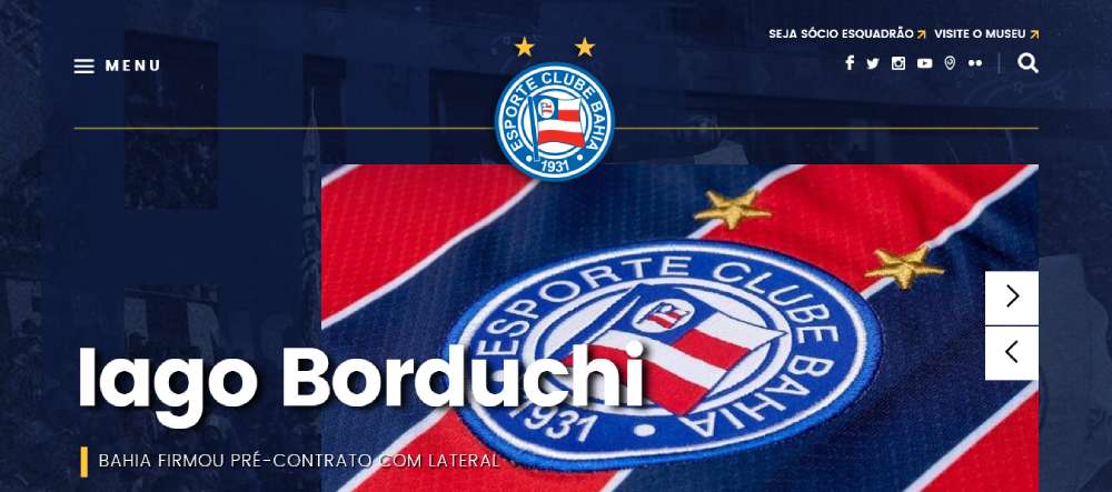
Esporte Clube Bahia
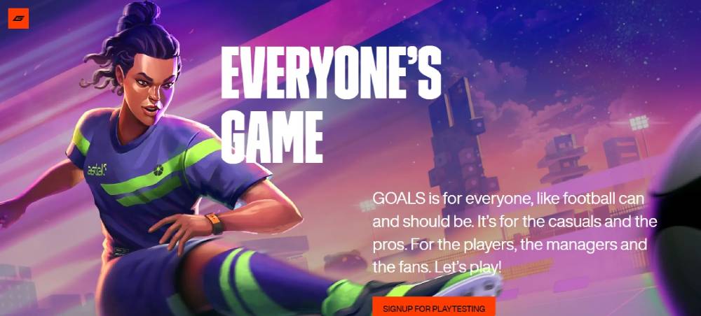
Goals
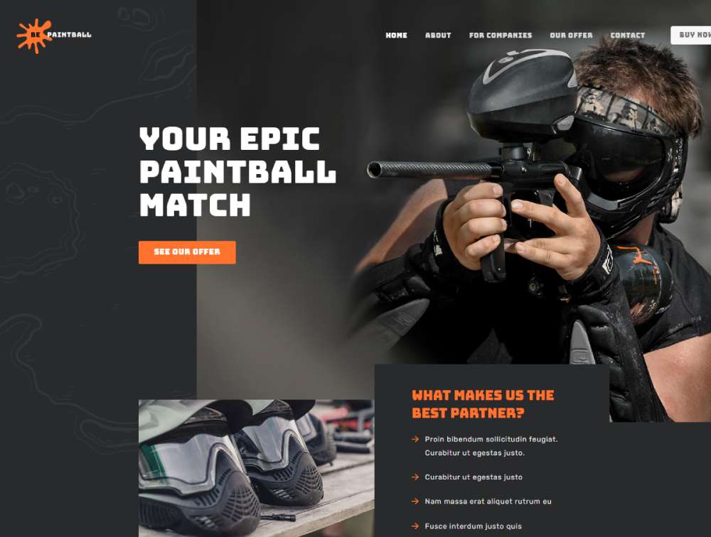
Bepaintball
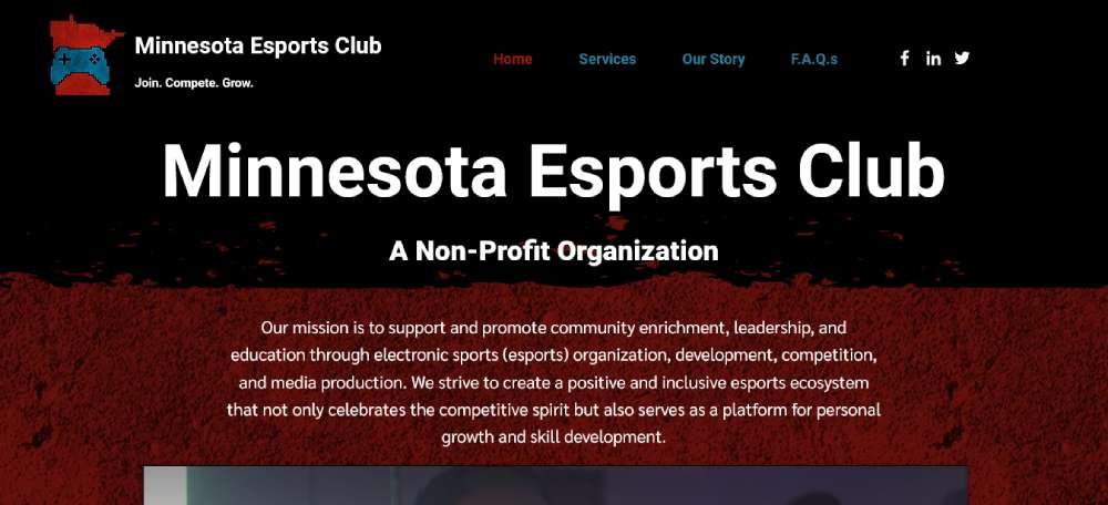
Minnesota Esports Club
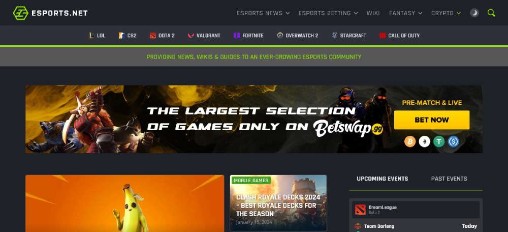
esports.net
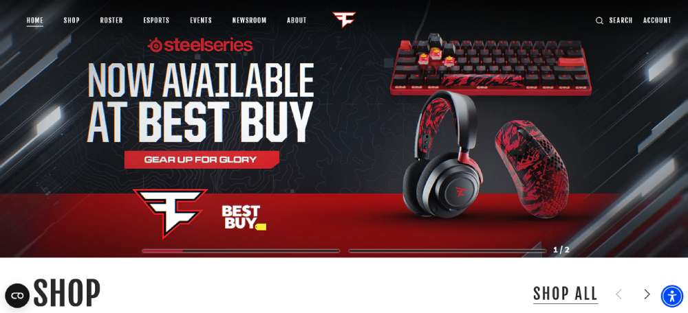
FaZe Clan
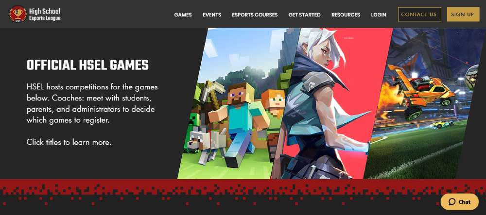
HSEL
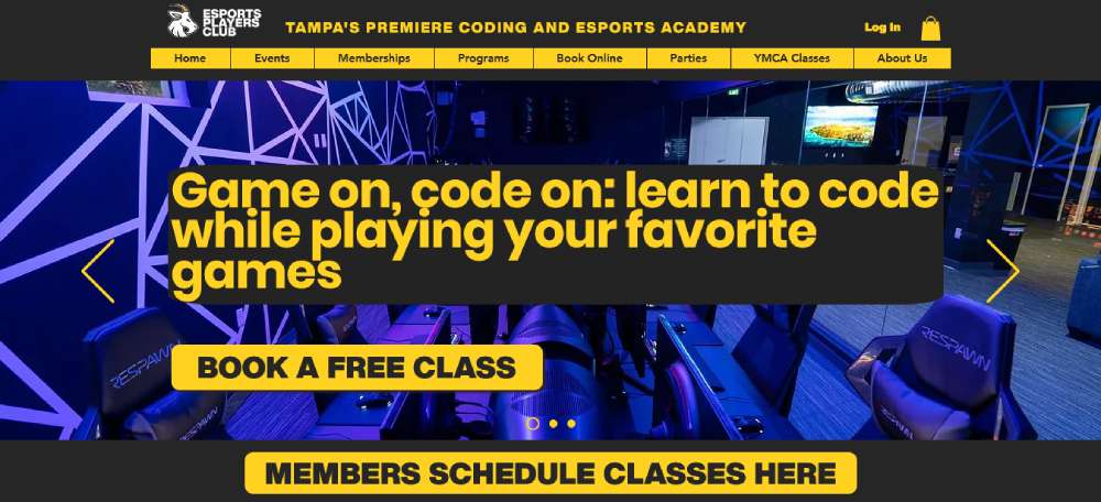
Esports Players Club
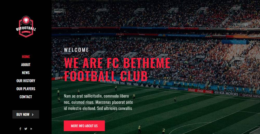
Befootball2
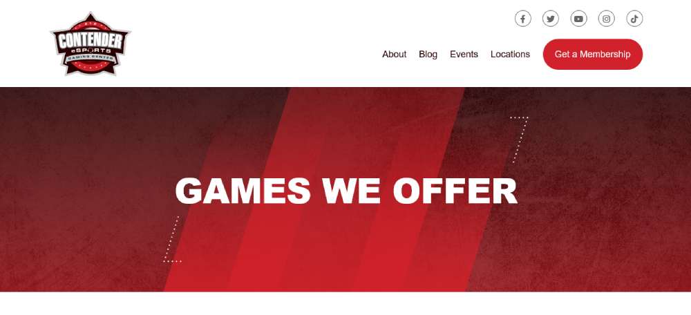
Contender eSports
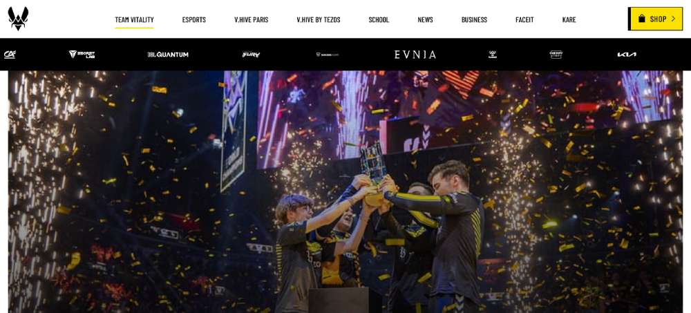
Team Vitality
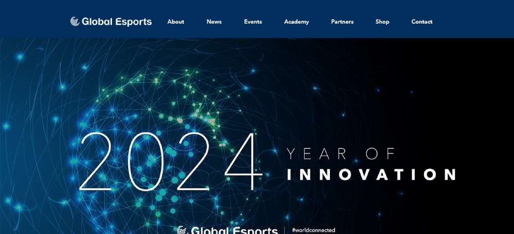
Global Esports Federation
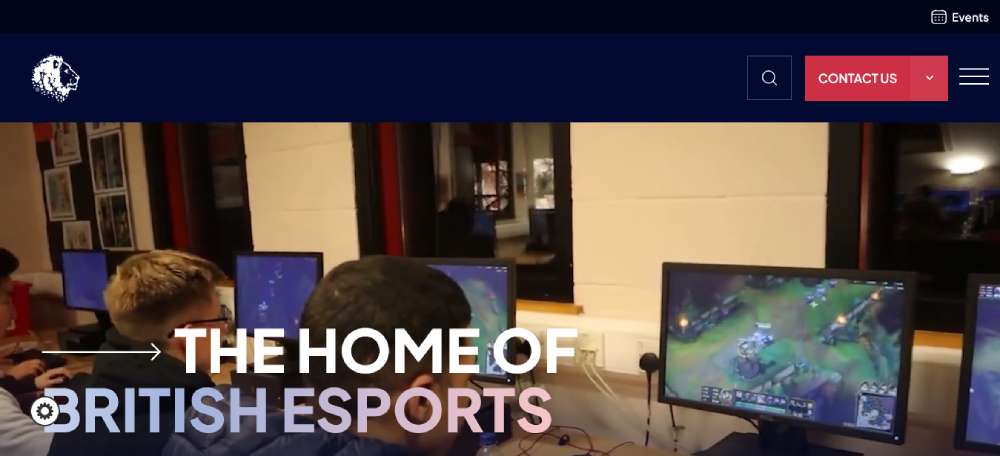
British Esports Federation
Beasg2
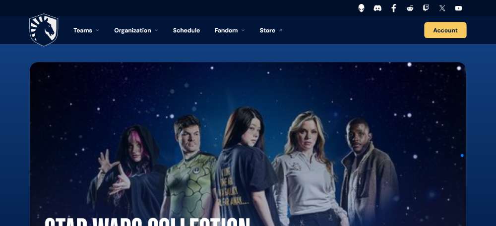
Team Liquid
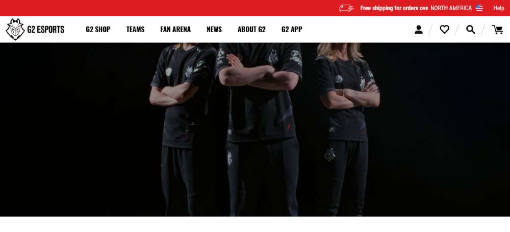
G2 Esports
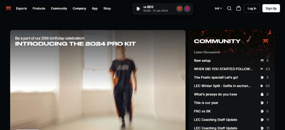
Fnatic
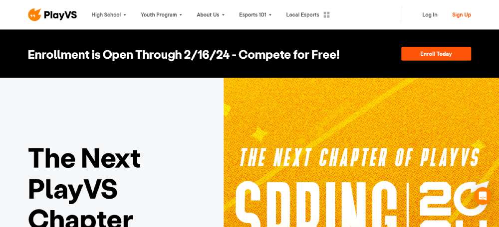
PlayVS
Begame
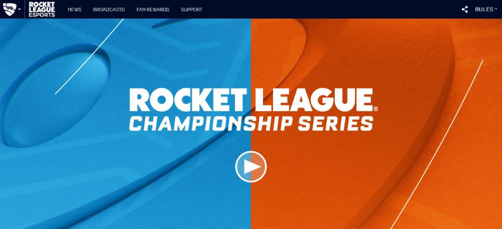
Rocket League Championship Series
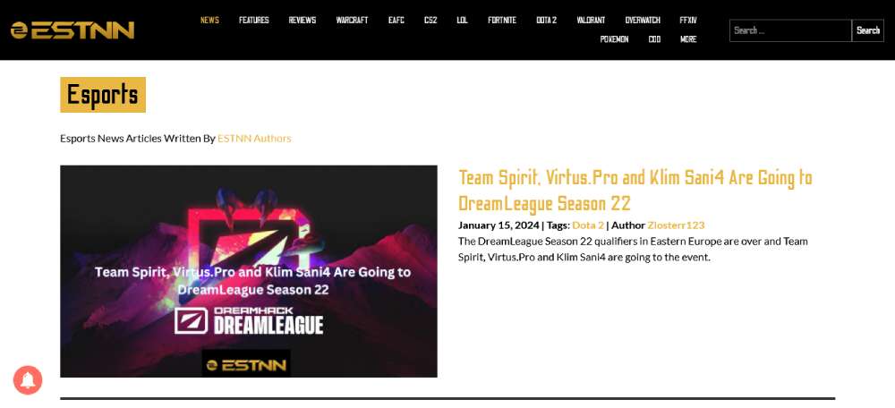
ESTNN Esports News
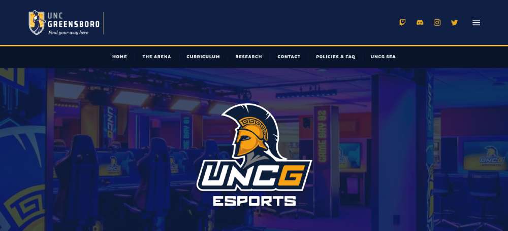
UNCG Esports
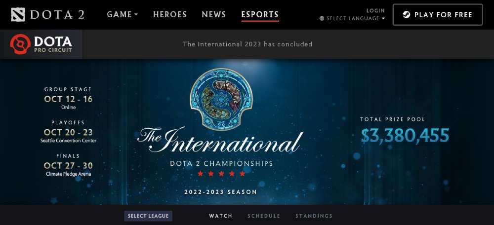
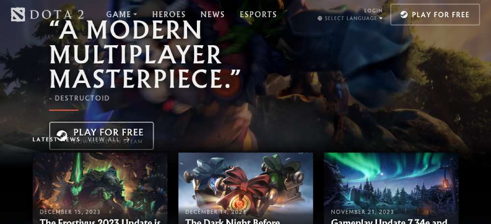
Dota 2 Esports
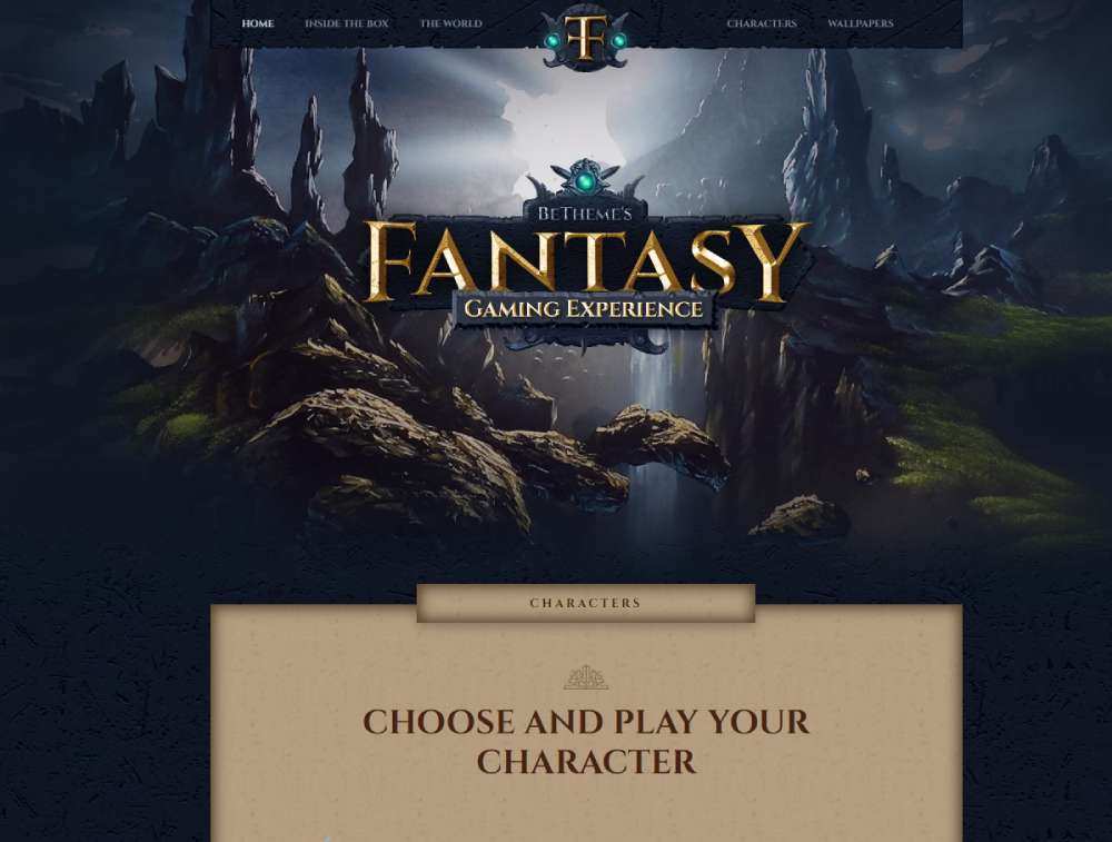
Befantasy
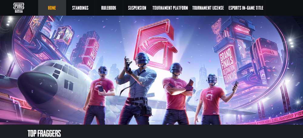
PUBG Mobile World Invitational
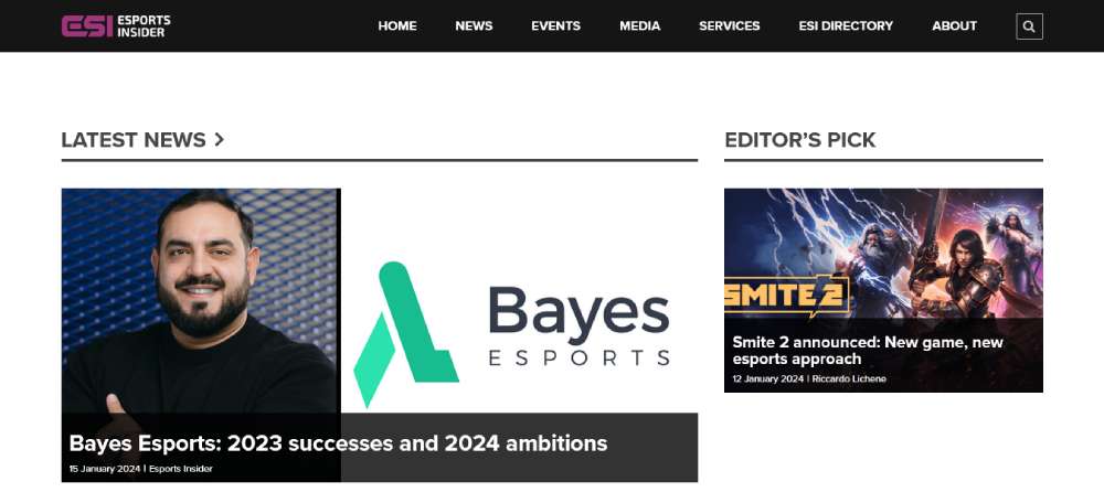
Esports Insider
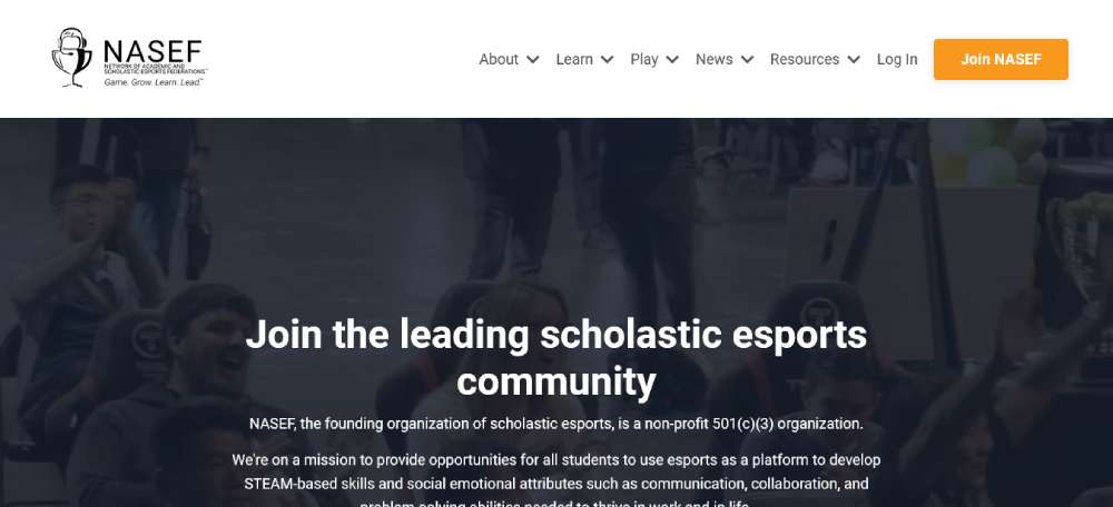
World Wide Scholastic Esports Foundation
Dota 2
Key Design Patterns Across the Best Esports Sites
Look at enough of these sites and patterns start repeating. Not because designers are copying each other - though that happens - but because some solutions just work for this audience.
Color and visual language
Dark backgrounds are close to universal. Whether it's pure black (#000), near-black (#0a0a0a), or a deep navy, the base is almost always dark. Bright neon accents on dark backgrounds improve readability and create a high-contrast, futuristic feel (Behance, 2025).
The accent color usually pulls from the team or game's existing brand. One accent. Maybe two, with a clear primary and secondary. More than that and things start to feel chaotic fast.
Sites like dark mode web design examples from outside the esports space often show how versatile this approach is - but esports was doing it before it was a mainstream design trend.
Typography patterns
A few consistent choices show up across the top sites:
- Condensed, heavy weights for headings - Barlow Condensed, Rajdhani, and custom faces all appear frequently
- Clean, readable body text - usually a neutral sans-serif at 14-16px, never competing with the heading
- All-caps labels for navigation items, stat headers, and section titles
- Variable fonts starting to appear in newer builds - responsive weight adjustments as viewport size changes
In 2025, bespoke typefaces became a bigger differentiator. G2 Esports, T1, and Evil Geniuses all use custom or heavily modified fonts in their visual identity (SologoAI, 2025).
Navigation and site architecture
Navigation on top gaming websites follows a fairly predictable hierarchy: roster, schedule or results, news, shop, about. The order shifts based on what the org prioritizes commercially.
Mega menus appear on larger org sites and tournament hubs where the content breadth demands it. Smaller orgs tend toward minimal top-nav with a hamburger menu on mobile. A well-executed mega menu can hold a lot of content without overwhelming - but it requires careful information architecture to pull off.
The sites that get navigation wrong usually have too many top-level items competing for attention. Or they bury the shop three clicks deep, which for orgs trying to move merch is a real problem.
Animation and motion design
Motion is used - sometimes well, sometimes as decoration. The best implementations:
- Hover states on player cards and match previews
- Scroll-triggered reveals for stat blocks and sponsor logos
- Hero section ambient motion (slow particle effects, subtle video loops)
The worst: full-page transition animations that add 300ms of friction to every click. Websites that load in 1 second convert 3x better than those that take 5 seconds (MindInventory, 2026). Heavy motion design is a direct risk to that metric.
FaZe Clan sits at the heavy end of the motion spectrum. HLTV sits at zero. Most sites worth studying land somewhere between those two, leaning toward restraint.
Mobile Design in Esports Websites
Mobile is no longer a secondary concern for esports sites. It's the primary one.
Over 56% of the global esports audience now watches content via mobile devices (SQ Magazine, 2025). And mobile is now the top gaming platform overall, with 78% of players aged eight and up choosing it over PC or console (Esports Insider, 2025).
If your esports site still treats mobile as an afterthought, you're designing for the wrong person.
How top esports orgs handle mobile nav
Most org sites collapse their navigation into a hamburger menu on mobile. Fine in theory, tricky in execution.
Team Vitality does this well. Their mobile nav opens into a full-screen overlay with large tap targets, clear section labels, and a persistent "Shop" CTA at the bottom. Nothing is buried. You can get to any major section in two taps.
Common failures worth avoiding:
- Tiny tap targets on roster cards and match previews
- Horizontal scroll tables that break on small screens
- Hero videos that autoplay and drain mobile data
- Nav menus that open but don't close reliably
Mobile users are five times more likely to abandon a task if a site isn't mobile-optimized (Financesonline). For orgs trying to sell merch or convert fans to newsletter subscribers, that abandonment is expensive.
Touch-friendly match schedule displays
Tournament schedules are particularly hard to get right on mobile. A match grid that looks clean on a 27-inch monitor often becomes a horizontal scroll nightmare on a phone.
The better implementations use a stacked card approach. Each match gets its own block: team logos, time, game title, and a link to watch. Vertical scroll, not horizontal. Simple.
BLAST Premier's mobile schedule is a reasonable reference point. Cards are generous in height, logos are clear at small sizes, and the time zone display adapts to the user's local time without needing a settings menu.
Image and video loading on mobile
53% of mobile visitors leave a site if it takes more than 3 seconds to load (Google). Esports sites love high-resolution player photography and ambient video loops, both of which are direct threats to that 3-second window.
The practical fix most large orgs use:
- Serve WebP images with AVIF fallback for modern browsers
- Lazy load everything below the fold
- Disable autoplay video on mobile, or replace with a static poster image
- Use a CDN (most use Cloudflare) to serve assets from edge locations
Fnatic replaced their homepage hero video with a high-quality static image on mobile, which cut their mobile load time significantly without any visible impact on brand impression. That's the right call, and it's what mobile-first design actually means in practice.
Where esports sites consistently fail on mobile
Took a while to notice this pattern, but it shows up everywhere.
Sponsor logo rows. Almost every esports site has one. On desktop, they look fine. On mobile, they collapse into a confusing stack of small, poorly scaled images that nobody can read. The fix is simple: either hide them on mobile or use a horizontal scroll carousel with proper padding. Most sites do neither.
The other consistent issue is font size. Condensed sans-serifs at 11-13px look fine in a desktop comp. On a 375px screen, they're borderline unreadable. Good typography scales down gracefully. Aggressive condensed fonts often don't.
Tools and Platforms Used to Build Esports Websites
The tech stack behind an esports site says a lot about the org's size, budget, and how seriously they treat their digital presence.
WordPress powers over 40% of the web globally (Pagepro, 2025). It shows up in esports too, but it's rarely the choice for larger orgs running content-heavy, high-traffic sites where custom functionality matters.
Custom builds vs. CMS for larger orgs
Major orgs like Team Liquid, FaZe Clan, and Cloud9 run fully custom builds. The reasons are practical:
- Merch integrations, live match data feeds, and roster APIs don't fit neatly into off-the-shelf CMS templates
- Custom code gives full control over performance optimization
- Brand design systems require flexibility that generic themes can't provide
The tradeoff is cost and maintenance. A custom-built org site can run $50,000 to $200,000+ depending on feature set, and it needs ongoing developer support to stay current.
Key difference: Custom builds are appropriate when the site is a significant revenue channel (merch, ticket sales, media rights). For smaller orgs, they're overkill.
Webflow for mid-tier organizations
Webflow has become a genuine option for smaller esports orgs that want a premium-looking site without a full dev team. Over 500,000 professional designers use Webflow to build and host sites (Webflow, 2025).
The esports-specific templates available on Webflow - including Anubis, Rampage, and the BRIX eSports template - cover the core pages: team roster, match schedule, news/blog, shop, and sponsorship display. All are fully responsive, which matters given the mobile traffic numbers.
Where Webflow hits limits for esports:
- Live match data integration requires custom code or third-party embeds
- CMS item limits can become a problem for sites with large news archives
- Ecommerce functionality is basic compared to Shopify
Headless CMS setups for tournament sites
Large tournament sites - ESL, PGL, BLAST Premier - often run on headless CMS architectures. The content layer (Contentful, Sanity, or similar) sits separately from the frontend, which can be built in Next.js or any other framework.
The benefit is performance and flexibility. Content editors can update match results, news, and schedules without touching the codebase. The frontend can be aggressively optimized without being constrained by the CMS rendering logic.
| Stack Type | Best For | Typical Cost |
| Custom Build | Tier 1 orgs, high-traffic hubs | $50K–$200K+ |
| Webflow | Mid-tier teams, fast launch | $2K–$15K |
| WordPress + Plugins | Content-first orgs, news sites | $5K–$30K |
| Headless CMS + Next.js | Tournament hubs, publisher sites | $30K–$100K+ |
Performance tools across the stack
Cloudflare is close to universal among esports sites of any significant scale. It handles DDoS protection, CDN delivery, and image optimization. During major tournament days when traffic spikes sharply, having edge caching in place is the difference between a site that works and one that goes down at the worst possible moment.
Beyond Cloudflare, a few tools show up consistently:
- Imgix or Cloudinary for dynamic image resizing and format conversion
- Vercel or Netlify for frontend hosting on headless builds
- Shopify integrated via API for merch fulfillment on custom builds
The web design tools and performance stack choices matter more than most orgs realize until they're dealing with a site failure during a playoff run. That's exactly the wrong time to figure out your CDN configuration.
Honestly, the tech stack conversation is often less interesting than the design conversation, but it shapes what's possible. An org that wants real-time match data embedded natively on their site can't do that with a basic Webflow template. That's just a reality worth knowing upfront before committing to a platform.
FAQ on Esports Website Design
What makes a good esports website design?
A strong esports site combines fast load times, clear navigation, and a dark visual identity with high-contrast accents.
Roster pages, match schedules, and a shop should all be reachable within two clicks. Mobile optimization is non-negotiable.
Which esports organizations have the best websites?
Fnatic, Team Liquid, and 100 Thieves consistently rank among the best for different reasons.
Fnatic wins on brand discipline. Team Liquid on content depth. 100 Thieves on lifestyle-brand execution. Each serves a different design philosophy well.
What color schemes do esports websites use?
Dark backgrounds with a single neon or high-contrast accent color dominate competitive gaming web design.
Black, deep navy, and charcoal are the most common bases. Team-specific colors - orange for Fnatic, blue for Team Liquid - handle the accent role.
What typography works best for esports sites?
Condensed, heavy sans-serifs dominate esports homepage design. Fonts like Barlow Condensed and Rajdhani appear frequently.
All-caps labels for navigation and stats are standard. Body text stays neutral and readable - usually 14-16px in a clean sans-serif.
How important is mobile design for esports websites?
Critical. Over 56% of the global esports audience watches content on mobile devices (SQ Magazine, 2025).
Sites without responsive gaming layouts lose fans before they even see the roster. Touch-friendly navigation and fast image loading are baseline requirements.
What platform do esports teams use to build their websites?
Tier 1 orgs like FaZe Clan and Cloud9 run fully custom builds. Mid-tier teams often use Webflow, which has strong esports-specific templates available.
WordPress appears on content-heavy media sites. Tournament hubs frequently run on headless CMS setups with Next.js frontends.
How do esports tournament sites differ from org sites?
Tournament sites prioritize live data: brackets, standings, match results, and VOD embeds. Org sites focus more on brand identity, roster presentation, and merch conversion.
ESL Gaming and BLAST Premier are good examples of tournament-first design thinking.
What features should an esports website include?
At minimum: roster pages with player profiles, a match schedule, news or blog section, and a shop.
Larger sites add live score integrations, social media feeds, sponsor placement zones, and game-specific sub-pages for each title the org competes in.
How do game publishers design their esports hubs?
Publishers like Riot Games tightly integrate game visuals with competition data. The Valorant Champions Tour site pulls team colors, agent art, and match stats from a unified system.
The result feels intentional rather than assembled - a clear advantage over third-party tournament sites.
What are common mistakes in esports website design?
Slow mobile load times, unreadable condensed fonts at small sizes, and sponsor logo rows that break on phones are the most consistent issues.
Heavy motion design that hurts performance is another common problem. Good UX always wins over visual complexity when they conflict.
Conclusion
This conclusion is for an article presenting esports website design examples drawn from real organizations, tournament platforms, and publisher hubs.
The patterns are consistent. Dark themes, condensed typography, and mobile-first layouts show up across every category worth studying.
What separates the good from the forgettable isn't budget - it's clarity. Fnatic, BLAST Premier, and Riot's competitive gaming platforms all know exactly what their audience needs and build around that.
Performance tools like Cloudflare, smart CMS choices, and disciplined visual identity systems matter more than chasing design trends.
Whether you're building a pro gaming site or a tournament hub, the best esports web development decisions start with understanding your users, not your competitors.


