

Innovative Educational Website Design Examples to Watch
February 26, 2026
A Strategic Guide to Ecommerce Popups That Actually Sell
February 26, 2026Gaming websites play by different rules than the rest of the web. Dark interfaces, cinematic motion, custom typography, aggressive color palettes. The design choices that would feel excessive on a SaaS homepage are baseline expectations here.
This collection of gaming website design examples breaks down what actually works across AAA studios, indie developers, esports organizations, and hardware brands. You'll see specific layout patterns, color strategies, animation techniques, and the tech stacks behind sites from Riot Games, Blizzard, Valve, and others.
Whether you're building a game launch page or redesigning a community platform, these references will give you concrete direction instead of vague inspiration.
What Makes a Gaming Website Stand Out
Gaming websites operate under a completely different set of rules than most other industries. Where a SaaS homepage might lean on clean grids and lots of breathing room, a game studio site goes loud. High contrast. Dense visuals. Cinematic motion. The whole thing feels like you walked into a trailer.
The global gaming market hit $187.7 billion in revenue during 2024, according to Newzoo. With over 3.4 billion players worldwide, the competition for attention starts the second someone lands on your page.
That pressure shows up directly in how these sites are built.
Dark backgrounds dominate. Nearly 82% of smartphone users now prefer dark mode on their devices (Earthweb, 2024), and gaming sites figured this out years before the rest of the web caught on. A dark canvas makes neon accents pop, lets screenshots and trailers breathe, and instantly signals "this is a gaming space" to visitors.
Then there's motion. Scroll-triggered animations, parallax layers, auto-playing trailers in the hero section, hover effects on game cards. Most entertainment websites use some degree of animation, but gaming sites push it further than anyone else.
Typography runs bold and condensed. Custom typefaces are common among AAA studios. Riot Games, Blizzard Entertainment, and Valve all use proprietary or heavily modified fonts that reinforce brand identity before you even read a word.
And here's the tricky part. All of this visual weight has to load fast. Google research confirms that 53% of mobile users abandon sites taking longer than 3 seconds to load. Gaming audiences are especially impatient. They expect polished experiences, and a stuttering page feels cheap.
Gaming Website Design Examples
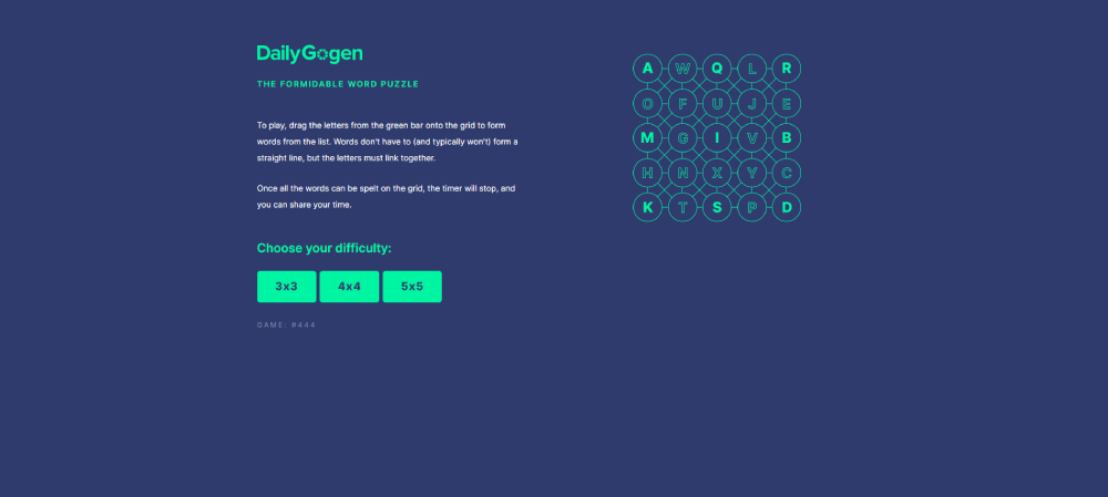
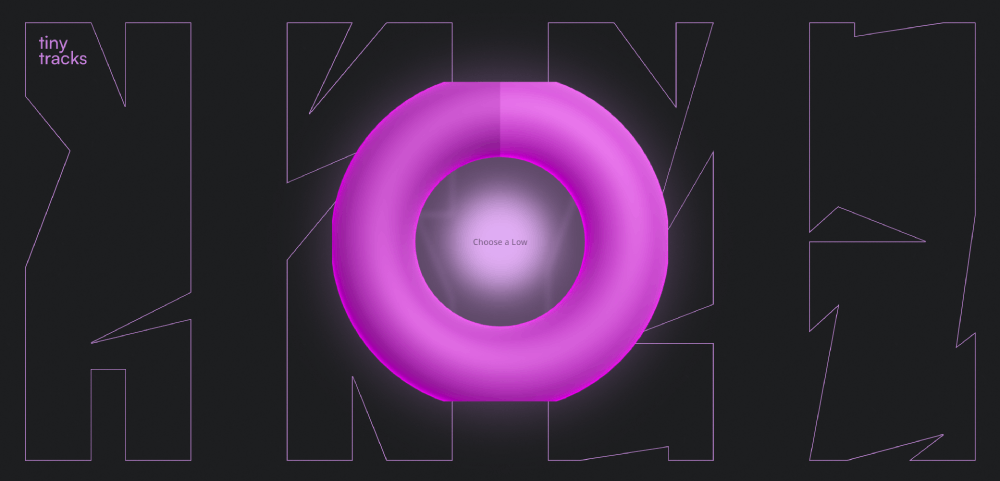
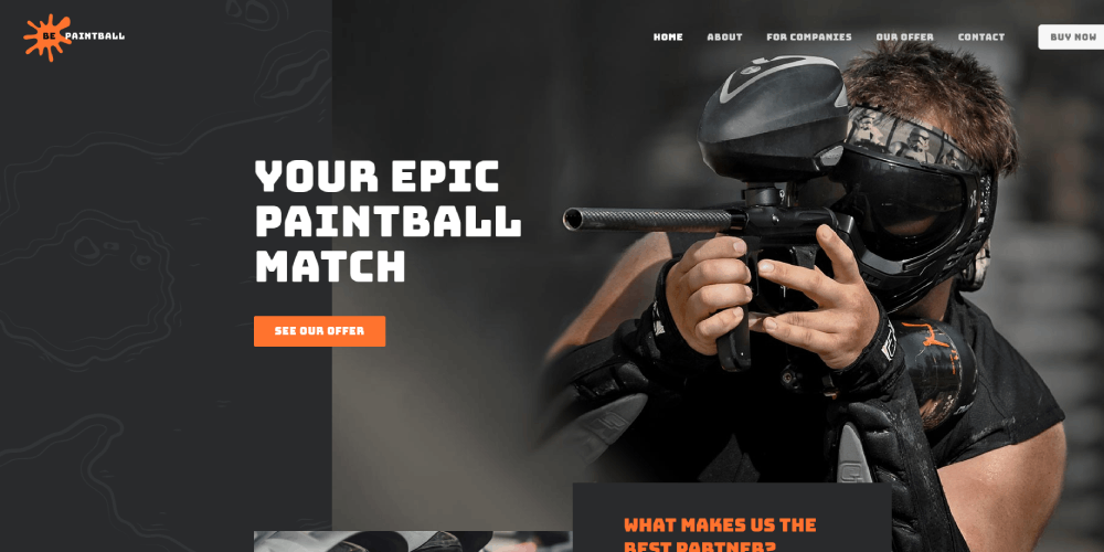
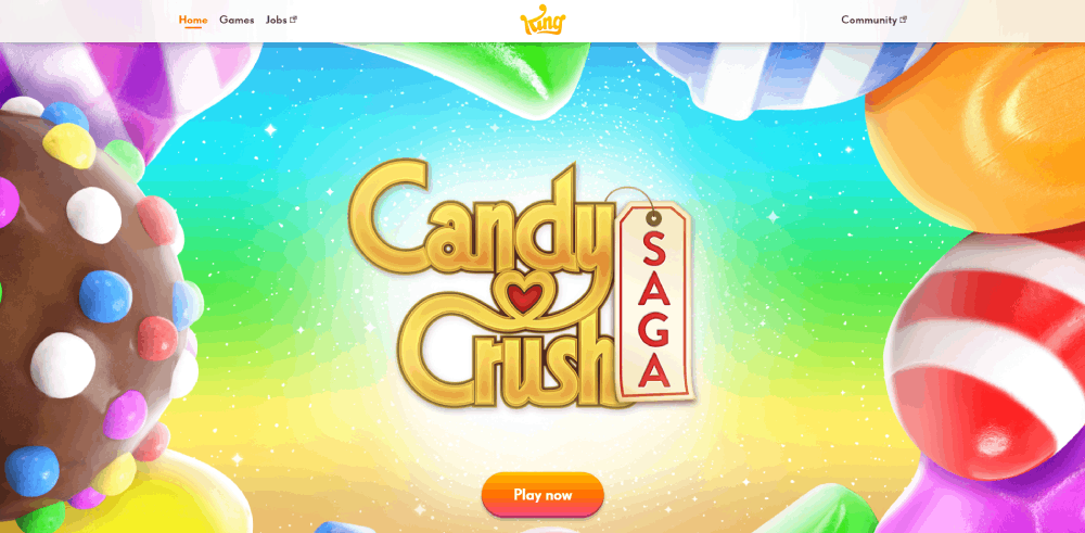
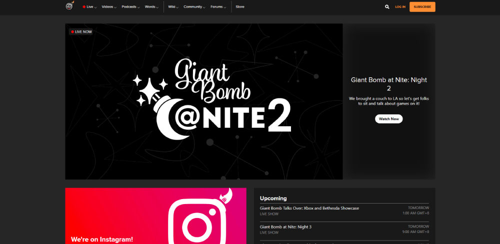
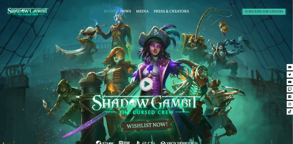
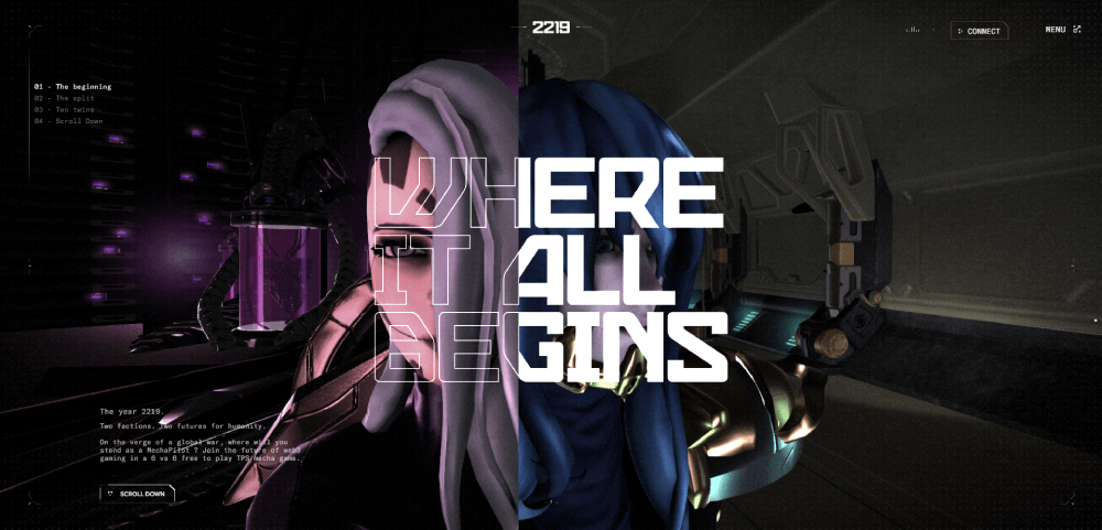
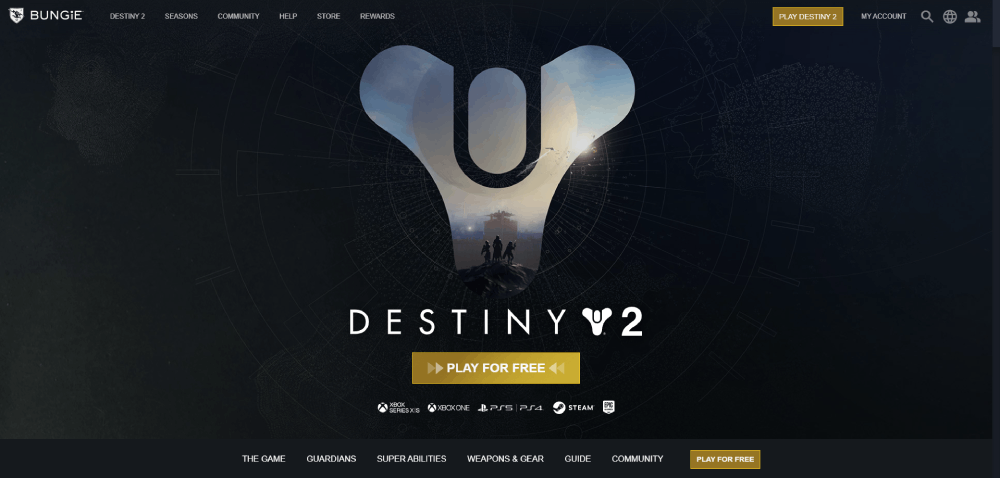
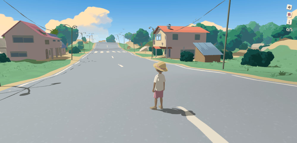
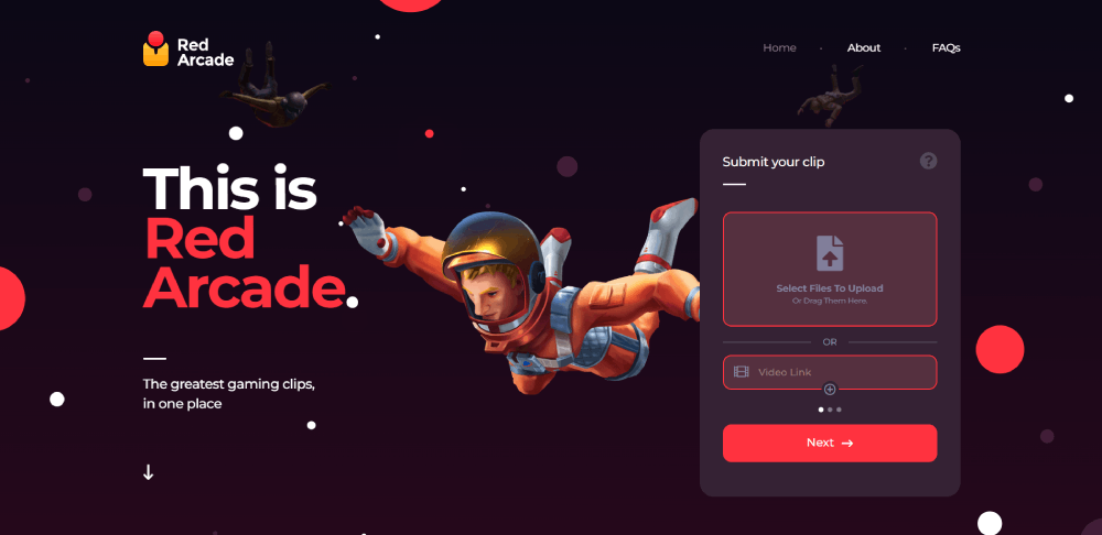
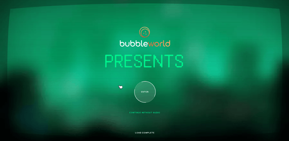
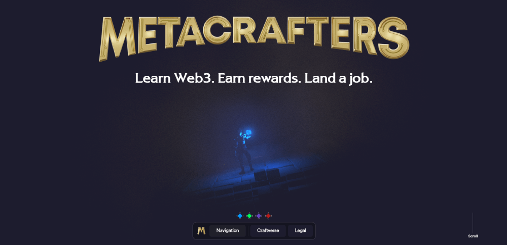
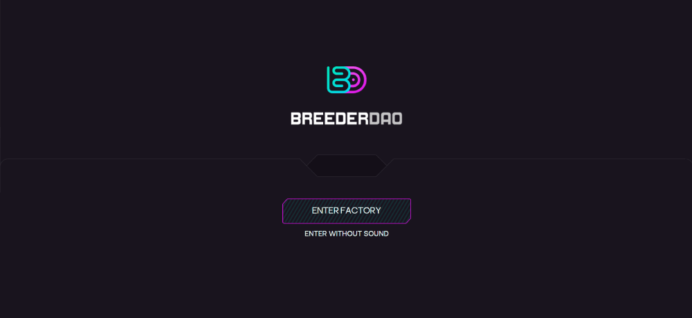
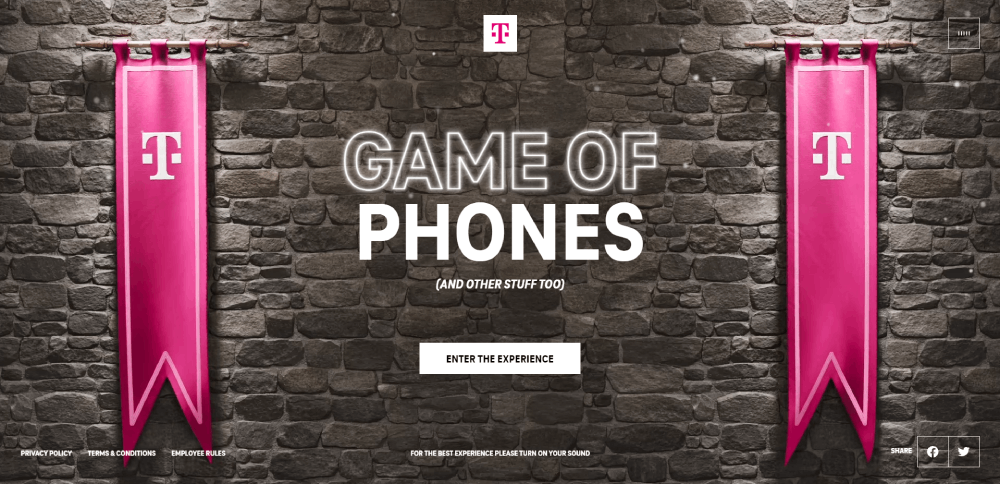
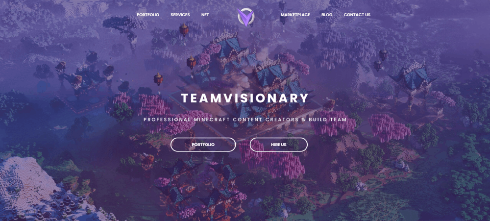
Jungle


Homepage Layouts That Work for Gaming Brands
The homepage is where gaming websites win or lose their audience. Most visitors form a judgment about your site within milliseconds. Research from multiple UX studies puts that window at roughly 0.05 seconds for first impressions.
So what actually works?
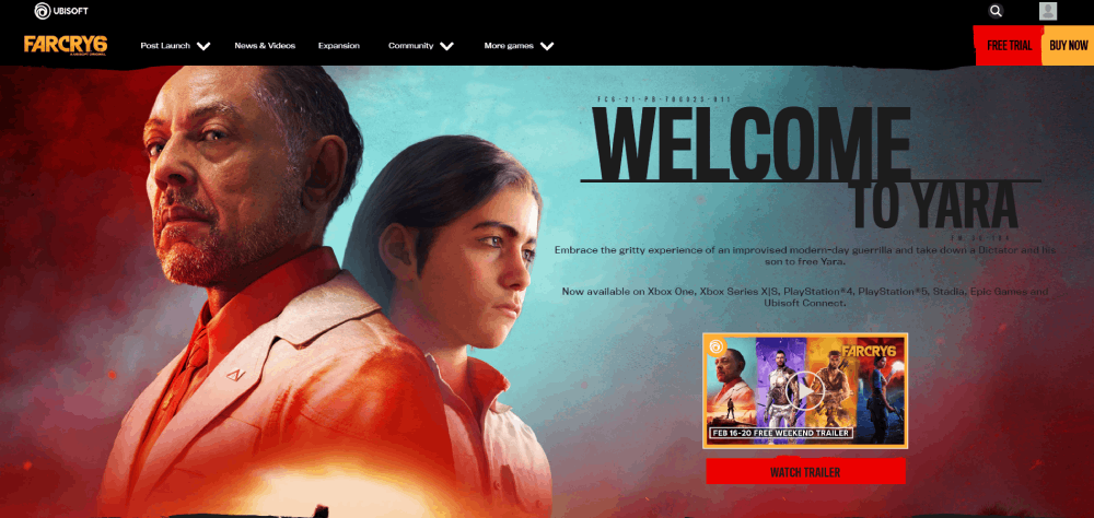
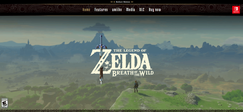
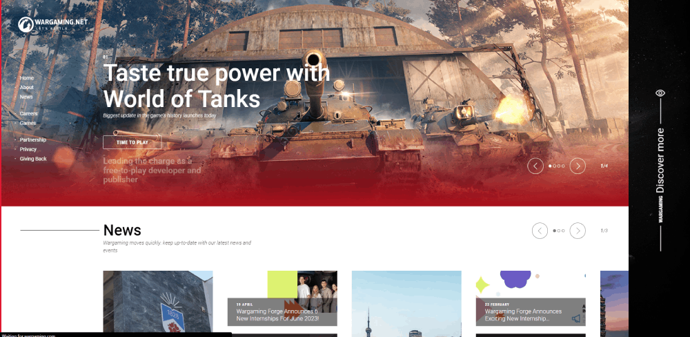
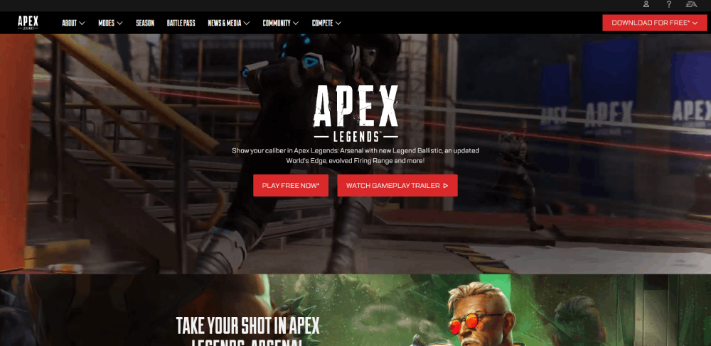
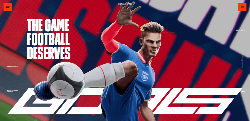
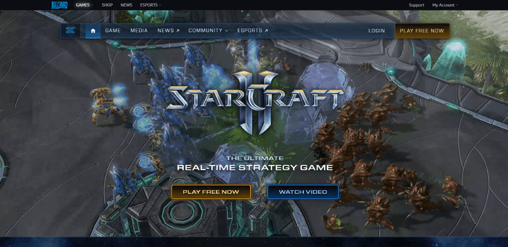
The Cinematic Full-Screen Hero
This is the most common pattern across AAA gaming sites. A full-viewport video or high-res image, a short headline, and one or two CTAs (usually "Buy Now" and "Watch Trailer").
Rockstar, CD Projekt Red, and Naughty Dog all use this approach. It works because it mirrors what gamers already expect from launch trailers. The site becomes an extension of the marketing campaign.
If you're leaning into websites with video background techniques, keep the file size under control. Hosting trailers through YouTube or Vimeo embeds with lazy loading prevents the hero from destroying your page speed.
Card-Based Multi-Title Grids
Publishers with large game catalogs need a different layout. EA, Ubisoft, and Xbox Game Studios all use card-based grids where each tile represents a game title.
The card format works well here because it's modular, responsive, and lets each game retain its own visual identity within a shared layout system. Hover states typically reveal a short description, a CTA, or a trailer thumbnail.
GoodFirms (2025) found that 84.6% of designers consider cluttered layouts a top mistake for business websites. Card grids done right avoid this. Card grids done poorly turn into a wall of rectangles that all blur together.
Sticky Navigation With Transparent Headers
Gaming sites frequently use a header that starts transparent (overlaying the hero) and transitions to a solid or blurred background on scroll. It's a small interaction, but it keeps the hero feeling immersive while maintaining usable navigation as you move down the page.
PlayStation's site does this well. The nav disappears into the hero image at the top, then snaps into a dark bar with clear menu labels once you scroll past the fold.
Color and Typography Patterns Across Gaming Sites
Gaming web design has a visual language that's pretty distinct from the broader web. You can usually identify a gaming site within a second just by its color palette and type choices.
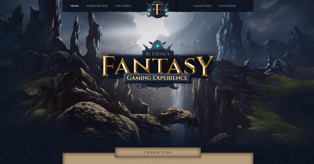
The Dark Mode Default
Most gaming sites ship dark by default. Not as a toggle. Not as an option. Just dark.
This makes sense for a few reasons. Dark backgrounds reduce eye strain during extended browsing sessions (most gamers browse at night). They also make screenshots, trailers, and character art look dramatically better. A dark mode web design approach gives neon accents, glowing UI elements, and saturated gradients the contrast they need to actually pop.
Earthweb reports that 82% of smartphone users use dark mode. Among gamers, that number is almost certainly higher.
Neon and RGB Accent Palettes
Electric blue. Hot pink. Toxic green. These aren't subtle accent colors. They're signals.
Gaming peripheral brands like Razer and Corsair built their entire visual identity around RGB lighting, and that aesthetic has bled into web design across the industry. Esports team sites use neon accents to match jersey colors. Indie games use them to convey genre (cyberpunk, sci-fi, synthwave).
The trick is restraint. One or two accent colors on a dark base creates a focused, high-energy feel. Three or more, and you're getting into colorful websites territory, which can work but requires significantly more design discipline to pull off.
Custom Typefaces and Bold Headlines
| Studio/Brand | Typography Approach | Effect |
| Riot Games | Custom display font across all properties | Instant brand recognition |
| Blizzard | Franchise-specific typefaces | Each game feels unique |
| Steam (Valve) | Clean sans-serif, utilitarian | Content-first readability |
| Epic Games | Geometric sans, heavy weight | Modern, tech-forward identity |
Font stacking in gaming sites usually follows a pattern: a display or custom font for headings and hero text, paired with a clean sans-serif for body copy. Google Fonts like Rajdhani, Orbitron, and Exo 2 show up frequently in indie and esports projects because they carry that futuristic weight without requiring a custom type license.
Accessibility is the one area that consistently gets overlooked in gaming typography. Contrast ratios on dark themed websites often fall below WCAG standards, especially when thin, light-colored type sits on near-black backgrounds. Something I've seen more times than I can count.
Navigation and UX Patterns in Gaming Websites
Navigation on a gaming site is nothing like a standard corporate page. The information architecture has to handle game catalogs, account systems, news feeds, community forums, esports schedules, and sometimes an integrated store. All without making users feel lost.
Mega Menus With Game Art
Publishers with large catalogs (EA, Ubisoft, Xbox) typically use mega menus that display game tiles, artwork thumbnails, and category groupings in a single dropdown panel.
These menus work because they let users see everything at once instead of drilling through nested dropdowns. The visual previews also reduce cognitive load. You don't have to read "Tom Clancy's Rainbow Six Siege" when the icon already tells you what game it is.
Hamburger Menus on Desktop
Here's where gaming sites break conventional UX advice. A lot of them use hamburger menus on desktop. Not because the nav is too complex, but because they want the full viewport for visuals.
Rockstar Games does this. The entire desktop experience is essentially a full-screen visual with a hidden menu. It's a bold choice that sacrifices discoverability for visual impact.
Baymard Institute data shows that 54% of e-commerce websites have mediocre or poor navigation experiences. Gaming sites that hide their nav need to be confident their audience knows where to click. That's a gamble that only works when your brand is strong enough to carry it.
Account Integration and Launcher Tie-Ins
Steam login. Epic Games account. Battle.net authentication. PlayStation Network.
Gaming sites don't just link to these platforms. They deeply integrate with them. Your website account might sync with your in-game progress, store purchase history, or friend list. This creates a good UX loop where the website becomes a companion to the game, not just a marketing page.
The challenge is keeping the login flow smooth. Nothing kills momentum faster than a broken OAuth redirect or a "link your accounts" prompt that takes five clicks to resolve.
Live Data in Navigation
Esports sites display live match scores, countdown timers, and streaming indicators directly in the nav bar or header. This is functionality you'd never see on a standard business website, but it's expected in competitive gaming.
The technical overhead is real. Live data feeds require WebSocket connections or frequent API polling, and any lag between the actual match and the site's display gets noticed immediately by viewers watching the stream simultaneously.
Animation and Motion Design in Gaming Sites
If there's one area where gaming websites push the web forward, it's motion design. Animation isn't decorative on these sites. It's structural. It guides attention, builds atmosphere, and reinforces the brand's identity at every scroll position.
Scroll-Triggered Reveals
The most common pattern: content sections that fade in, slide up, or scale into view as the user scrolls. GSAP (GreenSock Animation Platform) and CSS intersection observers handle most of this across the industry.
Done well, scroll reveals create a cinematic pacing to the page. The user feels like they're "progressing" through the content, which mirrors how game narratives unfold. Done badly, it just makes the page feel slow.
DesignRush reports that 82% of businesses say videos help keep visitors on their website longer. Scroll-triggered animations serve a similar purpose: they reward continued scrolling with new visual payoffs.
WebGL and Three.js for 3D Elements
This is where things get expensive. Some gaming landing pages use WebGL-powered 3D scenes, interactive character models, or particle systems rendered directly in the browser. Three.js is the go-to library for this kind of work.
The results can be stunning. But the performance cost is significant. A Three.js scene that runs smoothly on a gaming PC with a dedicated GPU might stutter badly on a mid-range phone. And considering that mobile accounts for over 61% of global web traffic (DesignRush, 2024), you're potentially losing the majority of your audience.
Unreal Engine and Unity have both experimented with web-based game previews, but these remain niche. The file sizes alone (often 50MB+) make them impractical for anything other than promotional microsites.
Hover States and Microinteractions
Game cards that tilt on hover. Buttons that pulse with a glow effect. Menu items that animate with a glitch or scan-line effect when you mouse over them.
These small interactions add up. They make the site feel alive and responsive, which is exactly the expectation gamers bring from the games themselves. A static, unresponsive gaming website feels broken in a way that a static corporate site simply doesn't.
The best interactive websites in this space use microinteractions to communicate state changes (hovered, active, loading, error) without any visible text labels. It's interface design borrowed directly from game UI patterns, and it works.
Video Backgrounds vs. CSS Animation
| Method | Best For | Performance Impact |
| Auto-play video (MP4/WebM) | Cinematic hero sections | High (large file size) |
| CSS keyframe animations | UI elements, hover effects | Low |
| Lottie/SVG animations | Icons, illustrations, loading states | Low to medium |
| Three.js/WebGL | 3D showcases, particle effects | Very high |
Most production gaming sites use a combination. Video for the hero, CSS for UI interactions, and Lottie Animations for icons and loading screens. The key is knowing which tool fits which job. I've seen too many sites drop a Three.js scene where a simple CSS gradient animation would have worked just fine.
A 0.1 second improvement in mobile site speed can boost retail conversions by 8.4%, according to Google data. Every animation choice has a direct line to your conversion rate, especially on animated websites that already carry a heavier load.
Mobile Responsiveness in Gaming Web Design
Most gaming websites are built desktop-first. You can tell the second you open one on your phone. Animations that looked cinematic on a 27-inch monitor become laggy thumb-scrolling exercises on a mid-range Android.
Statcounter (2025) data shows mobile devices generate 63.15% of all website traffic globally. Yet gaming sites consistently underperform on mobile compared to other industries.
Common Breakpoints and What Gets Cut
Standard breakpoints: 1440px (desktop), 1024px (tablet), 768px (small tablet), 375px (mobile).
The first casualty on smaller screens is usually the parallax effect. Scroll-triggered animations get stripped out or simplified. Hero videos swap to static images. Mega menu navigation collapses into a hamburger. And those elaborate hover states? They disappear entirely because touch screens don't have a cursor.
BusinessDasher (2024) found that responsive websites see 40% higher conversions than non-responsive ones. Gaming sites that ignore mobile are leaving real money behind.
Gaming Sites That Handle Mobile Well
Fortnite's site is one of the better examples. It strips back the visual complexity on mobile but keeps the bold color palette and clear CTAs intact. The layout shifts from a multi-column grid to a single stacked column, and load times stay reasonable.
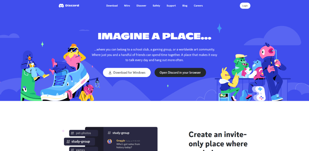
Discord does something smarter. Instead of trying to replicate the desktop experience, the mobile site is essentially a funnel to the app download. Clean copy, one CTA, done.
Most game studio sites, though? They just break. Overlapping text, images that bleed off-screen, navigation that requires pinch-zooming. Honestly, a lot of them feel like afterthoughts.
Progressive Loading on Heavy Pages
| Strategy | What It Does | Impact |
| Lazy loading images | Defers off-screen images until scroll | Reduces initial payload by 30-60% |
| Skeleton screens | Shows placeholder shapes while loading | Perceived speed feels faster |
| Adaptive serving | Serves different assets by device/connection | Prevents mobile from loading desktop files |
The mobile first design approach flips the build order. Start with mobile constraints, then add complexity for larger screens. It's the opposite of how most gaming sites are built, and the ones that adopt it tend to perform significantly better across all devices.
Performance and Loading Strategies for Asset-Heavy Gaming Pages
Gaming websites are some of the heaviest pages on the web. High-res screenshots, cinematic trailers, custom fonts, WebGL scenes, and dense JavaScript bundles all compete for bandwidth. Google PageSpeed Insights scores for major gaming sites often land in the 30-50 range on mobile.
That's a problem. Portent research shows sites loading in 1 second have conversion rates 3x higher than those loading in 5 seconds.
Image Formats and Responsive Delivery
WebP and AVIF are the standard now. Both compress significantly better than JPEG or PNG while maintaining visual quality that gamers (who are used to pixel-perfect graphics) won't complain about.
The srcset attributes lets you serve different image sizes based on viewport width and device pixel ratio. A 4K screenshot that looks incredible on desktop doesn't need to ship at full resolution to a phone screen.
Hostinger reports that slow image loading causes 39% of users to lose interest and leave. For a game studio homepage with 15+ screenshots, that stat hits hard.
CDN Usage and Edge Caching
Most large gaming companies run their static assets through CDNs like Cloudflare, Akamai, or Fastly. The logic is straightforward: serve images, videos, and scripts from the server closest to the user.
- Riot Games uses a global CDN for its regional game sites
- Steam caches store page assets across dozens of edge locations
- Epic Games Store relies on its own CDN infrastructure built for game downloads
For smaller studios, Cloudflare's free tier handles most use cases. No reason to skip this.
Core Web Vitals and Where Gaming Sites Actually Land
HTTP Archive data from 2025 shows only 48% of mobile websites achieve good Core Web Vitals scores. Gaming sites tend to fall below that average because of their heavy reliance on JavaScript, large media files, and complex animations.
The three metrics that matter:
LCP (Largest Contentful Paint): Under 2.5 seconds. Gaming hero sections with auto-playing video regularly blow past this.
INP (Interaction to Next Paint): Under 200ms. Heavy JS frameworks and unoptimized event handlers tank this score.
CLS (Cumulative Layout Shift): Under 0.1. Images without defined dimensions and late-loading ads cause layout jumps.
NDTV saw a 50% drop in bounce rate after improving their LCP from 3 seconds to 1.6 seconds. Gaming sites carrying even heavier assets would see proportional (or bigger) gains from similar optimization work.
Tools and Platforms Used to Build Gaming Websites
The tech stack behind a gaming website depends almost entirely on the size of the organization and what the site needs to do. A solo indie developer and a AAA publisher like Electronic Arts are solving fundamentally different problems.
| Platform | Best For | Limitation |
| WordPress + Custom Theme | Indie studios, gaming news, blogs | Plugin bloat, slower without optimization |
| React / Next.js | Large studios, esports orgs, dynamic content | Requires developer resources |
| Webflow | Brand sites, landing pages, small studios | Limited custom logic |
| Shopify | Gaming merch, peripheral stores | Less design flexibility |
WordPress for Gaming Content Sites
WordPress still powers 43% of all websites on the internet, according to WordPress.org. Gaming news outlets like PC Gamer and smaller indie studio sites frequently run on WordPress with custom themes.
The plugin ecosystem makes it easy to add features fast (forums, review systems, community profiles). The downside is performance. A WordPress gaming site with 15+ plugins, unoptimized images, and a heavy theme can crawl. Pair it with a CDN and a caching plugin like WP Rocket, and it gets much better.
React and Next.js for Dynamic Gaming Experiences
Twitch, Netflix, and Discord all use React. For gaming websites that need server-side rendering, dynamic content loading, and tight integration with APIs (game stats, leaderboards, account systems), Next.js is the go-to framework in 2025.
Server-side rendering means the page loads with fully rendered HTML, which is better for both SEO and perceived speed. Static site generation through Next.js can pre-build pages at deploy time, making them nearly instant to load.
The tradeoff: you need developers who know React. That rules out a lot of small teams.
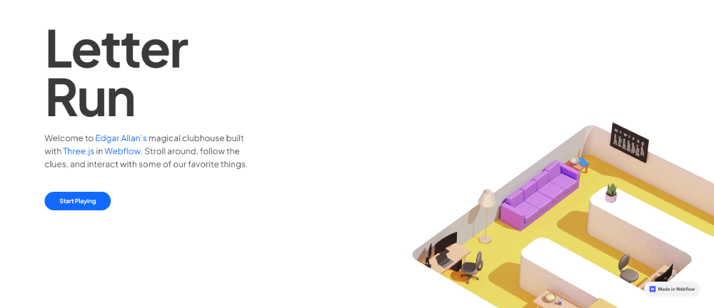
Webflow for Visual-First Gaming Brands
Webflow has quietly become popular with gaming studios that want a polished site without hiring a full dev team. Dropbox, Dell, and Discord all use Webflow for specific pages.
The visual editor handles parallax scrolling effects, scroll-triggered animations, and responsive layouts without writing code. For an indie game product landing page, it's often the fastest path from concept to live site.
Where Webflow falls short: complex e-commerce, heavy personalization, and any feature that requires server-side logic beyond basic form handling.
CMS Options for News-Heavy Gaming Sites
Ghost: Clean, fast, built specifically for publishing. Works well for game review sites.
Sanity: Headless CMS that pairs with React or Next.js for fully custom frontends.
Contentful: API-first CMS used by larger organizations that need structured content across multiple platforms (web, mobile app, in-game).
The headless CMS approach (where the content management system is separate from the frontend) is gaining traction with technology websites across every industry, gaming included. It gives teams full design control while keeping content editing simple for non-technical staff.
How to Apply Gaming Design Principles to Your Own Site
You don't need to be building a site for Riot Games to borrow from the gaming design playbook. Many of these patterns work across industries, especially if your brand leans toward bold visuals, younger audiences, or entertainment-adjacent content.
But the key word is "borrow." Copying a AAA game studio's homepage when you're selling accounting software would look ridiculous. Context matters.
Pick a Visual Direction Based on Your Niche
Competitive esports: High contrast, neon accents, dense information layouts with live data feeds.
Casual indie games: Illustrated websites with illustrations, hand-drawn elements, playful typography, lighter color palettes.
Gaming hardware: Product-forward aesthetic websites with editorial photography, spec tables, and RGB-inspired gradients.
Figma and Adobe XD are where most of this conceptual work happens before any code gets written. Build a moodboard first. Your mileage may vary, but I've found that 30 minutes of visual research saves hours of aimless design iteration later.
Start With Dark Mode, Add Accents Strategically
A dark background with one or two saturated accent colors is the fastest way to capture a gaming aesthetic. Understanding color theory helps here, especially when you're choosing accent tones that carry the right emotional weight for your brand.
Keep contrast ratios above WCAG AA minimums (4.5:1 for body text, 3:1 for large text). Accessible websites aren't optional anymore. Google penalizes poor accessibility, and gamers with visual impairments deserve a usable experience too.
Choose Animation Carefully
Every animation should answer one question: does this help the user or does it just look cool?
Subtle scroll reveals, smooth page transitions, and responsive hover states add polish. Auto-playing video backgrounds, particle systems, and full-page WebGL scenes add load time. The web design principles that apply to every other industry apply here too: performance first, decoration second.
GSAP handles most animation needs with minimal performance overhead. CSS transitions cover the rest. If you're reaching for Three.js, make sure the visual payoff justifies the performance cost, because most of the time, it doesn't.
Test Performance Early and Often
Gaming audiences expect fast, polished experiences. They'll judge your site the same way they judge a game's menu system: if it stutters, it feels cheap.
Run Google PageSpeed Insights and Lighthouse audits during development, not after launch. Check Core Web Vitals on real devices (not just Chrome DevTools emulation). And test on a mid-range Android phone over a 4G connection, because that's a closer match to how a lot of your audience actually browses.
Your website checklist should include performance benchmarks alongside design reviews. If the site scores below 70 on mobile PageSpeed, cut assets before adding more.
FAQ on Gaming Website Design
What makes a gaming website different from other websites?
Gaming sites rely on dark color palettes, bold typography, cinematic hero sections, and heavy use of animation. The visual density is much higher than typical corporate or SaaS pages. Motion design and immersive visuals are expected, not optional.
What color schemes work best for gaming websites?
Dark backgrounds with one or two saturated accent colors (neon blue, electric green, hot pink) are the standard. Brands like Razer and Corsair built entire identities around RGB-inspired palettes. Keep accents focused to avoid visual chaos.
Should a gaming website use dark mode by default?
Yes, for most gaming audiences. Over 82% of smartphone users prefer dark mode (Earthweb, 2024). Dark interfaces make screenshots, trailers, and character art look better. They also reduce eye strain during longer browsing sessions.
What platform is best for building a gaming website?
WordPress works for indie studios and gaming news sites. React with Next.js suits larger organizations needing dynamic content. Webflow is a strong option for visual-first brand pages that don't require custom server-side logic.
How fast should a gaming website load?
Under 3 seconds on mobile. Google data shows 53% of users abandon sites that take longer. Gaming pages carry heavier assets than most industries, so lazy loading, CDN usage, and image compression are non-negotiable.
What animations are most common on gaming websites?
Scroll-triggered reveals, parallax layers, hover effects on game cards, and auto-playing hero videos. GSAP handles most of these efficiently. CSS transitions cover simpler interactions. Three.js appears on high-budget promotional microsites for 3D elements.
How do esports websites handle live data?
They use WebSocket connections or frequent API polling to display live scores, match schedules, and tournament brackets. The data feeds integrate directly into the navigation and header areas so users see updates without leaving the current page.
Are gaming websites usually mobile responsive?
Most are built desktop-first, and many perform poorly on mobile. Animations get stripped, hover states disappear, and layouts often break on smaller screens. The best gaming sites use adaptive serving to deliver lighter assets to mobile users.
What typography do gaming websites use?
Bold, condensed, or custom-drawn display fonts for headlines. Clean sans-serifs for body copy. Studios like Riot Games and Blizzard Entertainment use proprietary typefaces. Google Fonts like Orbitron and Exo 2 are popular for indie projects.
What are the biggest mistakes in gaming web design?
Overloading the page with animations that tank load speed. Ignoring mobile responsiveness. Using low-contrast text on dark backgrounds that fails accessibility standards. And hiding navigation behind hamburger menus when the brand isn't strong enough to support it.
Conclusion
The best gaming website design examples share a few things in common: dark interfaces, purposeful animation, fast load times, and clear visual hierarchy. Everything else is execution.
Whether you're working with WordPress, building on Next.js, or prototyping in Webflow, the platform matters less than the decisions you make about color palette, responsive layout, and page speed. Core Web Vitals don't care which CMS you picked.
Gaming audiences expect sites that feel as polished as the games themselves. That means testing on real devices, compressing assets before launch, and choosing CSS animations over WebGL whenever possible.
Start with a focused dark theme, pick one or two accent colors, and build from mobile up. Treat performance benchmarks the same way you'd treat a design review. Your users will notice both.


