Awesome Navigation: Website Menu Design Examples
December 5, 2025
The Easiest Fonts to Read to Use in Your Websites
December 11, 2025A museum's website is often the first exhibit visitors experience.
Before they walk through your doors, they're scrolling through your homepage, checking exhibition schedules, and deciding whether the trip is worth their time.
The best museum website design examples do more than display collection images. They create digital experiences that mirror the wonder of being there in person.
From the Metropolitan Museum of Art to smaller regional institutions, effective museum web design balances visual storytelling with practical functionality.
This article breaks down what works. You'll see real examples from leading cultural institutions, learn the design principles behind their success, and find actionable ideas for your own museum website project.
What is Museum Website Design
Museum website design is the practice of creating digital platforms for cultural institutions that showcase collections, drive ticket sales, and build visitor engagement through purpose-built interfaces.
These sites blend visual storytelling with practical functionality.
A well-designed museum homepage layout serves multiple audiences: first-time visitors planning trips, researchers exploring archives, educators seeking resources, and donors considering contributions.
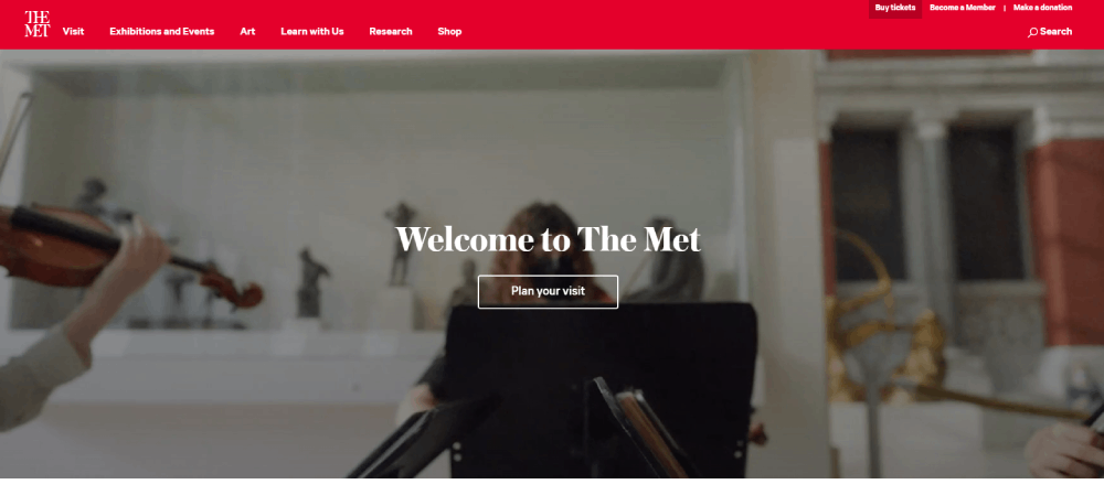
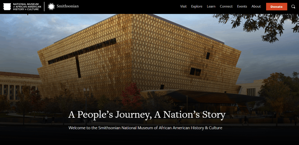
The Smithsonian Institution, Metropolitan Museum of Art, and Louvre Museum each approach this differently based on their collections and visitor demographics.
Unlike standard business sites, museum websites must balance aesthetic presentation with complex information architecture, often managing thousands of collection items, rotating exhibitions, and multiple visitor pathways.
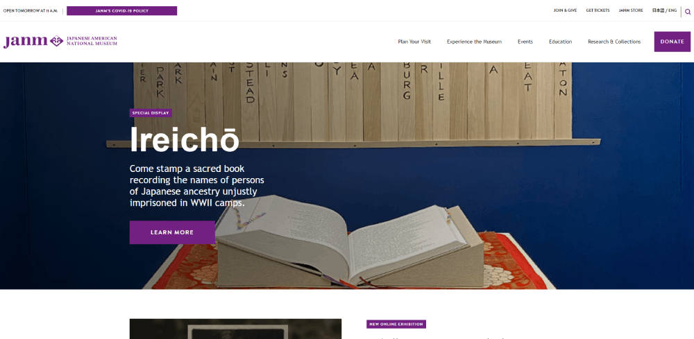
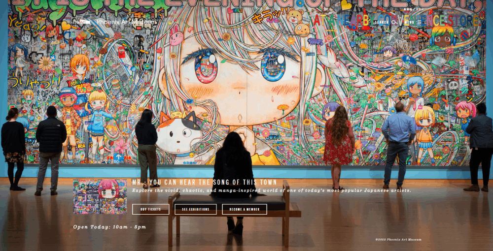
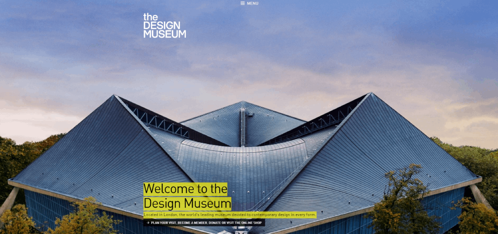
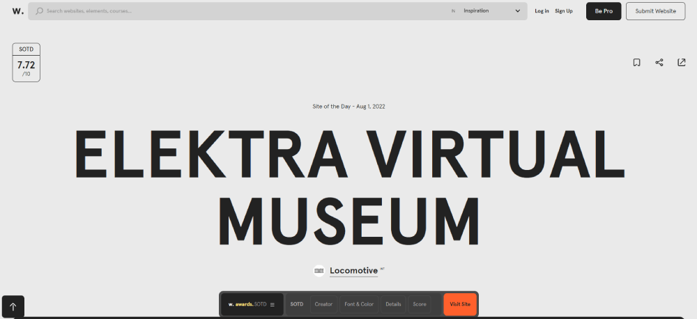
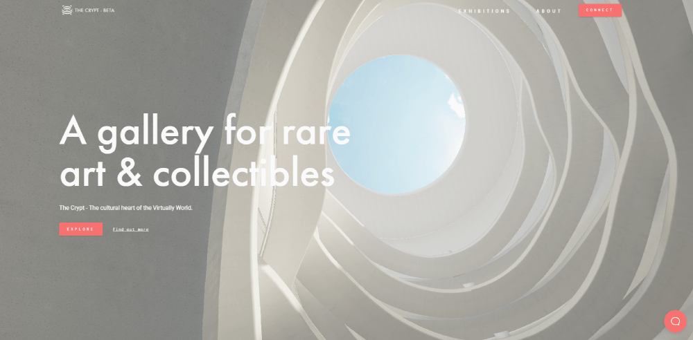
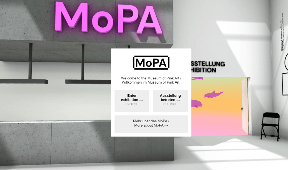
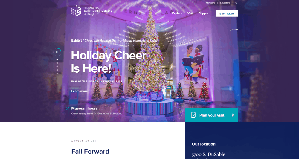
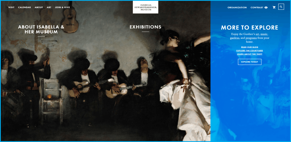
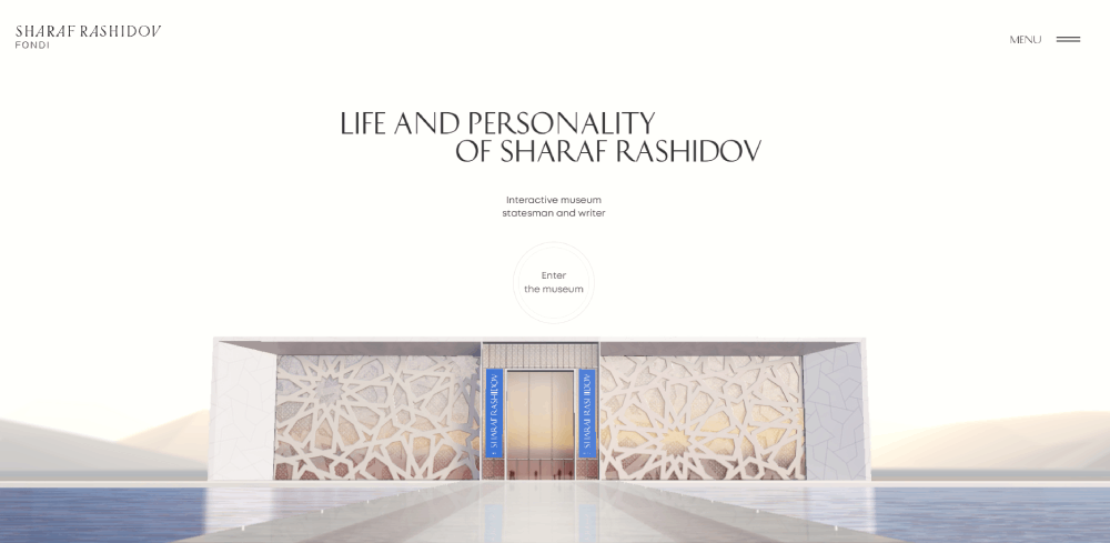
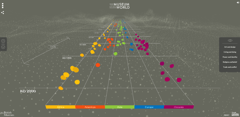
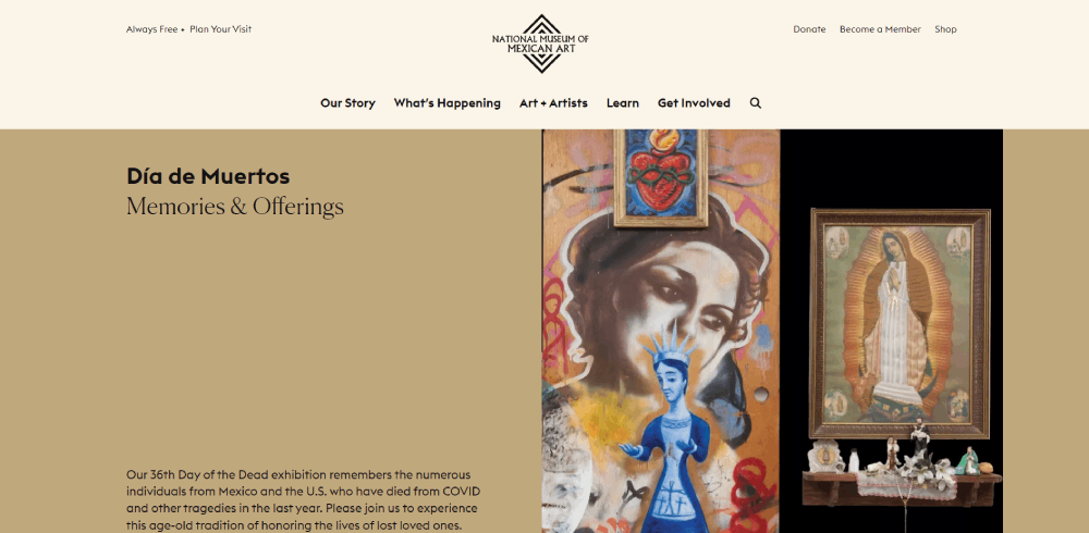
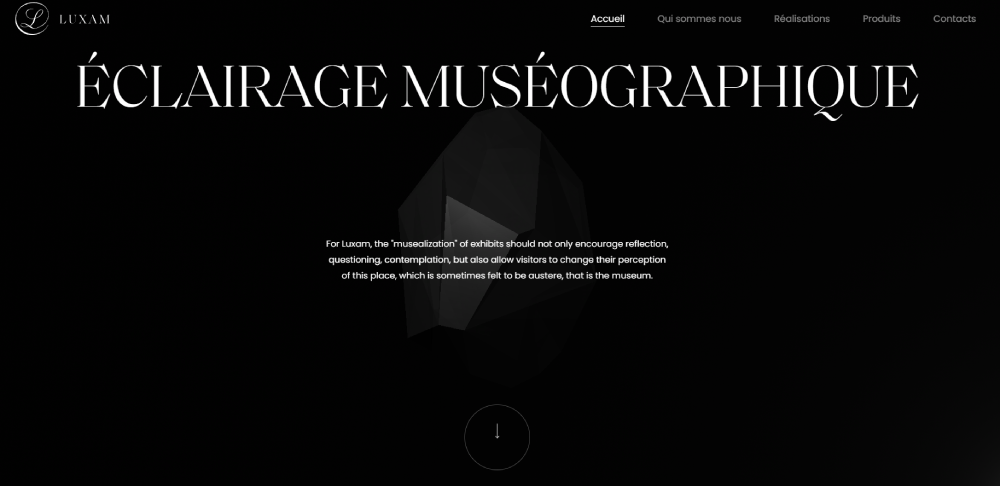
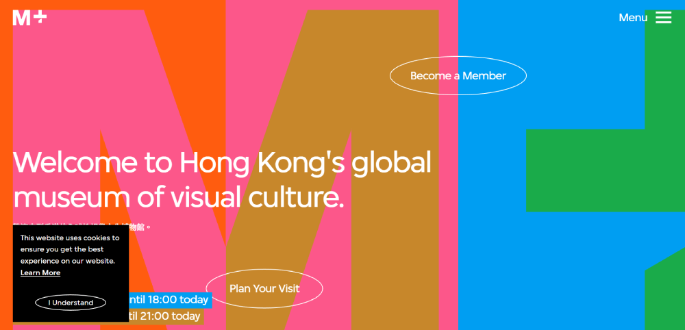
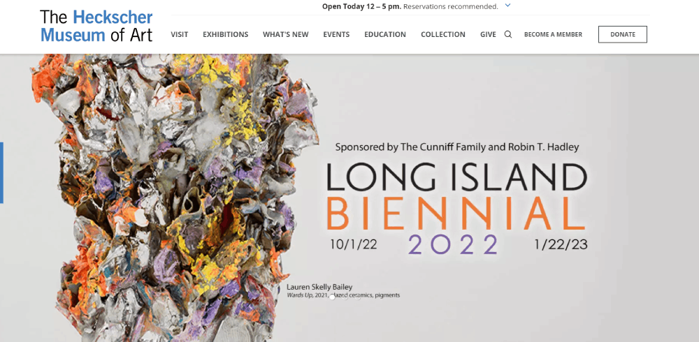
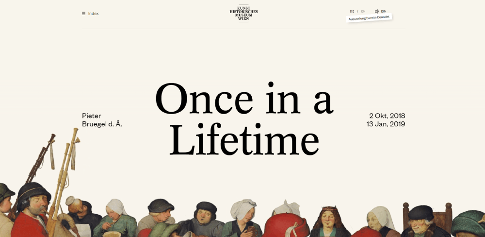
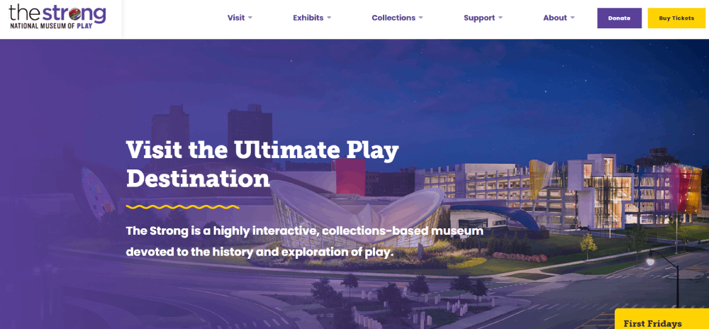
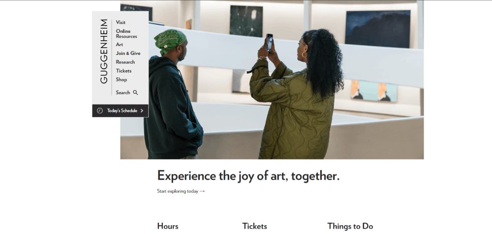
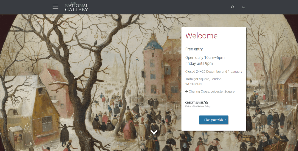
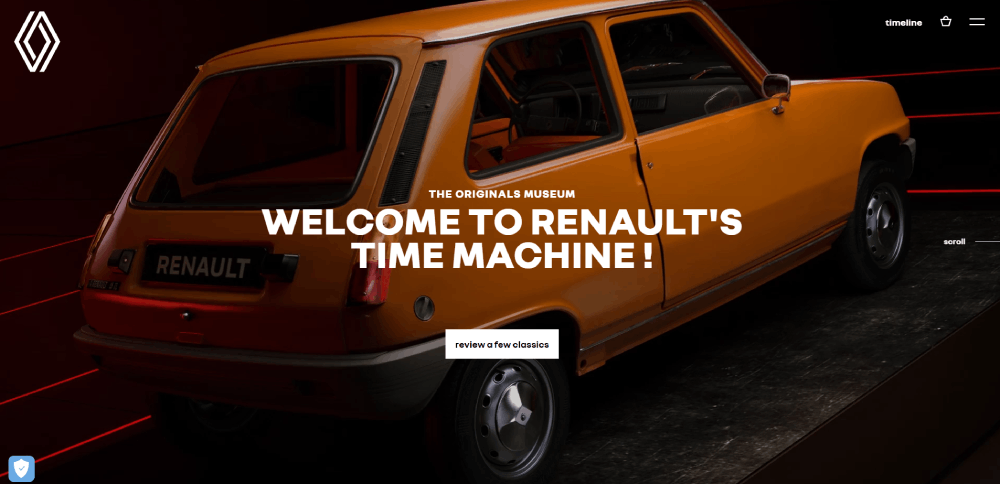
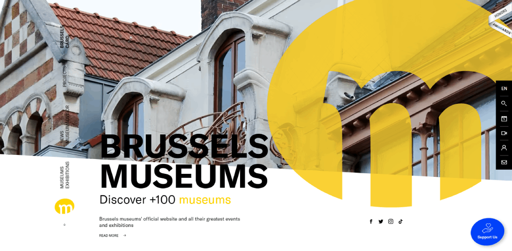
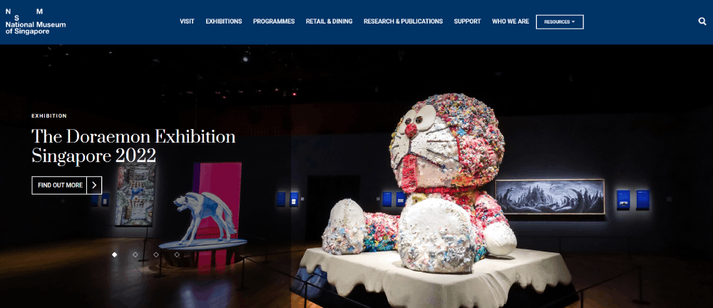
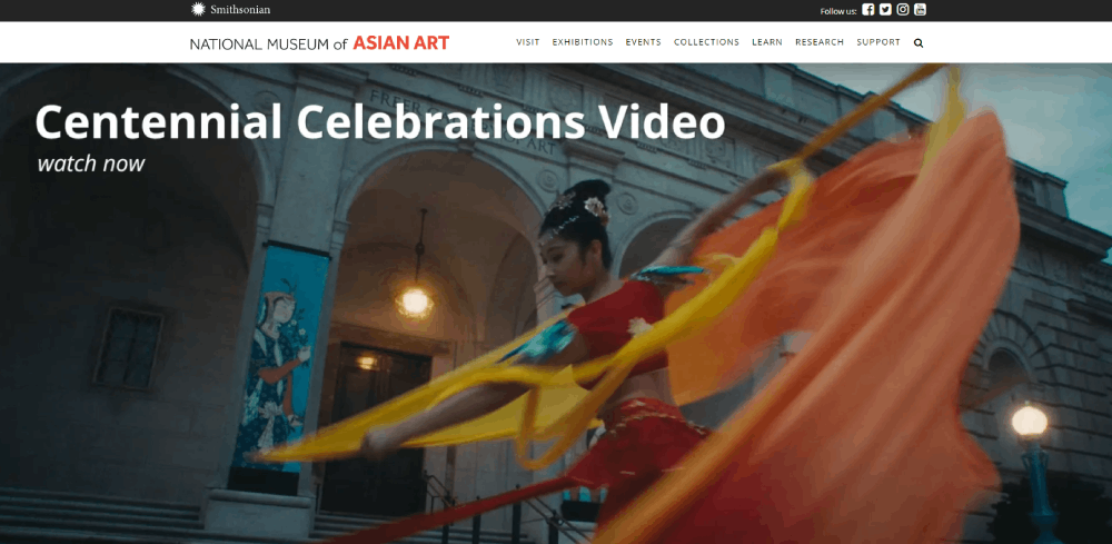
Museum Website Design Examples
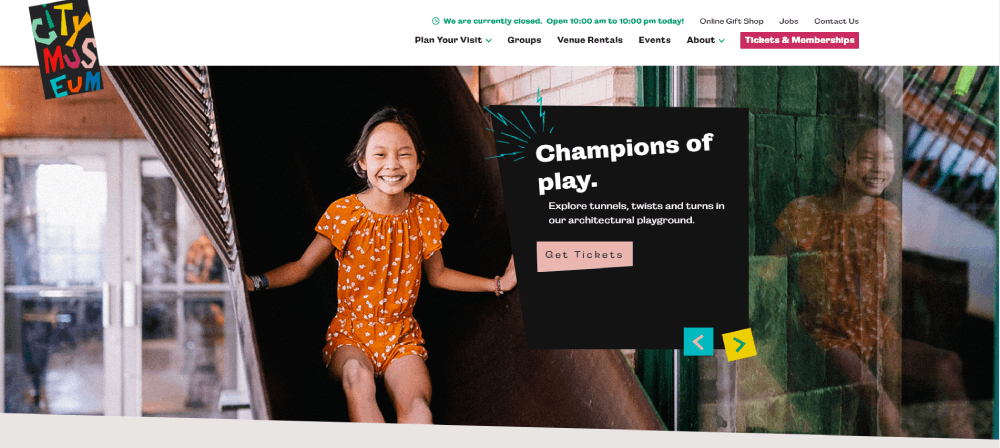
City Museum
How Museum Websites Differ from Standard Business Sites
Cultural institutions face unique requirements that standard corporate templates can't address.
A B2C website sells products. A museum website sells experiences, education, and cultural connection.
Visitor Planning Features
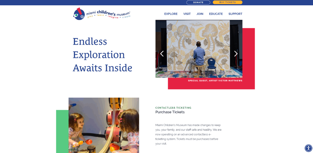
Museum sites need integrated ticket booking systems, event calendars, and facility information including accessibility details, parking, and nearby amenities.
Visitors plan day trips. Your site should help them do exactly that.
Collection Display Methods
Thousands of artifacts require searchable databases, high-resolution imagery, and contextual information that standard gallery modules can't handle.
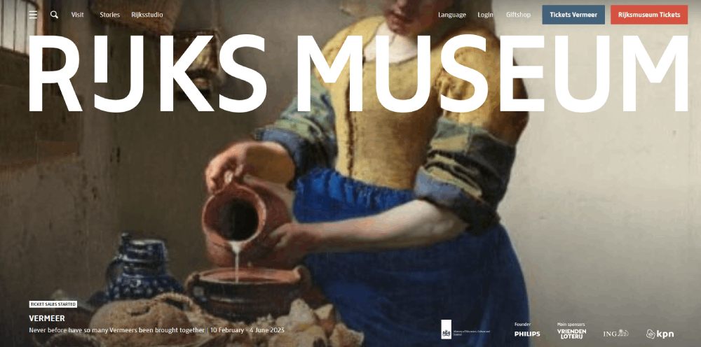
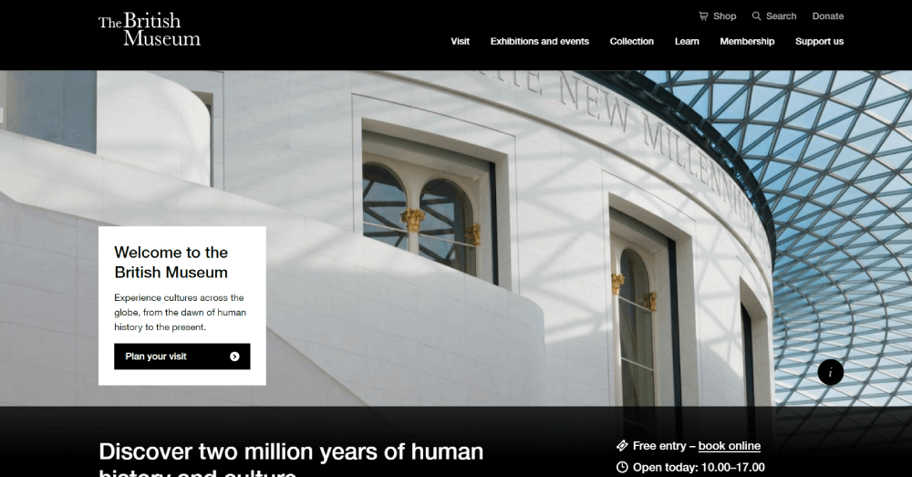
The Rijksmuseum displays over 700,000 objects online. The British Museum offers similar depth.
Educational Components
Schools, researchers, and lifelong learners expect downloadable resources, virtual tours, and curriculum-aligned content.
This separates museum sites from typical entertainment websites.
Donation Integration
Most museums operate as nonprofits. Membership portals, donation pages, and sponsorship information require seamless integration without disrupting the visitor experience.
What Makes a Museum Website Design Effective
Effective museum web design balances beauty with usability. Neither can compromise the other.
Visual Hierarchy Principles
The hero section should immediately communicate what makes your institution unique.
Large imagery, minimal text, clear pathways to tickets and exhibitions.
Navigation Structure
Complex collections demand intuitive website navigation.
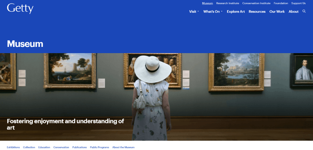
The Getty Museum uses mega menus. MoMA keeps it minimal. Both work because they match their content volume.
Accessibility Standards
WCAG compliance isn't optional for public institutions.
Screen reader compatibility, keyboard navigation, color contrast ratios, and alt text for every artwork image.
Mobile Responsiveness
Over 60% of museum website traffic comes from mobile devices.
Responsive design ensures booking works on phones, collection pages load quickly, and maps display correctly.
Booking System Integration
Timed entry, membership discounts, group rates, and special exhibition tickets all need smooth processing.
Eventbrite and Ticketmaster integrations are common solutions.
FAQ on Museum Website Design
What makes a good museum website design?
A good museum website combines visual hierarchy, intuitive navigation, and fast-loading high-resolution imagery. It should facilitate online ticket booking, showcase collections effectively, and meet WCAG accessibility standards. The V&A Museum and MoMA exemplify these principles.
How much does museum website design cost?
Museum website development ranges from $10,000 for basic sites to $250,000+ for institutions like the Smithsonian. Cost depends on collection database size, virtual tour integration, booking system complexity, and custom CMS requirements.
Which CMS platforms do museums use?
Most museums use WordPress or Drupal for content management. Larger institutions like the British Museum often build custom solutions. Squarespace and Webflow work for smaller galleries needing simpler exhibition showcase capabilities.
How do museums display collections online?
Museums use searchable databases with filtering by artist, period, medium, and location. The Rijksmuseum displays 700,000+ objects through high-resolution image galleries. Zoom functionality, contextual information, and related artwork suggestions improve the visitor experience.
What accessibility features do museum websites need?
Museum websites require WCAG compliance including screen reader compatibility, keyboard navigation, alt text for artwork images, proper color contrast, and video captions. The Americans with Disabilities Act influences requirements for U.S. institutions.
How do virtual tours work on museum websites?
Virtual tours use 360-degree photography, interactive floor plans, and embedded video. The Louvre Museum offers comprehensive virtual experiences. Integration requires significant server resources and mobile optimization for smooth performance across devices.
What booking systems work best for museum websites?
Eventbrite and Ticketmaster handle high-volume ticketing. Timed entry, membership discounts, group rates, and special exhibition pricing need seamless integration. The Metropolitan Museum of Art processes millions of transactions annually through custom solutions.
How important is mobile optimization for museum websites?
Over 60% of museum website traffic comes from mobile devices. Mobile-first design ensures booking flows work on phones, collection pages load quickly, and maps display correctly for visitors planning trips.
What color schemes work best for museum websites?
Neutral palettes with black, white, and subtle accents let artwork stand out. The Museo del Prado uses minimal color. Science museums like the Natural History Museum often incorporate brand colors more boldly.
How do museums handle multilingual website content?
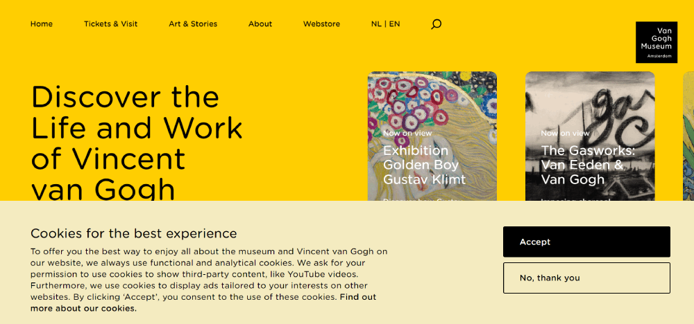
Major institutions like the Getty Museum and Guggenheim offer multiple language options. Language switchers appear in header navigation. Content translation requires ongoing maintenance as exhibitions and events change throughout the year.
Conclusion
These museum website design examples prove that cultural institutions can create digital experiences as compelling as their physical galleries.
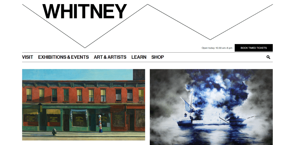
From the Tate Modern's bold aesthetics to the Whitney Museum's clean interface, each site balances art presentation with practical visitor needs.
The best museum websites share common traits: intuitive collection search databases, seamless online ticketing, strong visual storytelling, and full accessibility compliance.
Your institution doesn't need the budget of the Louvre Museum or British Museum to succeed online.
Start with clear navigation, high-quality exhibition photography, and a booking system that works on mobile devices.
Build from there. Study what institutions like the National Gallery of Art and Natural History Museum London do well. Adapt those principles to your collection size and visitor demographics.
A thoughtful user-friendly website turns curious browsers into actual visitors walking through your doors.


