

Deliciously Inspiring Food Website Design Examples
September 4, 2025
Stylish Tailor Website Design Examples to Inspire
September 7, 2025Your conference website has about three seconds to convince someone to register.
That's it.
Looking at conference website design examples reveals what separates events that sell out from those struggling to fill seats.
The difference isn't budget or brand recognition. It's design that actually works.
Most event organizers think they need flashy animations or cutting-edge layouts. Wrong.
What you need is a site that answers questions fast, makes registration painless, and gets people excited about showing up.
This article breaks down real conference sites that convert visitors into attendees, from Web Summit and SXSW to INBOUND and Google I/O.
You'll see what makes speaker showcase sections effective, how successful events structure their agenda displays, and which registration page designs actually reduce drop-off rates.
What is Conference Website Design
Conference website design is a specialized approach to creating event-focused web pages that drive registrations, showcase speakers, and communicate schedules to potential attendees.
Unlike standard business websites, these sites serve a time-sensitive purpose.
They need to convert visitors into ticket buyers within seconds.
The core function separates conference sites from general event websites: multi-day programming, speaker lineups, session tracks, and networking opportunities all compete for attention on a single platform.
Think Web Summit, SXSW, or Google I/O.
Each handles thousands of attendees through carefully structured digital experiences.
Registration systems sit at the center of every conference website.
Without clear ticket pricing, early bird options, and smooth checkout flows, even gorgeous designs fail.
The best conference homepage designs balance visual appeal with pure functionality.
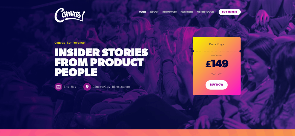
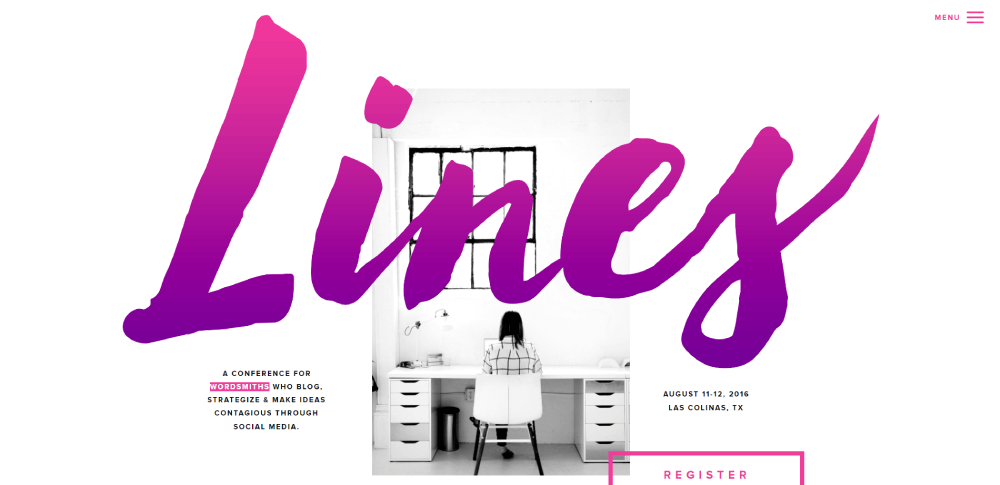
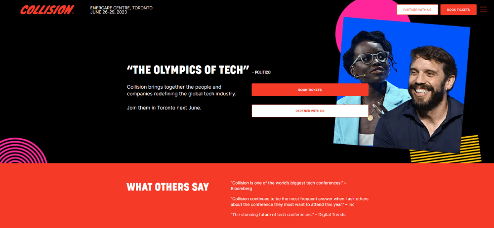
Conference Website Design Examples
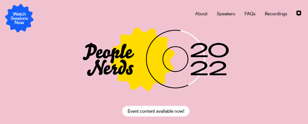
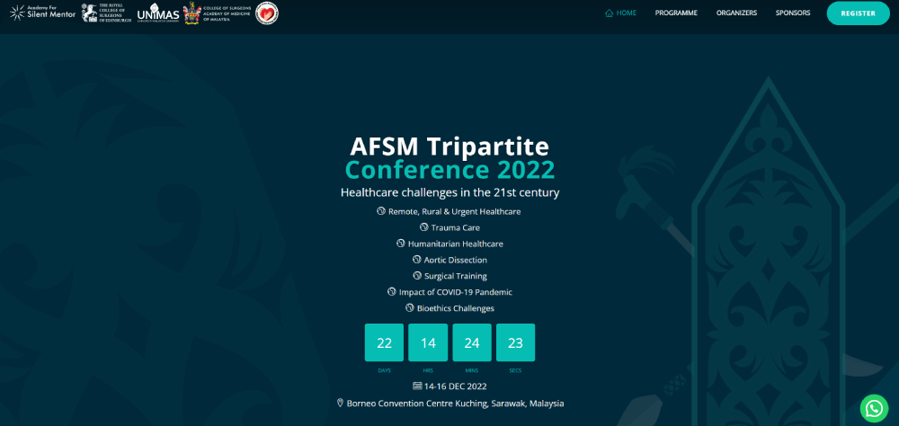
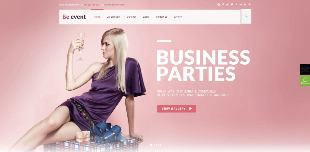
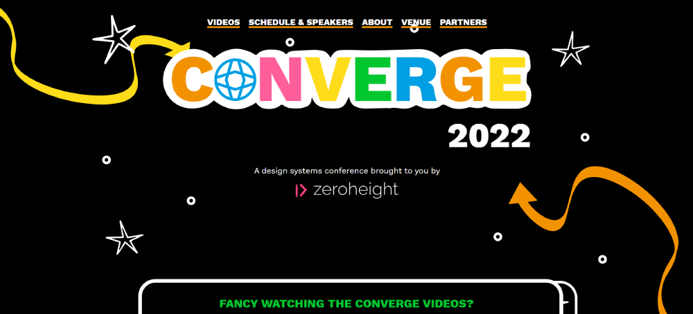
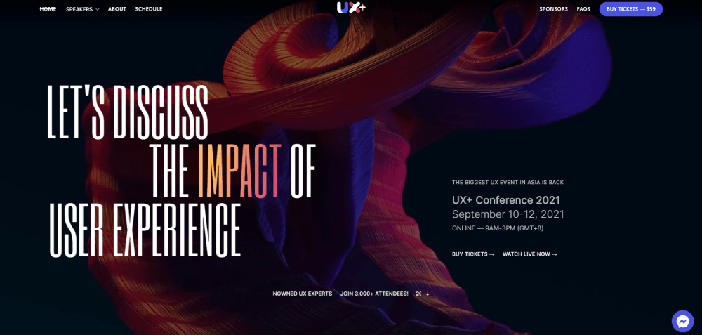
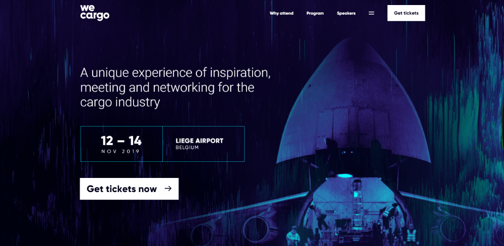
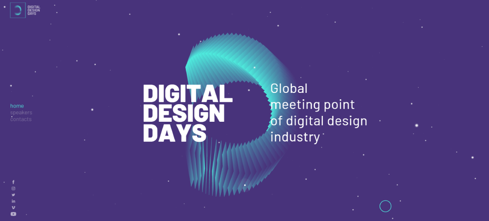
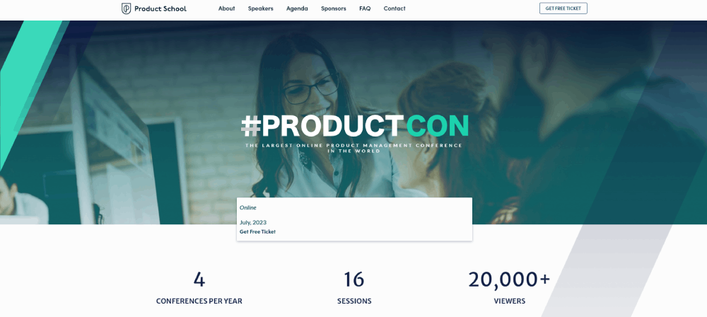
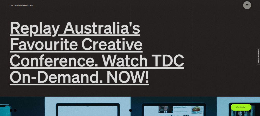
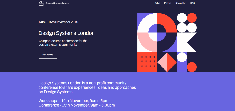
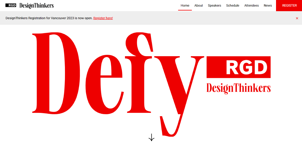
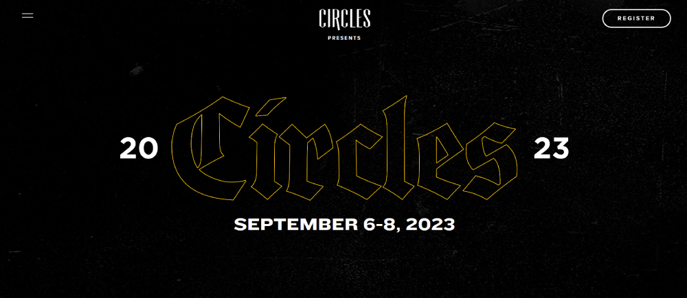
People Nerds Conference
What Makes a Conference Website Successful
Success comes down to one metric: registration conversion rates.
Everything else supports that goal.
How Do Registration Conversion Rates Affect Conference Websites
Visitors decide within 3 seconds whether to explore further or bounce.
Clear call-to-action buttons, visible ticket pricing, and a streamlined form design push those numbers up.
What Role Does Information Accessibility Play
Attendees want fast answers: When? Where? How much? Who's speaking?
Bury this information and watch your bounce rate climb.
The agenda display, speaker showcase sections, and venue details need to be one click away from anywhere on the site.
Why Does Mobile Responsiveness Matter for Conferences
Over 60% of conference website traffic comes from mobile devices.
Most registration decisions happen on phones during commutes or lunch breaks.
A responsive website isn't optional; it's the baseline for any professional website design.
How Does Brand Alignment Impact Attendee Trust
Tech conferences use bold, modern palettes.
Academic events lean toward professional, muted tones.
Your color scheme signals what kind of experience attendees can expect before they read a single word.
What Makes Speaker and Agenda Presentation Effective
Speaker profiles need professional headshots, concise bios, and session topic connections.
Agenda layouts should filter by day, track, or topic.
Both elements build credibility and help attendees justify the ticket price to themselves (or their bosses).
How Do Visitors Use Conference Websites
Understanding user behavior shapes every design decision.
Visitors arrive with specific goals and limited patience.
What Are the Primary User Goals on Conference Sites
Four tasks dominate:
- Checking event dates and location
- Reviewing the speaker lineup
- Scanning the session schedule
- Completing registration
Everything else is secondary.
How Do Mobile and Desktop Behaviors Differ
Desktop users browse deeper, comparing session details and reading full speaker bios.
Mobile users want quick facts and fast registration.
Design for both, but prioritize mobile checkout flows.
How Long Before Visitors Make Registration Decisions
About 3 seconds for the initial stay-or-leave decision.
Maybe 2 minutes for the full registration commitment.
Your hero section carries most of that weight.
What Information Hierarchy Do Attendees Expect
Top priority: date, location, call to action buttons.
Second tier: speakers, agenda overview, ticket pricing.
Third tier: venue details, sponsor information, FAQs.
Break this hierarchy and you'll confuse visitors into leaving.
What Are the Types of Conference Website Designs
Different industries demand different approaches.
A technology website style won't work for an academic symposium.
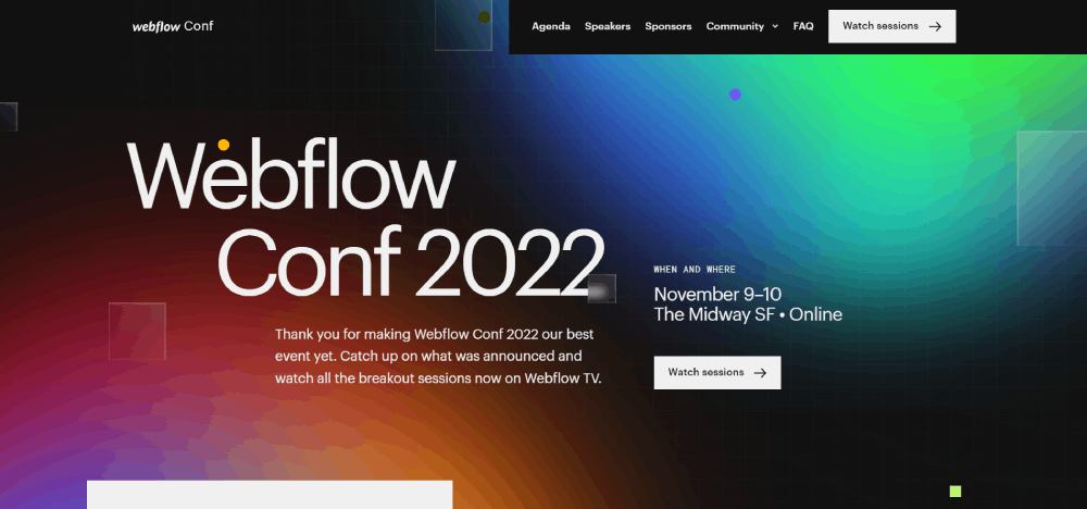
How Do Tech Conference Designs Differ From Others
Bold typography, dark themed websites, animated transitions, and futuristic elements.
Think Figma Config or Adobe MAX.
These sites push boundaries because their audiences expect innovation.
What Defines Academic and Scientific Conference Design
Clean layouts, readable fonts, minimal animation.
Credibility matters more than flash.
White space and clear information architecture signal serious scholarship.
How Do Creative Conference Websites Stand Out
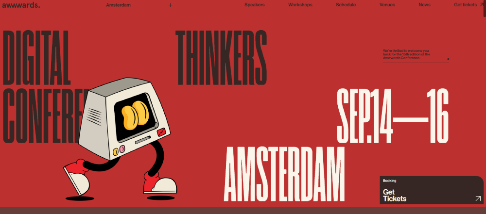
Awwwards Conference uses ambient city sounds and 360-degree views.
OFFF Tel Aviv features experimental visuals and bold color blocks.
Creative websites break conventions because their audiences are designers who appreciate rule-breaking.
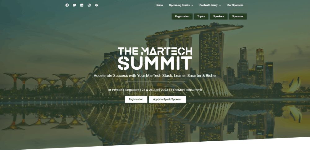
What Characterizes Business Summit Website Designs
Professional imagery, corporate websites aesthetics, clear ROI messaging.
INBOUND by HubSpot nails this with consistent branding and prominent speaker credentials.
These sites sell value, not vibes.
How Do Hybrid and Virtual Event Designs Adapt
Livestream integration, virtual networking features, and timezone displays become primary elements.
Hopin and Zoom Events have shaped expectations here.
The registration flow must handle both in-person and remote attendees without confusion.
What Elements Do Conference Websites Need
Core components determine whether visitors convert or bounce.
Skip any of these and registration rates suffer.
What Should a Conference Website Header Include
Essential header elements:
- Logo with homepage link
- Primary navigation (4-6 items maximum)
- Registration CTA button in contrasting color
- Event date and location
Sticky headers keep the registration button visible during scroll.
Strong website navigation reduces bounce rates significantly.
What Should Conference Speaker Pages Contain
Each speaker profile needs:
- Professional headshot (minimum 400x400 pixels)
- Two to three sentence bio focused on expertise
- Company and title
- Session topic links
- Social media connections
Grid layouts work better than lists for browsing large speaker lineups.
How Should Conference Agendas Be Displayed
Timeline layouts work for single-track events; multi-track conferences need filterable grids.
Essential filters: day, topic category, session type, difficulty level.
Calendar integration (Google Calendar, Outlook, iCal) lets attendees save sessions directly.
Expandable session cards should show speaker name, time, location, and description.
What Registration Features Increase Conversions
Form fields should stay under 8; each additional field drops completion rates by 10%.
Show ticket pricing upfront, not after clicking through multiple pages.
Payment integrations: Stripe, PayPal, invoice options for corporate buyers.
Group registration discounts displayed prominently boost average order value.
Early bird countdown timers create urgency without feeling manipulative.
What Tools Build Conference Websites
Platform choice depends on budget, timeline, and technical capabilities.
Which Website Builders Work for Conference Sites
Wix offers drag-and-drop simplicity with event-specific templates.
Squarespace provides polished designs suited for creative and design conferences.
Webflow gives designers full control for custom, unique websites without coding.
All three handle mobile responsiveness automatically.
What Event-Specific Platforms Exist
Fourwaves specializes in academic and scientific conferences with abstract submission tools.
Cvent handles enterprise-scale events with CRM integrations.
Eventbrite works well for smaller conferences needing simple ticketing.
Hopin and Zoom Events focus on virtual and hybrid conference features.
How Do WordPress Themes Compare
WordPress themes offer flexibility but require more setup time.
Event-focused themes include registration plugins, speaker post types, and schedule builders.
Best for teams with existing WordPress experience or specific customization needs.
When Does Custom Development Make Sense
Large conferences (10,000+ attendees) with complex registration requirements.
Events needing deep CRM or marketing automation integrations.
Organizations with in-house development teams and long-term event programs.
Budget minimum: $15,000-50,000 depending on feature complexity.
How to Choose a Conference Website Design Style
Design decisions flow from audience expectations and event positioning.
How to Match Design Style to Conference Type
Tech conferences: bold colors, animated landing pages, cutting-edge interactions.
Academic events: clean websites with readable fonts and clear hierarchies.
Creative conferences: experimental layouts, colorful websites, interactive elements.
Business summits: professional imagery, trust signals, ROI-focused messaging.
What Brand Consistency Requirements Apply
Use existing brand colors, fonts, and voice if your organization has established guidelines.
New events can establish identity through consistent application across all pages.
Sponsor logo placement should follow size hierarchies based on sponsorship tiers.
How Do Budget and Timeline Affect Choices
Under $500: template-based builders (Wix, Squarespace) with minimal customization.
$500-5,000: premium themes or builder upgrades with custom branding.
$5,000+: custom design work or specialized event platforms.
Timeline minimum: 4-6 weeks for template sites; 3-6 months for custom builds.
How to Assess Technical Capabilities
No-code teams: Wix, Squarespace, or turnkey event platforms.
Design-focused teams: Webflow for visual control without development.
Technical teams: WordPress or custom development for maximum flexibility.
Match platform complexity to team skills; over-engineering causes more problems than it solves.
FAQ on Conference Website Design
What makes a conference website effective?
A conference website succeeds when it converts visitors into registrants quickly. Clear navigation, visible ticket pricing, prominent speaker profiles, and mobile-friendly registration forms drive conversions. The best sites answer attendee questions within seconds of landing.
How much does a conference website cost to build?
Costs range from $0-500 for template builders like Wix or Squarespace to $15,000-50,000 for custom development. Event platforms like Cvent or Fourwaves fall in between. Budget depends on attendee volume, registration complexity, and integration requirements.
What pages should a conference website include?
Essential pages: homepage with registration CTA, speaker lineup, agenda or schedule, venue and travel information, ticket pricing, sponsor recognition, and contact details. Larger events add session tracks, networking features, and virtual attendance options.
How do I display conference speakers effectively?
Use grid layouts with professional headshots, concise bios, company affiliations, and session links. Speaker pages build credibility and help attendees justify registration costs. Include social media profiles and past talk recordings when available.
What's the best way to show a conference agenda?
Filterable layouts work best for multi-track events. Let attendees sort by day, topic, session type, or difficulty level. Include calendar integration for session saving. Single-track conferences can use simpler timeline displays.
Should conference websites be mobile responsive?
Absolutely. Over 60% of conference website traffic comes from mobile devices. Most registration decisions happen on phones during commutes. A non-responsive site loses more than half your potential attendees before they even see your speakers.
How do I increase conference registration conversions?
Keep registration forms under 8 fields. Show pricing upfront without hidden clicks. Add early bird countdown timers. Offer group discounts prominently. Provide a "convince your boss" letter like INBOUND does. Remove friction at every step.
What platform should I use for my conference website?
No-code teams: Wix or Squarespace. Designers wanting control: Webflow. Academic conferences: Fourwaves. Enterprise events: Cvent. Hybrid or virtual focus: Hopin or Zoom Events. Match platform complexity to your team's technical skills.
How do virtual conference websites differ from in-person events?
Virtual conference sites prioritize livestream access, timezone displays, and virtual networking features. Registration flows handle remote-only tickets. Session pages include direct video links. Platforms like Hopin and Zoom Events specialize in these hybrid requirements.
When should I launch my conference website?
Launch 4-6 months before the event minimum. Early bird pricing creates urgency for quick registrations. Speaker announcements drive traffic over time. Allow 4-6 weeks for template sites or 3-6 months for custom builds before launch.
Conclusion
These conference website design examples prove that simplicity beats complexity every time.
Your attendees don't care about fancy parallax effects or animated transitions. They want fast answers and frictionless registration.
Focus on what actually moves people from browsing to buying tickets.
A clear event website layout with prominent speaker bios, an organized agenda display, and visible pricing tiers will outperform flashy designs that hide information behind unnecessary clicks.
Your summit landing page should work flawlessly on mobile devices.
Most ticket purchases happen on phones during commutes or lunch breaks, not at desktop computers.
Test your forms. Check your load times. Make sure international attendees can access everything without frustration.
Whether you choose Webflow, Squarespace, or a specialized platform like Cvent, the principles remain the same: answer questions quickly, build trust through speaker credibility, and remove every barrier between interest and registration.


