Designing Photography Websites
November 22, 2016
Website inspiration: where to look for the recent design trends
February 12, 2019The pre-built websites we have launched to date address the major website types and many the most popular website niches. We are presently looking into the needs of the increasing number of web designers who are working with small businesses.
Our support team has been listening to the suggestions of the design community, and we are responding to those suggestions.
We have launched four exciting pre-built websites this month to address the needs of web designers working in the following niche categories:
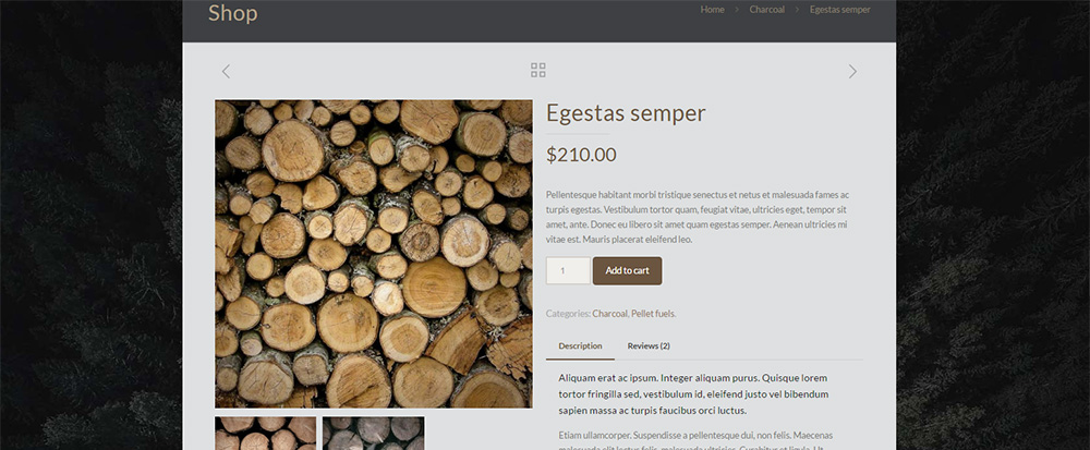
- BeFireplace – a delightfully beautiful shop for firewood sales;
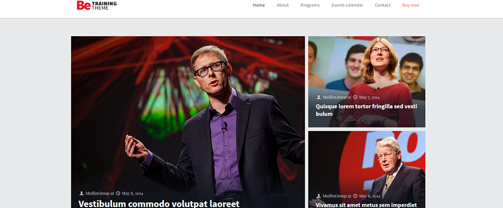
- Betraining – a pre-built website destined to professionals and businesses in the training and consulting sectors;
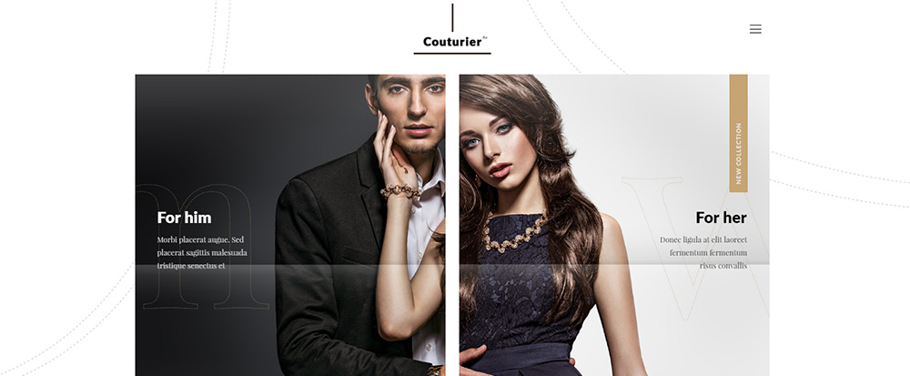
- BeCouturier – a modern, chic pre-built website ideally suited for fashion designers;
- BeSurveyor – destined to those in the surveying profession.
Be Fireplace – Keeping that Cozy Fire Ready for Winter
Fireplaces on homes are quite common these days. Many older homes have them, and the trend in newly-built homes is for the owner to engage the services of an interior designer for the express purpose of adding an interior or exterior fireplace.
Since we identified with what appears to be a growing trend, we felt companies selling firewood would benefit from the launching of this cozy-looking pre-built website.
This pre-built websites video header nicely conveys the beautiful and cozy experience of watching the fire.
We wanted to find the best way to express this type of business. We decided that a video, such as the one used here, was all that was needed. Since the video is customizable, you can choose whatever one you want, to best satisfy the needs of your client.
This pre-built website is e-commerce optimized, so we added a gallery of available products right after the header to give the user an easy and satisfying UX.
A high level of clarity, as displayed in the product page, greatly simplifies the user’s shopping experience.
Be Training – Helps Trainers Get More Visibility Online
When we built BeTraining, our approach was to present a clearly structured pre-built website that used only the basic pages, such as programs, an event calendar, an about page, and a contact page. We also created BeTraining with the objective of providing professional trainers and consultants, along with training agencies and larger institutions, an opportunity to increase their online visibility.
If the format of this versatile pre-built website suits your web design objective, well and good. You can of course customize it for any professional or agency that offers training, coaching, classes, workshops, etc.
This homepage provides a quick look into the most recent event section articles.
Scroll down the home page, and you’ll find an area the explains the services offered, a section about the business and its owner or owners, and a section that provides contact information, including a map. Additional sections could easily be customized to present images of from the workshop or training facility, or to describe and illustrate offline events.
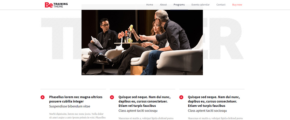
Showing the trainer’s services, always an important section.
Be Couturier – Where Fashion Meets Web Design Coolness
A couturier website should convey uniqueness and a feeling of luxury. We created BeCouturier because of our awareness of the rising trend in the number of people opening tailoring businesses. This is in response to a growing consumer demand for unique and attractive custom made clothes. As you would expect, our pre-built website conveys this same sense of uniqueness and luxury.
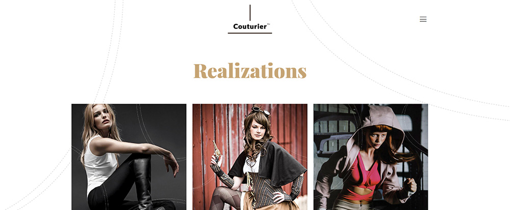
Notice how the white space helps the user focus on the header images, while at the same time conveying a feeling of relaxation.
As you examine BeCouturier in detail, you’ll see how we generously use white space to transmit a feeling of elegance. The offer, together with other items of clothing, are on display, plus there is a section about the professional tailors that you, as a client, could be working with.
The pre-built structure also features a page destined to the fashion studio itself, where photos can be added along with the studio’s story. A gallery with realizations, a page communicating the offer, and a contact page, complete the picture.
Clothes made in the couturier’s studio are highlighted in the gallery.
Be Surveyor – A corporate presentation pre-built website
At first glance, this pre-built website’s content would appear to cover all aspects of the surveying business quite well. There are however, many different ways in which the services of surveyors and surveying companies are rendered.
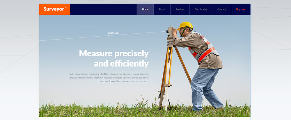
Consequently, when we designed and built BeSurveyor, our approach was to make it easy to transform and customize the branding and content, to be certain it will be easy to use for the entire spectrum of surveying business clients.
On the home page, you will see the areas that communicate basic information about the company and its services. Past and present clients and testimonials are features many business will want to include, and these could easily be incorporated if desired.
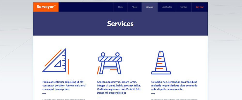
The menu includes the about page, the services page, a certificates page, and a contact page. The services page makes good use of modern icons and white space while providing the basic information a potential client might be looking for.
A certificates page is an especially important feature for businesses operating in the surveying domain. In this case, the user can open a PDF file to display any of several certificates. The contact page nicely presents all the information a potential client needs – including a map, telephone number and address, and an e-mail form.
Custom, domain-oriented icons helps to convey a corporate, yet friendly, atmosphere.

