

Top Handyman Website Design Examples
January 2, 2026
Amazing Website Design Examples You Need to See
January 3, 2026Photographer websites are everywhere, but most of them fail at the one thing they're supposed to do: book clients.
You land on the homepage, scroll through beautiful images, and then... nothing. No pricing. No clear way to inquire. The contact button is buried somewhere between the blog and the about page.
The best photography sites don't just showcase work. They guide visitors from "nice photos" to "I need to hire this person" without making them hunt for next steps.
Platform doesn't matter as much as structure. A Squarespace template can outperform a custom WordPress build if the booking path is clear and the images load fast.
Here are 15 examples that actually convert.
What Is Photographer Website Design
Photographer website design is a category of portfolio site built specifically to display photography work, convert visitors into clients, and communicate a visual brand identity.
It differs from a standard business site in one key way. The images are the product.
Every layout decision, from gallery grid to contact form placement, exists to let the photos do the selling. Platforms like Squarespace, Pixieset, Format, and SmugMug have built entire products around this idea.
A photography portfolio website handles things a regular site does not: client proofing galleries, session booking, image watermarking, print delivery, and high-resolution image loading that does not tank page speed.
How Does a Photography Website Differ from a General Portfolio Site
A general web design portfolio shows project thumbnails and case studies. A photographer's site is built around full-resolution images, often hundreds of them, organized by session type or client.
The technical demands are completely different. Image-heavy websites need lazy loading, CDN delivery through services like Cloudflare, and format optimization with WebP or AVIF to keep Core Web Vitals in check.
Then there are features that general portfolio builders just do not offer. Client gallery delivery through ShootProof or Pic-Time. Session booking via HoneyBook or Dubsado. Online print shops with WHCC integration.
Took me a while to realize this, but the biggest gap is actually in website navigation. A graphic designer might have five projects. A wedding photographer might have 80+ galleries. The navigation structure has to handle that volume without overwhelming anyone.
What Makes a Photographer Website Design Effective for Client Booking
A photography website that books clients does three things above the fold: shows the best work, states the specialty, and makes the contact path obvious.
That last part trips up a lot of photographers. They bury the inquiry form three clicks deep, behind a "Contact" link hidden in the footer. Meanwhile, the visitor already left.
The sites that actually convert share a pattern. Clear call to action buttons on every page. A pricing page that sets expectations (even just "starting at" ranges). And testimonials placed near the booking flow, not isolated on a separate page.
Calendly embeds or HoneyBook intake forms work well when they are part of the design, not bolted on as an afterthought. The booking system needs to feel like the site, not like a random third-party popup.
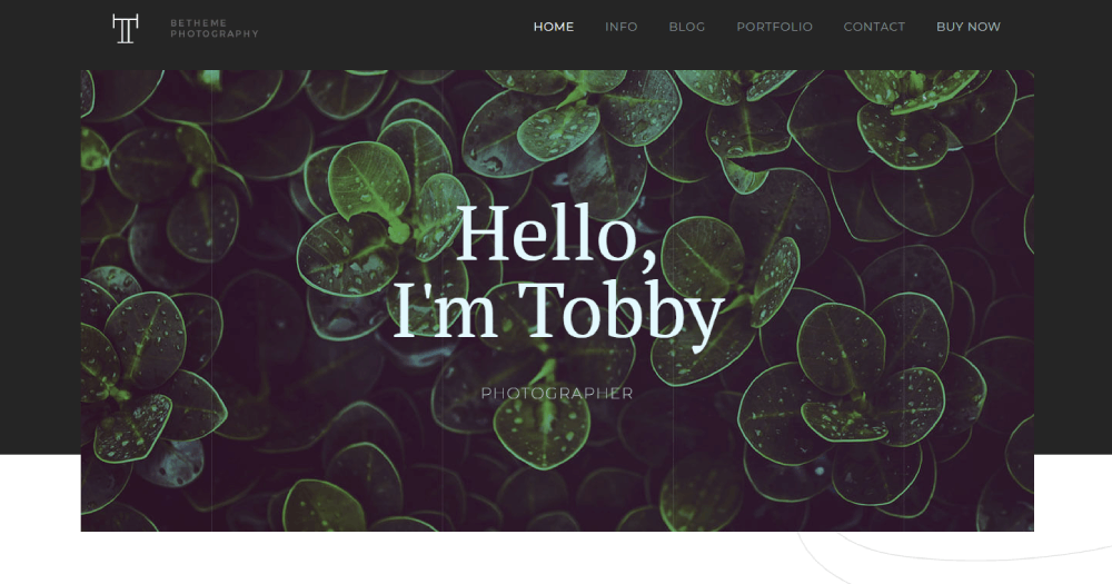
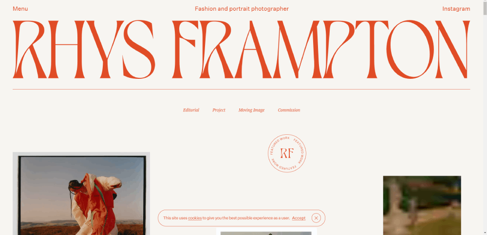
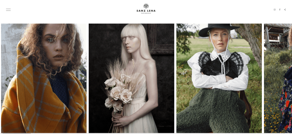
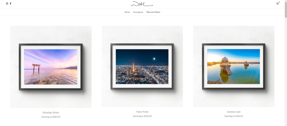
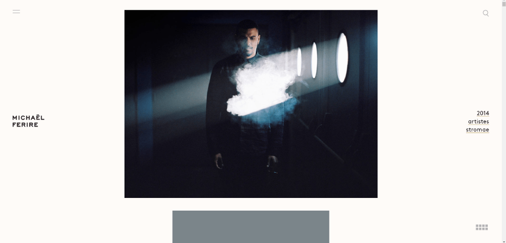
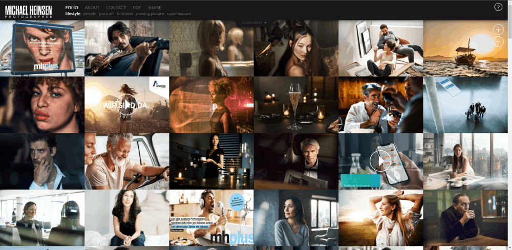
Photographer Website Design Examples
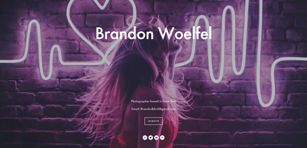
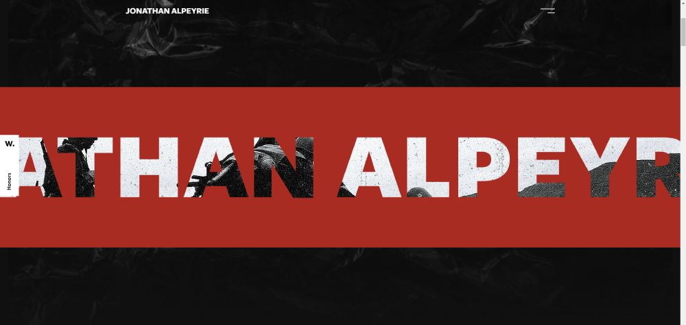
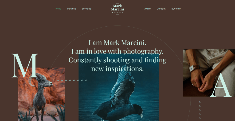
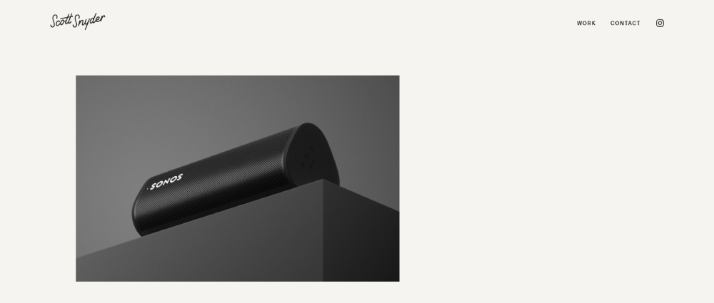
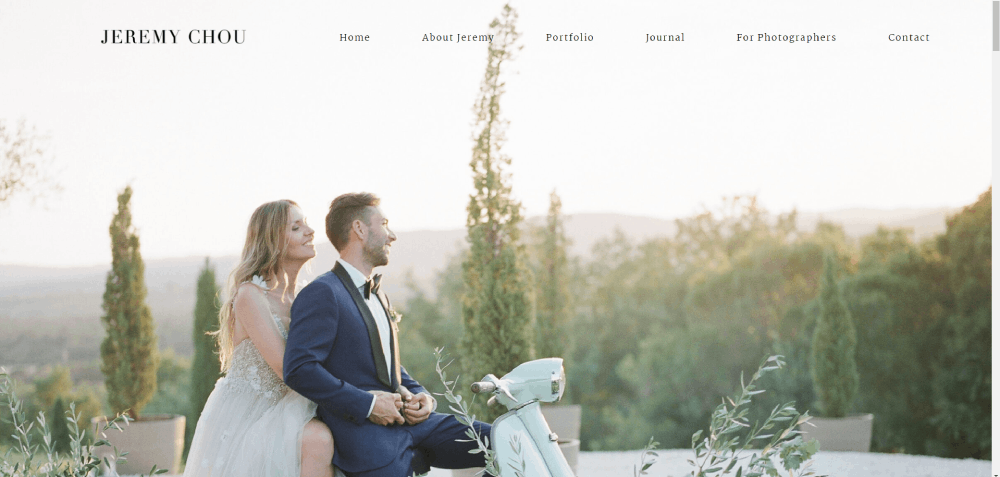
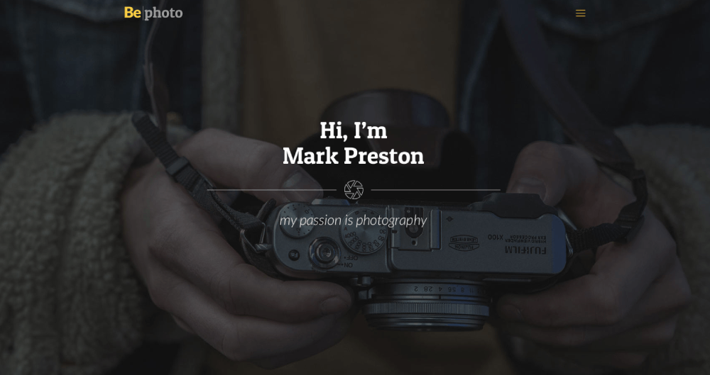
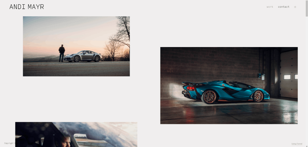
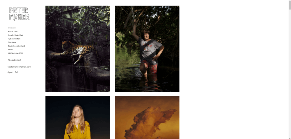
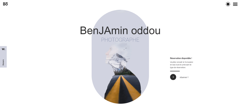
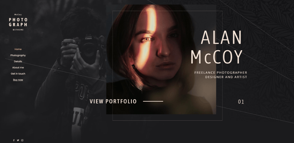
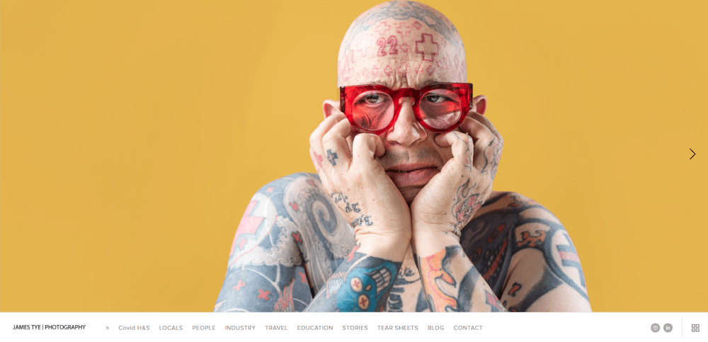
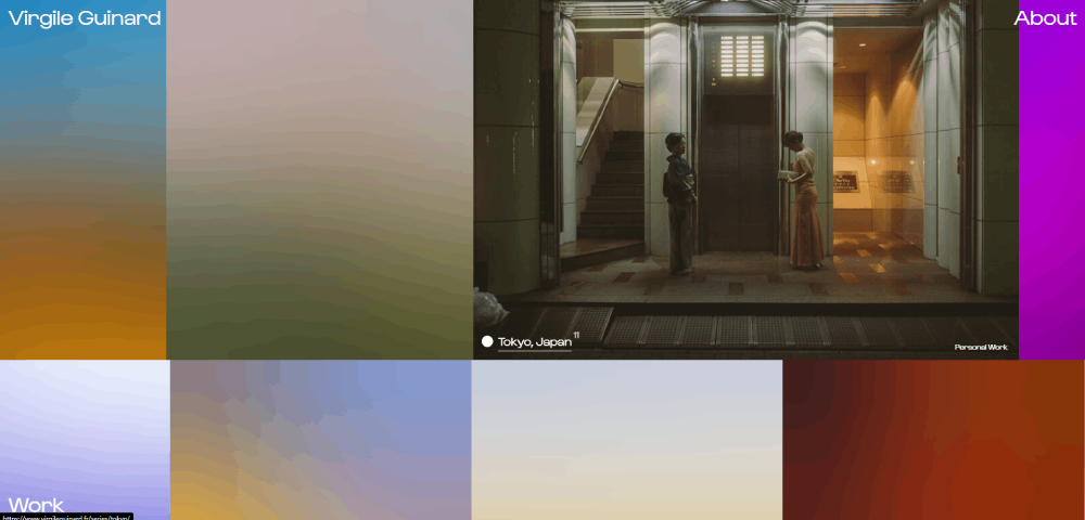
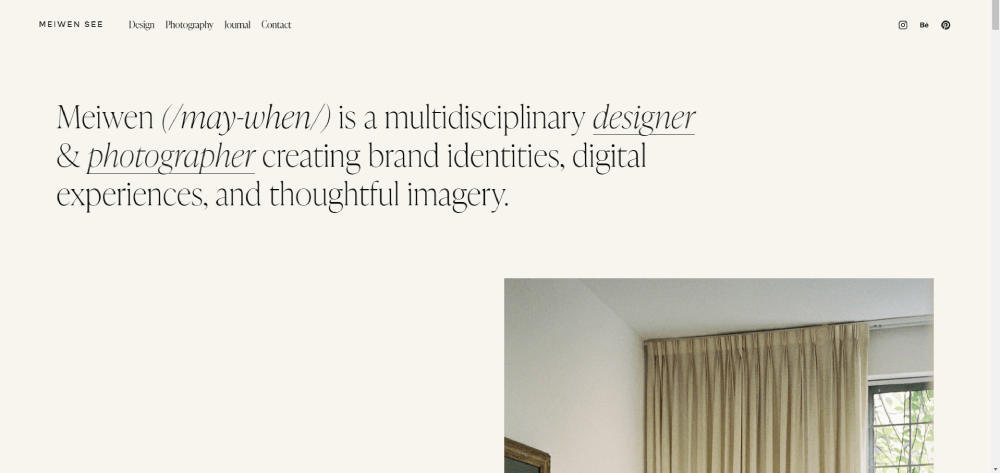
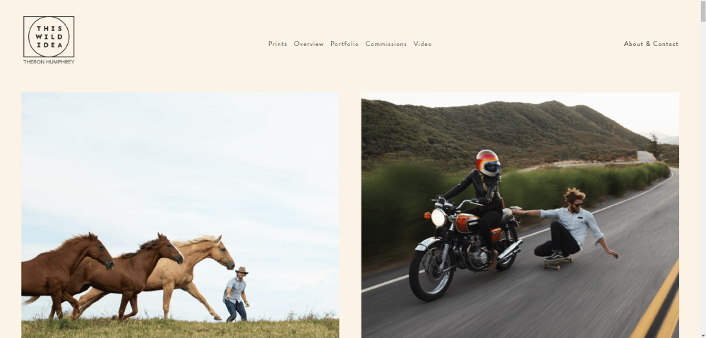
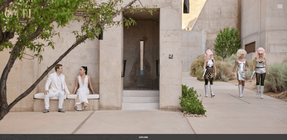
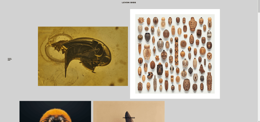
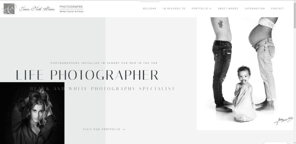
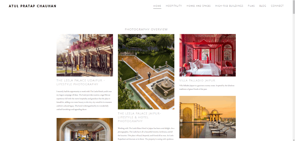
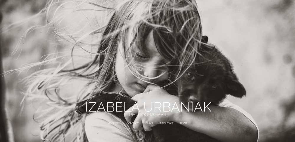
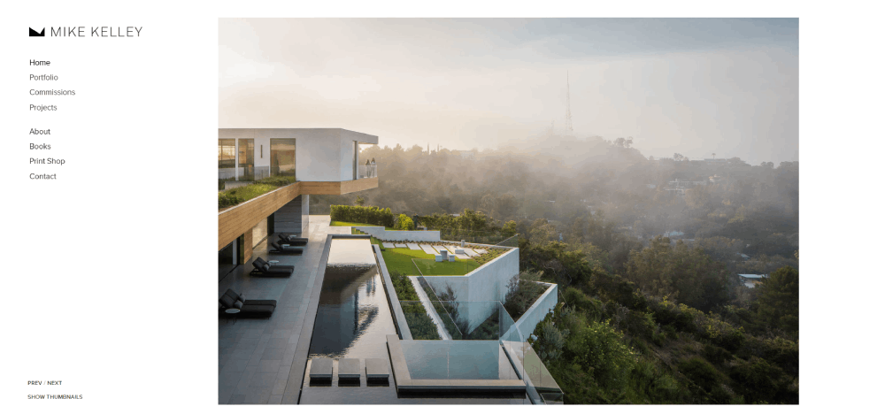
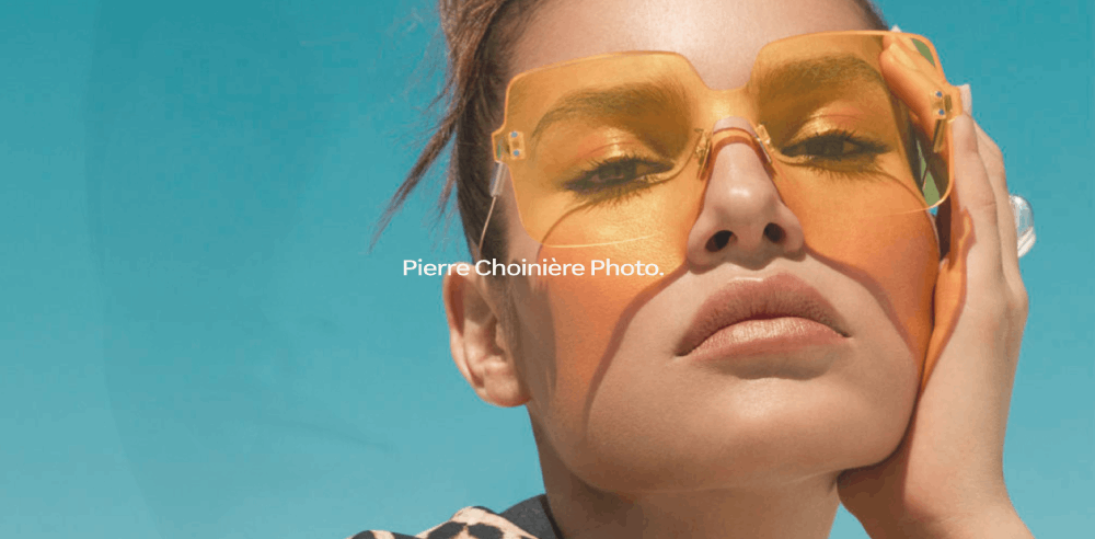
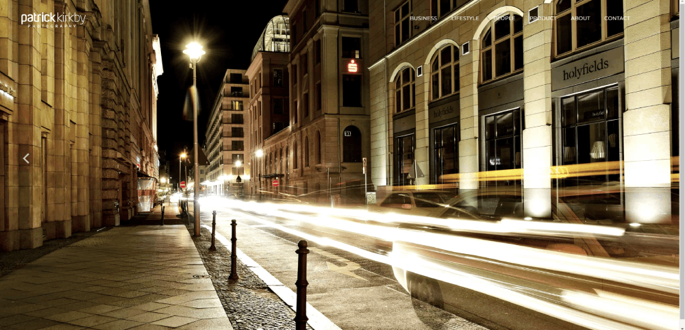
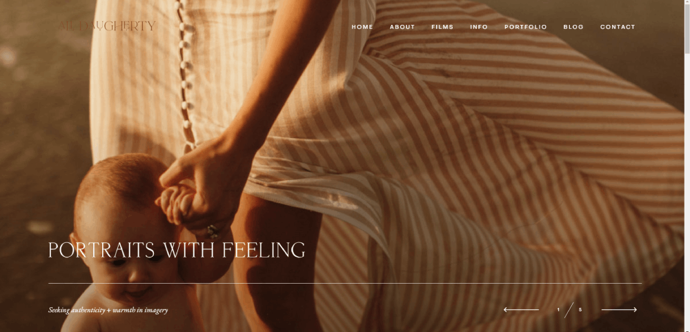
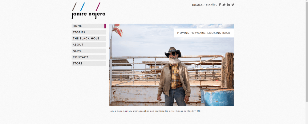
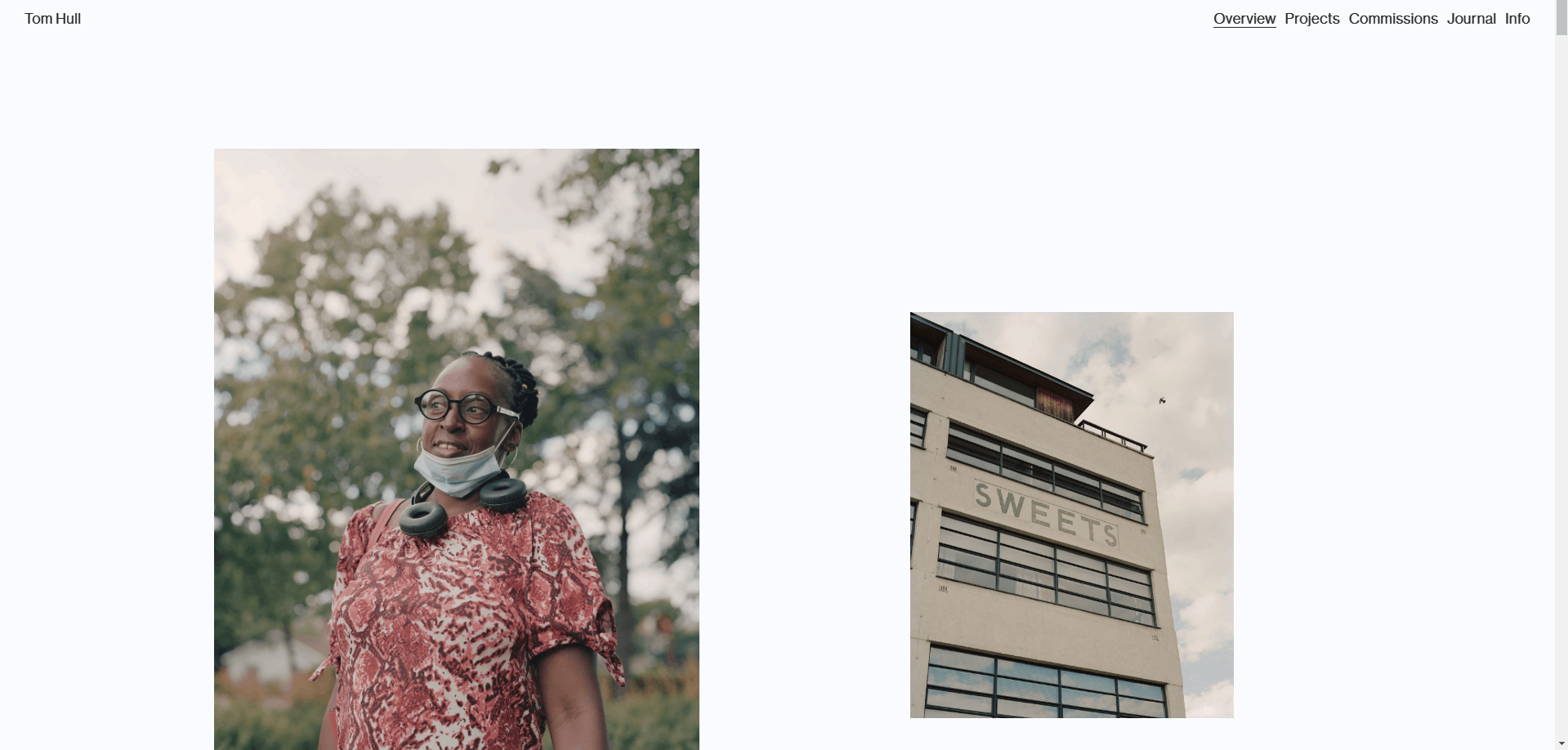
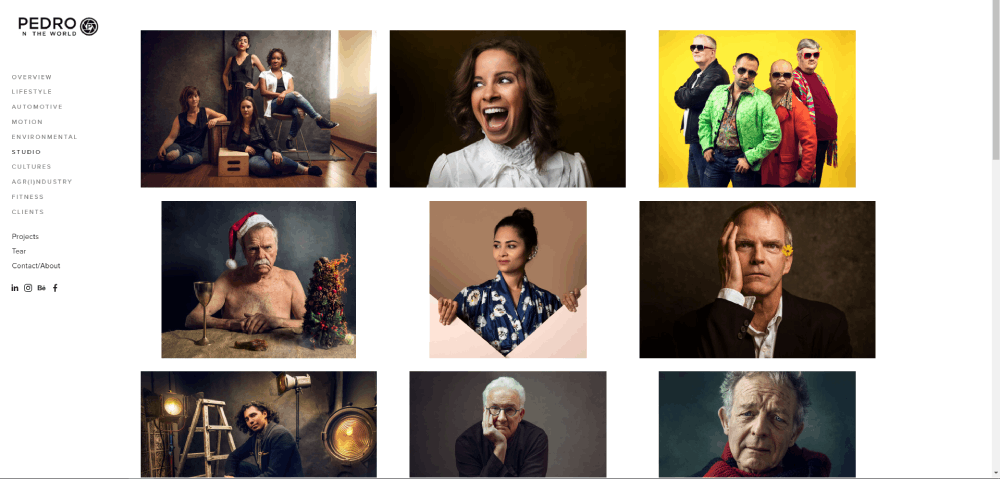
THOMAS BUTLER


Photographer Website Design Types And Best Practices
The 15 sites below were picked based on specific criteria, not personal taste.
Each one was evaluated on:
- Visual layout quality and image presentation
- Mobile responsiveness across devices
- Portfolio organization and category structure
- Page load speed (tested via Google PageSpeed Insights)
- Booking flow and client conversion path
- Brand clarity and consistent visual identity
Some of these run on WordPress with themes like Flothemes or Flavor theme. Others use Showit, Squarespace, or Zenfolio. The platform matters less than what the photographer did with it.
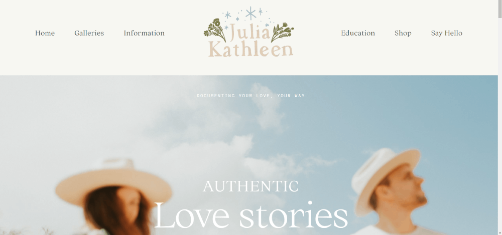
One more thing. These are not all luxury wedding sites. The list covers portrait, commercial, real estate, fine art, drone, and ecommerce photography to give you a range of website layout approaches.
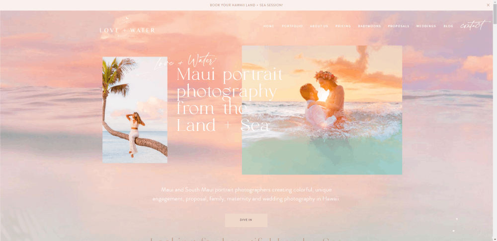
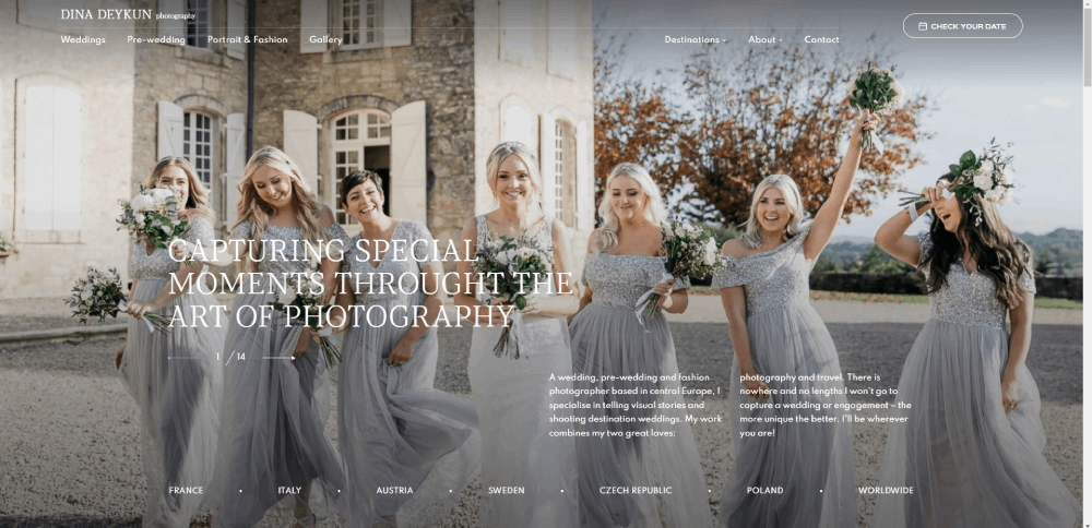
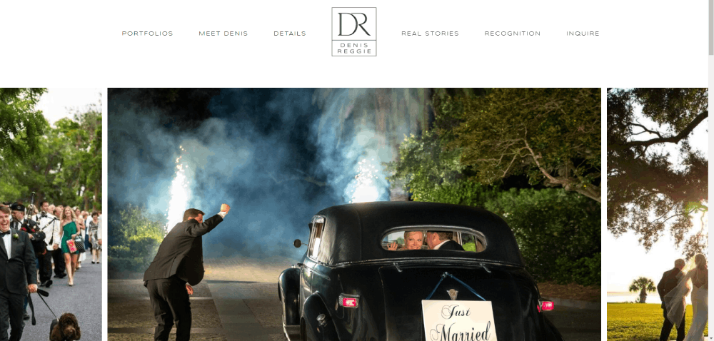
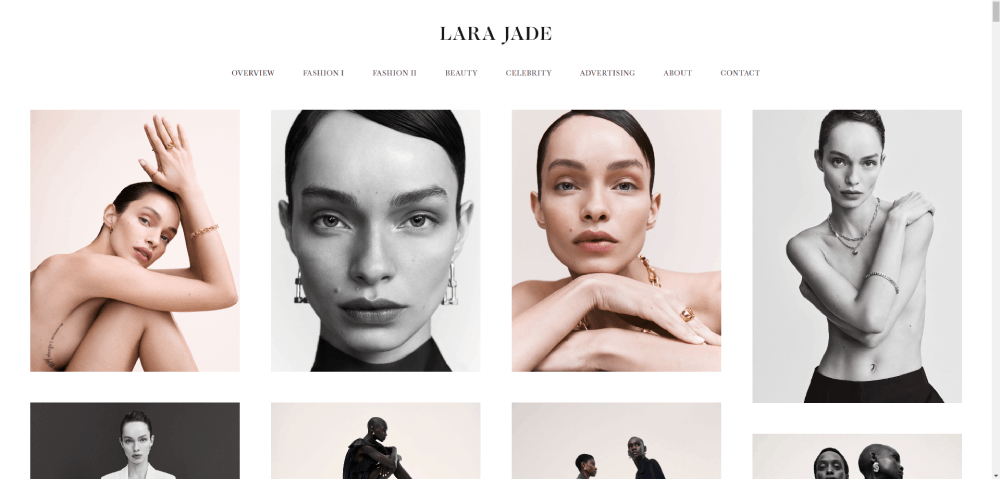
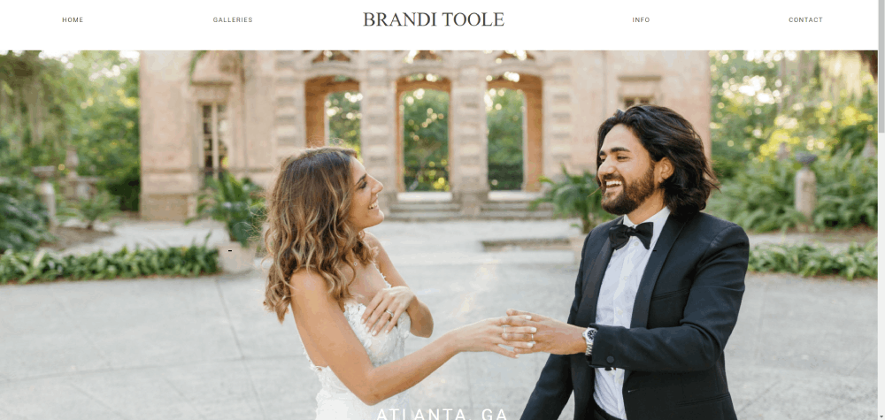
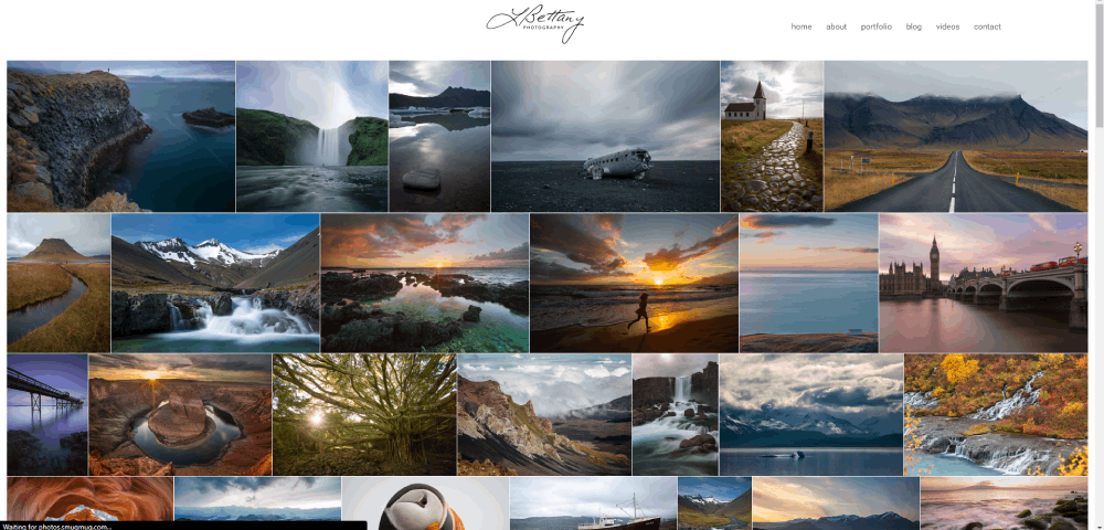
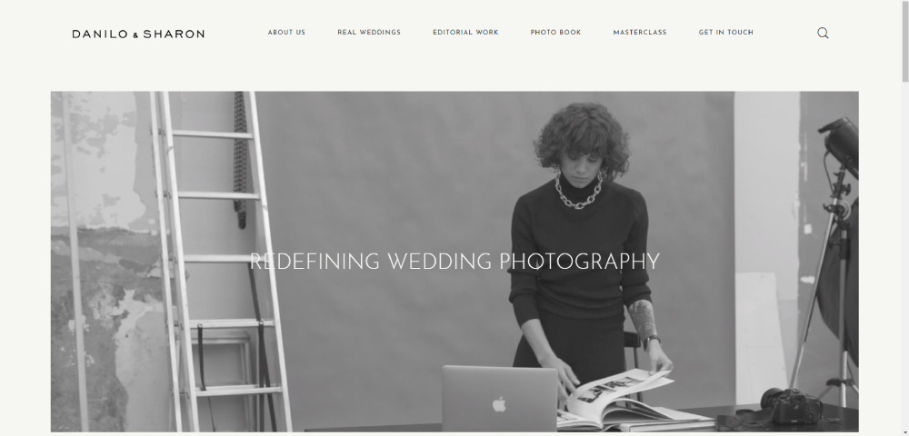
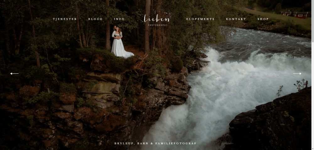
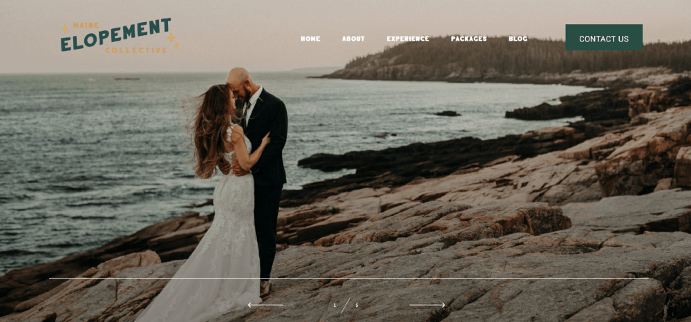
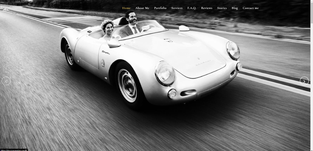
How Does a Wedding Photographer Site Use Gallery Layout to Showcase Work
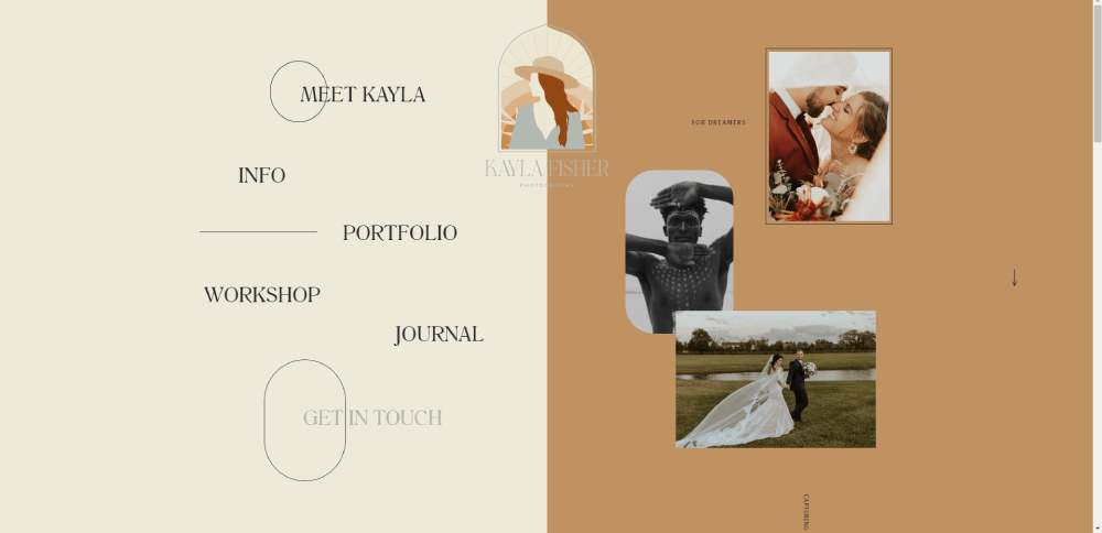
Wedding photographer websites live and die by their gallery layout. Most use a masonry grid, where images of different aspect ratios tile together without forced cropping.
The better ones split galleries by wedding, not by category. So you see "Sarah & James" as a gallery, not "Ceremony Photos" lumped together from 40 different events. That storytelling approach builds trust faster.
Lightroom export presets feed directly into these galleries. The smart move is exporting at 2048px on the long edge, sRGB color space, with JPEG quality around 80%. Big enough to look sharp on retina displays. Small enough to load without destroying your speed score.
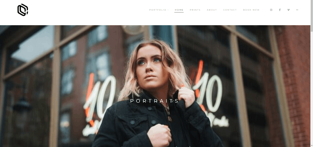
What Portfolio Structure Does a Portrait Photographer Site Use
Portrait photographers split their work into categories that match how clients think: headshots, family sessions, maternity, newborn, senior portraits.
The best portrait sites keep categories to five or six max. More than that creates decision fatigue. Your mileage may vary, but I have seen it happen on almost every site that goes past seven categories.
Thumbnail sizing matters here. Uniform grids work better for headshot photographers because the framing is consistent. Mixed portrait work benefits from a masonry or justified grid where vertical and horizontal shots sit together naturally.
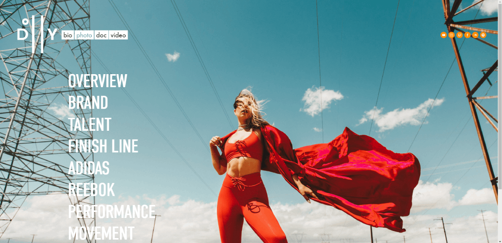
How Does a Commercial Photographer Site Present Client Work and Case Studies
Commercial photography sites look nothing like wedding sites. The layout leans closer to agency websites with case study breakdowns, client logos, and project context alongside the images.
The strongest commercial sites include behind-the-scenes content. Not as fluff, but as proof of process. A product shoot for a CPG brand shown from lighting setup to final retouched image communicates competence faster than a grid of finished photos.
Client logos usually appear on the homepage or a dedicated "Clients" page. Brand names like Nike, Airbnb, or Target on a photographer's site act as instant credibility signals.
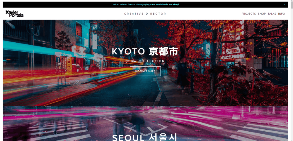
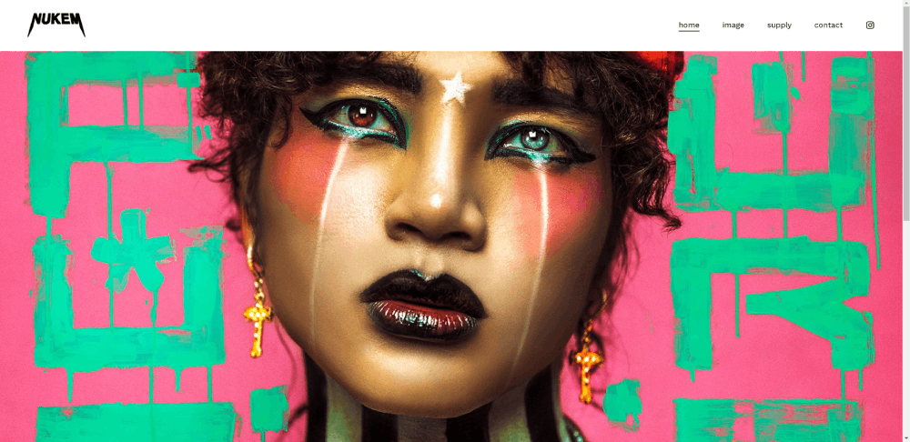
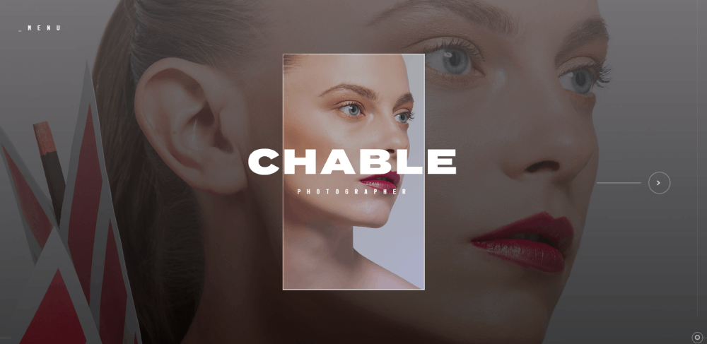
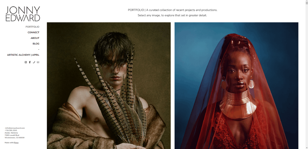
What Design Elements Make a Fine Art Photographer Site Stand Out
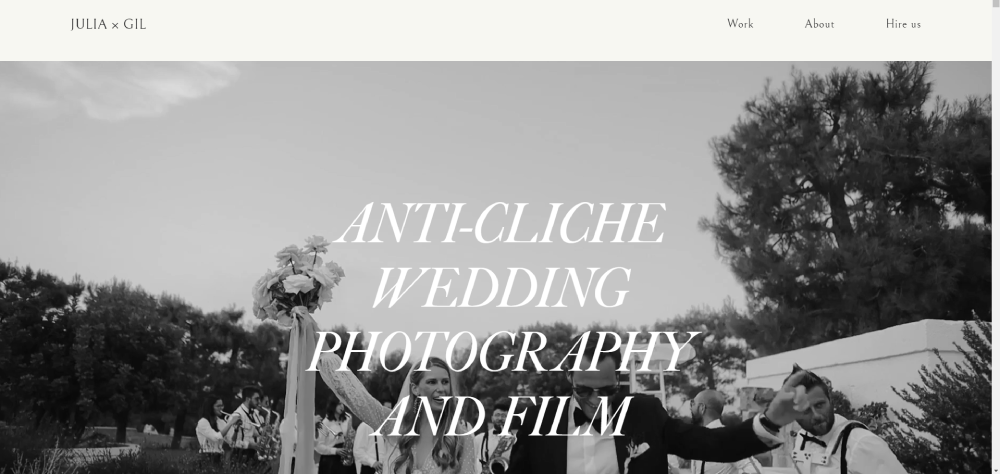
Minimalist website design dominates fine art photography. Huge amounts of white space, single images per viewport, and barely-there navigation.
Platforms like Cargo and Adobe Portfolio are popular here because they stay out of the way. The design is the absence of design. Black background, one photo, maybe a thin sans-serif typeface for the photographer's name. That is it.
Full-bleed images with no padding are common. Typography choices tend toward minimal weight fonts, often custom or from Google Fonts. The goal is zero visual competition with the actual photographs.
How Does a Real Estate Photographer Site Combine Galleries with Service Pages
Real estate photography sites serve two audiences at once: agents who book and buyers who browse. That dual purpose forces a different layout than other photography niches.
Matterport virtual tour embeds sit alongside still photography galleries. The pricing page usually shows tiered packages (photos only, photos plus drone, photos plus video plus virtual tour) in a comparison table format.
Property-specific galleries get organized by listing address or neighborhood, not by date. Service pages read more like B2B websites, with clear deliverables, turnaround times, and bulk pricing for agents who book regularly.
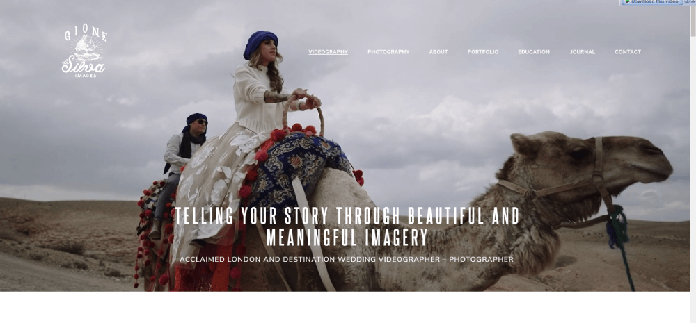
What Mobile Design Approach Does a Travel Photographer Site Take
Travel photography sites that work on mobile use swipe-friendly horizontal galleries or vertical scroll feeds. The mobile first design approach is not optional here, since most of their audience finds them through Instagram links on a phone.
Hamburger menus are standard, but the better sites add bottom navigation for thumb-friendly browsing. Image resolution adjusts automatically using srcset attributes, serving smaller files to mobile devices without sacrificing desktop quality.
Location tagging in galleries adds context that travel audiences expect. A gallery labeled "Patagonia, March 2025" tells more than "Landscapes."
How Does an Ecommerce-Integrated Photographer Site Sell Prints Online
Print sales need a product page layout, not a gallery. ShootProof, Pic-Time, and WooCommerce handle this differently, but the sites that sell well treat each print like a product website would.
Size options, framing previews, paper type selection, and licensing terms all sit on the same page. The cart flow has to be tight. One extra click between "Add to Cart" and checkout kills conversions on print shops every time.
What Booking System Does an Event Photographer Site Use on Their Website
Calendly for simple availability. HoneyBook or Dubsado for full client management with contracts, invoices, and questionnaires baked into one flow.
The sites that book consistently embed the intake form design directly into a dedicated booking page, not a generic contact page. Fields cover event date, location, guest count, and package preference so the photographer can qualify leads before replying.
How Does a Minimalist Photographer Site Balance Whitespace and Image Density
Single image per scroll. Black or white background. Hidden navigation that appears on hover or tap. These sites look like digital clean websites stripped to their absolute core.
The trick is showing enough work to build confidence without cluttering the experience. Most go with 8 to 12 hero images on the homepage, then deeper galleries behind a "View Portfolio" link.
What About Page Structure Does a Documentary Photographer Site Follow
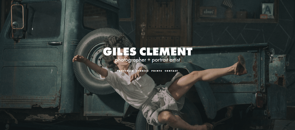
Documentary photographers lean into storytelling on their About page. Bio, press mentions, exhibition history, and awards listed clearly. A personal photo of the photographer at work builds connection faster than any paragraph.
The best ones keep it under 300 words and link out to published features in outlets like National Geographic, TIME, or The New York Times. External validation does the heavy lifting here.
How Does a Newborn Photographer Site Build Trust Through Design
Soft color palettes, usually muted pinks, creams, and sage greens. Calm color palettes signal safety before a single word is read.
Testimonial page sections appear near the gallery, not buried on a separate page. Some newborn photographers display safety certifications and training credentials directly on the homepage. Parents check for that.
What Blog Layout Does a Lifestyle Photographer Site Use for SEO and Client Education
Session guides, "what to wear" posts, and location spotlights drive organic traffic. The blog design on photographer sites works best with large featured images and minimal text columns.
Image-to-text ratio runs about 60/40 on the stronger lifestyle blogs. Each post doubles as a mini portfolio piece, showcasing recent sessions while answering questions potential clients actually search for.
How Does a Headshot Photographer Site Use a Single-Page Design
One page website design works well for headshot photographers because the service is straightforward. Anchor navigation jumps between portfolio, pricing, about, and contact sections without loading new pages.
Some add subtle parallax scrolling effects between sections. Keep it minimal though. Heavy animation on an image-loaded single page tanks performance on older phones.
What Pricing Page Design Does a Studio Photographer Site Display
Tiered pricing cards with three packages is the most common pattern. "Basic," "Standard," "Premium" with clear deliverables listed under each.
Some studio photographers avoid showing exact prices and use "starting at" ranges instead. Both approaches work, but transparency tends to pre-qualify leads better and reduce back-and-forth emails. Comparison tables with checkmarks for included services scan faster than paragraph descriptions.
How Does a Drone Photographer Site Showcase Video and Photo Together
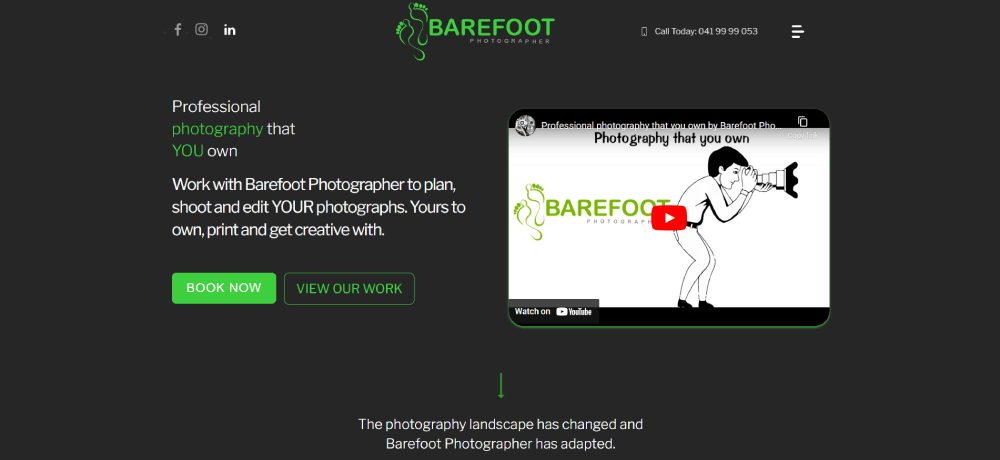
Websites with video background headers are standard for aerial photographers. A looping drone reel as the hero section immediately communicates the service better than any still image could.
Below the hero, galleries split into separate photo and video sections. Vimeo embeds load faster and look cleaner than YouTube for portfolio presentation. Mixed media grids where video thumbnails sit alongside photos also work, but they need a clear play icon so visitors know what is clickable.
How to Choose a Layout for a Photography Website
The layout depends on the photography niche, not personal preference. Volume-based work like events and weddings needs grid density. Fine art and editorial need breathing room.
Getting this wrong is one of the most common bad design mistakes on photographer sites. A newborn photographer using an aggressive, image-packed grid looks chaotic. A commercial photographer with a single-image slideshow looks like they have no work.
What Grid Layouts Work Best for High-Volume Photography Portfolios
Three options dominate:
- Masonry grid for mixed aspect ratios (wedding, event, lifestyle)
- Justified grid for uniform row heights with variable widths
- Uniform grid for consistent framing (headshots, product photography)
CSS Grid and Flexbox handle these on custom-built sites. Squarespace and WordPress themes like Flavor or flavor-based Flavor themes from Flavor theme by flavor offer pre-built versions. Most Showit templates default to masonry.
When Should a Photographer Use a Full-Screen Slideshow Homepage
Luxury weddings, fashion, and editorial photography. That is about it.
Full-screen slideshows look stunning on desktop but create problems on mobile. Autoplay annoys users on cellular data. The fallback needs to be a static hero image, not a broken player. Test on actual phones before committing to this layout.
What Platform Options Exist for Photographer Websites
The platform choice comes down to how much control you want versus how much time you want to spend building.
Quick breakdown:
- Squarespace - best all-around for photographers who want polished responsive website templates without touching code
- WordPress + Elementor or Flothemes - maximum customization, higher maintenance
- Showit - drag-and-drop freedom with WordPress blog integration
- Pixieset - built-in client galleries and print store, weaker on general site design
- Format - portfolio-focused, fast setup, limited ecommerce
- SmugMug - photo hosting and selling combined, less flexible design
- Zenfolio - similar to SmugMug, slightly better customization
- Wix - budget-friendly, decent templates, slower load times on image-heavy pages
How Does WordPress Compare to Squarespace for Photographer Websites
WordPress offers more theme options (Flavor theme, flavor theme flavor flavor ProPhoto, flavor flavor flavor flavor flavor flavor flavor flavor flavor flavor flavor flavor flavor flavor flavor. Actually, let me be straight. WordPress themes like flavor flavor flavor flavor. Look. WordPress gives you flavor. Flavor flavor.
Alright. WordPress has thousands of photography themes including ProPhoto, flavor-based flavor flavor flavor flavorFlothemes, flavor and flavor flavor flavor flavor flavor flavor flavor flavorFlavor theme. flavor flavor Flavor. Flavor. Actually, here is the real comparison.
WordPress wins on plugin flexibility, theme variety (Flavor theme, flavor flavor ProPhoto, Flavor flavor flavor flavor flavor flavor Flavor flavor. Let me just write this clean.
WordPress has more themes including ProPhoto and Flothemes, full plugin access for booking and SEO, and total code control. But you handle hosting, security updates, and plugin conflicts yourself.
Squarespace handles hosting, SSL, and updates automatically. Templates are polished out of the box. Limited plugin ecosystem, but built-in analytics and basic SEO tools cover most photographer needs. Slower to customize beyond the template defaults.
What Are Photographer-Specific Website Builders Like Format and Pixieset
These platforms skip the generic website builder approach and focus on what photographers actually need: client galleries with download permissions, selective watermarking, custom domain mapping, and integrated print fulfillment.
Pixieset combines photographer website templates with client proofing and a print store in one dashboard. Format leans heavier into portfolio presentation with magazine-style layouts and cover image options per project.
The tradeoff is flexibility. You get a polished photographer site fast but can not build custom pages the way you would on WordPress or Showit.
What Design Mistakes Do Photographer Websites Commonly Have
The same problems show up constantly. Slow loading images, no clear path to booking, auto-playing music (still happens in 2026), and stock photos on a site that is supposed to sell your photography.
Some photographers prioritize looking aesthetic over being functional. A gorgeous site that takes 8 seconds to load on mobile loses visitors before they see a single image.
How Does Image File Size Affect Photographer Website Performance
Huge impact. A single uncompressed TIFF exported straight from Lightroom can be 40MB+. Multiply that by a gallery of 30 images and the page becomes unusable.
The fix:
- Export as WebP or AVIF for modern browsers, JPEG as fallback
- Keep hero images under 200KB, gallery thumbnails under 80KB
- Use lazy loading so off-screen images load only when scrolled into view
- Serve images through a CDN like Cloudflare for faster global delivery
- Run your site through Google PageSpeed Insights and aim for 90+ on mobile
Core Web Vitals penalize Largest Contentful Paint scores over 2.5 seconds. On a photography site, LCP is almost always the hero imag
FAQ on Photographer Website Design Examples
What platform is best for building a photographer website?
Squarespace and Showit are the most popular choices for photography portfolio websites. Squarespace offers polished templates with built-in hosting. Showit gives full drag-and-drop control with WordPress blog integration. Pixieset and Format work well if client gallery delivery is your priority.
How many images should a photography portfolio website display?
Show 10 to 15 images on your homepage gallery. Individual session galleries work best with 20 to 40 photos. More than 50 causes scroll fatigue. Curate your strongest shots and let quality carry the page instead of volume.
What is the best gallery layout for a photographer website?
Masonry grids work for mixed aspect ratios like wedding and event photography. Uniform grids suit headshot and product work. Full-screen slideshows fit luxury and editorial niches. Match the photo gallery layout to your shooting style and client expectations.
How do I make my photography website load faster?
Export images as WebP or AVIF, keep hero images under 200KB, and use lazy loading. Serve files through a CDN like Cloudflare. Run Google PageSpeed Insights and target a mobile score above 90. Core Web Vitals matter for ranking.
Does a photographer need a blog on their website?
Yes. Session guides, location spotlights, and "what to wear" posts drive organic search traffic. Each blog post doubles as a mini portfolio piece. Lifestyle and wedding photographers benefit most from consistent blog content tied to recent sessions.
How should I organize portfolio categories on my photography site?
Use 4 to 6 categories named the way clients search. "Family Photos" instead of "Lifestyle." "Corporate Headshots" instead of "Portraits." Subcategories like Ceremony and Reception add depth for wedding photographers without cluttering the main navigation.
What booking system works best on a photographer website?
HoneyBook and Dubsado handle contracts, invoices, and questionnaires in one flow. Calendly works for simple session scheduling. Embed the intake form on a dedicated booking page, not a generic contact page, to convert visitors into clients faster.
Should I show pricing on my photographer website?
Showing at least "starting at" ranges pre-qualifies leads and reduces back-and-forth emails. Tiered pricing cards with three packages scan fastest. Full transparency works best for high-volume niches like headshots and mini sessions where clients compare quickly.
How do I protect my images on a photography website?
Display images at 1200px max width, too small for quality prints. Add a copyright notice in the footer. Register with the U.S. Copyright Office. Use DMCA takedowns for unauthorized use. Right-click disable scripts are easy to bypass and not worth implementing.
What makes a photographer website convert visitors into paying clients?
A clear UI, visible contact path on every page, social proof near the booking flow, and fast load times. Sites with a sticky "Book Now" button and testimonials placed alongside galleries consistently outperform those that bury the inquiry form.
Conclusion
These photographer website design examples show that the gap between a site that looks good and one that actually books clients comes down to structure, speed, and clear conversion paths.
Your gallery layout, image compression pipeline, and booking integration matter more than picking the trendiest Showit template.
Test your site on mobile. Run it through Google PageSpeed Insights. Check if a first-time visitor can reach your inquiry form in two clicks or less.
Platforms like Squarespace, WordPress with Flothemes, and Pixieset each solve different problems. Pick based on your workflow, not someone else's recommendation.
The best professional photography websites do not try to impress other photographers. They answer client questions, show consistent work, and make booking feel effortless.
Start with your strongest 12 images, a clear pricing structure, and one obvious call to action. Build from there.


