10 Business Website Examples that Give Powerful First Impressions
February 26, 2016
Top Recommendations for a WordPress Portfolio
March 24, 2016Pre-built websites, give the designer the opportunity to get a project off to a rapid start, and going in the right direction. These useful tools also can serve as conceptual design elements. The layouts will impress clients, and designers can use them as solid, customizable, starting points.
There is however, much more involved in website design than simply customizing a layout that is ready for you to use. This is true for most business niches, including restaurants, food delivery services, or bakers.
Key factors include the details necessary to enhance the user experience (UX), the selection of conceptual components that emphasize a particular business’s look and feel, and marketing-related components, including a business’s unique value proposition, and a call to action, whether it is overt or implied.
E-commerce sites have many things in common from a designer’s perspective, but each niche, as is definitely the case with restaurant/food delivery businesses, has its unique characteristics; as you will see.
What are These Key Elements that Make a Restaurant or Food Related Business Website Not Just Good, but Outstanding?
UX Design
UX design must first and foremost address the goals of the user. A user visiting a website has one or more goals in mind. They could include the need to reserve a table, determine a restaurants location, browsing the fare on a menu; or all of the above.
If any of these goals is not readily attainable, the user will likely go elsewhere. Two of the prerequisites of UX design are clean, crisp content, and easy navigation.
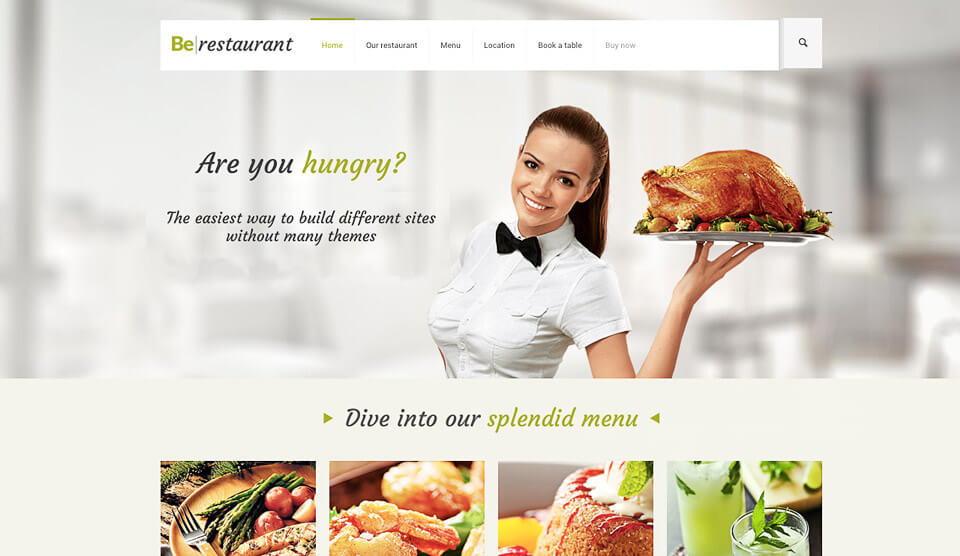
This, the newest addition to the Be Theme family, is a modern pre-built website with a fresh feel. It illustrates the main products and a selection from the menu.
Good Photography
Food related advertisements tend to rely heavily on photos. The photos need to be of superb quality, they need to be a meaningful part of the overall web design, and they need to balance a page, so it does not become cluttered or noisy.
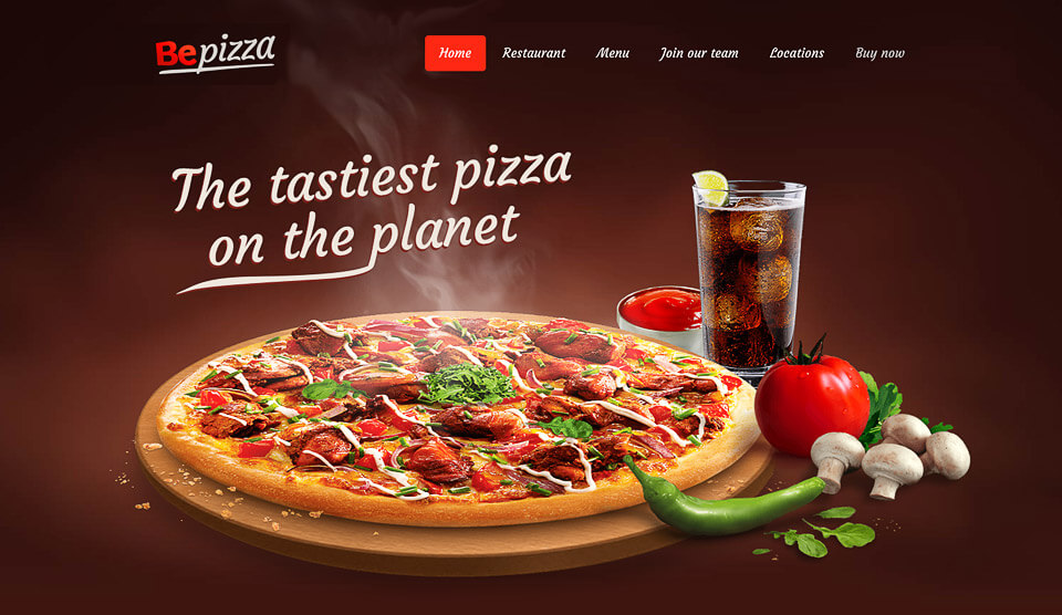
Cool animation can play a valuable role in many types of websites. This one, on the homepage of Be Pizza, shows how food and drink are arranged on a table; centering of course on a mouth-watering pizza, accompanied by a glass of cold soda, and a red sauce dip or topping.
Animation brings the user a step closer to a familiar restaurant atmosphere. Animation can be used to create a subtle, yet powerful, call to action.
Focus on the Menu
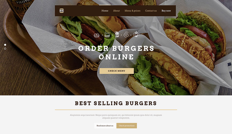
First-time visitors to a restaurant’s website are most likely to want to see what the menu has to offer before making a reservation. While it would make little sense to clutter up a home page with a full menu, a practical alternative is to show images of best-selling items, as is the case with this burger delivery business’s home page.
Focus on Brand and Identity
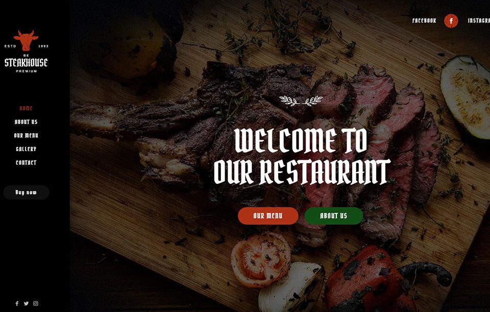
The logo and the color selection, along with the choice of a pre-designed website, needs to covey the atmosphere of the restaurant, or the essence of the restaurant delivery service.
Since food is the common topic, a proper choice of colors is absolutely vital; especially so in the presentation of food items. Color and imagery play a more important role in this business niche than in almost any other, with the possible exception of design agencies.
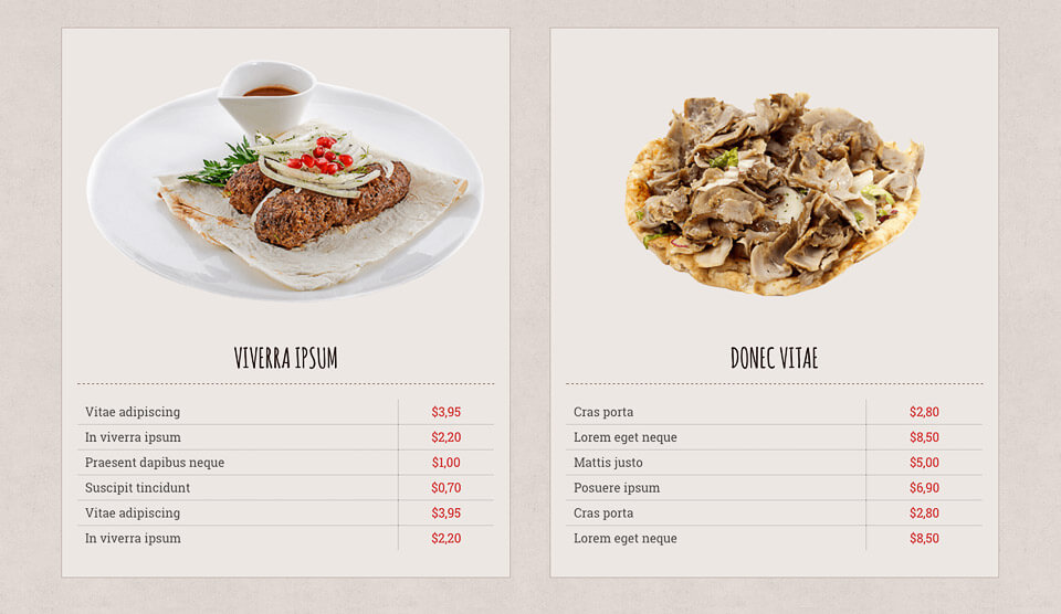
Detail is also important. A typical restaurant’s menu will generally provide the information people look for; without overdoing it.
A proper use of white space can play a meaningful role by giving each menu item its allotted space, rather than by cramming everything together. A “clean” menu, one that is easy to browse, will say a lot about an eating establishment or a delivery service.
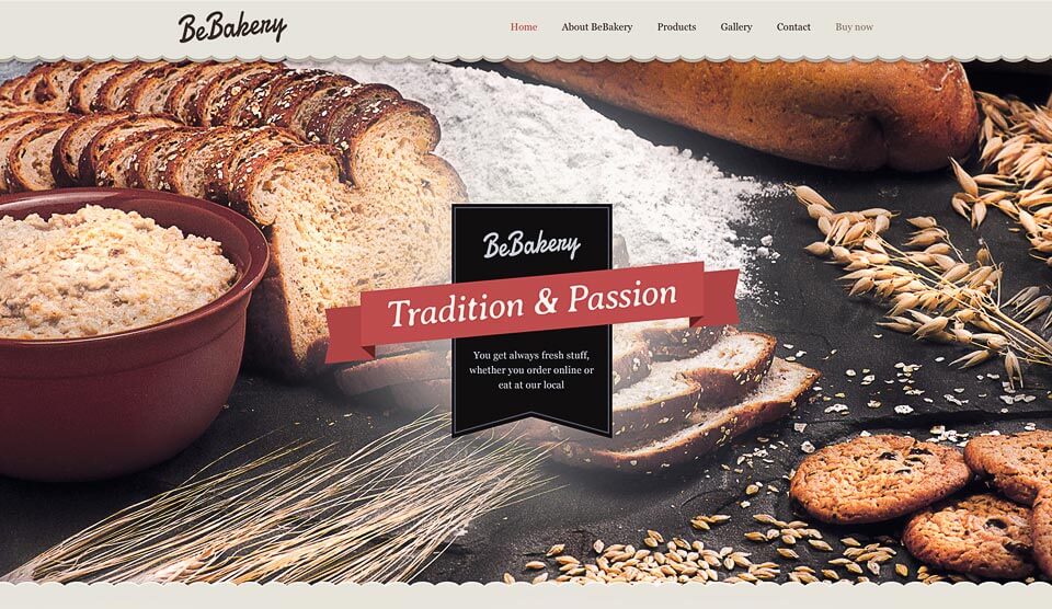
Be Bakery is another example of a pre-designed website that gives viewers the warm, cozy feeling they like to associate with small businesses. Here is a good example of a smart use of white space and icon design.
Be Bakery provides an excellent starting point for a website that will accurately reflects a client’s values.
UX design, great photography, menu presentation, and presenting a just-right look and feel, are key factors when designing a website for a client’s restaurant or food delivery service.
When all of these items are addressed properly, a home page can be used as a subtle call to action by engaging a visitor, and encouraging that visitor to find out more or guiding the visitor to where he or she wishes to go.
What Be Theme’s pre-designed websites can accomplish is to encourage a designer to take these key factors into account, and in fact lead the way.
This, the biggest WordPress theme on the market, features more than 180 pre-designed websites that address virtually any topic and any layout you might need to satisfy a client.
As you have seen, there is more than one of these pre-designed websites you could use in the restaurant/delivery service niche.
There are in fact a number worth looking into for a source of ideas, which is what makes Be Theme such a wonderful website building tool to have at your disposal, plus – Be Theme is powerful and delightfully easy to use.
