Trends in Pre-Built Websites: The Hamburger Menu
September 20, 2016
Designing Technology Related Websites
October 4, 2016Be Theme’s more than 220 (and counting) pre-built websites is just one of the features making this the biggest WordPress theme ever. New releases are currently appearing at a rate of approximately four per month. The latest releases, for the month of September, are presented here.
Pre-built websites cover a wide range of website types and themes, and the September selection is no different. You seldom have to look far to find just the right one to get your latest project off to a flying start, whether it is a website, an app, a blog, or a special landing page.
Although the subject matter differs, these pre-built websites have much in common.
- They are built upon smart UI principles, advanced structures, and in accordance with recent design trends.
- Using these pre-built websites requires no coding skills.
- Customizing and branding is easy and intuitive.
That said, let’s have a look at what these new releases have to offer.
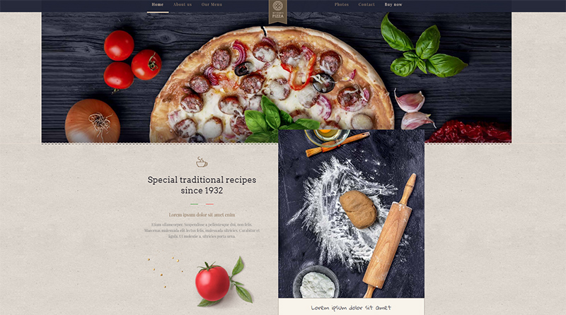
BePizza 2 – This warm, engaging pre-built website is destined to food businesses.
An online visitor will most likely make a quick decision whether to pay a visit to a given business or not. That’s just the way the web works. This is certainly true for the food-related sector as well, where competition is as tough as anywhere. Going about selling a service in the right way is not only necessary for an enterprise, it is crucial. The key to success is to make certain the website is both appealing and informative.
The BePizza2 pre-built website – launched early in September
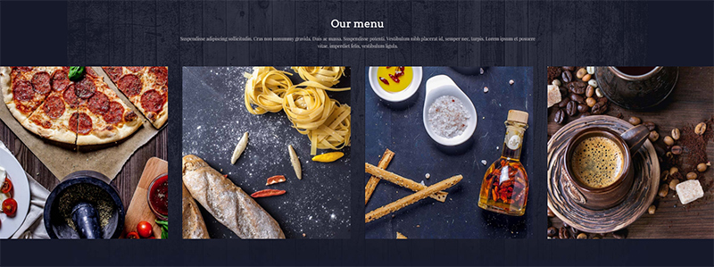
The Pizza2 pre-built website is definitely appealing. The images are large and engaging, the colors are warm, and the overall style is flat, with a touch of the traditional.
Plenty of white space helps the reader focus on the informative aspect of this website. In addition to the attractive home page, a page is dedicated to the menu, another to a chic “About Us” section, and a call to action and telephone number are found in the footer section of each page.
All in all, BePizza2 leaves presents a relaxed, easy-going experience.
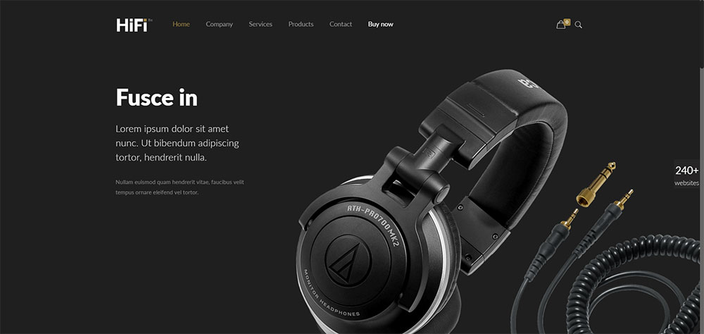
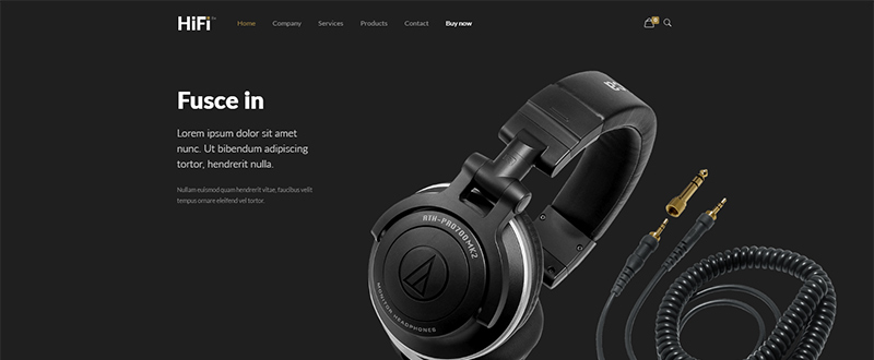
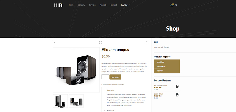
BeHiFi – and e-commerce shop for audio equipment
BeHiFi provides an excellent example as to how color choice and usage can be used to convey a luxurious touch. Note how the dark gold adds to the elegance of the black imagery.
The hero image’s promotion of an eye candy product on the home page captures the user’s attention from the start. A section promoting the latest new product acquisitions using both images and conceptual elements follows. There is a coherency through the design between the use of icons and the use of design elements. Everything is structured to contribute to the brand image, while parallax, as employed on the company page, conveys a feeling of depth.
The classic e-commerce elements are present in the product page as related products, product categories, prices, top rated products, etc. In spite of making a wealth of information available, the website as a whole, with its elegant use of colors, retains a sharp, stylish appearance.
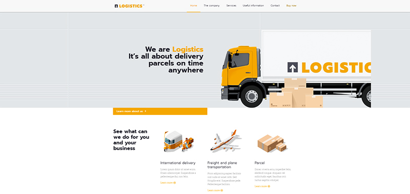
BeLogistics – a clear message and presentation, with a casual twist
This pre-built website is destined to enterprises and companies engaged in logistics-related services.
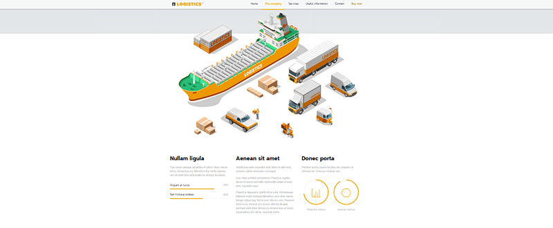
The BeLogistics design is concise and to the point, as is the unique value proposition. The focus is more on addressing the user’s needs, than on the company itself. It is in the details throughout the website however, where there is a casual twist. The icons and illustration-like elements are visually engaging. The manner in which the various services and modes of transportation are laid out convey a sense of friendliness.
The company page definitely benefits from this visual style, as seen here:
A good many clients will appreciate being presented with a corporate-with-a-twist website. The seriousness to be expected when presenting a big company is there, as is the simple presentation of the services provided. Still, the message is conveyed in a fun and friendly manner. Users are almost certain to be attracted by this somewhat rare combination of seriousness and friendliness.
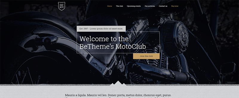
BeMoto – Join the Badass Club
BeMoto is destined to a motorcycle club.
You can almost hear the “Vroom, Vroom”. Yet the design, with its clear lines and concise approach, is in its own way, subtly elegant, while underlining the spirit, adventure, and camaraderie of the biker’s club.
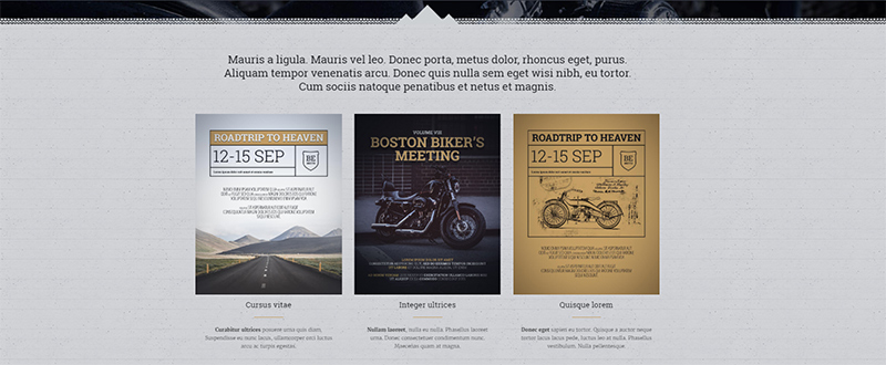
Under the header on the homepage is an events section. Here, forthcoming road trips and other club events are announced. The overall simplicity of BeMoto extends into the other pages as well, including the all-important “About” page.
The purpose of this website is not simply that of providing information about a club. In actuality, it is more of a marketing tool. A call to action on each page invites users to become new club members, in addition to informing all members about current issues and planned events.
Images are always important, and in BeMoto, the images are used tell to tell a story about of the biker’s world that text alone can never completely relate.

