

Creative Website Design Examples That Are Awesome
October 4, 2024
Unique websites you should see: 20 unusual website designs
October 7, 2024Premium web design is about more than just aesthetics; it's an intersection of sophisticated user interface (UI) design, seamless user experience (UX), and functional web development. A truly "premium" example demonstrates originality, advanced HTML5/CSS3 techniques, and responsive design, ensuring that a site looks stunning on any device.
These high-end designs, often crafted using tools like Adobe Photoshop, Sketch, and Figma, not only look elegant but also meet the highest standards of website usability and web accessibility, crucial factors for modern web success. Platforms such as WordPress, Webflow, and Shopify often host these cutting-edge examples, offering flexibility and a wide range of customization options.
We'll explore a curated selection of premium website designs showcasing the latest design trends, exceptional visual hierarchy, and effective integration with content management systems (CMS). By examining these examples, you will gain valuable insights into what makes a design truly outstanding and how you can incorporate these principles into your projects.
Premium Website Design Examples
Tore S. Bentsen Portfolio
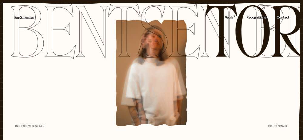
Check out Tore S. Bentsen's Portfolio. This site's a mix of web flow and brand identity. It's got this cool parallax effect that makes stuff move on your screen, creating an interactive user experience. The design is sleek, with lots of white space and fonts like Rosalinda and Bandeins Sans that just pull you in.
Sketch
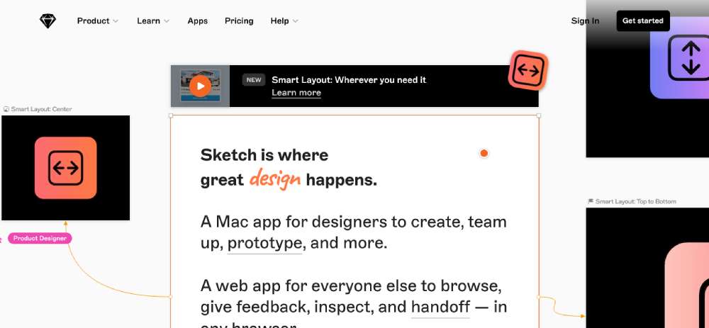
Now, Sketch is a tool for making awesome designs, and guess what? Its website is a beauty too. It's got these high-quality mockups and wireframes that just scream creative web solutions.
Project Cars
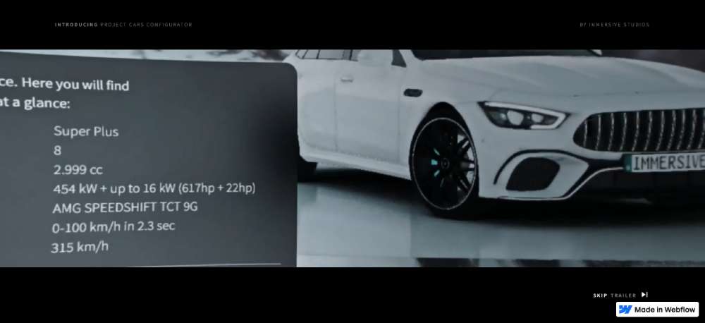
Then there's Project Cars. It’s not your average car site. Built with ThreeJS, WebGI, and Webflow, it's like stepping into the future of custom web development. You get to tinker with a car in this sci-fi 3D space.
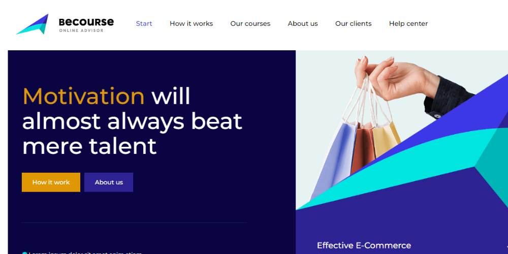
BeCoaching3
Palette
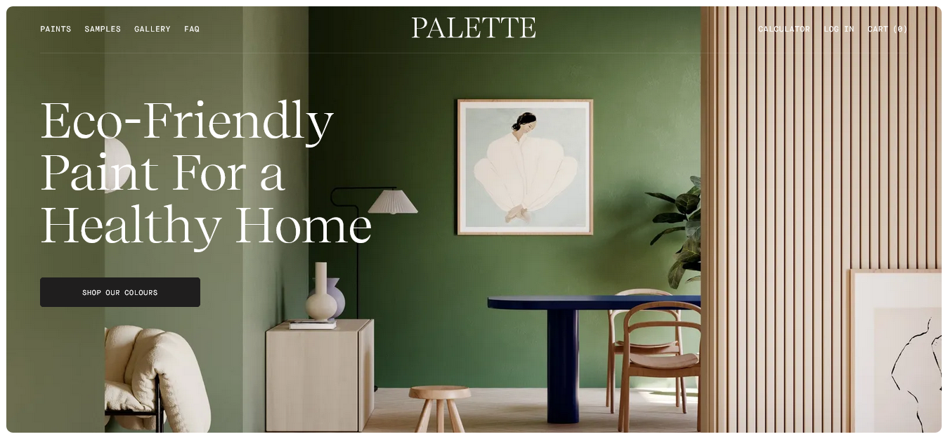
Palette is what happens when you take an e-commerce platform and turn it into art. The site's gallery makes even paint swatches look fascinating, like a blend of watercolors and eyeshadow palettes. It’s all about that high-end website graphics feel.
Lacoste Heritage
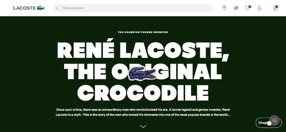
Lacoste Heritage is a feast for the eyes. From the get-go, it's all big, bold imagery. They showcase their popular clothes and make browsing feel like a walk in the park, highlighting the importance of responsive web design and website usability.
ARK/8
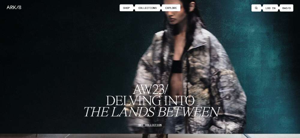
Over at ARK/8, things are pretty cool. They've got this digital flagship store that's all about blending high fashion with entertainment. It's like walking into a futuristic mall where everything's just a click away. The design? Pure premium, with sleek lines and an ultra-modern feel. It’s web design magic at its best.
Stord
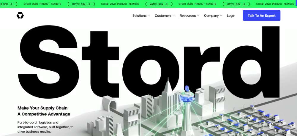
Then there's Stord. This site is what every B2B website aspires to be. It's not just about the words; the visuals are show-stoppers. Picture this: street animations that bring each section to life. It turns a regular scroll-through into a fun, interactive journey. Responsive design and user experience? They’ve nailed it.
Foundry
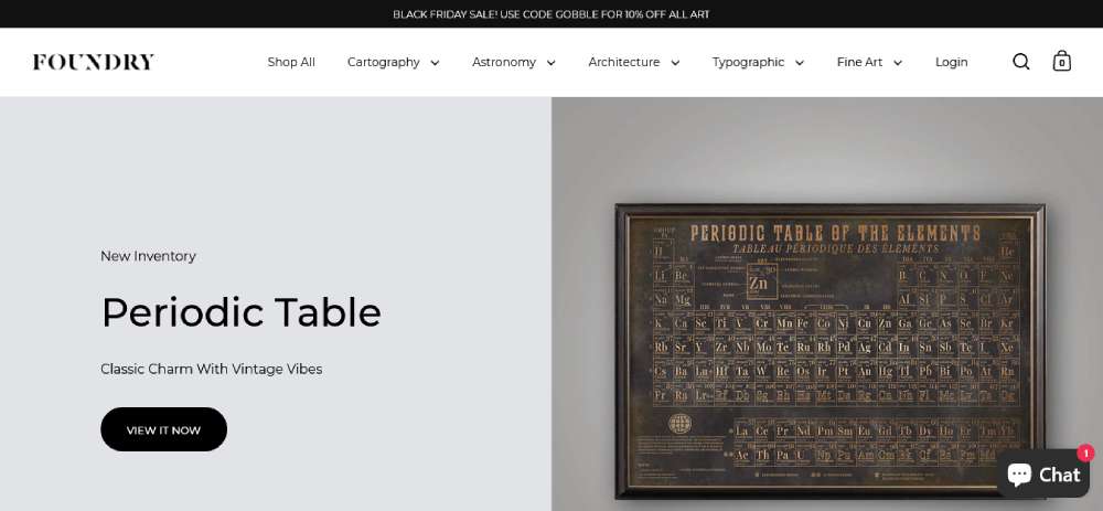
Foundry keeps it simple and stylish. Their minimalist style, sticking to flat design principles, makes everything look clean and easy to read. No shading, no extra fluff. Just straight-up, smooth browsing. It's a lesson in modern web aesthetics and user interface design.
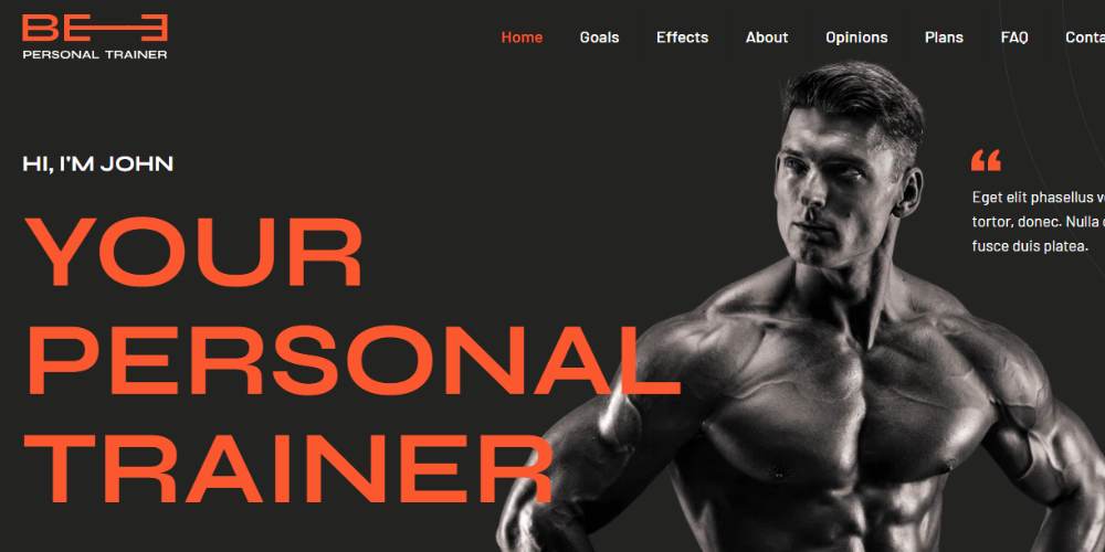
BePersonaltrainer3
PRIMO
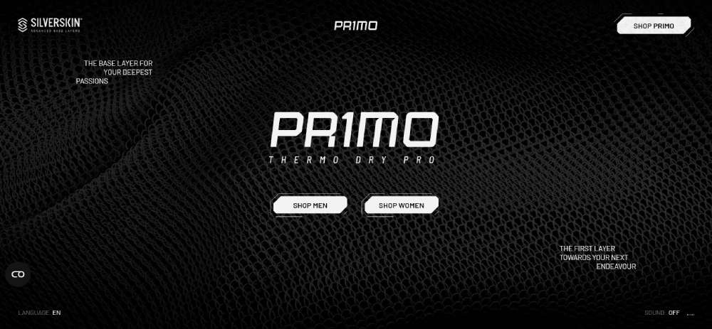
The work we did for PRIMO was all about interaction. We mixed 3D modeling, motion graphics, and WebGL animations to show off this Silverskin product line. It all starts with a blank canvas, building 3D models from ground zero, adding textures and maps that make it look real as life. It's about crafting a digital experience that makes you go "wow".
Jotform
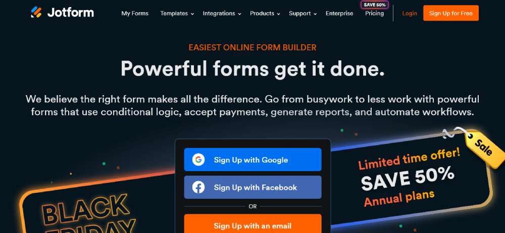
They’ve got clarity down to a science. It's a SaaS website that doesn’t beat around the bush. It tells you what you're getting into right away, no guessing games. It's a masterclass in content clarity and service presentation.
Digital Cover
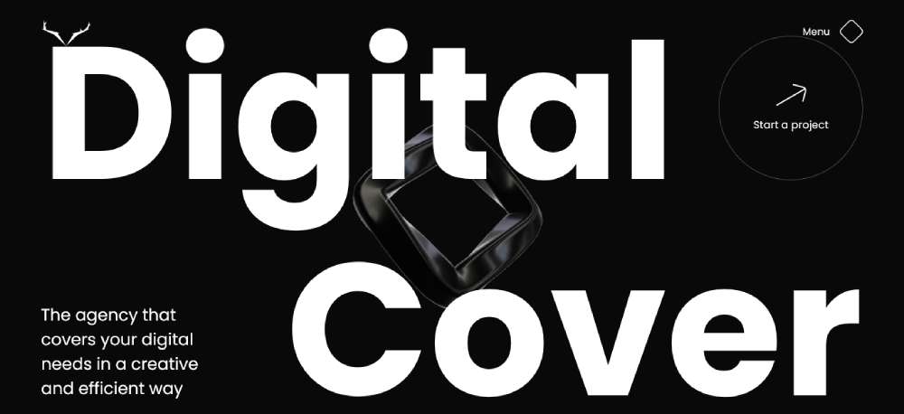
Heading over to Digital Cover, you're in for a visual feast. From the moment the site loads, it's a graphic adventure. The homepage almost leaps out at you, feeling three-dimensional. It's like stepping into a digital universe that's both inviting and mind-blowing. They’re acing the web graphics game.
RCA Records
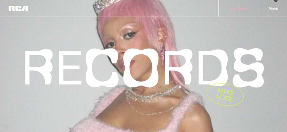
RCA Records is where risks meet rewards. Their site is a blend of interactivity and dynamism. There's this fast-moving gallery at the top showcasing hot artists and timeless icons. It's interactive web design with a pinch of audacity.
PARFAITEKUISSON
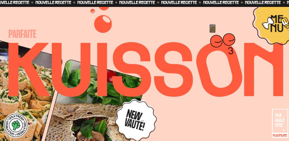
Over at PARFAITEKUISSON, things are getting spicy! It's a recipe hub that's all about flavor and flair. Powered by Wokine, this site is where food meets art. The layout, the images, oh man, it's like a feast for your eyes before you even start cooking.
BeConsultant2
The Sea We Breathe
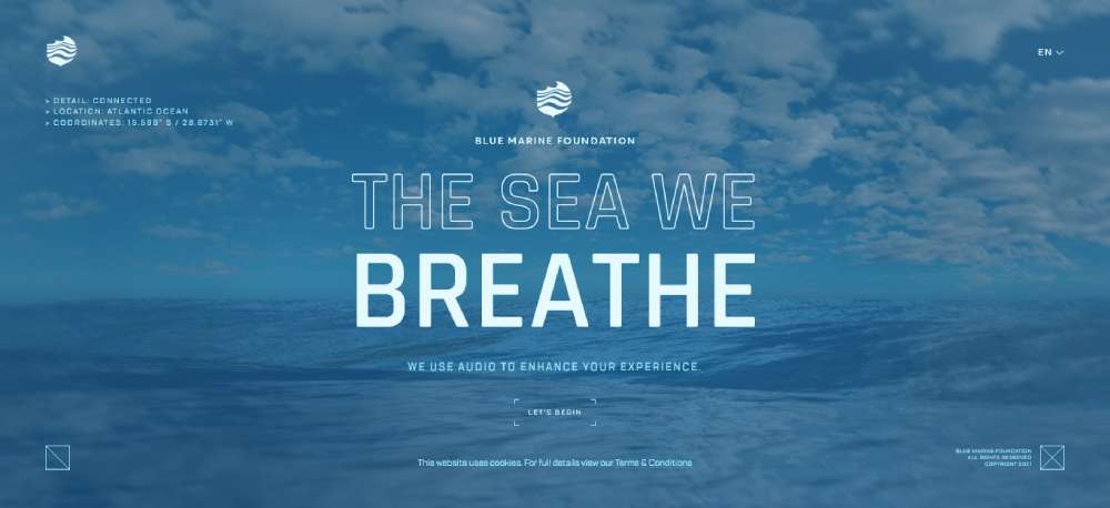
Then there's The Sea We Breathe. This site tells a story, and not just any story. It's about our oceans, climate change, and all that heavy stuff. But the way they do it? Pure magic. Stunning visuals, an informative voiceover, and that background music - it's a sad but beautiful journey.
Supima
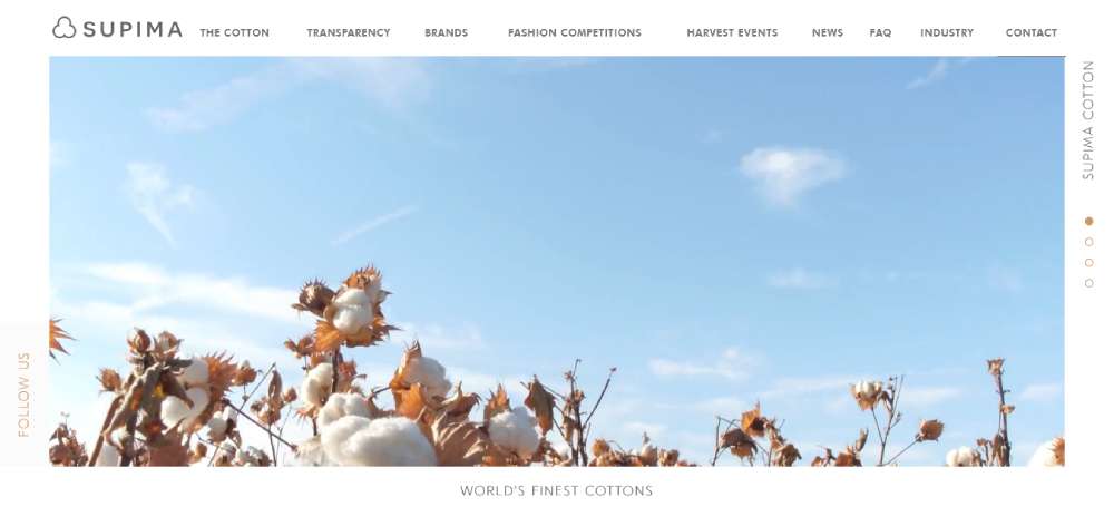
Supima knows how to make an entrance. Their hero image? It's like walking into a visual wonderland. It's not just a pretty picture; it's an invitation to explore, to discover what Supima's all about. It’s premium website design with a purpose.
DocuSign
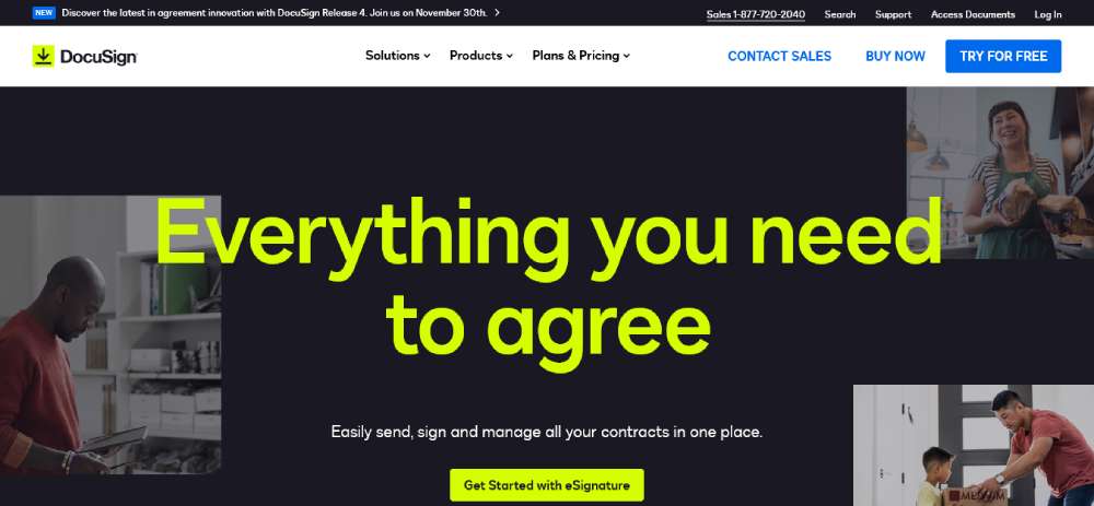
And let's talk about DocuSign. Everything here screams big. Big fonts, bold statements, and benefits that make you think, "I need this in my life." It's like they're not just selling a service; they're selling confidence.
FIT&YOU
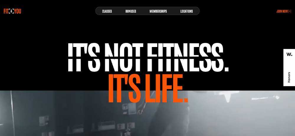
Check out FIT&YOU. This isn't just a gym; it's a lifestyle. The site reflects that. It's all about choosing your own fitness adventure, with coaches who really listen. The design? Sleek, modern, and totally motivating.
SPINX Digital
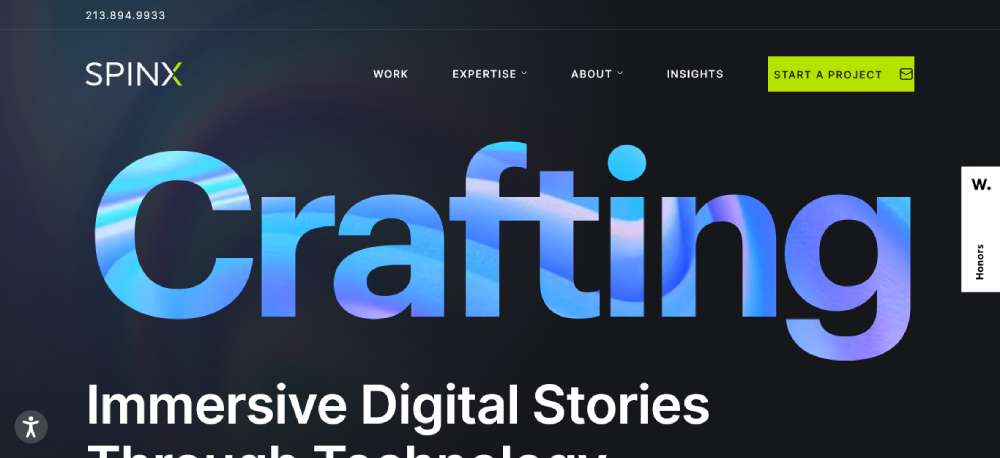
Then we have SPINX Digital. These guys are all about innovation, and it shows. Their site combines bright colors and simple navigation for a minimal but impactful experience. It's like stepping into a world of digital artistry.
BeCourse2
Mbau
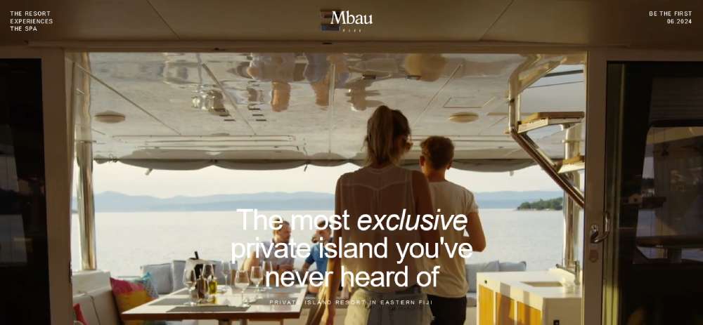
Mbau is a tropical dream. Awarded for its design, the site greets you with a hero video that's pure eye candy. It's like a digital postcard from paradise, making you want to dive right into that crystal-clear water.
Gins Aux
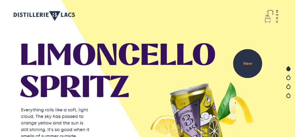
Gins Aux is a testament to how far e-commerce web design has come. From sleek and simple to detailed and interactive, their site is a playground for the senses. It's the new norm, and for good reason.
HALF OF EIGHT
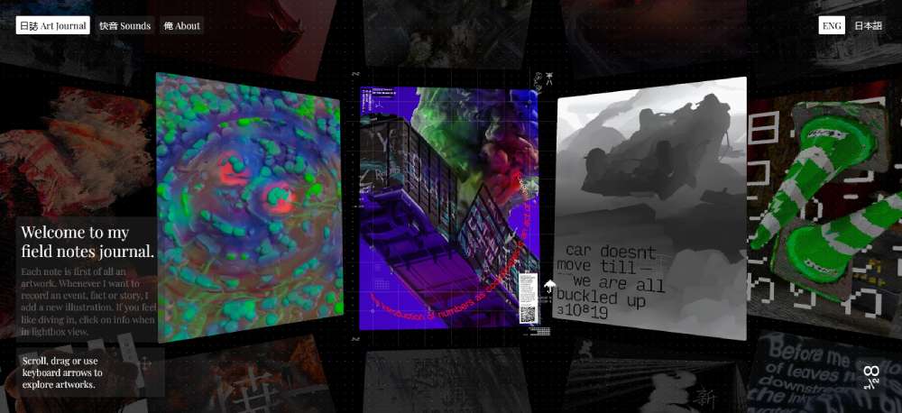
HALF OF EIGHT is something else. It's an art journal, but not the kind you're used to. It's a grid of CGI snaps and stories, sounds that are artworks in themselves, and a peek into recent projects. It's digital creativity unleashed.
Unseen Studio
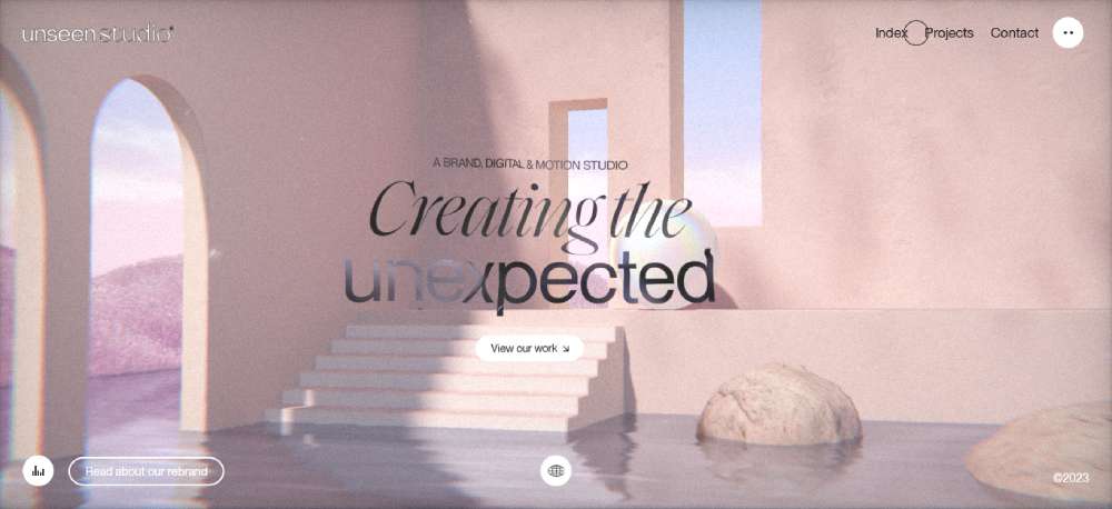
Unseen Studio plays with contrasts in a cool way. Soft colors, bold text, and a homepage that reacts to your cursor. It's like the site is alive, changing colors and shimmering as you explore. It's subtle, but oh-so-catchy.
Critical Danger
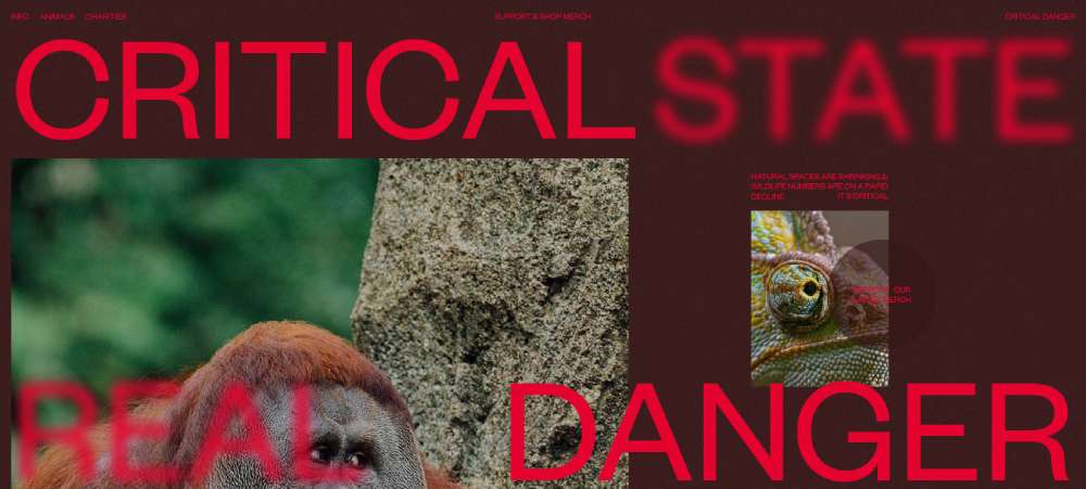
Critical Danger is not just a website; it's a narrative experience. They use art, illustration, and compelling storytelling to draw you in. It's about making a statement, telling a story that sticks with you.
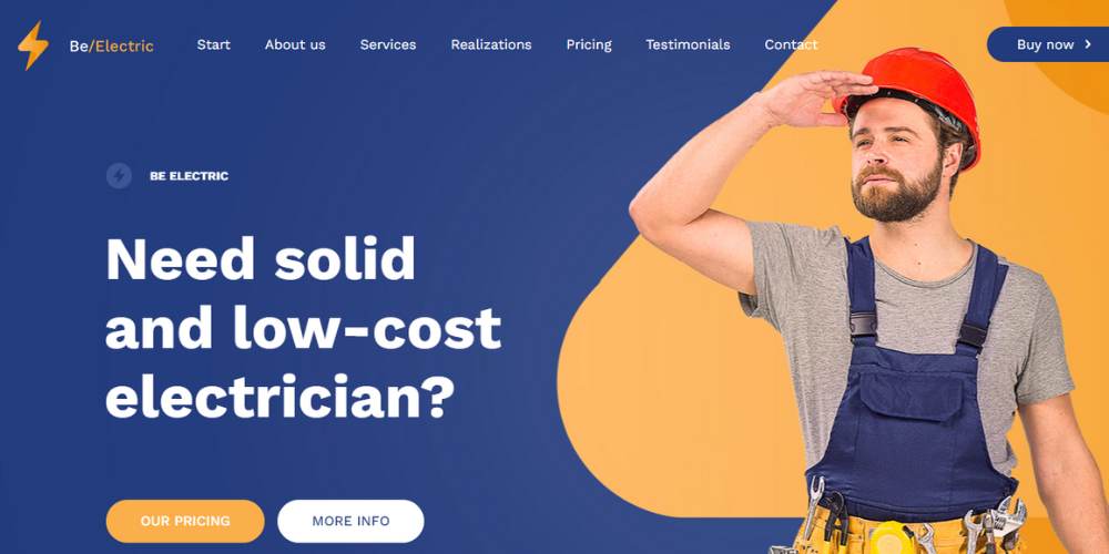
BeElectric2
Outreach Space
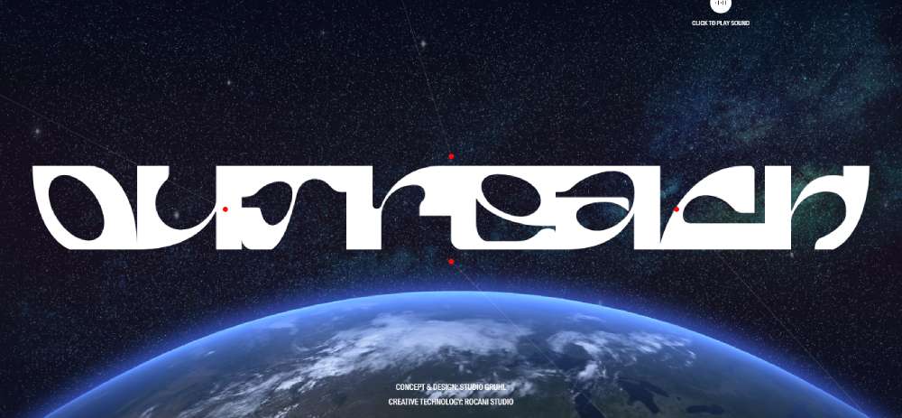
Outreach Space is like stepping into the future. The homepage is a mix of high-quality animations and artistic typography. It's bold, it's brave, and it's all about carving out a strong brand voice in the digital world.
Amy Currell
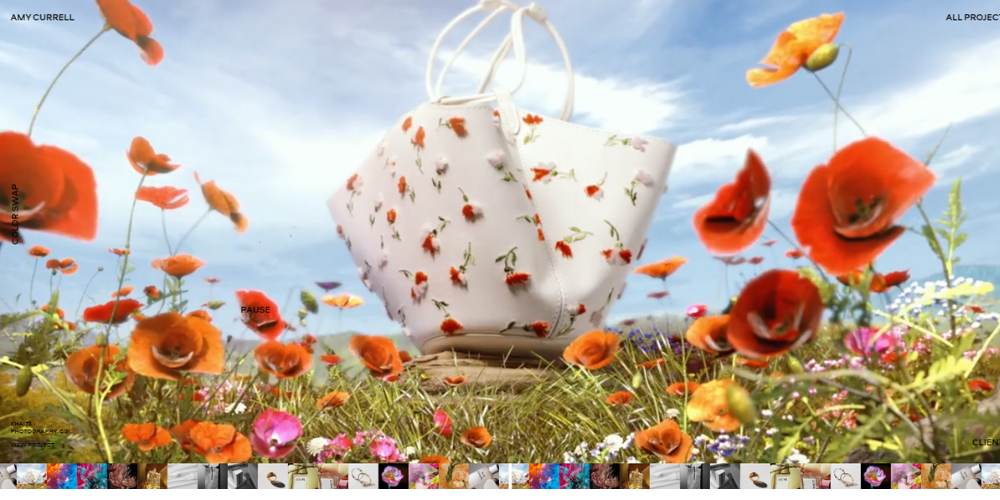
Amy Currell. She's a photographer and director from London, and her website? A masterpiece. Inspired by her crisp aesthetic, it's a blend of modern interface elements and interactive features that make you feel part of her visual story.
On
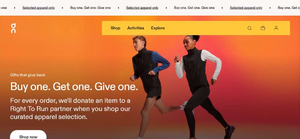
Check this out - On might look simple at first, but wait till you see their tech page. It's all about interactive touches and animations that catch your eye. It's a sleek, modern approach to web design, making something simple look absolutely stunning.
Zuora
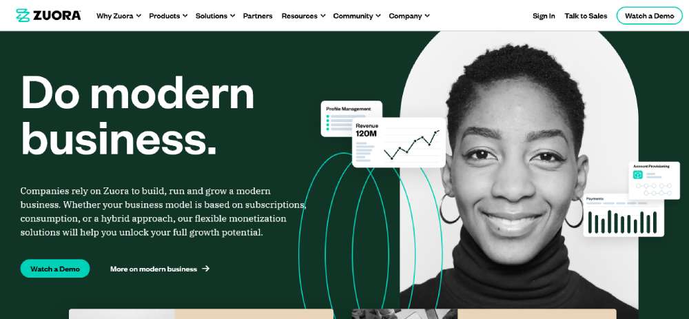
Over at Zuora, they're all about making a statement. Their homepage shouts, "We're number one in subscriptions!" It's bold, it's confident, and it totally embodies their value proposition. This is B2B website design with some serious swagger.
Curious & Company
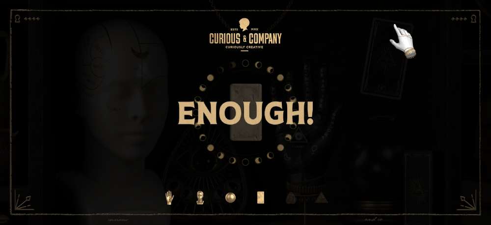
Then there's Curious & Company. Their opening frame is like stepping into a mystery novel. Move your cursor around, and parts of the background light up, urging you to explore every inch. It’s user experience design that’s both playful and intriguing.
HiFi Project
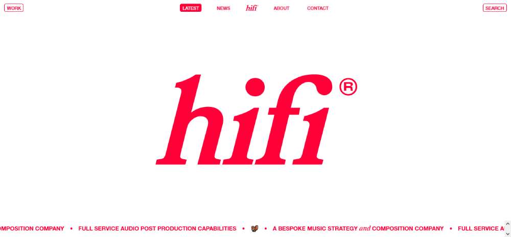
For HiFi Project, we went all out. They’re a music strategy company, so we built a site that's all about trust and wonder. It’s a mix of their fresh visual identity and our knack for creative web solutions.
Elva
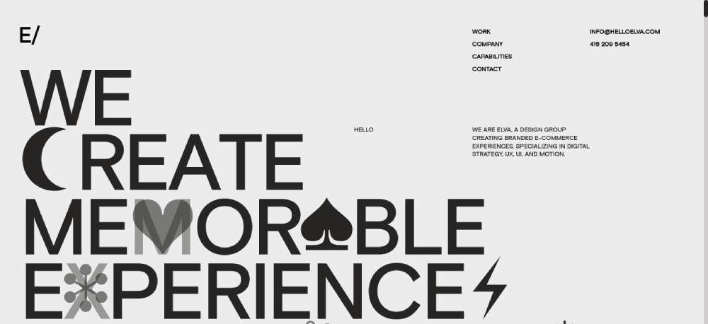
Elva is where kinetic typography and minimal design meet. Their website is a lesson in modern web aesthetics, with geometric elements and smooth animations. It’s a custom web development project that really shows off what we can do.
The Hall Of Zero Limit
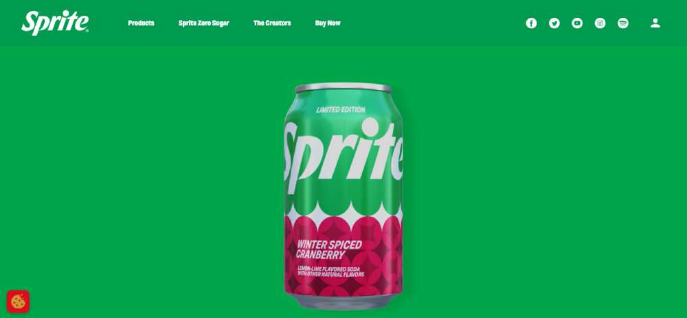
The Hall Of Zero Limits by Sprite is something else. It's like a 3D journey through the world of Black Panther: Wakanda Forever. It’s all about content, inspiration, and discovering your gifts. Interactive web design? They’ve got it down.
Thompson Stenning
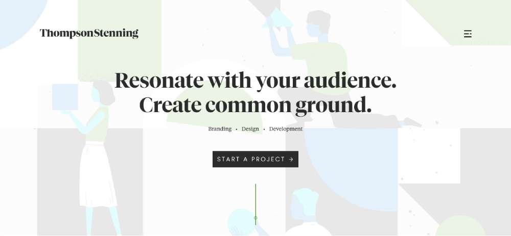
Thompson Stenning is tapping into a cool trend – blending shapes to create images. Scrolling through their homepage is like a mini-adventure, with new info popping up in a satisfying way. It’s responsive web design that’s both stylish and useful.
Addifico
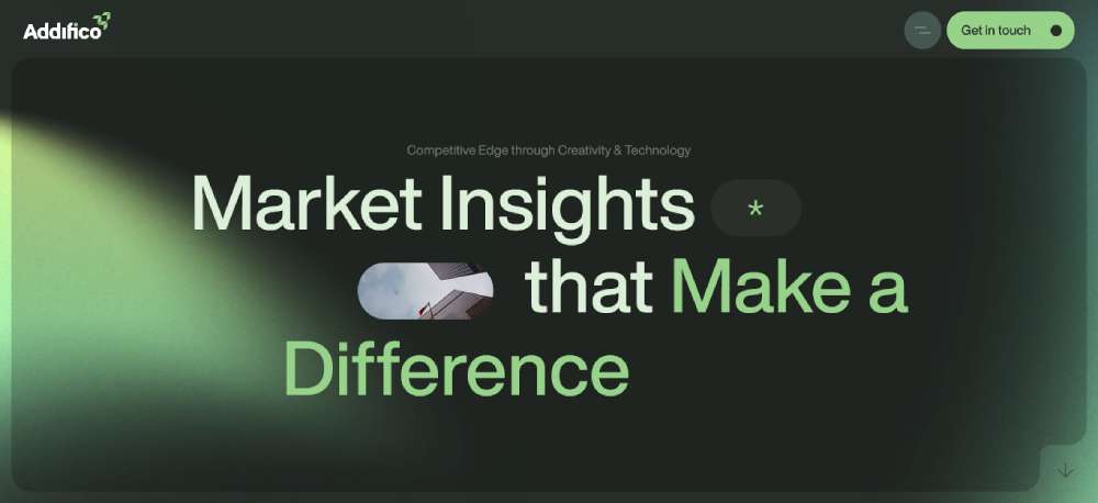
At Addifico, it's about blending human creativity with the latest tech. They’re helping leaders and entrepreneurs up their game, optimizing their market position with a blend of art and science.
FPP
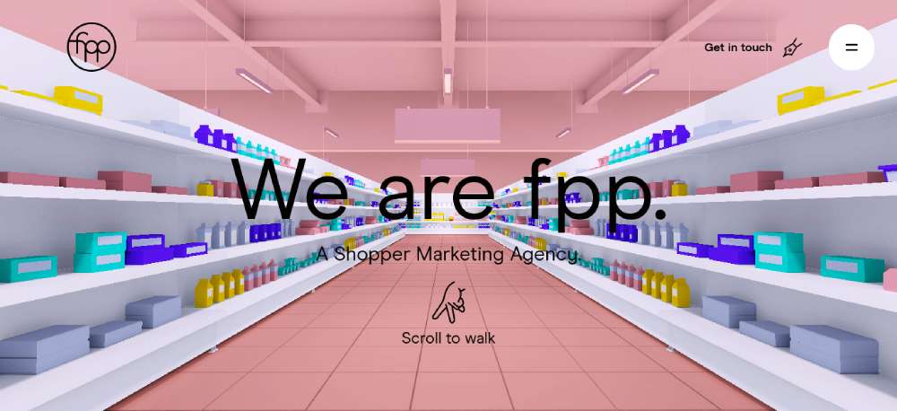
FPP is redefining shopper marketing. They design VR shopping experiences and killer marketing content for e-commerce. Their complimentary design services? They make online shopping smooth and effortless. Talk about advanced web development!
Motion
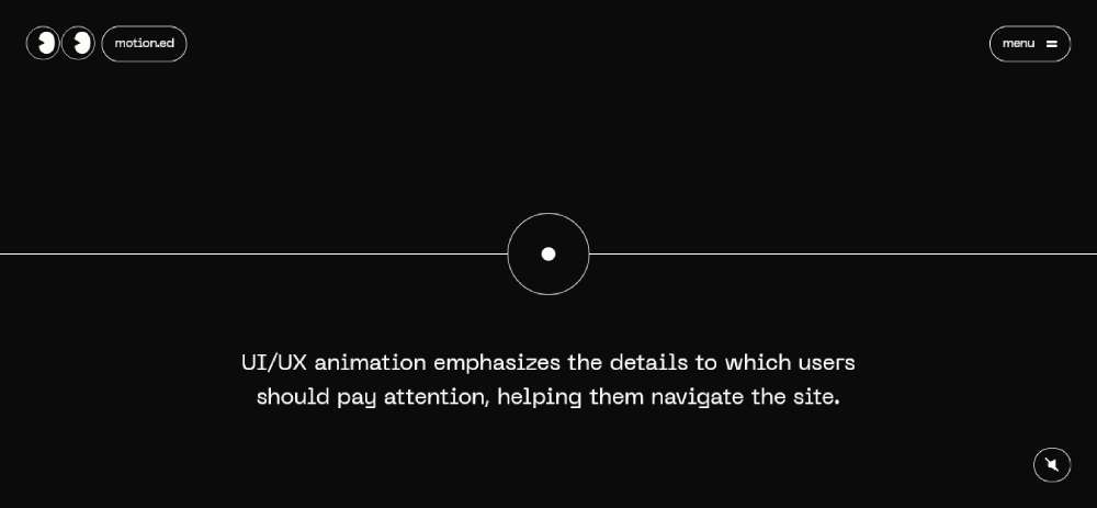
Motion is for anyone wanting a standout site. Simple yet super creative, it’s a fresh take on CSS, turning browsing into an explorative adventure. This creative agency knows how to make dynamic content really pop.
Elementary
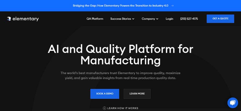
Elementary. Their advanced imagery is a major highlight, showing off their products right on the homepage. It's an engaging, interactive experience that's SaaS website design done absolutely right.
Iryce
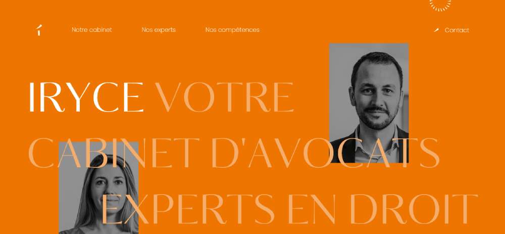
Over at Iryce, they're shaking things up in the legal world. It's not just about courtrooms; they cover everything - tax, corporate, you name it. And their website? It's like walking into a digital law office that's super welcoming and friendly.
FlyHyer
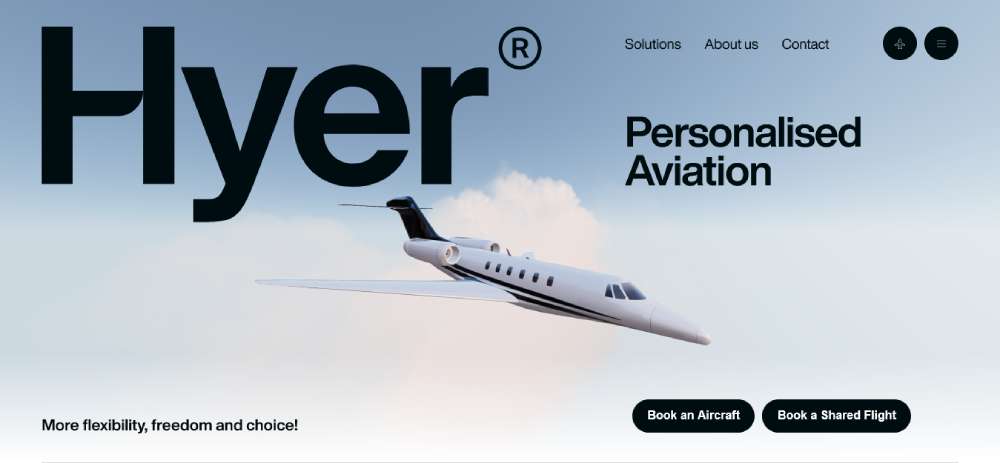
Then, there's FlyHyer. Imagine an airplane right on your screen, looking like it's about to take off. As you scroll, it zooms in, giving this crazy sense of motion. It's a visual treat for anyone dreaming of a personalized flying experience.
Mailchimp
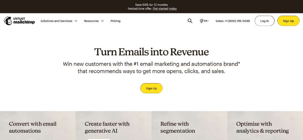
Mailchimp is all about surprises. They change up their homepage design so often, it's like a new experience every time you visit. It's quirky, fun, and totally on-brand for them.
Spotify Design
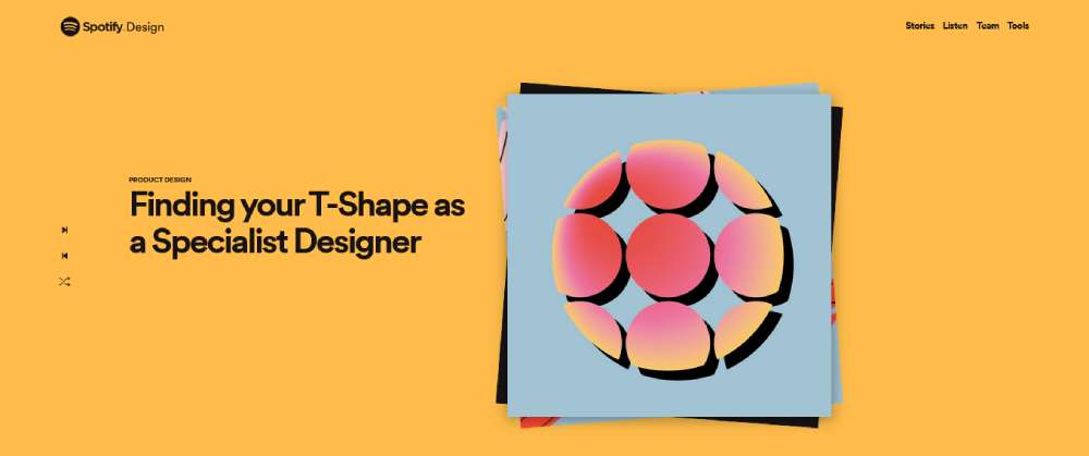
Spotify Design brings it with their website. Think seamless animations, cool drop shadows, and abstract stuff that pops out at you. It’s like a 3D adventure through the world of music streaming.
SELF-DISCIPLINE
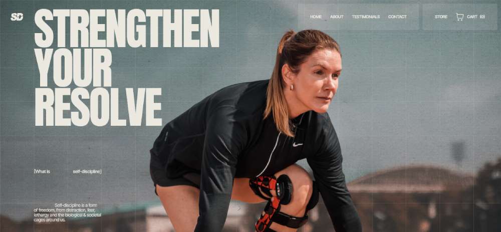
We had a blast designing SELF-DISCIPLINE for Gregg Miele. It's a sports goods store that merges online shopping with his unique sports philosophy. The vintage vibe with torn paper and retro pics? That's all us.
Swab the World
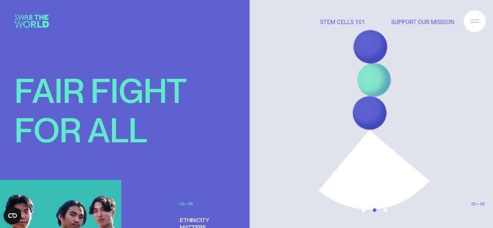
Check out Swab the World. They use motion graphics and geometric design to make their site pop. It's dynamic, aesthetically pleasing, and breaks the mold with its split-screen hero image.
Beauvoir
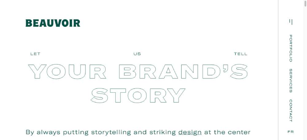
Beauvoir is all about making a strong first impression. Their agency website greets you with this informative video that showcases their strengths. It’s bold, modern, and really catches your eye.
Superlist
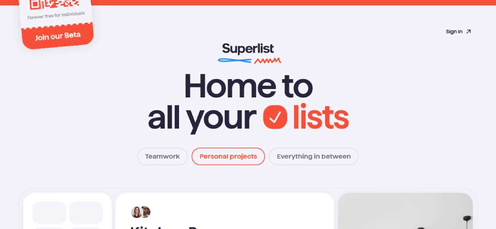
Landing on Superlist is like getting an instant download of what they're about. In just a few seconds, you get that they're all about boosting productivity for teams and individuals. It’s clear, concise, and visually appealing.
Ga-In
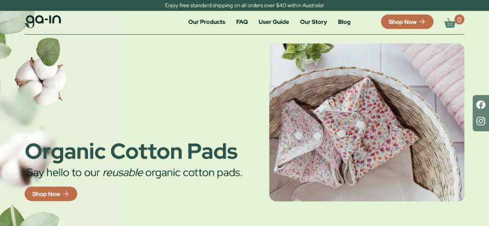
Ga-In is driven by a mission to create natural period care products. Their website reflects this commitment to well-being and positive social impact, offering an insightful and engaging online experience.
Okendo
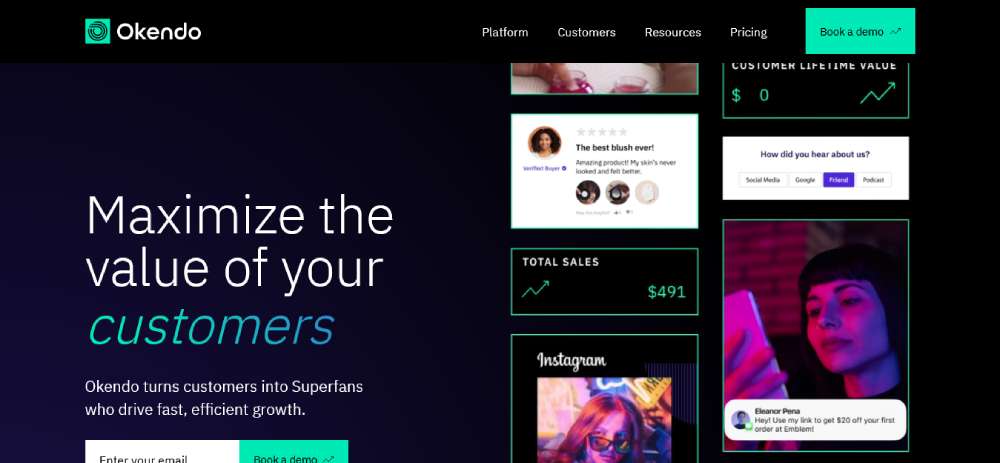
Okendo takes pride in being a game-changer in customer reviews. Their site makes it clear they're setting new standards, and dropping Shopify's name for credibility? Smart move.
The Octopus
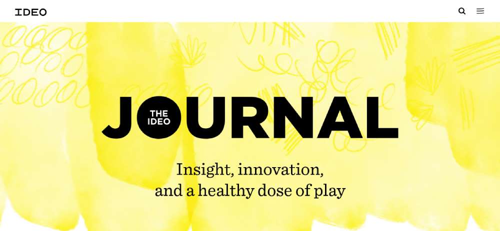
The Octopus by IDEO. These guys are like the wizards of design. The Octopus? It's their way of showing us a designer’s view of the universe. Think minimalistic but super interesting, with a mix of yellow, black, and white. It's like stepping into a creative wonderland.
BYD Auto
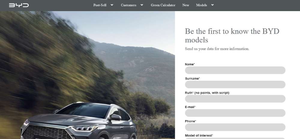
Next up, BYD Auto. For their Chilean launch, they wanted more than just a website. They needed a digital showroom, a place where every model shines. And that’s exactly what we gave them. It's sleek, functional, and really brings the cars to life.
Foursixty
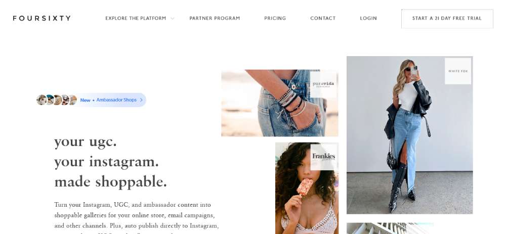
Now, take a peek at Foursixty. These folks make it all about user-generated content on Instagram. Their three-liner says it all – UGC, Instagram, shoppable. It's straightforward, effective, and screams e-commerce solution.
Minna
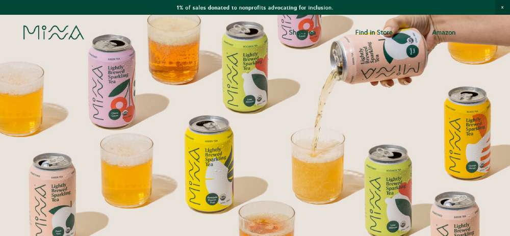
Over at Minna, it's a color explosion. Their page uses a fun, youthful palette that makes everything pop. It's a prime example of how to nail an e-commerce homepage design – bold, vibrant, and totally eye-catching.
Nomadic Tribe
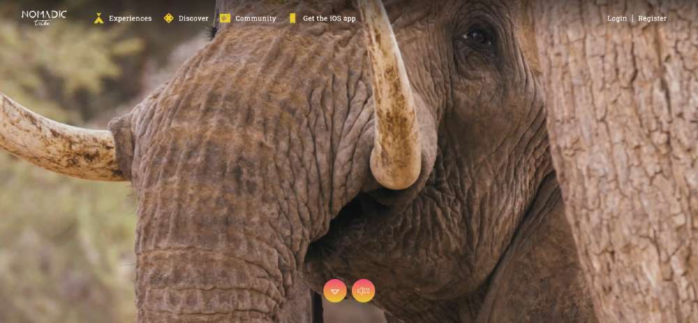
The Nomadic Tribe is something special. They connect folks with indigenous tribes around the globe. The site? As unique and fascinating as their mission. It's an experience that's part travel, part education, and all adventure.
WhatTheDeck?!
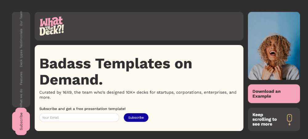
WhatTheDeck?! is all about wowing with presentations. Their service is a godsend for startups looking to stand out. The website? It's just as stunning and out-of-the-box as the decks they help create.
Roee Ben Yehuda
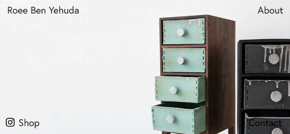
Roee Ben Yehuda. Yehuda’s site is a playground of experimental navigation. Menus in the corners, cinemagraphs that blend still images with subtle animations. It's all about highlighting products and adding a dynamic twist.
George Nakashima Woodworkers
George Nakashima Woodworkers. It's like stepping back in time, but with a modern twist. They've got this cool way of showing off woodworking history, all while keeping it fresh. The website's full of natural vibes – think trees, greenery, and earthy tones. It's calming and just feels right, you know?
9 Pokklonaya
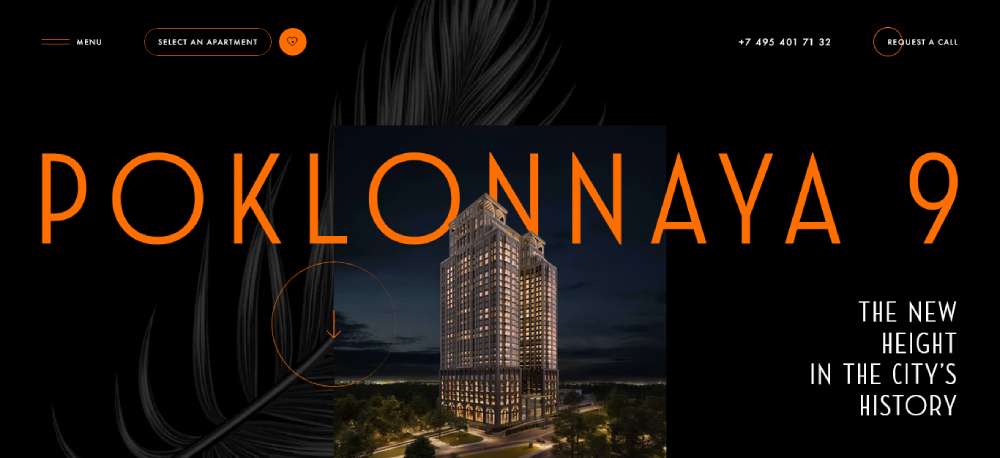
Then there's 9 Pokklonaya. This real estate site is the definition of sleek. Fonts, subtle animations, and bold colors against a dark backdrop – it screams luxurious. It's like every detail's been polished to perfection.
VERDA DESIGN
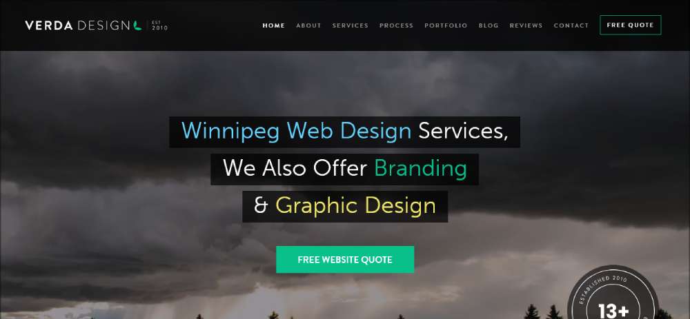
Over at VERDA DESIGN, they're all about making websites that catch your eye. They're in Winnipeg, crafting sites that are just straight-up captivating. It's about making a visual impact the moment you land on their page.
Life in Vogue
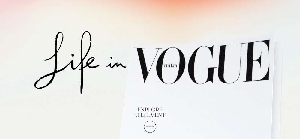
Life in Vogue is something else. It's like a virtual venue that grabs you right away. The use of color gradients is off the charts – it's visually stunning and keeps you hooked. It’s like a digital art show.
Frans Hals Museum
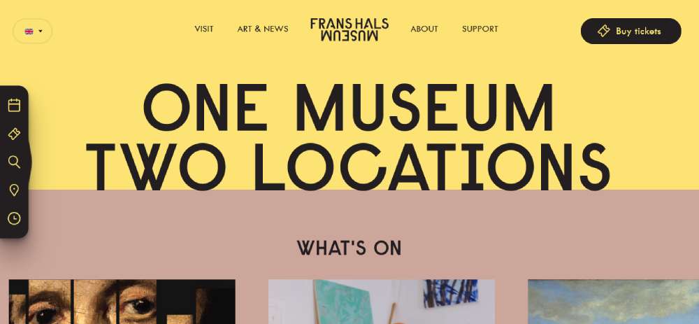
Frans Hals Museum mixes the old with the new. They take what’s cool about their exhibits and sprinkle some digital magic on it. Visiting their site is like getting a sneak peek into the museum, but from your couch.
Crypton.trading
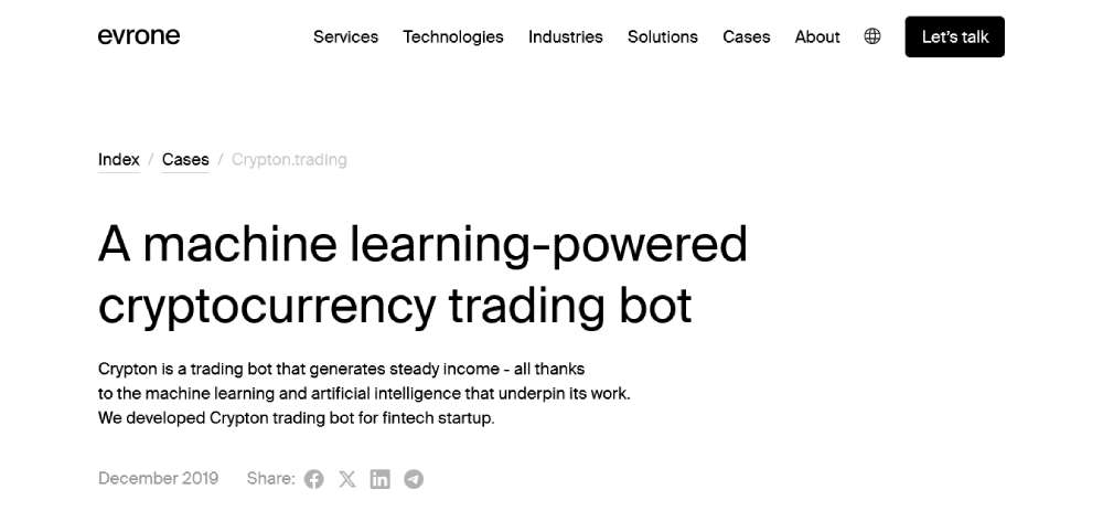
Crypton.trading is where trading meets tech. They use AI and machine learning to spot the best trading opportunities. It's like having a smart buddy who knows all about crypto and wants to help you out.
Agro Certify
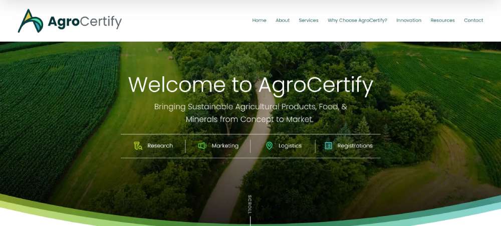
Check out Agro Certify. These guys are all about sustainable agriculture. Their site takes you from the concept stage right up to the market. It's about telling the story of sustainable products in a digital world.
Tenuta Sant’Apollonia
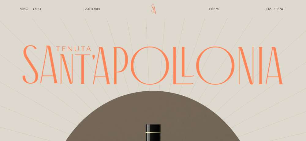
Tenuta Sant’Apollonia. This site is another level of luxury. The color scheme, animations, and round sections – everything just flows together. Scrolling through their site is like taking a leisurely stroll through elegance.
FAQ On Premium Website Design
What makes a website design "premium"?
A premium website design combines luxury aesthetics, advanced UI/UX principles, and responsive design. It uses the latest HTML5/CSS3 techniques and tools like Adobe Photoshop and Figma. These designs excel in website usability, offer seamless web accessibility, and often use platforms such as WordPress or Webflow for better customization.
How can I identify a premium website design?
Look for high-quality web graphics, advanced visual hierarchy, and responsive design that adapts to any device. These sites often feature modern web design trends, interactive elements, and are built on robust platforms like Shopify or Magento. Awwwards and Dribbble showcase excellent examples.
Are premium designs only for big brands?
No, premium designs aren't exclusive to big brands. They are accessible via platforms like Squarespace and Wix, allowing even smaller businesses to implement designer website examples using customizable templates. WordPress and Shopify also offer options suitable for various business sizes, ensuring high-end design is achievable.
What tools are used to create premium website designs?
Common tools include Adobe Photoshop, Illustrator, Sketch, Figma, and frameworks like Bootstrap. HTML5/CSS3 and JavaScript are fundamental, while platforms like WordPress and Webflow are widely used. Dribbble and Behance often feature designs created with these tools, providing inspiration and showcasing capabilities.
What are the benefits of a premium website design?
A premium design enhances website usability and boosts conversion rate optimization. It improves user experience (UX) and user interface (UI), leading to higher engagement and trust. Premium designs also facilitate better web accessibility, making your site more inclusive and potentially improving your rankings on engines like Google.
Can I achieve a premium design on my own?
With tools like WordPress, Wix, and Squarespace, it's possible to create high-quality designs on your own. However, working with a professional who uses Adobe Photoshop, Sketch, or Figma can elevate your site with sophisticated HTML5/CSS3 and JavaScript techniques, ensuring a more polished and functional result.
How do premium websites perform on mobile devices?
Premium web designs prioritize responsive design, ensuring the site looks stunning and functions seamlessly on all devices. This involves using modern web design techniques and mobile-friendly CSS. Platforms like Shopify and Webflow make it easier to achieve such mobile-friendly designs, enhancing overall user experience (UX).
What are some examples of premium website designs?
Look at showcases on Awwwards and CSS Design Awards. Examples often include sites built on WordPress, Webflow, and Shopify. These designs feature high-end graphics, impeccable UI/UX, and the latest design trends, serving as excellent inspiration for your own projects.
What should I avoid in premium website design?
Avoid overloading your site with unnecessary elements that can detract from user experience (UX). Steer clear of poor-quality graphics and ensure your web accessibility standards are met. Using reputable tools like Adobe Photoshop and platforms like WordPress helps maintain quality and website usability.
How much does a premium website design cost?
The cost varies depending on complexity and customization. Simple but high-quality designs using Squarespace or Wix may be more affordable. Custom projects developed using Sketch, Figma, HTML5/CSS3, and platforms like Webflow or Magento can be more costly but offer unparalleled customization and features.
Conclusion
Exploring premium website design examples reveals that superior web experiences combine aesthetics, functionality, and modern web technologies. From responsive design that ensures mobile compatibility, to advanced user experience (UX) principles, these examples highlight the significance of using tools like Adobe Photoshop, Sketch, and Figma.
WordPress, Webflow, and Shopify stand out as platforms where high-end designs shine. Such sites also demonstrate exceptional website usability and web accessibility, key factors for online success. It's clear that incorporating elements like visual hierarchy, cutting-edge HTML5/CSS3 techniques, and intuitive user interface (UI) design creates truly engaging websites.
Ultimately, understanding and leveraging these examples allows for creating sophisticated web designs. Moving forward, prioritize platforms, techniques, and tools mentioned here. The insights gleaned from premium examples equip you with the necessary knowledge to elevate your digital projects to new heights.
If you enjoyed reading this article about Premium Website Design, you should read these as well:


