

Showcasing Premium Website Design Examples
October 6, 2024
The best 30 business website designs to take as example
October 8, 2024Discover the essence of creativity with examples of unique website designs. These creations don't just attract; they engage and communicate.
Each design uses responsive layouts, vibrant colors, and interactive features to create impactful user experiences. By looking into these sites, you're exploring the intersection of aesthetics and usability.
Why trust these examples? They've been picked for their standout qualities, highlighting innovative web layouts, digital design trends, and effective UX/UI strategies. If you're keen to see what modern design looks like, you're in the right place.
What can you expect? We’ll break down key components like responsive design, multimedia integration, and unique navigation systems. You'll gain insights into how these elements shape user interaction and contribute to digital branding.
By the end, you’ll understand how combining visual appeal and functionality can take your own projects to another level. Get ready to explore what's possible.
You won’t stand out if you just follow the newest trends. Website design layouts that are trend-based and formulaic might bring you paychecks, but don’t expect to win any awards for design. The scariest thought is that you might be compromising your creative side just to become more like a typical manufacturer..
This feeling is something that almost every designer goes through at some point or another, therefore there are plenty of ways to sort this out. One way is to draw inspiration from the most out-of-the-box and unique website design available.
Sadly, there’s no set of rules for designing unique websites. The easier option for boosting traffic is turning to something like Search Engine Optimization. However, the most effective way to drastically increase traffic is to have a unique website that stands out so much that it gets plenty of media and word-to-mouth attention because of it.
Keep on reading this article to discover a few tips on how to achieve this kind of out-of-the-box thinking and experimentation.
Steer Clear of Pre-Described Layouts
Grid systems are a fantastic way to display web content, not just due to their easy setup and the fact that they boost efficiency in maintaining and expanding web projects, but also due to them improving the consistency and usability of website layouts. However, if you’re a designer trying to think outside the box, you might find this kind of layout too restricting. Wouldn’t it be great if page size and website layout were unimportant factors?
In order for this to be achieved, your first step should be planning out your design’s objectives:
- What do you want to be noticed first by visitors? Content? Logo? Navigation?
- What kind of feeling do you want your design to invoke in visitors?
- How usable do you want your design to be? You may require some feeling of a generic layout.
The next step is building on these answers. If you’re looking for a particular photo to stand out, be careful in deciding where to place it. Try to place your main feature in the top left area as that’s where most visitor’s eyes tend to go first. After deciding where your main feature should go, be that an image, navigation, logo, or content, build the remaining design around it.

Creatively using colors can truly help create unique websites, even if this is the only unique thing about the website. Colors are a powerful way to create playful looks, evoke emotions, add class etc.
An effective way to make your design stand out is by using high contrast colors. Colors can also be used in a non-typical way, for example, by breaking colors up unto blocks. The DoneDone website breaks up retro colors into geometric blocks. You should also check out the image slideshow from Mike Kus’ designer portfolio which uses some brilliant colors.
Whether we’re aware of it or not, we all have our own collection of personal techniques. Set aside time to think over and evaluate all the design habits and techniques that you’ve collected throughout the years.
Think about the following things when determining your own techniques:
- Is there are general color scheme you gravitate towards?
- Are there any tutorials you came across several years ago, but have likely significantly modified since?
- What website layouts do you usually use? Why do they work, and why don’t they?
- What do you usually use as the main focus of your design – color, brushes, images, or typography?
Write down all the answers to these questions. Your next step is creating a list under each answer to determine what improvements your techniques need or how they should be defined to personalize them more.

Sometimes you just need to use some unique buttons or icons to turn a boring website into a brilliant one. You just need to make sure that they’re all of a similar style so that your design doesn’t look too messy or overwhelming.
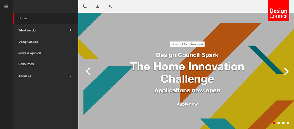
Unique icons are used throughout The Design Council’s website, turning what would have been a simple website layout into a unique website layout.
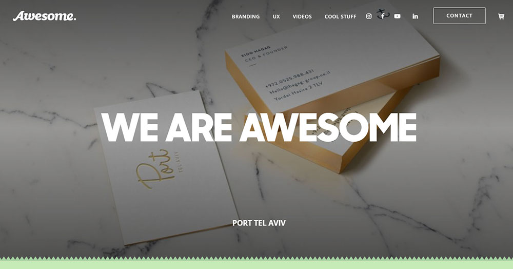
A retro/vintage style was used by awesome’s design team for design elements such as icons, buttons, and typography.Using design to save the world is their creative pitch, and this theme is cleverly stuck to throughout the website.
Consider Why Exactly Your Favorite Website Sucks
The next thing to write down is why your favorite website sucks, and you need to list 10 reasons. You’ve spent so much time admiring it, but now you need to think about what’s bad about your favorite site. This can be anything from personal preferences to larger concerns such as usability.
Your list should consist of issues regarding the following:
- Take a look at the overall design– general appeal, style, and layout.
- Pay attention to the design’s details such as shapes and colors.
- How usable is the site?
- How optimized is the site for ads and widespread usability?
- Look at its hierarchy– do your eyes go to the spot to where they should go?
- What kind of content is offered by this site? Does it function for a big audience in its specialty?
After contemplating these reasons, write down, in detail, all the actions that would improve it. You should then apply similar enough techniques to your own web design.
We wanted to provide you with several more examples of good website layouts whose different approaches will inspire you to create unique websites without letting down your users.
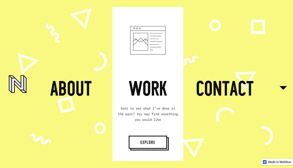
BeArtist
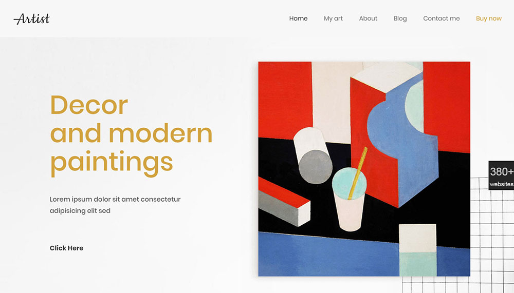
Layout: a three-column hero that upon scrolling becomes the main navigation menu.
NeluCebotari’s online portfolio perfectly captures his designer skills and personality without falling into the trap of being cliche.
Yellow is often a harsh color, but the muted shades chosen for his background work perfectly with the shapes throughout it. The black text really pops thanks to this color choice.
The navigation is another unique aspect of this design, placed smack down in the middle in the form of the following calls to action: work, contact, and about. If you hover over each of them, a box will slide up from the bottom.
Each box contains some text motivating you to find out more or contact them. When you combine all of this with the website’s simple outline, you get an effortless experience.
BeTypo
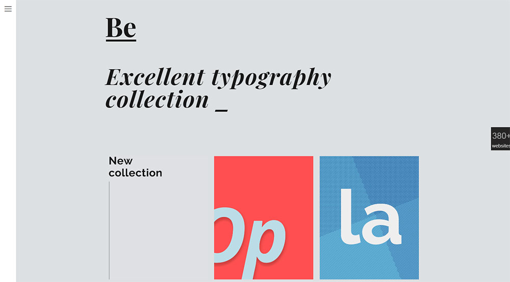
Your mind is the starting point of hunting for the perfect house. starts in your mind. This cool and eclectic website is both interactive and has unique navigation, aiming to guide you through all the steps of finding your dream home. To begin this journey, you just need to start scrolling!
Peerspace
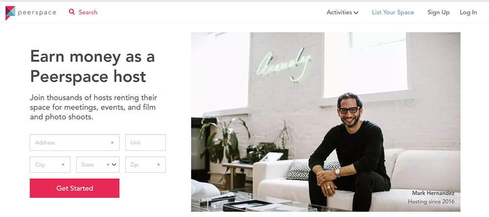
Layout: a full-screen cover that transforms into two broken-grid sections, and then a few more-rigid grids.
Their year in review is not just pleasant to look at thanks to its stylized heading treatments and subtle pastels, but it also tells the story of “How we create experiences has changed.”
Peerspace is also great at letting their users do the storytelling. Videos, writing, and images are used to demonstrate how Peerspace was of help to them.
However, it should be noted that they go overboard with using images to deliver content. It makes you wonder why they chose this approach since it hinders the page’s accessibility and CEO.
GrzegorzKozak

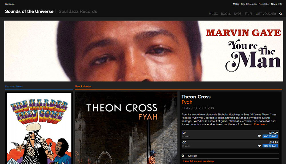
Layout: The experience of a brick-and-mortar record store is reproduced through a grid layout.
Sounds of the Universe is eclectic record label Soul Jazz’s digital offshoot. The numerous types of genres released on this record label are represented well through the website. Each artist has a plethora of background information available along with sound samples to give you an idea of their sound.
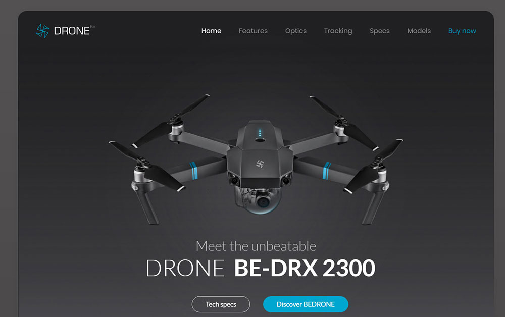
BeDrone
FAQ on designing unique websites
What makes a website design unique?
A unique website design strikes a balance between creative aesthetics and functional usability. It often features innovative web layouts, interactive elements, responsive frameworks, and an eye-catching visual design. Whether it's through creative typography or engaging multimedia integration, these elements together deliver a memorable user experience.
Why are examples of unique website designs important?
Showcasing examples is key in sparking design creativity. It highlights what’s possible and inspires new ideas. From discovering cutting-edge web graphics to understanding successful UX/UI design trends, seeing examples helps in grasping how innovative designs function while pushing the boundaries of conventional digital design.
How do I find inspiration for unique website designs?
Discover inspiration through online design showcases, portfolios, and design agencies' websites. Explore the latest trends in UX/UI design and interactive features. Pay attention to modern website aesthetics, responsive layouts, and how they harmonize graphic elements and colors to create compelling online branding experiences.
Can unique website designs improve user engagement?
Yes, absolutely. Unique website designs can draw in users by offering an engaging and intuitive experience. Interactive web elements and user-friendly interfaces make navigation smooth, while visual storytelling and personalized digital branding captivate their interest, ultimately leading to improved client engagement and conversion rates.
What are some features of unique website designs?
Key features include responsive web design, innovative navigation, and creative use of colors and typography. Also, elements like animated effects, multimedia integration, and custom web solutions that prioritize user experience can contribute to a site’s uniqueness, making it stand out in the online space.
Are mobile-friendly designs part of unique website designs?
Certainly. Today, mobile optimization is a must for any pioneer design. Unique website designs often integrate mobile-friendly layouts to ensure accessibility across devices. This is essential as a significant portion of web traffic comes from mobile users, demanding seamless functionality and aesthetic appeal on smaller screens.
How do I incorporate multimedia effectively in a website design?
To use multimedia effectively, focus on balance and relevance. Ensure videos, animations, and images enhance, not disrupt, the user experience. Optimize for quick loading and clarity. Incorporate them into the visual storytelling of the site, ensuring they align with the overall aesthetic and online branding.
What role does user experience play in unique website designs?
User experience is crucial. It encompasses the ease of navigation, responsiveness, and overall satisfaction users feel when engaging with a site. Unique designs prioritize UX through intuitive layouts and interfaces, leading to higher user retention, satisfaction, and conversion. It's the foundation upon which all other design elements are built.
How important is color theory in web design?
Color theory is vital. It influences mood, perception, and readability. In unique website designs, thoughtful color application enhances visual aesthetics and reinforces brand identity. It guides users naturally and complements typography and graphic design elements, resulting in a cohesive and engaging digital experience.
Are there specific tools or software ideal for creating unique website designs?
Yes, popular tools include Adobe Creative Suite for design, HTML/CSS, and JavaScript for development. Also, content management systems like WordPress and wireframing tools help in structuring and executing creative designs smoothly. These tools support custom design creation, ensuring flexibility, precision, and creativity in web development.
Conclusion
The examples of unique website designs we explored show the potential of creative digital artistry. These sites combine engaging user interface elements with effective functionality. They effectively use responsive web design, typography, and multimedia integration to deliver strong user experiences. Such creativity doesn't only stand out; it makes a real impact.
By considering different web design strategies, from minimalist layouts to animated effects, you’re not just seeing aesthetic appeal, you're understanding and analyzing the importance of a holistic user experience. This journey through different ideas highlights the role of customized design solutions in attracting and retaining users.
Think about your own digital branding projects. Use these design insights to inspire new developments. Apply responsive frameworks, graphic design elements, and easy navigation to create user-friendly interfaces. Embrace these inspiring ideas, build on them, and create your own memorable and functional websites. You're not just designing; you're making a difference in the ever-changing field of web design.


