

WordPress missing a temporary folder: Easy fixing guide
May 7, 2026
Great Travel WordPress Themes You Can’t Miss
May 9, 2026Your reel is only as strong as the site that frames it.
Producers, agencies, and festival programmers judge a filmmaker's credibility before the video plays. A poorly structured filmmaker website loses work that a stronger portfolio would have won.
This article breaks down the best filmmaker website design examples across 4 disciplines: directors, cinematographers, editors, and production companies.
You'll see what makes each site work, which platforms filmmakers actually use, and what design decisions separate a professional film portfolio from one that gets ignored.
What Is a Filmmaker Website
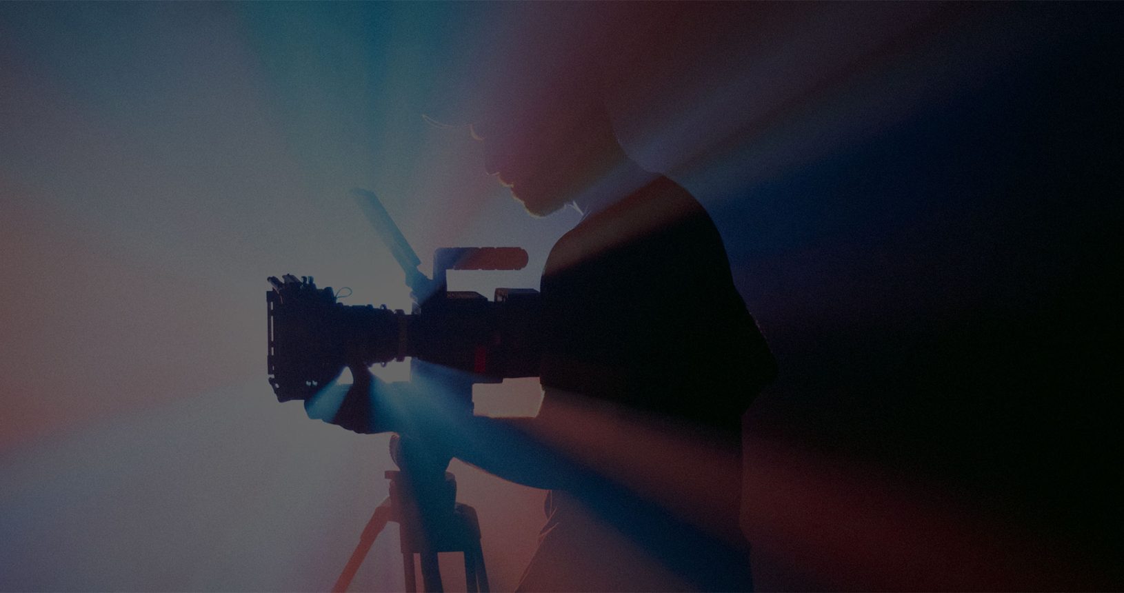
A filmmaker website is a dedicated online portfolio that presents a director's, cinematographer's, or production company's body of work to clients, producers, and festivals. It is not a general creative portfolio with images and text sitting at the center. Video is the primary content format, and every design decision flows from that.
The site serves 3 goals: reel visibility, contact conversion, and professional credibility. A producer visiting your site needs to assess your work, understand your discipline, and reach you. Those 3 things have to happen without friction.
75% of consumers judge a company's credibility based on website design alone (Stanford Web Credibility Research). For filmmakers, that first impression is formed in 50 milliseconds. A weak or disorganized film portfolio page communicates the same lack of attention to detail as a poorly cut reel.
Who Needs a Filmmaker Portfolio Website
Typical site owners fall into 4 categories:
- Independent directors, documentary filmmakers, and short film directors building their professional identity
- Cinematographers and directors of photography who need a visual showreel separate from any production company affiliation
- Video production companies and commercial production houses presenting their client work and capabilities
- Motion designers and editors who combine film portfolio logic with design portfolio conventions
Each profile has different content priorities. A solo director needs a personal brand and a clear creative vision statement. A production company needs a client list, a capabilities overview, and team pages.
Standard Pages on a Film Director Website
Reel page: the primary destination for any first-time visitor, usually a full-screen or near-full-screen embed.
Project archive: individual project detail pages with video, credits, and production context.
About and bio: 2 to 4 sentences maximum for solo directors; team pages for production companies.
Contact: direct email or a short-form inquiry page with representation info if applicable.
Press kit: optional but useful for festival-circuit filmmakers and directors with significant credits.
Filmmaker sites that try to do more than this tend to dilute the portfolio. More pages means more decisions for the visitor, and the goal is always to get them to the reel.
Filmmaker Website Design Examples
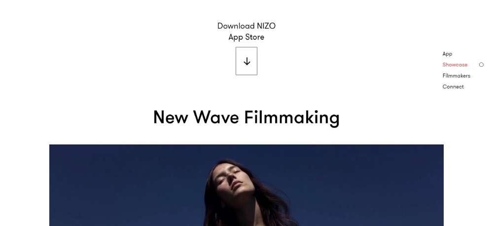
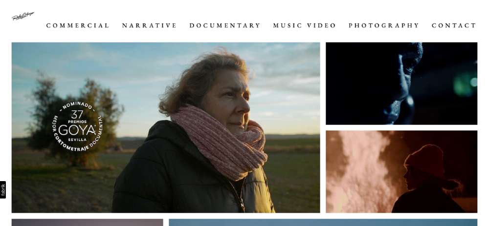
NEW WAVE FILMMAKING
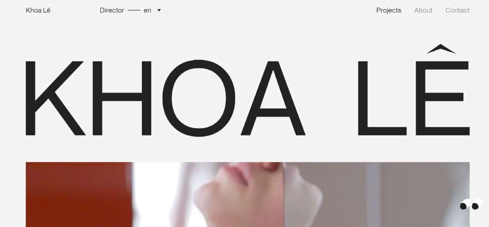
Khoa Lê
BeCourse

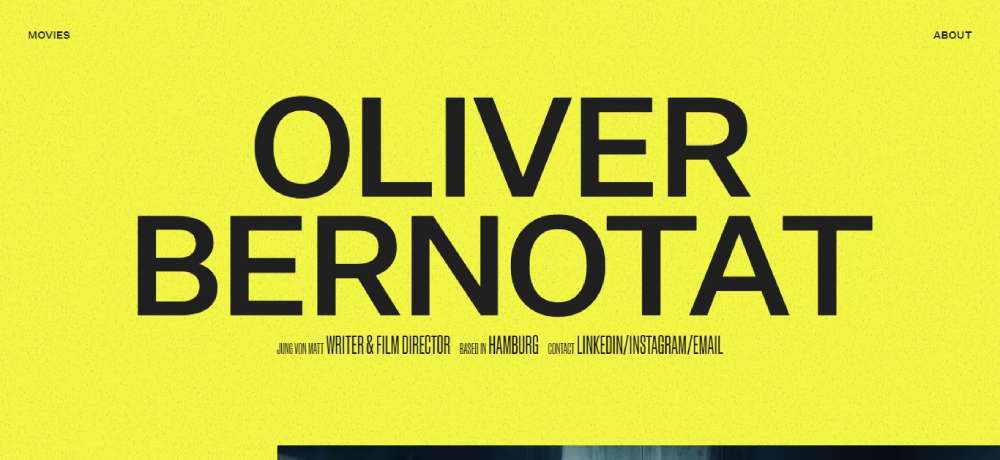
Oliver Bernotat
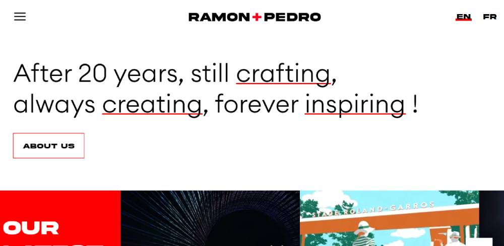
Ramon + Pedro
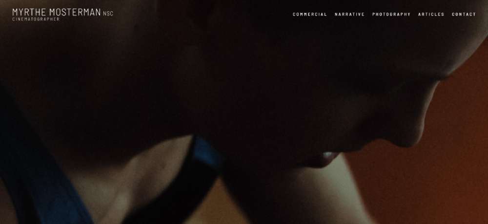
Myrthe Mosterman
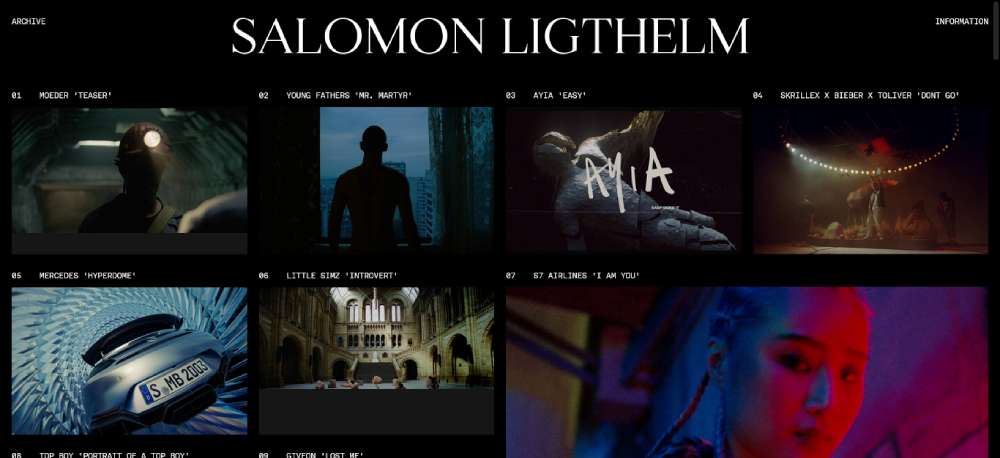
Salomon Ligthelm
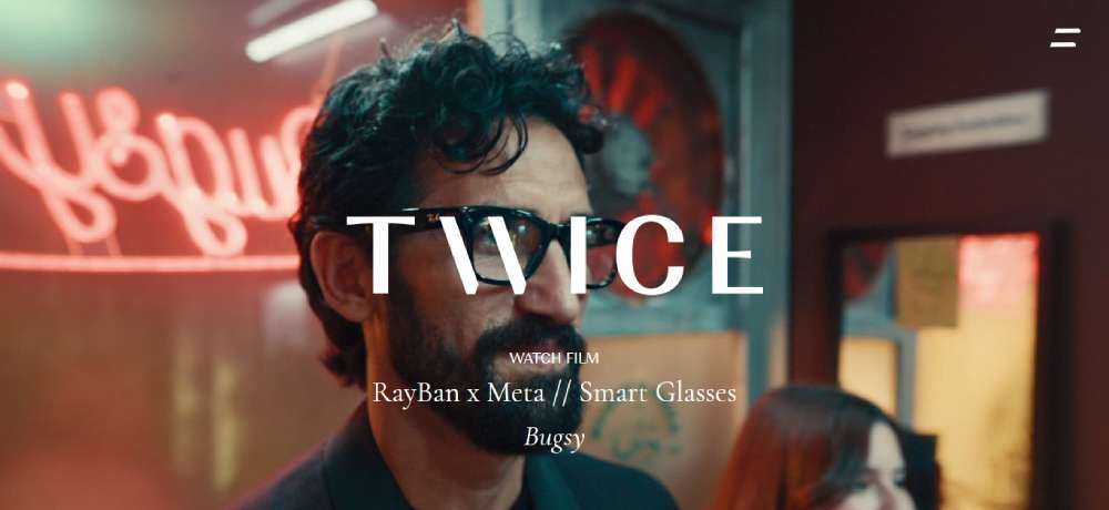
Twice
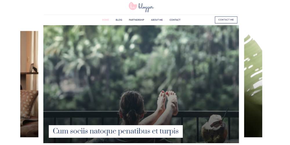
BeBlogger4
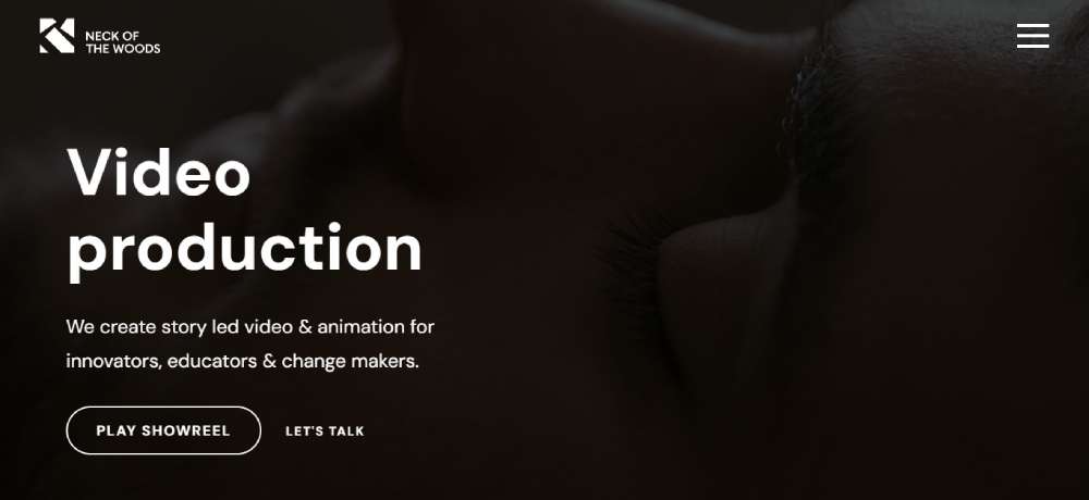
Neck of The Woods Films – Creative Background Video
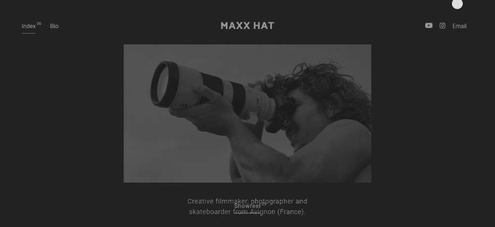
Maxx Hat
Malte Rosenfeld
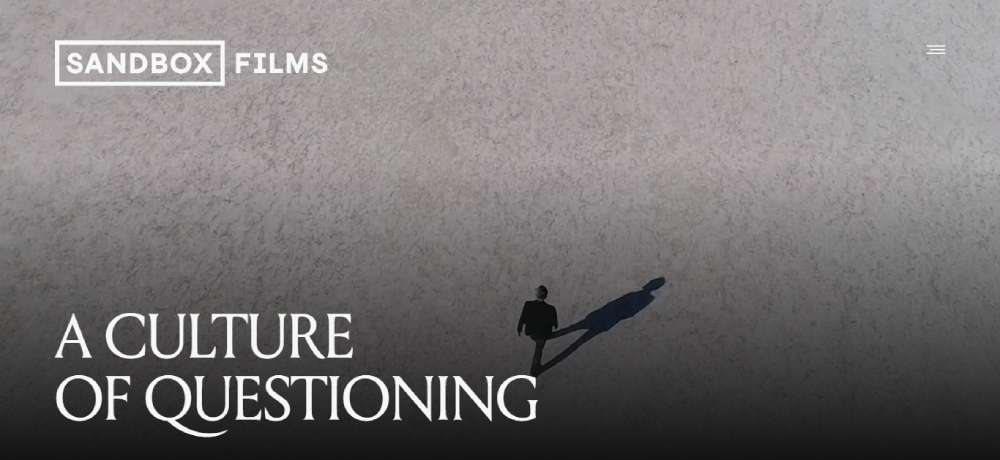
Sandbox Films – Video Background
BePhotography2
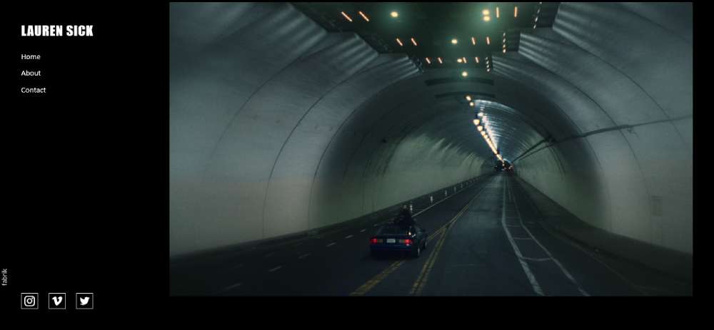
Lauren Sick
Will Dohrn
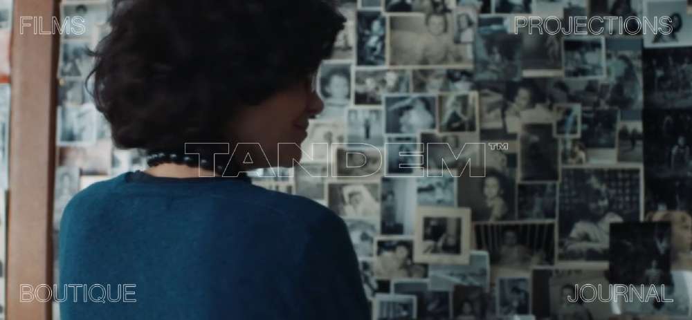
Tandem Films
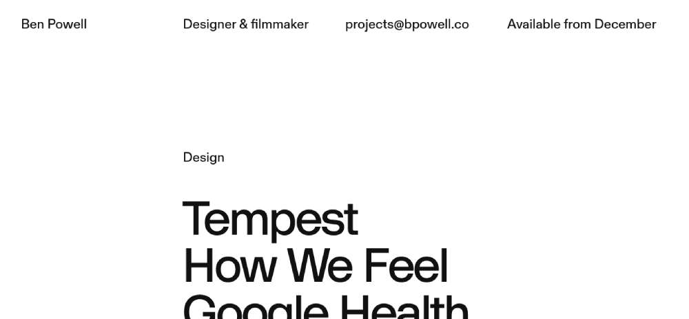
Ben Powell
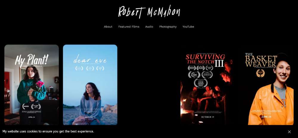
Robert McMahon
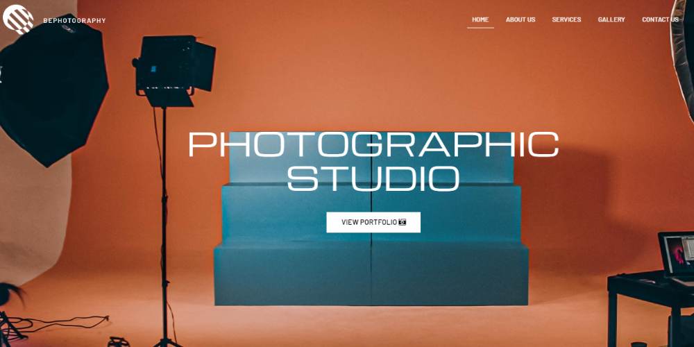
BePhotography
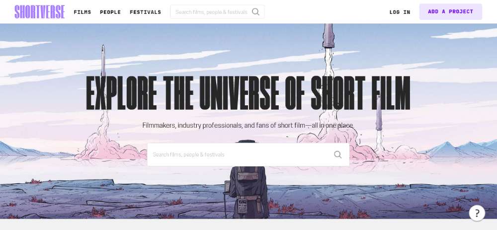
Shortverse
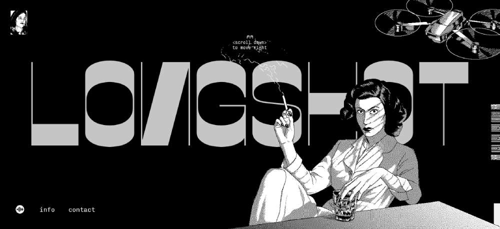
Longshot Features
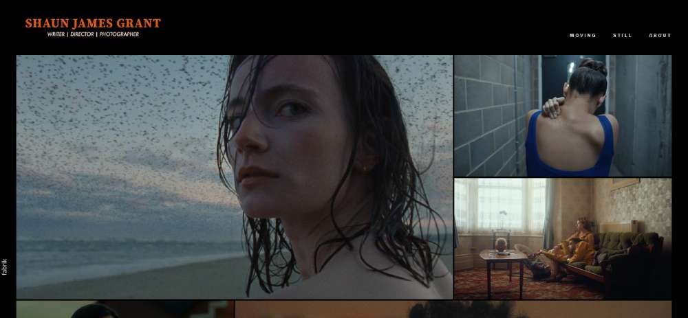
Shaun James Grant
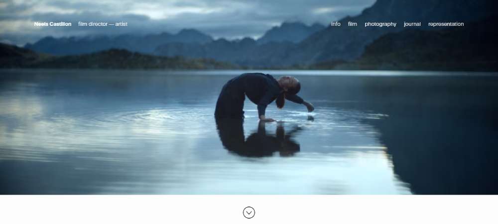
Neels Castillon
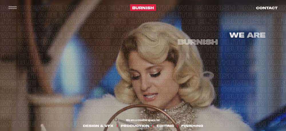
Burnish Creative
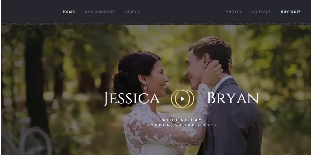
BeWeddingVideos
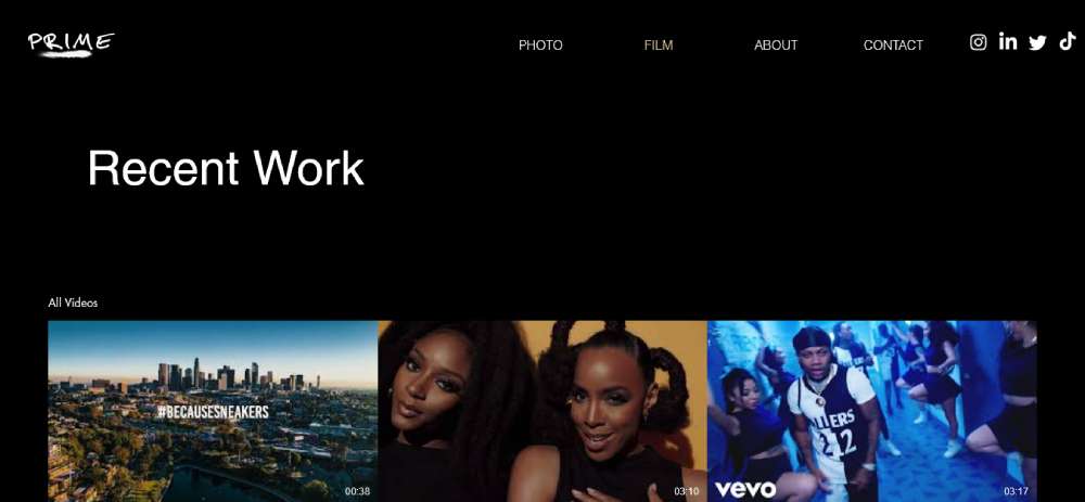
Prime
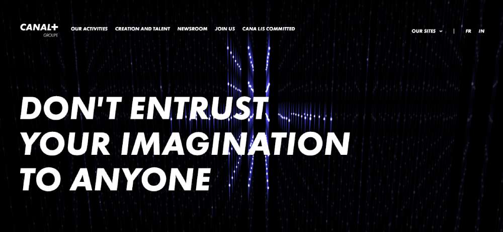
CANAL+
Edoardo Smerilli
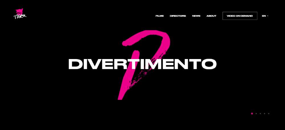
Easy Tiger
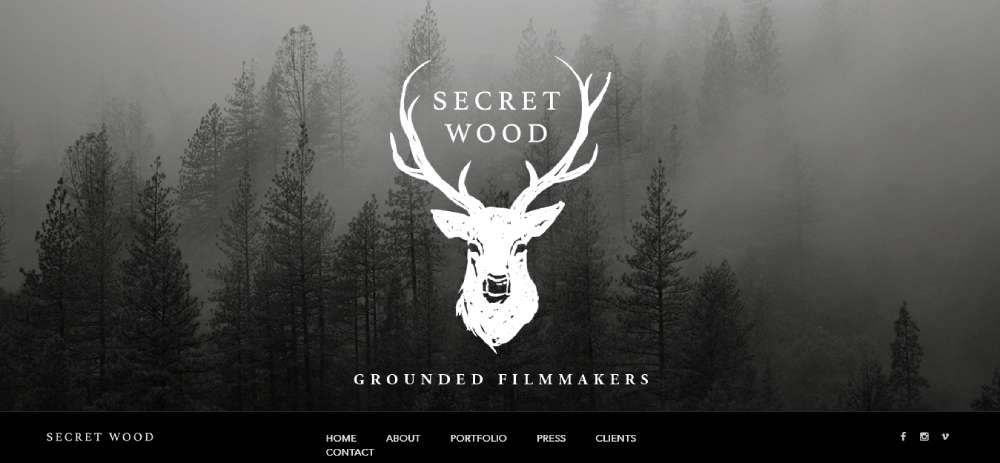
Secret Wood
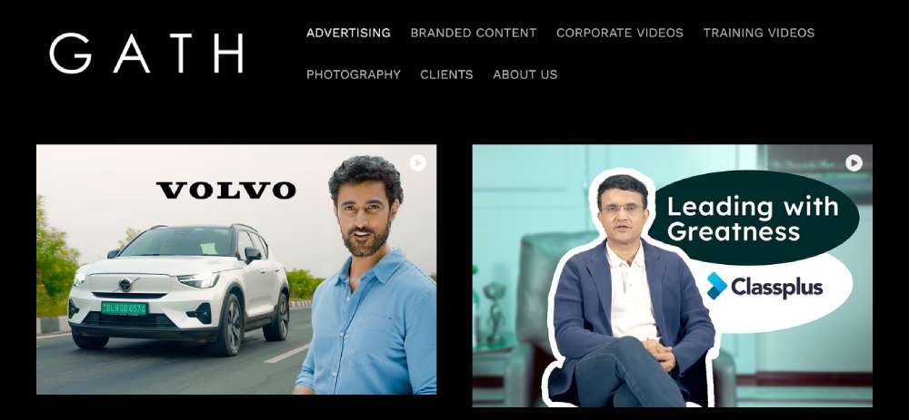
Gath Productions
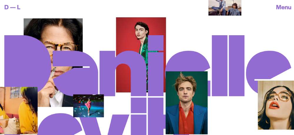
Danielle Levitt
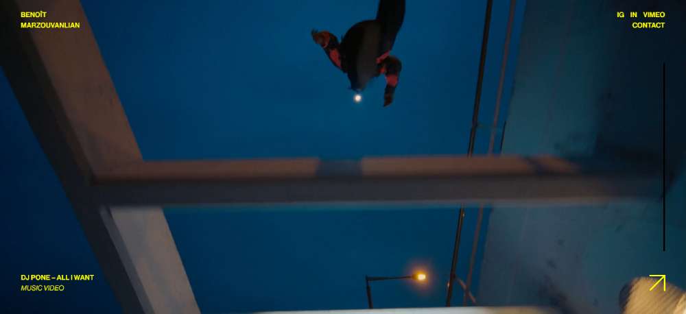
Benoît Marzouvanlian
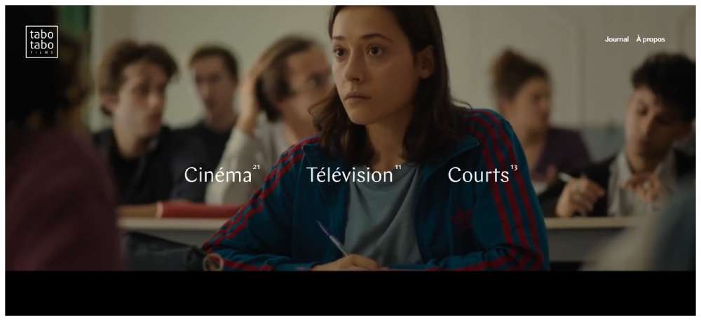
Tabo Tabo Films
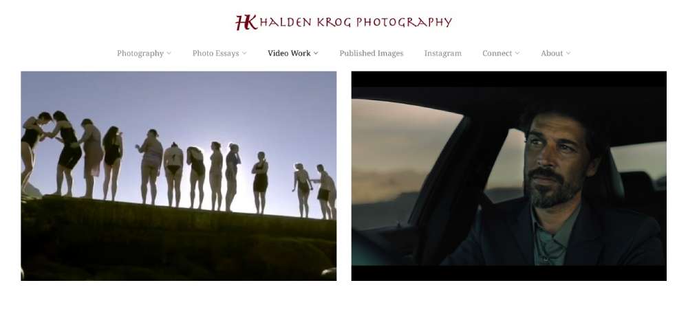
Halden
Edoardo Smerilli
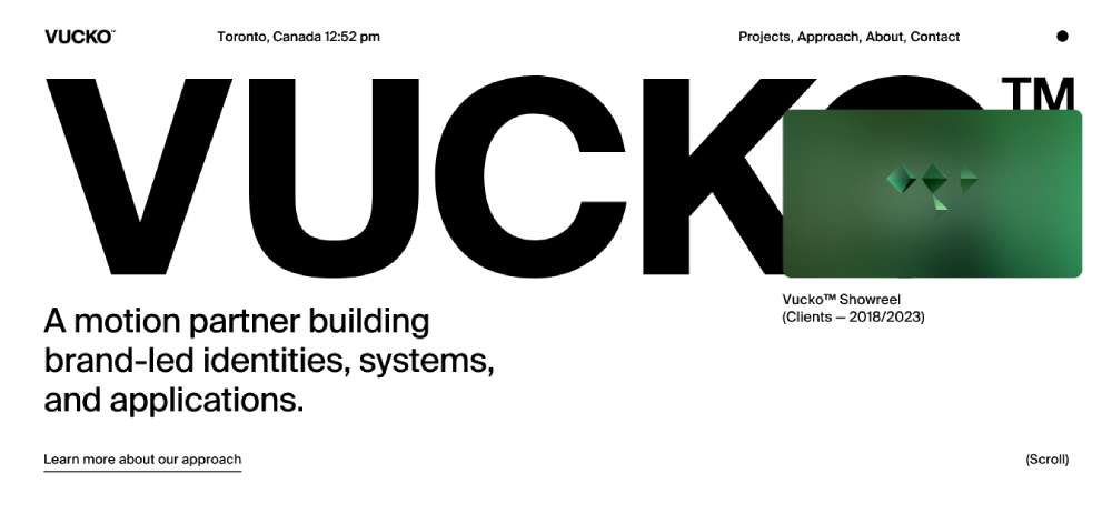
Vucko
Rafa G. Arroyo
Le plus beau livre du monde

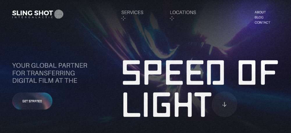
SLING SHOT INTERGALACTIC
What Makes a Filmmaker Website Design Effective
Effective filmmaker website design is measured by one outcome: does the reel get seen, and does the visitor make contact? Every design decision either helps or hurts those two outcomes.
Bounce probability increases 32% as page load time moves from 1 to 3 seconds (Google benchmarking data). On a filmmaker site where the reel is the main event, a video embed that takes 4 or 5 seconds to initialize is a serious problem.
Video Performance and Hosting Decisions
Vimeo Pro is the standard for professional film portfolios. It removes ads, hides related video suggestions, and gives full control over the embedded player's appearance. YouTube embeds introduce competing content and branding that take attention away from the filmmaker's work.
Vimeo has 260 million global users and has built its platform specifically around the needs of filmmakers, artists, and media professionals. The ad-free environment and privacy controls (including password-protected links for festival submissions) make it the practical choice for a director's primary reel.
Beyond hosting choice, the poster frame matters. The still shown before the reel plays is the first visual frame the visitor actually sees. A low-contrast or blurry poster frame creates a weak first impression before the video even starts.
| Platform | Ads | Privacy controls | Best for |
|---|---|---|---|
| Vimeo Pro | None | Password protection, domain-level privacy | Professional film portfolios, festival reels |
| YouTube | Yes | Private or unlisted only | Public reach, filmmaker-as-content-creator |
Navigation and Page Architecture for Film Portfolios
Navigation on a filmmaker site should be minimal. 3 to 5 items maximum. Every additional menu item is a decision point that pulls attention from the reel.
Single-page layouts work for solo directors with a focused body of work. Multi-page layouts make more sense for production companies with large project archives or directors who work across multiple genres and need separate reel sections.
The contact path needs to be reachable in 1 click from any page. Producers and agency creatives move fast. If they have to hunt for a contact link, they leave.
Filmmaker sites that I'd describe as broken almost always have the same problem: 10-item navigation bars, a homepage intro paragraph before the reel, and a contact page buried 3 clicks deep. Simple fixes, but they require deciding what the site is actually for.
What Platform Do Filmmakers Use to Build Their Websites
Platform choice affects performance, embed behavior, and the ceiling on visual customization. Most filmmakers are not developers, and the platform decision shapes everything from how the reel loads to how project pages are organized.
Squarespace
Squarespace is the most common choice among independent filmmakers. Native Vimeo integration works cleanly, and templates like Bedford and Palermo are designed with video-heavy layouts in mind.
Best for: solo directors and cinematographers who want a professional result without custom code. Setup time is low. Performance on video-heavy pages is reliable. The trade-off is limited layout flexibility compared to Webflow or Cargo.
Cargo Collective
Cargo is popular among art-house directors and festival filmmakers. The platform gives designers more structural freedom than Squarespace and has a reputation in the film and art communities specifically.
Joel Santos, documentary filmmaker and travel photographer, uses Cargo. The aesthetic tends toward the editorial. Less drag-and-drop convenience, more direct control over grid layouts and typographic choices.
Webflow
Webflow is the choice for production companies and filmmakers who need custom interactions, CMS-managed project archives, and scroll-based animations. Jennie Butler's documentary portfolio uses a clean grid layout that would require Webflow-level control to replicate properly.
Best for: production companies with development resources or filmmakers willing to invest time learning the platform. Higher ceiling, higher learning curve.
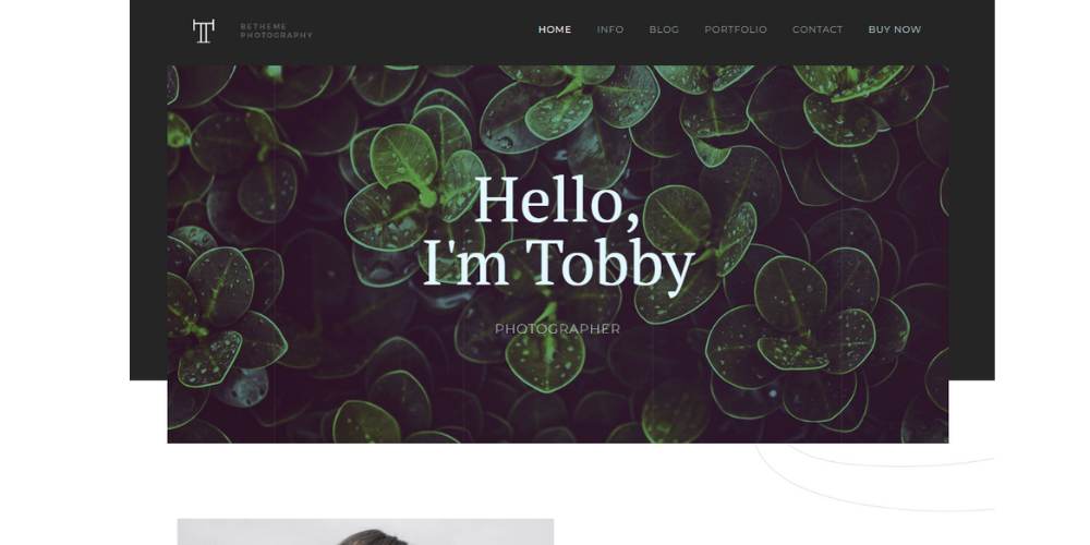
WordPress and Wix
WordPress with BeTheme or custom themes appears among production companies with existing development infrastructure. Wix is an entry-level option but struggles on video-heavy pages where load performance matters most.
For filmmakers considering WordPress, comparing options like videographer WordPress themes is a reasonable starting point before committing to a custom build.
Wix is fine for a first site. It starts to feel limiting the moment a filmmaker tries to do anything with layout that isn't in a preset template.
What Design Mistakes Appear Most Often on Filmmaker Websites
The most common mistakes on filmmaker portfolio sites are not design problems. They're priority problems. They happen when the homepage tries to do too much before letting the reel speak.
53% of mobile visitors leave if a page takes longer than 3 seconds to load (Google). On a filmmaker site where the video embed is the main element, a misconfigured player or unoptimized poster frame is enough to push that number higher.
Reel and Video Errors
Auto-playing video with audio on load is blocked by most browsers and frustrates users on mobile. Chrome, Safari, and Firefox all restrict autoplay with audio as a default setting. A reel set to auto-play with audio either silently fails or fires an error that breaks the first impression.
Other common video mistakes:
- Burying the reel below a text-heavy intro or a large static hero image
- Using a low-resolution poster frame that loads blurry before the video initializes
- Embedding YouTube instead of Vimeo, which introduces competing video suggestions and ads in the player
Navigation and Contact Errors
Navigation with more than 6 to 8 items is a sign the filmmaker hasn't decided what the site is for. Every extra menu item dilutes the portfolio. Most filmmaker sites need 4 links: Work, About, Reel, Contact.
Missing or buried contact information is the most costly mistake for commercial filmmakers. A producer ready to hire moves to the next option if the email address takes more than 2 clicks to find. This happens more than it should.
Sites with these problems are a good reminder that websites with bad design don't fail because they're ugly. They fail because the structure doesn't serve the visitor's actual goal.
How Should a Filmmaker Structure the Homepage
The filmmaker homepage has one job: get the producer or client to the reel, and then to the contact page. Every section should serve that sequence, nothing else.
Users take 0.05 seconds to form an opinion about a website (Lindgaard et al., Behaviour and Information Technology). The first viewport of a filmmaker's homepage is doing real credibility work before the reel plays.
Above-the-Fold Reel vs. Static Hero Image
Full-width reel above the fold is the standard for director and cinematographer sites. The reel is the strongest argument for hiring the filmmaker. Leading with it reduces the time between landing on the site and forming a positive impression of the work.
Static hero images work for filmmakers whose visual photography is strong enough to carry that first moment. Alexandros Maragos uses fullscreen stills on his homepage. The stills are good enough that they function as a statement of visual capability before the reel loads.
What should always appear above the fold:
- Filmmaker's name and discipline (director, DP, editor, production company)
- Primary reel or a curated selection of clips
- Navigation with a visible path to Work and Contact
Avoid: large intro text blocks, a lengthy bio, or an "about" section that appears before the reel. That content belongs further down the page or on a separate about page. Hero section design choices on film portfolios should prioritize the work, not the words.
Project Grid Layout Options
Below the reel, a grid of 3 to 6 selected projects is the standard homepage structure. More than 6 projects on the homepage suggests the filmmaker hasn't curated the work. Producers don't have time to scroll through 20 thumbnails.
| Layout type | Best for | Risk |
|---|---|---|
| Uniform thumbnail grid | Production companies with varied project types | Can feel generic without strong image selection |
| Asymmetric featured layout | Directors with 1-2 flagship projects to highlight | Requires strong hero project thumbnail |
| Full-width stacked projects | Cinematographers with high-quality stills | Slower scroll, can bury lower projects |
Below the project grid: a short bio (2 to 3 sentences), client logos if available, and a footer with contact email, social links, and representation info. Keep the footer lean. The footer is not a second navigation menu.
How Do Filmmakers Present Their Reel on a Website
The showreel is the centerpiece of every filmmaker portfolio website. How it's hosted, how it's triggered, and how long it runs all affect whether a producer actually watches it.
Vimeo's platform specifically serves the filmmaker and creative professional community, with privacy controls and an ad-free embed experience that YouTube cannot match for portfolio use. Password-protected Vimeo links serve a different function: festival submissions and client-confidential reels that shouldn't be publicly indexed.
Reel Length and Format Standards
Industry standard for a general filmmaker reel is 60 to 90 seconds. Longer reels lose producer attention. The goal is to demonstrate range and quality, not duration.
Reel format decisions:
- General reel: 60-90 seconds, shows breadth across genres or disciplines
- Genre-specific reels: separate cuts for commercial, narrative, documentary work
- Password-protected reels: for unreleased work, festival submissions, or client-confidential projects
Editors often use a breakdown reel that shows before-and-after cuts or pacing choices across different genres. That format communicates craft in a way a general cut cannot.
Auto-Play vs. Click-to-Play
Click-to-play is safer on both desktop and mobile. Auto-play without audio is technically possible on most browsers, but the behavior varies across Chrome, Safari, and Firefox. A click-to-play reel with a strong poster frame and a clear play button is more reliable and puts the viewer in control.
The poster frame is underestimated. It's the static image that sits on the player before the video plays. It's the first visual frame a visitor actually sees in detail. A strong, high-contrast, well-composed still from the reel is worth spending time on.
For filmmaker sites where reel presentation is the core design challenge, looking at how websites with video backgrounds handle full-screen video without performance loss is useful reference material. The technical approach for background video and hero reels overlaps significantly.
Some filmmakers keep a public reel for general visitors and maintain a separate, longer cut that's only available to producers who request it directly. That's a reasonable approach for directors with enough work to justify a longer presentation.
What Typography and Color Choices Work for Filmmaker Websites
Typography and color on a filmmaker portfolio site have one job: stay out of the way of the video.
That sounds simple. It's not. Most filmmaker sites either go too neutral and feel lifeless, or add too much typographic personality and compete with the reel. The right balance is a restrained palette with one or two deliberate choices that communicate the filmmaker's brand without demanding attention.
Color Palette Decisions for Film Portfolios
In a 2024 study published in the journal Ergonomics, more than 50% of respondents preferred dark mode or found it equally comfortable to light mode. For filmmaker sites, dark backgrounds do more than follow a trend: they replicate cinema viewing conditions and reduce visual competition with video content.
Common color patterns across effective filmmaker portfolios:
- Near-black or pure black backgrounds, used by the majority of top-reviewed director and cinematographer sites
- White or off-white text for maximum contrast against dark backgrounds
- Single accent color for hover states and CTA buttons only (red, amber, or electric blue appear most often)
- Monochrome or 2-color palettes that keep visual focus on project thumbnails and video
Johnny Harris's site breaks this pattern deliberately. It uses beige tones, collage frames, and a travel-journal aesthetic that matches his content style as a journalist-filmmaker. The color palette is a brand signal, not just a background choice.
Typography for Filmmaker Website Design
Sans-serif fonts dominate filmmaker portfolio sites. They're clean, screen-optimized, and don't compete with visual content. Neue Haas Grotesk, Founders Grotesk, and GT America appear repeatedly across well-designed director sites, all wide-set grotesque typefaces that feel cinematic without being decorative.
Font size minimum: 16px for body text, with line spacing at 1.5x the font size (Webflow, 2024). Smaller text on dark backgrounds creates legibility problems that hurt time on page.
Serif typefaces appear occasionally on editorial-style filmmaker sites, particularly documentary filmmakers whose work has a literary sensibility. Aaron Egbert Allsop uses bold serif-adjacent typography to signal his writer-director background. But it's the exception, not the rule.
Practically speaking: 2 typefaces maximum. One for display text (name, headings), one for body text (bio, project descriptions). More than 2 starts creating visual noise that pulls attention away from the portfolio work. Typography in web design decisions on filmmaker sites should always serve the work, not announce the designer.
| Typeface | Style | Best use on filmmaker sites |
|---|---|---|
| Neue Haas Grotesk | Neo-grotesque sans-serif | Name, title, and navigation on commercial director sites |
| Founders Grotesk | Geometric sans-serif | Display headings on production company sites |
| GT America | Grotesque sans-serif | Versatile; works across director and cinematographer portfolios |
| Inter | Neo-grotesque sans-serif | Body text, project descriptions, accessible across devices |
How Do Filmmaker Websites Handle Project Detail Pages
Project detail pages are where hiring decisions happen. A producer lands on the homepage, watches the reel, and then clicks a project thumbnail to go deeper. That project page is where they decide whether to reach out.
Minimal, content-first layouts increase viewing time by roughly 59% compared to cluttered designs (LoopEx Digital, 2026). On a project page, that means video at the top, credits and context below, and nothing competing with the work itself.
Standard Project Page Structure
Full-width video embed at the top. No exceptions. The project video should be the first element on the page, not below a title block or an intro paragraph.
Below the video: project title, director or DP credit, client or festival name, year, and a short description (3 to 5 sentences maximum). More copy than that shifts the page from portfolio to case study, which only matters for production companies pitching to agencies.
Cinematographer Christopher Mably's project pages follow this structure: video first, credits listed clearly, no extraneous text. Functional, fast, and gets out of the way of the work.
Behind-the-Scenes and Production Photography
Production stills and behind-the-scenes photography on project pages increase time-on-page. They give producers context for how the shoot was run and signal the filmmaker's professionalism on set.
This is particularly relevant for cinematographer portfolio websites, where clients are evaluating lighting choices and visual texture as much as the finished video. Still frames from the shoot show the technical work in a way the reel cannot.
What to include on project detail pages beyond the video:
- Awards and festival selections (Sundance, SXSW, Cannes selections carry weight for independent directors)
- Behind-the-scenes stills: 4 to 8 images, not a full gallery
- Related projects section at the bottom to keep producers browsing
- Password protection for unreleased or client-confidential work
One thing that's easy to overlook: the page title and meta description for each project page. These affect how the project appears in search results. A project page titled "Project 04" communicates nothing to a producer searching for a specific type of director. Descriptive titles like "30-second automotive commercial, dir. [name]" do better work.
What Contact and Booking Information a Filmmaker Website Needs
Contact pages on filmmaker sites are often the most neglected part of the design. Technically correct but practically useless. A contact page that buries the email behind a 6-field form, or doesn't list representation separately from general inquiries, wastes the goodwill built by a strong reel.
Less than 38% of contact forms are completed after a visitor starts filling them out (Zuko Analytics). For filmmaker sites where the primary inquiry comes from producers and agency creatives, a direct email address performs better than a form because it removes friction and feels more professional.
Direct Email vs. Contact Form
Direct email address is the standard for solo filmmaker and director portfolio sites. Production inquiry feels less transactional when it goes to a real address rather than a generic form handler.
Contact form makes sense when:
- The filmmaker receives high inquiry volume and needs routing (production inquiry vs. press vs. general)
- The site belongs to a production company with multiple departments
- Spam protection is needed without sacrificing professionalism
If a form is used, keep it to 3 fields maximum: name, email, and message. Every additional field reduces the completion rate.
Representation and Agency Information
For directors with agent or management representation, the agency contact needs to be clearly separate from personal contact. Commercial producers book through representation. Listing both on the same contact page, clearly labeled, is the professional standard.
Creative Artists Agency (CAA) and WME both have specific protocols for how their clients' contact information appears online. Filmmakers represented by major agencies typically list "For commercial inquiries, contact [agent name] at [agency]" with a direct email or phone, and keep personal contact for press and collaboration.
Social media links belong in the footer, not on the contact page or in primary navigation. Sending a producer to Instagram or LinkedIn from the contact page takes them off-site before they've reached out. A clean website footer with social links, copyright info, and a contact email covers this without creating a distraction.
How Mobile Design Affects Filmmaker Website Performance
Mobile traffic now accounts for approximately 62% of global website traffic (Statista, Q4 2024). Filmmaker sites are no exception. A portfolio site that looks great on a 27-inch desktop monitor and breaks on an iPhone is losing a significant portion of potential visitors.
Responsive design results in an 11% higher conversion rate compared to non-responsive sites (Insivia). For filmmaker portfolios, that conversion is a contact inquiry or a reel watch. Both matter.
Video Embed Behavior on Mobile
Vimeo and YouTube iframes need responsive wrappers to scale correctly on mobile. Without a proper aspect-ratio container (either the padding-bottom: 56.25% method or the CSS aspect-ratio property), embedded videos either overflow the screen or collapse to zero height on smaller devices.
Common mobile video embed failures:
- Fixed-width iframes that overflow the viewport on phones
- Auto-playing reels with audio that mobile browsers block silently
- Poster frames over 200kb that cause slow LCP scores on mobile connections
The Largest Contentful Paint (LCP) threshold for a good user experience is under 2.5 seconds (Google Core Web Vitals). An unoptimized poster frame on a Vimeo embed is one of the most common reasons filmmaker sites fail this threshold on mobile.
Touch Navigation and Layout on Smaller Screens
Hamburger menus perform better than exposed horizontal navigation on mobile filmmaker sites. A 4-item nav collapses cleanly into a hamburger. An 8-item nav becomes unusable on a 375px screen.
Touch targets (buttons, links, thumbnails) need to be at least 44x44px to be reliably tappable. Project thumbnails that are too small on mobile create frustration before a producer has even reached the project page.
For reference: responsive website design principles apply to filmmaker sites just as they do to any other content-heavy portfolio. The difference is that video-heavy pages need additional attention to how embeds behave across screen sizes, not just how text and images reflow.
68% of mobile users are more likely to stay engaged on mobile-responsive websites (Elephant in the Boardroom). For a filmmaker whose reel is the entire pitch, keeping that mobile visitor engaged long enough to watch 90 seconds of video is the whole game.
How Filmmaker Websites Differ by Discipline
A director's portfolio and a cinematographer's portfolio serve different audiences and communicate different things. Building both the same way is a common mistake. The discipline shapes the content hierarchy, the visual emphasis, and what a producer is actually looking for when they land on the site.
Director and Documentary Filmmaker Sites
Director sites lead with the reel and follow with a creative vision statement or director's note. Commercial directors also include client logos and a list of brands they've worked with. Documentary filmmakers prioritize festival credits: Sundance, SXSW, Cannes, and Tribeca selections carry more weight than client names for this discipline.
Jennie Butler's documentary site uses a clean project grid with red accents and minimal navigation. The design gets out of the way of the work. Joel Santos, documentary filmmaker and travel photographer, presents his site as a blend of film portfolio and photojournalism portfolio, because that dual discipline is part of his professional identity.
Cinematographer Portfolio Websites
\\Production stills are load-bearing content on DP sites.\\ The reel matters, but a cinematographer's clients are evaluating lighting choices, lens selection, and visual texture. High-resolution stills from actual productions make that case in a way motion cannot always capture.
Technical credits also matter on DP sites in a way they don't on director sites. Camera package information, ASC membership (American Society of Cinematographers), and specific format credits (35mm, IMAX, anamorphic) communicate professional standing to producers and directors hiring a DP.
Christopher Mably, a CSC member cinematographer, lists his technical credits clearly on project pages. Matias, an award-winning cinematographer featured on Fabrik, uses a thumbnails homepage and stacked project layout that puts visual stills front and center before the reel.
Editor and Motion Designer Sites
Editor portfolio websites use a breakdown reel that shows pacing and rhythm across different genres. A general reel doesn't communicate an editor's craft the way a genre-specific cut does. Comedy timing is different from documentary pacing, which is different from commercial rhythm. Separate reels by genre make the case more directly.
Motion designer sites blend film portfolio and design portfolio logic. Scroll-based animations, interactive elements, and higher use of visual effects in the site itself are acceptable on motion designer portfolios in a way they aren't on director or DP sites. The site can be a demonstration of the work.
| Discipline | Primary content | Key credibility signals |
|---|---|---|
| Director | General reel, project archive, vision statement | Brand clients, festival selections, director's note |
| Cinematographer (DP) | Reel + production stills, technical credits | ASC/CSC membership, camera format credits |
| Editor | Genre breakdown reels, before/after cuts | Named productions, pacing variety across genres |
| Motion designer | Mixed reel and design work, interactive site elements | Brand clients, VFX credits, software proficiency |
| Production company | Client list, team pages, capabilities overview | Named brands, awards, downloadable capabilities deck |
Production company websites carry the most content of any filmmaker site type. Team pages, client rosters, award listings, and sometimes a downloadable capabilities deck for agency pitches. The design challenge is keeping that content weight from slowing the site or burying the work. Red Creative Films handles this with dark backgrounds, bold white typography, and dynamic video sections that keep the site feeling cinematic despite the volume of content.
For filmmakers comparing their sites to other creative professionals, it's worth seeing how adjacent disciplines handle similar portfolio challenges. Graphic designer portfolio websites and photographer website designs solve many of the same content hierarchy problems: how to present visual work, how to structure project pages, and how to get a potential client from the portfolio to a contact inquiry without losing them along the way.
The same logic applies across creative industries. Artist website templates and music website templates share the filmmaker portfolio's core challenge: leading with the work, not the words, and making the contact path frictionless.
FAQ on Filmmaker Website Design
What should a filmmaker website include?
A filmmaker website needs a showreel, project archive, short bio, and a direct contact path.
Optional additions: press kit, client logos, and representation info. Keep it focused. Every extra page dilutes the portfolio.
Which platform is best for a filmmaker portfolio website?
Squarespace works for most independent directors and cinematographers. Cargo suits art-house filmmakers wanting more layout control.
Webflow is the choice for production companies needing CMS project archives and custom interactions.
Should a filmmaker use Vimeo or YouTube to host their reel?
Vimeo Pro is the industry standard for professional film portfolios. It removes ads, hides competing video suggestions, and offers password-protected links for festival submissions.
YouTube works for public reach, not portfolio presentation.
How long should a filmmaker's showreel be?
60 to 90 seconds is the industry standard for a general reel. Longer reels lose producer attention before the best work appears.
Editors benefit from separate genre breakdown reels that show pacing range across comedy, drama, and commercial work.
What color scheme works best for filmmaker websites?
Dark backgrounds (near-black or pure black) are used by the majority of top filmmaker and cinematographer portfolio sites.
They replicate cinema viewing conditions and reduce visual competition with video content. One accent color for hover states is enough.
What fonts do filmmaker websites typically use?
Wide-set grotesque sans-serifs dominate: Neue Haas Grotesk, Founders Grotesk, and GT America appear across the strongest director and DP sites.
Limit typefaces to 2 maximum. More than that creates visual noise that competes with the film portfolio content.
How should a filmmaker structure their homepage?
Reel above the fold, always. Below that: a grid of 3 to 6 selected projects, a 2-sentence bio, and a footer with contact email.
No intro paragraphs before the reel. No navigation with more than 5 items.
Do filmmaker websites need to be mobile-friendly?
Yes. Mobile devices account for approximately 62% of global web traffic (Statista, Q4 2024).
Vimeo iframes need responsive wrappers to scale correctly. Unoptimized poster frames are the most common reason filmmaker sites fail Core Web Vitals on mobile.
How do filmmaker websites differ by discipline?
Director sites lead with a creative reel and vision statement. Cinematographer portfolios add production stills and technical credits. Editor sites use genre breakdown reels.
Production company sites carry team pages, client lists, and capabilities overviews that solo filmmaker sites don't need.
What contact information should a filmmaker website display?
A direct email address outperforms contact forms for production inquiries. Keep it visible in one click from any page.
Directors with representation should list agent contact separately from personal email. Social links belong in the footer only, not primary navigation.
Conclusion
This conclusion is for an article presenting filmmaker website design examples across every major discipline: directors, cinematographers, editors, and production companies.
The pattern across every strong example is the same. Video first. Restrained navigation. A frictionless path to contact.
Platform choice matters less than structure. Whether you build on Cargo, Squarespace, or Webflow, a showreel page that loads fast and a project archive that gets out of the way of the work will outperform a technically impressive site with weak hierarchy.
Dark color palettes, grotesque typefaces, and Vimeo Pro embeds are defaults for good reason. They work.
Audit your own film portfolio against these examples. Fix the contact path. Cut the navigation. Put the reel first.


