Simple Website Design Examples for Modern Businesses
January 4, 2026
Cool Ice Cream Website Design Examples to Inspire You
January 5, 2026Looking for a therapist online used to mean scrolling through directories and squinting at outdated headshots. Now? The website itself does half the work before the first session even happens.
A well-built therapy site answers questions, sets expectations, and makes booking feel less like a commitment and more like a natural next step.
But not all therapist websites get it right.
Some nail the trust-building part but bury the booking button three pages deep. Others look polished but feel sterile. The best ones balance warmth with clarity and make HIPAA compliance invisible to the visitor.
What Is a Therapist Website Design
A therapist website design is the visual layout, page structure, and user interface of a website built for licensed mental health professionals. It covers everything from the homepage and therapist bio page to the online booking system and secure client portal.
Unlike generic business sites, a therapy practice website has to do two things at once. It needs to feel warm and approachable while meeting strict compliance standards like HIPAA and ADA.
The design includes color palettes (usually soft blues, greens, earth tones), calming imagery, clear service page structures, and scheduling integrations with tools like SimplePractice or Jane App.
Most therapist sites are built on Squarespace, WordPress, or Wix. Some practices use therapy-specific platforms like Brighter Vision or TherapySites.
A well-built counselor website makes it easy for potential clients to understand what the therapist specializes in, check credentials, and book a session within a few clicks.
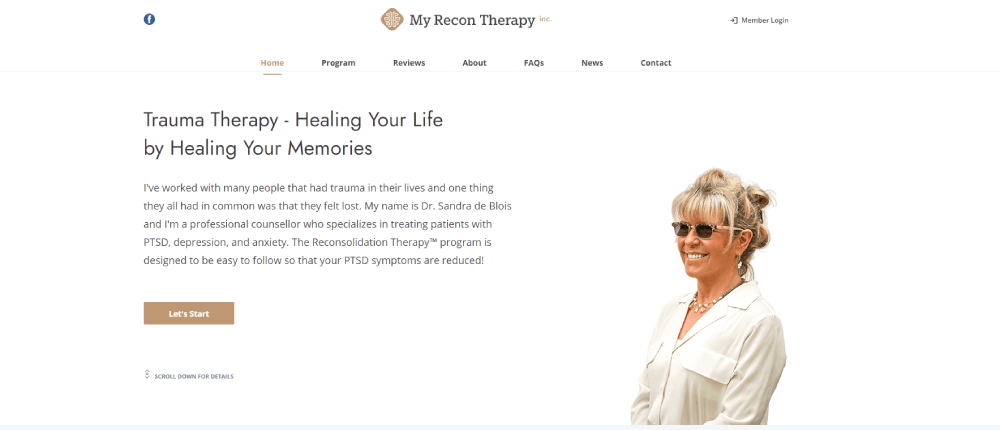
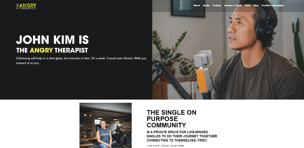
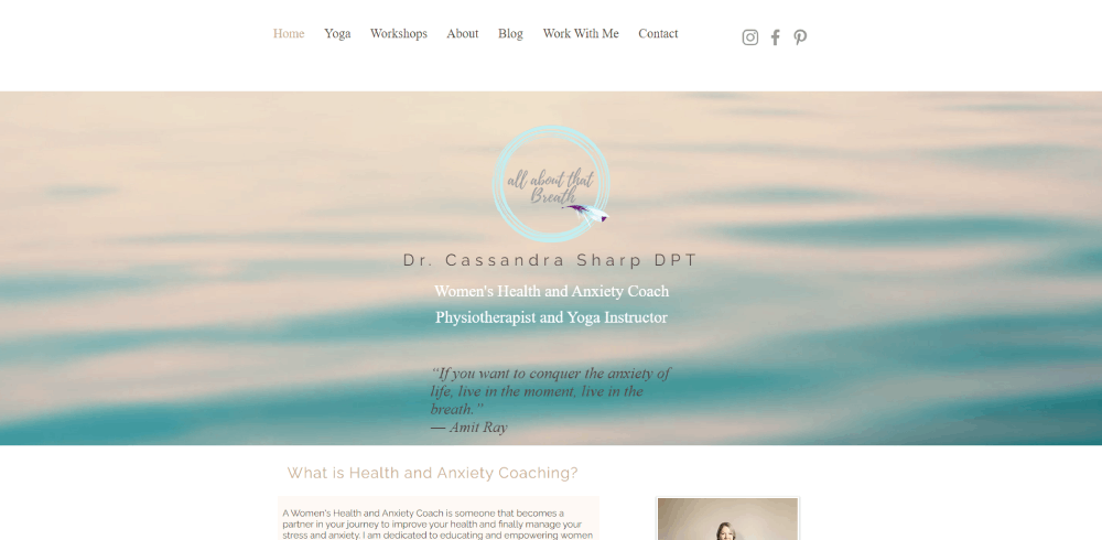
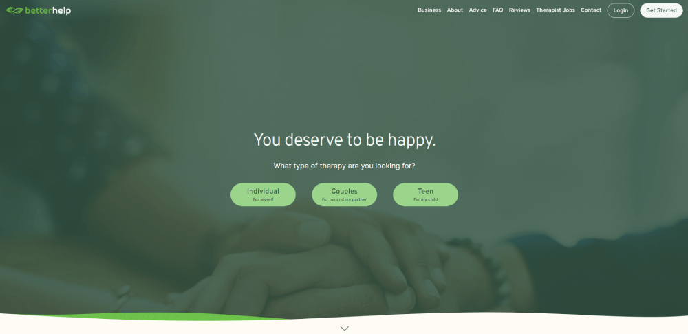
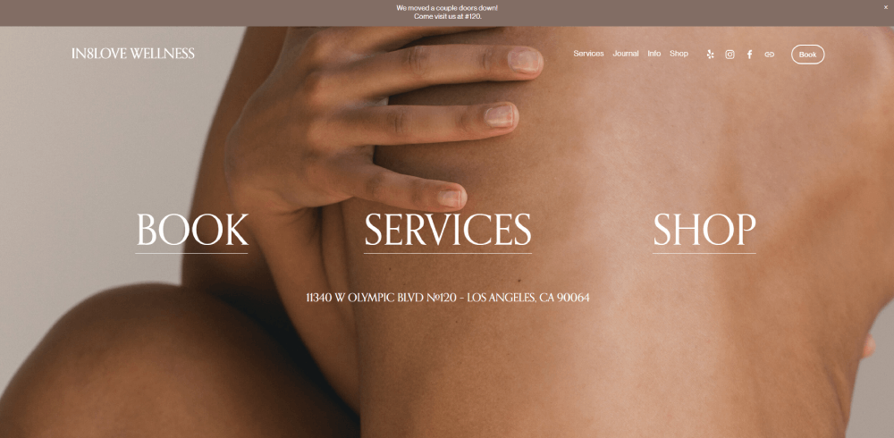
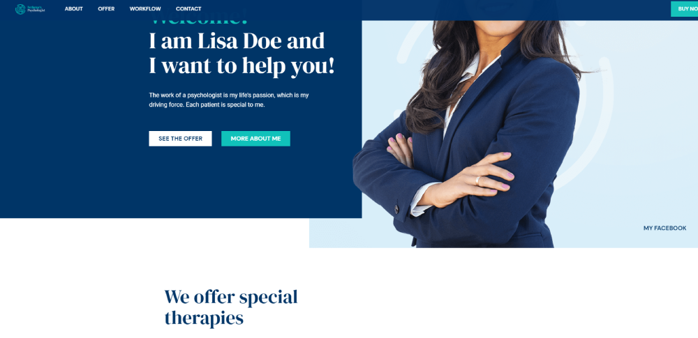
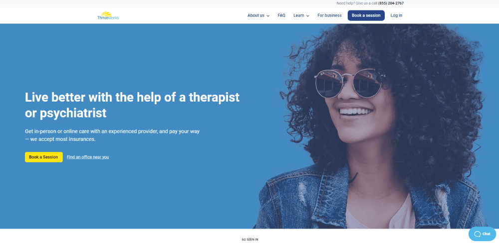
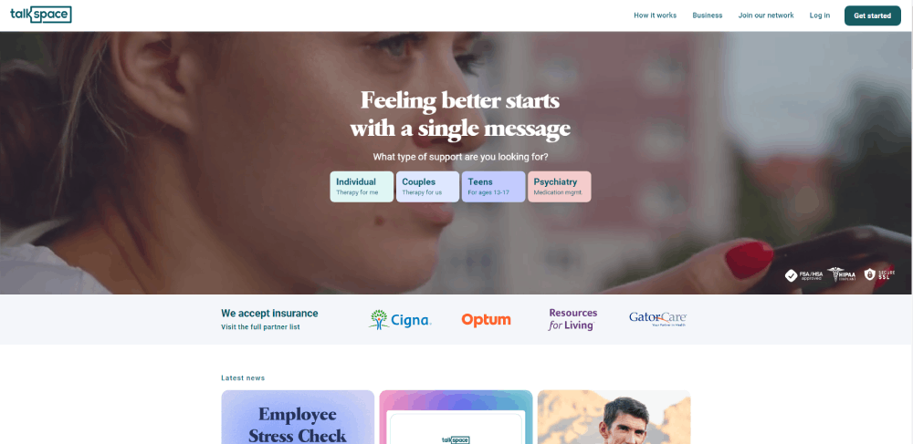
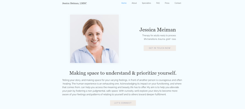
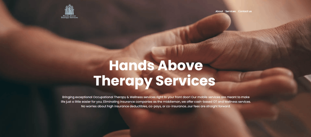
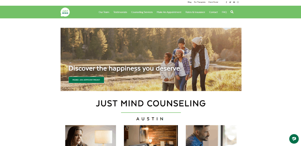
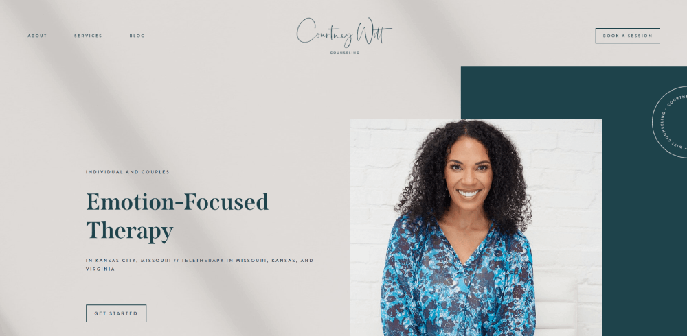
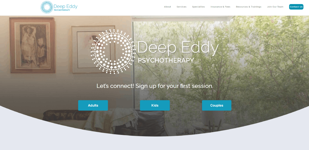
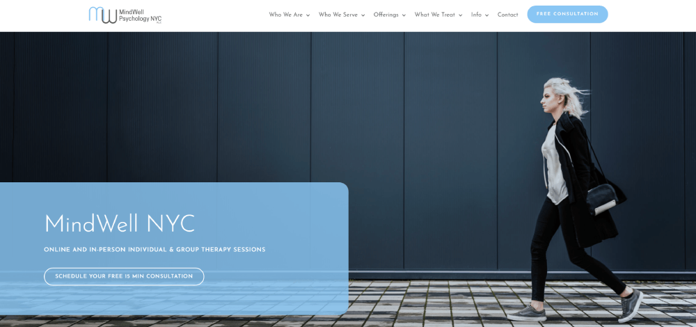
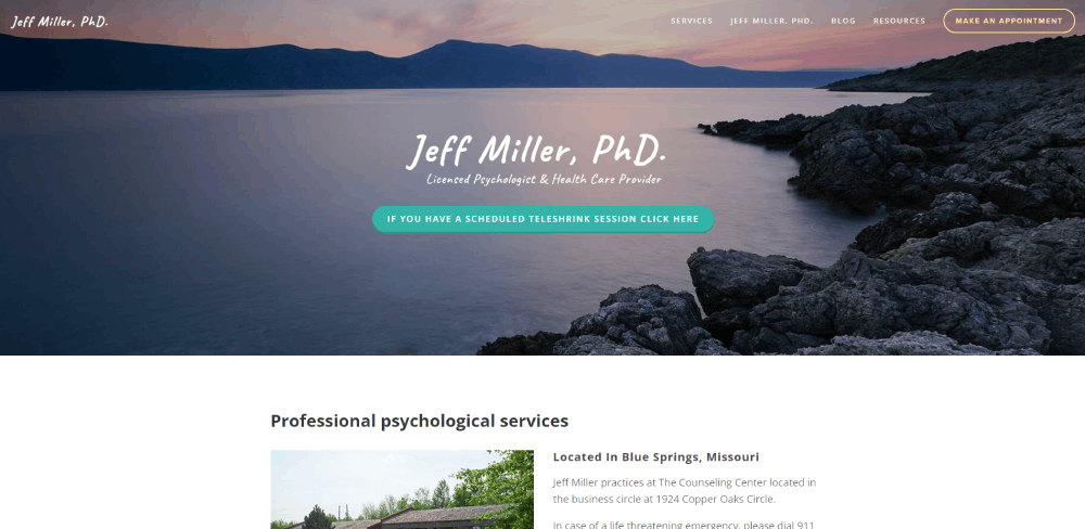
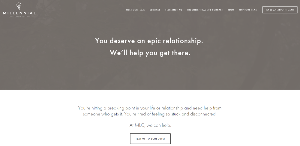
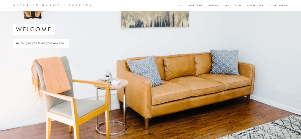
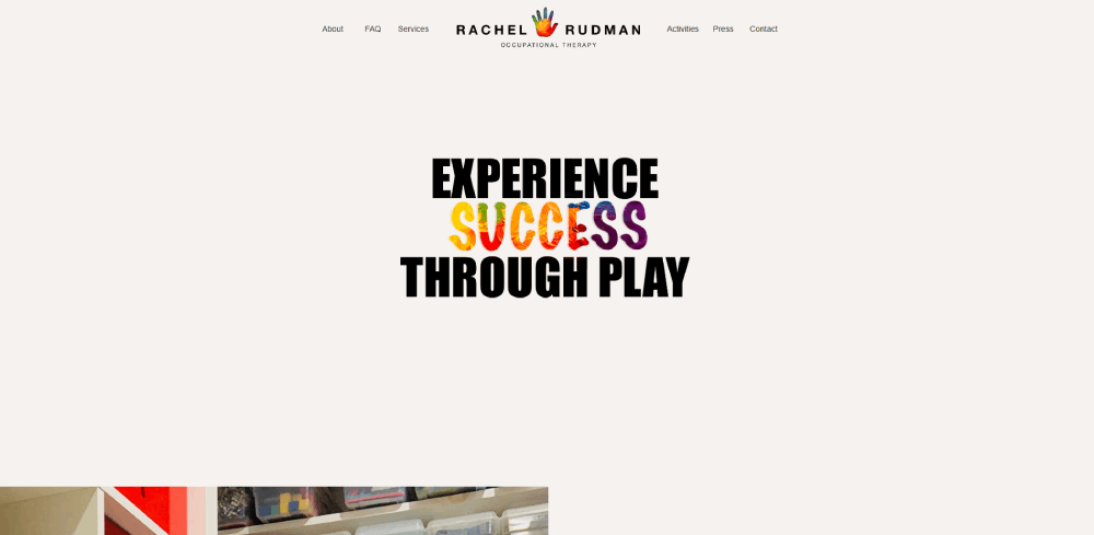
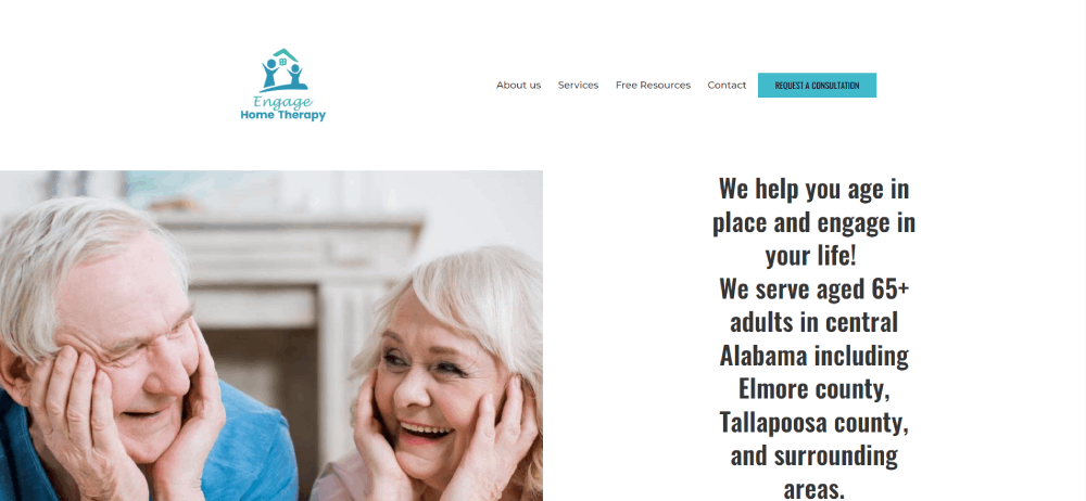
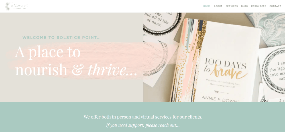
Therapy website design examples
My Recon Therapy
How Does a Therapist Website Differ from Other Healthcare Websites
A therapist website prioritizes emotional safety and trust-building over clinical authority. Hospital sites and healthcare websites lead with services, departments, and insurance networks. Therapy sites lead with the therapist as a person.
The biggest difference is tone. A psychologist website or counseling site uses first-person language, soft visuals, and personal storytelling on the about page. Doctor websites and clinical portals typically use third-person, institutional language.
Here's where they split apart:
- Trust signals - therapist sites show headshots, personal bios, and therapeutic approach descriptions; hospital sites show certifications, awards, and department listings
- Booking flow - therapy sites use tools like Acuity Scheduling or Calendly for direct session booking; medical sites route through intake departments
- Privacy weight - both follow HIPAA, but therapist sites carry extra sensitivity around mental health stigma, so contact forms and client portals need additional discretion in their design
- Visual identity - therapy sites lean into calm color palettes, generous white space, and minimalistic design patterns; clinical healthcare sites lean toward clean, sterile layouts with brand-heavy headers
Telehealth integration also looks different. A therapist embeds Doxy.me or Zoom for Healthcare directly into a virtual sessions page. Medical practices typically handle telehealth through patient portals managed by larger EHR systems.
Therapist websites also tend to list specific modalities like CBT, EMDR, and DBT on dedicated service pages. General healthcare sites don't break down treatment methods at that level.
What Criteria Define a Well-Designed Therapist Website
A well-designed therapist website meets six criteria: it builds immediate trust, uses simple navigation, reflects a calming visual identity, offers smooth online booking, communicates services clearly, and stays HIPAA-compliant.
These are the benchmarks used to evaluate every example in this article.
Does the Homepage Build Immediate Trust
A therapy homepage has roughly 3-5 seconds to establish credibility. The therapist's photo, credentials (LCSW, LPC, LMFT), and a clear specialization statement belong above the fold.
Testimonials placed near the hero section or just below it reinforce trust before a visitor scrolls. Licensing information and links to a Psychology Today profile or a professional organization like the APA or NASW add another layer.
Is the Navigation Simple and Client-Focused
Three clicks to book a session. That's the benchmark for good website navigation on a therapist site.
The website menu should include five to seven items max: Home, About, Services, Contact, Book Now, and maybe a Resources or Blog page. Anything beyond that creates friction, especially on mobile where over 60% of therapy site visits happen.
WCAG 2.1 accessibility compliance matters here too. Readable font sizes, proper contrast ratios, and keyboard-navigable menus are baseline requirements for an accessible website.
Does the Design Reflect a Calming Visual Identity
Color psychology plays a direct role in therapist website design. Blues signal trust. Greens signal growth. Earth tones signal grounding. Most top therapy sites pull from a calm color palette built around these families.
The typography leans toward clean sans-serif fonts or soft serif fonts at comfortable sizes. Heavy display fonts and decorative typefaces show up less in this space.
Original photography outperforms stock images on therapist sites almost every time. A real photo of the therapist's office or workspace builds more connection than a generic stock photo of clasped hands. Generous white space between sections keeps the layout from feeling cluttered or overwhelming.
How Effective Is the Online Booking System
The booking system is the conversion point of a therapist website. Most practices integrate SimplePractice, Jane App, Acuity Scheduling, or Calendly directly into a "Book Now" page or a sticky call to action button in the header.
The best setups take two to three steps: select a service, pick a time, fill out a brief HIPAA-compliant intake form. Longer flows lose people.
Some practices add insurance verification as part of the booking process. Others handle it separately through a dedicated "Insurance and Fees" page. Either approach works, but the fewer form fields upfront, the higher the completion rate. Good form design keeps fields minimal and labels clear.
Does the Website Communicate Services and Specializations Clearly
Every therapy modality the practice offers (CBT, EMDR, DBT, psychodynamic therapy, somatic experiencing) should have its own section or dedicated page. Bundling everything into one "Services" page with short bullet points is a common mistake.
Separate pages for each specialization perform better because they match how people actually search. Someone looking for "EMDR therapist near me" lands on a focused page, not a wall of text listing 12 different approaches.
The populations served matter too. Dedicated sections for couples counseling, child therapy, veteran support, or LGBTQ+ affirming care help visitors self-identify quickly. This is where a therapist site starts to function less like a brochure and more like a user friendly website that actually answers the visitor's question before they ask it.
Is the Website HIPAA-Compliant and Secure
An SSL certificate is the bare minimum. Every therapist website needs HTTPS encryption across all pages, not just the contact form.
HIPAA-compliant contact forms require a Business Associate Agreement (BAA) with the form provider. Standard WordPress contact form plugins or basic Squarespace forms don't meet this standard on their own. Tools like Hushmail, SimplePractice's built-in forms, or HIPAA-compliant Jotform plans handle this correctly.
Secure client portals for document sharing, session notes, and billing add another layer of compliance. Telehealth pages should link to HIPAA-compliant video platforms like Doxy.me, VSee, or Zoom for Healthcare, not regular Zoom or Google Meet.
The privacy policy page needs to be visible from every page, typically in the footer. It should spell out how client data is collected, stored, and protected.
How Do the Best Therapist Websites Compare
Looking at all 10 examples side by side, patterns start to show up. But so do some real differences in approach, platform choice, and how each practice handles booking.
Here's the breakdown:
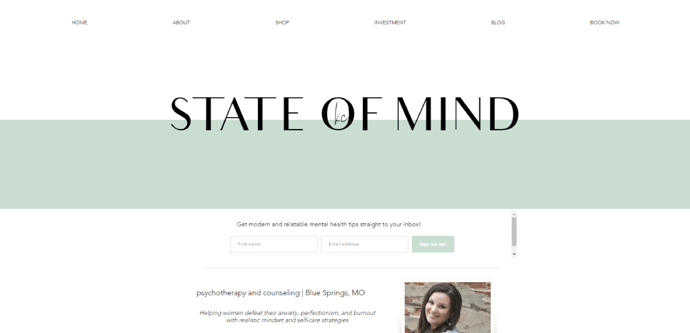
- Platform split: Squarespace leads among solo practitioners (Cindy Shu, State of Mind KC, Wholeness Collective). WordPress powers the group practices with heavier content needs (My LA Therapy). Custom builds appear on sites with strong personal brands (Minaa B, Rachel Rudman).
- Booking tools: Jane App (Ikigai Integrative), SimplePractice (Elite Psychological Services, Empower Family), and embedded Calendly or Acuity (the rest). Jane App users tend to have a smoother intake experience.
- Free consultation offers: Cindy Shu, Therapy with Gayane, and New Heights Counseling all lead with free 15-minute consultations. The others go straight to paid session booking. Free consults work better for practices targeting first-time therapy clients.
- Mobile performance: Wholeness Collective and Elite Psychological Services load fastest on mobile. Sites with heavy imagery and animations (Rachel Rudman, My LA Therapy) trade speed for visual impact.
- Content depth: My LA Therapy has the deepest content library with blog posts, podcast episodes, and condition-specific pages. Most solo
FAQ on The Best Therapist Website Design Examples
What makes a therapist website design effective?
An effective therapist website design builds trust through a professional headshot, visible credentials (LCSW, LPC, LMFT), calming color palette, clear service pages, and a booking system that takes two to three clicks. HIPAA-compliant forms and mobile responsiveness are baseline requirements.
Which platform is best for building a therapist website?
Squarespace is the most popular choice for solo practitioners due to its templates and drag-and-drop editor. WordPress offers more flexibility for group practices with active blogs. Therapy-specific platforms like Brighter Vision bundle HIPAA tools and hosting into one subscription.
How much does a therapist website cost?
A Squarespace or Wix site costs $16-$45 per month. Custom WordPress builds range from $2,000 to $10,000 depending on design complexity. Therapy-specific platforms like Brighter Vision or TherapySites charge $59-$99 monthly with hosting and HIPAA features included.
What pages should a therapist website include?
A complete therapy practice website includes a homepage, about page, individual service pages for each modality (CBT, EMDR, DBT), a telehealth page, contact page with HIPAA-compliant form, booking page, and a privacy policy in the footer.
How do therapist websites stay HIPAA-compliant?
HIPAA compliance requires SSL encryption, a Business Associate Agreement with form providers, secure client portals, and HIPAA-compliant video platforms like Doxy.me or VSee. Standard contact form plugins do not meet these requirements without third-party integrations.
What colors work best for a therapy website?
Soft blues, muted greens, earth tones, and warm neutrals perform best on therapist websites. These colors signal trust, calm, and safety. High-contrast accents on CTA buttons keep booking actions visible without disrupting the overall soothing visual identity.
Should a therapist website include a blog?
A blog helps with search visibility and demonstrates expertise on specific topics like anxiety management, relationship patterns, or grief processing. Group practices benefit most. Solo practitioners should prioritize strong service pages and an about page first.
What booking tools do therapists use on their websites?
SimplePractice, Jane App, Acuity Scheduling, and Calendly are the most common scheduling integrations on therapist sites. SimplePractice and Jane App include HIPAA-compliant intake forms. Acuity and Calendly require separate solutions for compliant document collection.
How important is mobile responsiveness for a therapist website?
Over 60% of therapy website visits come from mobile devices. A non-responsive site loses the majority of potential clients before they even read the homepage. Every booking button, form, and navigation menu must function properly on smaller screens.
What is the biggest mistake therapists make with their websites?
Using generic stock photography instead of original photos. Thousands of therapy sites feature the same images of clasped hands or sunsets. A real headshot and authentic office photos build more client trust than any template or color choice.
Conclusion
The best therapist website design examples in this list share one thing: they put the client's experience before everything else. Real photos, clear credentials, fast booking, and HIPAA-compliant tools do more than look good. They convert visitors into sessions.
Whether you're building a solo private practice site on Squarespace or a group practice on WordPress, the structure matters more than the template. Dedicated pages for each therapy modality, a strong therapist bio page, and a secure client portal are non-negotiable.
Pick a platform that fits your technical comfort level. Prioritize mobile responsiveness and ADA compliance from day one.
Then build around trust. That's what separates a functional counselor website from one that actually fills your calendar.


