


The Best Chrome Themes You Can Try for a Better Experience
October 7, 2023
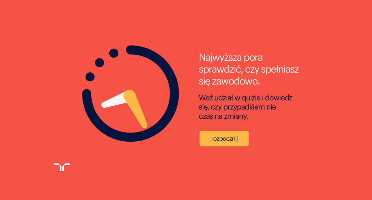
What’s the best podcast WordPress theme out there?
October 8, 2023First of all, you need to understand what a website layout is. It represents the one factor that determines whether a website is successful or not. A website layout is the actual structure of the site. It structures the information as needed by the owner and it gives visitors a path to follow when they access the webpage. It is based on hierarchy and good navigation practices. To understand it better, see some website layout examples and decide which one would be suitable for your own website.
The definition of an effective layout design
A website layout helps designers place the content on a page. When looking for website design ideas, the first thing that is considered is represented by the content hierarchy. Content must guide visitors through the website, making it easy for them to find what they are looking for or to focus on the products and services you want to sell. This means that you build targeted website layouts.
A good layout will help visitors to:
Identify what is it that you are offering and what products they should know about
Get the information they need fast and efficiently, through following the direction that you provided through the page layout design.
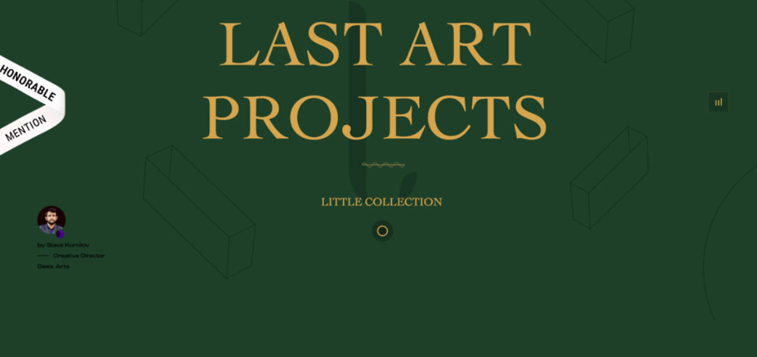
Website layout examples you can’t miss
Chekhov (split screen)
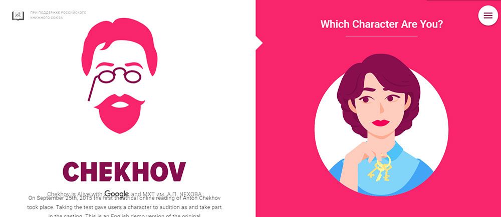
If your business website has two different things to present at the same time, the split screen layout should be used. A good web design example of the split screen layout should include two different sections that don’t contain too much content. Split screen designs are not meant to expand, so content usage is limited. If the website is focused on using large chunks of text, other website layout examples should be considered.
Balance in a Silhouette View
Another website layout idea to consider is balancing everything out in a silhouette view. This is a website structure that doesn’t have too many elements included. It is simple, and it doesn’t include adjustments that may distract the viewer from reaching the information he wants to fist. The overall structure of the website will be very intuitive and balanced out. The balance between visual elements is what makes people stay on a page. Too many visual elements gathered in the same place will only confuse the visitors.
Casangelina (Asymmetrical layout)
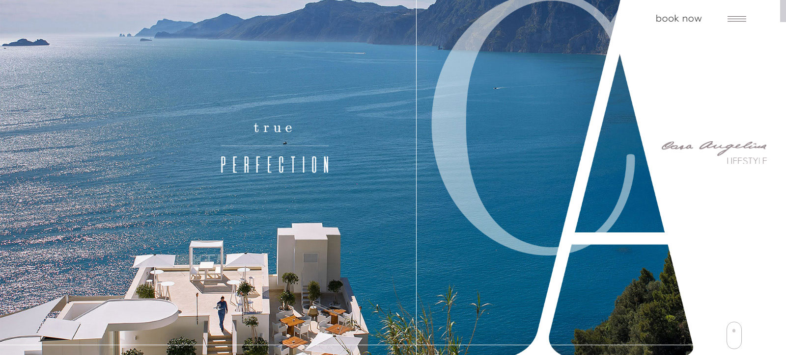
When it comes to the best website layouts, Casangelina is the example you definitely want to see. The key to making a website look artistic and professional at the same time is by using asymmetry. First of all, you should understand that asymmetry is not the same as an imbalance. Asymmetry is still balanced, but it creates more dynamism in website design layouts. If your website is more unconventional and you want to step away from the layouts you have seen so often, asymmetry could give you exactly what you desire. Keep in mind that you need to follow several principles when building an asymmetric layout.
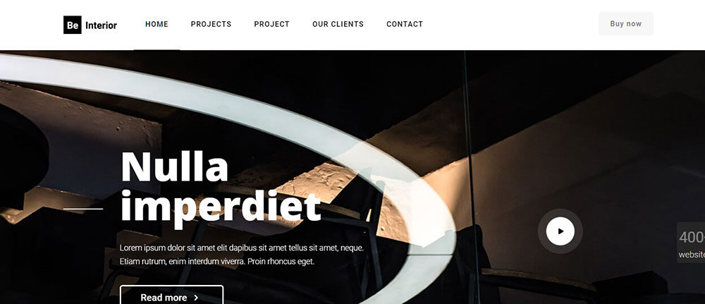
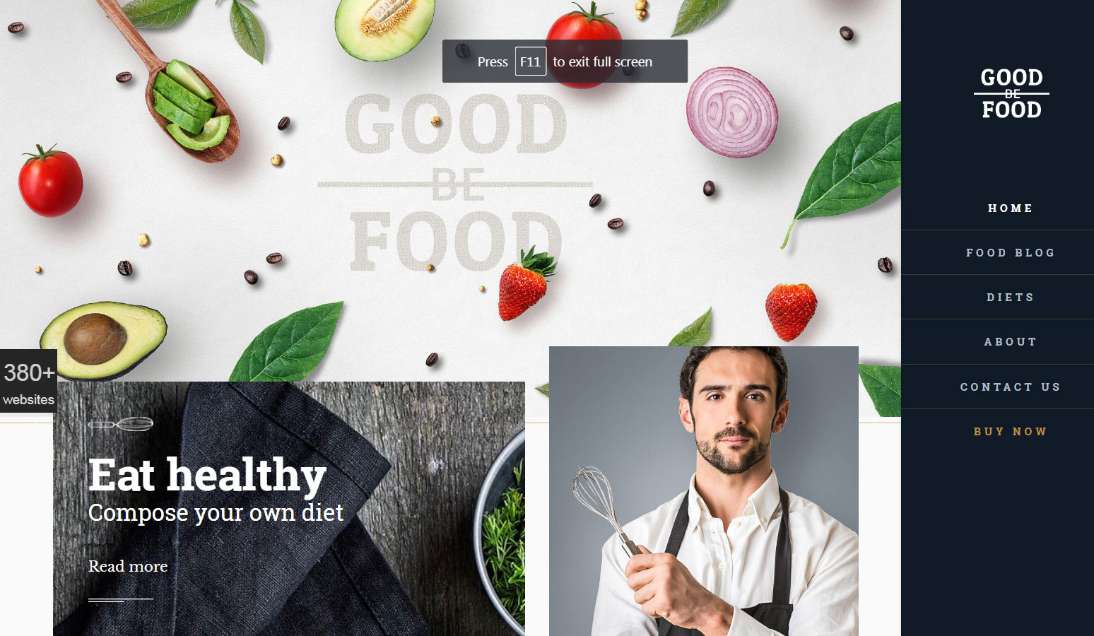
Rudy’s
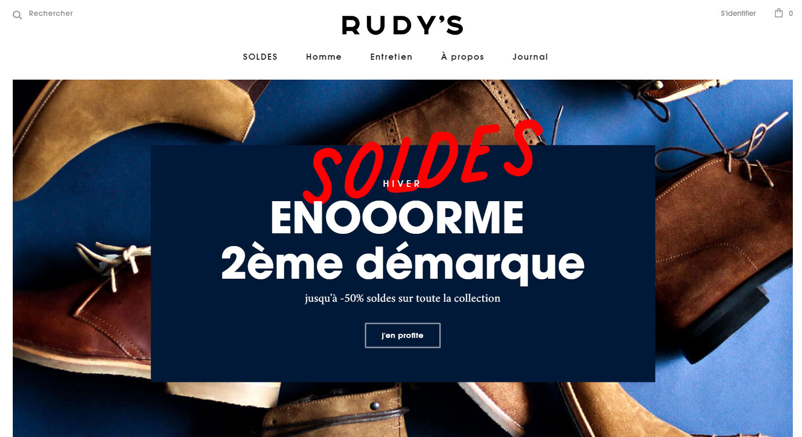
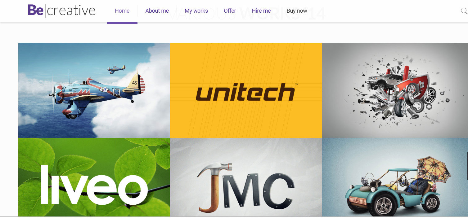
This layout is one that you definitely need to try if you want to achieve a clean-looking website. If you use a lot of visuals, you should look up website layout examples that contained squared photographs. This type of layout is easy to put together. You can add other elements that change its look, such as animations. This type of layout is great for websites that need to present a lot of products in a unique manner.
Go outside the standard layouts
If you don’t want anything similar with what is already used on the market and you want to step away from the website layout examples you see on the Internet, it’s time to forget about the standard layouts and make something entirely new from scratch. Breaking the layout mold and coming up with something entirely new is both efficient and risky. Users will definitely remember a website layout design that they’ve never seen before, but you need to make sure that your visitors share your vision.
Timothee Roussilhe
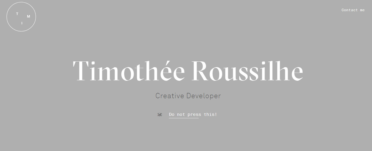
A good web design layout such as the one at Timothee Roussilhe can’t be achieved that easy. The website is created by Timothee Roussilhe, a designer that used the parallax effect to create an impressive layout. The designer made the best out of the parallax effect by including boxes of content that move in and out as the visitor scrolls down. The way he used this effect is definitely noticeable and should be followed as an example. Roussilhe’s whole website seems like a guided story that all people will enjoy if they follow his indications. Browsing on this website is a true pleasure, not to mention that the website is kept so minimal and responsive.
Medium
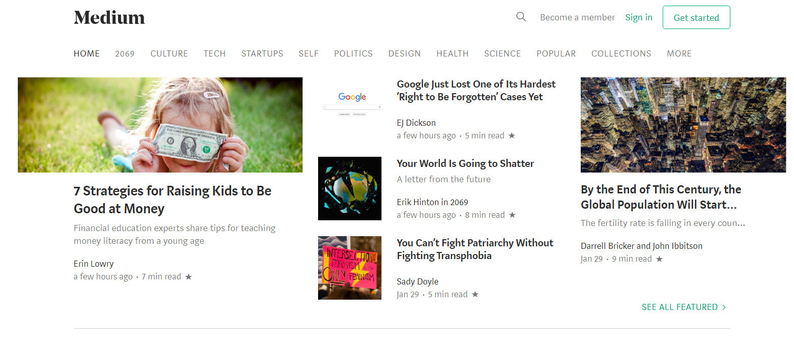
Everyone heard at least once about Medium and the way their website is built. The pages are really easy to follow, which makes Medium one of the website layout examples you should follow. It includes a multi-column layout, which has a very complex hierarchy that keeps information and multimedia content organized thoroughly. Because the website hosts so many blogs, finding information rapidly on it is a must. Medium has a magazine-like layout, the best for an online publication such as this.
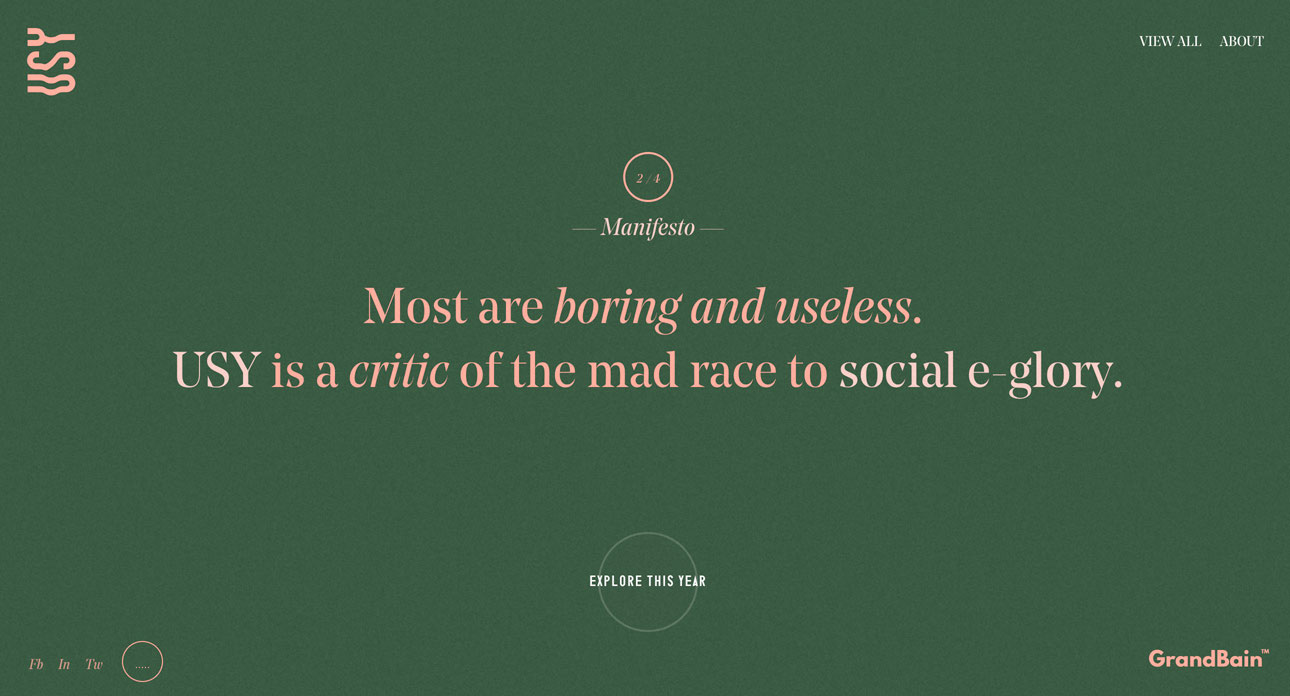
Fantasy
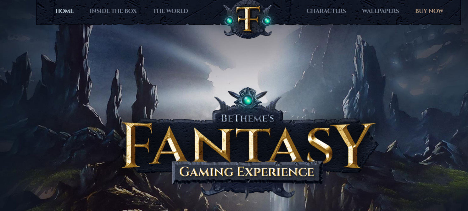
When you want to direct the attention of the visitor towards a certain element on the website, the layout you use has to include a featured image. Visuals are always more effective than written content because they rapidly send an emotional message. Illustrations and images are great for catching the attention of a person and leaving behind a great first impression. To design layouts that sell products fast, using images is mandatory.
Design layouts that accomplish website goals
In some cases, website layout examples don’t help you because you need to create one that fits exactly the goals your own website has. Each website has specific goals that can’t be met unless you create a layout that follows these goals strictly. Layouts that encourage visitors to follow a certain path will encourage them to help the website reach its goals as well.
ERDEM (Alignment Oriented)
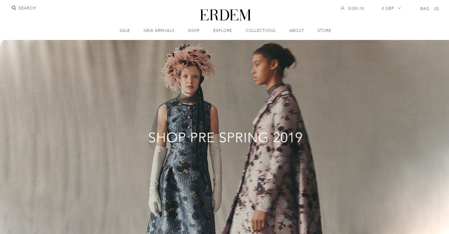
For people who are obsessed with details, this is the perfect pick. Alignment oriented layouts include categorizing all the elements on the page and perfectly position them in straight lines. This confers the website a very high-end, minimal look and it’s great for professional websites. It also makes navigation much easier. Pay attention though – it is one step away from being boring.
Visual Weight through Negative Space
Negative space is often forgotten because people tend to fill their websites with information. Well, negative space can actually bring balance to a website layout. It can be used to direct attention to a certain element on the website or it can balance out a crowded area of it. Negative space has a lot of uses that should be taken into account when creating a website layout. Most minimalist websites use it to obtain that clean, cutting-edge look. If that goes well with your business, go ahead and apply negative space techniques to your website layout. It’s easy to create and very effective in the long run.
Website layout examples to check out
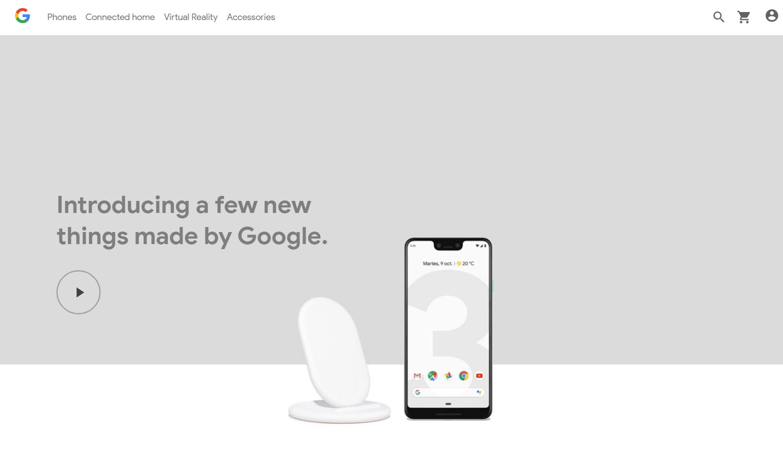
Google Store
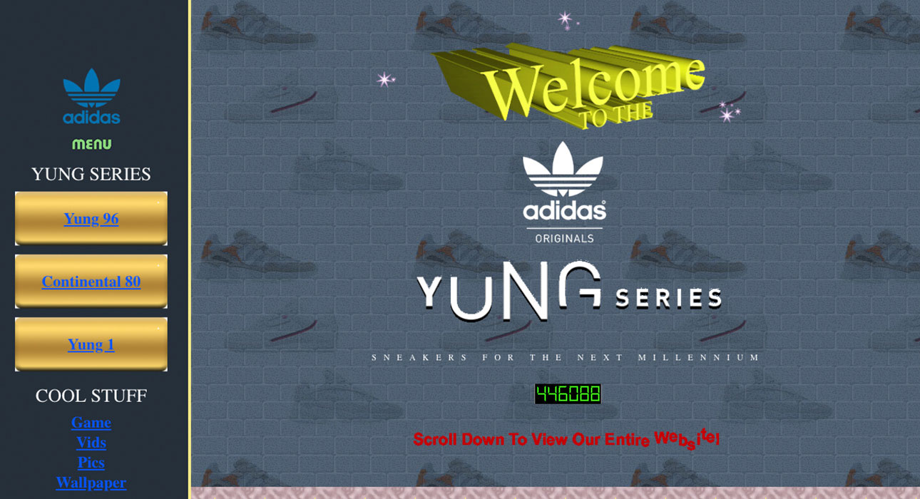
Step back into the 90s with this homepage homage for the adidas Yung series featuring a music rhythm game, wallpapers, and videos along with animated WordArt and vibrant visuals.
FAQ on website layouts
What's the ideal website layout for user engagement?
Well, here's the thing. There's no one-size-fits-all answer. But, generally, a clean, intuitive design that prioritizes user experience is the way to go. Think about your audience and what they want. A clear call-to-action, easy navigation, and mobile responsiveness are key. And don't forget about whitespace! It gives your content room to breathe.
Why are responsive website layouts so important?
You ever tried viewing a site on your phone and it's all wonky? Frustrating, right? That's why responsive design is crucial. It ensures your site looks and functions well on all devices, from desktops to smartphones. With more folks browsing on mobile these days, you don’t want to miss out on that audience. Plus, search engines love it. So, it's a win-win.
How can I choose the best layout for my content?
Alright, here's a tip. Start with your content. What are you trying to convey? Once you've got that down, choose a layout that complements it. For instance, if you've got a lot of visuals, maybe a grid layout works best. If it's more text-heavy, a single column might be better. Remember, the layout should enhance, not overshadow, your content.
What's the deal with grid layouts?
Grid layouts are like the Swiss Army knife of website design. Super versatile. They help organize content in a clean, structured way, making it easier for users to digest. Whether you're showcasing a portfolio or a product catalog, grids can be your best friend. But, like anything, don't overdo it. Balance is key.
How important is whitespace in a layout?
Whitespace is like the unsung hero of design. It might seem unimportant, but it's vital for readability and focus. It's not just about empty space; it's about giving elements room to stand out. Think of it as the pause in a conversation. It lets your content shine and helps guide the user's eye. So, embrace the whitespace!
Can I mix and match different layout styles?
Totally! It's like mixing patterns in fashion. Done right, it can look amazing. But there's a trick to it. Make sure there's a consistent theme or element that ties everything together. And always keep user experience in mind. If it feels disjointed or confusing, it might be time to rethink.
How does color impact website layout?
Color is a powerful tool. It can set the mood, highlight important info, or guide users to a call-to-action. When thinking about your layout, consider how colors interact. You want harmony, not chaos. And remember, colors can look different on various screens, so always test!
What are the latest trends in website layouts?
Oh man, trends come and go like fashion seasons. But some recent faves include parallax scrolling, asymmetrical layouts, and even some retro-inspired designs. But here's the golden rule: trends are cool, but don't sacrifice usability for style. If it doesn't serve your audience, it might not be worth it.
How do I make my website layout more interactive?
Interactivity can boost engagement big time. Think about adding hover effects, animations, or even interactive infographics. But a word of caution: ensure it adds value. Don't just throw in bells and whistles for the sake of it. And always, always make sure it doesn't slow down your site.
Should I redesign my website layout regularly?
Refreshing your site can keep things fresh and up-to-date. But constant overhauls? Maybe not the best idea. If you're always changing things up, it can confuse regular visitors. Instead, focus on small, incremental changes based on user feedback and analytics. Keep it fresh, but familiar.
Conclusion
After finally selecting a web layout, all you have to do is wait and see how effective it is. Of course, if you don’t see the expected results, you can always change it. Think about that layouts are not all about looks. They have to be easy to navigate and responsive as well.


