


Understanding the Different Types of Landing Pages
May 31, 2025
Stunning Examples of Agency Landing Pages That Work
June 19, 2025Converting business visitors into qualified leads requires more than generic web pages. Examples of B2B landing pages demonstrate how top companies capture enterprise attention through strategic design and compelling value propositions.
Most B2B marketers struggle with conversion rates below 3%. The difference between high-performing corporate campaigns and failed ones often comes down to landing page optimization. Professional SaaS landing pages and enterprise-focused designs follow specific patterns that drive results.
This guide examines B2B landing page examples across industries. You'll discover conversion optimization techniques, lead generation strategies, and design principles that turn website visitors into marketing qualified leads.
From product landing pages to consultation booking forms, each example includes analysis of what works and why. Learn how successful companies structure their sales funnels and implement trust signals that resonate with business decision-makers.
Examples Of B2B Landing Pages
Salesforce
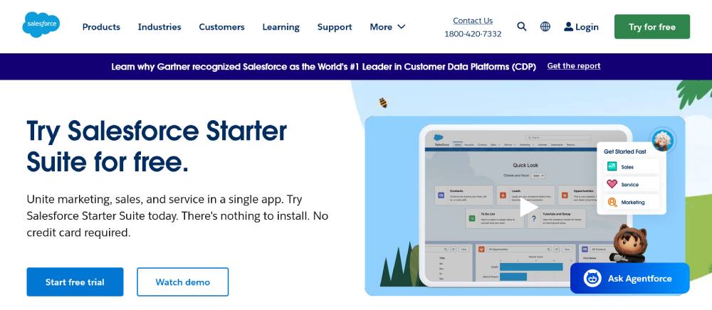
Bold typography dominates the header section. Clean white backgrounds create breathing room between content blocks.
The navigation stays fixed during scroll, keeping key actions visible. Blue accent colors guide users toward conversion points. Multiple CTA buttons appear without overwhelming the layout. Product screenshots sit alongside benefit statements, showing real functionality rather than abstract concepts.
Asana
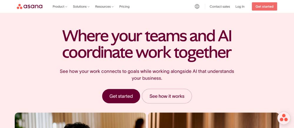
Gradient backgrounds add visual depth without distracting from core messaging. The hero section uses oversized text that scales well across devices.
Animation triggers as users scroll down each section. Colorful illustrations break up text-heavy areas. Team photos build trust through human connection. The pricing section uses cards with clear feature comparisons. Progress bars and checkmarks make complex information digestible.
Trello
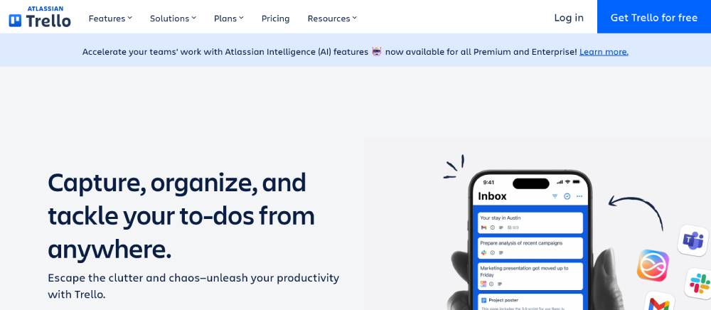
Card-based layouts mirror the product's core interface design. Soft shadows create layers between different content sections.
Interactive demos let visitors test features before signing up. The color palette stays consistent but adds pops of bright accent colors. Customer logos appear in organized grids rather than scattered placement. Video backgrounds play on loop without sound controls cluttering the interface.
Be Landing 2
Zoom
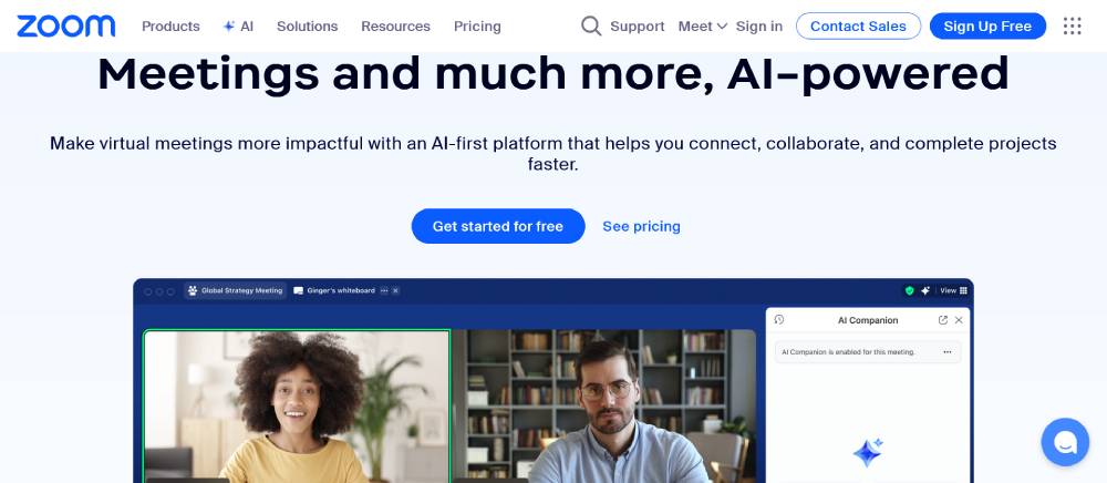
Split-screen layouts balance text content with product visuals. The header includes quick access to different product categories.
Live usage statistics update in real-time across the page. Icons use simple line art that loads quickly on slow connections. Multiple language options appear in the footer navigation. The sign-up flow breaks into small steps instead of long forms.
Notion
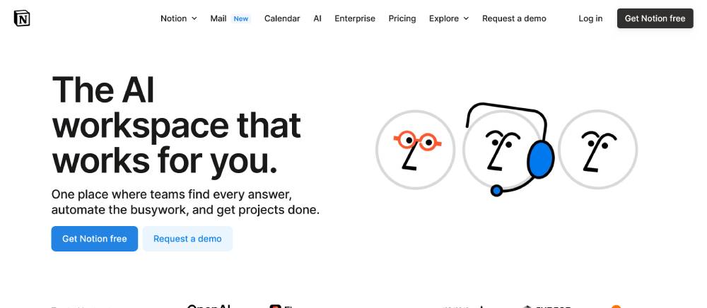
Minimalist design puts content first without unnecessary decorative elements. The sidebar navigation collapses on smaller screens but stays accessible.
Dark and light theme toggles let users choose their preferred viewing mode. Code blocks and formatting examples show the product's flexibility. Community-generated templates get featured prominently. Search functionality works across all page content, not just navigation items.
Airtable
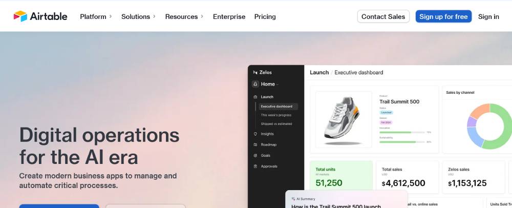
Database-style grids demonstrate the product's core functionality through visual examples. Hover effects reveal additional information without page reloads.
The onboarding sequence uses progressive disclosure to avoid overwhelming new users. Color coding helps differentiate between various feature categories. Mobile responsive tables maintain usability on touch devices. API documentation links integrate directly into marketing content.
Miro
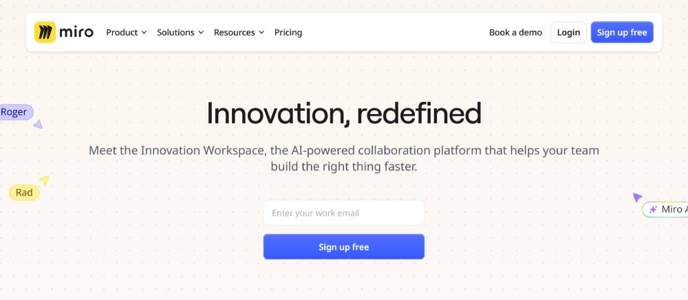
Canvas-style layouts reflect the collaborative workspace environment. Drag-and-drop interactions work even in the marketing demo sections.
Template galleries use large preview images with filtering options. Team collaboration features get highlighted through animated user avatars. The pricing structure compares plans using detailed feature matrices. Integration logos appear as interactive elements rather than static images.
Mailchimp
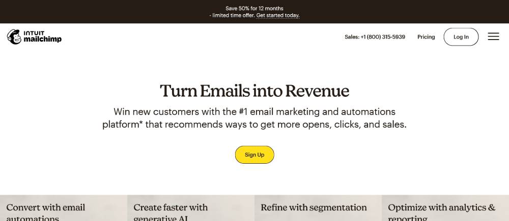
Playful illustrations maintain brand personality while staying professional. The email template previews update based on user selections.
A/B testing results appear as live data visualizations. Segmentation tools get explained through interactive flow charts. Mobile app screenshots show the full user experience. Customer success stories include specific metrics and results.
Be Product
Zendesk
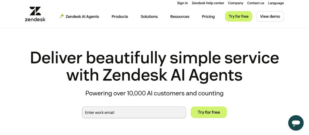
Ticket interface mockups demonstrate real customer service scenarios. Chat widgets appear as functional overlays, not just decorative elements.
Knowledge base search works across multiple content types and formats. Agent productivity dashboards show actual performance metrics. The help center design mirrors the main product interface. Customer satisfaction scores display as interactive charts and graphs.
DocuSign
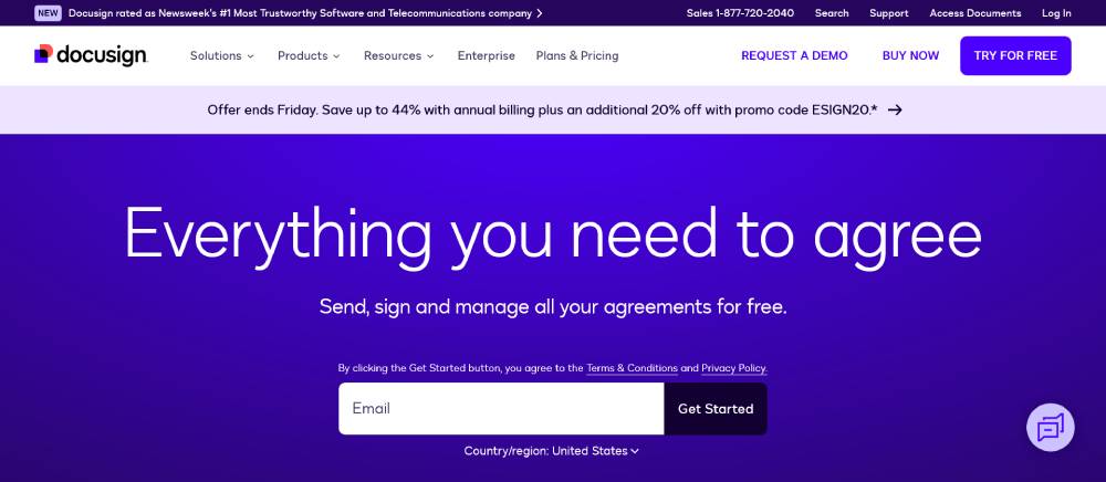
Document signing flows appear as step-by-step visual processes. Legal compliance badges build trust through recognized certifications.
Security features get explained using layered visual metaphors. Mobile signing experiences show the full touch interface. Integration partners appear with direct connection setup options. ROI calculators provide personalized business impact estimates.
Shopify

Store examples showcase real merchant websites with live product data. Theme previews allow customization without leaving the main page.
Payment processing options display with real-time fee calculations. Inventory management screenshots show the actual admin interface. App marketplace integration happens through embedded browsing experiences. Success metrics come from verified merchant case studies.
Twilio
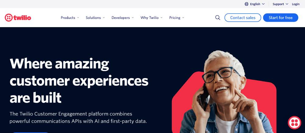
Code examples update based on programming language selection. API documentation integrates directly into marketing page content.
Developer tools appear as functional interfaces rather than static screenshots. Communication channels get demonstrated through live message threading. Usage analytics show real implementation data from customer accounts. Pricing calculators adjust based on expected volume and features.
Segment
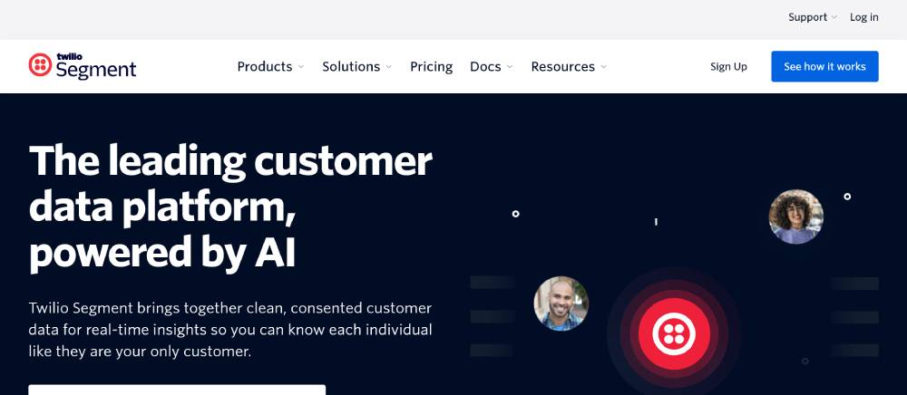
Data flow diagrams animate to show information movement between systems. Integration marketplace uses real connection status indicators.
Event tracking examples demonstrate actual user behavior patterns. Privacy controls appear as interactive toggle switches and settings panels. Analytics dashboards display with live data feeds and updating metrics. Customer data platform features show unified user profiles.
Be Landing 4
Sage
Financial dashboard mockups display realistic business accounting scenarios. Report generation tools appear as functional preview interfaces.
Compliance checklists show region-specific requirements and deadlines. Accounting workflow diagrams animate through complete business processes. Tax preparation features demonstrate real form completion and submission processes. Integration capabilities connect with actual business software partners.
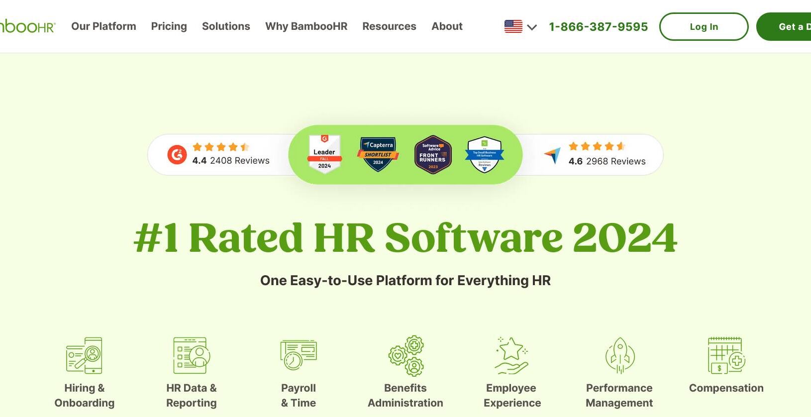
BambooHR
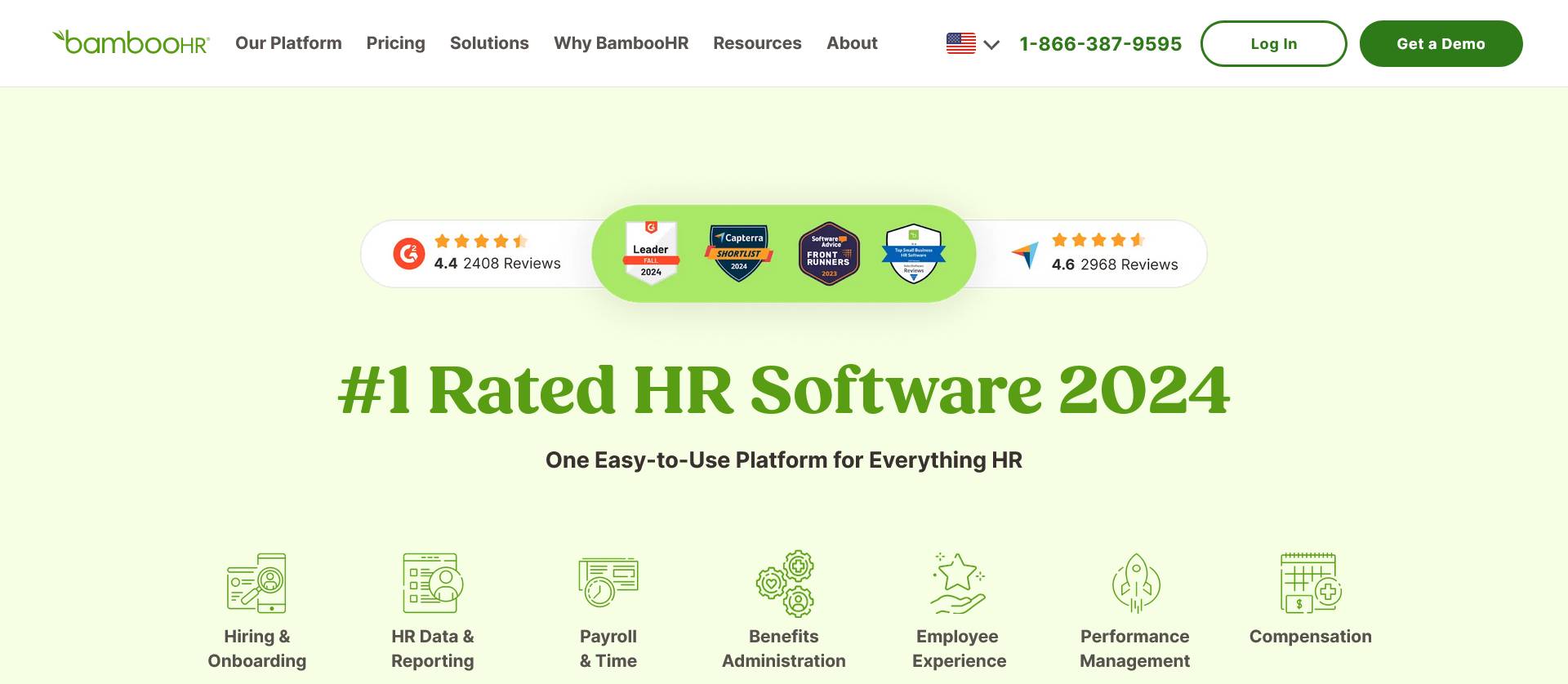
Employee profile interfaces show realistic HR management scenarios. Payroll processing screens demonstrate actual calculation and reporting features.
Performance review workflows appear as interactive step-by-step processes. Benefits administration tools show real insurance and retirement plan options. Time tracking interfaces mirror the actual employee portal experience. Reporting dashboards display with live HR metrics and analytics.
Freshworks
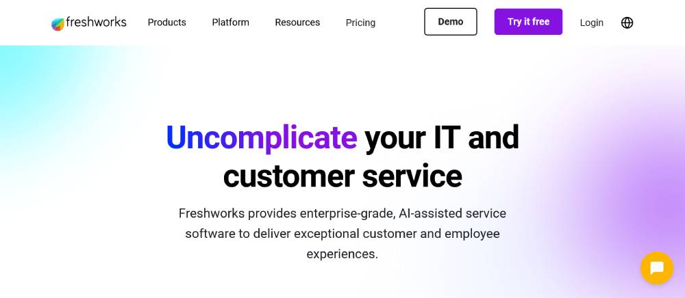
Multi-product navigation allows switching between different software offerings. Customer journey mapping tools show real interaction tracking and analysis.
Support ticket resolution displays actual response time metrics and satisfaction scores. Sales pipeline management appears through functional CRM interface previews. Marketing automation workflows demonstrate complete campaign setup and execution processes. Integration ecosystem shows verified third-party connections and data syncing capabilities.
FAQ on B2B Landing Pages
What makes a B2B landing page different from B2C?
B2B landing pages target decision-makers with longer sales cycles. They focus on ROI demonstration, case studies, and trust signals rather than emotional triggers. Corporate buyers need detailed product information and social proof from similar companies.
How many form fields should a B2B landing page have?
Optimal B2B forms contain 3-5 fields maximum. Include company name, email, and job title as essentials. Longer forms reduce conversion rates but improve lead quality. Test different lengths based on your sales team's requirements.
What's the ideal length for B2B landing page copy?
300-800 words works best for most B2B campaigns. Complex technology websites need more explanation than simple lead magnets. Match copy length to product complexity and buyer research stage.
Should B2B landing pages include pricing information?
Include pricing for lower-cost products under $500. For enterprise solutions, use "Request Quote" or "Custom Pricing" approaches. Pricing page transparency builds trust but can scare away qualified prospects prematurely.
What call-to-action buttons work best for B2B?
"Get Demo," "Download Guide," and "Start Free Trial" outperform generic CTAs. Action-oriented language that promises immediate value drives higher conversion rates. Avoid "Submit" or "Learn More" for primary actions.
How important are testimonials on B2B landing pages?
Customer testimonials increase conversions by 34% average. Include specific results, company logos, and job titles for credibility. Video testimonials from similar industries perform better than text-only formats for complex B2B solutions.
What's the best above-the-fold content for B2B pages?
Lead with your value proposition, target audience pain point, and primary CTA. Include hero images showing your product in action. Avoid generic stock photos. Test hero section variations for optimal performance.
Should B2B landing pages be mobile-optimized?
67% of B2B research happens on mobile devices. Ensure forms work perfectly on smartphones. Simplify navigation and reduce cognitive load. Mobile-first design improves conversions across all devices for modern buyers.
How do you reduce friction on B2B landing pages?
Remove unnecessary navigation links, simplify forms, and provide clear value statements. Use progressive profiling for returning visitors. Add security badges and privacy statements to build confidence in data sharing.
What analytics should you track for B2B landing pages?
Monitor conversion rate, time on page, form abandonment, and cost per lead. Track quality metrics like SQL conversion and deal size. Use heatmaps to identify optimization opportunities in form design and content placement.
Conclusion
Examples of B2B landing pages reveal consistent patterns across successful campaigns. Top performers prioritize customer acquisition through strategic design choices rather than flashy aesthetics. Enterprise buyers respond to clear value propositions backed by concrete ROI data.
Effective business-to-business campaigns balance detailed product information with streamlined user experience. The best corporate websites integrate social proof elements like client testimonials and industry certifications seamlessly into their conversion funnels.
Implementation beats perfection every time. Start testing these proven approaches:
- Focus on lead capture forms over complex navigation
- Add trust signals throughout the buyer journey
- Optimize call to action button placement and copy
- Include specific benefits for target decision-makers
Marketing automation platforms like HubSpot and Salesforce provide the infrastructure, but strategic thinking drives results. Your next campaign success depends on applying these insights to your specific audience needs.
If you enjoyed reading this article about B2B landing pages, you should read these as well:


