

Great Travel WordPress Themes You Can’t Miss
May 9, 2026
The Best Lead Generation WordPress Themes
May 11, 2026Your tech website either builds trust in the first five seconds or loses the visitor to a competitor who does.
The best technology website design examples share a clear pattern: fast load times, product-first layouts, and visual hierarchies that move technical buyers toward a decision without friction.
This article covers real examples across SaaS, enterprise software, cybersecurity, AI, hardware, and developer tools.
You will see what each site does well, which design patterns repeat across categories, and how tools like Webflow, Next.js, and Framer fit into the build decisions behind these sites.
What Is Technology Website Design?
Technology website design is a distinct discipline focused on communicating product credibility, technical depth, and fast information hierarchy to audiences who know exactly what they are looking at.
It is not general web design with a dark color scheme. The decisions made at the layout, typography, and copy level are shaped by a specific user: someone evaluating software, hardware, or a platform with real money or real workflow on the line.
How Tech Website Design Differs From General Web Design
Key distinctions that separate the two disciplines:
- Copy density: Tech sites carry more technical detail per section because the audience wants it
- Trust architecture: Uptime stats, compliance badges, security certifications, and client logos carry heavier weight than testimonial copy alone
- Demo-forward layouts: Product UI is the hero. Stock photography is almost always absent from top-tier tech product sites
- Navigation depth: Documentation, API references, and status pages sit in the footer or top nav as primary destinations
General web design optimizes for impression. Technology website design optimizes for conviction.
Core Elements Present in Every Strong Tech Site
A software company website or SaaS landing page design that converts shares 4 structural traits: a headline that names the outcome (not the feature), real product UI in the above-the-fold section, a primary CTA repeated at each scroll depth, and a pricing page that answers questions before a sales call is needed.
These are not stylistic preferences. They are patterns repeated across Linear, Stripe, Vercel, and Notion, all of which convert developer-focused or product-led audiences at above-average rates.
| Element | Tech Site Standard | General Site Standard |
|---|---|---|
| Hero content | Product UI screenshot or live demo | Brand photography or illustration |
| Trust signals | Uptime SLAs, security certs, client logos | Testimonials, star ratings |
| Navigation | Docs, API, status page in primary nav | About, Blog, Contact |
| Copy style | Spec-level, technical, outcome-focused | Aspirational, broad, brand-driven |
What Makes a Technology Website Design Effective?
Effectiveness in tech web design comes down to one thing: how fast a qualified visitor reaches a decision. Every design choice either shortens or lengthens that path.
75% of users judge a company's credibility based on its website design alone, according to research cited by Forrester. For tech companies, that credibility window is even smaller because the audience is comparing across multiple tabs at once.
Performance Standards for Tech Sites
A one-second delay in page load time reduces conversions by 7%, and retailers lose an estimated $2.6 billion annually to slow sites (Hostinger, 2024). For tech products, where the site is often a direct proxy for product quality, speed is a credibility signal, not just a UX nicety.
Core Web Vitals benchmarks Google uses for ranking (updated March 2024):
- LCP (Largest Contentful Paint): under 2.5 seconds
- INP (Interaction to Next Paint): under 200 milliseconds
- CLS (Cumulative Layout Shift): under 0.1
Vercel's own documentation confirms INP replaced First Input Delay as the third Core Web Vital in March 2024. Sites built on Next.js and deployed on Vercel's infrastructure benefit from automatic optimizations for all 3 metrics through ISR, image optimization, and font loading controls.
Trust and Credibility Design Patterns
According to DesignRush (2025), 94% of first impressions of a website come from its design. The design choices that carry the most credibility weight in tech specifically are not visual flair. They are proof elements placed deliberately within the layout.
High-trust placement patterns seen across top tech sites:
- Client logos immediately below the hero (not buried in a separate case study section)
- Uptime or reliability stats displayed numerically, not as vague claims
- Security certifications (SOC 2, ISO 27001) in the footer and on the pricing page
- Live product demo or interactive preview accessible without a sales call
Stripe places its developer-mode code preview directly in the hero. That single design decision communicates product depth and eliminates the need for paragraphs of copy explaining what the API does.
What Are the Best SaaS Website Design Examples?
The best SaaS website design examples share a single discipline: they show the product doing something real before asking the visitor to do anything. Stripe, Linear, Vercel, and Notion each approach this differently, but the principle is the same.
The average SaaS free trial conversion rate sits between 2% and 5%, but Slack has reached up to 30% (Webstacks, 2025). The gap between 2% and 30% is almost entirely explained by design and messaging clarity, not traffic volume.
Developer-Focused SaaS Design
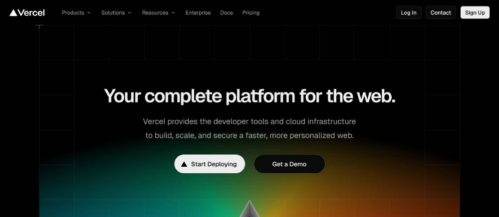
Vercel's site is built for developers who arrive pre-educated. It does not waste their time with marketing copy. It gives them specs, code samples, and pricing, then gets out of the way.
What Vercel does that most sites do not:
- Dark mode default that signals technical seriousness
- Dense, informative layout that respects the visitor's intelligence
- Documentation linked directly from the main navigation
Linear takes a different angle. Its motion design communicates speed and precision without slowing the page. The site itself performs like the product it is selling: fast, focused, and without friction. That alignment between product and presentation is rare and effective.
Product-Led SaaS Design
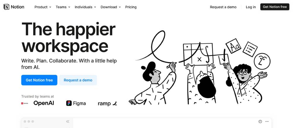
Notion's homepage is the product. There is no stock photography. No lifestyle imagery. The UI is the hero, and the layout is built around feature discovery, not persuasion.
Stripe's gradient use and developer-first copy have set the visual standard for SaaS product website layouts since 2020. Most B2B SaaS website design you see today carries Stripe's DNA, right down to the angled section dividers and the API code preview in the hero.
| Company | Hero Approach | Primary Audience | Standout Pattern |
|---|---|---|---|
| Stripe | Live API code preview | Developers + finance teams | Gradient + technical copy |
| Linear | Animated product demo | Product and eng teams | Motion without weight |
| Vercel | Deployment stats + dark UI | Frontend developers | Speed-to-answer layout |
| Notion | Product UI as hero | Teams and individuals | No stock photography |
If you are building a SaaS website and looking for structural reference, these 4 are the most studied starting points in the industry right now.
What Are the Best Enterprise Technology Website Design Examples?
Enterprise tech sites are designed for longer sales cycles, multiple buyer personas, and committees, not individuals. The design reflects that. Fewer CTAs, deeper content, heavier social proof, and navigation built around industry verticals rather than features.
IBM, Salesforce, and ServiceNow are the 3 most referenced examples in this category, and each takes a structurally different approach to the same challenge.
How Enterprise Design Differs From SMB Tech Design
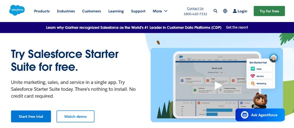
Salesforce organizes its homepage navigation by industry first, not product. That single architectural choice signals immediately to a healthcare CIO or a financial services VP that Salesforce understands their specific context.
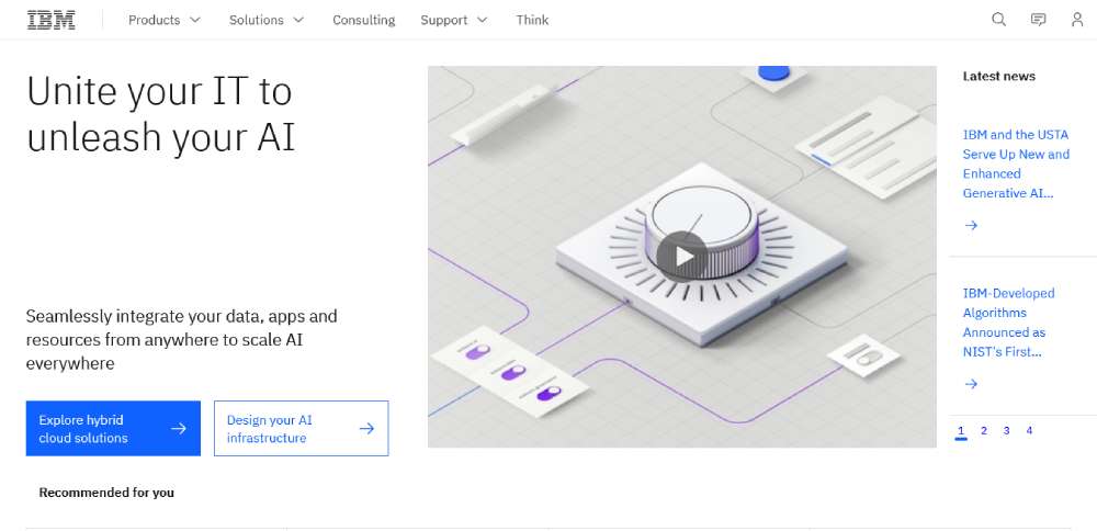
IBM goes further in a different direction: content density over visual flair. The IBM site carries more written content per page than almost any comparable tech site. That is a deliberate decision. Enterprise buyers read.
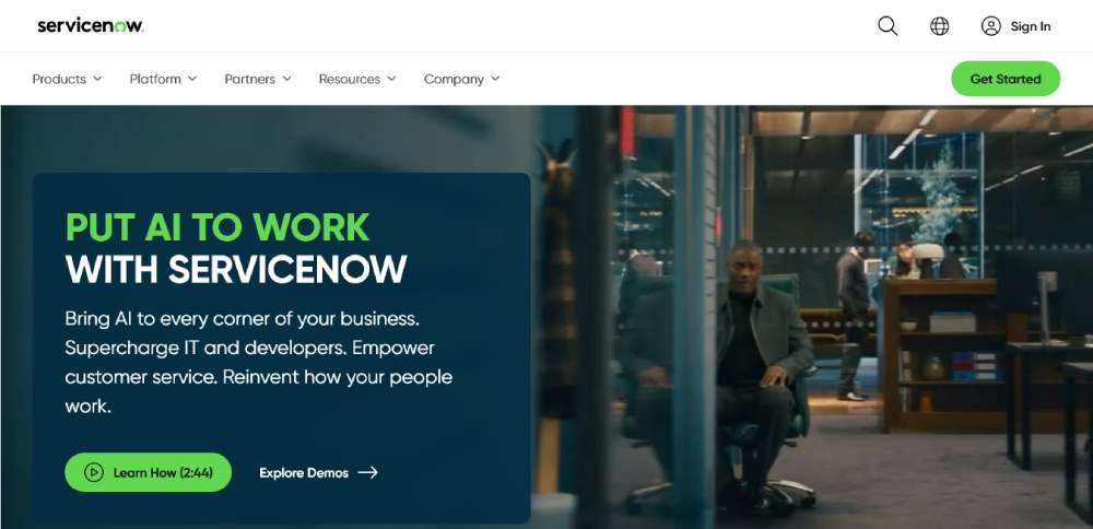
ServiceNow's homepage formula:
- ROI metric placed above the fold
- Customer case study integrated into the hero section, not hidden in a separate tab
- Industry-specific landing pages accessible from the main navigation
Research from mindfeederllc (2025) notes that in B2B design, one good lead can carry enormous deal value, which means enterprise tech sites are optimized for lead quality over lead volume.
That explains the contact-sales CTA dominance over free-trial CTAs on sites like IBM and ServiceNow.
For broader reference on enterprise website design patterns, the structural differences between SMB-focused and enterprise-focused layouts are significant enough to treat as separate design disciplines entirely.
What Are the Best Cybersecurity Website Design Examples?
The cybersecurity website design category carries one constraint no other vertical has: the site itself must signal trustworthiness immediately, or the brand is disqualified before the visitor reads a word.
The cybersecurity technology market was valued at $185.7 billion in 2024 (Techopedia). With that level of market size, the design bar for credibility is extremely high, and the top companies in the space know it.
CrowdStrike: Data as a Design Element
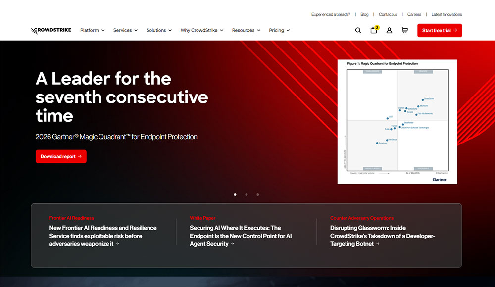
CrowdStrike's site uses live threat intelligence data as a visual component. Threat counters, global attack maps, and real-time detection stats appear in the hero section.
This is not decoration. It is product proof placed at the highest-visibility location on the page. The dark palette reinforces the category context without being heavy-handed.
Cloudflare: Network Visualization as Hero
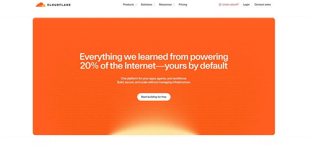
Cloudflare leads with its global network footprint: number of cities, terabits of capacity, requests per second. All of it is numerical and specific. No vague claims about being "the most trusted" anything.
Design patterns across top cybersecurity sites:
- Real-time statistics displayed numerically in the hero
- Compliance badge placement on both the homepage and the pricing page
- Incident response and threat intelligence pages linked from the main navigation
- Case studies from recognizable enterprise clients placed above the fold
1Password: Consumer-Facing Security Design
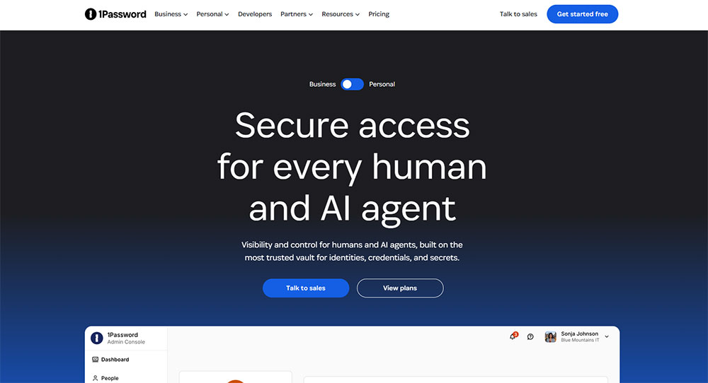
Password faces a different design challenge: making security feel approachable to non-technical users without losing credibility with IT teams evaluating the business tier.
The site solves this with a dual-track layout: consumer-friendly copy in the hero section and business/enterprise pathways accessible from a persistent navigation toggle. That single structural decision serves 2 distinct buyer types without compromising either experience.
The cybersecurity category also represents one of the strongest use cases for dark mode web design. Among Apple iOS users, dark mode adoption ranges from 55% to 70% (Accio, 2024), and tech-category audiences skew even higher.
What Are the Best AI and Machine Learning Website Design Examples?
AI product websites face a specific design problem: the capabilities are abstract, the competition is loud, and most visitors arrive skeptical. The best sites in this category solve that with restraint, not spectacle.
Gartner predicted that 75% of websites would incorporate some form of AI by 2025. That prediction has driven enormous noise in the category, which makes the companies that design with discipline stand out considerably more.
OpenAI: Restraint as Brand Signal
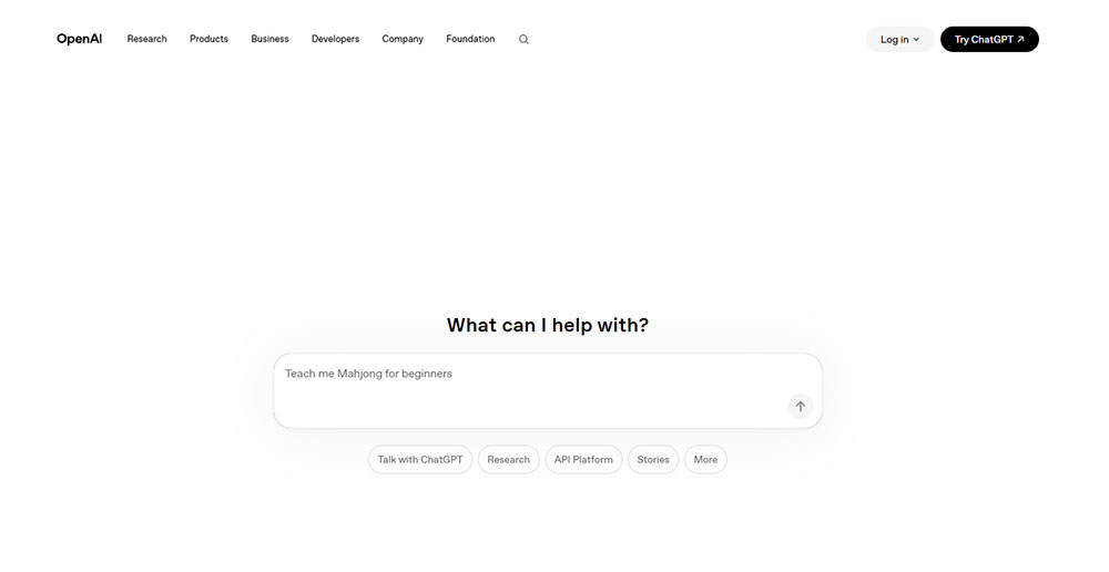
OpenAI's site is minimal to the point of being almost sparse. White background, clean sans-serif type, product access as the primary CTA.
That restraint is a deliberate positioning choice. When every competitor is using animated gradients and generative preview loops, a calm and simple layout communicates confidence. The product does not need to be oversold because the product is already famous.
Runway: Output as the Hero
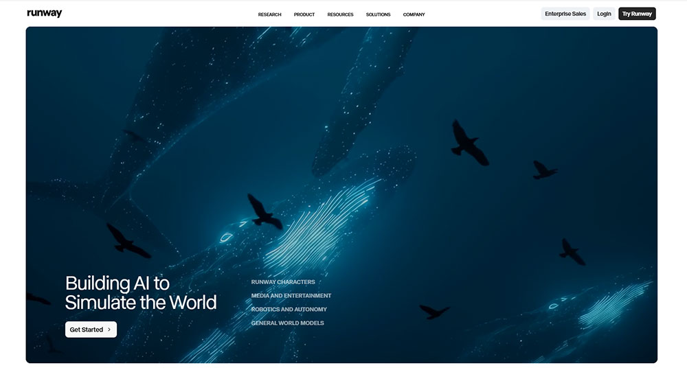
Runway takes the opposite approach: video-first, generative output immediately visible, no explanation needed before the visitor sees what the tool produces.
Visual patterns common across AI product websites:
- Generative output previews embedded directly in the hero
- Model benchmarks displayed as data tables, not marketing bullets
- Interactive demos accessible without account creation
Hugging Face is the outlier worth studying. Its community-driven layout and open-source credibility signals attract a developer-first audience that other AI platforms are not designed to serve. The design looks intentionally utilitarian, and that is exactly right for its audience.
AI-focused interactive landing pages that allow visitors to experience the model output before signing up consistently outperform static alternative layouts in trial conversion rates, according to conversion data from Grafit Agency (2025).
What Are the Best Hardware and IoT Website Design Examples?
Physical technology products present a design challenge that software sites do not have: the product exists in the physical world, but the website has to make it feel real through a screen. Product visualization and spec presentation carry almost all of the weight.
Apple: The Photography Standard
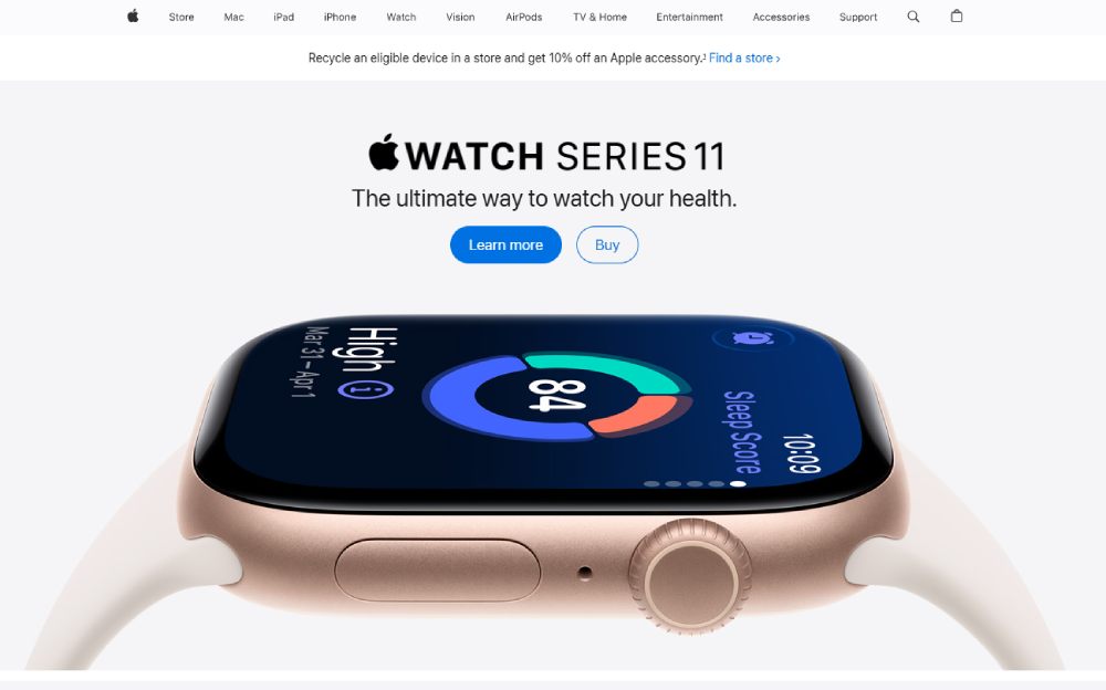
Apple has set the product photography standard that every hardware brand is measured against. Scroll-driven spec reveals, full-bleed product imagery, and typography that scales with the product's physical dimensions on screen.
Well-designed websites drive higher conversions, and Forrester data shows a great UX design can boost conversion rates by up to 400% (BusinessDasher, 2024). Apple's hardware product pages are arguably the most studied examples of this principle applied at scale.
DJI: Cinematic First, Specs Second
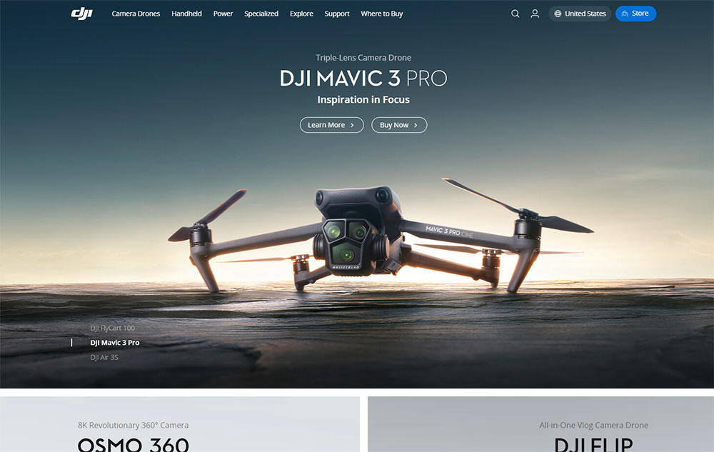
DJI leads with video. Cinematic hero footage, drone perspective shots, and product-in-action sequences appear before a single spec is shown.
DJI's spec comparison approach:
- Side-by-side comparison tables for product tiers (Mini vs. Air vs. Pro)
- Ecosystem cross-sell integrated into every product page
- Accessory and compatibility information linked directly from the hero
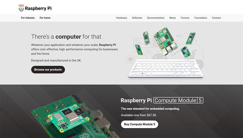
Raspberry Pi is worth studying for a completely different reason. Its site integrates community documentation, project tutorials, and forum links directly into the main site structure. For a product whose value is defined by its community, that design decision is not incidental. It is the product strategy expressed as navigation architecture.
3D Renders vs. Photography: The Real Trade-Off
3D renders allow full product rotation, custom lighting, and color variants without a photo shoot. But they add significant page weight and require careful optimization to meet Core Web Vitals thresholds.
Photography performs better on load time by default. The decision between the two is not aesthetic. It is a Core Web Vitals decision with direct SEO implications. Most hardware sites at the mid-market level use photography in the hero and 3D renders for spec detail sections lower on the page, which balances both concerns.
For teams building physical product sites with a structured template starting point, product website templates with pre-optimized image sections can cut development time significantly while maintaining the visual standard hardware audiences expect.
What Are the Best Developer Tool Website Design Examples?
Developer tool sites are a category where the audience will judge the product by the quality of the site itself. A slow, poorly structured developer tool website is a red flag before a single line of code is written.
React.js is used by 33% of developers, making it the second most preferred front-end framework in 2024 (TechBuzz). That same audience is the primary user of developer-focused platforms like GitHub, Postman, and Tailwind CSS, and they arrive at those sites with high baseline expectations.
GitHub: Activity as Identity
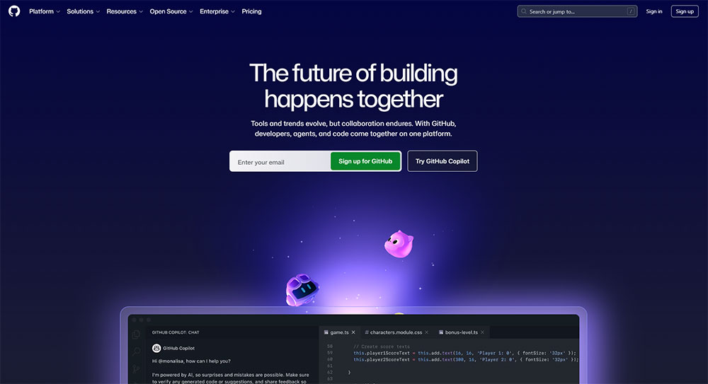
GitHub's homepage design formula:
- Repository activity and contribution graphs displayed prominently
- Community scale signals (stars, forks, contributors) used as social proof
- Free tier and enterprise pathways clearly separated in the navigation
GitHub has to speak to both individual contributors and enterprise CTOs simultaneously. The site achieves this through dual-track navigation, not through trying to serve both audiences in the same hero.
Tailwind CSS: Live Code as the Product Demo
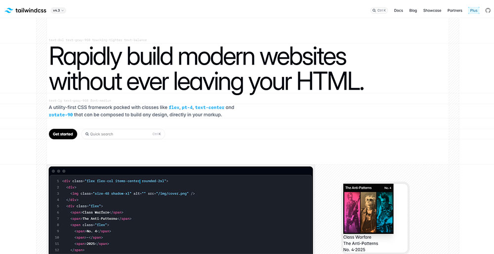
Tailwind CSS leads with a live interactive code preview in the hero section. Visitors see utility classes applied to a real component before reading a single sentence of marketing copy.
That is not a coincidence. Tailwind CSS is a utility-first framework, and the fastest way to communicate what "utility-first" means is to show it. No explanation needed.
Postman: Use Case Navigation Over Feature Lists
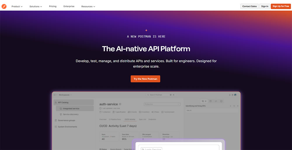
Postman organizes its homepage around what users are trying to accomplish, not around feature categories. API testing, API design, and API monitoring each get their own navigation pathway.
Design decisions that work specifically for developer audiences:
- Dark mode as the default or easily accessible toggle
- Monospace typography in code blocks to signal technical context
- Copy-paste code snippets that work without modification
- Documentation depth signaled early, not buried in a footer link
For teams building a software website targeting developers, the navigation architecture decision matters as much as the visual design. Developer audiences use nav to find documentation, not to browse features.
What Design Patterns Appear Across All Technology Website Examples?
Study enough tech sites and the same patterns surface regardless of category, audience size, or budget. These are not trends. They are structural decisions that consistently reduce friction for technically minded users.
| Pattern | Where It Appears | Why It Works |
|---|---|---|
| Dark mode default | Dev tools, cybersecurity, AI | Signals technical context, preferred by 82% of smartphone users (Statista) |
| Product UI in hero | SaaS, AI, developer tools | Eliminates need for descriptive copy above the fold |
| Micro-animation on scroll | SaaS, hardware, enterprise | Communicates product attributes without page weight of autoplay video |
| Pricing page toggle | SaaS, developer tools | Monthly/annual comparison reduces decision friction |
Navigation and Information Architecture Patterns
Consistent brand presentation can increase revenues by up to 23%, according to mindfeederllc (2025). Navigation architecture is the single most consistent aspect of brand presentation across the top tech sites studied here.
Primary navigation structure across top tech sites:
- Product or Solutions as the first nav item (not About or Company)
- Pricing always visible in the top nav, never buried
- Documentation, API, and Status page in the footer as primary links
Enterprise sites deviate slightly. Salesforce and IBM lead with industry verticals in the nav, placing the product second. That reflects how enterprise buyers search: by problem domain, not by feature.
Visual and Motion Design Patterns
Scroll-triggered animation beats autoplay video on almost every performance metric. It keeps page weight manageable, it does not interrupt the user, and it creates a sense of the product responding to the visitor's actions.
Linear does this better than anyone. Its animations are tied entirely to scroll position, load under 200ms on most connections, and directly communicate what the product does rather than just looking interesting.
Conversion Design Patterns
The above-the-fold formula repeated across Stripe, Vercel, Linear, and Notion:
- Headline (outcome-focused, not feature-focused)
- Subheadline (adds specificity or target audience)
- Primary CTA (single button, high contrast)
- Trust element (client logos or a stat, immediately below the fold)
Pricing page patterns that appear across all categories: feature matrix, tier comparison at a glance, annual/monthly toggle with savings displayed, and a free tier or trial accessible without a sales call.
Sites that require a sales call to see pricing consistently underperform on direct conversion. The data from Webstacks (2025) confirms this: top-converting SaaS sites show pricing without a gating requirement.
How Does Typography Choice Affect Technology Website Design?

Typography is where most tech sites either quietly signal credibility or quietly undermine it. The choice of typeface carries meaning to a technical audience in a way it does not for general consumer sites.
Variable fonts were used on 33% of desktop pages in 2024, up from 28% in 2022 (HTTP Archive Web Almanac). In tech specifically, that adoption rate is higher because performance-conscious development teams understand the file size advantage.
Sans-Serif Dominance in Tech
Sans-serif fonts dominate tech sites at an \\85% preference rate\\ for readability, according to an analysis of 1,000 websites (Dhanbad Web Design Research, 2024). That number is even higher in the developer tool and SaaS categories.
Inter is the most common choice across the sites covered in this article. It was designed specifically for screen legibility and works across a wide range of weights without losing clarity at small sizes. Vercel's Geist font is a variant of this same typographic tradition, slightly more distinctive but structurally similar.
Monospace as a Trust Signal
Monospace typography does one job in tech web design: it signals code context. When a developer sees monospace type, they read it as technical content without needing a label saying "this is a code block."
Tailwind CSS, GitHub, and Postman all use monospace selectively and deliberately. It appears in code samples, terminal commands, and API references. It never appears in marketing headlines, where it would create the wrong context.
Type Scale and Audience Positioning
How headline size maps to brand positioning:
- Large, bold headlines (80px+): Consumer-facing SaaS and AI products targeting broad audiences
- Medium, confident headlines (48-64px): Developer tools and B2B SaaS with technical buyers
- Dense, information-forward type: Enterprise platforms where content depth signals competence
IBM uses the latter deliberately. Its homepage carries more written content per page than any comparable enterprise tech site studied here. That is not a design failure. It is a direct response to how enterprise buyers consume information before a purchase decision.
83% of designers acknowledge typography's importance in brand identity, according to Monotype's 2024 Global Font Use Survey. For tech companies specifically, a mismatched typeface sends a brand positioning signal that no amount of copy can correct.
For a deeper look at how typeface decisions interact with layout hierarchy, the guide on typography in web design covers the relationship between font choice, visual hierarchy, and user trust in detail.
How Do Color Schemes in Technology Website Design Signal Brand Positioning?
Color in tech web design is not primarily an aesthetic decision. It is a positioning decision. The palette a company chooses places it on a spectrum from consumer-friendly to technically serious, and audiences read that signal accurately whether or not they can articulate it.
Technology companies see \\24% better engagement\\ using minimalist two-color designs compared to more complex palettes, according to Striven (2025). That data point explains why the best-performing tech sites in this article are all relatively restrained in their color use.
Dark Backgrounds and Technical Credibility
Vercel, Linear, and GitHub all default to dark backgrounds. That is not coincidence or personal preference. It is a direct response to their primary audience: developers who have spent years staring at dark-mode code editors.
Among software developers specifically, 95% prefer dark mode for their development environment (Helpfultech, 2024). A dark-default website for a developer tool is simply meeting the audience where they are.
Neutral Plus Single Accent: The SaaS Standard
Stripe uses purple on white. Notion uses black on white. Figma uses a restrained multicolor system that maps to its product's multi-tool identity. All 3 follow the same structural logic: a neutral base with a single accent color that does all the conversion work.
What the accent color handles on these sites:
- Primary CTA buttons
- Active state indicators in navigation
- Highlighted feature callouts
- Pricing page emphasis elements
Consistent brand presentation increases revenues by up to 23% (mindfeederllc, 2025). Limiting the palette to one accent color is the most reliable way to maintain that consistency across every page and every viewport size.
Gradient Use: What the Top Sites Are Actually Doing
Gradients peaked in tech web design between 2021 and 2023. Stripe popularized the style, and most SaaS sites followed. By 2024, the best-performing sites had pulled back considerably.
Gradients are still present in the category, but they are used more sparingly: backgrounds in a single section, not across the entire page. OpenAI removed gradients almost entirely from its 2024 redesign. That restraint signals confidence in a category where most competitors are still reaching for visual spectacle.
For teams building in this space, reviewing websites with strong color schemes across industries shows how the single-accent approach performs outside of tech as well, which makes the pattern easier to justify internally when stakeholders push for more color.
What Are the Most Common Technology Website Design Mistakes?
Most tech website failures are not dramatic. They are the accumulation of small decisions that each seem reasonable in isolation but collectively produce a site that does not convert.
88% of users are less likely to return to a website after a bad experience (BusinessDasher, 2024). For tech sites, where the sales cycle involves multiple return visits before a decision is made, a single friction point has compounding cost.
Overloading the Hero With Multiple CTAs
3 CTAs above the fold is not giving users more options. It is giving them a reason to make no decision at all.
The top-converting tech sites in this article, Stripe, Linear, Vercel, Notion, each have a single primary CTA in the hero. A secondary action (documentation, demo video) may appear, but it is visually subordinate. The hierarchy is never ambiguous.
Stock Photography Where Product UI Should Be
What stock photography signals to a technical audience:
- The product is not visually compelling enough to show
- The team does not trust visitors to understand the UI
- The site was built for marketing leadership, not for the buyer
Notion's homepage uses zero stock photography. The entire visual language of the site is built from product UI screenshots and clean type. That decision eliminates the credibility gap that stock imagery creates for technical audiences.
Page Weight From Unoptimized Assets
A 60% visitor abandonment rate kicks in when sites take over 2 seconds to load (Hostinger, 2024). 3D assets and autoplay video are the 2 most common causes of load time failures on tech product sites.
The solution is not to avoid these elements. It is to load them correctly: 3D renders in detail sections below the fold, video compressed and served via CDN, and both deferred until the critical above-fold content has fully rendered.
Copy Written for Internal Stakeholders
The most common copy mistake on tech sites has nothing to do with grammar. It is writing for the executive who approved the budget, not the developer or product manager who will actually use the product.
Signs the copy was written for internal approval:
- Headlines that describe the company's mission rather than the user's outcome
- Feature lists that use internal product names instead of user vocabulary
- Pricing pages that require a "Contact Sales" step before a number is shown
Vercel's homepage copy is written for a developer evaluating whether to migrate their deployment infrastructure. Not for a VP who wants to feel good about the brand. That specificity is what makes the site convert at the rate it does.
For teams actively auditing their own sites for these issues, a structured website design checklist covering layout, performance, copy, and conversion elements gives a practical framework for identifying which problems to fix first.
Broader reference on websites with poor design decisions across categories also helps calibrate what "bad" actually looks like in practice, which is surprisingly useful when trying to convince a team that the current site has a problem.
FAQ on Technology Website Design
What makes a technology website design different from a regular business site?
Tech sites prioritize product UI over brand photography, carry higher copy density for technical audiences, and treat documentation as a primary navigation destination. Trust signals like uptime stats and compliance badges carry more weight than testimonials alone.
Which companies have the best technology website design examples?
Stripe, Linear, Vercel, and Notion are the most referenced SaaS examples. For enterprise, Salesforce and IBM set the standard. In cybersecurity, CrowdStrike and Cloudflare lead. Each site is studied for its visual hierarchy and conversion design.
What is the most common layout pattern in tech website design?
The above-the-fold formula used by top SaaS sites: outcome-focused headline, short subheadline, single primary CTA, and a trust element (client logos or a stat) placed immediately below the fold. Product UI replaces stock photography in the hero.
Does dark mode improve performance on technology websites?
Dark mode does not directly improve load performance, but it reduces eye strain and matches the preferred environment of developer audiences. 95% of software developers prefer dark mode for their development environment, making it a credibility signal for developer-focused platforms.
What tools do tech companies use to build their websites?
Webflow is used by Series A to C SaaS companies for marketing sites. Next.js powers developer-facing products like Stripe and Vercel. Framer handles motion-heavy brand sites. Figma is the design source across all categories, with Radix UI and shadcn/ui as common component libraries.
How important is page speed for a technology website?
Critical. A one-second load delay reduces conversions by 7%, and 60% of visitors abandon a site that takes over two seconds to load. For tech products, slow load time signals poor engineering, which directly damages product credibility before a single feature is evaluated.
What typography do most technology websites use?
Sans-serif fonts dominate, with Inter and Geist being the most common choices across SaaS and developer tool sites. Monospace type appears selectively in code blocks and API references. Variable fonts are used on 33% of desktop pages in 2024 for performance and flexibility.
How do enterprise technology websites differ from SaaS website design?
Enterprise sites use industry-vertical navigation, lead with ROI metrics and case studies, and prioritize contact-sales CTAs over free trial signups. SaaS sites show pricing openly and push toward self-serve conversion. The information architecture reflects the length and complexity of each sales cycle.
What color schemes work best for technology website design?
Technology companies see 24% better engagement using minimalist two-color designs. Dark backgrounds work for developer tools and cybersecurity. Neutral base with a single accent color (Stripe uses purple, Notion uses black) is the most consistent pattern across high-converting tech product sites.
What are the most common mistakes in technology website design?
Multiple CTAs above the fold, stock photography in place of product UI, unoptimized 3D assets killing Core Web Vitals, and copy written for internal approval rather than the actual buyer. Each mistake adds friction at the exact point where a qualified visitor is making a decision.
Conclusion
This conclusion is for an article presenting technology website design examples across SaaS, enterprise, cybersecurity, AI, hardware, and developer tools.
The patterns are consistent: product-first layouts, restrained color schemes, monospace typography used with intention, and navigation built around how technical buyers actually think.
Whether you are working with Webflow, Next.js, or a custom build, the structural decisions matter more than the tool itself.
Dark mode, micro-animations, and visual hierarchy are not stylistic choices. They are signals that tell a qualified visitor whether your product deserves their time.
Use the examples in this article as benchmarks, not blueprints. Your product, your audience, and your conversion goals are specific. The design should reflect that.


