


The Best Architecture Website Templates for Modern Firms
April 29, 2026
The Best WordPress Themes for Consultants
May 1, 2026Your ecommerce homepage has roughly 2.5 seconds to convince someone to stay. Most stores waste that window with cluttered banners, auto-rotating carousels, and generic hero images that say nothing about what they actually sell.
The best ecommerce homepage design examples prove that conversion and visual appeal aren't competing goals. They work together when the layout prioritizes clarity, trust signals, and fast product discovery.
This article breaks down real online store homepages across fashion, tech, food, and marketplace categories. You'll see what top brands like Allbirds, Apple, and Wayfair do differently with their hero sections, navigation menus, mobile layouts, and social proof placement. Every example includes specific design choices you can apply to your own storefront.
What Makes an Ecommerce Homepage Design Effective
Your homepage has about 2.6 seconds to make an impression, according to eye-tracking research from Missouri University of Science and Technology. That's it. Less time than it takes to read this sentence.
And yet most online stores treat the homepage like a dumping ground for banners, seasonal promos, and whatever the marketing team pushed live on Friday afternoon.
A high-performing ecommerce homepage does three things at once. It communicates what you sell, why you're trustworthy, and where to go next. Every element on the page either serves one of those goals or gets in the way.
Visual Hierarchy Decides Who Stays
The first screen (everything visible before scrolling) carries the most weight. If a visitor can't figure out your store's purpose within seconds, they bounce.
Portent research shows a site loading in 1 second converts 2.5x more visitors than one loading in 5 seconds. Speed and clarity work together here. A fast page that's visually confusing still loses people.
Strong ecommerce homepages follow a pattern that works without thinking too hard about it:
- A clear hero section with a single focused message, not three rotating offers
- Product categories visible without opening the menu
- One primary call to action button that tells visitors exactly what to do
Trust Comes Before Transactions
Forter's 2024 research found that 81% of online shoppers feel uneasy when shopping on an unfamiliar ecommerce site. That number matters more than your hero image.
The same study found consumers spend 51% more with retailers they trust. So trust isn't just a feel-good metric. It directly impacts revenue.
Spiegel Research Center data: products with just 5 reviews are 270% more likely to be purchased than those with zero reviews.
Interestingly, perfect 5-star ratings actually hurt conversions. Purchase likelihood peaks between 4.0 and 4.7 stars. Shoppers are skeptical of perfection, and honestly, they should be.
The Difference Between Looking Good and Performing Well
I've seen gorgeous storefronts that convert terribly. The homepage looked like a magazine cover but visitors had no idea where to click.
Took me a while to fully internalize this: a homepage that converts well often looks "simpler" than you'd expect. White space isn't wasted space. It's breathing room for your visitor's attention. The stores consistently winning at homepage design prioritize good UX over visual spectacle.
That doesn't mean ugly is fine. It means every visual choice needs to serve the conversion goal, not just the brand guidelines PDF.
Ecommerce Homepage Design Examples Worth Studying
Looking at real homepages is worth more than reading about "best practices" in the abstract. The stores below do specific things well, and each one makes different tradeoffs based on their audience and catalog size.
What I want you to notice isn't just "this looks nice." Pay attention to how each site structures the first screen, where they place navigation, and how quickly you understand what they sell.
Fashion and Apparel Homepages
Allbirds keeps its homepage almost aggressively simple. One hero image. One headline. One CTA. That's it above the fold.
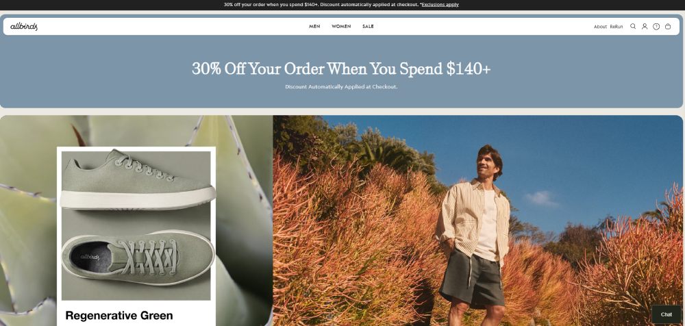
The entire product grid below the hero uses lifestyle photography instead of flat product shots. Visitors see shoes on real people in real settings, which reduces the mental gap between "browsing" and "owning."
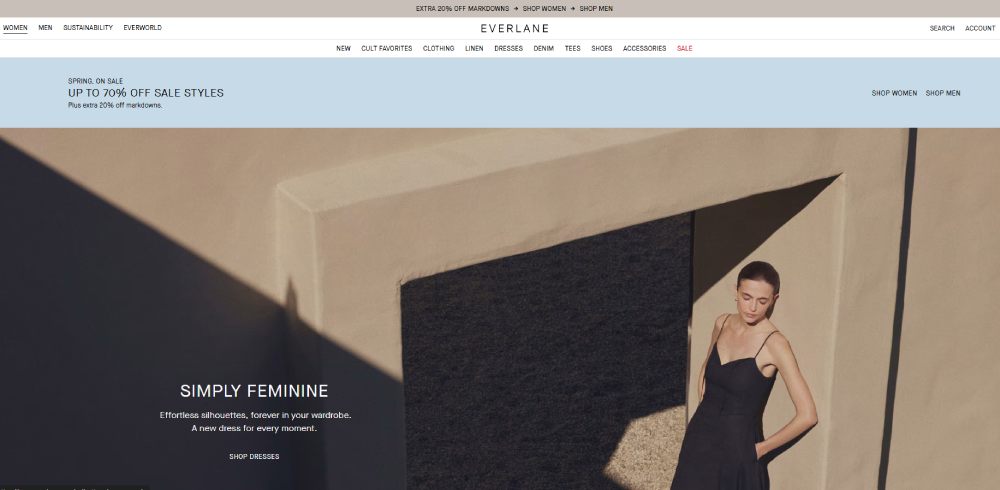
Everlane takes a different approach. Their homepage leads with transparency messaging (pricing breakdowns, factory info) before showing products. It's a bet that their audience cares more about values than visuals. And for their DTC customer base, it works.
Zara does something interesting with seasonal collections. The homepage functions almost like an editorial layout, closer to a fashion website than a traditional online store. Minimal text, full-bleed imagery, barely any visible product categories above the fold.
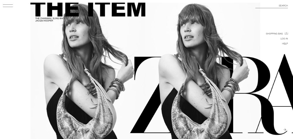
It's a bold choice that works precisely because their audience already knows the brand. A newer clothing website trying this approach would probably lose visitors fast.
Electronics and Tech Store Homepages
Apple's homepage is the one everyone references, and for good reason. It handles a dense product catalog by showing exactly one product at a time in the hero, with massive imagery and almost no body text.
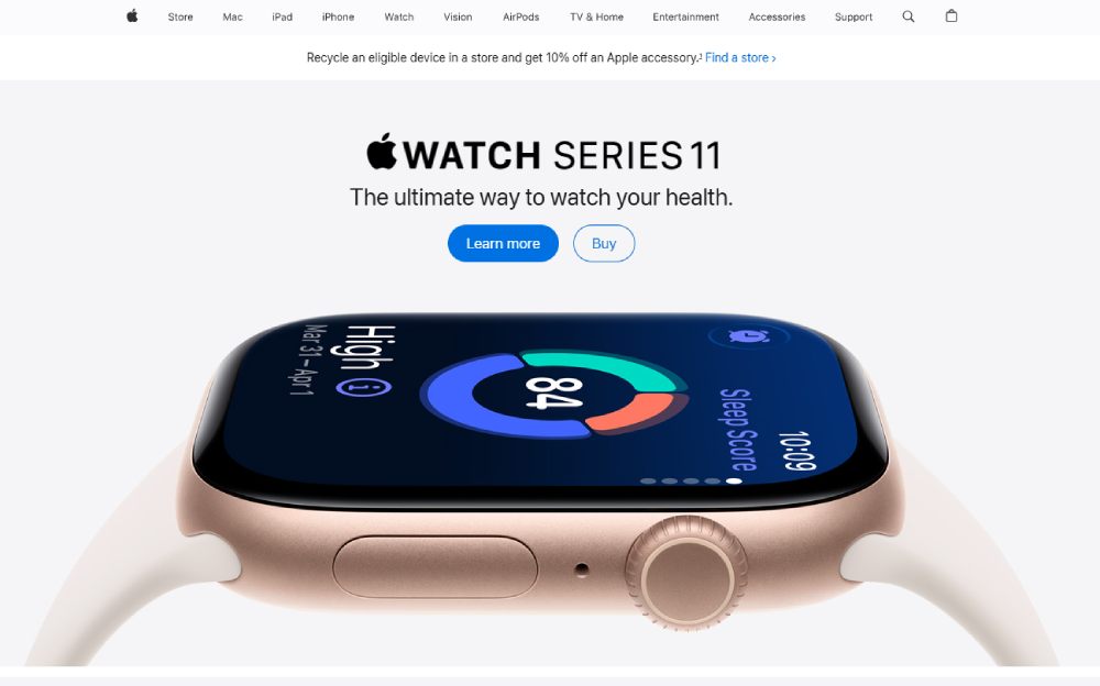
Scroll down and each product gets its own full-width section. It's basically a series of mini landing pages stacked vertically.
Best Buy faces a completely different problem. They sell thousands of SKUs across dozens of categories, so their homepage has to be a mega menu gateway more than a branding exercise. They use category tiles, deal modules, and prominent search to help visitors self-sort quickly.
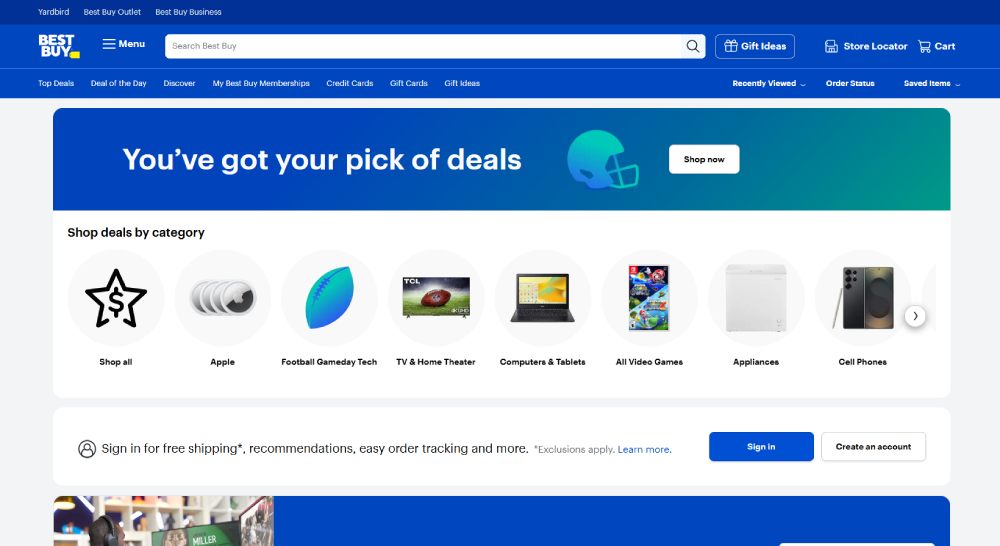
|
Brand |
Hero Approach |
Navigation Style |
Works Because |
|
Apple |
Single product spotlight |
Minimal top bar |
Brand recognition + small catalog |
|
Best Buy |
Promotional banner carousel |
Full mega menu |
Thousands of SKUs need sorting |
|
Dyson |
Product innovation focus |
Category dropdown |
Premium positioning + visual demos |
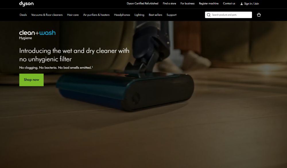
Dyson deserves a quick mention. Their homepage puts product websites design thinking into practice by leading with technology demonstrations rather than price or category browsing.
Food, Beverage, and Subscription Homepages
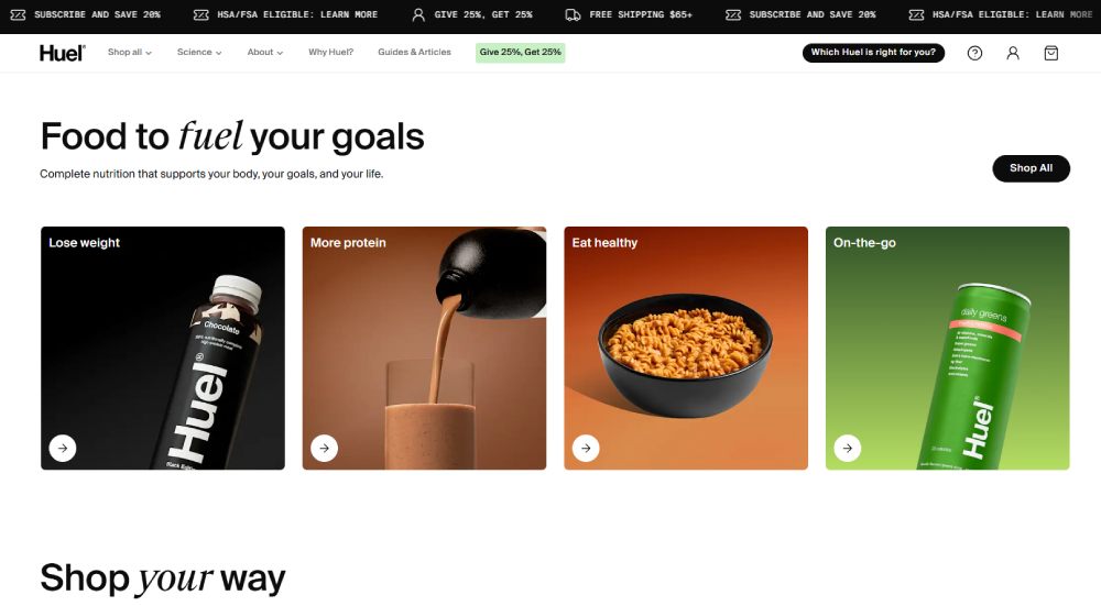
Single-product brands like Magic Spoon or Huel have a built-in advantage. When you sell one thing (or a tight range), your homepage can function as one focused product landing page.
Magic Spoon's homepage loads fast, hits you with bright colors and a bold value proposition, and basically just asks you to pick your flavor. The entire page funnels toward one action: start your order.
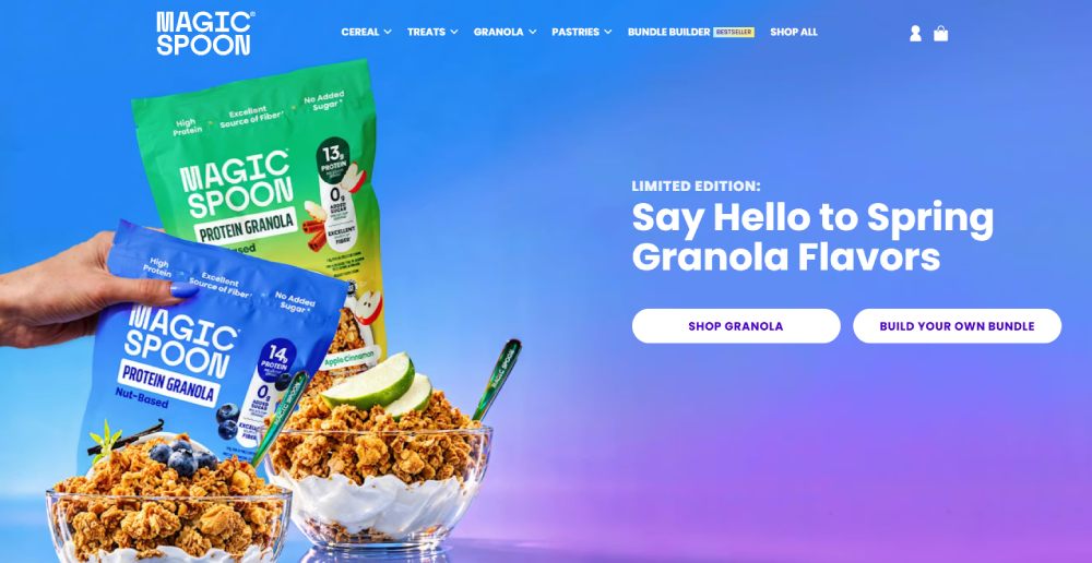
Subscription-first brands tend to strip away navigation complexity. Fewer menu items. Fewer category links. The homepage for these stores is really just a conversion page with extra social proof bolted on.
Huel goes heavy on nutritional data and ingredient transparency right on the homepage. Their audience wants that information before they'll commit to a subscription, so it earns its place.
Multi-Category Marketplace Homepages
Amazon's homepage is, well, a mess. But a profitable mess. The personalization engine drives almost everything you see. Two people visiting amazon.com at the same time see completely different pages.
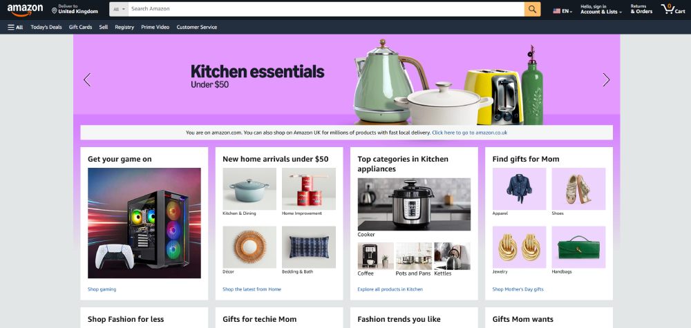
Amazon maintains a dominant conversion rate of roughly 10-13%, according to multiple ecommerce benchmarks. Most stores hover around 1.5-3%. That gap comes from years of personalization, Prime infrastructure, and one-click checkout, not from homepage "design" in any traditional sense.
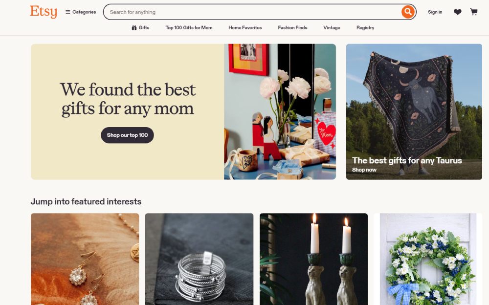
Etsy handles marketplace navigation differently. Their homepage surfaces trending items and curated collections rather than product categories. It's more of a discovery experience.
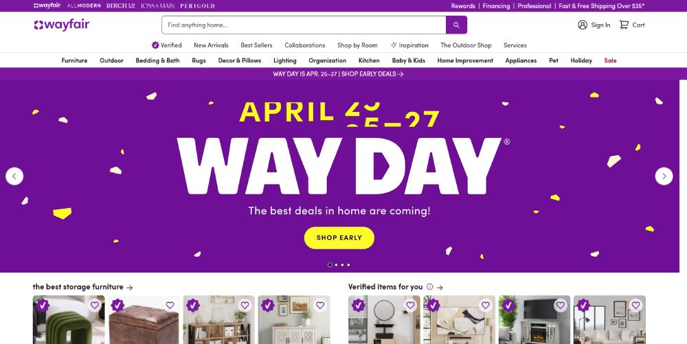
Wayfair uses a hybrid approach. Category tiles at the top (Bedroom, Living Room, Kitchen) with personalized product recommendations below. For a store with millions of products across home and furniture categories, this balance between browsing and algorithmic surfacing makes sense.
Homepage Layout Patterns That Repeat Across Top Stores
After looking at enough ecommerce homepages (and I mean hundreds), you start seeing the same structural templates over and over. Not because designers are lazy. Because certain patterns just work with how people scan web pages.
The Standard Formula
Most successful online stores follow a variation of this layout from top to bottom:
- Benefit bar: free shipping threshold, return policy, or a current promo (one line, full width)
- Header: logo, search, cart, account, and primary navigation
- Hero: single image or short carousel with one clear CTA
- Categories: product type tiles or collection links
- Social proof: review count, press mentions, or trust badges
- Bestsellers: a curated product grid (usually 4-8 items)
This formula persists because it maps to how visitors actually behave. They orient first (what is this store?), then browse (what do they sell?), then evaluate (can I trust them?).
Single-Column vs. Multi-Column Approaches
DTC brands and single-product stores almost always use a single-column layout. Each section takes the full page width. Scrolling is the only navigation required.
This works brilliantly for stores with fewer than 50 products. But it falls apart when you have 500+ SKUs and a visitor who knows exactly what they want.
Multi-column layouts, like what you see on Target or Walmart, sacrifice that clean editorial feel in exchange for information density. They pack more category links, product tiles, and promotional modules into less vertical space.
|
Layout Type |
Best For |
Tradeoff |
|
Single-column |
DTC, small catalogs, brand storytelling |
Slower to browse large catalogs |
|
Multi-column |
Marketplaces, large retailers |
Can feel cluttered without careful spacing |
|
Hybrid |
Mid-size stores (100-500 products) |
Requires strong visual hierarchy to work |
Sticky Elements That Persist
Across nearly every top-performing store, two things stay visible as you scroll: the search bar and the cart icon. Most use a sticky header that condenses on scroll, keeping these tools accessible.
Baymard Institute's 2025 navigation benchmark found that 95% of sites fail to highlight the user's current scope in their main navigation. The sticky header is there, but it doesn't tell you where you are.
That's a missed opportunity. The best implementations (IKEA does this well) visually indicate which section you're browsing even as you scroll deep into the page.
Above-the-Fold Design Decisions That Affect Conversions
The top portion of your homepage carries disproportionate weight. Not because people never scroll (they do), but because this area determines whether they want to scroll.
Hero Banner Choices
Static images still dominate. Roughly 60-70% of the top-performing Shopify stores use a single static hero rather than a carousel, according to Inflow's 2024 Best in Class report.
Auto-rotating carousels remain surprisingly common despite years of UX research showing their problems. Visitors rarely see slides beyond the first one. The animation draws attention but doesn't direct it anywhere useful.
Some brands use websites with video background in their hero. When done right (short loops, no audio by default, compressed files), video can increase engagement. Done wrong, it tanks your page speed and costs you conversions.
Nitropack research with Google found a 0.1-second improvement in mobile site speed leads to an 8.4% increase in ecommerce conversions. So that beautiful 4K background video? It better be worth the milliseconds it adds.
CTA Placement and Wording
The highest-converting homepages don't use "Learn More" as their primary call to action. They use action-specific language tied to the next step: "Shop the Collection," "Build Your Box," "Browse New Arrivals."
Placement matters just as much as copy. CTAs that sit within the hero image (not below it) consistently perform better because they're visible without any scrolling.
One pattern I keep seeing on strong DTC sites: a primary CTA (bold, contrasting color) paired with a secondary text link underneath. "Shop Now" as the button. "See what's new" as a softer option. It gives visitors two paths without cluttering the hero.
Search Bar as a Conversion Tool
For stores with large catalogs, the search bar is arguably more conversion-critical than the hero image.
Baymard's benchmark data shows that exposing the search field (rather than hiding it behind an icon) is a consistent trait of top-performing ecommerce homepages. On mobile, this is trickier since screen space is limited, but the best stores still make search immediately accessible.
Amazon and Walmart both give the search bar the most prominent position on their homepage. Not the logo. Not the hero. The search bar. That tells you everything about their conversion priorities.
Navigation and Menu Design on Ecommerce Homepages
A 2024 Baymard Institute benchmark found that up to 67% of leading ecommerce sites in the US and Europe have "mediocre" to "poor" navigation UX. And this is among the top stores, not random Shopify starter themes.
That statistic is wild when you think about it. Two-thirds of the biggest online retailers haven't figured out their menus yet.
Mega Menus vs. Dropdown Menus
Mega menus work best when you have a deep catalog with multiple levels of categories. They spread everything out visually so shoppers can scan and jump to exactly where they want without multiple clicks.
Amazon, Best Buy, Walmart, IKEA, and Zappos all use mega menus. Nielsen Norman Group recommends them specifically for ecommerce sites with complex category structures.
Standard dropdowns make more sense for smaller stores. If you have 5 product categories with 3-4 subcategories each, a mega menu is overkill. Partake (a food brand) uses simple dropdowns that show bestselling categories with clean links. Quick, minimal, no decision fatigue.
The tricky part: 61% of sites don't implement a hover delay on their dropdown menus, according to Baymard. So the menu fires accidentally when visitors move their cursor across the navigation bar. Small detail, big annoyance.
Category-First vs. Collection-First Labels
How you label your menu items shapes how people shop.
Category-first labels are straightforward: "Shoes," "Bags," "Accessories." Visitors know exactly what they'll find. This approach works when your products fit neatly into standard categories.
Collection-first labels are more curated: "Summer Essentials," "Work From Home," "Date Night." These create a browsing experience that feels less like a catalog and more like a recommendation from a stylist.
Most retail websites blend both. Zara's menu uses category labels (Women, Men, Kids) at the top level but surfaces collection-based groupings within each category dropdown. It's a practical compromise.
The "Shop All" Link
Including a "Shop All" or "View All" link in each menu category sounds obvious. But a surprising number of sites make you choose a specific subcategory before you can see any products.
That's a friction point for visitors who want to browse broadly. Baymard's research found that menu headings on many leading sites aren't even clickable, which frustrated test participants who expected them to be links.
Simple fix: make every category heading a clickable link to the full category page. Then list subcategories below it. This gives visitors both options without forcing a choice.
Mobile Ecommerce Homepage Design Differences
Mobile drives 78% of ecommerce site traffic and accounts for 66% of all online orders, according to 2024 data from multiple sources. But conversion rates on mobile still lag behind desktop by roughly 30-40%.
That gap represents a massive opportunity. Or, depending on how you look at it, a massive problem that most stores still haven't solved.
Why Desktop Layouts Don't Just Shrink Down
Responsive design handles the technical side (content reflows to fit smaller screens), but it doesn't solve the UX problem. A homepage designed for a 27-inch monitor with a mouse and keyboard needs fundamentally different thinking for a 6-inch touchscreen.
Thumb zones matter. The bottom third of a mobile screen is where users can comfortably tap with one hand. CTAs placed at the top of the screen require a stretch. Bottom navigation bars (like what you see in native apps) have started appearing on progressive mobile-first ecommerce sites for this reason.
Dynamic Yield data shows mobile accounts for 76% of overall ecommerce visitors across industries, with desktop taking 23% and tablet barely registering at 1%.
Speed Tradeoffs on Mobile
Google research with Deloitte showed that a 0.1-second improvement in mobile load time increases retail conversions by 8.4% and boosts average order value by 9.2%.
On mobile, every image, script, and font file costs more than it does on desktop. The average ecommerce site takes 6.3 seconds to load on mobile, according to Google's benchmarks. That's more than double their recommended 3-second target.
The stores that get mobile first design right tend to make hard choices: fewer hero images, lazy-loaded product grids, stripped-down navigation. They sacrifice visual richness for speed because the data overwhelmingly supports that trade.
Mobile Navigation Patterns
The hamburger menu icon is one of the few UI patterns with near-universal recognition on mobile. Inflow's Best in Class research confirms that top-performing mobile ecommerce sites consistently use it.
But here's what the best stores also do: they expose product categories outside of the hamburger menu, right on the homepage itself.
Both Wayfair and Target show swipeable category tiles above the fold on mobile. Visitors can start shopping without ever opening the menu. That single change (making categories visible by default) consistently tests well for both engagement and conversion.
Some stores go further with a persistent bottom navigation bar that keeps cart, search, account, and home links always accessible. It borrows from native app design patterns and reduces the friction of scrolling back to the top to find the menu.
Trust and Social Proof Placement on the Homepage
Forter's 2024 consumer trust research found that 81% of online shoppers feel uneasy when buying from an unfamiliar ecommerce site. That anxiety doesn't just affect feelings. It affects revenue directly.
The same research showed consumers spend 51% more with retailers they trust. Your homepage is where that trust either forms or doesn't.
Where Reviews and Ratings Belong
Trustpilot research confirms that positive star ratings on the homepage are the single strongest trust signal for purchase decisions, influencing 86% of buyers.
But here's the thing most stores get wrong: they either skip the homepage rating widget entirely or bury it at the bottom of the page where nobody scrolls.
EcomHint's audit data found that 76% of Shopify stores lack a store rating widget on their homepage. That's three out of four stores missing the highest-impact trust signal available.
One more detail that surprised me. Spiegel Research Center data shows purchase likelihood actually peaks for products rated 4.0 to 4.7 stars, then drops as ratings approach 5.0. Perfect scores look suspicious. People know that.
Security Badges and Payment Logos
Placement matters more than presence. Build Grow Scale tested trust signal variations across their client base and found that security badges placed below the payment button at checkout increase completion by 12.1%. Badges on the homepage? Minimal measurable impact.
So the common instinct to plaster Norton and McAfee logos across the homepage header isn't backed by the data. Those badges work best at the exact moment financial anxiety peaks: when someone's entering their card number.
For the homepage specifically, payment provider logos (Visa, Mastercard, PayPal, Shop Pay) and a clear shipping/returns policy bar are more effective trust signals than generic security seals.
User-Generated Content as Social Proof
WiserNotify data shows 72% of consumers trust customer-submitted photos and reviews more than stock photography or brand-produced images.
Brands like Glossier built their entire homepage experience around this idea. Customer photos, real reviews, Instagram embeds. It works because it feels authentic in a way that polished brand imagery can't replicate.
A well-designed testimonial page matters too, but the homepage needs at least a taste of real customer voices to build confidence before visitors dig deeper.
Common Ecommerce Homepage Design Mistakes
Some of these will seem obvious. They keep showing up anyway.
Illustrate Digital's 2024 Global Page Speed report found that websites lose an average of 4.42% in conversion rate for each additional second of load time between 0 and 5 seconds. And most of these speed problems start right on the homepage.
Overloading the Hero Section
The worst offender: cramming three rotating promotions, a seasonal sale banner, and a "new arrivals" callout into one auto-rotating carousel. Visitors rarely see anything past the first slide.
Baymard Institute found that 32% of sites don't correctly implement homepage carousels. The slides rotate too fast, lack clear controls, or bury the most relevant promotion behind two irrelevant ones.
If your hero section tries to say everything, it communicates nothing. One message. One CTA. That's the pattern that converts.
Ignoring Page Speed for Visual Impact
Webstacks research found pages loading in 2.4 seconds achieve a 1.9% conversion rate, while pages at 5.7+ seconds drop to 0.6%.
|
Speed Problem |
Common Cause |
Fix |
|
Slow hero load |
Uncompressed 4K images |
WebP format, max 200KB |
|
Layout shift |
Images without dimensions |
Set width/height attributes |
|
Delayed interactivity |
Heavy third-party scripts |
Defer non-critical JS |
|
Slow mobile render |
No lazy loading |
Lazy load below-fold images |
Google PageSpeed Insights is free. Run your homepage through it. If your Largest Contentful Paint (LCP) is above 2.5 seconds, that's the first thing to fix before touching any other design element.
For a closer look at the technical fixes that actually move that number, this guide to ecommerce technical SEO is worth a read.
Missing or Weak CTAs Above the Fold
No button, no conversion. Some homepages use beautiful full-screen imagery with zero actionable text or buttons visible before scrolling. Looks great in a portfolio. Terrible for selling products.
The fix is straightforward. Put a button with specific action language ("Shop Women's New Arrivals" beats "Learn More") inside the hero image, not below it. Make the color contrast high enough that it's impossible to miss.
Homepage That Looks Like a Landing Page
This one catches newer DTC brands the most. They build a homepage that's essentially a modern landing page with no visible navigation, no category access, and a single CTA funnel.
That works for paid ad traffic going to a purpose-built page. It fails as a homepage because organic visitors and returning customers need browsing options. They want to explore, not be funneled.
A homepage needs to balance conversion focus with discovery. Strip away navigation entirely and you lose repeat visitors who know what they want but can't find it. Keep the categories accessible through a clear website menu at minimum.
Tools and Platforms That Shape Ecommerce Homepage Design
The platform you build on determines what your homepage can (and can't) do without custom development. That choice matters more than most design decisions because it sets the ceiling for everything else.
Shopify alone powers over 2.9 million live stores as of early 2026, according to StoreLeads data. It holds roughly 30% of the US ecommerce market, making it the single most common platform behind the homepages you see online.
Shopify Themes and Default Homepage Structures
The Shopify Theme Store now lists 268 themes (23 free, 245 paid). But the actual usage is concentrated heavily at the top.
Trademark leads with 23.1% of all Shopify stores. Dawn (the free default) sits at 8.8%. The older Debut theme still runs on 5.4%. These three alone power over a third of all Shopify sites.
Dawn is fast, minimal, and built for visual storytelling. It's a good starting point for brands with fewer than 100 products. But it looks like Dawn. Visitors who shop on Shopify stores regularly start recognizing the default sections, the spacing, the font choices.
Premium themes like Impulse, Prestige, and Be Yours offer more built-in homepage sections (lookbooks, countdown timers, video backgrounds, announcement bars) that give designers more tools without touching code.
Page Builders That Override Default Templates
PageFly: drag-and-drop builder, popular for custom homepage layouts beyond what standard theme sections allow.
Shogun: focuses on conversion optimization with built-in A/B testing for homepage elements.
GemPages: offers AI-assisted page creation and a large template library, strong for stores that want polished results without hiring a developer.
These tools solve a real problem. Shopify's built-in theme editor lets you rearrange sections, but it limits structural creativity. Page builders let you go further, at the cost of potential speed overhead from extra scripts.
When Custom Development Makes Sense
|
Approach |
Best For |
Typical Cost Range |
|
Free theme (Dawn) |
New stores, tight budgets, simple catalogs |
$0 |
|
Premium theme |
Growing brands wanting polish without dev costs |
$180–$380 |
|
Theme + page builder |
Stores needing custom homepage layouts |
$15–$99/mo |
|
Custom theme |
Established brands with unique UX needs |
$5,000–$50,000+ |
Custom development makes sense once your store generates enough revenue that conversion rate improvements translate into meaningful dollar amounts. If a 0.5% conversion lift means $50,000 in annual revenue, spending $15,000 on a custom homepage is easy math.
For everyone else, a well-configured premium theme with strong responsive design and smart use of built-in sections will get you 80% of the way there.
BigCommerce, WooCommerce, and Squarespace Commerce Compared
BigCommerce offers more built-in ecommerce features out of the box than Shopify (no apps needed for multi-currency or certain B2B features), but its theme ecosystem is smaller. Fewer homepage templates means less variety without custom work.
WooCommerce runs on WordPress, which gives maximum flexibility but requires more technical management. Homepage design depends entirely on your WordPress theme and page builder (Elementor, Divi, etc.). It's powerful for developers but tricky for non-technical store owners.
Squarespace Commerce is the pick for brand-first stores where visual design quality matters more than catalog depth. Their templates are consistently well-designed, and the built-in blog design integration is cleaner than most competitors. But advanced ecommerce features (product filtering, complex shipping rules) are limited compared to Shopify or BigCommerce.
Your platform choice should match your technical comfort, catalog size, and budget. A beautiful homepage built on the wrong platform creates problems you won't notice until you're trying to scale.
FAQ on Ecommerce Homepage Design Examples
What makes a good ecommerce homepage?
A strong ecommerce homepage communicates what you sell, why you're trustworthy, and where to go next. Clear visual hierarchy, fast load times, and a single focused CTA above the fold separate high-converting homepages from forgettable ones.
What should be included above the fold on an online store?
Your logo, primary navigation, search bar, hero image with one clear message, and a call to action button that uses specific language. Avoid rotating carousels. Static hero images with a single offer consistently outperform sliders.
How do I choose the right homepage layout for my store?
It depends on catalog size. Single-column layouts work for DTC brands with fewer than 50 products. Multi-column layouts suit larger retailers like Wayfair or Target where visitors need to browse multiple product categories quickly.
Why does page speed matter for ecommerce homepage design?
Sites loading in 1 second convert 2.5x more than those loading in 5 seconds, according to Portent. Every additional second costs roughly 4.42% in conversion rate. Compress images, defer scripts, and use lazy loading.
Should my ecommerce homepage use a mega menu?
Only if you have a deep product catalog with multiple category levels. Stores like Amazon and Best Buy need mega menus. Smaller brands with 5-10 categories do better with simple dropdown navigation that reduces decision fatigue.
How do I design my ecommerce homepage for mobile?
Mobile drives 78% of ecommerce traffic. Design for thumb zones, use a persistent bottom navigation bar, expose product categories outside the hamburger menu, and prioritize speed over visual richness. Test on real devices, not just browser previews.
Where should I place trust signals on my homepage?
Feature store ratings and review counts above the fold. Place shipping, returns, and guarantee messaging in a benefit bar at the top. Save security badges for the checkout page where financial anxiety actually peaks.
What is the best Shopify theme for an ecommerce homepage?
Dawn is Shopify's free default and works well for minimal, visually driven stores. Premium themes like Impulse and Prestige offer more homepage sections. Your choice should match your catalog size, brand style, and technical comfort level.
How many products should I show on my homepage?
Between 4 and 8 featured products is the sweet spot. Show bestsellers or curated picks, not your entire catalog. The homepage should drive visitors toward category pages where they can browse the full product grid.
What are the biggest ecommerce homepage design mistakes?
Auto-rotating carousels that bury key messages, missing CTAs above the fold, uncompressed hero images that kill page speed, and stripping away navigation to force a single funnel path. Each one costs measurable conversions.
Conclusion
The ecommerce homepage design examples covered in this article share a common thread. They prioritize conversion rate optimization without sacrificing brand identity or user experience design.
Whether you're building on Shopify, WooCommerce, or BigCommerce, the same principles apply. Fast page load speed, clear product category navigation, strategic social proof placement, and a responsive layout that works across every device.
Start with your above-the-fold content. Fix your homepage wireframe so it delivers one clear message with one actionable CTA. Test your Core Web Vitals through Google PageSpeed Insights. Then layer in trust badges, customer reviews, and featured products section by section.
Don't redesign everything at once. Pick the highest-impact change from the examples above and ship it. Measure the results. Then move to the next one. Small, data-backed improvements compound faster than a full homepage overhaul that takes six months to launch.


