

What “WordPress Mixed Content” Means and How to Fix It
February 19, 2026
Corporate Website Design Examples and WP Themes to Build Your Own
February 21, 2026Your clothing website has about 50 milliseconds to make a first impression. That's not a metaphor. It's how fast visitors form a judgment about your brand.
The best clothing website design examples share a few consistent traits: fast load times, clear product presentation, and a mobile experience that doesn't frustrate people into leaving.
This article breaks down real examples across luxury, streetwear, mid-market, and DTC fashion brands. You'll see what works, what doesn't, and how to apply these patterns whether you're building on Shopify, Webflow, or a custom stack.
What Is Clothing Website Design
Clothing website design is the combination of visual layout, UX patterns, brand communication, and technical structure built specifically for fashion ecommerce. It's not just a pretty storefront. It's the system that turns a browser into a buyer.
The difference between a clothing site and a general ecommerce site comes down to one thing: product feel. You can't touch a garment through a screen. So the design has to do that work instead.
Core components every clothing website needs:
- Product presentation (photography style, image count, zoom quality)
- Navigation structure (category depth, filtering logic, search)
- Mobile experience (since 81% of fashion ecommerce transactions happen on mobile, per Firework)
- Checkout flow (speed, payment options, friction points)
- Trust signals (returns policy, size guides, review placement)
This is why clothing website design is its own discipline. Fashion brands like ASOS and Zara invest heavily in design systems that go far beyond template selection.
Good clothing website design also connects directly to revenue. The average fashion ecommerce conversion rate sits at 2.9-3.3% (Littledata, 2024). Top performers hit 4.7%. That gap is mostly a design problem.
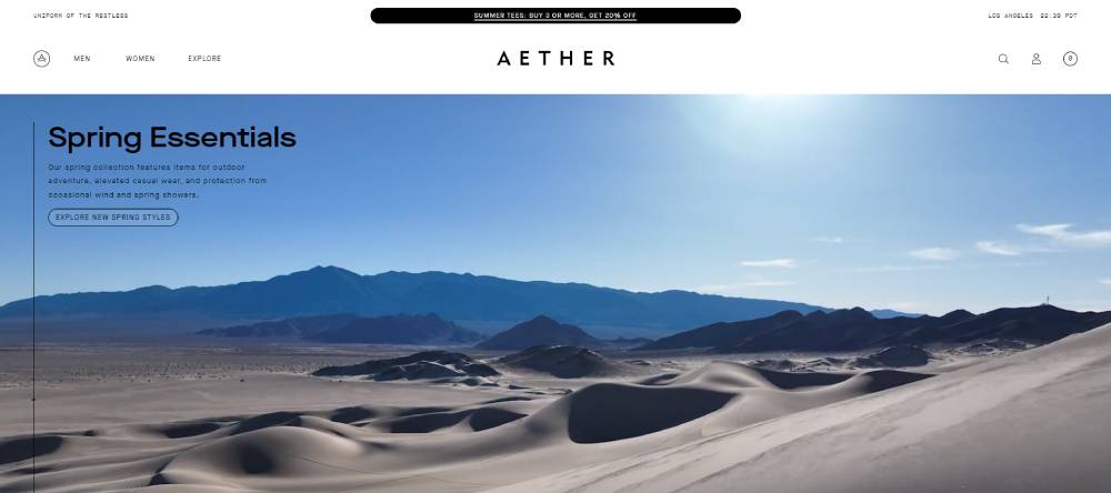
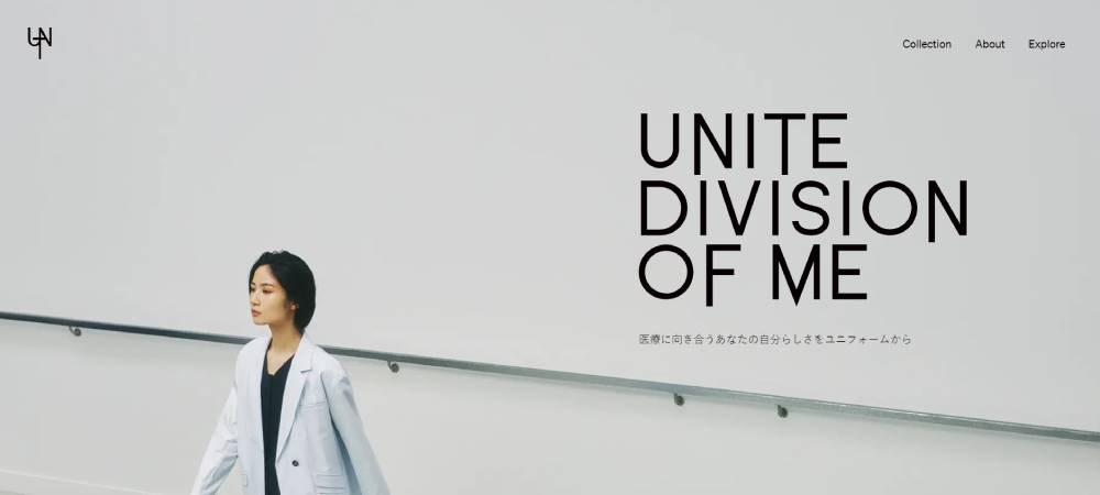
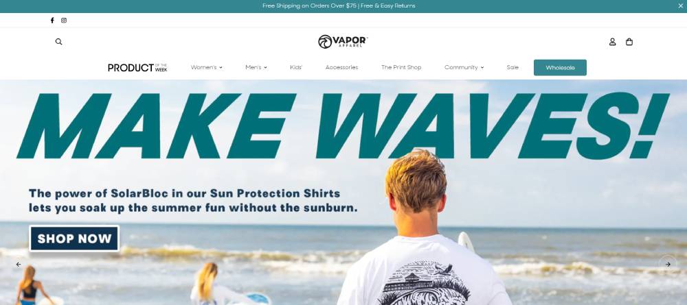
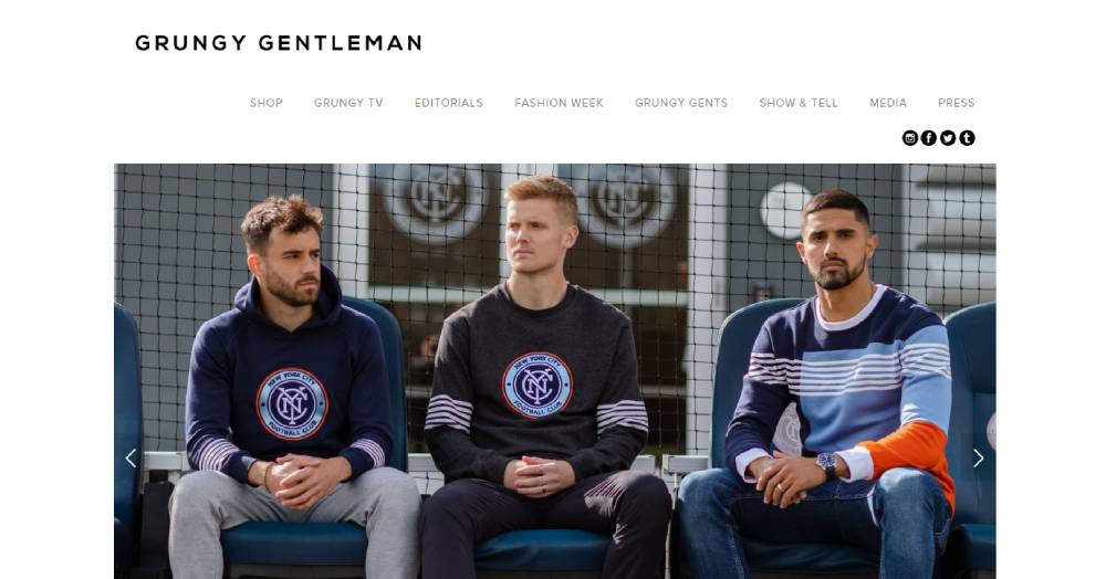
Clothing Website Design Examples
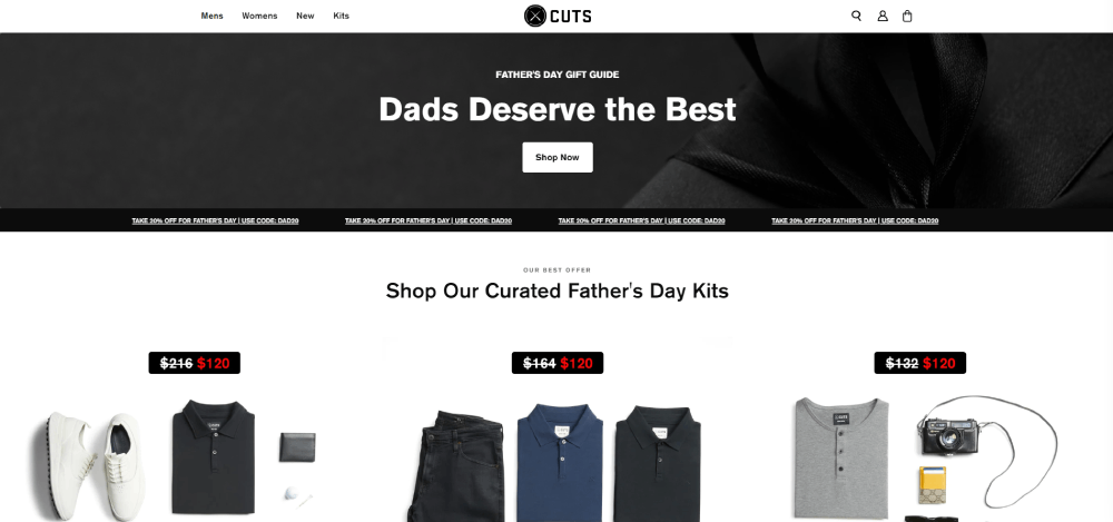
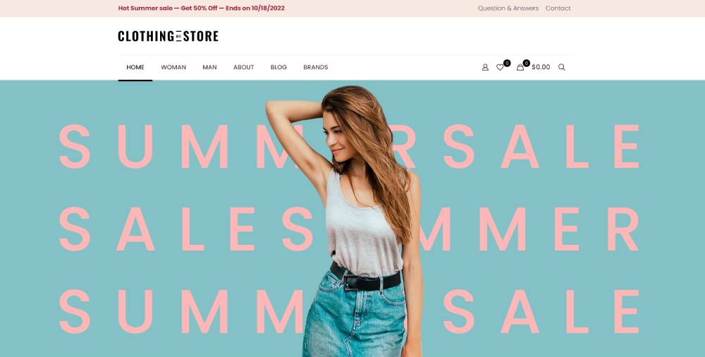
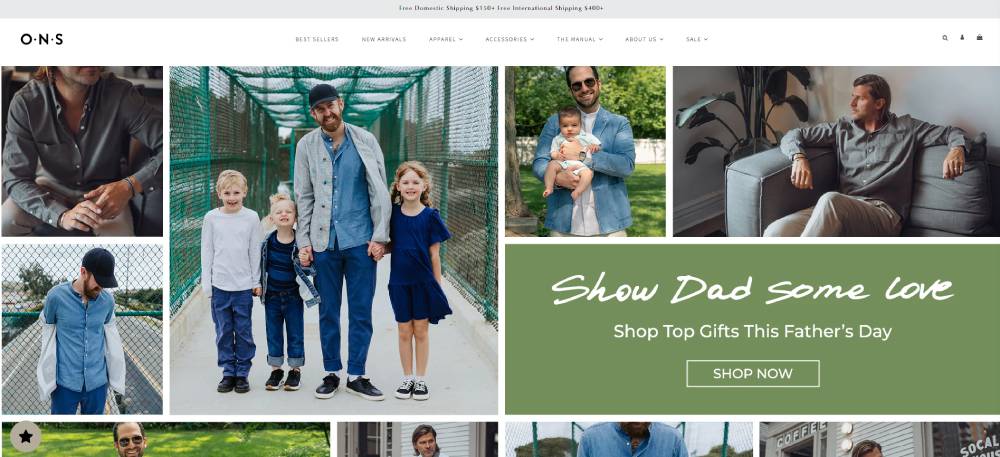
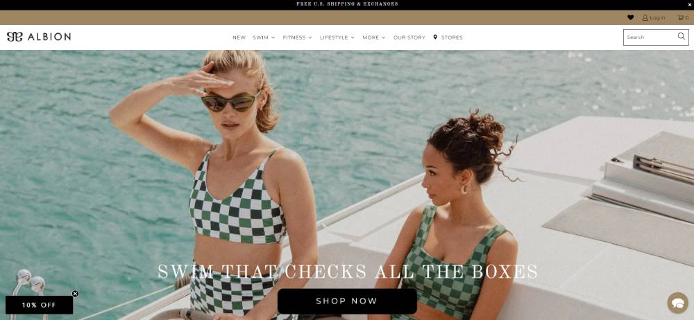
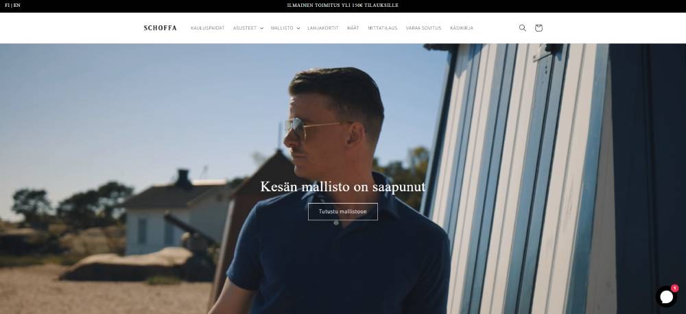
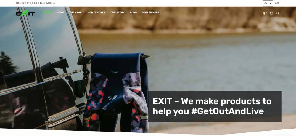
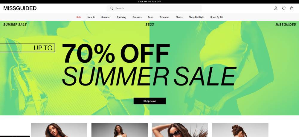
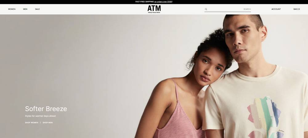
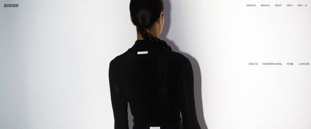
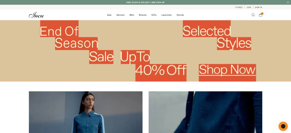
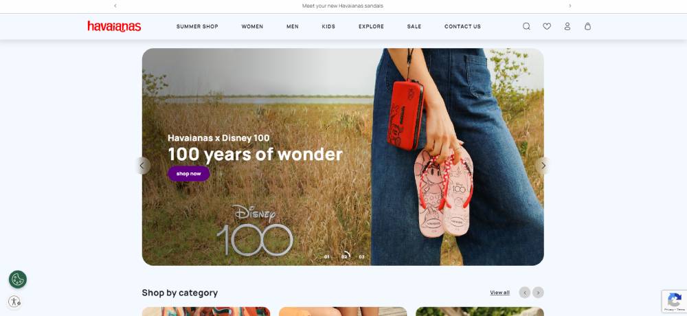
Cuts Clothing


What Separates Good Clothing Website Design from Average
Most clothing websites look fine. Very few actually perform. The difference isn't about having a bigger budget or a flashier homepage animation.
Forrester Research found that a well-executed UX can increase conversion rates by up to 400%. That's not a small tweak. That's the entire business model.
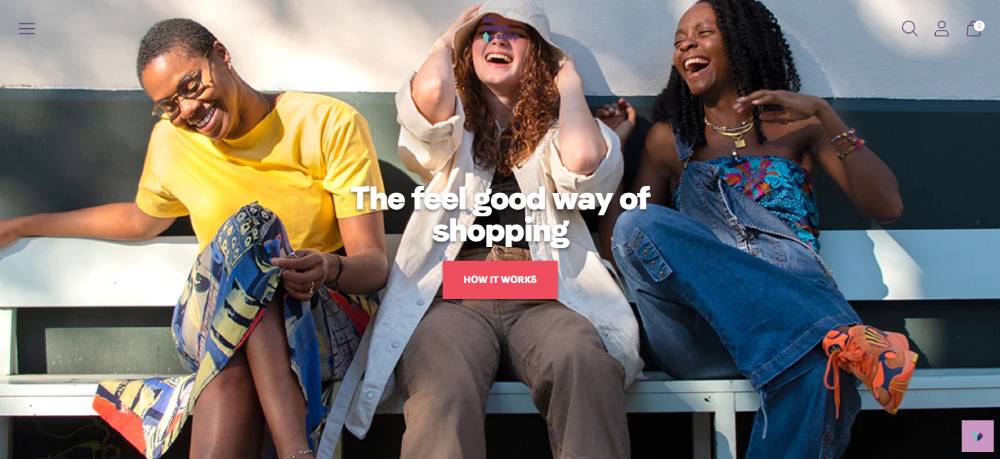
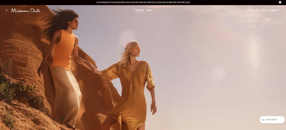
Photography and Visual Hierarchy
Image quality is non-negotiable. The most important ecommerce features for fashion shoppers in 2024 were high-quality product images, clear inventory availability, and transparent delivery details (Shopify, 2024).
Three photography approaches dominate clothing sites:
- Studio shots: clean background, consistent lighting, used by fast fashion and mid-market brands
- Lifestyle/editorial: contextual settings that sell aspiration, common in DTC and luxury
- UGC-forward: customer photos mixed with branded content, increasingly used post-2024 FTC restrictions on fake reviews
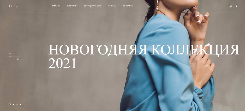
Typography and Color System
Inconsistent type choices kill credibility fast. A clothing brand's font selection communicates price point and personality before a visitor reads a single word.
What well-designed clothing sites get right: They treat typography as a brand asset, not an afterthought. Luxury brands lean serif. Streetwear sites go bold sans-serif or intentionally raw. Mid-market brands tend to play it safe with geometric sans-serifs like Helvetica or Futura variants.
The same logic applies to color. A well-chosen color scheme is part of the product experience, not just decoration.
Performance and Page Speed
Fast-loading pages can increase conversions by 27% for fashion brands (Centra, 2025). A 1-second delay causes a 7% drop in conversions.
Fashion sites are image-heavy by nature, which makes speed harder to maintain. Google's 2024 Core Web Vitals update made Interaction to Next Paint (INP) a ranking factor, directly hitting media-heavy fashion storefronts that hadn't optimized their JavaScript load.
The benchmark: INP under 200 milliseconds. Most clothing sites miss it.
Mobile-First UX Patterns
Almost 80% of fashion ecommerce traffic comes from mobile devices (SellersCommerce). Designing desktop-first and retrofitting mobile is the wrong approach in 2025.
Key mobile patterns that separate good from average:
- Sticky add-to-cart buttons that follow the user down the product page
- Swipe-based product image galleries
- Bottom navigation bars instead of hamburger menus
- One-tap checkout with Apple Pay or Shop Pay integration
For a broader look at how mobile-first design principles apply across site types, the approach is consistent: build for the smallest screen first.
Common Design Mistakes in Clothing Websites
Bad clothing website design usually isn't one catastrophic error. It's five medium-sized ones that compound.
88% of consumers say they're less likely to return to a site after a poor experience (Contentsquare). In fashion, that's especially damaging because repeat purchases are the business model.
Autoplay Video and Page Speed
Autoplay video on the homepage hero looks impressive in a design mockup. In production, it tanks Core Web Vitals scores, especially on mobile.
The problem: a 1-second delay in page load causes a 7% drop in conversions. Fashion sites with autoplay video often miss their LCP target by 2-3 seconds. That's a 14-21% conversion penalty built directly into the design.
The fix isn't removing video. It's loading a static image first, then lazy-loading video after the rest of the page renders. Most websites with video backgrounds that perform well use this approach.
Overloaded Navigation
Too many top-level categories is one of the most common clothing website design mistakes. It creates choice overload and raises bounce rate.
61% of users abandon sites with poor navigation (UX research). For clothing brands with large catalogs, the solution isn't fewer products. It's smarter hierarchy.
The pattern that works: 4-6 top-level categories maximum, with filtering handling the depth. COS manages hundreds of SKUs with five main navigation items. Their filtering logic handles everything else.
Inconsistent Product Photography
Mixing photography styles across product pages destroys brand perception.
What "inconsistent" looks like in practice:
- Some products shot on white background, others on lifestyle sets
- Model skin tones processed differently across product families
- Varying image dimensions that break the product listing grid
56% of online returns result from products not matching their online descriptions (Firework). Photography that misrepresents color or fit is a direct driver of that number. A well-structured hero section and product gallery that maintain visual consistency reduce that mismatch.
Missing or Buried Trust Signals
Returns policy, size guide, and payment security badges are not footnote content. They're conversion tools.
Paysafe data shows 62% of consumers see fraud as an inevitable risk when shopping online. That anxiety is happening while someone looks at your product page. If your trust signals are hidden in the footer, they're not doing any work.
Clothing sites with good UX put returns policy and size guides directly on the product page, not linked away from it.
How to Apply These Design Patterns to Your Clothing Website
Knowing what good clothing website design looks like is useful. Knowing which parts to actually build first is more useful.
Start with brand tier. The design decisions that work for Brunello Cucinelli actively hurt a fast-fashion DTC brand and vice versa.
Match Design to Brand Tier
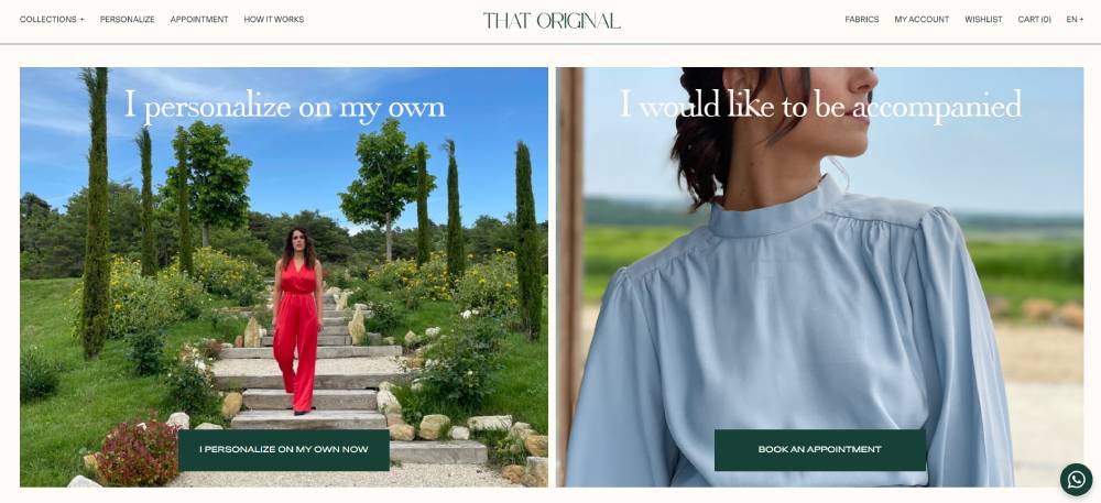
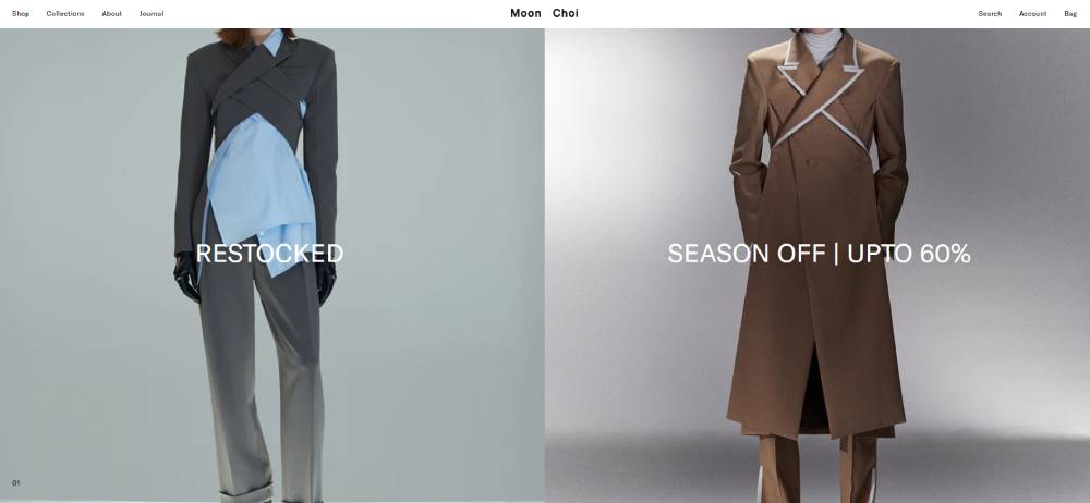
Luxury positioning: whitespace-heavy, serif type, minimal navigation, no visible sale section.
Mid-market: clean grid, prominent filtering, sustainability content on PDPs, size guide above the fold.
DTC/value: community content, email capture integrated into the homepage flow, UGC as primary social proof.
Getting this wrong is expensive. A startup apparel brand that builds a Bottega Veneta-style homepage with sparse products and no clear conversion path will struggle to justify the design investment. Build for where your customer is, not for a brand you admire.
Platform and Build Decisions
Most clothing brands should start on Shopify. Fashion and apparel represent 60% of Shopify Plus merchants for a reason (wiserreview, 2025). The ecosystem is built for the category.
| Platform | Best For | Design Flexibility |
| Shopify | DTC, mid-market scaling | High: Uses Liquid/Online Store 2.0; extensive theme market |
| Shopify Plus | High-volume, enterprise | Unlimited: Full API access and native Headless (Hydrogen) support |
| WooCommerce | Content-heavy & niche brands | Unlimited: Open-source, but requires high technical maintenance |
| Squarespace | Small, design-forward brands | Moderate+: Now features AI-assisted styling and custom font uploads |
For design references before building, Awwwards and SiteInspire both index high-quality clothing website design examples. Behance has strong apparel brand case studies with design rationale included.
Pre-Launch Design Checklist
Before going live, run through the non-negotiables:
- Mobile checkout tested on actual devices, not just browser resize
- Product images consistent in style, dimension, and color processing
- Returns policy and size guide visible on every product page
- Page speed score above 70 on Google PageSpeed Insights for mobile
- Trust signals (payment badges, security cert) visible before the fold on checkout
A complete website checklist covers more ground, but for clothing sites specifically, these five items account for most post-launch conversion problems. Fix them before launch. The cost of finding them after is higher.
When to Hire vs. Use a Theme
Straightforward answer: use a clothing website template if you're under $50k in monthly revenue. Hire a designer or agency when design differentiation directly affects brand perception and conversion.
Mid-market clothing brands with strong visual identities often hit a wall with theme customization at around the 18-month mark. The things they want to do aren't possible without custom development. That's the right time to invest, not at launch.
For the design reference research phase, looking at aesthetic website designs across categories (not just fashion) is underrated. Some of the best clothing website design patterns borrow from minimalist website design, B2C website design, and even product website design examples outside the apparel space entirely.
FAQ on Clothing Website Design
What makes a good clothing website design?
Fast load times, consistent product photography, and a frictionless mobile checkout. Good apparel ecommerce UX removes every obstacle between product discovery and purchase. Trust signals like returns policy and size guides must be visible on the product page, not buried elsewhere.
Which platform is best for clothing website design?
Shopify is the most practical starting point. Fashion and apparel brands make up 21.8% of all Shopify merchants. For larger brands needing full design control, Shopify Plus with a custom or headless build is the standard approach.
How much does a clothing website design cost?
Theme-based Shopify stores run $500–$5,000 to set up. Custom clothing website design from an agency starts around $15,000–$40,000. Headless builds for high-volume apparel brands typically exceed $75,000 depending on scope.
What are the best clothing website design examples to study?
COS, Everlane, Gymshark, and Kith each represent different design approaches worth studying. For luxury apparel ecommerce design, Brunello Cucinelli and The Row are the clearest benchmarks. Awwwards and SiteInspire index strong apparel site examples.
How important is mobile design for clothing websites?
Critical. 81% of fashion ecommerce transactions happen on mobile devices. Clothing website design that isn't built mobile-first loses sales at checkout. Sticky add-to-cart buttons, fast image loading, and one-tap payment options are non-negotiable.
What colors work best for clothing website design?
It depends entirely on brand positioning. Luxury apparel sites use neutral, restrained palettes. Streetwear brands run high contrast. Mid-market clothing stores tend toward clean whites with one accent color. The color theory principles behind fashion site palettes always connect to price point and audience.
What pages does a clothing website need?
Homepage, product listing pages, product detail pages, size guide, returns policy, and About page are the core set. DTC clothing brands also add editorial or community pages. A visible website footer with policy links builds trust at every scroll depth.
How do luxury fashion websites differ in design from fast fashion sites?
Luxury clothing website design prioritizes whitespace, editorial photography, and minimal navigation. Fast fashion sites prioritize filtering depth, promotional banners, and checkout speed. The design goals are opposite. Luxury slows the shopper down. Fast fashion removes every possible hesitation.
What are the most common clothing website design mistakes?
Autoplay video that kills page speed, overloaded navigation menus, inconsistent product photography, and missing size guides on product pages. Also: burying the returns policy in the footer instead of placing it where purchase decisions actually happen.
Do clothing websites need a blog or editorial section?
Not always, but it helps. DTC and mid-market clothing brands that publish styling content see better organic search performance. Noah NYC and Everlane both use editorial content to reinforce brand values. A basic blog design integrated into the store is enough to start.
Conclusion
This conclusion is for an article presenting clothing website design examples across luxury, streetwear, mid-market, and DTC apparel brands.
The pattern is consistent: brands that treat design as a conversion tool outperform those that treat it as decoration.
Gymshark, Everlane, COS, and Supreme all make different design choices. What they share is intentionality. Every layout decision connects back to how their specific customer shops.
Whether you're building on Shopify, WooCommerce, or a custom stack, the fundamentals stay the same. Mobile-first UX, consistent product photography, visible trust signals, and fast page load times drive results across every fashion ecommerce category.
Pick the patterns that match your brand tier. Build from there.


