

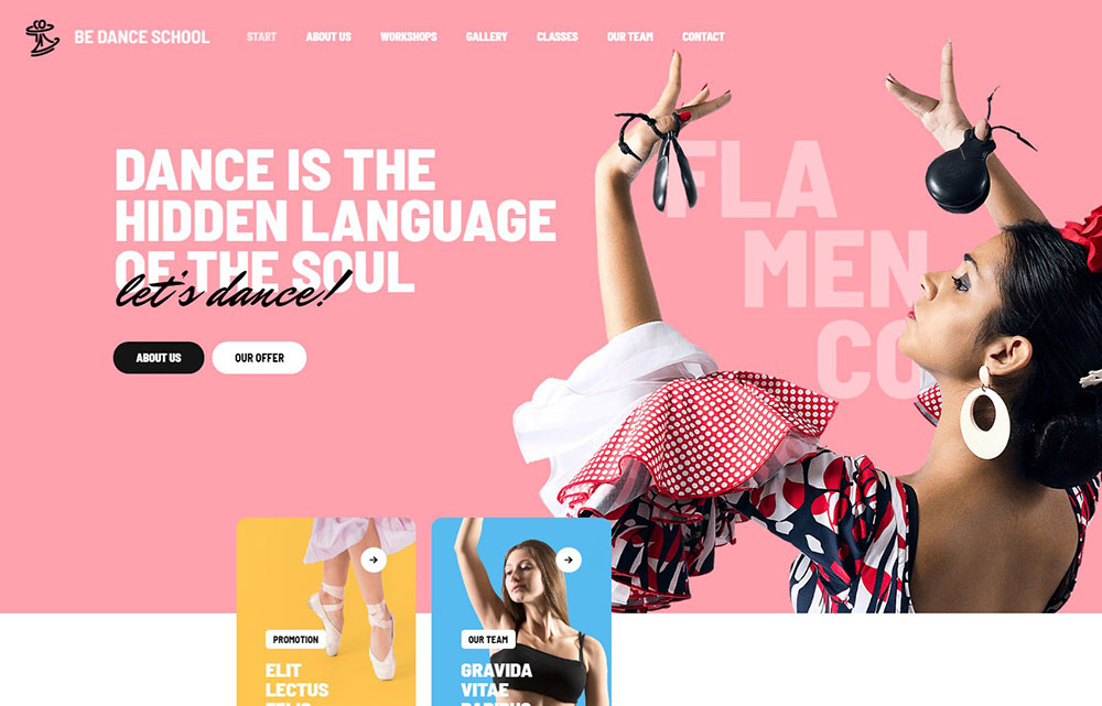
Stunning Yoga Website Design Examples for Inspiration
April 21, 2024
Inspiring SaaS Website Design Examples to Learn From
April 24, 2024Words may be the lifeblood of a website, but it’s typography in web design that sets the pulse. The right font breathes character into pixels, whispering the story of a brand into the reader’s consciousness.
It’s the silent yet powerful force defining user experience, marrying aesthetics with functionality.
In this read, there’s a dive deep into the alphabet soup of web typography. From the meticulous dance of typefaces to the science of readability, the journey reveals how subtle text nuances significantly impact audience engagement and brand perception.
The art of molding letters not only carries the weight of information but also ensures it’s served with clarity.
Prepare to uncover the layer beneath the surface, beyond mere letters and into the realm of visual storytelling.
By the end, there will be no secrets left in coordinating the symphony of serifs with the practicality of pixels, and mastering this craft in the vast, digital landscape.
Understanding Typography Elements
Typefaces and Fonts

When diving into the world of Typography in Web Design, we hit a common fork in the road: typefaces and fonts. Though they seem similar to the uninitiated, they’re distinctly different beasts.
A typeface is like the music of a band, encompassing a style, vibe, melody—aesthetic. It’s the visual equivalent of the genre. Imagine it as the overarching family name. Arial, for instance, is a typeface, much like rock is to music genres.
A font, on the other hand, is like the album in that genre. It’s the physical manifestation of the typeface.
Arial bold 12pt is a font, just as ‘Thriller’ is to pop. It’s more granular, detailing the specifics—weight, size, and style—the nuts and bolts that make it work on your web page.
Within this sphere, we see the timeless battle of serifs and sans-serifs.
Serifs bring a traditional sense of flair, with little feet adorning characters, as seen on Times New Roman.
They’re old-school, a hat tip to printed literature, often dressing up more formal settings.
Sans-serifs, the modernists, ditch the frills for a cleaner line—think Arial or Helvetica.
These are the to-go for clarity, especially in the digital landscape where crispness equals readability. On screens, they help keep eyeballs from tiring, which is vital.
The usage then becomes a question of context. A fancy wedding invite might call for serifs’ sophistication, while a startup’s website craves the clean, approachable look of sans-serifs.
Technical Aspects of Typography
Kerning, Tracking, and Leading
Kerning is a subtle art, the tightrope walk of spacing between specific letters. It’s ensuring “AV” doesn’t look like a singular, perplexing symbol.
It’s the individual attention that brings harmony to letter pairs.
In the same breath, we talk about tracking. If kerning is the individualized spacing, tracking is the equalizer.
It adjusts letter spacing uniformly, affecting the overall density and texture of the text block.
Let’s not forget leading—the vertical spacing, the high jumper of typesetting.
It’s the gap between baselines, the breathing room for lines. Set it too tight, and you suffocate the text; too loose, and it’s a jumble of thoughts failing to connect.
Color and Contrast

Color whispers feeling into text. It’s the mood lighting. Go bold with reds for energy, or soft with blues for trust. It’s the visual representation of tone.
But, caution—contrast is key. A gray font on a slightly darker gray background? That’s a recipe for eye gymnastics no reader wants to endure.
High contrast is the beacon for readability. Black on white—classic for a reason. It’s like clear dialogue in a movie.
No one wants to strain to catch the plotline, just like no reader wants to squint at the screen.
Font Sizes and Line Height
Comfort is king—font sizes should be the comfy couch of web design. Too small, and it’s like sitting on pebbles.
Too large? It’s an echo in an empty hall. The right size invites the reader in, nudging them to stay awhile.
And it’s not just about size; enter line height. A partner to leading, line height determines the personal space of each word.
It’s setting the table for a feast of words where every guest has enough room to savor the meal.
Designing for Readability and Legibility

Challenges of Digital Typography
Whisk yourself into the digital streams of today’s web, and you’ll splash against the rocks of screen size, resolution, and calibration.
Like a chameleon, digital typography must adapt, morphing to fit screens from palm-sized smartphones to billboard-esque monitors.
The resolution sharpness shifts across devices; a font that sings on a retina display may croak on lower resolution screens.
Calibration? That’s another beast. Imagine colors and clarity changing with each screen; it’s like every person hearing a different version of a song based on their headphones.
Then, there’s the multi-device compatibility jig. It’s not just about making sure text looks good on a laptop and forgetting the rest. No, no.
This dance involves twirling gracefully across devices of all sorts. You’ve got tablets, phones, laptops, all joining in.
Each device is a unique stage, and if the choreography isn’t spot-on, well, the performance falters—all the world’s your stage, and that stage is wickedly diverse.
Best Font Selection for Screen Reading
In the arena of Typography in Web Design, web-safe fonts wield the shield of consistency.
They’re the brave warriors battling across browsers, devices, operating systems. They keep the peace by looking good everywhere. Arial, Verdana, Times New Roman—these are the trusty steads, reliable and steadfast.
But look closer. The hero of our story might just be x-height and counter.
You see, x-height, that’s the height of lowercase letters, plays a colossal role in how easy fonts are on the eyes. Taller x-heights? They bring clarity, making the tiny ‘e’ and ‘s’ more discernible on screens.
Then there’s the counter—the open space in letters like ‘o’ and ‘c’. It’s like the courtyard in a bustling castle; the more open it is, the easier it is to navigate.
Small counters can muddle the view, blending letters into an indecipherable stew.
Typography Practices in Web Design
Establishing Hierarchy and Focus
Imagine entering a library with books scattered all around. Typographic hierarchy is the librarian of your content; it organizes, categorizes, and brings order to the chaos.
Through size, color, and style, it whispers to the reader, “Start here, go there next.”
The impact is immense. It guides the reader’s journey through headings, subheadings, body text, drawing attention where it’s due.
It’s a silent conductor leading an orchestra, each element—a note played at the right volume, at the precise moment.
Then comes setting a visual order. It’s placing breadcrumbs along the forest trail of the webpage.
Readers follow, almost without thinking; larger fonts for titles, bolded for emphasis, italics for whispers. It’s the path well-lit, and it feels natural. Who loves getting lost anyway?
Formatting for a Pleasant Reading Experience
Opening a book, the text meets the eye in comforting waves. On the web, it’s the same.
The delicious width of lines, the way text blocks hug the edge of the screen, or float in a sea of white space—it all matters.
Line width and text block shaping — get this right, and it’s like arranging furniture in a room, welcomes you in, sit down, stay awhile. Too wide and the reader’s eyes tire, dashing back and forth. Too narrow and the rhythm is broken, choppy like a rough sea.
Now, picture a canvas — that’s your background. Then, the paint —that’s your font color.
It’s a match that needs to complement, not clash. High contrast? It’s the bread and butter for legibility. Soft on the eyes but clear as crystal. It’s the morning coffee, just the right strength, perfectly balanced.
Mobile Typography Considerations
Switch gears, swap lenses; now the world’s in the palm of hands. Mobile devices—ubiquitous and unyielding.
Scaling for them is non-negotiable. Every letter sculpted to perfection, no matter the screen.
The fonts that shine on desktop must also glow on mobile.
Resizing, adjusting, maintaining that seamless beauty, crafting that functionality, it’s no less than architectural ingenuity.
Then, adaptability —the chameleon skill. Responsiveness—text flexing, flowing, falling in place as screens pivot and twist.
It’s tapping into rhythm, a fluid dance between content and container, always in sync, and never missing a step.
Implementing Effective Typography
Typography Mistakes to Avoid
Stroll down the path of creating digital spaces and soon discover that missteps in typography are as common as pebbles on a beach.
One of the slip-ups made often is not giving enough breathing room between lines — it’s like trying to read a book with all the words in a scramble.
Correction? There’s a magic to mastering leading — that’s the space between lines.
Not just random spaces, but carefully measured ones that allow each word to stand out, ensuring none are lost in a sea of text. Ensure that the line spacing invites eyes to glide smoothly over text, not jump like a bunny in a meadow.
Now, consider fonts.
A jambalaya of typefaces on one page — well, that’s like wearing stripes with polka dots, it confuses the eye.
Stick to two, maybe three fonts; keep it classy and coherent. Mixing typefaces? Only if they’re from the same family, or complement each other like wine and cheese. Harmony is the goal, discord the danger.
Utilization of Typography Tools and Resources
Ah, technology! It brings an arsenal of tools that serve as allies in the quest for typographic excellence. Found a font on a whim?
There’s a plugin for that, identifying fonts from any site with a click. Need to pair fonts? There’s an app singing the perfect duet of typefaces.
And workflows — there are golden gadgets that layout font properties right in the browser.
Tweak away, watch the live magic as text evolves before your very eyes. CSS font properties become less of code and more of a canvas to paint upon.
Diving deeper, platforms for font selection and testing are like a playground for grown-ups.
Adobe Fonts, Google Fonts, offering up their treasures like libraries with infinite stories. Test. Try. Fall in love with a typeface.
Practical Application of Typography in Web Design
Best Practices for Typography
In pursuit of visual harmony, where does one even begin? Start by picturing a seesaw balanced with care.
Words and whitespace, size and scale, all weighed for that perfect equilibrium. Let headings stand tall, body text follow in measured footsteps, and calls to action shout with might.
Practically, think of a palette: limit choices to avoid a cacophony of hues.
It’s like ingredients in a dish; too many, and the flavors clash. Opt for a limited number of fonts, each serving its purpose, none fighting for attention.
The rules of thumb are simple, yet profound.
Choose web-safe fonts, dress them up for the occasion, and never fear white space — it’s the canvas for your word art. Be consistent with styles, tie them to actions and meanings.
FAQ On Typography In Web Design
What’s the difference between a typeface and a font?
Typefaces are the collective family of a set of characters sharing the same design principles.
A font is a subset; it’s the digital file that dictates the typeface’s specific weight, style, and size. It’s like a recipe and an ingredient.
Why is choosing the right font important in web design?
Choosing the right font is crucial as it affects both readability and the emotional impact of your site.
It’s part of visual communication, enhancing user experience and ensuring that the message resonates with users, aligning with a brand’s voice and identity.
How does typography affect user experience?
Typography weaves through user experience, guiding users with visual hierarchy and legibility, fostering a seamless journey through content.
Proper typography ensures information is digestible and enjoyable, thereby increasing visitor engagement and comprehension.
What is typographic hierarchy and why is it important?
Typographic hierarchy organizes content, signifying importance through size, color, and font variations.
It’s vital for leading readers’ eyes, framing information flow, and promoting an intuitive understanding of content structure.
This hierarchy forms the visual rhythm on a webpage, enabling efficient information processing.
How does one ensure typography is accessible and inclusive?
Ensuring typography is accessible involves choosing web-safe fonts, ample contrast, considerate font sizes, and supporting assistive technologies.
It’s about inclusivity, ensuring legibility across various visual abilities, thus reaching a broader audience and aligning with web accessibility standards.
What role does responsive typography play in web design?
Responsive typography dynamically adjusts to various screen sizes and resolutions, providing an optimal reading experience across devices.
It adapts through scaling font sizes, line heights, and weights, ensuring text is both beautiful and functional on any device, from desktops to smartphones.
Can typography impact a website’s loading speed?
Absolutely, typography can affect loading times. Web fonts, especially custom or multiple font files, add additional HTTP requests.
Responsibly using system or optimized fonts can mitigate these effects on speed, enhancing the balance between aesthetic and performance.
Are there any rules for mixing fonts?
When mixing fonts, aim for complementary contrasts and avoid over cluttering. Stick with a pairing—a serif with a sans-serif, for example, balancing style and readability. Maintain consistency across design elements, ensuring harmony and a unified design language.
What is kerning and how does it affect web typography?
Kerning adjusts the spacing between specific character pairs to prevent visual awkwardness and improve readability.
Even slight modifications can fine-tune the text’s appearance, facilitating a pleasant reading experience and maintaining visual consistency throughout the web content.
Should web designers stick to web-safe fonts only?
While sticking to web-safe fonts guarantees universal compatibility, it’s not a strict rule anymore.
With advancements in CSS and font resources like Google Fonts, designers can safely explore a wider range of typefaces, provided there’s careful consideration for fallbacks and loading times.
Conclusion
Wading through the nuances of typography in web design, one unearths the true essence of digital aesthetics.
The journey across the font landscape is much like crafting a visual symphony, where each letter plays its part in the grand schema of user interaction and visual communication.
The mastery lies in the delicate balance of readability, accessibility, and expressive typography tools—all working in concert to echo the brand’s voice.
The realization dawns that every curve of a serif and the sleek line of a sans-serif is a strategic choice, resounding with purpose and intent.
Navigating responsive typography and emerging web font technologies equips us with an evolving toolkit, propelling our narratives into ever-more engaging and inclusive territories.
As the final pixel falls into place, what remains is the clarity of content transformed into an immersive user experience, where each word is set with intention—a quiet nod to the power of well-executed typography.
If you enjoyed reading this article on typography in web design, you should check out these articles also:


