

How to make a WordPress mega menu
July 6, 2024
Awesome Looking Landing Page Designs To Check Out
July 12, 2024Mega menus emerge as your trusty compass—navigating users effortlessly through vast digital landscapes. Imagine a world where intuitive navigation meets seamless user experience; that's where a well-crafted mega menu takes center stage. Gone are the days of clunky dropdown menus that frustrate more than facilitate. In today's fast-paced environment, responsive navigation is crucial not just for aesthetics but for accessibility and engagement.
With front-end development tools like Bootstrap and Webflow, designing these menus has never been more exhilarating. Whether you're an e-commerce giant on Shopify or a creative platform on WordPress, a mega menu simplifies complex information architecture and enhances website usability.
In this article, we'll journey through inspiring mega menu examples, covering essentials from visual hierarchy to the latest UI design techniques. By the end, you'll not only appreciate the art of crafting intuitive navigation structures but be ready to elevate your site's UX to unmatched heights.
Examples of mega menus:
Asana
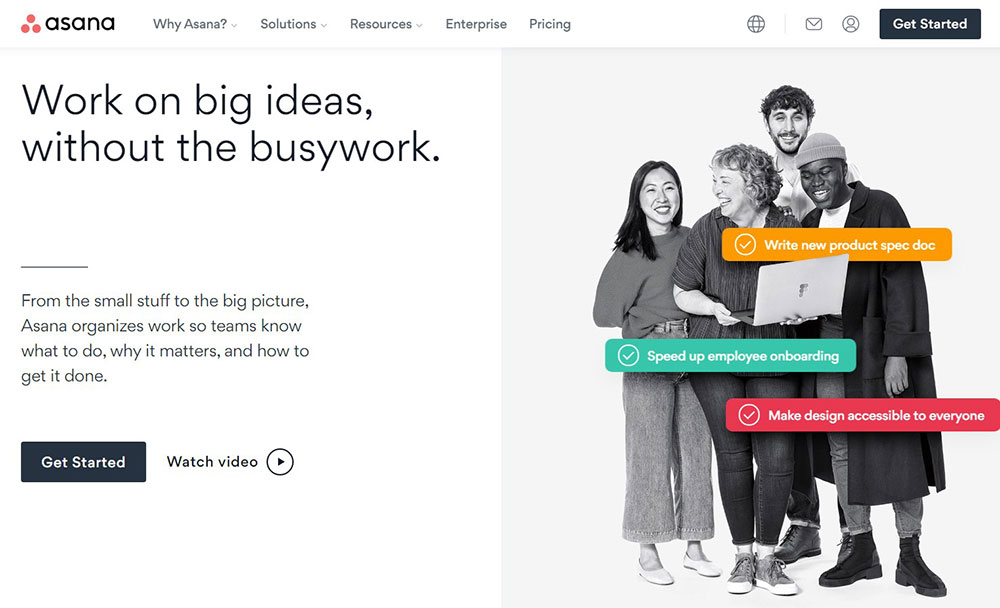
Asana is an excellent mega menu example of a content-heavy website that organizes everything under a mega menu.
When you click on any of the main menu items, a full-width drop-down menu with multilayer navigation and logical organization displays. The features menu, for example, shows the major features with a brief description of each on the left and a related menu that includes all service plans.
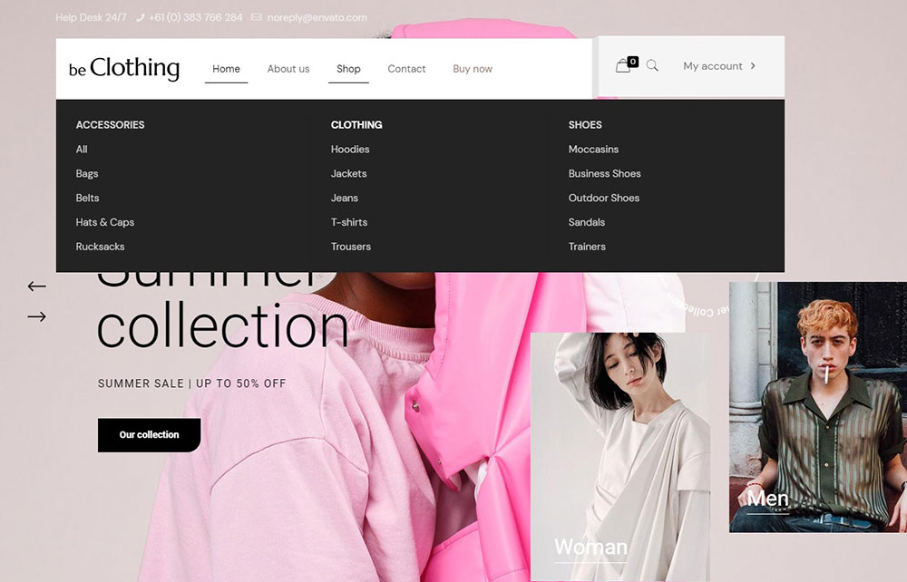
BeClothing
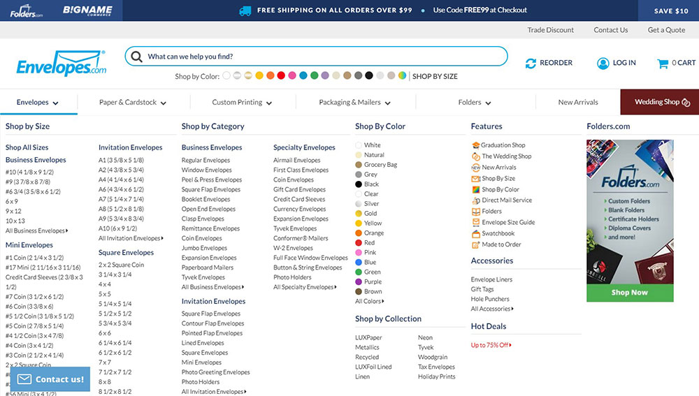
Envelopes is a website that sells mailing and envelope supplies. When you visit the website, you can immediately recognize the breadcrumbs. They also feature a down arrow next to the titles, indicating that you should move your mouse there to access more material.
When you do so, you'll be confronted with submenu choices where you may sort the items by size, style, color, and paper texture. Effective subcategorization would make the content quicker to scan and assist visitors in locating exactly what they're looking for.
BeShop
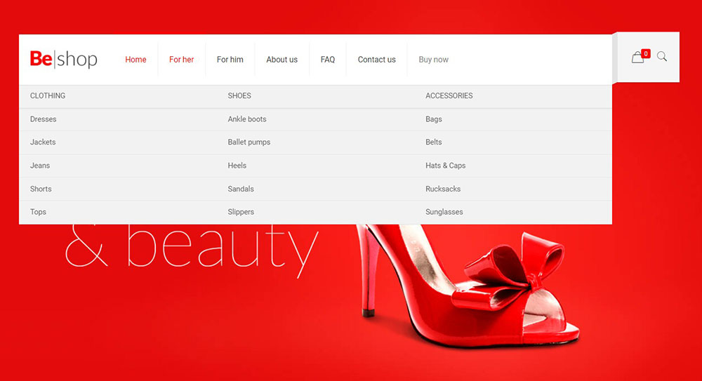
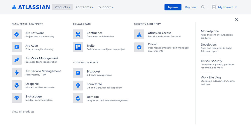
Atlassian creates agile tools such as Jira and Trello. It is a team tool that shares practices, methods, and guidelines for great agile teamwork. The website's massive volume of material has been neatly organized into sections and subcategories through a dropdown mega menu. Whether you want to look at planning, collaboration, or security tools, it's straightforward to discover.
Evernote
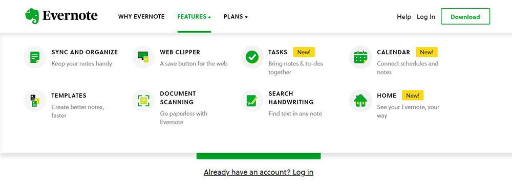
If you've ever needed a good note-taking tool, you've probably heard of Evernote. Overall, the website offers a very clean and functional user interface. The logo is at the top left corner of the website's header, and all of the key breadcrumbs are in a horizontal line next to the logo.
Individual breadcrumbs are labeled with a downward arrow. When you hover your cursor over these breadcrumbs, you will be presented with various alternatives relating to that breadcrumb. Evernote incorporates its green hue across the website.
As a result, you will get a drop-down list of sub-items when you hover over a breadcrumb. When you move your cursor over these sub-items, the backdrop will turn green. This is a wonderful method to reinforce the same color association practice while also be more appealing.
Android Police
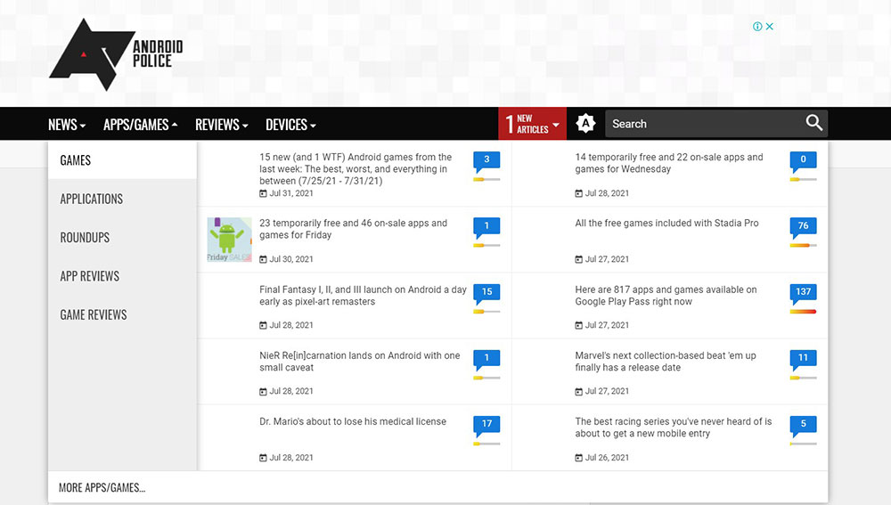
Android Police is a well-known website that regularly publishes news and reviews on everything Android-related. The website's massive volume of material has been neatly organized into sections and subcategories through a dropdown mega menu. Whether you want to read the newest news on Android OS, a certain brand of Android devices, applications, or discover reviews for Android tablets to help you decide on your next buy, the navigation will guide you.
Quincy Compressor
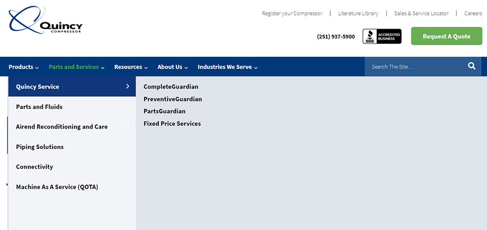
Quincy Compressor is an eCommerce website with difficult-to-manage material. They contain numerous inner pages of specific goods that may be classified and sub-categorized to be included in the mega menu.
Industrial items, in particular, can be challenging to organize due to their complicated numbers and titles. They have handled this situation admirably. They have three primary categories, each with its own subcategory. Each month, a product catalog is available for download at the bottom of the website.
Build
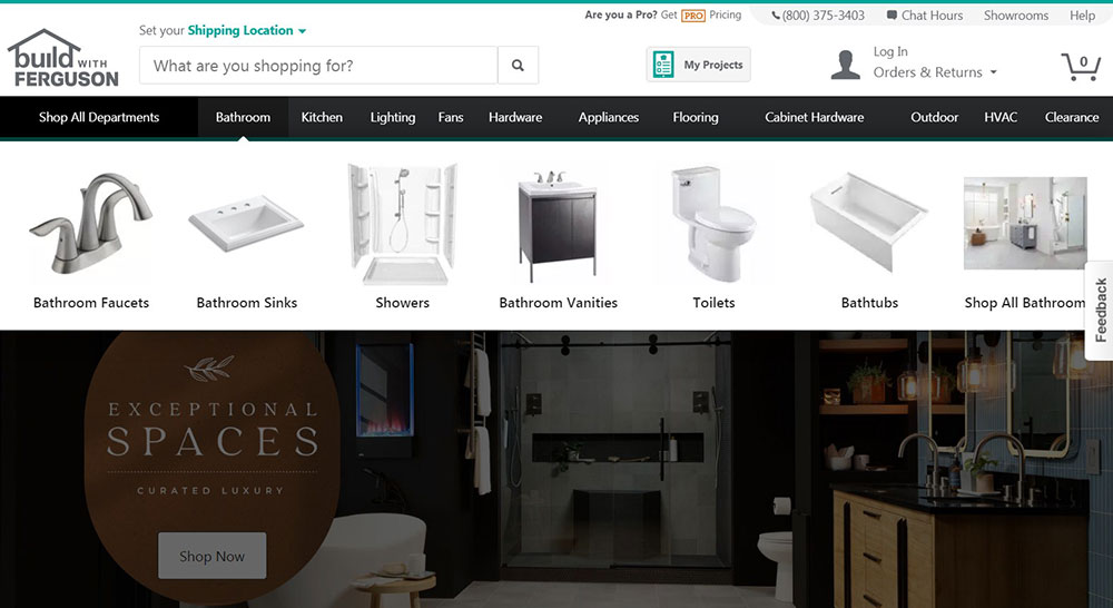
Build is a great website for house purchasing and decorating. They sell all required home appliances for your kitchen, bathroom, flooring, furniture, and décor, among other things. Because there are so many categories on the website, it is impossible to accommodate all of the navigation into a single menu.
Fitting it in a giant menu, on the other hand, is a challenge, but they have come up with a clever solution to accommodate more material in an appealing manner utilizing a mega menu. This website's mega menu is small to take up less space and uses icons instead of words. It looks beautiful and is also a practical technique.
The Sak
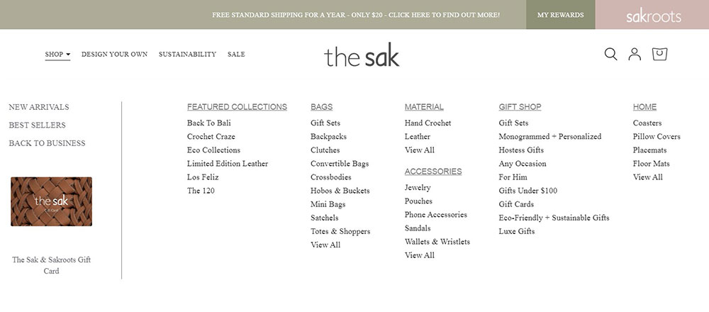
The Sak is a fantastic eCommerce store specialized in selling bags. It includes a massive menu for certain breadcrumbs. This may appear inconsistent at first, but it is actually a fantastic practice. Because none of the breadcrumbs contain gigantic menu items, the forced impression of having them throughout the design is avoided.
The tourists appreciate this. The few that do employ big menu design do so elegantly. The huge menu design responds to the dynamic impacts of the site. Underlining occurs when the mouse hovers over a breadcrumb before the mega menu is shown. This animation is smooth and well-executed. A minor visual indication like this improves the user experience.
Riad11
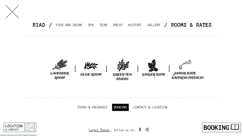
When you click on the menu icon, it immediately transforms into a full-page mega menu with nicely-created styled icons for the rooms.
This is an example of mega menu navigation that works for websites with fewer pages. The menu does not include a lot of information or multi-level categories. Nonetheless, it manages to utilize this functionality correctly without disrupting the user experience.
Estee Lauder
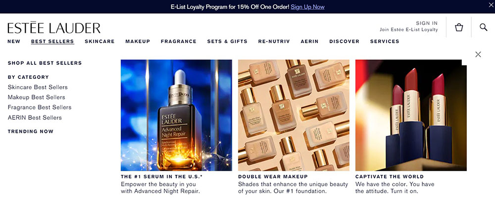
Estee Lauder is a well-known cosmetics company. It carries a wide range of popular skincare and cosmetic items. As a result, it stands to reason that such a website would require excellent website design and style. Estee Lauder's website does not disappoint.
The entire website is designed straightforwardly, with black text on a plain white backdrop. A huge banner graphic also adds to its visual appeal. The mega menu is straightforward yet effective. The primary subcategories are distinguished from the others by utilizing strong formatting, making it simple to distinguish between them. Overall, it appears to be structured, hierarchical, and well-organized.
Oracle
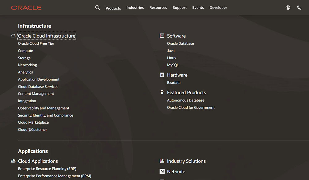
Oracle Database is a cloud database solution that is all-in-one for data marts, data lakes, operational reporting, and batch data processing. It is, unsurprisingly, a data-heavy website offering infrastructure, apps, and tools for developers, entrepreneurs, and students. This is why the mega menu is a whole page, allowing you to see many items in one location without having to scroll. It is critical to locate much deeper material that would otherwise be difficult to locate.
Beyond Trust
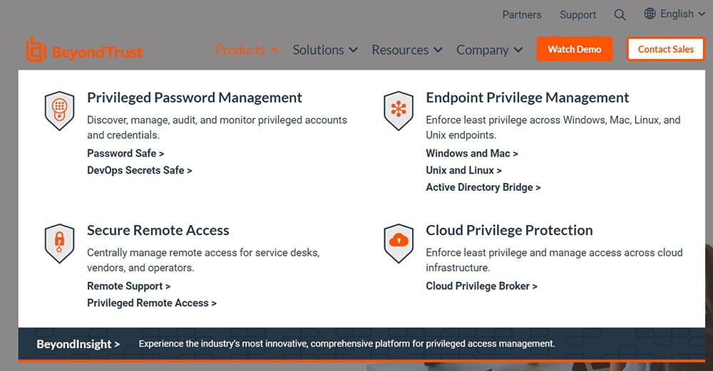
Beyond Trust is a business located in the United States that specializes in the development, marketing, and support of a family of privileged remote access, privilege identity management, and vulnerability management solutions for UNIX.
It offers a fantastic giant menu with several functions. It's split up into two horizontal menus. The options in the second menu are organized vertically. At first sight, the hierarchy is straightforward and simple to grasp. When you moved the mouse over the words, it became crimson.
Daniella Draper
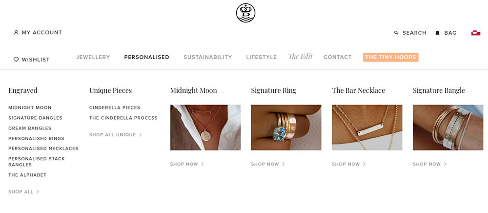
Daniella Draper is an excellent example of an eCommerce website that categorizes a large number of items. The mega menu is a two-level navigation dropdown with a few subcategories for each primary category. The latter appears basic yet elegantly made, with graphics that make it easy for people to navigate through.
Fao Schwarz
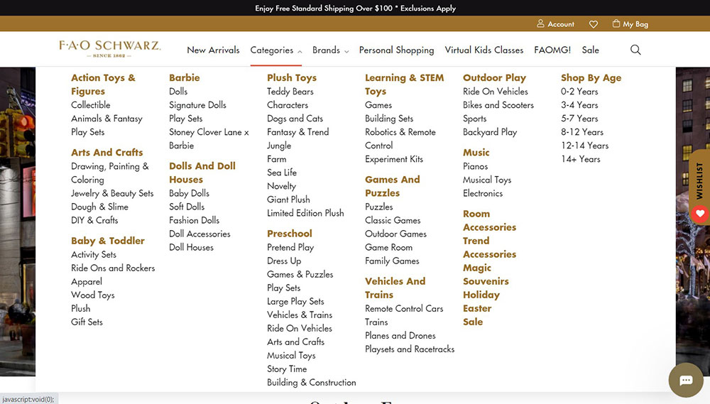
FAO Schwarz is a toy company based in the United States. It is well-known for its high-quality toys, life-size stuffed animals, brand integration, interactive experiences, and games. The website features an amazing mega menu design, with information organized by age group, brand, and other categories for quick access. When you move your cursor over different breadcrumbs, they too feature dynamic movements.
The mega menu is shown when a smooth horizontal line runs through the text. The site also employs mega menus sparingly, mainly for the necessary breadcrumbs, and adheres to normal drop-down menus for the rest. This makes everything seem nice and tidy, and it makes it very easy to access essential information.
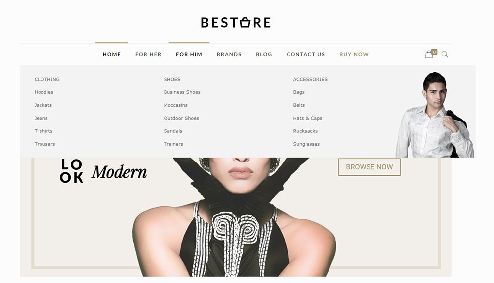
Bestore
FAQ on mega menus
What is a Mega Menu and How Does It Work?
A mega menu is an expansive, often full-width dropdown navigation that reveals multiple links, categories, and content offerings at once. Powered by frameworks like Bootstrap or custom CSS, it's the go-to for websites with vast information architecture, enhancing user experience by presenting everything in one glance.
Why Should I Use a Mega Menu on My Website?
Mega menus excel at structuring complex navigation hierarchies, especially in e-commerce or content-rich websites. They boost website usability by allowing quick access to deep-linked sections, improving UX design. They're especially effective when used with responsive design, ensuring easy navigation across all devices.
How Do I Design an Effective Mega Menu?
Start with a clear navigation structure. Categorize logically, applying visual hierarchy for clarity. Use UI design best practices like grid layouts. Prototype using Adobe XD or Figma for feedback. Ensure it's mobile-friendly, leveraging responsive techniques. A/B testing can refine usability further.
Can Mega Menus Impact SEO?
Yes, they can enhance internal linking and thereby improve SEO. With proper implementation, mega menus can highlight keywords and distribute link equity across pages. Ensure proper structured data and avoid clutter to prevent any negative impact on user interaction and page load speed.
Are Mega Menus Mobile-Friendly?
They can be, with careful design. Utilize mobile-first design or responsive navigation techniques to ensure accessibility. Consider simplified menus or collapsing sections that adapt to screen size, maintaining functionality without overwhelming the user. JavaScript or CSS tweaks often help in creating adaptive versions.
How Do I Implement a Mega Menu on WordPress?
Utilize themes or plugins tailored for WordPress that support mega menus. Many themes come pre-equipped, or you can leverage plugins for custom implementation. Modify the CSS mega menu to align with your branding, ensuring compatibility with your existing site structure and content management system.
What Are the Best Examples of Mega Menus?
Look at retail giants like Shopify—their well-structured categories and intuitive design offer clarity. Similarly, media platforms using Google Material Design principles present content-rich mega menus. These examples lead with design efficiency, ensuring that both aesthetics and functionality are optimized.
How Do Mega Menus Affect User Experience?
Mega menus, executed well, significantly enhance user experience by reducing search friction—users find what they need faster. They improve navigation patterns, visual appeal, and interaction quality, marrying aesthetics with function. Within web development, prioritizing accessibility and logical flow is crucial.
Are Mega Menus Suitable for All Types of Websites?
Not necessarily. For smaller sites or those with limited content, a simple menu might suffice. For content-heavy or e-commerce websites, mega menus excel in structuring and presenting information. Align menu type with site goals, user needs, and the overall navigation patterns you're aiming to deploy.
How Can I Ensure My Mega Menu is Accessible?
Incorporate accessibility features from the start. Use descriptive labels, ensure keyboard navigation, and test for screen readers. Follow W3C guidelines and prioritize contrast and readability. Regularly conduct usability testing to identify potential barriers, ensuring inclusivity across all user demographics.
Conclusion
Crafting the perfect mega menu involves more than just listing links—it's about designing a seamless navigation experience that resonates. Through various mega menu examples, we've explored how these intriguing layouts transform complex web design. Using forwards-thinking techniques from the likes of Adobe XD and Figma, the key lies in applying visual hierarchy judiciously and intuitively.
Mega menus push the envelope with responsiveness, ensuring UX design prowess across devices. They enhance website navigation, streamline information architecture, and bolster content visibility, playing perfectly into the hands of your users’ needs.
The journey also includes essential accessibility features, safeguarding inclusivity. Usability testing, when integrated, guarantees continuous improvement, echoing the dynamic nature of contemporary web development. As mega menus evolve within the digital canvas, they remain a testament to strategic UI design, drawing the line between a visitor's confusion and a seamless interaction, each level like a narrative unfolded.
If you enjoyed reading this article on mega menu examples, you should check out this one about how to get a WordPress mega menu.
We also wrote about a few related subjects like hotel website design, the best looking tourism websites, best corporate websites, great looking spa websites, top notch musician websites, church websites, the most impressive luxury websites and impressive animated websites.


