

The Best Church Website Design Examples
January 8, 2026
Architect website design examples to check out
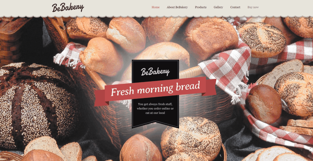
January 8, 2026Your bakery deserves a website that makes visitors hungry before they finish scrolling.
Most bakery website design examples fail because they treat baked goods like any other product. But croissants aren't software subscriptions, and wedding cakes aren't consulting services.
This guide examines real bakery web design across artisan shops, commercial operations, and specialty businesses. You'll see what works for product photography, online ordering systems, and mobile responsive layouts.
We'll cover visual hierarchy, navigation architecture, typography choices, and ecommerce features that actually convert browsers into customers.
What is Bakery Website Design
Bakery website design is the process of creating digital platforms that showcase baked goods through visual layouts, product photography, and ordering systems. The design combines brand identity with functional architecture to support both browsing and ecommerce transactions.
A well-executed bakery web design balances appetite appeal with usability. Product images need proper lighting and styling while maintaining fast load times across devices.
Most bakery ecommerce design focuses on three core functions: displaying products with clear categorization, processing custom orders through forms, and scheduling pickup or delivery. The website layout must accommodate both walk-in customers checking hours and online shoppers placing advance orders.
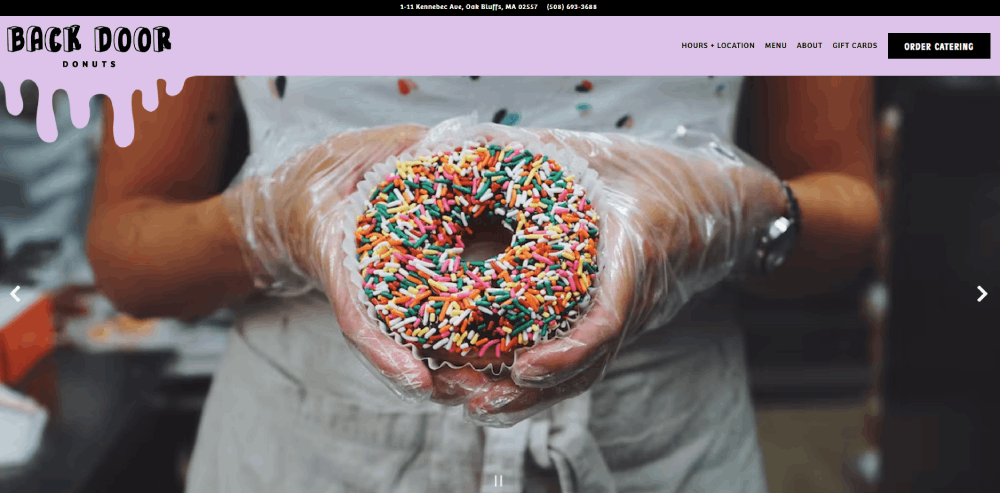
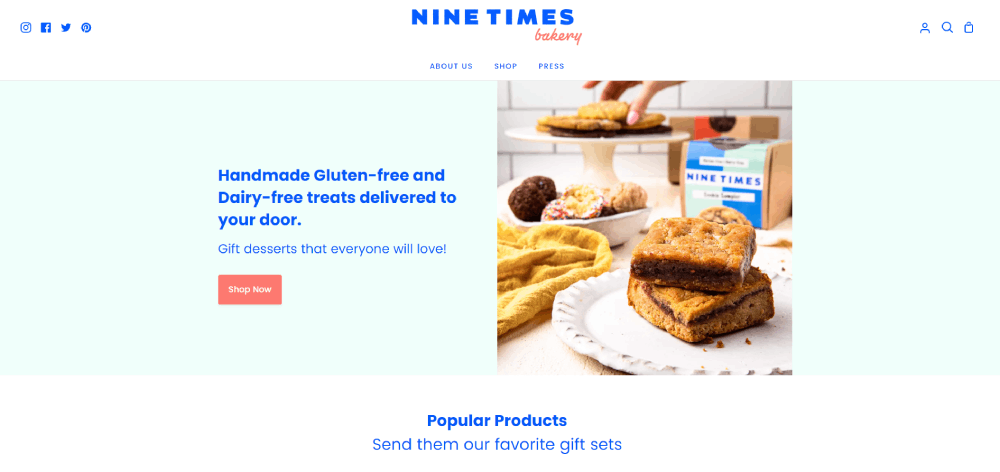
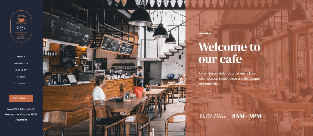
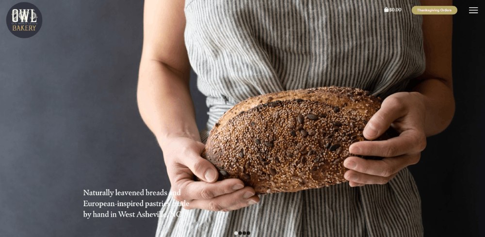
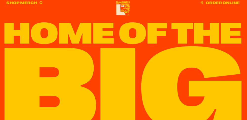
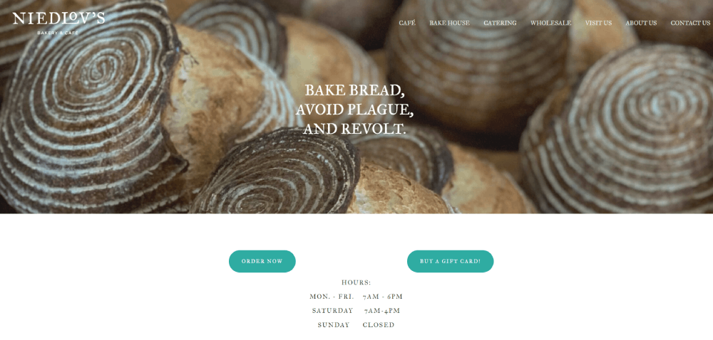
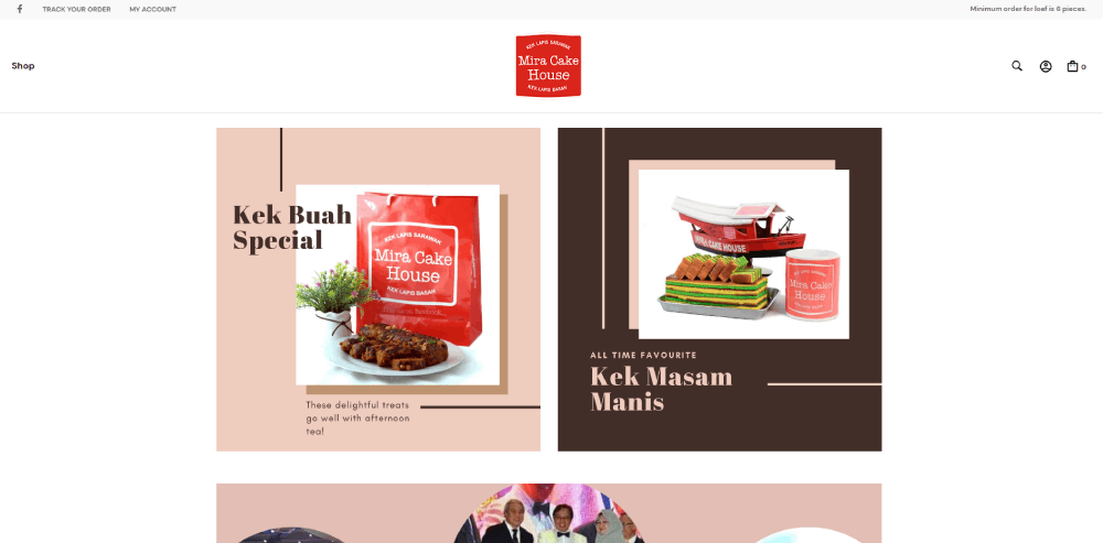
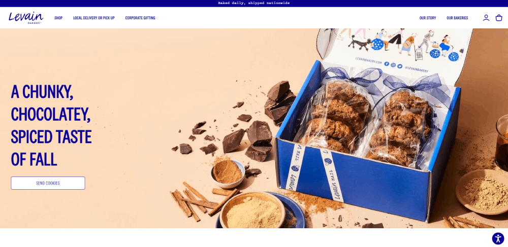
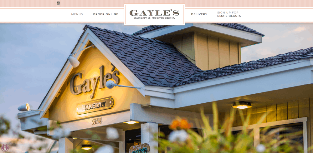
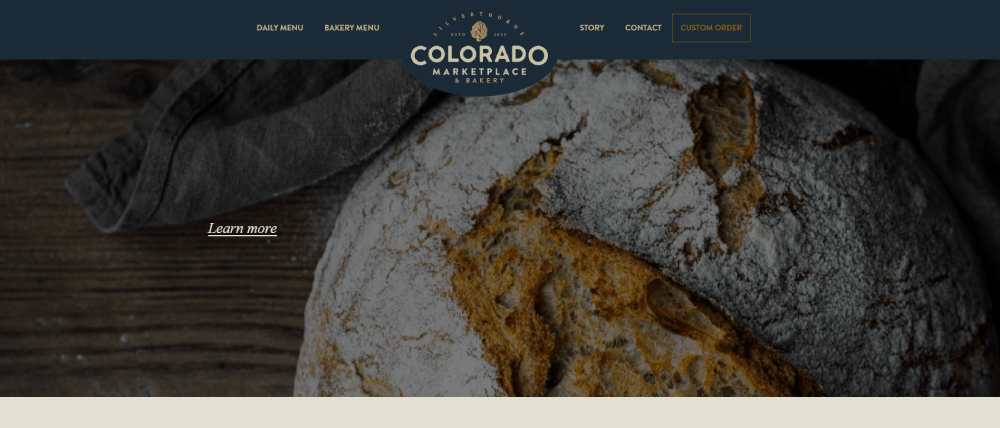
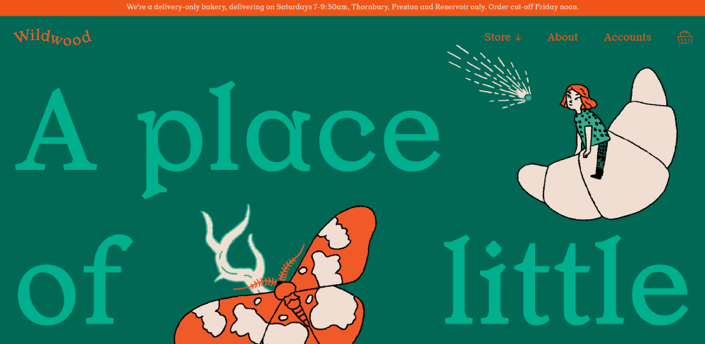
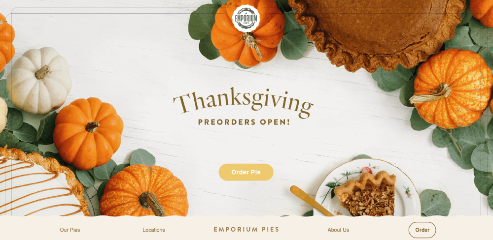
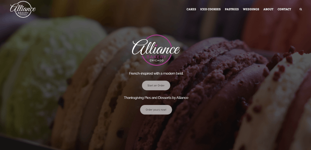
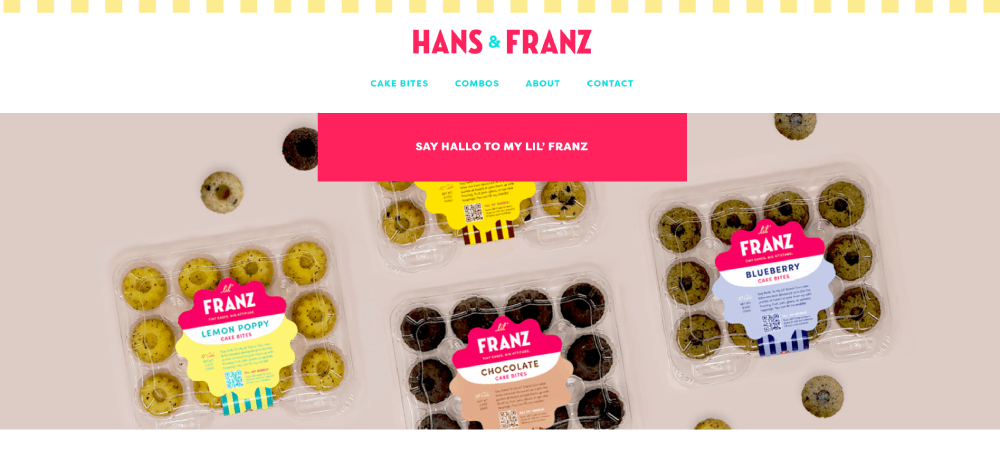
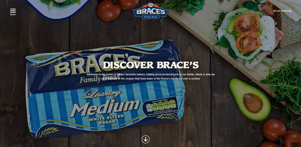
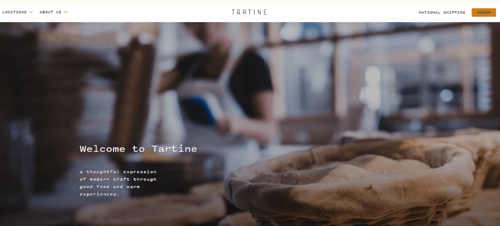
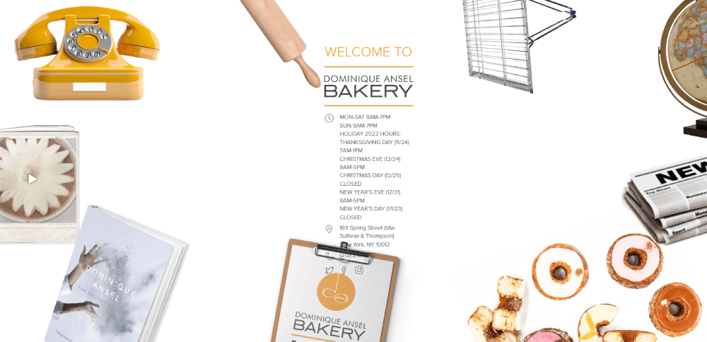
Bakery Website Design Examples
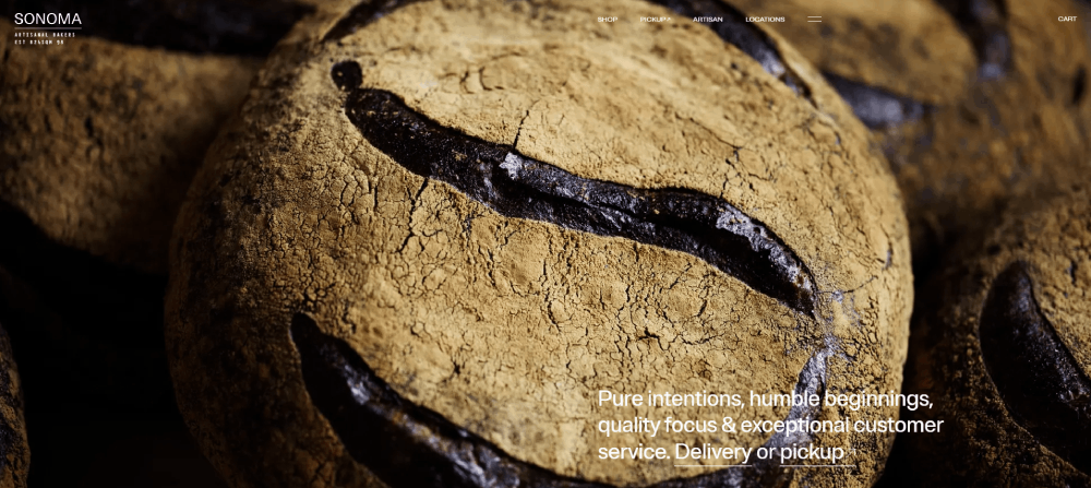
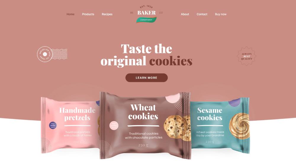
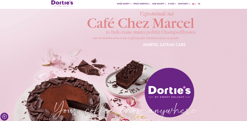
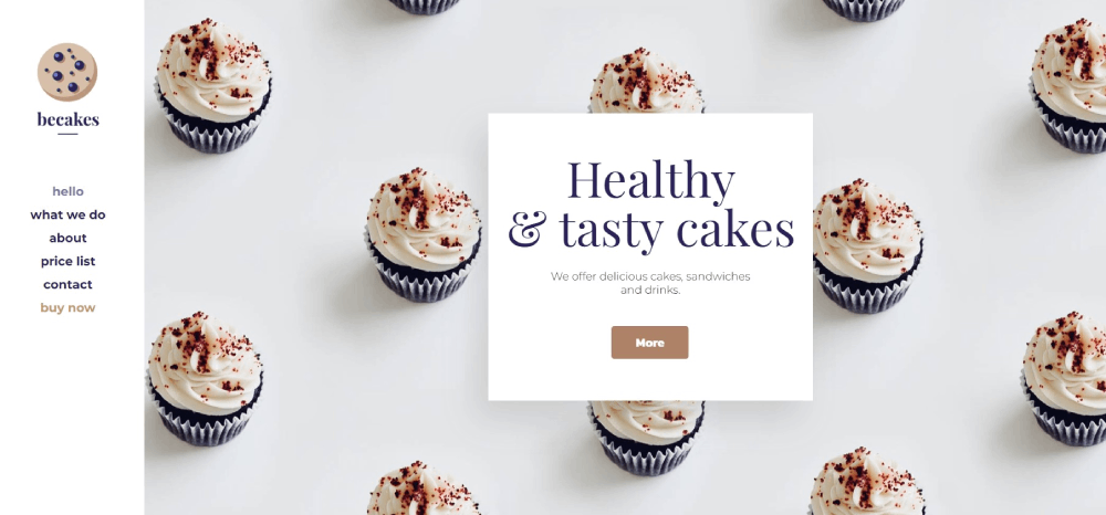
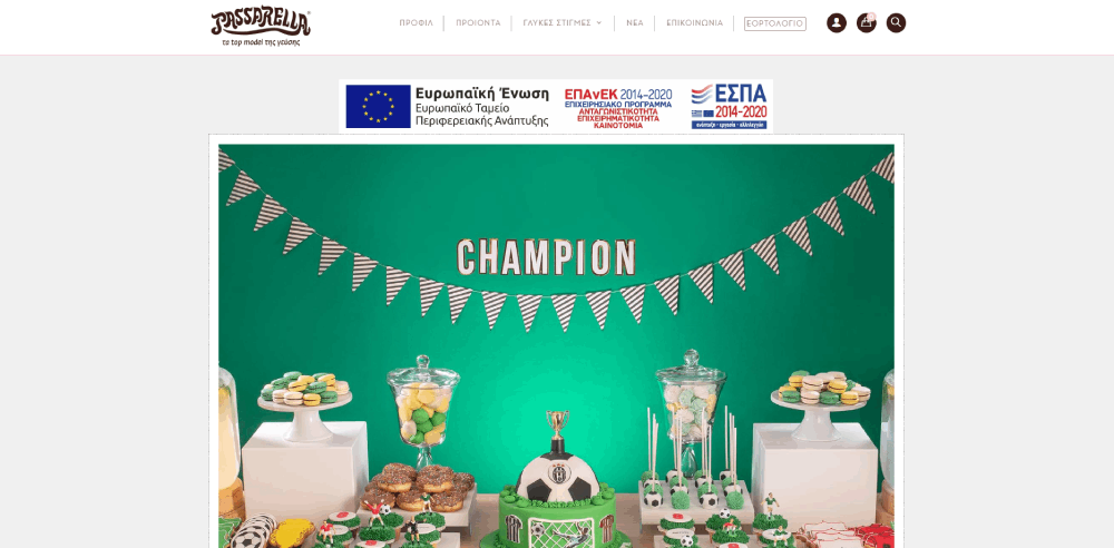
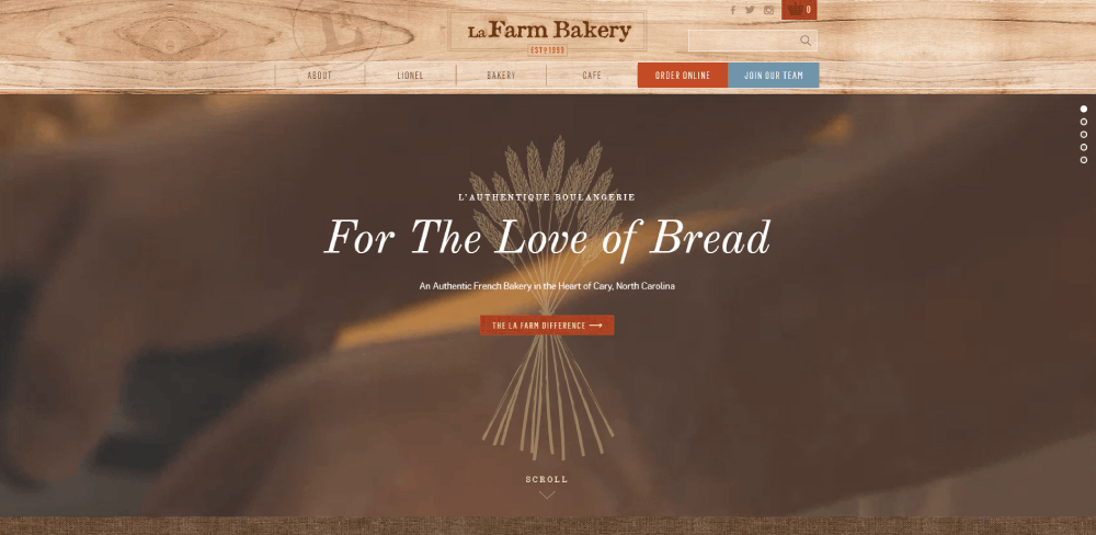
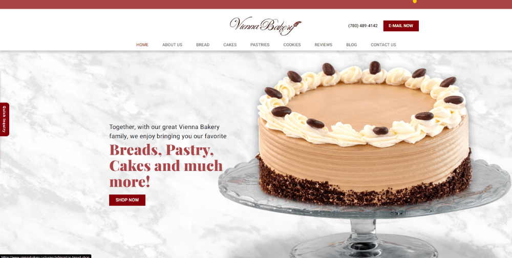
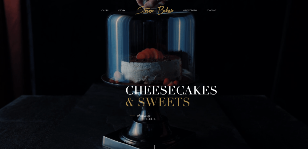
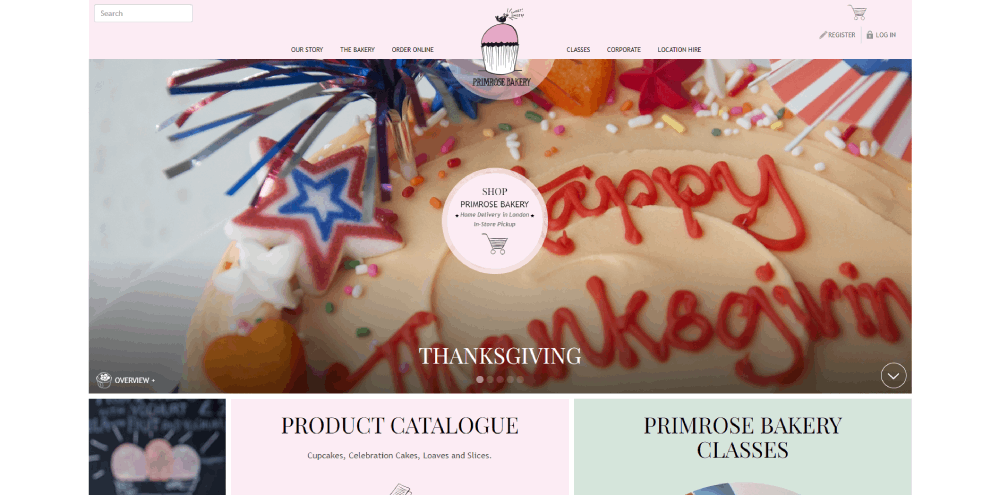
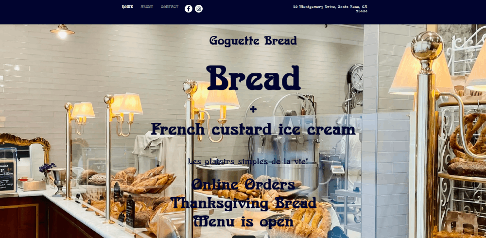
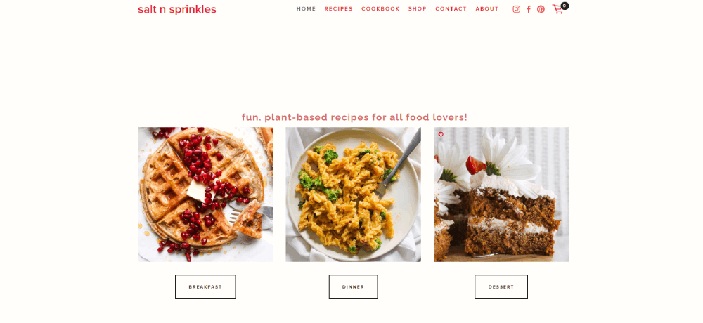
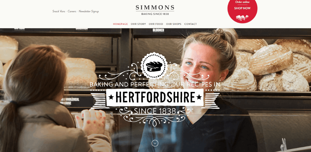
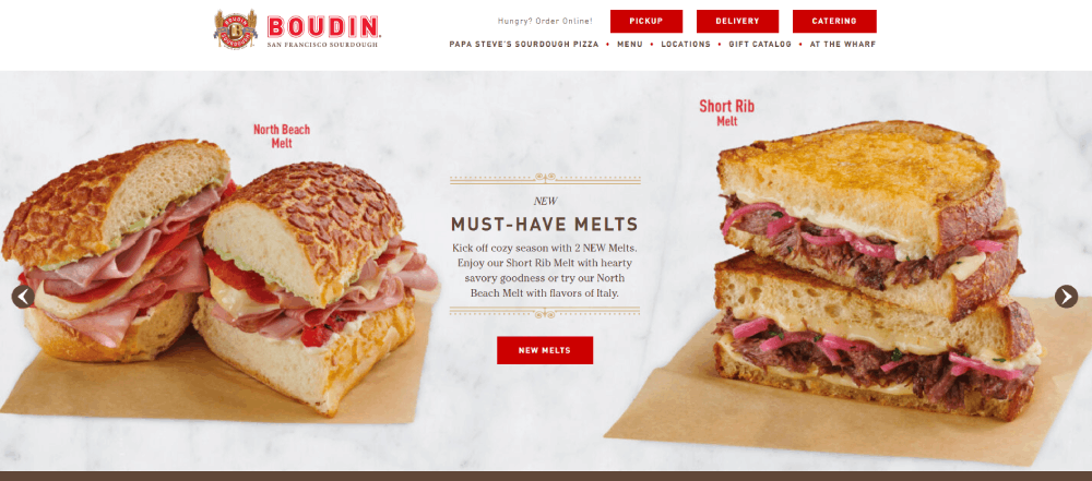
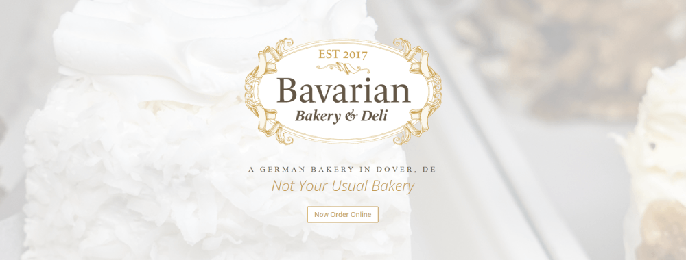
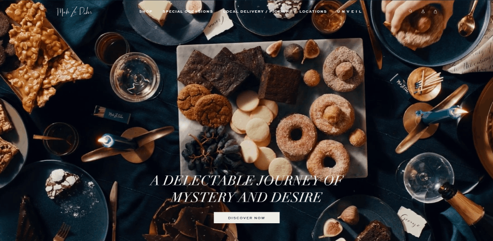
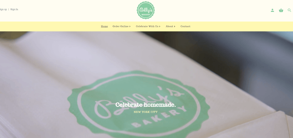
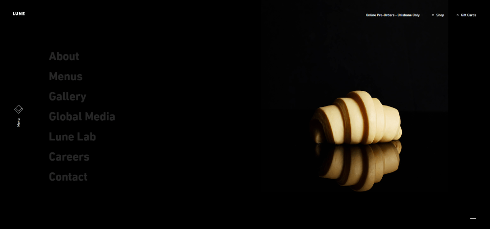
Sonoma
Core Design Elements for Bakery Websites
Visual Hierarchy in Bakery Web Design
Visual hierarchy directs attention from hero images to product categories to call-to-action buttons. Bakery sites typically feature large product photography at the top, followed by navigation menus with clear category labels like "Artisan Bread," "Custom Cakes," or "Pastries."
Typography hierarchy separates product names from descriptions and prices. Headers use larger font sizes (28-36px) while body text stays at 16-18px for readability.
Contrast ratios matter for food photography backgrounds. Light-colored baked goods need darker backgrounds; chocolate items work better against cream or white surfaces. The color scheme should match brand identity while maintaining WCAG accessibility standards of 4.5:1 for normal text.
Product Photography Standards
Professional bakery product photography requires natural lighting or softbox setups to avoid harsh shadows. Direct overhead shots work for cookies and pastries; 45-degree angles showcase layer cakes and bread texture better.
Image dimensions should be 1200x1200px minimum for product pages, with consistent aspect ratios across the gallery. WebP format reduces file sizes by 30-40% compared to JPEG without visible quality loss.
Styling approaches include minimal props (wooden boards, linen napkins) that don't distract from the product. Background choices lean toward neutral tones or subtle textures that complement rather than compete with the baked goods.
Color Schemes for Bakery Brands
Warm tones (browns, golds, creams) dominate bakery color palettes because they stimulate appetite and convey freshness. A calm color palette with earthy hues creates a comforting browsing experience.
Brand differentiation comes through accent colors. Artisan bakeries often use deep burgundy or forest green; modern patisseries choose blush pink or charcoal gray. These accents appear in buttons, headers, and decorative elements.
Accessibility compliance requires testing color combinations for sufficient contrast. Text over images needs overlay shadows or background tints to maintain readability across all viewport sizes.
Navigation Architecture for Bakery Sites
Menu Structure Best Practices
Product categorization follows customer search behavior: bread, cakes, pastries, cookies, seasonal items. Subcategories group by type (sourdough, whole grain, gluten-free) rather than arbitrary divisions.
Filtering systems let shoppers narrow by dietary needs (vegan, nut-free, sugar-free), occasion (birthday, wedding, corporate), or pickup date. The website menu should display these filters prominently without cluttering the interface.
Search functionality becomes critical for bakeries with 50+ products. Autocomplete suggestions help users find specific items like "raspberry croissant" or "chocolate babka" without browsing multiple categories. Mobile navigation patterns typically use hamburger menus with expandable category sections.
Shopping Cart Integration
One-click ordering works for standard items with fixed pricing. Custom cakes and specialty orders require multi-step forms capturing size, flavor, decoration details, and delivery preferences.
Cart visibility stays constant through a sticky header icon showing item count and subtotal. The checkout flow should complete in 3-4 screens maximum: cart review, customer information, payment, confirmation.
Payment gateway positioning affects conversion rates. Displaying accepted methods (credit cards, Apple Pay, PayPal) early in the process reduces abandonment. SSL certificates and trust badges near payment fields address security concerns common in online food ordering.
Typography Selection for Bakery Websites
Font Families for Bakery Branding
Serif fonts convey tradition and craftsmanship. Playfair Display, Merriweather, and Lora work well for artisan bakeries emphasizing heritage recipes and handmade processes.
Sans-serif fonts signal modern efficiency. Montserrat, Raleway, and Inter suit contemporary patisseries focused on clean aesthetics and streamlined ordering. The typography in web design establishes immediate brand personality before users read any content.
Script fonts appear sparingly in bakery web design. A script header for the bakery name adds personality, but body text in script becomes illegible at small sizes. Pairing rules suggest limiting to two font families maximum: one for headings, one for body text.
Text Hierarchy Implementation
Header sizes descend logically: H1 at 36-48px, H2 at 28-32px, H3 at 20-24px. Product names typically use H3 tags with 22px sizing for visual prominence without overwhelming the layout.
Body text stays at 16-18px for comfortable reading on desktop; mobile versions often increase to 18-20px given smaller screens and varied viewing distances. Line height of 1.5-1.6 prevents text from feeling cramped, especially important for ingredient lists and order instructions.
Pricing display requires careful treatment. Too small and customers miss it; too large and it dominates product appeal. Most successful bakery sites use 18-20px for prices, slightly larger than body text but smaller than product names, with medium weight (500-600) to stand out without shouting.
FAQ on Bakery Website Design
What makes a bakery website design effective?
Effective bakery web design combines high-quality product photography with simple navigation and clear ordering systems. The layout should showcase baked goods prominently while making pickup times, pricing, and custom order forms easily accessible across all devices.
How much does a professional bakery website cost?
Professional bakery websites range from $2,000-$5,000 for template customization to $8,000-$15,000 for custom builds. Platforms like WordPress, Shopify, and Squarespace offer lower-cost options starting at $500-$1,500 plus monthly hosting fees.
What pages should a bakery website include?
Essential pages include homepage, product menu with categories, about section, contact information with location and hours, online ordering or inquiry forms, and gallery. Wedding or custom cake bakeries need portfolio pages showing previous work.
How do I showcase products on a bakery website?
Use product photography with natural lighting, consistent backgrounds, and 1200x1200px minimum dimensions. Organize items by category (bread, pastries, cakes), include ingredient lists, pricing, and availability. Enable image zoom for detail views of textures and decorations.
Should my bakery website have online ordering?
Online ordering increases revenue by capturing customers who prefer advance planning over walk-ins. Integration with Square, Toast POS, or WooCommerce enables payment processing, pickup scheduling, and inventory tracking. Even simple contact forms improve conversion over phone-only ordering.
What design style works best for bakery websites?
Artisan bakeries benefit from warm, rustic aesthetics with serif typography and earthy color palettes. Modern patisseries suit clean, minimalist layouts with sans-serif fonts and ample white space. Match your website design style to your physical storefront branding.
How can I make my bakery website mobile-friendly?
Use responsive design frameworks that adapt layouts to screen sizes. Implement touch-friendly buttons (44x44px minimum), readable text (16-18px), and simplified navigation. Test ordering forms on mobile devices since 60-70% of bakery website traffic comes from smartphones.
What content should I include on my bakery homepage?
The homepage needs a hero section with appetizing imagery, featured products or daily specials, clear navigation to product categories, location and hours, and prominent call-to-action buttons for ordering or viewing menus. Keep scrolling minimal.
How do I handle custom cake orders on my website?
Create dedicated form design capturing event type, date, guest count, flavor preferences, and design inspiration. Include photo upload options for reference images. Set expectations about consultation requirements, lead times (typically 2-4 weeks), and deposit policies.
What are common mistakes in bakery website design?
Common errors include poor-quality product images, missing pricing information, complicated navigation, slow loading speeds, unclear ordering processes, and neglecting mobile optimization. Avoid cluttered layouts, hard-to-read fonts, and failing to display location or hours prominently.
Conclusion
These bakery website design examples demonstrate how visual hierarchy, product photography standards, and streamlined navigation architecture separate successful sites from mediocre ones. Your bakery digital storefront needs more than pretty pictures.
Effective ecommerce checkout flow and mobile responsive design directly impact revenue. Whether you run an artisan bread shop or a commercial bakery operation, the principles remain consistent.
Focus on showcasing your baked goods through high-quality imagery while making the ordering process frictionless. Study how successful food websites handle product categorization, custom order forms, and pickup scheduling.
Your website should work as hard as your ovens. Start with clear website navigation, compelling call to action buttons, and photography that makes visitors taste your pastries through their screens.


