


Inspiring Websites with Video Backgrounds
October 23, 2025
Elegant Website Design Examples
October 28, 2025Your banking website has roughly three seconds to convince visitors you're legitimate.
That's it. Three seconds before they bounce to Chase or Wells Fargo because your site looks outdated.
The best bank website design examples share specific patterns: clean visual hierarchy, visible security indicators, and mobile-first layouts that actually work.
We analyzed 12 financial institutions, from traditional giants like Bank of America to neobanks like Chime and Revolut.
You'll see what separates high-converting banking websites from forgettable ones. Color psychology, navigation structure, trust signals, CTA placement.
Everything you need to evaluate or redesign your own digital banking platform.
What is Bank Website Design
Bank website design is the practice of creating digital interfaces for financial institutions that balance security, usability, and brand trust.
It covers everything from the homepage layout to account dashboards, login pages, and mobile banking interfaces.
Unlike standard corporate sites, banking websites must display trust signals prominently while keeping navigation simple enough for users of all technical abilities.
Wells Fargo, Chase Bank, and Bank of America each approach this differently, but they share core principles: clear visual hierarchy, secure login indicators, and responsive design across devices.
The goal? Make complex financial tasks feel effortless.
Bank Website Design Examples
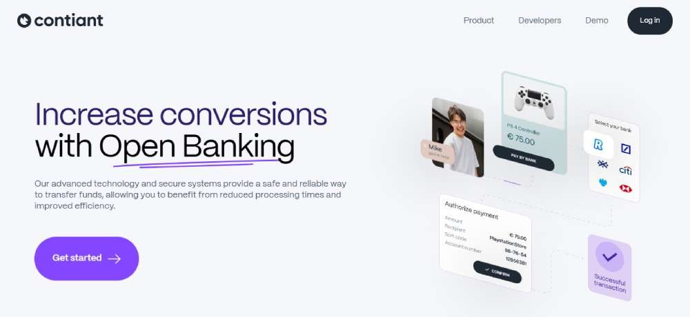
Contiant Open Banking Fintech
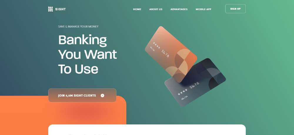
Sight Banking
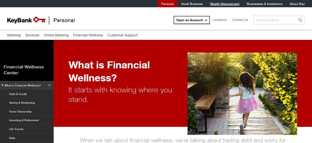
KEYBANK
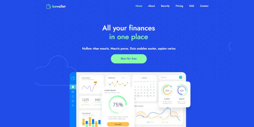
BeWallet2
BeginnerBank

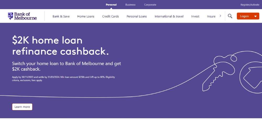
Bank of Melbourne
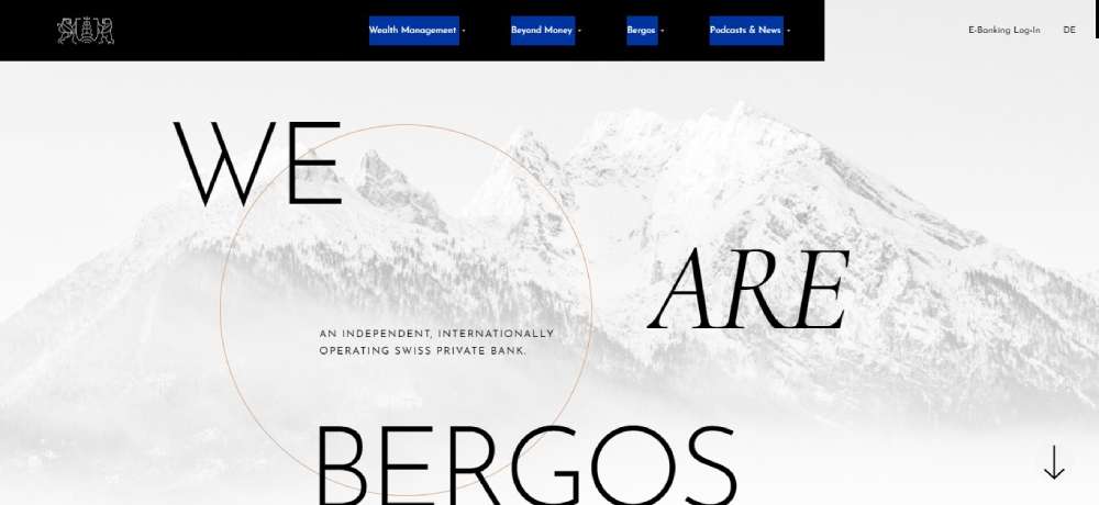
Bergos
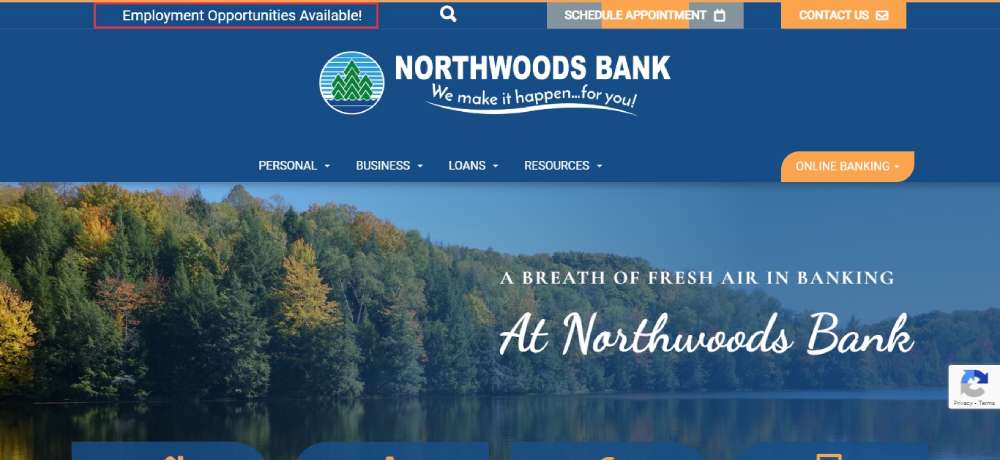
Northwoods Bank
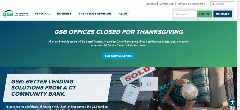
Guilford Savings Bank
BeFinance3

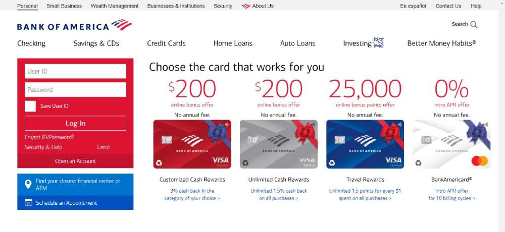
Bank of America
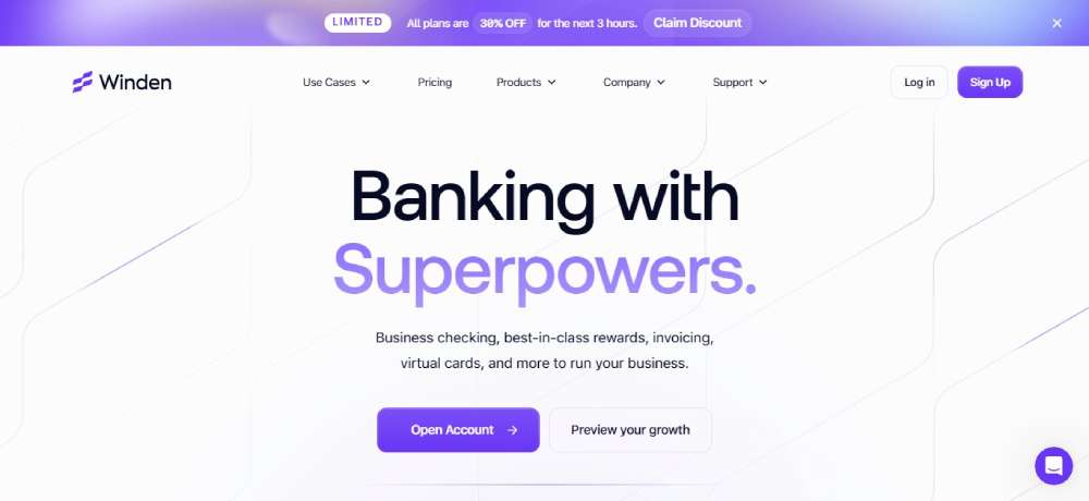
Winden
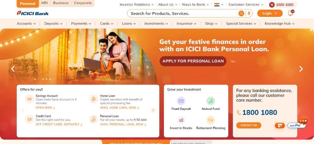
ICICI Bank
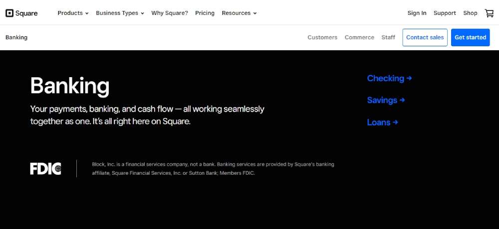
Square Banking
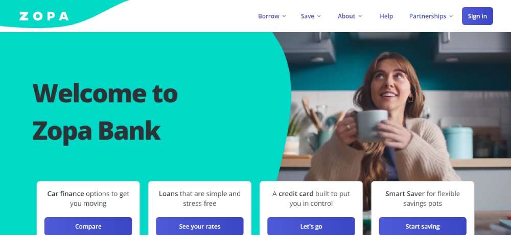
Zopa
Beloans4

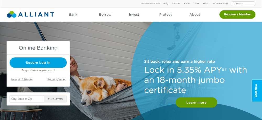
Alliant
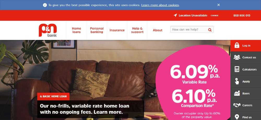
P&N Bank
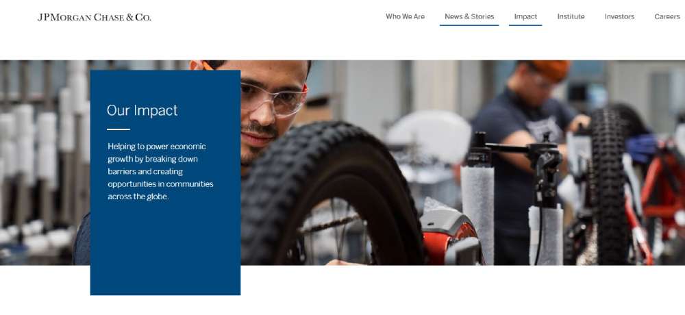
JPMorgan Chase
DBS Bank

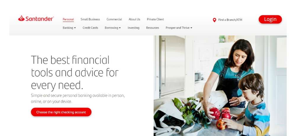
SANTANDER
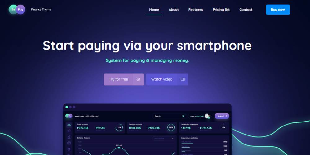
Bepay
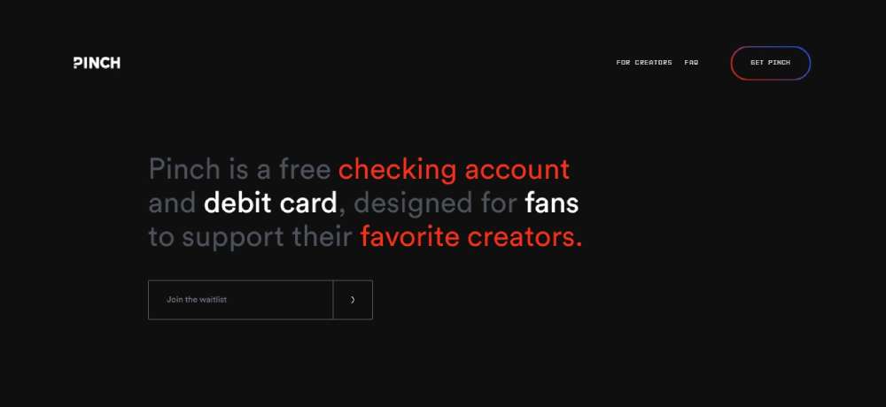
Pinch
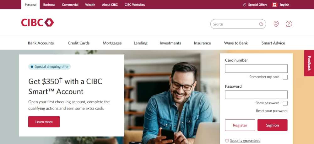
CIBC
STERLING NATIONAL BANK

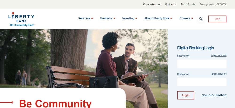
Liberty Bank
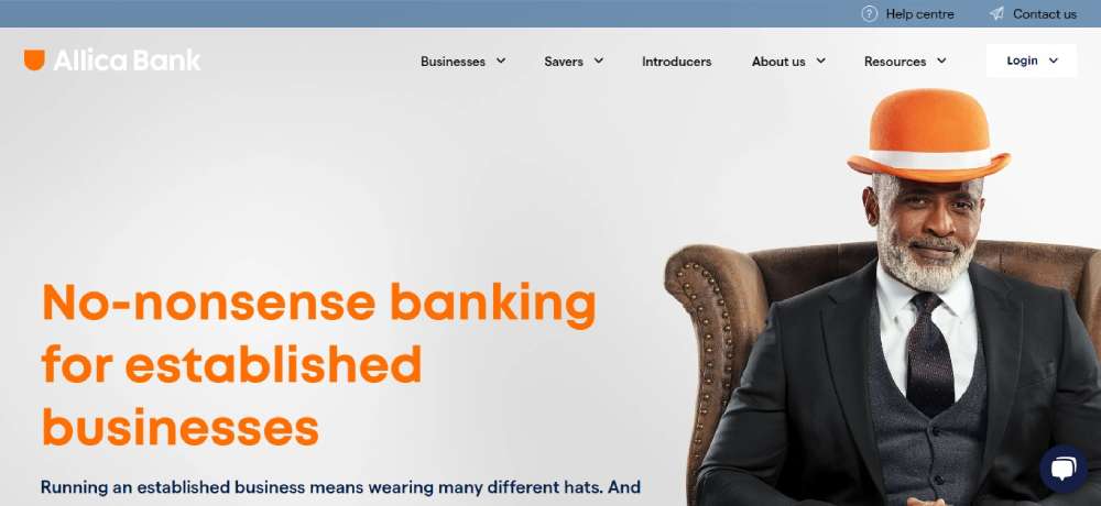
Allica Bank
Beloans

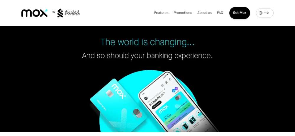
Mox
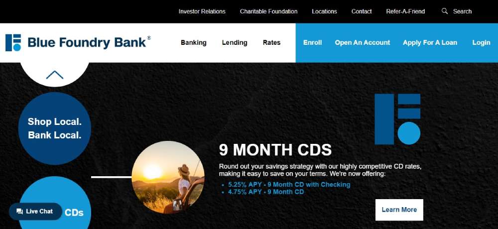
Bluefoundry Bank
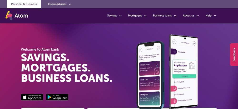
Atom Bank
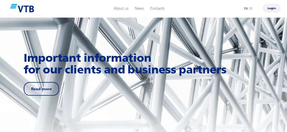
VTB Bank (Europe) SE
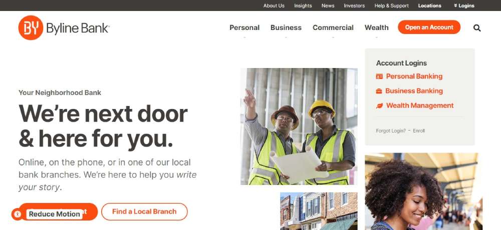
Byline
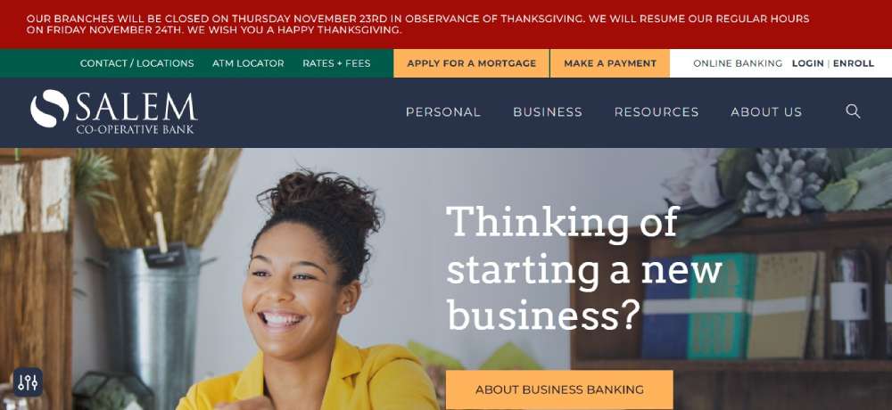
Salem Co-Op Bank
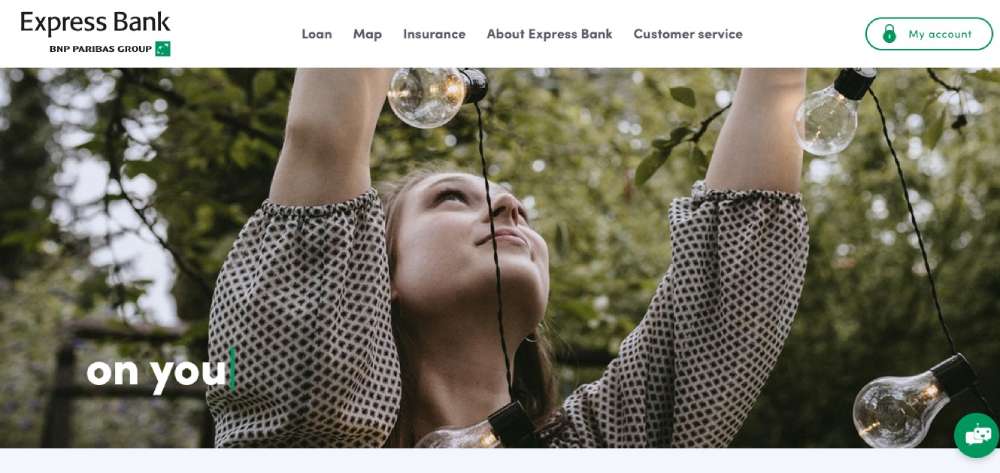
Express Bank
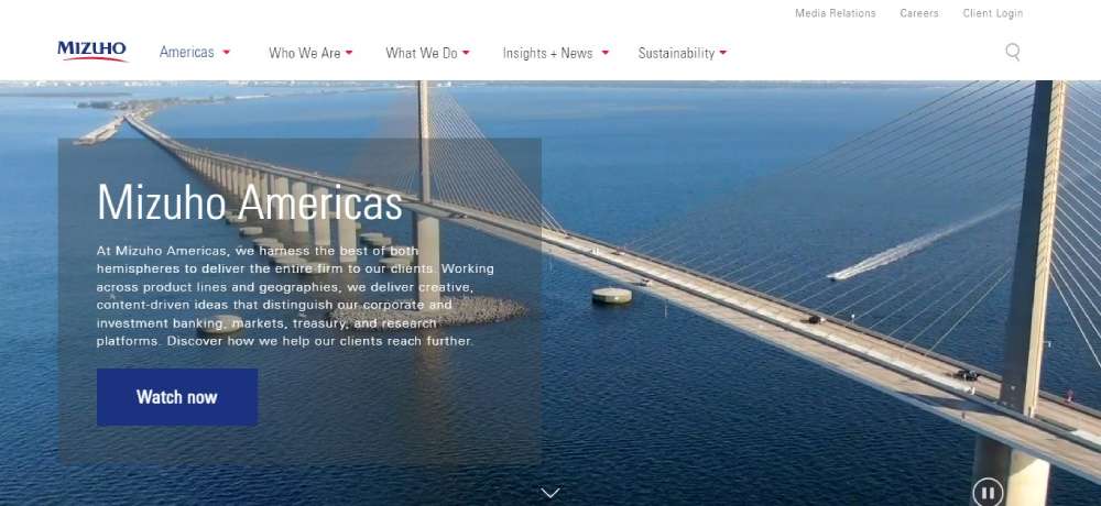
Mizuho
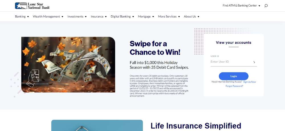
Lone Star National Bank
Work at Margo Bank
Seasons

Why Does Bank Website Design Matter for Financial Institutions
Digital banking platforms processed over $6.6 trillion in payments in 2021.
That number keeps climbing.
Your website is often the first touchpoint customers have with your institution. A poorly designed banking interface drives users straight to competitors like Capital One or Ally Bank.
Trust evaporates in about three seconds when a financial services website looks outdated or confusing.
Consider what modern users expect:
- Instant access to account balances
- Mobile-first banking design that works on any device
- Visible SSL certificates and two-factor authentication prompts
- Clean website navigation examples they can follow without thinking
Banks that nail these elements see lower bounce rates and higher conversion on loan applications, credit card signups, and new account openings.
The fintech websites from companies like Chime and Revolut have raised the bar considerably.
Traditional institutions now compete against neobank design standards that prioritize speed and simplicity above all else.
How to Evaluate Bank Website Design Quality
Not all banking websites deserve praise. Some fail spectacularly at basic UX principles.
Before looking at specific examples, you need criteria for judging what actually works.
What Are the Core Visual Design Characteristics
Strong banking visual hierarchy guides users to primary actions without overwhelming them. Look for balanced typography, consistent color schemes, and strategic white space throughout.
The best bank homepages use high-quality imagery sparingly, keeping focus on CTAs like "Open Account" or "Check Rates."
What Security Features Should Bank Websites Display
Visible trust indicators separate legitimate financial institutions from sketchy operations.
Essential security elements include:
- SSL certificate badges in browser bars
- FDIC insurance logos (for US banks)
- Clear two-factor authentication options
- Privacy policy links in footers
- Secure login page design with encryption notices
N26, Monzo, and other European neobanks display regulatory compliance information prominently, building trust with skeptical first-time visitors.
What Makes Navigation User-Friendly in Banking Sites
Banking information architecture should separate personal banking from business services immediately. TD Bank and PNC Bank handle this with clear top-level menu divisions.
Drop-down menus work when organized logically; mega menus help institutions with extensive product offerings.
How Does Mobile Responsiveness Affect Bank Website Performance
Over 60% of banking sessions happen on smartphones now.
Responsive websites that adapt to screen sizes aren't optional anymore. Touch-friendly buttons, simplified mobile menus, and fast page load speeds determine whether users complete transactions or abandon them.
Simple Bank built its entire reputation on mobile-first banking design. The desktop version came second.
What Design Patterns Do Top Bank Websites Share
After reviewing these examples, clear patterns emerge. The best banking website designs share common DNA despite different brand personalities.
What Color Schemes Work Best for Banking Sites
Blue dominates traditional institutions (Chase, Citibank, USAA) because it signals trust and stability. Neobanks break this rule with greens, corals, and purples to appear disruptive and modern.
What Typography Choices Increase Readability
Sans-serif fonts (Helvetica, Inter, Circular) improve screen readability. Large body text sizes (16px minimum) accommodate older demographics; clear heading hierarchies guide scanning behavior.
What CTA Placements Convert Visitors
Primary CTAs appear above the fold on every high-performing banking homepage. Secondary actions like "Learn More" use ghost buttons; primary actions like "Open Account" use solid, contrasting colors.
What Common Bank Website Design Mistakes to Avoid
Some banking websites fail despite large budgets. These mistakes kill conversion rates and erode trust.
- Cluttered homepages with competing CTAs
- Hidden contact information and support options
- Slow page load speeds (anything over 3 seconds)
- Missing mobile optimization
- Outdated security certificate displays
- Generic stock photography that feels impersonal
- Complex navigation requiring multiple clicks for basic tasks
- Poor form design on loan applications
Check out examples of bad design to understand what drives users away.
The fix? Follow a comprehensive website checklist before launching any banking interface.
How to Choose Bank Website Design Elements for Your Institution
Your bank isn't Chime or Chase. Copying their exact approach won't work.
Start with your audience. Community banks serving retirees need larger text and simpler navigation than neobanks targeting Gen Z.
Consider these factors when planning your banking website:
- Brand positioning: Traditional authority or modern disruptor?
- Primary user actions: Account opening, loan applications, or daily transactions?
- Regulatory requirements: FDIC disclosures, accessibility compliance (WCAG standards)
- Competitive landscape: What do regional competitors offer?
- Technical infrastructure: Integration with existing core banking systems
Study professional websites across industries for website inspiration beyond banking.
The best financial website templates borrow ideas from technology websites, B2B websites, and even healthcare websites where trust matters equally.
Test everything. Run A/B experiments on CTAs, website layouts, and color variations. Let user behavior data guide decisions rather than personal preferences.
Build for mobile first, then adapt upward to tablet and desktop experiences.
Your banking customers expect nothing less.
FAQ on Bank Website Design
What makes a good bank website design?
A good bank website design combines clear navigation, visible security indicators, mobile responsiveness, and fast load times. Trust signals like FDIC logos and SSL certificates must appear prominently. The visual hierarchy should guide users toward primary actions without confusion.
Which banks have the best website designs?
Chase, Ally Bank, and Capital One lead among traditional institutions. Neobanks like Chime, N26, and Revolut set standards for modern banking interfaces. Each excels at different aspects: Chase for navigation, Ally for simplicity, Revolut for fintech aesthetics.
How important is mobile responsiveness for banking websites?
Over 60% of banking sessions occur on smartphones. Mobile-first banking design isn't optional anymore. Sites must feature touch-friendly buttons, simplified menus, and page loads under 3 seconds. Poor mobile experience drives customers directly to competitors.
What colors work best for bank website design?
Blue dominates traditional banking because it signals trust and stability. Wells Fargo uses red for recognition; Chime uses green for freshness. Neobanks often choose unconventional colors like coral (Monzo) or purple (Ally) to differentiate from established institutions.
How do I build trust through banking website design?
Display security features prominently: SSL certificates, FDIC insurance badges, two-factor authentication options. Include clear privacy policies, visible contact information, and customer testimonials. Consistent branding and professional typography reinforce credibility with first-time visitors.
What features should a bank website include?
Account dashboards, secure login pages, financial calculators, and clear product information pages. Support options like live chat increase engagement. Mobile banking access, branch locators, and educational content round out essential features for modern financial institutions.
How much does bank website design cost?
Custom banking website development ranges from $50,000 to $500,000+ depending on complexity. Enterprise institutions like Bank of America invest millions. Smaller credit unions might spend $20,000-$75,000 using templates. Security compliance and integration with core banking systems drive costs significantly.
What is the difference between traditional bank and neobank website design?
Traditional banks emphasize authority, comprehensive services, and regulatory compliance. Neobanks like Simple Bank and Monzo prioritize minimalist layouts, mobile-first experiences, and playful branding. Traditional sites serve diverse demographics; neobank designs target younger, tech-savvy users specifically.
How often should banks redesign their websites?
Major redesigns every 3-5 years keep banking websites current. Minor updates should happen quarterly. Monitor Google PageSpeed Insights, user behavior analytics, and competitor changes. Outdated designs erode trust quickly in the financial services sector.
What are common mistakes in bank website design?
Cluttered homepages, hidden contact information, slow load speeds, and poor mobile optimization top the list. Other failures include generic stock photography, complex navigation, and weak security indicator displays. These mistakes increase bounce rates and kill conversion.
Conclusion
These bank website design examples prove that financial institutions can balance security with exceptional user experience.
From TD Bank's traditional approach to Monzo's community-driven interface, each example offers specific lessons worth applying.
The patterns are clear. Clean typography, strategic CTA placement, and visible trust indicators separate successful banking websites from forgettable ones.
Mobile responsiveness isn't negotiable anymore. Neither is fast page load speed.
Whether you're redesigning for a credit union or launching a new fintech platform, start with user needs first. Study how Citibank handles complex navigation. Look at how HSBC displays regulatory compliance.
Then build something better.
Your customers expect nothing less from their online banking experience.


