


A Strategic Guide to Ecommerce Popups That Actually Sell
February 26, 2026
The Best Cosmetics Website Templates for Stunning Stores
February 27, 2026A game site has roughly one second to convince someone to stay. That is less time than it takes to read this sentence.
The best games website design examples do something most sites fail at: they make the visitor feel the game before a single word registers. Visual hierarchy, load speed, dark backgrounds, cinematic hero sections, and CTA placement all work together to pull players in and push them toward the buy button.
This article covers what separates top-performing game landing pages from average ones, with real examples from AAA studios, indie developers, and live service titles. You will leave with a clear picture of the design patterns, tools, and color decisions that actually drive results.
What Makes a Games Website Design Effective?
An effective games website design converts visitors into players or buyers. It does this through 4 measurable elements: visual hierarchy built around key game art, load speed under 2.5 seconds, a mobile-first layout, and CTAs placed above the fold.
The global gaming industry generated $187.7 billion in revenue in 2024, growing 2% year-over-year (Newzoo). A games website is where a large portion of that commercial intent lands first.
94% of first impressions are tied to website design (BeBusinessed, 2024). For a game site, that first impression happens in under a second, before a single word is read.
| Design Element | Purpose | Common Failure |
|---|---|---|
| Visual hierarchy | Guide eye from hero to CTA | Too many competing focal points |
| Load speed | Keep users before they bounce | Uncompressed video assets |
| Mobile layout | Serve 63%+ of web traffic | Desktop-first build adapted late |
| CTA placement | Drive wishlist, buy, or play actions | CTA buried below trailer or screenshots |
Why Visual Hierarchy Matters More in Gaming Than Most Industries
Game sites compete with the game art itself. The design has to frame that art without being buried by it.
Strong hierarchy uses 3 layers: a dominant hero (full-bleed key art or trailer), a secondary block (game description, platform badges), and a CTA (wishlist, buy, play free). Everything else is tertiary.
CD Projekt Red's Cyberpunk 2077 site is a studied example. The key art fills the entire viewport on load, the game logo sits center, and a single CTA routes users to the store. Nothing competes.
Load Speed and Its Direct Effect on Game Site Conversions
53% of mobile users abandon a site that takes over 3 seconds to load (Google). The average mobile page still loads in 8.6 seconds (Colorlib, 2026).
Game sites are particularly at risk. Trailers, 4K screenshots, particle effects, and WebGL elements push page weight up fast. Only 33% of websites pass all three Core Web Vitals today (Colorlib, 2026).
- Use WebP or AVIF for screenshots instead of PNG
- Lazy-load trailer videos, never autoplay full resolution on mobile
- Defer non-critical JavaScript (GSAP animations, scroll effects)
Navigation Patterns Specific to Game Sites
Game site navigation serves 4 distinct user types: new visitors, existing players, press, and community members. Mixing all 4 in one nav bar creates a messy experience.
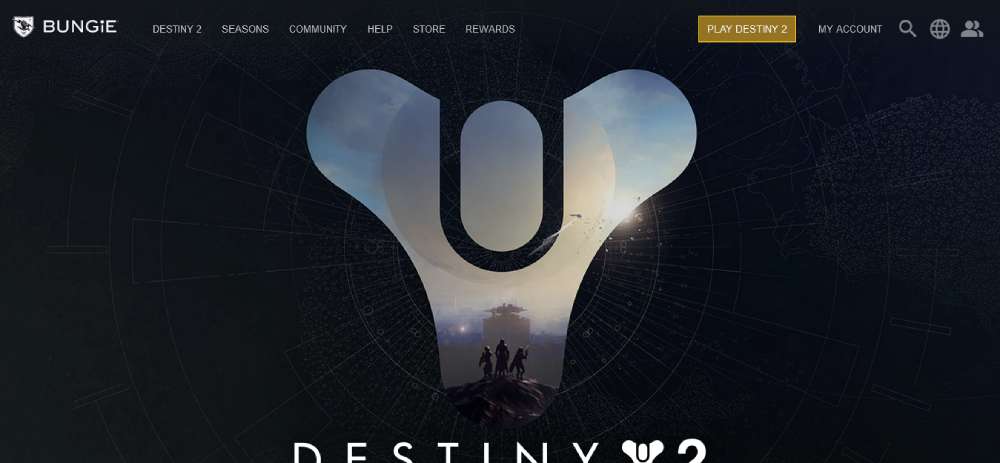
Top-performing game sites split navigation into: a primary bar (Store, News, About) and a secondary utility row (Support, Community, Press Kit). Bungie uses this two-tier approach on the Destiny 2 site.
Well-structured website navigation examples show how grouping by user intent, rather than content type, keeps interaction paths clean across all screen sizes.
CTA Design on Game Websites
The 3 most common CTAs on game sites: "Wishlist on Steam," "Buy Now," and "Play Free." Which one leads depends on the game's release stage and business model.
Pre-launch sites should lead with Wishlist. Post-launch paid titles lead with Buy. Free-to-play titles lead with Play Free, followed by a secondary Store CTA. Getting this order wrong costs real conversions.
The mechanics behind a high-converting call to action button, from contrast ratios to label copy, directly apply to game site CTAs where the buy decision is often emotional and fast.
Game Website Design Examples
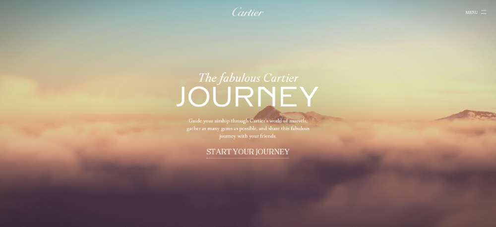
THE FABULOUS CARTIER JOURNEY
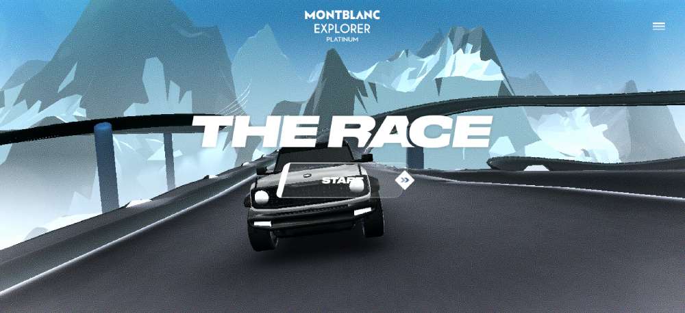
THE RACE EXPLORER INTERPARFUMS
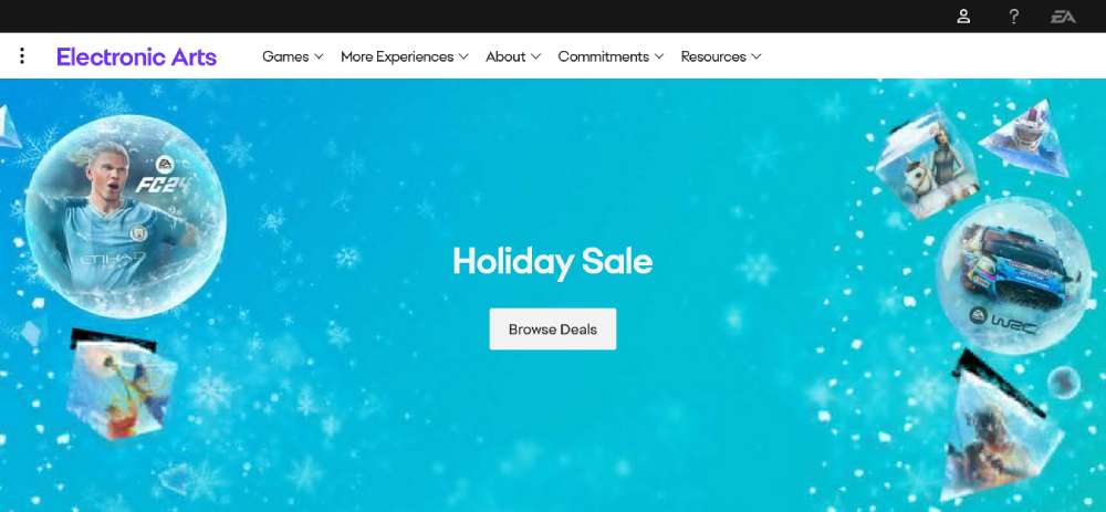
EA.com
BePaintball

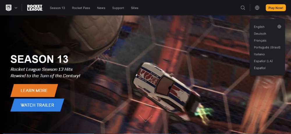
Rocket League
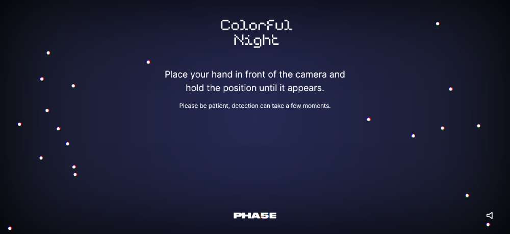
Colorful Night
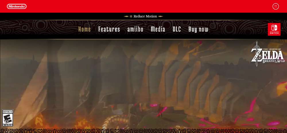
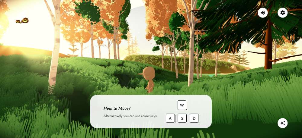
The Legend of Zelda
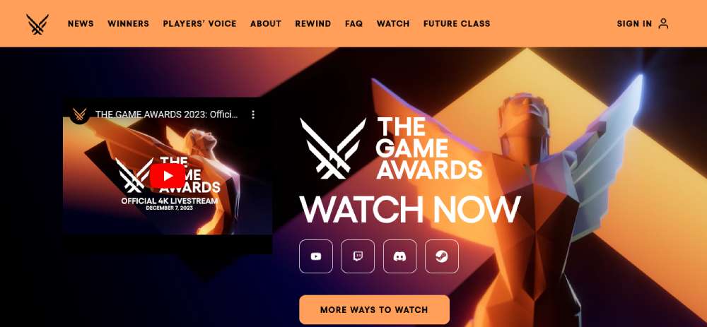
The Game Awards
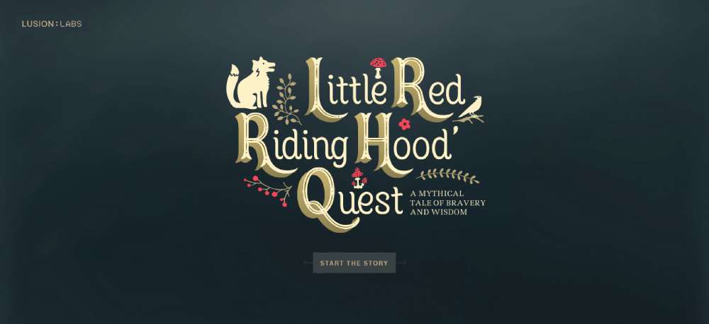
Little Red Riding Hood
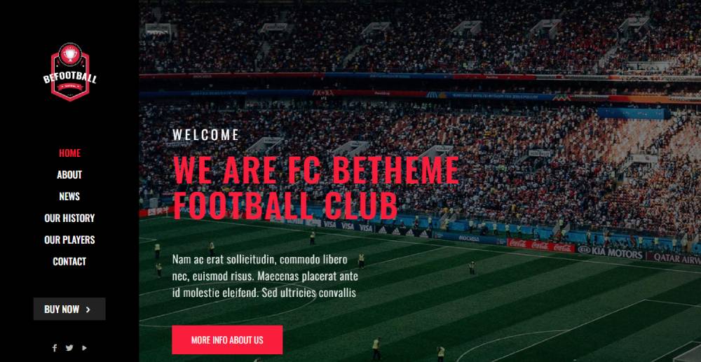
BeFootball2
Block Rage
GAME Marketplace
The Bézier Game
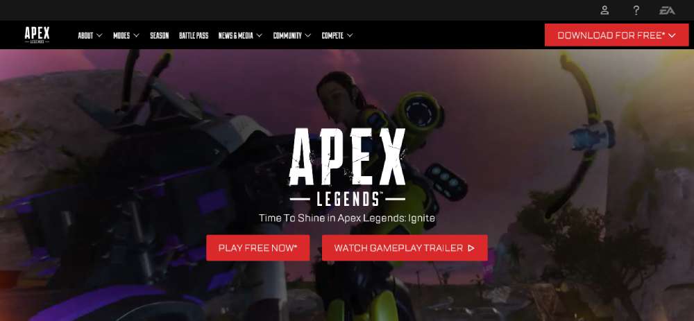
Apex Legends
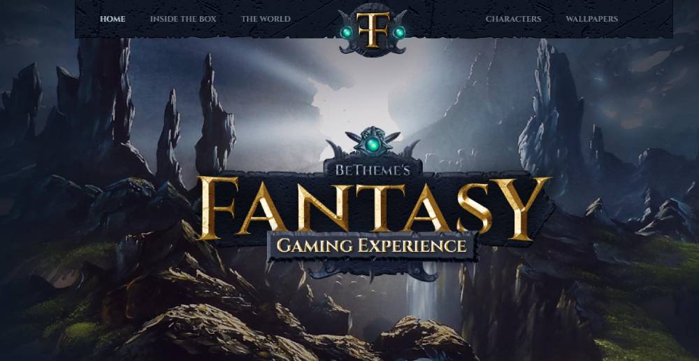
BeFantasy
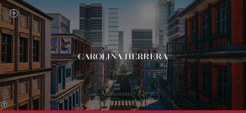
Carolina Herrera: 212 Heroes Skate Game
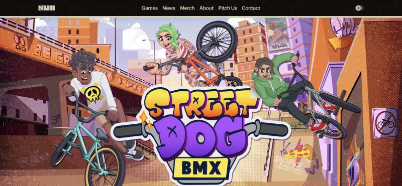
Null Games
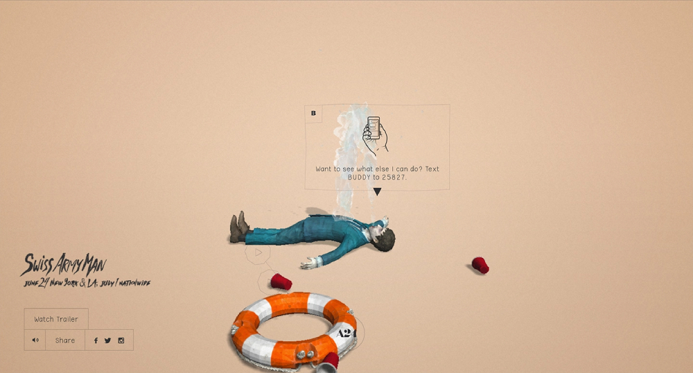
Swiss Army Man
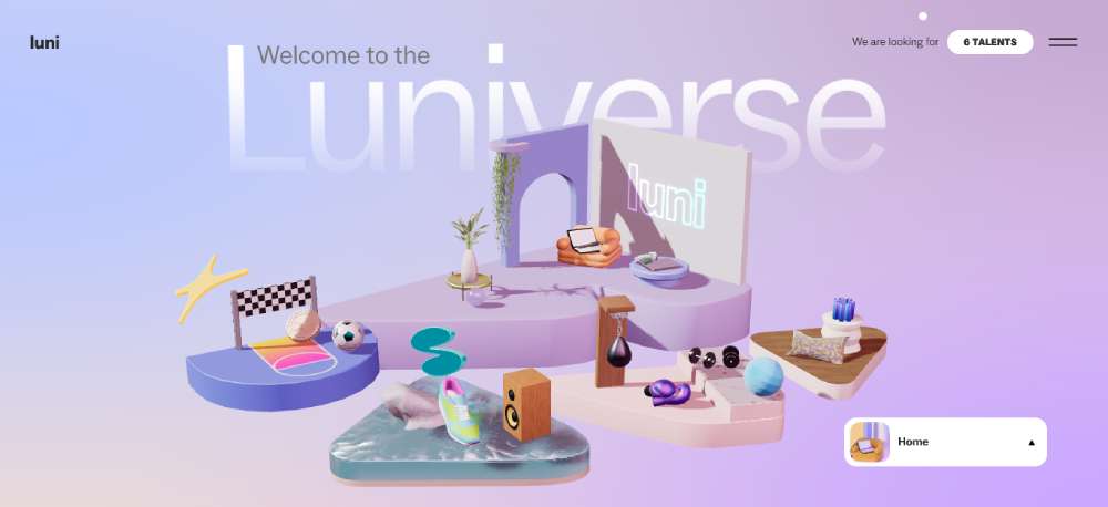
Luni
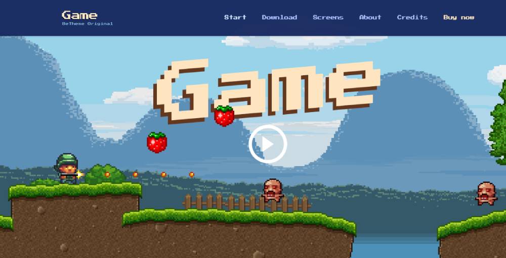
BeGame
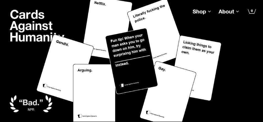
Cards Against Humanity
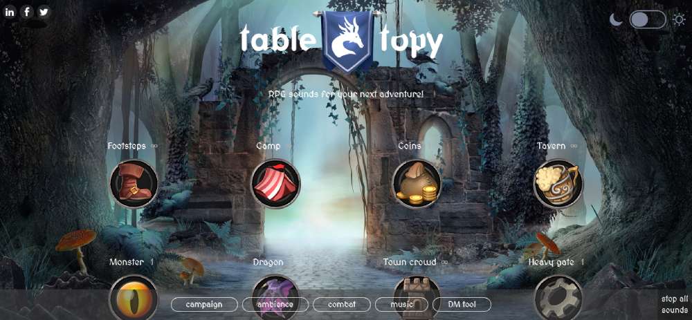
Tabletopy
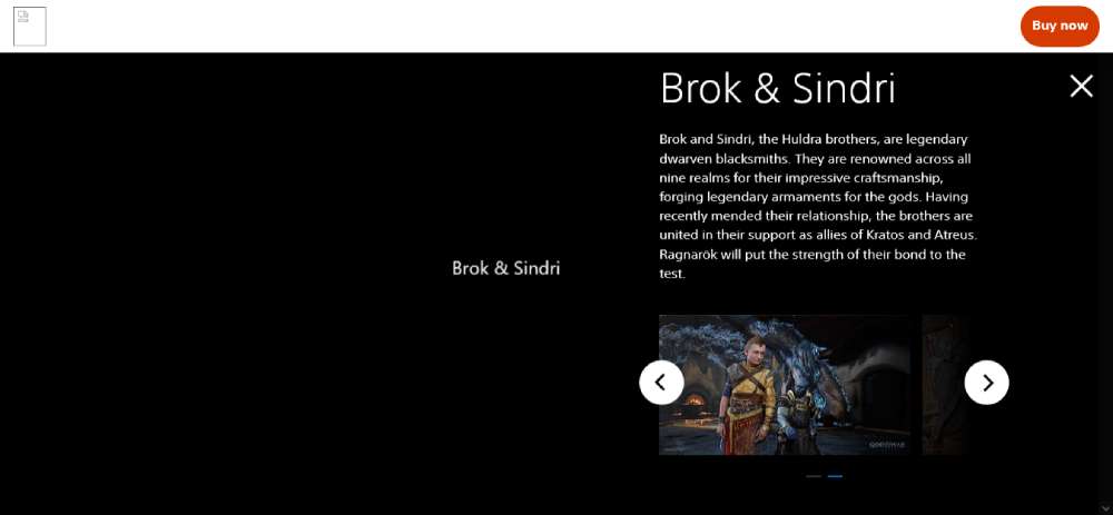
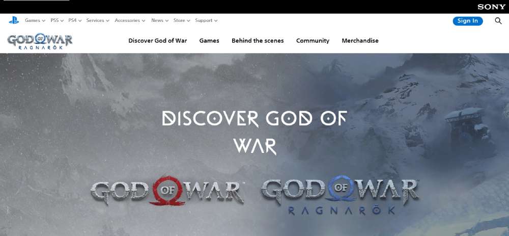
God of War Ragnarök
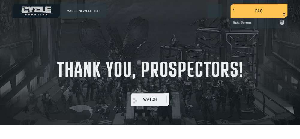
The Cycle
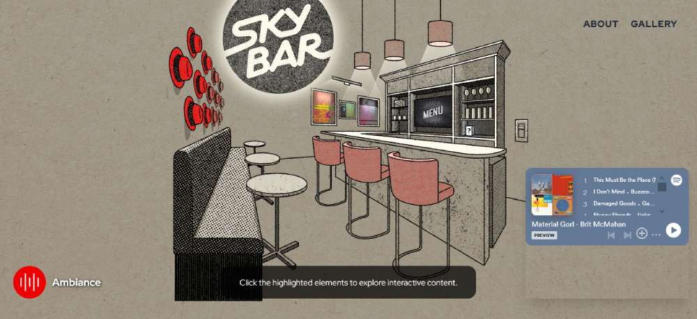
SkyBar
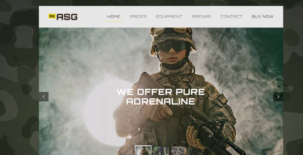
BeAsg
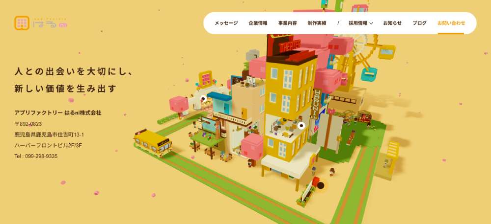
APP FACTORY HARUNI
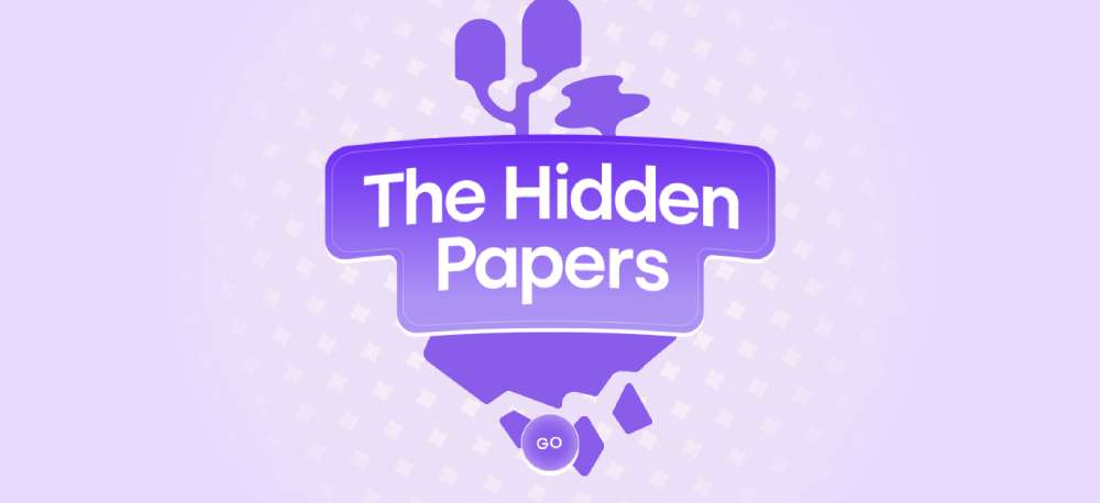
THE HIDDEN PAPERS
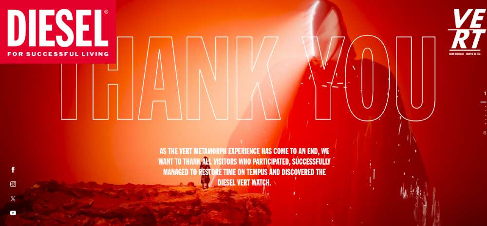
Diesel’s Metamorph
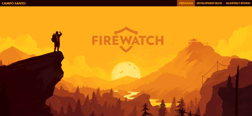
Firewatch
Destiny 2
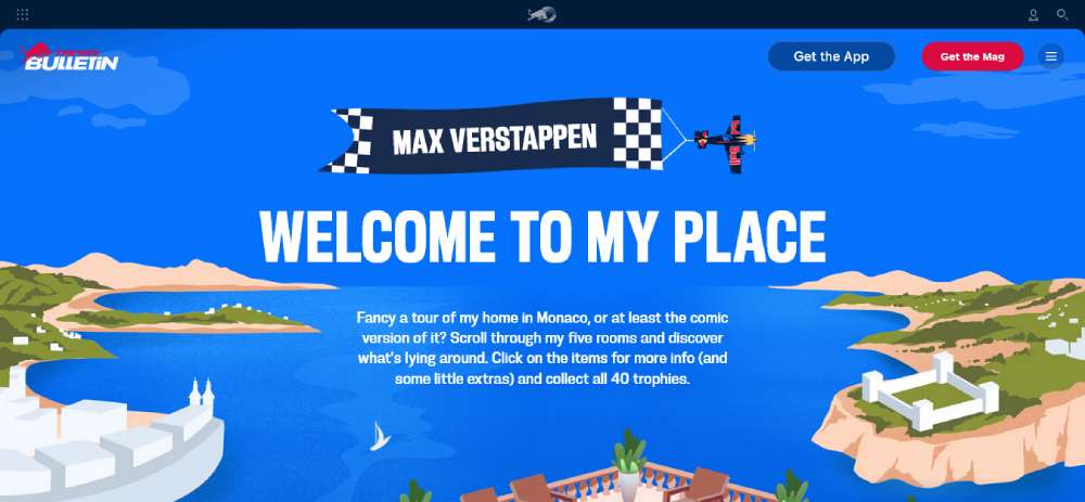
MAX VERSTAPPEN'S MANSION GAME
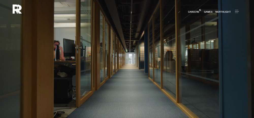
Aten7
Remedy
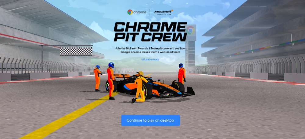
Chrome Pit Crew
God of War
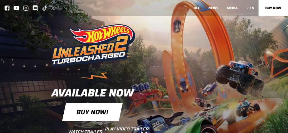
HOT WHEELS UNLEASHED 2
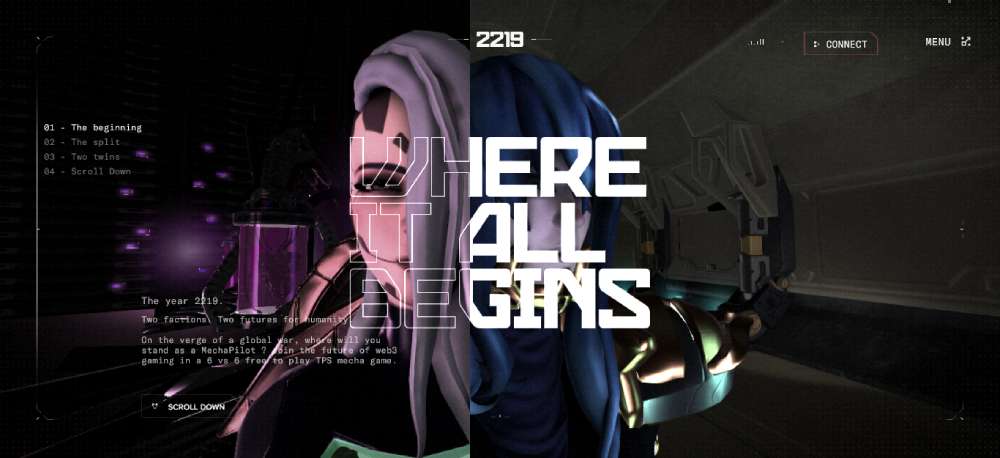
Mechachain
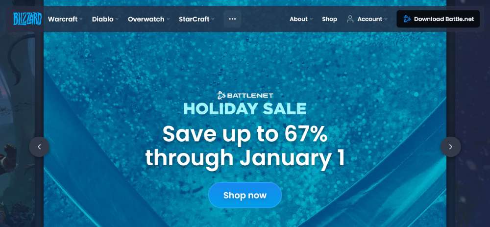
Blizzard.com
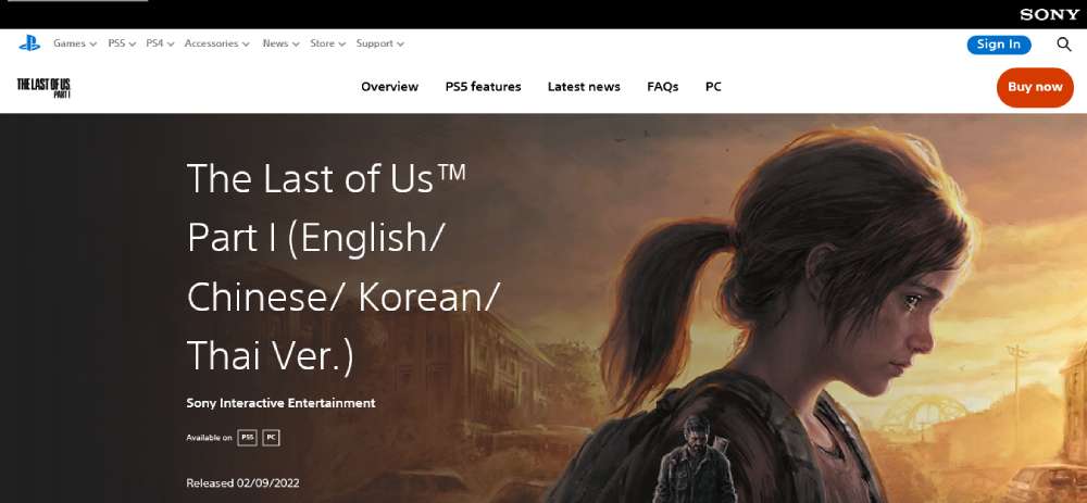
The Last of Us
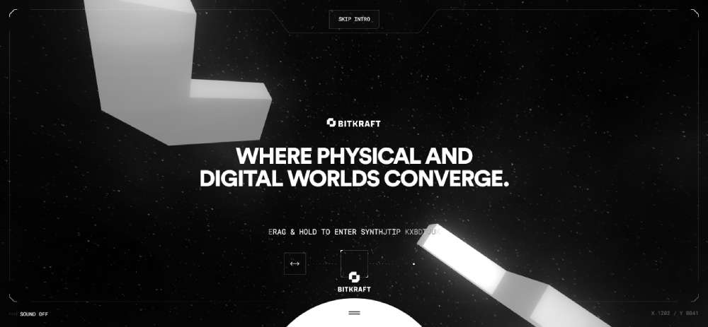
BITKRAFT
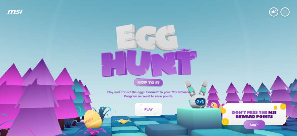
MSI - EGG HUNT
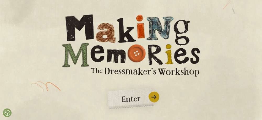
Making Memories
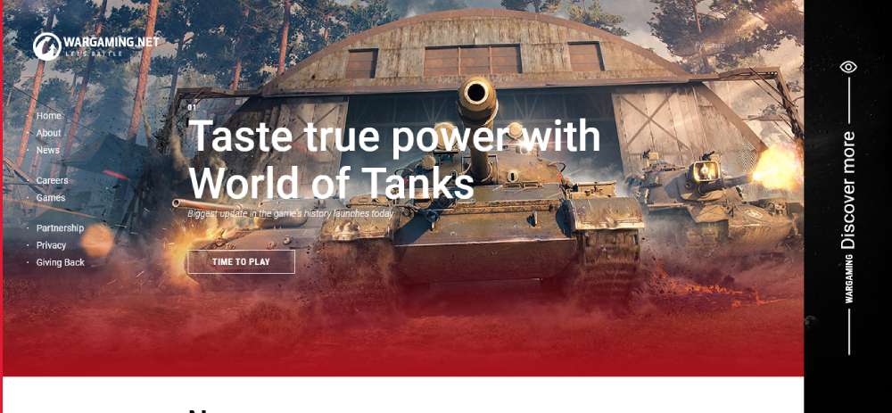
Wargaming
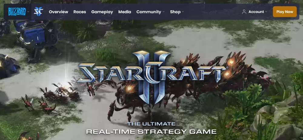
StarCraft II
DETECTIVE BOX

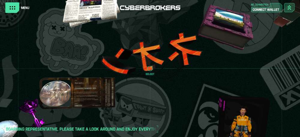
CyberBrokers
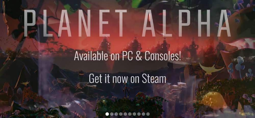
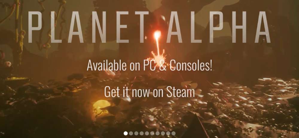
Planet Alpha
GAGUNASHVILI CHESS ACADEMY
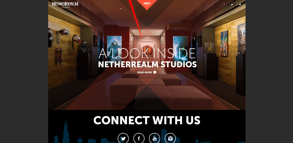
Netherrealm
T-MOBILE GAME OF PHONES

TTK GAMES
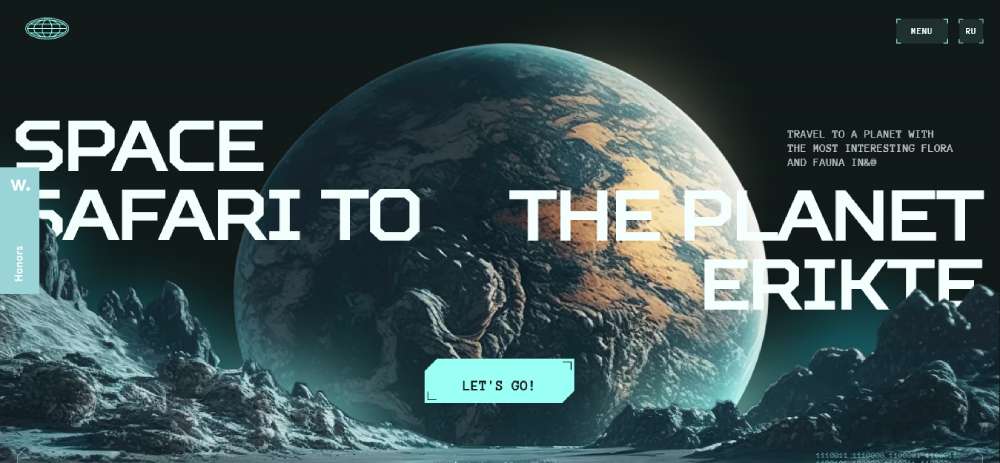
SPACE SAFARI TO ERIKTE PLANET
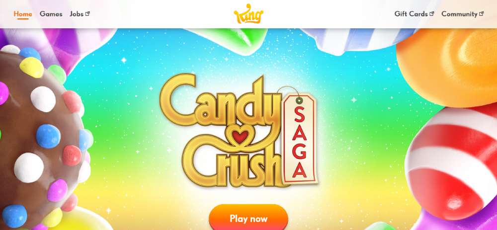
King
SNAKE 3D GAME
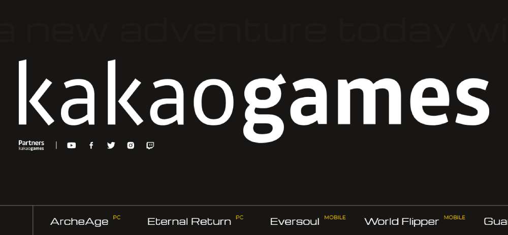
KAKAO GAMES EUROPE B.V. HUB
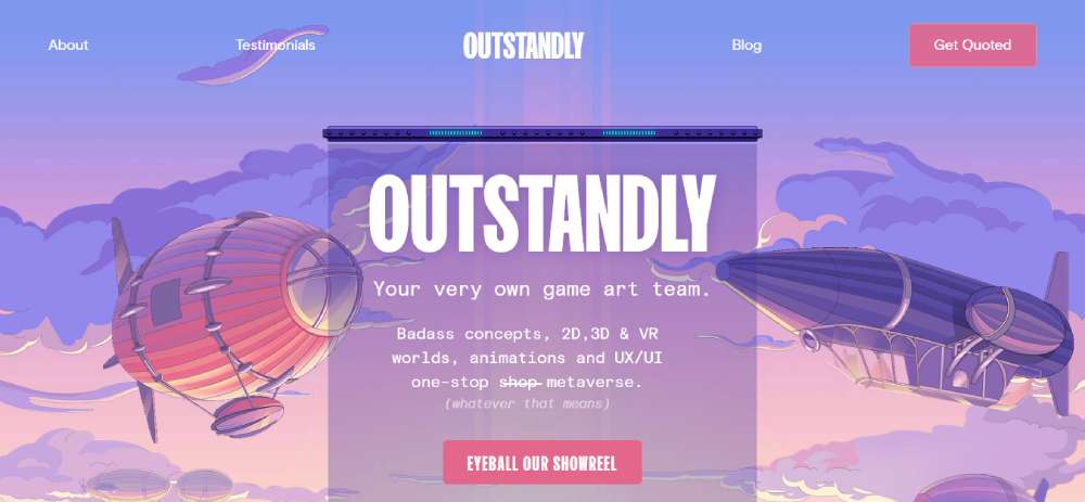
OUTSTANDLY
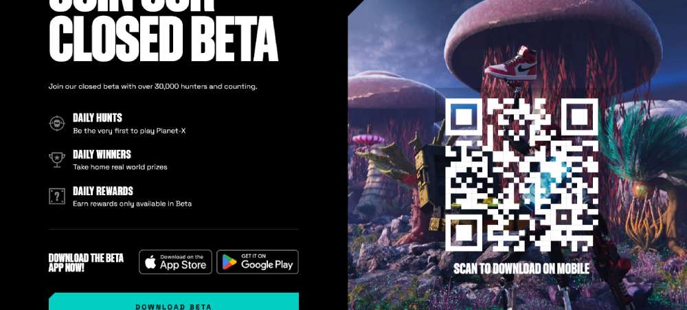
PLANET-X
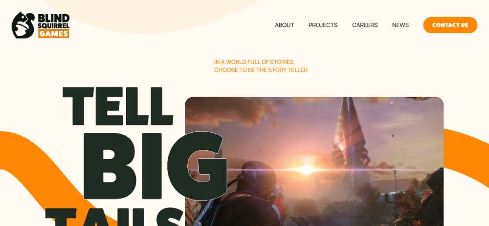
Blind Squirrel Games
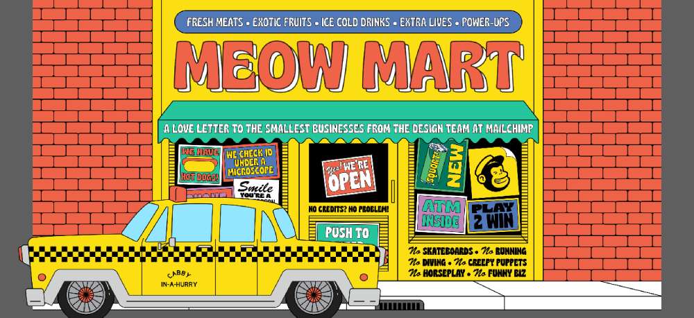
Meow Mart
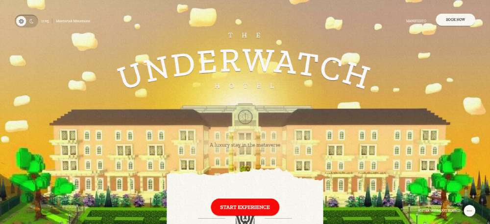
The Underwatch Hotel
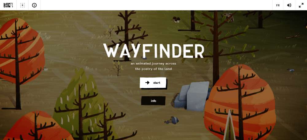
Wayfinder
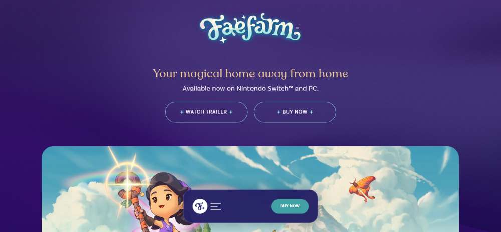
Fae Farm
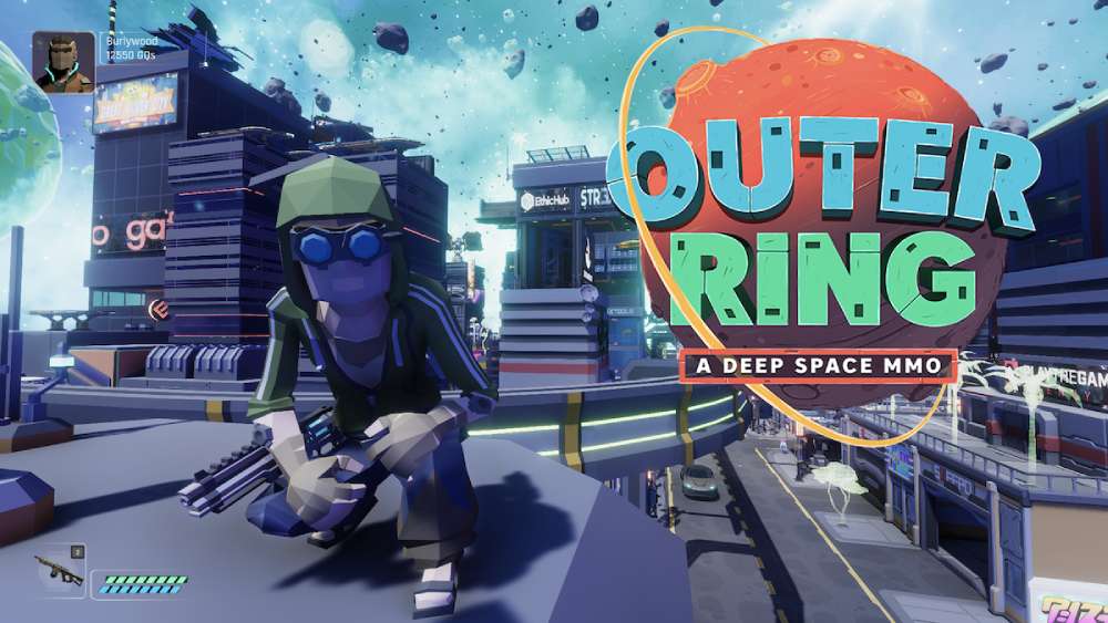
Outer Ring
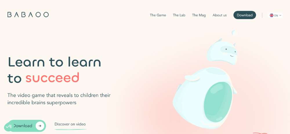
Babaoo
How Do AAA Game Studios Structure Their Websites?
AAA studio websites follow a consistent structural pattern, even when the visual design changes dramatically between franchises. Understanding that structure helps explain why they convert well.
Standard AAA site structure (top to bottom):
- Full-bleed hero: autoplay trailer or cinematic still with game logo
- Game overview block: genre, platform badges, ESRB rating
- Feature highlights: 3 to 5 key gameplay sections with screenshots
- Social proof: review scores, awards, player count
- Buy / pre-order block: platform-specific CTAs, edition comparison
- News feed: studio blog or patch notes
- Footer: links to press kit, support, community
Cinematic Hero Sections in AAA Design
82% of businesses report that video keeps visitors on their website longer (DesignRush, 2025). AAA studios have used this to their advantage for years, but the execution gap is significant.
Good execution: Hero video loads a compressed preview, upgrades to full resolution after the page renders, and pauses on mobile to preserve performance.
Poor execution: Full 4K trailer autoplays on mobile, blocks the CTA during load, and sends Core Web Vitals scores into failure range.
The Last of Us Part II site (Naughty Dog) is a reference point for doing this right. The hero loads fast, the CTA sits above the fold on all viewports, and the trailer is offered as a modal, not a forced autoplay.
Multi-Game Navigation and Franchise Hubs
Studios with multiple titles face a navigation problem that single-game sites never deal with. Users arrive searching for a specific game but often discover related content if the navigation structure makes that easy.
Ubisoft handles this with a franchise hub model: each game has its own standalone URL, but the parent studio site aggregates them under genre and series filters. Electronic Arts (EA) uses a similar hub approach at ea.com.
Key distinction: the studio homepage functions as a portfolio, while each individual game page functions as a product landing page with a single conversion goal.
Social Proof Blocks in AAA Game Sites
Review scores, award callouts, and player counts are the 3 most common social proof elements on AAA sites. Their placement matters as much as their content.
| Social Proof Type | Placement | Example |
|---|---|---|
| Metacritic score | Below hero or near buy CTA | Elden Ring site: 96 score next to buy block |
| Award logos | Horizontal strip below overview | GOTY, BAFTA, The Game Awards |
| Player count | Real-time counter in hero or footer | Destiny 2, GTA Online, Fortnite |
How Do Indie Game Websites Approach Design Differently?
Indie game sites solve a different problem than AAA sites. Without a marketing budget for custom 3D scenes or full-bleed cinematics, indie designers rely on art direction, personality, and tight layout decisions to make an impression.
The gaming industry had 3.6 billion total gamers globally in 2024, with mobile and PC indie titles capturing a growing share of that audience (Newzoo). Indie game web design is more important than it has ever been.
Personality-Driven Design Over Production Value
The Untitled Goose Game site has no trailer autoplay, no particle effects, and no complex scroll animation. It has a goose, a clean sans-serif typeface, and a Steam button. That is the entire design.
This works because the personality is consistent. The tone of the site matches the tone of the game. Visitors feel the game before they click anything.
Hollow Knight does the same thing differently. The site uses hand-drawn key art as the dominant visual element, a dark background that reinforces the underground atmosphere, and a navigation bar so minimal it almost disappears.
Single-Page Layouts and Why Indie Studios Use Them
Single-page layouts work well for indie games for 3 reasons: lower development cost, faster load times without multi-page routing, and a focused conversion path with no exit points until the CTA.
Typical indie single-page flow: hero with key art, short game description, feature screenshots, platform badges, then buy or wishlist CTA. Done in under 5 scroll steps.
Celeste, A Short Hike, and Stardew Valley all use variants of this structure. Each executes it slightly differently, but the conversion logic is the same.
Itch.io vs. Standalone Site Tradeoffs
Itch.io: Free, instant setup, built-in audience, zero hosting cost. Works well for game jams and small releases.
Standalone site: Full brand control, custom domain, no platform dependency. Worth the effort for commercial releases with a meaningful marketing budget.
Most indie studios use both: a standalone site for the main game presence and an Itch.io page for exposure and early sales. The standalone site links to Steam for the primary conversion.
What Design Patterns Appear Across Top-Performing Game Websites?
After looking at dozens of top game sites across genres and studio sizes, 5 structural patterns show up consistently. These are not trends. They are functional decisions that game designers have independently arrived at because they work.
Sticky CTAs and Above-the-Fold Placement
A one-second delay in page load time reduces conversions by 7% (Colorlib, 2026). Sticky CTAs offset some of that friction by keeping the buy or wishlist action reachable at all times, even during heavy scroll sections.
Most top game sites use a sticky header that collapses the full navigation into a minimal bar with a single persistent CTA button after the user scrolls past the hero. This is the same pattern used on high-converting ecommerce homepage designs and applies directly to game store conversion flows.
Dark Backgrounds as the Default Game Site Standard
Nearly 82% of smartphone users use dark mode in 2024 (Earthweb). Game sites have used dark backgrounds long before dark mode became a mainstream UI trend, and the two now reinforce each other.
Why dark backgrounds dominate game web design:
- Game key art reads better against dark than light backgrounds
- High-contrast UI elements (neon accents, white type) pop without competing with the art
- Dark themes reduce perceived brightness on mobile, which correlates with longer session times
- Genre signaling: dark backgrounds immediately communicate fantasy, sci-fi, horror, or action
The relationship between dark mode web design and gaming aesthetics is not coincidental. Gaming is one of the industries that established the convention, and it continues to define it.
Parallax Scrolling for World-Building
Parallax scrolling is one of the most used effects on game sites and also one of the most abused ones. When it works, it creates a sense of depth that pulls visitors into the game world. When it is overdone, it slows the page and triggers motion sensitivity issues.
Good parallax usage on game sites: 1 to 2 layers of depth on the hero section, triggered on scroll, using pre-rendered assets rather than live WebGL. The Ori and the Will of the Wisps site is a clean example: forest layers scroll at different speeds, the effect reads immediately, and the page stays fast.
A broader collection of parallax scrolling websites across industries shows how the technique is used outside gaming, but game sites remain its most commercially relevant application.
Platform Badge Placement Standards
Platform badges (Steam, PlayStation, Xbox, Switch, Epic Games Store) tell users where they can buy the game. Their placement follows a consistent pattern on almost every top game site.
Standard placement: below the hero, directly adjacent to or within the primary CTA block. Badge row sits between the buy button and the game description. Users scan left to right: price, platform, button.
Sites that bury platform badges in the footer or in a separate "availability" section consistently perform worse on store click-through rates.
How Do Live Service Games Design for Ongoing Engagement?
A launch-focused game site has one job: convert a visitor to a buyer. A live service game site has a second job that never ends: bring existing players back repeatedly.
Mobile gaming sessions increased 12% year-over-year in 2024 (Sensor Tower), driven largely by live service titles with regular content updates. The website plays a role in that retention loop, not just acquisition.
Dynamic Content Zones for Seasonal Updates
Fortnite's site redesigns its hero section every season. The underlying layout stays fixed: hero, store, battle pass, news. But the creative, copy, and color scheme flip completely with each chapter update.
This approach solves 2 problems at once: it keeps the site feeling current without a structural rebuild, and it gives returning players a visual signal that new content is live.
Destiny 2 takes this further with a live season roadmap embedded directly in the site. Players can see upcoming content dates, expansion timelines, and active weekly challenges without leaving the page.
Battle Pass and Shop Integration on Game Homepages
In-app purchase revenue grew 4% year-over-year in 2024 despite a 7% decline in new downloads (Sensor Tower). That means existing player spending is increasing. Live service sites are designed to accelerate that spending through direct shop access.
Top live service sites that integrate shop elements directly:
- Fortnite: rotating item shop preview on homepage
- League of Legends: skin and champion spotlight in main navigation
- Apex Legends: battle pass tracker visible from the main page
This is a fundamentally different design goal from a launch-focused site. The conversion target is not "buy the game" but "spend inside the game today."
Community Hubs and Esports Sections
Riot Games built League of Legends' web presence as a network of connected sections: the main game site, a dedicated esports portal, a universe lore section, and a client download page. Each functions independently but links to the others.
Community-focused design elements on live service sites:
- Discord server links in navigation or footer
- Creator/content integration (Twitch drops, YouTube premiere embeds)
- Leaderboards or ranked season tracker widgets
- Forum or Reddit community links in a dedicated community tab
These elements serve a different kind of user than the main game pages do. They serve players who are already committed and looking for depth, not conversion.
What Role Does Typography Play in Games Website Design?
Typography on a game site does two jobs simultaneously: it communicates information and it signals genre. A horror game using rounded sans-serif type feels wrong before a single word is read. A sci-fi RPG in a serif typeface reads as miscast.
39% of users say color schemes are the most attractive element of a business website (WebFX, 2025). Typography is the second signal users process, and for game sites, it is genre-defining.
Custom Typefaces in AAA Game Branding
Custom typefaces are a standard budget line for AAA franchises. Halo Infinite uses a custom geometric sans-serif that echoes military hardware and future-tech aesthetics. Cyberpunk 2077 uses a condensed gothic face that reads as gritty, corporate, and dystopian all at once.
The 3 things a custom game typeface signals: the game's time period or world (futuristic, medieval, contemporary), its tone (grim, playful, epic), and its target audience (core gamer, casual, narrative-focused).
A thorough understanding of typography in web design clarifies why these choices are not decorative. They are functional signals that set user expectations before gameplay or story copy does the same job.
Genre Conventions in Game Website Type Choices
| Game Genre | Type Style | Common Characteristics |
|---|---|---|
| Fantasy RPG | Serif or decorative | Ornate letterforms, aged texture, gold color |
| Sci-fi / Cyberpunk | Condensed sans-serif | Tight tracking, angular cuts, neon accent color |
| Horror | Distressed or slab serif | Irregular baseline, low contrast, desaturated |
| Sports / Racing | Wide sans-serif, italic | Forward lean, high contrast, motion implied |
| Indie / Casual | Rounded sans-serif or hand-drawn | Warm, approachable, often paired with flat illustration |
Legibility vs. Style on Dark Backgrounds
Dark game site backgrounds create a real legibility challenge for body text. White text on dark backgrounds reads well for headlines but causes eye strain at paragraph length if contrast ratios are not handled carefully.
Practical rules for dark-background game site type: use off-white (not pure #FFFFFF) for body text to reduce halation, keep body copy above 16px, and avoid light gray text on dark gray backgrounds where contrast ratios drop below WCAG AA standards.
The websites with good typography that stand out in the gaming space are the ones that treat legibility as a baseline requirement before style decisions are made, not after.
How Do Game Websites Handle Mobile Design?
Over 63% of global web traffic comes from mobile devices (Hostinger, 2025). Game sites carry heavy assets: trailers, parallax layers, WebGL scenes. Getting all of that to work on a 390px viewport without tanking performance is genuinely tricky.
Desktop conversion rates sit at 4.03%, while mobile trails at 2.19% (ContentSquare, 2024). For game sites, closing that gap starts with the same decisions every mobile-first design process requires: layout, touch targets, and load speed, in that order.
Collapsed Navigation on Game Sites
Three navigation patterns dominate game site mobile layouts:
- Hamburger menu with full-screen overlay (most common on AAA sites)
- Bottom navigation bar (used on live service games with 4-5 key sections)
- Fixed minimal header with a single CTA (indie single-page layouts)
Fortnite's mobile site uses a bottom nav bar for its 5 main sections: Home, Store, Battle Pass, News, Support. The tap targets are large, the icons are clear, and switching between sections never requires a scroll back to the top.
Video Handling on Mobile Game Sites
Autoplay trailer videos on desktop become performance liabilities on mobile. A full-quality game trailer can weigh 80 to 200MB, which is a load time disaster on a 4G connection.
Standard mobile video handling on top game sites:
- Replace hero video with a compressed static key art image on mobile
- Keep the play button visible so users can opt into the trailer
- Use the HTML5
playsinlineandmutedattributes for any video that does autoplay
Sony Santa Monica's God of War: Ragnarok site handles this well. Desktop gets the cinematic hero video; mobile gets a still from the same scene with a manual play trigger.
Touch-Optimized CTA Sizing
57% of users say they would not recommend a business with a poorly designed mobile site (CRO Statistics, 2026). CTA buttons that are too small to tap accurately are one of the fastest ways to qualify for that group.
Google's minimum tap target recommendation: 48x48dp. Most top game sites use buttons taller than 56px on mobile, with at least 8px of spacing between adjacent tap targets.
Well-designed, touch-friendly websites with good UI follow the same sizing rules that game sites depend on, but game sites add another layer: buttons often sit over busy key art, so contrast ratios need extra attention.
Responsive Game Website Layout in Practice
The gap between a good desktop game site and a good mobile game site is usually not a technical problem. It is a content priority problem.
Desktop vs. mobile content hierarchy on top game sites:
| Element | Desktop | Mobile |
|---|---|---|
| Hero section | Full-bleed video or parallax image | Static key art, portrait crop |
| Feature highlights | 3-column grid with screenshots | Single-column vertical stack |
| Platform badges | Horizontal row, large icons | Wrapped row, smaller icons |
| CTA block | Side-by-side edition options | Stacked, full-width buttons |
What Tools and Technologies Power Games Website Design?
The tech stack behind a game site determines what is visually possible and what the performance ceiling looks like. AAA studios build custom, indie developers often reach for faster solutions, and both make deliberate tradeoffs.
WebGL and Three.js for Interactive 3D
WebGL renders 2D and 3D graphics directly in the browser using GPU acceleration. Three.js is the JavaScript library that sits on top of WebGL and makes it accessible without requiring deep graphics programming knowledge.
Real use on game sites: interactive character viewers (rotate and zoom the protagonist), environmental particle systems on hero sections, and scroll-driven 3D scene transitions between game chapters. The Awwwards Site of the Year 2021, Star Atlas, was a game site built almost entirely on Three.js and WebGL. It won partly because the interactive experience felt unlike anything else in that category.
Brands like Gucci, Nike, and Spotify use GSAP for scroll animations alongside Three.js for 3D scenes (JSMastery, 2024). Game sites use the same combination, just with game art instead of product photography.
GSAP for Scroll Animations
GSAP (GreenSock Animation Platform) handles scroll-triggered animations, timeline-based sequencing, and precise element transitions. It runs on the CPU rather than the GPU, which makes it a better fit for text reveals, element transitions, and parallax layers than for heavy 3D rendering.
GSAP vs. Three.js use cases on game sites:
- GSAP: chapter title reveals, screenshot fade-ins, nav bar transitions, parallax depth effects
- Three.js: interactive 3D character displays, real-time environment previews, particle systems
- Both together: scroll-driven 3D scenes where GSAP controls the camera and Three.js renders the model
CMS and Build Choices
Webflow handles a meaningful portion of mid-tier game studio sites, particularly for indie developers and AA studios that need marketing site flexibility without a custom build. Contentful is the headless CMS of choice for live service games that push frequent news and patch updates.
Custom vs. off-the-shelf: AAA studios almost always build custom. The Cyberpunk 2077 and Halo Infinite sites are bespoke builds. That costs six figures and takes months. Webflow gets a competent indie game site live in weeks for a fraction of the budget.
Designers who want to build or study game-adjacent interactive web experiences benefit from understanding the full range of web design tools available, from Webflow for no-code flexibility to Three.js for full GPU rendering control.
Performance Optimization on Asset-Heavy Game Sites
A 0.1 second improvement in mobile load time increases conversions by 8% (Deloitte, via HubSpot). For game sites running 4K screenshots, WebGL scenes, and autoplay trailers, hitting that threshold requires deliberate asset optimization.
Common optimization stack on top game sites:
- AVIF or WebP for all screenshots and key art
- CDN delivery for all static assets (Cloudflare, Fastly, AWS CloudFront)
- Lazy loading for below-fold content
- Deferred JavaScript for non-critical animations
How Do Game Websites Use Color to Communicate Genre?
Color on a game site works before the user reads anything. It sets genre expectations, emotional tone, and audience signal in under a second. A color palette that mismatches the game's genre creates friction, even if visitors cannot articulate why.
Research shows that when people observe objects, color perception accounts for 85% of initial impression in the first 20 seconds (Game Developer, 2023). The site's color scheme is doing most of that work before a single mechanic or screenshot is processed.
Horror and Sci-Fi Color Palettes
Horror game sites use desaturated palettes, deep blacks, and red accents almost universally. The Resident Evil Village site pairs near-black backgrounds with muted gold and blood red, which signals gothic horror without a word of copy.
Sci-fi titles split into 2 sub-palettes: corporate dystopia (blues, grays, neon cyan) and space opera (deep navy, purples, glowing whites). Cyberpunk 2077 leans hard into cyan and magenta on black. Mass Effect's marketing sites typically use dark navy with electric blue highlights.
These choices connect directly to how color theory in web design applies to audience psychology: cool, desaturated palettes lower arousal and prime users for tension and atmosphere rather than immediate action.
Fantasy and Sports Game Palettes
Rich golds, deep purples, and earthy reds dominate fantasy RPG sites. World of Warcraft and Elden Ring both use gold as the primary accent color, which signals wealth, magic, and the epic scale those games promise.
Sports and racing game sites sit at the opposite end. High-energy primary colors, forward-leaning italic typography, and motion-blur inspired backgrounds signal speed and competition. FIFA and Forza Motorsport both use high-contrast reds or blues against white, with heavily saturated team color accents.
Indie and Casual Game Color Decisions
Casual and indie game sites that use bright, vibrant color schemes see higher engagement signals, which research confirms: colorful visuals increase perceived fun and attract attention faster than neutral palettes (Line25, 2025).
Indie genre signals by palette:
- Cozy/farming games: warm earth tones, soft greens, pastel yellows
- Pixel art platformers: bold primaries, high contrast, flat color blocks
- Narrative indie titles: muted, painterly palettes that feel literary
Stardew Valley's site uses warm greens and yellows that feel immediately welcoming. Hades uses deep purples and flame oranges that signal mythology and intensity. Both get the genre signal right at first glance.
Building a cohesive game site color palette follows the same logic as any strong color scheme process: start with the game's core emotional promise, then choose a dominant hue that carries that emotion, and use accent colors to direct attention toward CTAs.
What Conversion Elements Do the Best Game Websites Use?
Conversion design on game sites is more specific than on most product sites because the purchase decision is often emotional and fast. Players decide in seconds whether a game interests them. The conversion structure has to match that pace.
Websites with clear, color-contrasting CTA buttons average a conversion rate of 17.85%, compared to 11.48% for sites with less prominent CTAs (Market.us CRO Statistics, 2026). That gap is entirely about design execution, not product quality.
Pre-Order and Wishlist Page Design
Pre-launch game sites have one goal: capture intent before the sale is possible. Wishlist buttons on Steam are the primary mechanism, followed by email sign-up for direct marketing.
Pre-order page design elements that perform:
- Edition comparison table (Standard, Deluxe, Ultimate) with feature differentiators
- Countdown timer to release date, visible above the fold
- Bonus content callout adjacent to the pre-order CTA
- Platform badges with direct routing to each store
Ubisoft tested a redesigned pre-order page layout that moved platform selection into the same viewport as the buy button without requiring a scroll. The two-column layout, built with VWO, increased conversions by reducing the steps between intent and action (VWO, via Blogging Wizard).
Email Capture and Beta Sign-Up Design
Landing page sign-up forms convert at 23% on average, compared to 3% for popup-based forms (Crazy Egg, 2026). Pre-launch game pages that integrate email capture directly into the page layout outperform those that rely on exit-intent popups.
Best practice: place the email capture form below the hero and above the first feature section. Keep the form to a single field (email only). Follow it with a benefit statement, not a generic "stay updated" placeholder. Form design decisions like field count, label placement, and button label copy directly affect how many players actually sign up for a beta or early access list.
Platform-Specific CTA Routing
Game sites that route platform badges directly to the correct store page, rather than a generic "buy" landing page, remove one additional click from the purchase flow. That click matters.
Platform routing done right: clicking the Steam badge opens the Steam store page in a new tab. Clicking the PlayStation badge opens the PS Store page. Each platform gets its own URL, not a generic redirect through the game's marketing site.
This is the same logic behind well-structured hero sections on product pages: every element in the above-the-fold zone should reduce steps between interest and action, not add them.
How Do Award-Winning Game Websites Differ from Average Ones?
Award-winning game sites take design risks that standard commercial sites avoid. That is the most direct answer. The commercial sites optimize for conversion. The award entries optimize for experience. The best ones do both.
Over 15,000 websites are submitted to Awwwards each year. Fewer than 365 earn a Site of the Day. The ratio at FWA is similarly tight (Utsubo, 2026). Getting shortlisted in a gaming category requires design decisions that go beyond a well-structured layout and a strong hero.
Design Risks Award Winners Take
Standard game sites follow the hero-features-CTA formula because it works. Award-winning game sites break that formula when the game's identity calls for it.
Common award-winning departures from standard game site structure:
- Non-linear navigation where scroll path is replaced by interactive exploration
- Full-site WebGL environments where the website is the game world
- Typography as the primary visual element, with no key art hero
- Sound-reactive design where user interaction triggers audio and visual feedback
Star Atlas, Awwwards Site of the Year 2021, put users inside an interactive 3D space environment before presenting any traditional page content. The entire site was an experience. It won because nothing else in the gaming category came close to that level of environmental storytelling through browser technology.
Interactive Storytelling on Award-Winning Game Sites
Awwwards scores sites across 4 criteria: Design (40%), Usability (30%), Creativity (20%), and Content (10%) (Utsubo, 2026). Award-winning game sites score high on Design and Creativity specifically because they use interactive storytelling to present content that would otherwise be static.
Interactive storytelling techniques used in award entries:
- Scroll-driven narrative where game story elements reveal as users scroll
- Cursor-reactive parallax that creates depth based on mouse position
- Chapter-based layout where each section of the site represents a chapter of the game
These techniques are also found in strong interactive websites across industries, but game sites have a natural advantage: the game world itself provides the narrative raw material. The website just has to make it accessible through the browser.
Performance Reality on Award-Winning Game Sites
Award-winning game sites do not always pass Core Web Vitals. Only 33% of websites pass all three Core Web Vitals (Colorlib, 2026), and highly interactive game sites with WebGL scenes and complex animations often sit in the failing tier.
Key distinction: award entries are evaluated on design, creativity, and experience, not load performance. Commercial game sites, by contrast, need to balance visual ambition against conversion goals and search performance.
The honest tradeoff is that a site built to win an Awwwards SOTD will likely score worse on Google PageSpeed Insights than a site built to sell 100,000 copies at launch. Riot Games and Ubisoft have separate teams for award-style experience microsites versus their primary commercial game pages. Not every studio can afford that split. Knowing which goal the site is serving up front determines every design and technology decision that follows.
The full collection of gaming websites across studio sizes shows how this spectrum plays out in practice, from lean indie sites optimized purely for conversion to full WebGL experiences built for recognition and brand awareness.
For anyone studying these patterns across industries, the same tension between visual ambition and practical performance shows up in entertainment websites, esports platforms, and film promotional sites. Game sites just push the technical limits further than almost any other category.
FAQ on Games Website Design
What makes a game website design stand out?
Strong visual hierarchy, fast load times, and a clear CTA above the fold. The best game sites frame key art without being buried by it. Dark backgrounds, cinematic hero sections, and genre-accurate color palettes separate memorable sites from forgettable ones.
Which AAA studios have the best game website design?
CD Projekt Red, Naughty Dog, and Bungie consistently produce top-tier game site design. Their sites combine full-bleed hero sections, platform badge rows, and sticky CTAs. Each site reflects the game's visual identity from the first scroll.
What is the best color scheme for a game website?
It depends on genre. Horror sites use desaturated palettes and deep blacks. Fantasy RPGs lean into rich golds and purples. Sci-fi titles use cyan and neon on dark backgrounds. The color palette should signal genre before any copy is read.
How do indie game websites differ from AAA game sites?
Indie game sites prioritize personality over production value. Single-page layouts, hand-drawn key art, and minimal navigation are common. Sites like Hollow Knight and Celeste prove that a tight layout with strong art direction outperforms bloated design every time.
What typography works best on dark game website backgrounds?
Use off-white rather than pure white for body text to reduce eye strain. Custom typefaces signal genre: condensed sans-serif for sci-fi, decorative serifs for fantasy. Keep body copy above 16px. Avoid light gray text on dark gray backgrounds where contrast drops below WCAG standards.
How important is mobile design for game websites?
Critical. Over 63% of global web traffic comes from mobile devices (Hostinger, 2025). Mobile-first game site design means replacing hero videos with static key art, using touch-friendly CTA buttons, and stacking desktop grid layouts into single-column vertical flows.
What tools are used to build game websites?
AAA studios build custom using WebGL, Three.js, and GSAP. Indie developers often use Webflow for speed and flexibility. Live service games use headless CMS setups like Contentful for frequent content updates. The choice depends on budget, timeline, and animation requirements.
How do live service games design their websites differently?
Live service sites serve returning players, not just new ones. They integrate battle pass previews, rotating item shops, patch note feeds, and season roadmaps directly on the homepage. Fortnite and Destiny 2 refresh hero sections with every new season update.
What conversion elements do the best game websites use?
Sticky CTAs, platform badge routing to direct store pages, and above-the-fold wishlist buttons. Pre-launch sites lead with a Steam Wishlist CTA and a countdown timer. Edition comparison tables with clear feature differentiators reduce purchase hesitation on post-launch buy pages.
What separates award-winning game sites from standard ones?
Award-winning sites take risks: full-site WebGL environments, scroll-driven narrative layouts, and cursor-reactive parallax. Awwwards scores on Design, Usability, Creativity, and Content. Star Atlas won Site of the Year 2021 by putting visitors inside an interactive 3D space environment before showing any standard page content.
Conclusion
This conclusion is for an article presenting the patterns behind effective game website design, from AAA studio structures to indie single-page layouts and live service content hubs.
The throughline is consistent: genre-accurate color palettes, responsive game websites, and conversion-focused layouts outperform visually ambitious sites that ignore load speed and mobile UX.
Whether you are studying esports website design, building a game studio site, or planning a pre-order page, the fundamentals stay the same. Nail the game hero section, route platform badges correctly, and keep CTAs reachable at every scroll depth.
Good game web design is not about impressing designers. It is about getting players to click.


