
Automatic image optimization into next-generation format
June 2, 2026
The Beauty Of Minimalist Website Design Explained
June 6, 2026Some websites make you stop scrolling. Not because of a flashy banner, but because something on the page actually reacts to you.
The best interactive websites share one thing: user input changes what happens next. That is a different standard from "visually impressive," and most sites do not meet it.
This article covers 10 categories of genuinely interactive web experiences, from creative portfolios and data visualization tools to browser-based games and AI-powered interfaces.
Each site was selected against four criteria: real-time response, user agency, variable output, and purposeful design. You will leave with a clear picture of what makes interactive web design work and a concrete list of sites worth studying.
What Is an Interactive Website?
An interactive website is one where user input directly changes the content, state, or output in real time. The page responds to what the visitor does, not what a developer pre-scripted for everyone equally.
This matters because most people confuse animation with interactivity. They are not the same thing.
A hero section with a CSS fade-in is animated. A product configurator that rebuilds a 3D model every time you change a color swatch is interactive. The distinction: one plays on a timer, the other reacts to the user.
What separates animation from real interactivity
Animation is output. Interactivity is a two-way exchange.
| Type | What it does | User role |
|---|---|---|
| Passive animation | Plays on load or scroll trigger | Observer |
| Scroll-linked motion | Responds to scroll position | Indirect controller |
| True interactivity | Changes state based on specific input | Active participant |
| AI-driven interaction | Generates non-deterministic output per user | Co-creator |
True interactivity requires 3 core components: an input mechanism (click, touch, cursor position, voice), a processing layer that interprets that input, and a dynamic response that changes the page state visibly and immediately.
Input types vary widely across interactive web experiences: form-based, click-driven, cursor-reactive, data-driven, scroll-triggered, and AI-assisted. Each creates a different user relationship with the content.
Why the definition matters for evaluation
94% of first impressions are tied to design (Bebusinessed, 2024), but many designers chase visual novelty over genuine responsiveness.
A site can win awards for animation and still fail the interactivity test. Understanding what "interactive" actually means is what separates useful benchmarking from decoration appreciation.
What Makes a Website Truly Interactive?
4 markers define genuine interactivity: real-time response, user agency over output, variation in results based on input, and purposeful design where every interaction serves a goal. Sites that check all 4 are the ones worth studying.
Response latency and the 100ms threshold
Jakob Nielsen's usability research established 100ms as the limit for instantaneous perception (Nielsen Norman Group). Below that, users feel the system reacted to them. Above it, they start to notice a gap between action and response.
Web.dev's Core Web Vitals documentation confirms this: visual feedback delays up to 100ms are perceived as caused by the user's own action, which is exactly the sensation interactive design requires.
Interaction to Next Paint (INP), Google's current Core Web Vitals metric, sets "good" at under 200ms for 75% of page loads. The best interactive sites consistently target well under that ceiling.
Input variety and state persistence
High-quality interactive web experiences accept more than one input type.
- Mouse and cursor: position, movement speed, hover state
- Touch: tap, swipe, pinch, multi-finger gestures
- Keyboard: navigation, shortcut-driven state changes
- Scroll position: used as a timeline or control axis
- Device sensors: gyroscope, accelerometer on mobile
State persistence separates shallow interactivity from deep engagement. Does the site remember what the user did 30 seconds ago? Does it build on prior input or reset on every click?
Feedback mechanisms that confirm user actions
Every interaction needs a confirmation signal. Without it, users repeat actions, second-guess clicks, or leave.
Feedback types used on the best interactive websites:
- Visual: color change, shape morph, element movement
- Auditory: tone or sound tied to a specific action
- Haptic: vibration feedback on mobile touch interaction
Poor website usability, including missing feedback signals, drives 79% of visitors away (Hostinger, 2026). On interactive sites especially, unclear feedback breaks the cause-effect loop users expect.
What Are the Best Interactive Websites for Creative Portfolios and Agencies?
Creative agency and portfolio sites push browser-based interactivity further than almost any other category. They treat the browser as a canvas, using WebGL and real-time 3D to turn navigation itself into the experience.
Bruno Simon's portfolio at brunosimon.me is the reference most front-end developers point to first. You drive a small car around a 3D world to discover his work. There is no scroll, no hover menu. The entire navigation is a game mechanic built in Three.js.
Sites that define the creative interactive benchmark
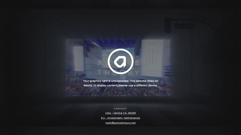
Active Theory uses cursor-driven particle systems where pointer position and movement speed directly control visual density in real time. Immersive Garden layers CSS Houdini with physics-based scroll elements that respond to both velocity and direction.
What separates these from sites that are "just animated": remove the user from the equation and the experience collapses. There is nothing to watch. That is the test.
What technologies power these creative interactive sites
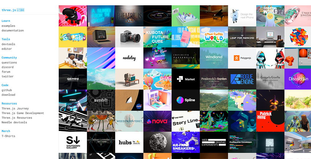
Three.js is the dominant library here, originally authored by Ricardo Cabello in 2010 and now on release r184 (April 2026).
It abstracts WebGL into a workable JavaScript API, making real-time 3D rendering accessible without writing raw GLSL shaders.
Three.js core ships at roughly 600KB minified before scene assets (Utsubo, 2026).
Add geometry, textures, and post-processing and a project easily exceeds 3MB. Studios that do this well budget for performance from the start, not as an afterthought.
GSAP (GreenSock Animation Platform) handles the coordination layer between user input and visual state. ScrollTrigger, GSAP's scroll-binding plugin, links timeline playback directly to scroll position, turning page depth into a control axis.
The Canvas API handles cursor-reactive particle and drawing effects on sites where full 3D is too heavy.
It renders 2D graphics directly in the browser without a library dependency.
Because these sites are among the most visually ambitious on the web, performance trade-offs are real.
Three.js sites that skip HTML-first rendering often score in the 30s on Lighthouse, since canvas content contains no indexable DOM text.
What Are the Best Interactive Websites for Data Visualization?
The best data visualization sites do not just display data. They let users interrogate it. Country filters, time sliders, variable comparators. The user controls what story the data tells.
The interactive data visualization market is expected to reach $19.20 billion by 2027 (Analytico Digital), reflecting how central exploratory data tools have become to journalism, science communication, and public education.
The Pudding
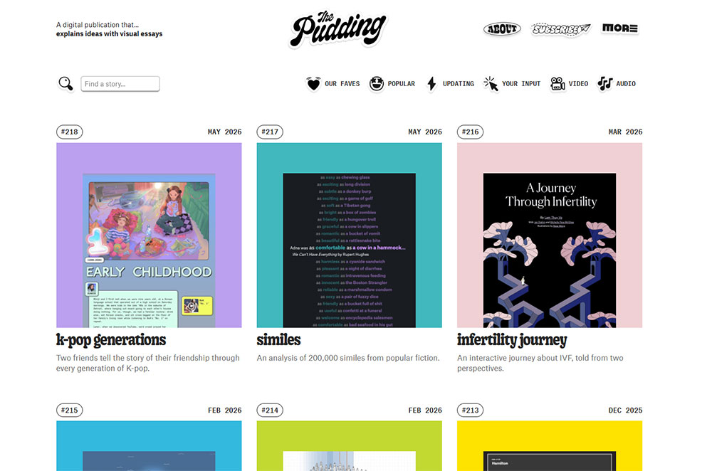
The Pudding builds data-driven essays where scrollytelling and user-queryable elements are the delivery mechanism, not decoration.
Their 2024 piece analyzing 5,100 Billboard Top 10 hits combined animated timelines with user-controlled filtering to let readers test the analysis themselves.
D3.js powers most of what The Pudding builds. It binds data directly to DOM elements and handles transitions, scales, and axes with precise control. It is also the dominant library across serious data visualization work on the web.
Our World in Data and Gapminder
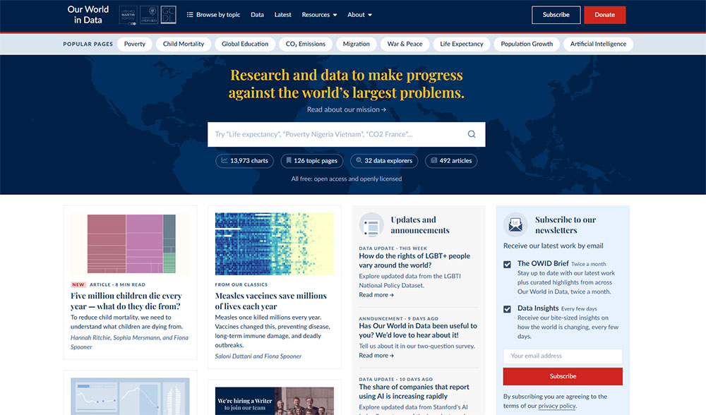
Our World in Data (ourworldindata.org) takes a different approach. Their charts include country selection dropdowns, metric toggles, and time-range sliders. Every chart is configurable by the reader, not locked into one editorial frame.
Gapminder (gapminder.org) built its reputation on animated bubble charts with a year-scrubbing control.
Drag the timeline and watch 200 years of development data play out country by country. It remains one of the clearest examples of interaction serving understanding rather than entertainment.
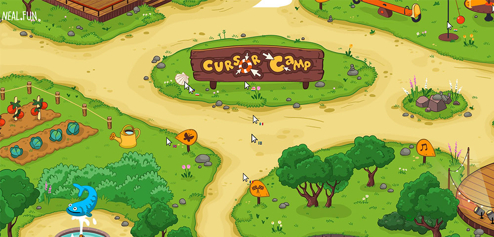
Neal.fun
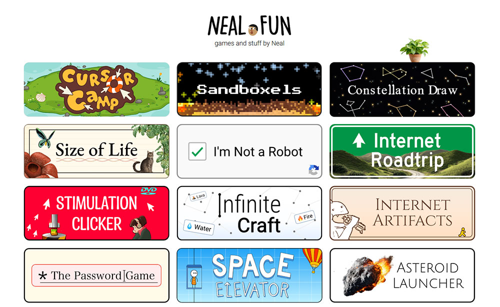
Neal.fun is a study in single-interaction design. Each tool does one thing: visualize the scale of space, walk through the layers of Earth, spend the budget of NASA. Minimal input, maximum engagement loop.
The site proves that interactive web experiences do not require complex stacks. Sometimes a well-scoped idea with tight feedback design outperforms technically impressive but directionless experiences.
What Are the Best Interactive Websites for Education and Learning?
Interactive educational websites use real-time feedback loops to replace passive reading with active recall. Users do not read about a concept. They attempt it, get a result, and adjust.
Duolingo reached 103 million monthly active users in 2024, with daily active users growing 51% year-over-year to 34.1 million (Business of Apps, 2026).
Those numbers do not come from content quality alone. They come from interaction design that makes returning feel rewarding.
Duolingo
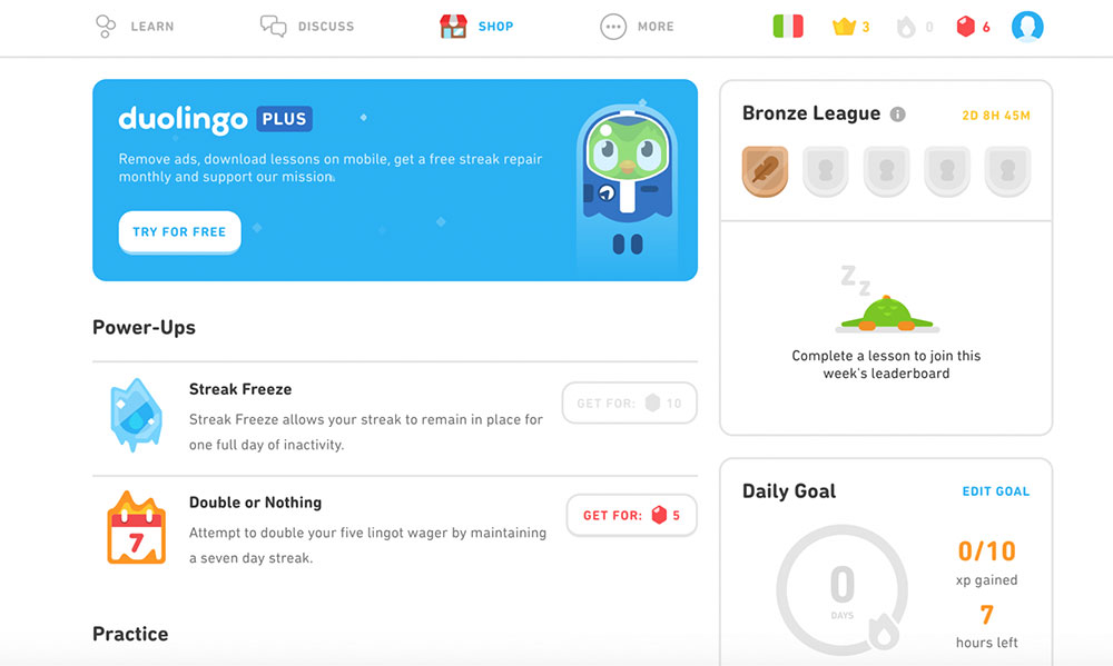
Adaptive response loops are the core mechanism. Answer correctly and the difficulty increases. Answer incorrectly and the question reappears later.
Streak mechanics add a persistence layer: the interaction architecture creates a daily return habit rather than relying on motivation alone.
Every correct answer triggers an immediate visual and auditory confirmation.
Every wrong answer shows the correct response within the same frame. Zero ambiguity about what happened and why.
Brilliant.org and Khan Academy
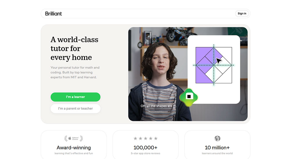
Brilliant.org leads with the problem before the explanation. You attempt to solve something, then the solution and reasoning follow.
Feedback is visual and immediate: interactive diagrams update in real time as you manipulate variables.
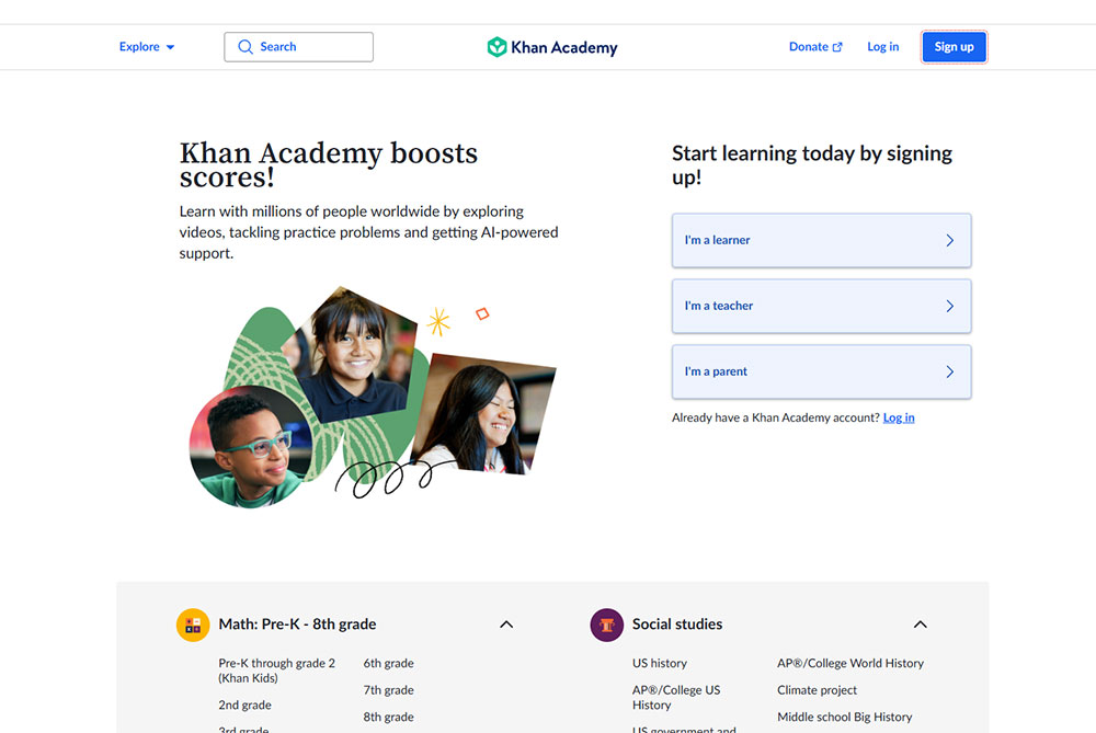
Khan Academy's hint system on exercises is worth noting separately. Users get step-level hints, not full solutions.
The interaction design is built to maintain productive struggle rather than short-circuit it.
Code.org
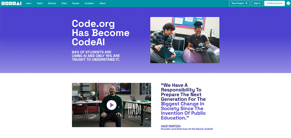
Code.org uses block-based drag-and-drop coding with instant output preview in a split-screen layout.
Write a command on the left, see the result execute on the right. The feedback loop is under 200ms for most interactions.
This format follows the same interaction principle as all the best educational platforms: action, result, adjustment.
The loop is tight enough that users stay in a state of active learning rather than passive observation.
What Are the Best Interactive Websites for Storytelling and Journalism?
Interactive journalism uses user-driven elements to advance narrative comprehension, not just visual engagement. The interaction teaches something. Remove it and the story loses meaning, not just aesthetics.

The New York Times' "Snow Fall" (2012) is still the reference point for this category. Scroll-triggered multimedia, chapter-based navigation, embedded video that activated on scroll position.
It changed what editorial teams thought a long-form article could be.
The Guardian Firestorm and Reuters Graphics
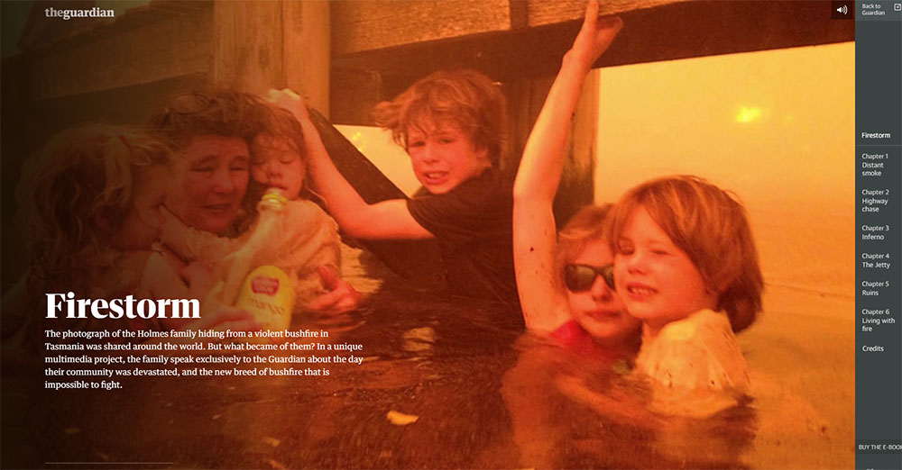
The Guardian's "Firestorm" built on Snow Fall's foundation with audio that layered in as users progressed through chapters. The pacing was user-controlled, not autoplay. Stop reading and the audio paused. Return and it resumed.
Reuters Graphics and Bloomberg Visual Stories take a more data-driven approach. Chart reveals are tied to scroll position. Users see one variable first, then a second overlays on interaction. The comparison only exists because the user moved through the page.
What makes interactive journalism work
The line between functional and decorative interactivity is clearest in journalism. Decorative: a parallax background image that shifts as you scroll. Functional: a map that updates to show data relevant to the paragraph the user is currently reading.
Functional interaction advances understanding. Decorative interaction advances aesthetics. The best journalism sites are built entirely around the first category.
| Site | Interaction type | What it adds to the story |
|---|---|---|
| NYT Snow Fall | Scroll-triggered multimedia | Paces information with visual context |
| Guardian Firestorm | User-controlled audio + chapters | Immersive pace without autoplay force |
| Reuters Graphics | Scroll-revealed chart layers | Builds comparison only on reader demand |
| Bloomberg Visual Stories | Embedded data controls in prose | Lets readers test editorial claims directly |
What Are the Best Interactive Websites for E-Commerce and Product Experiences?
Interactive product pages reduce return rates and increase conversion by giving online buyers the physical-store advantage: the ability to examine a product from every angle before purchasing.
Retailers using 3D product configurators see a 65% average increase in conversion rates, a 40% reduction in returns, and a 25% higher average order value, based on data from over 200 customer implementations (3Devision, 2025).
Brands like Bumbleride have seen conversion lift of up to 121% after integrating 3D configurators.
Nike By You and Apple product pages
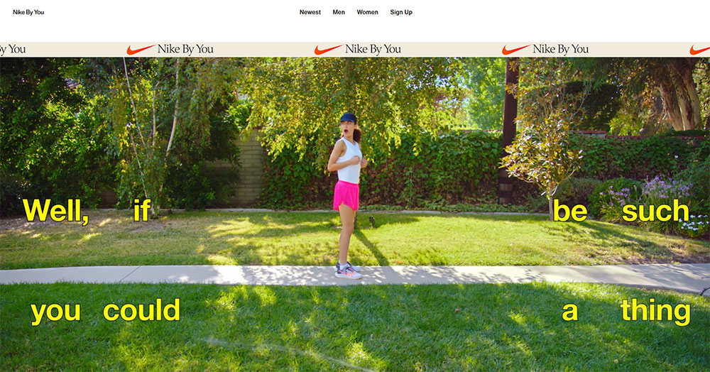
Nike By You (nike.com/nike-by-you) renders a real-time 3D shoe model that updates every time a user switches color zones, materials, or custom text.
The model rotates, zooms, and reflects light based on the selected material. The configurator is the product page.
Apple's product pages use scroll-synced 3D renders and hardware spec comparators.
Scroll past a MacBook section and the laptop animates open.
The interaction is not decorative: it shows the product from angles a static image cannot capture.
IKEA and the AR interaction layer
IKEA Place (web and app versions) uses AR to show furniture in the user's actual room via device camera. 66% of consumers feel more confident purchasing after using 3D configurators (BeeGraphy, 2023). Placing a sofa in your own living room before buying is a different purchasing experience than viewing it on a white studio background.
The 2024 Deloitte report found that 75% of customers prefer brands that offer personalization, and their cart value averages 40% higher than non-personalized shopping sessions. Configurators are the direct technical channel for that preference.
What powers interactive e-commerce experiences
WebGL handles the real-time 3D rendering. Three.js, Babylon.js, and model-io APIs connect product data to the rendering layer. AR integration on the web uses WebXR, the browser standard for mixed reality experiences.
For sites that need strong e-commerce homepage design without a custom 3D build, product configurator platforms like Threekit and Zakeke provide embeddable WebGL configurators that connect to existing product catalogs.
These are worth knowing if you are evaluating e-commerce landing page design options where interactive product previews need to ship fast.
What Are the Best Interactive Websites for Games and Entertainment?
The browser game market was valued at $8.1 billion in 2023 and is projected to reach $11.3 billion by 2032 (DataIntelo).
More than 68% of casual gamers prefer browser-based games they can play instantly without downloads (Global Market Statistics, 2024).
That preference for instant play is why browser-based interactive entertainment has kept growing even as native apps dominate mobile.
Google Doodles and Chrome Experiments
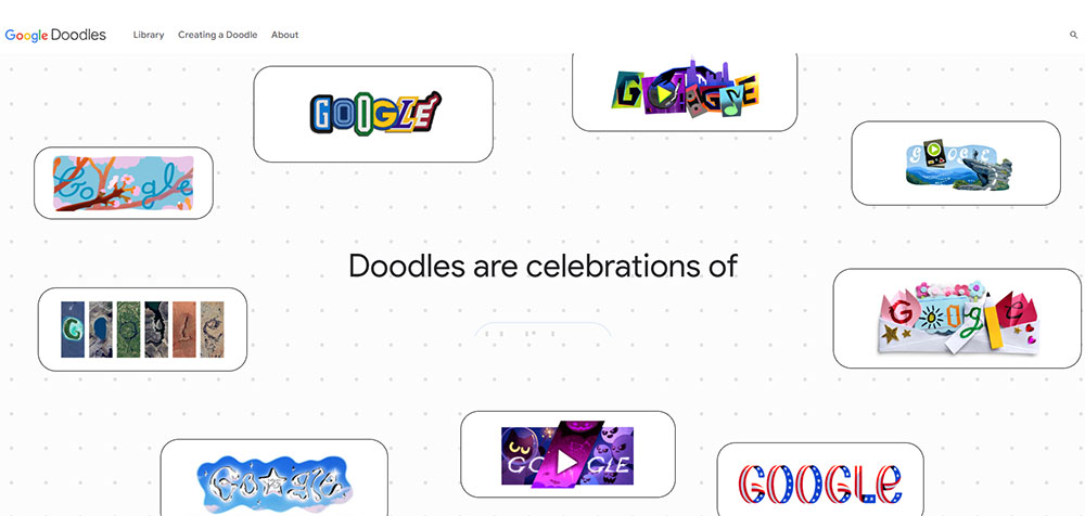
Google's interactive doodles (google.com/doodles) are the highest-traffic interactive experiences on the web. They hit millions of users daily, run without installation, and complete in under 5 minutes.
What makes them a useful benchmark:
- Accessible with zero setup on any device
- Interaction is the entire experience, not a feature layer
- Built to work at global scale without performance degradation
Chrome Experiments (experiments.withgoogle.com) is the developer-facing counterpart. Each experiment pushes one specific browser API to its limit: WebGL, WebAudio, device sensors, or the Gamepad API.
Little Alchemy 2 and Poki
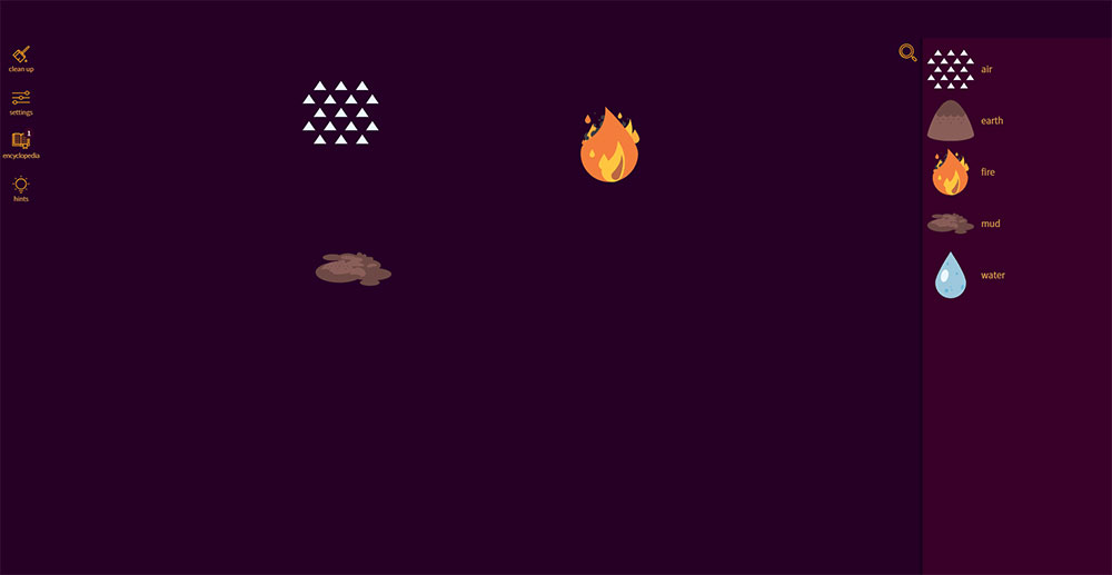
Little Alchemy 2 is drag-and-drop combination logic with 700+ elements to discover.
No score. No timer. No fail state. The entire engagement loop runs on curiosity.
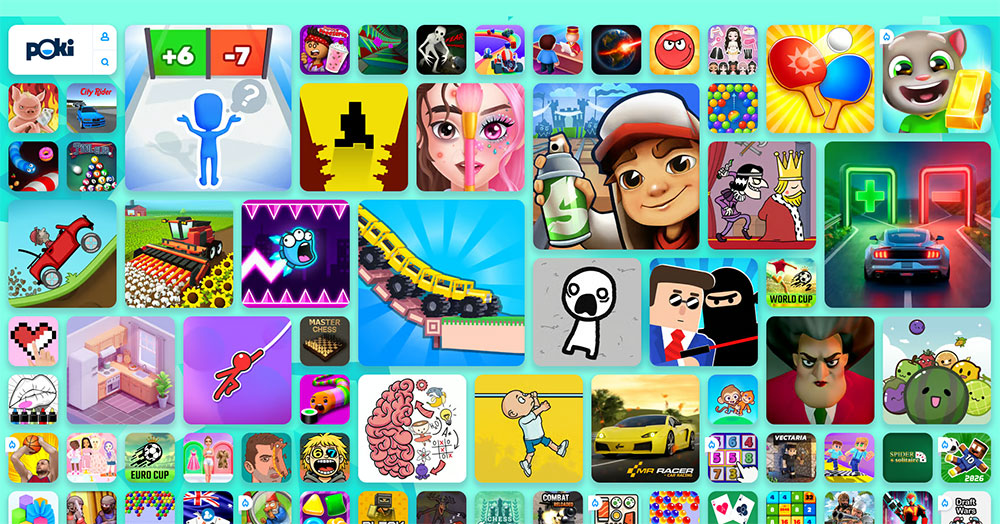
Poki takes a different approach: a platform of HTML5 titles targeting sub-2-second load times.
In March 2024, Google integrated WebGPU support into Chrome, unlocking near-native rendering speeds for browser games. Poki's catalog benefits directly from that shift.
What separates entertainment interactivity from UX interactivity
Entertainment interactivity is self-contained. The loop is the point.
UX interactivity is instrumental. It exists to help the user accomplish a goal outside the interaction itself. A product configurator solves a purchase decision. A language learning exercise builds a skill.
Both categories appear in this article. The distinction matters when evaluating whether a technique belongs on a brand site or a game site.
What Are the Best Interactive Websites Built with AI?
AI-driven interactivity is categorically different from all other categories here. The output is non-deterministic. No two interactions produce the same result, because the response is generated at runtime based on the specific input.
This changes the user relationship with the page. Users are not exploring a pre-built state space. They are co-generating something new.
Google Teachable Machine
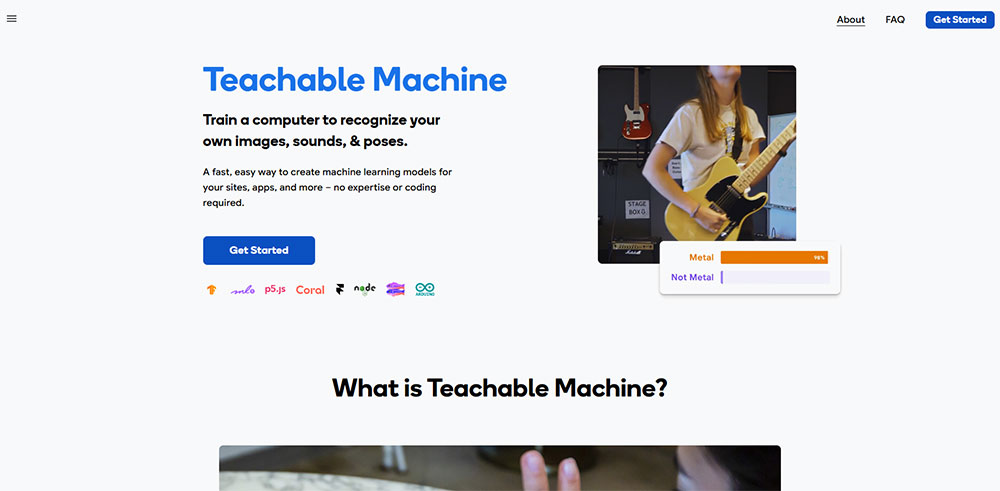
Teachable Machine lets users train a machine learning model in the browser using their own camera, microphone, or file uploads. The model trains locally, runs locally, and produces output immediately.
No code. No installation. The entire ML training loop runs inside a standard browser tab.
Reviewed as a first AI experience for ages 7 through adult (KidsAITools, 2026), it works because the interaction design makes the feedback loop visible: the model's confidence score updates live as you move or speak.
Runway ML and generative web tools
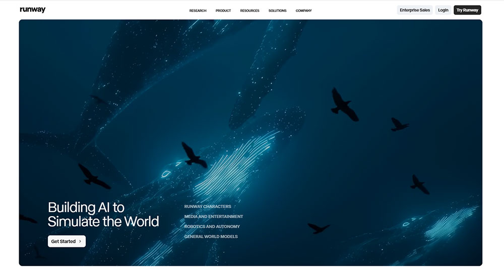
Runway ML's web tools handle real-time AI video and image editing directly in the browser. Upload a clip, type a prompt, and the model processes the output frame by frame without requiring a local GPU.
This Person Does Not Exist (thispersondoesnotexist.com) runs a GAN (Generative Adversarial Network) server-side, serving a new synthetic face on every page load or refresh. Zero user input required. The interaction is the visit itself.
Why AI interactivity belongs in this list
The 4 markers defined in section 2: real-time response, user agency, output variation, purposeful design.
AI-driven sites pass all 4. Output variation in particular is maximal: the same input at two different timestamps rarely produces identical results. That unpredictability is the engagement mechanism.
| Site | AI type | User input | Output |
|---|---|---|---|
| Teachable Machine | Classification model | Camera/audio/files | Custom trained classifier |
| Runway ML | Generative video/image | Text prompt + media | AI-edited footage |
| This Person Does Not Exist | GAN | None (page load) | Unique synthetic face |
What Are the Best Interactive Websites for Science and Exploration?
Science and exploration sites use interactivity to give users genuine agency over discovery. The user controls where they go, what they zoom into, and how far back in time they travel.
The data is real. The experience is self-directed.
This is a different use case from entertainment. The interaction serves comprehension. Stop exploring and understanding stops too.
NASA Eyes on the Solar System
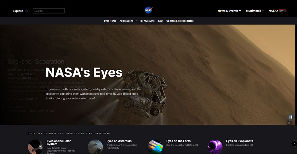
NASA's Eyes renders a real-time 3D simulation of the solar system using actual mission data from 1950 through 2050. Users scrub time, ride along with specific spacecraft, and switch between hundreds of planetary bodies and NASA missions.
The application covers over 170 real NASA missions and runs entirely in a standard web browser.
When the Mars Science Laboratory Curiosity rover landed in 2012, the Eyes software drew 739,000 concurrent visits and streamed 20 terabytes of data from JPL servers that weekend alone (NASA/JPL).
Windy.com and scale exploration tools
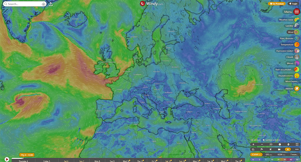
Windy.com renders real-time global weather data as an animated, layered map. Users toggle between wind, temperature, precipitation, and ocean current layers. The interaction is entirely layer-selection and map navigation.
What makes it work: the data updates every 3 hours. The interaction is always live. There is no static version of this experience.
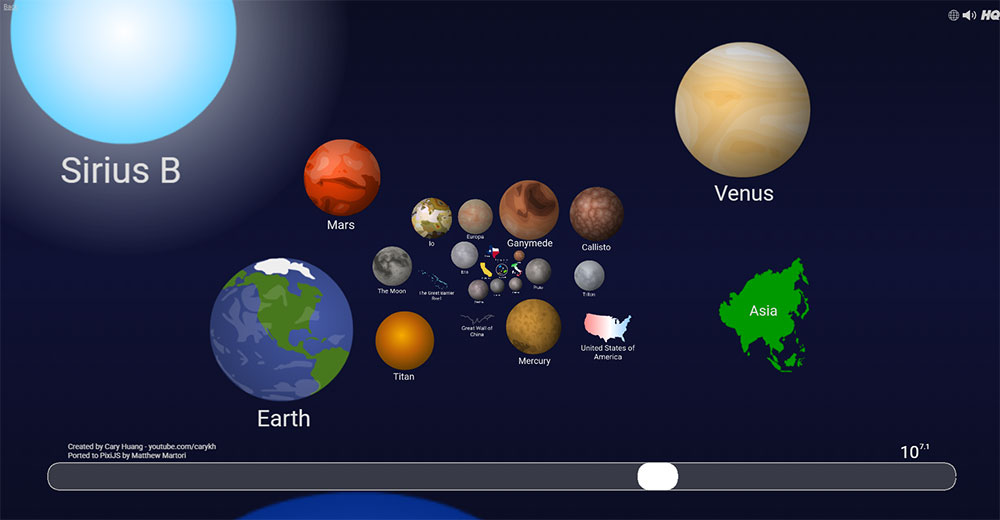
Scale of Universe 2 uses a horizontal zoom axis to move from quantum strings to the observable universe. One scroll covers 62 orders of magnitude. The interaction is the entire curriculum.
Histography
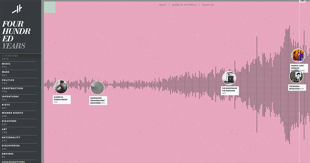
Histography plots events sourced from Wikipedia across a 14-billion-year timeline. Users filter by category, zoom into specific eras, and click individual events for source articles.
Took me a while to find a site that makes historical scale feel navigable rather than overwhelming.
This one does it well, largely because the interaction design hides irrelevant data until the user requests it.
What Separates a Good Interactive Website from a Great One?
Good interactive websites respond to input. Great ones make the user feel like the experience was built specifically for their session.
Pages that pass all three Google Core Web Vitals thresholds receive a ranking advantage. Pages with Largest Contentful Paint slower than 3 seconds lost an additional 23% traffic after Google's December 2025 core update (CEO Monthly, 2026).
Purposeful interactivity vs. decorative interactivity
Every interaction on a great site serves a user goal. Not a design goal. Not a brand goal.
The test: remove the interaction. Does the user lose the ability to accomplish something? If yes, the interaction is purposeful. If no, it is decorative.
Apple's product page scroll animations pass this test. Removing them would reduce the user's ability to understand product dimensions. A parallax background on a contact page fails it completely.
Performance under load
Google's INP threshold sets "good" at under 200ms for 75% of page loads. The best creative interactive sites maintain 60fps during complex interactions, not just on load.
Studios that build at this level budget performance from the start: lazy-loading interaction scripts, WebWorkers for off-thread computation, and progressive enhancement fallbacks for devices that cannot handle full WebGL rendering.
Accessibility of interaction
In 2024, over 4,500 digital accessibility lawsuits were filed in the U.S. under the ADA (BroWorks, 2025). WCAG 2.2, published in October 2023, added 9 new success criteria focused specifically on keyboard navigation, touch interactions, and cognitive accessibility.
3 requirements that interactive sites frequently fail:
- Keyboard operability: all interactions must be completable without a mouse
- Reduced-motion support: the
prefers-reduced-motionCSS media query must be respected - Drag-only interactions banned: any drag action needs an equivalent single-pointer alternative
What are the most common mistakes in interactive web design
The sites that fail the interactivity test almost always share the same 4 problems.
No visible feedback within 100ms. Users repeat actions, assume something is broken, or leave. Nielsen Norman Group established this threshold in 1993. It has not changed.
Interaction gates that block content. Forcing users to interact before they can access information inverts the purpose of interaction. The interaction should serve the content, not gate it.
Desktop-only interaction design. Cursor hover effects and drag interactions that do not map to touch inputs exclude the majority of mobile users. Over 62% of browser game players in 2023 accessed games on mobile browsers (Business Research Insights).
No progressive enhancement fallback. A Three.js site that shows a blank canvas on older devices or low-power GPUs has failed the user entirely. The experience should degrade gracefully, not disappear.
How Are the Best Interactive Websites Built?
The technology stack behind the best interactive websites follows predictable patterns by category. Agency and portfolio sites cluster around Three.js and GSAP. Data visualization projects favor D3.js and Svelte. Educational platforms run on React with custom game loop logic.
The choice of stack is not arbitrary. Each combination reflects a specific trade-off between rendering performance, developer ergonomics, and interaction complexity.
Front-end rendering and animation layers
GSAP (GreenSock Animation Platform) has been the industry standard for professional scroll animation and timeline sequencing for over 15 years.
Disney, Google, Amazon, and Stripe all use it (Annnimate, 2026). Its 1.47 million weekly npm downloads reflect consistent adoption across agency work (LogRocket, 2026).
Framer Motion (now called Motion) leads React-specific animation with 35.6 million weekly npm downloads, roughly 11.9 times more than GSAP's 3 million (pkgpulse, 2026).
The difference reflects audience: Framer Motion owns the React component space, GSAP owns complex scroll and sequence animation across any framework.
What frameworks do top interactive sites use most
React + GSAP: dominant combination for agency and portfolio sites. React manages state and component structure; GSAP handles the animation timeline tied to scroll, cursor, or click events.
Svelte + D3.js: preferred for data visualization. Svelte's minimal runtime keeps bundle sizes small on pages that already carry heavy D3 rendering logic.
Vanilla JS + WebGL: chosen by performance-critical creative studios. No framework overhead means tighter control over the render loop and lower initial load cost.
GSAP and Framer Motion are not mutually exclusive. Many production sites use GSAP for marketing and scroll sections while Framer Motion handles application UI transitions in the same build (Codolve, 2026).
Scroll-based interactivity and performance patterns
ScrollTrigger, GSAP's scroll-binding plugin, links animation timeline playback directly to scroll position. It is the technical layer behind most of the scroll-driven storytelling covered in the journalism section.
Performance patterns used consistently across high-quality interactive sites:
- Lazy loading interaction scripts until they enter the viewport
- WebWorkers for physics calculations and off-thread computation
- Reduced-motion media queries tested with OS motion settings active
- Progressive enhancement fallbacks for canvas-heavy sections
For anyone building interactive experiences without a custom codebase, starting with solid web design tools that support these patterns is the practical entry point.
Understanding the core principles behind interaction design matters more than library choice in most cases.
And if the project calls for a portfolio or agency site where interactive elements are central, reviewing portfolio design approaches that integrate animation frameworks natively saves significant build time.
FAQ on The Best Interactive Websites
What makes a website interactive?
A website is interactive when user input directly changes the content or state in real time. Clicks, cursor movement, scroll position, or typed input all count. Animation that plays automatically without user involvement does not qualify as interactivity.
What are the best interactive websites for design inspiration?
Bruno Simon's portfolio, Active Theory, and Immersive Garden are the most-referenced sites among front-end developers. All three use WebGL and Three.js to build experiences where navigation itself is the interaction. Awwwards and CSS Design Awards catalog hundreds more.
What technologies are used to build interactive websites?
Most interactive web experiences rely on Three.js or WebGL for 3D rendering, GSAP for scroll-driven animation, and D3.js for data visualization. Framer Motion handles React-based UI transitions. Vanilla JavaScript with the Canvas API covers cursor-reactive and drawing effects.
Are interactive websites bad for SEO?
They can be. Canvas-rendered content contains no DOM text, so Googlebot cannot index it. The fix is HTML-first rendering: every meaningful page state must exist as crawlable markup before JavaScript runs. Performance also matters. Three.js sites frequently score poorly on Core Web Vitals.
What is the difference between an animated website and an interactive website?
Animation plays on a preset timer or trigger. Interactivity responds to the specific user. A scroll-triggered fade is animation. A product configurator that rebuilds a 3D model when you change a color is interactive. The distinction is whether user input changes the output.
What are the best interactive websites for data visualization?
The Pudding, Our World in Data, and Gapminder lead this category. All three let users filter, compare, and control what the data shows. D3.js powers most serious data visualization work on the web. Neal.fun earns a mention for lightweight, single-interaction tools with high engagement.
How do interactive websites affect user engagement?
Responsive design and interactive elements increase mobile engagement by up to 30%, according to Forrester. Sites with positive user experiences see 88% of visitors return. Interaction keeps users on-page longer and reduces bounce rates when the feedback loop is fast and clear.
What are the best interactive websites for learning?
Duolingo, Brilliant.org, Khan Academy, and Code.org are the strongest examples. Each uses real-time feedback loops as the core teaching mechanism. Duolingo reached 103 million monthly active users in 2024, largely because its interaction design creates a daily return habit.
Can interactive web design hurt website performance?
Yes, if handled poorly. Three.js adds 600KB before scene assets. Heavy WebGL scenes regularly push Lighthouse scores into the 30s. Progressive enhancement and lazy-loaded interaction scripts are the standard fix. Performance budgets should be set before design begins, not after.
What is scrollytelling?
Scrollytelling is a technique where scroll position drives narrative progression. Text, data, and media reveal in sequence as the user moves down the page. The New York Times' "Snow Fall" (2012) defined the format. The Pudding and Reuters Graphics use it consistently in data journalism.
Conclusion
This conclusion is for an article presenting a clear picture of what separates genuinely interactive web experiences from sites that only look the part.
From scrollytelling in data journalism to browser-based AI tools and real-time product configurators, the pattern is consistent: the best sites treat interaction as the delivery mechanism, not the decoration.
Three.js, D3.js, GSAP, and Framer Motion keep appearing across categories for a reason. They are the tools that make real-time user feedback technically possible at scale.
Performance, accessibility, and purposeful design are not optional extras. They are what separate award-winning interactive web design from a site that crashes on mobile and excludes keyboard users.
Study these sites. Then build something better.


