Amazing Website Design Examples You Need to See
January 3, 2026
Modern Dog Grooming Website Design Examples to Inspire
January 3, 2026A dealership website that looks outdated will lose buyers before they even check the inventory. With 95% of car shoppers starting online, your site is the actual first impression, not the showroom.
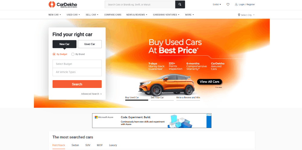
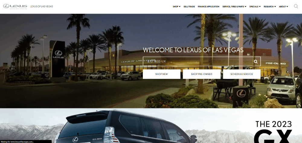
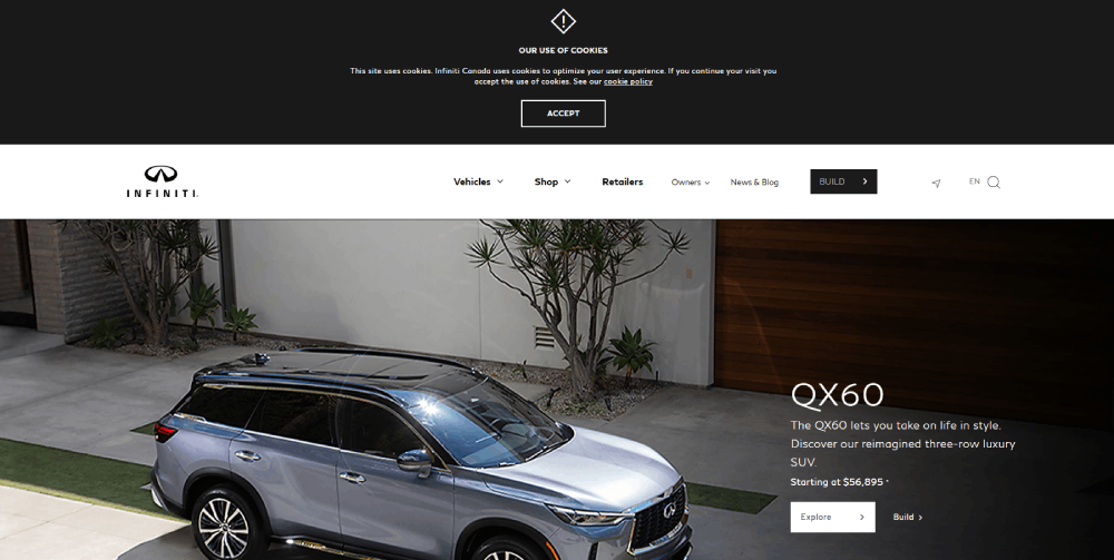
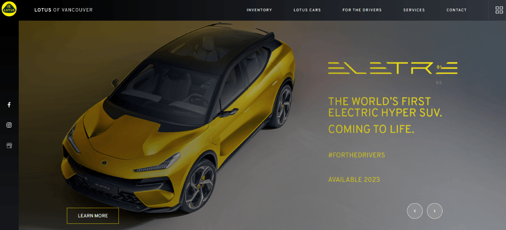
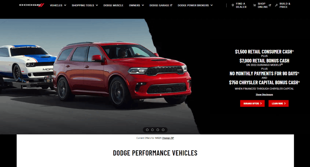
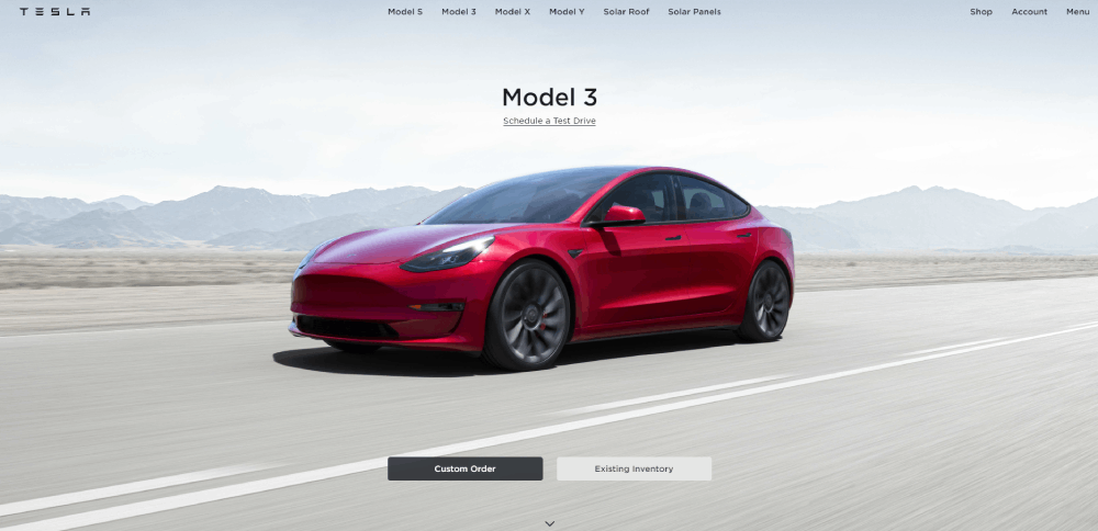
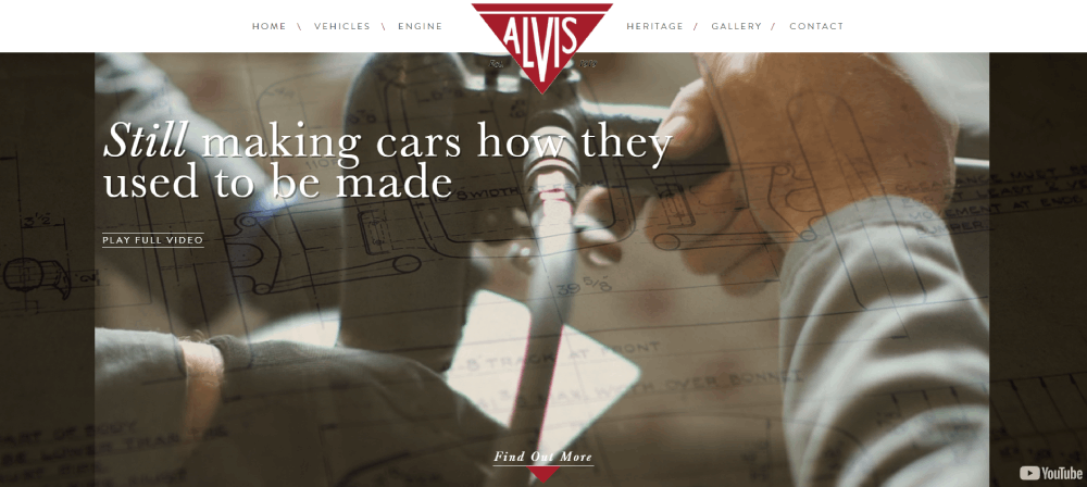
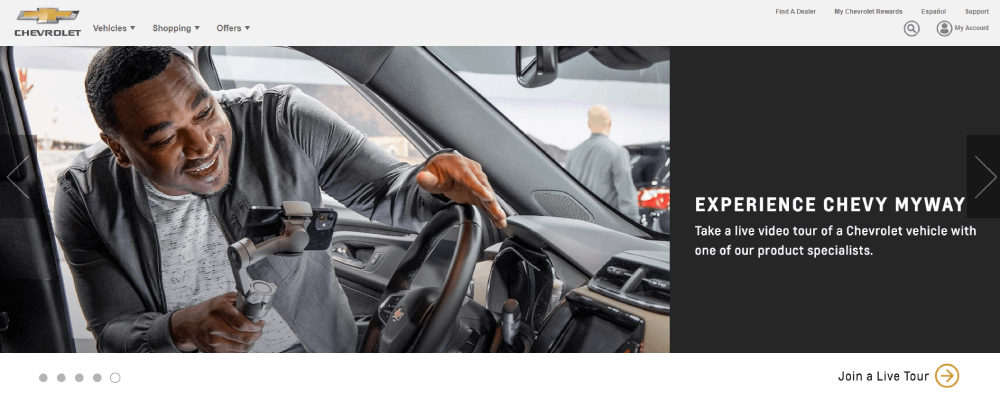
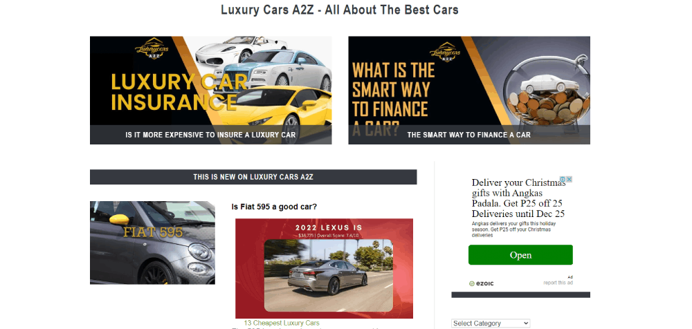
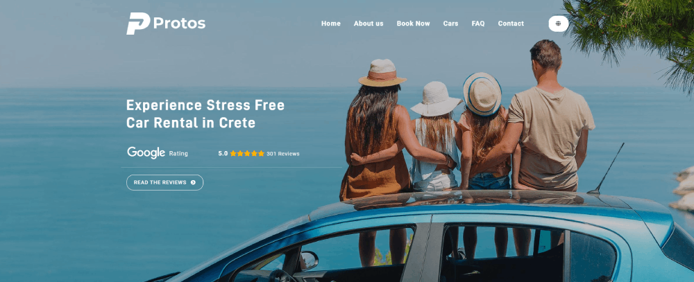
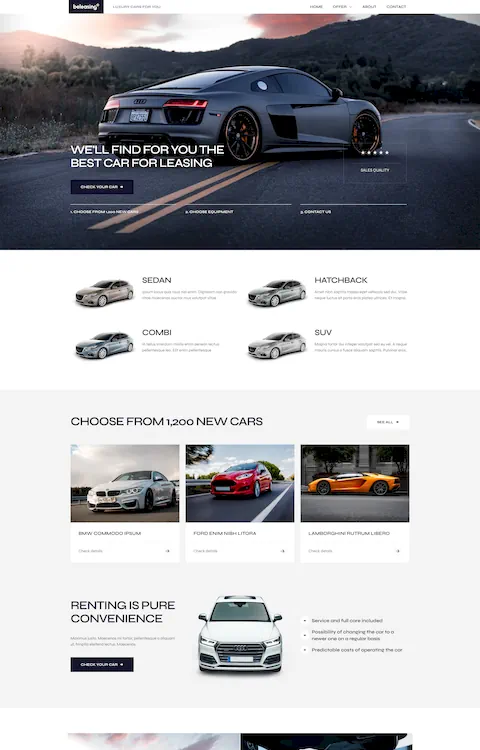
These dealer website design examples break down what top-performing automotive sites get right. From Tesla's minimalist layout to Carvana's search filter UX, each example highlights specific design choices that drive leads and build trust.
You will see what works across vehicle detail pages, mobile responsiveness, CTA placement, inventory displays, and page speed. Real sites, real design patterns, real results.
What Is Dealer Website Design
Dealer website design is the process of building an online platform for a car dealership that displays vehicle inventory, financing options, service scheduling, and dealership information to potential buyers.
About 95% of car buyers start their research online before visiting a showroom. That single stat explains why a dealership homepage design matters more than the lot sign out front.
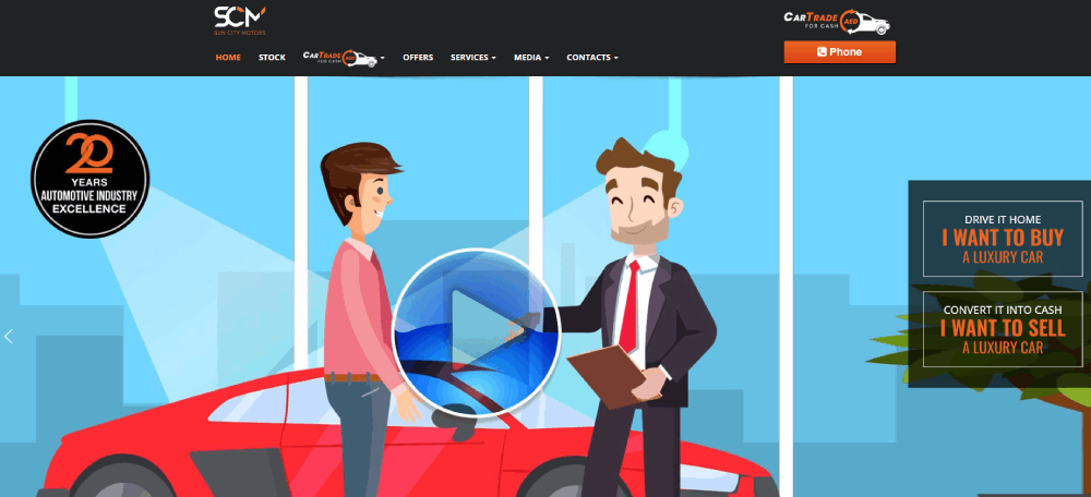
The site has to do multiple things at once. Show inventory. Capture leads. Build trust. Handle trade-in requests. And it has to do all of that without feeling cluttered or slow.
Platforms like DealerFire, Dealer.com, and DealerOn provide template-based solutions specifically for auto dealers. CDK Global and VinSolutions handle the deeper integrations with dealer management systems and CRM tools.
But templates only get you so far. The dealerships that actually convert online traffic into showroom visits tend to have sites built around specific buyer behavior patterns, not just a generic grid of car photos.
A well-built dealer site connects inventory search filters, vehicle detail pages, financing calculators, and service booking into one experience. Every page should push toward a single goal: getting the visitor to take the next step.
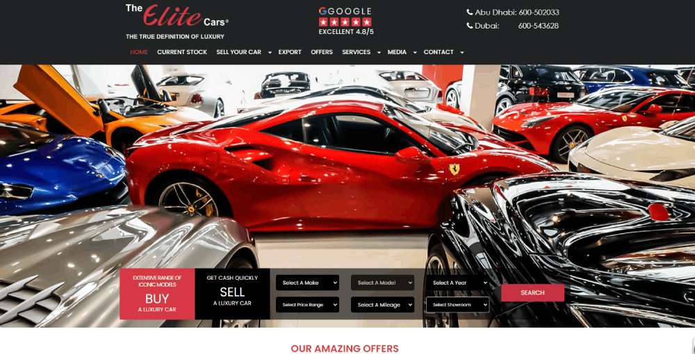
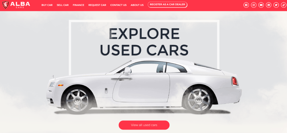
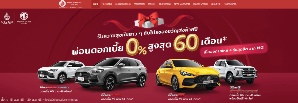
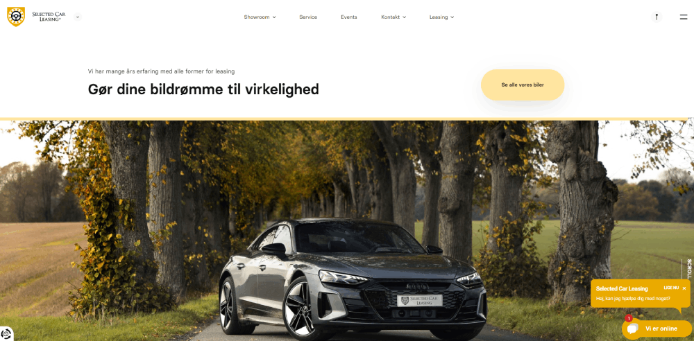
Examples of Dealer Websites
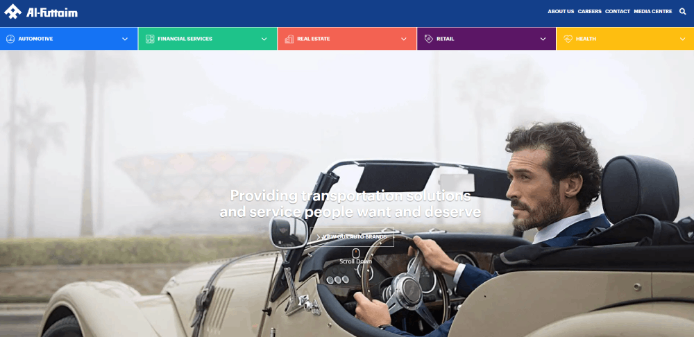
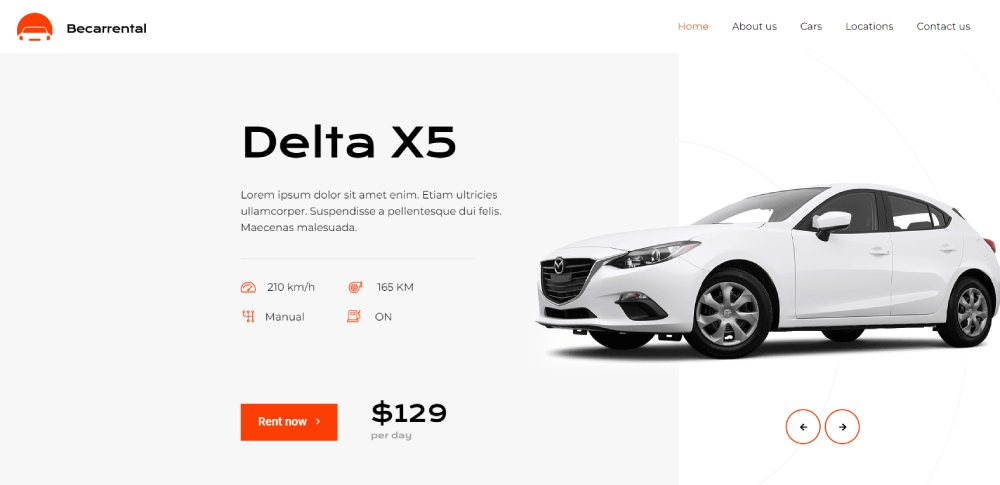
Al-Futtaim Automotive
How Does Dealer Website Design Affect Sales Conversions
Page layout directly changes how buyers behave. A messy homepage with six competing banners and three pop-ups will lose visitors in seconds. I've seen it happen on countless automotive sites.
Load speed is the silent killer. Pages that take longer than 3 seconds to load lose over half their visitors. Google PageSpeed Insights flags most dealer sites for oversized vehicle images and unminified code.
Mobile responsiveness is not optional anymore. Over 70% of car shoppers browse on their phones first. If your lead capture forms require pinch-zooming on a phone screen, you're losing leads. Applying mobile first design principles fixes this at the structural level.
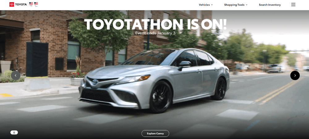
CTA placement makes or breaks conversion rates on vehicle detail pages. Buttons like "Check Availability" or "Book a Test Drive" need to sit above the fold and repeat at natural scroll points. A strong call to action button uses direct, short copy with high-contrast colors.
Here's what high-converting dealer sites get right:
- Search filters visible immediately on inventory pages
- Vehicle photos load in under 1.5 seconds
- Contact forms have 4 fields or fewer
- Phone number is clickable on mobile
- Chat widget appears after 5-10 seconds, not instantly
The difference between a site that converts at 2% and one that hits 5% usually comes down to these details. Not the color of the logo. Not the font choice. The structure.
What Are the Key Design Elements of a High-Converting Dealer Website
Good-looking dealer sites that don't convert are just expensive brochures. The elements below are what separate sites that generate leads from sites that just look nice in a web design portfolio.
How Does Mobile-First Design Impact Dealer Websites
Build for the phone screen first, then scale up. Responsive layout is the baseline, but true mobile optimization means touch-friendly filter buttons, thumb-reachable CTAs, and lead forms that don't require a keyboard for every field.
Google ranks mobile versions of dealer sites first. If your desktop site looks great but your mobile experience is clunky, your search visibility drops. That is just how it works now.
What Role Does Vehicle Photography Play in Dealer Website Design
High-resolution images sell cars. Low-quality phone photos taken on the lot with shadows and reflections actively hurt conversions.
The standard now includes 360-degree vehicle views, consistent background removal, and uniform lighting across all listings. Sites like Carvana and Cars.com set this expectation, and buyers compare every other dealer site against it.
How Should Inventory Search Filters Be Designed on a Dealer Website
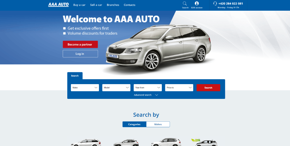
Filters should cover make, model, year, price range, and mileage at minimum. Real-time inventory sync with the dealer management system prevents the frustrating "call for availability" dead end.
Search result page layout matters just as much as the filters themselves. Grid view with large thumbnails, price, and key specs visible without clicking into each listing. Sorting by price, mileage, and year should be one click away.
What Types of CTAs Perform Best on Dealer Websites
"Check Availability," "Get a Quote Now," and "Book a Test Drive" outperform vague buttons like "Learn More" or "Contact Us" on automotive sites.
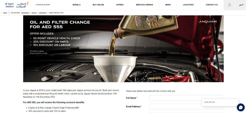
Place them on vehicle detail pages, the homepage hero section, and service pages. Button color should contrast the page background. Size should be large enough to tap on mobile without zooming. Effective form design behind these CTAs keeps submissions high.
How Does Page Speed Affect Dealer Website Performance
Dealer sites are image-heavy by nature, which makes speed optimization tricky. Compress vehicle photos to WebP format, lazy-load images below the fold, and minify CSS and JavaScript.
A CDN like Cloudflare helps serve images faster to visitors in different locations. Hosting on a shared server with 200 other sites is a common mistake that kills load times for multi-location dealers.
How Should a Dealer Website Display Vehicle Detail Pages
The vehicle detail page is where buying decisions happen. Every other page on the site exists to funnel visitors here.
Spec sheets should list engine, transmission, drivetrain, fuel economy, and trim level in a scannable format. Tables work better than paragraphs for this. Price should be visible without scrolling.
Photo galleries need 20+ images minimum per vehicle. Include exterior angles, interior shots, trunk space, dashboard closeups, and any cosmetic imperfections on used cars. Buyers who see more photos spend more time on the page.
Video walkthroughs are becoming standard on high-performing dealer sites. A 60-second clip of a salesperson walking around the vehicle adds a human touch that photos alone cannot replicate.
Finance calculator integration belongs on this page, not a separate financing section. Let the buyer estimate their monthly payment while they are still looking at the car. Trade-in estimator tools next to the pricing section reduce the number of steps between interest and action.
CTA positioning on VDPs follows a simple rule: one above the fold, one after the photo gallery, one after the specs. Three opportunities to convert without feeling pushy.
FAQ on Dealer Website Design
What makes a good dealer website design?
A good dealer website design loads fast, displays inventory with high-resolution photos, includes clear CTAs like "Book a Test Drive," and works flawlessly on mobile. Real-time inventory sync with the dealer management system prevents outdated listings from frustrating buyers.
How much does a car dealership website cost?
Template-based platforms like Dealer.com or DealerOn range from $500 to $2,000 per month. Custom dealer website builds with CRM integration, DMS connectivity, and unique branding start around $10,000 and go up depending on features and multi-location needs.
Which platform is best for building a dealer website?
DealerFire, Dealer.com, and CDK Global are the top automotive website platforms. WordPress works for independent dealers who want more design control. Each option handles inventory display, lead capture, and search engine optimization differently.
How do vehicle detail pages affect conversions?
Vehicle detail pages are where buying decisions happen. Sites with 20+ photos per listing, visible pricing, spec tables, and an integrated financing calculator convert significantly higher than pages with minimal information and a single "Contact Us" button.
Why does page speed matter for dealer websites?
Over half of visitors leave if a page takes longer than 3 seconds to load. Dealer sites are image-heavy, so compressing photos to WebP format, using a CDN like Cloudflare, and lazy-loading below-the-fold content are baseline requirements.
What CTAs work best on automotive dealership sites?
"Check Availability," "Get a Quote Now," and "Schedule a Test Drive" outperform generic buttons. Place them on the homepage, vehicle detail pages, and service sections. High-contrast colors and direct copy increase click-through rates on both desktop and mobile.
How important is mobile responsiveness for dealer websites?
Over 70% of car shoppers browse on phones first. Google indexes mobile versions before desktop. Touch-friendly filters, thumb-reachable CTAs, and short lead forms are requirements, not extras. A clunky mobile experience directly kills search rankings and leads.
Should a dealer website use dark or light themes?
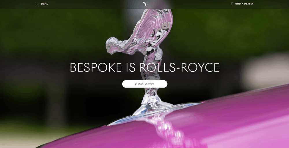
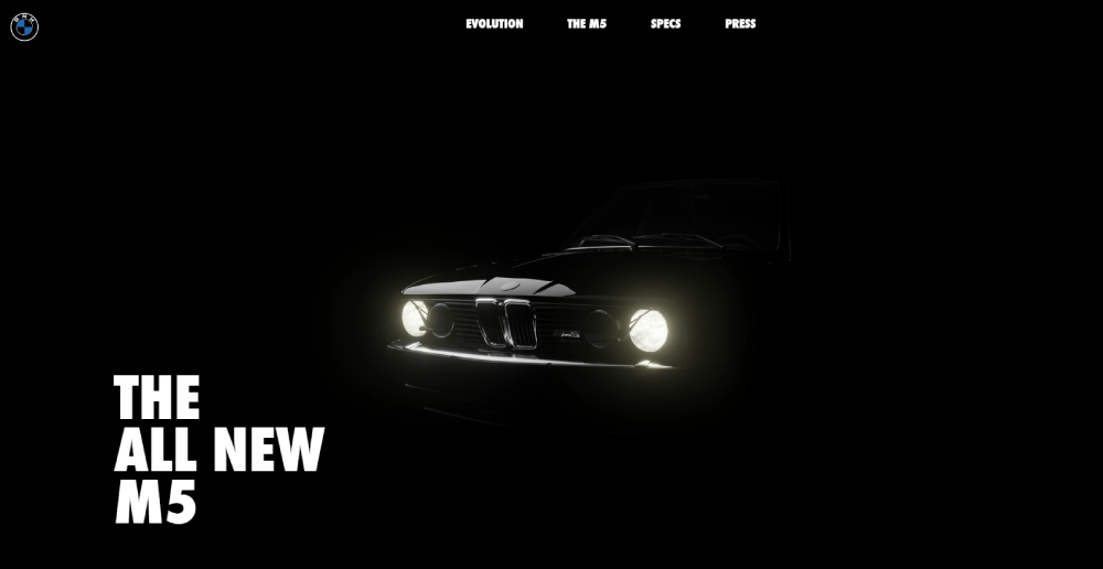
Luxury brands like Rolls-Royce and Lamborghini use dark themes to create a premium feel. Volume dealers selling used inventory perform better with light backgrounds that keep vehicle photos clear and listings easy to scan quickly.
What trust signals should a car dealership website include?
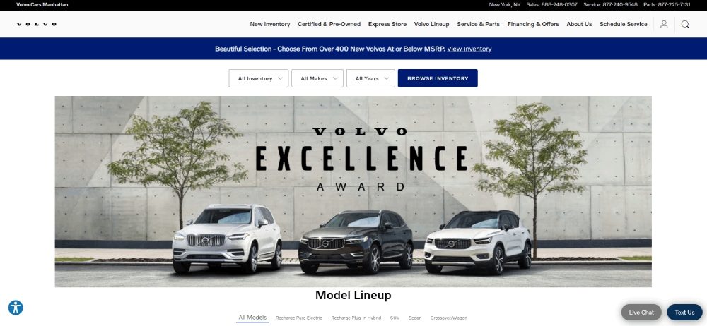
Customer testimonials on vehicle pages, manufacturer certifications, staff bios, and Google Business Profile integration build credibility. Award badges and review widgets from Google or Cars.com placed above the fold perform better than those hidden in footers.
How does local SEO connect to dealer website design?
Location pages with consistent name, address, and phone details help dealers rank in local search. Schema markup for dealerships, Google Maps embeds, and city-specific service area pages connect the site structure directly to local search visibility.
Conclusion
The dealer website design examples covered here share common patterns. Fast load times, clean vehicle detail pages, strong CTAs, and mobile-optimized layouts. These are not trends. They are baseline requirements for any dealership that wants to compete online.
Sites like Carvana and Tesla prove that automotive digital retailing works when the UX removes friction from the buying process. Porsche and Rimac show that brand storytelling and conversion can coexist on the same page.
Whether you are building on DealerFire, Dealer.com, or a custom WordPress setup, the priorities stay the same. Real-time inventory search filters, high-quality photography, financing tools on the VDP, and local SEO through schema markup and location pages.
Pick the examples that match your dealership's size and audience. Then build from there.

