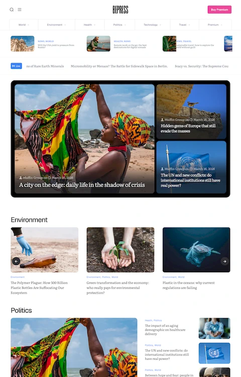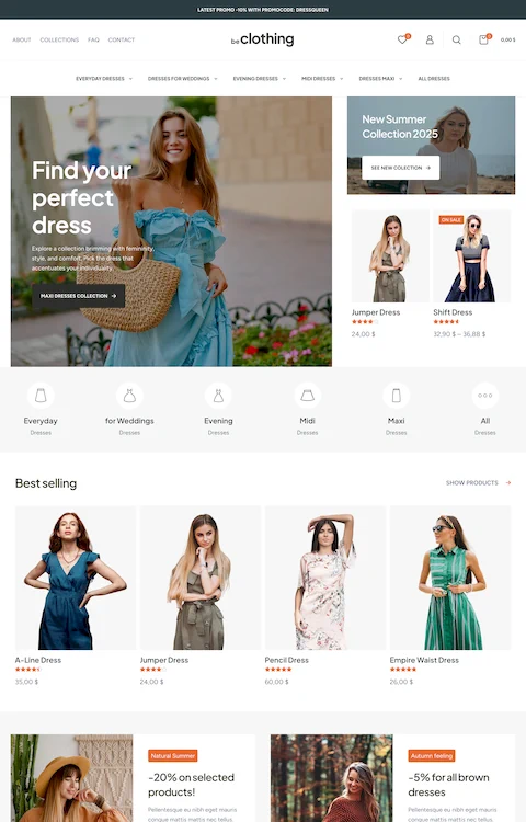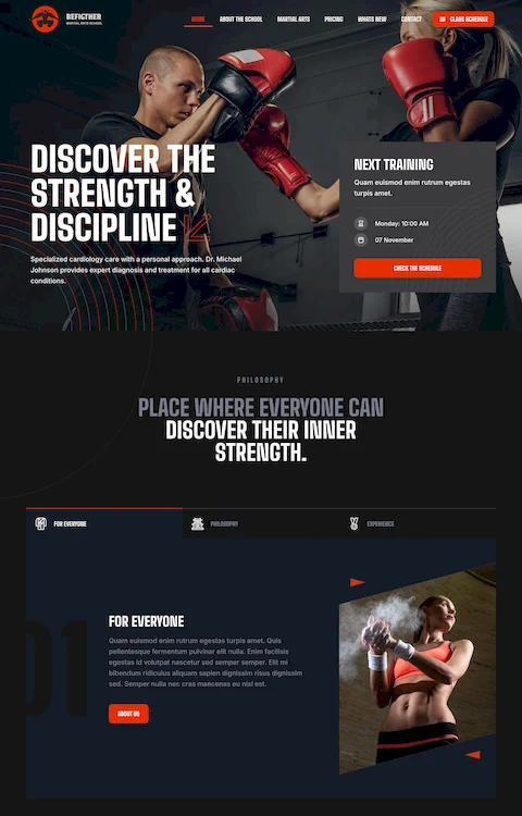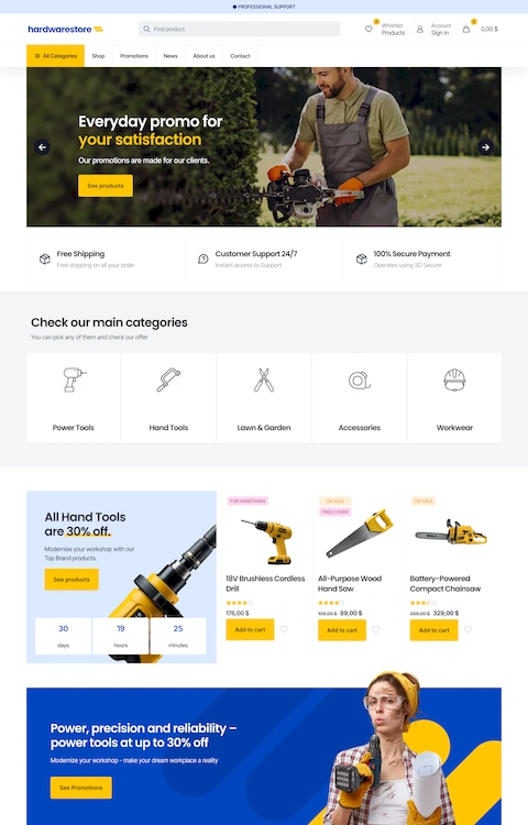
The Best Museum Website Design You Can See Today
December 6, 2025
Artsy Websites with Lovely Web Designs to Inspire You
December 22, 2025Your visitors decide within seconds whether to stay or leave. The wrong typeface makes that decision for them.
Choosing the easiest fonts to read directly impacts how long people engage with your content, whether they trust your message, and if they’ll return.
Typography research from MIT and Stanford confirms what designers have known for decades: legibility drives comprehension, retention, and user satisfaction.
This guide covers the specific characteristics that make fonts readable, the best typefaces for screen and print, optimal sizing and spacing recommendations, and how major companies like Apple and Google approach font selection.
You’ll walk away knowing exactly which fonts work for your project and why.
What is Font Readability
Font readability is the measure of how easily text can be consumed and understood by readers.
Typographers, UX designers, and ophthalmologists have studied this since the 1920s when legibility research first emerged at institutions like the Royal College of Art.
The core measurable factors include x-height ratio, character spacing, stroke contrast, and counter size.
A readable typeface allows the eye to move smoothly across lines without strain or confusion between letterforms.
Screen reading fonts behave differently than print fonts because pixel density and rendering technology affect how characters display.
What Makes a Font Easy to Read
Several specific characteristics determine whether a typeface offers high text clarity or causes reading fatigue.
Research from MIT’s AgeLab and Stanford’s reading studies consistently points to the same factors.
X-Height Ratio
The x-height is the distance between the baseline and the top of lowercase letters like “a” and “e.”
Fonts with larger x-heights (55-60% of cap height) score higher on legibility tests. Verdana and Georgia were specifically designed with generous x-heights for screen display.
Counter Space
Counters are the enclosed or partially enclosed spaces within letters like “o,” “e,” and “a.”
Open counters prevent letters from appearing muddy at small sizes. This matters especially for body text set below 14 pixels.
Character Spacing and Tracking
Proper letter spacing prevents characters from colliding or floating apart.
Studies show that slightly increased tracking (2-4% wider than default) improves reading speed by 5-7% for continuous text.
Stroke Uniformity
Fonts with consistent stroke widths maintain clarity across different sizes and screen resolutions.
High stroke contrast (thick/thin variation) works beautifully in headlines but reduces legibility in paragraph text.
Character Distinction
Readable fonts make it easy to distinguish similar characters: lowercase “l,” uppercase “I,” and the number “1.”
Same goes for “0” versus “O” and “rn” versus “m.” Poor distinction causes reading errors and slows comprehension.
How Font Size Affects Readability
Even the most legible typeface fails if set too small.
Font size recommendations vary between screen and print because the viewing distance and medium differ significantly.
Screen Typography
For desktop screens, 16-18 pixels serves as the baseline for body text. Mobile devices need 16px minimum due to smaller screens held closer to the face.
The W3C and WCAG 2.1 guidelines recommend a minimum of 16px for accessible websites.
Print Typography
Standard book typography uses 10-12 point sizes for body copy.
Newspapers often push down to 9pt, compensating with narrow columns and high-quality paper. Legal documents and government forms require minimum 12pt under ADA compliance standards.
Scaling Considerations
Line length affects optimal size. Wider columns need larger text.
The general rule: 45-75 characters per line for comfortable reading. Anything longer causes the eye to lose its place when jumping to the next line.
How Screen Resolution Influences Font Clarity
Pixel density dramatically changes how fonts render and appear to readers.
What looks crisp on a Retina display may appear fuzzy on an older monitor.
Standard Displays (72-100 PPI)
Older monitors and budget laptops fall into this range.
Sans-serif fonts like Arial, Verdana, and Tahoma perform better here because their simple shapes render cleanly without subpixel antialiasing artifacts.
High-Density Displays (200+ PPI)
Retina screens, modern smartphones, and premium laptops display fonts with print-like clarity.
Serif fonts like Georgia and more detailed typefaces finally render properly. The extra pixels capture subtle stroke variations that would blur on standard screens.
Font Rendering Technologies
Windows uses ClearType technology for subpixel rendering. macOS applies its own antialiasing that tends to make fonts appear heavier.
Web fonts can look different across operating systems because of these rendering differences. Testing on multiple devices matters.
Which Fonts Are Easiest to Read on Screen
Screen fonts need to survive pixel grids, varying resolutions, and different rendering engines.
The following ranked list uses criteria including: legibility research scores, usage data from Google Fonts, and real-world good UX testing results.
Arial
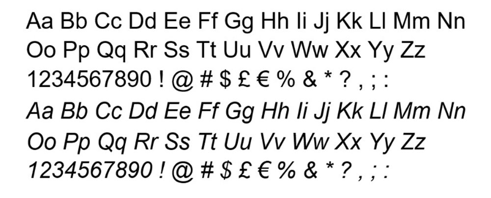
Designed by Robin Nicholas and Patricia Saunders in 1982 for Monotype.
Arial offers excellent character distinction and consistent stroke width. Its large x-height and open counters make it reliable at small sizes. Preinstalled on virtually every computer, making it a safe fallback choice.
Verdana
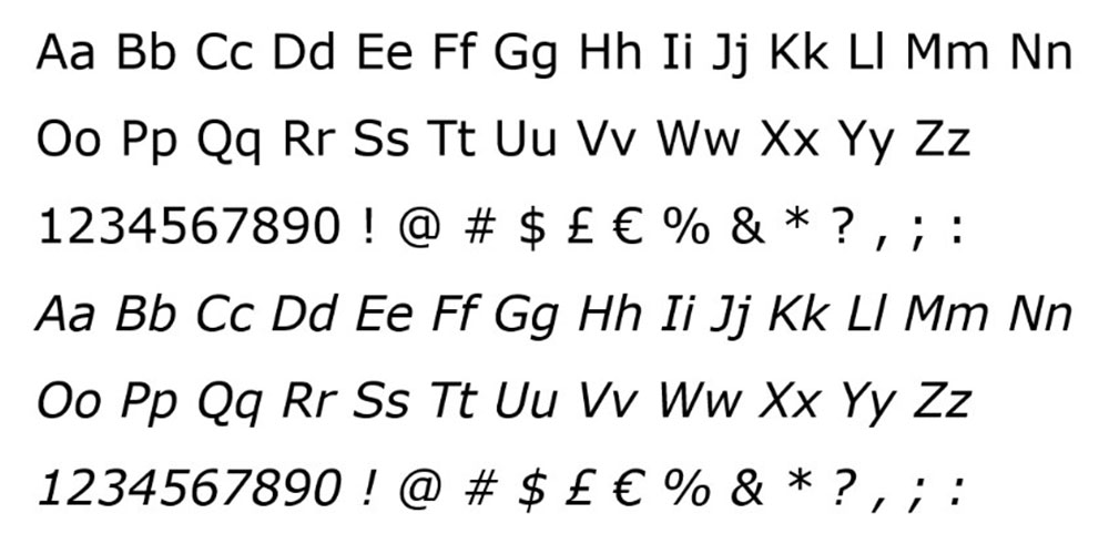
Matthew Carter designed Verdana in 1996 specifically for Microsoft’s screen display.
It has the largest x-height of any major system font. Wide letter spacing built into the design prevents crowding. Remains one of the most readable fonts at sizes below 12 pixels.
Georgia
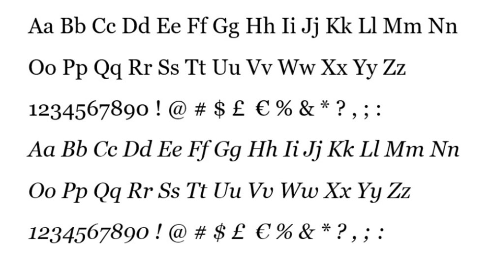
Also by Matthew Carter, released alongside Verdana in 1996.
Georgia proved that serif fonts could work on screen with the right design choices. Generous proportions, sturdy serifs, and clear number designs. Still a top choice for long-form reading on websites and in blog design.
Open Sans
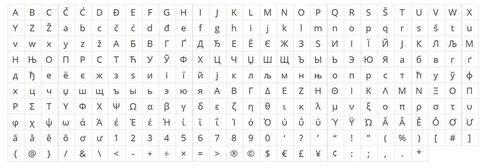
Steve Matteson designed Open Sans in 2011 for Google.
Humanist sans-serif with friendly, neutral appearance. Excellent for UI text and body copy across responsive websites. Over 40 billion views on Google Fonts makes it the most popular web font by usage.
Roboto
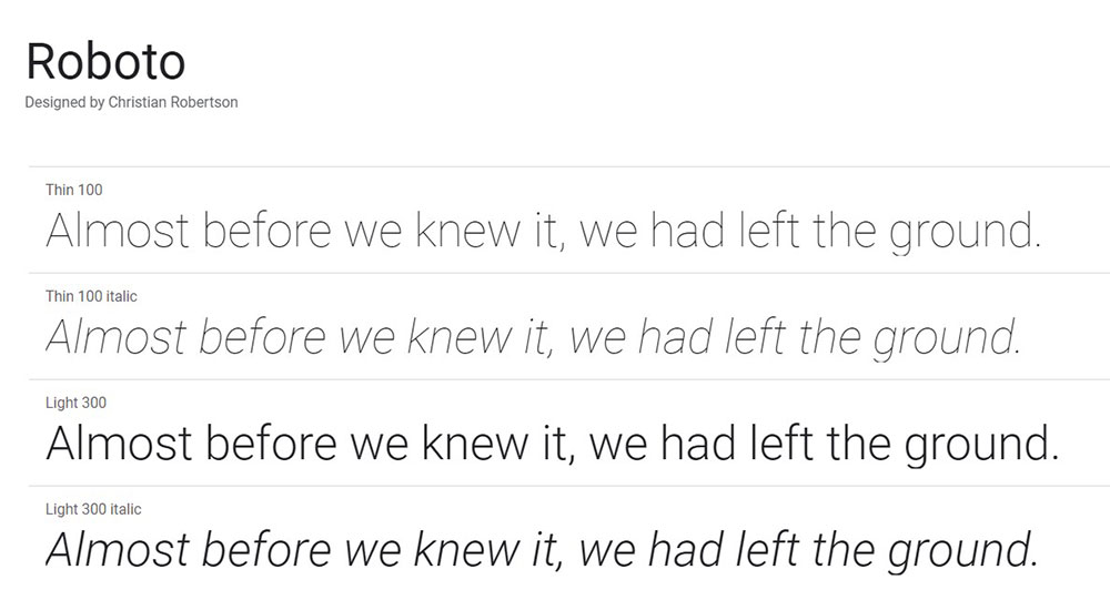
Christian Robertson created Roboto in 2011 as Android’s system font.
Geometric shapes with open curves balance modernity and readability. Works across headlines and body text without losing clarity. The go-to choice for technology websites and mobile apps.
Lato

Łukasz Dziedzic released Lato in 2010 through Google Fonts.
Semi-rounded letterforms feel warm without sacrificing professionalism. Strong presence in headers while remaining comfortable for paragraphs. Popular among corporate websites and brand applications.
Which Fonts Are Easiest to Read in Print
Print typography operates under different rules than screen display.
Ink spread, paper texture, and physical lighting conditions all affect how letterforms appear. The following fonts have proven their legibility across centuries of printed material.
Garamond
Claude Garamond designed the original in the 1540s. Still among the most readable serif fonts for books and long documents.
Elegant proportions reduce eye fatigue during extended reading sessions.
Caslon
William Caslon I created this in 1722. The American Declaration of Independence was set in Caslon.
Reliable workhorse for body text in magazines, newspapers, and book publishing.
Times New Roman
Stanley Morison designed it for The Times of London in 1931 to maximize legibility in narrow newspaper columns.
Compact letterforms fit more words per line without sacrificing readability. Overused in documents but genuinely effective for dense text.
Which Sans-Serif Fonts Are Most Readable
Sans-serif typefaces lack the small decorative strokes at letter ends.
Three main categories exist, each with different readability characteristics.
Geometric Sans-Serif
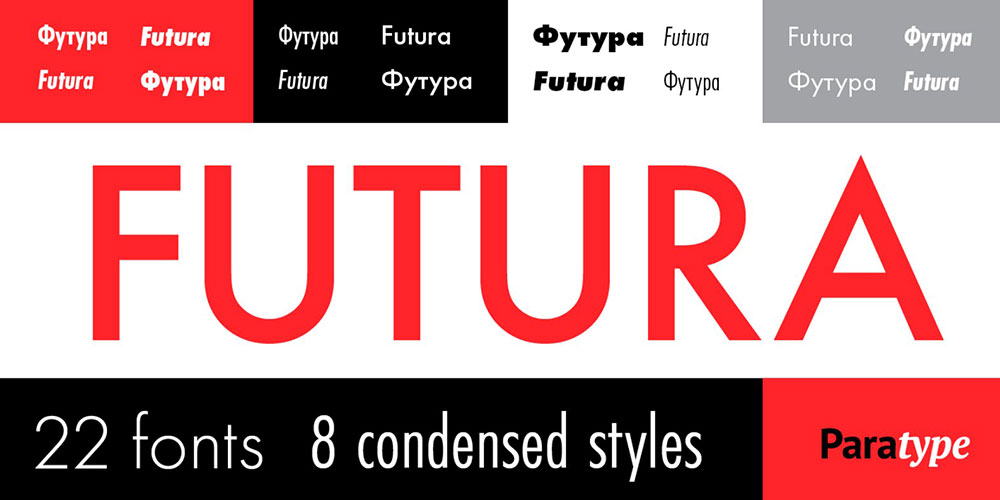
Built from circles and straight lines. Futura and Century Gothic fall here.
Clean and modern but can cause confusion between similar letters at small sizes. Better for headlines than body text.
Humanist Sans-Serif
Open Sans, Verdana, and Tahoma belong to this group.
Letterforms based on handwriting proportions make them the most readable sans-serif category. Ideal for paragraphs and UI text.
Grotesque Sans-Serif
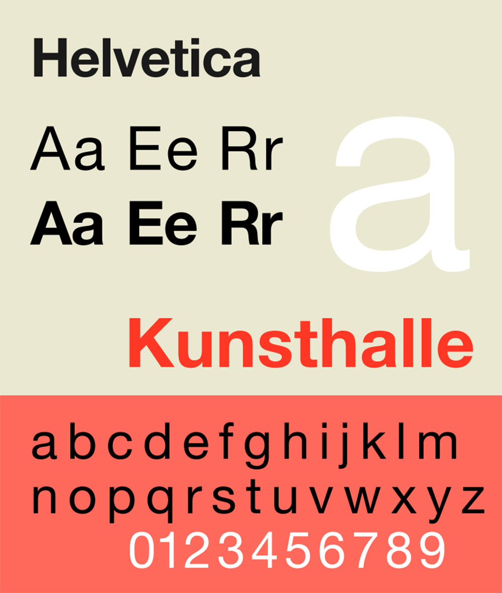
Helvetica and Arial represent this utilitarian style.
Neutral appearance works across contexts. Slightly less warm than humanist options but extremely versatile.
Which Serif Fonts Are Most Readable
Serif fonts guide the eye along text lines through their horizontal strokes.
Categories differ in contrast, bracket style, and historical origin.
Old-Style Serifs
Garamond, Caslon, and Palatino feature low stroke contrast and angled stress.
The most comfortable for extended reading. Book publishers prefer these for fiction and nonfiction alike.
Transitional Serifs
Times New Roman, Georgia, and Bookman sit between old-style and modern.
Higher contrast than old-style but not extreme. Versatile across print and screen applications.
Modern Serifs
Bodoni and Didot have dramatic thick-thin contrast.
Stunning in headlines, difficult in body text. The hairline strokes disappear at small sizes, especially on screens.
How Dyslexia-Friendly Fonts Differ from Standard Readable Fonts
Approximately 15-20% of the population has some form of dyslexia according to the International Dyslexia Association.
Dyslexia-friendly fonts use specific design features to reduce letter confusion and improve reading flow.
Key Design Features
- Weighted bottoms prevent letters from appearing to flip or rotate
- Unique letterforms for b/d, p/q, and other commonly confused pairs
- Increased spacing between characters and words
- Varying letter heights to create distinct word shapes
OpenDyslexic
Created by Abelardo Gonzalez in 2011 as a free, open-source option.
Heavy weighted bottoms anchor each letter. Available as a browser extension and system font.
Lexie Readable
Designed by Keith Bates specifically for readers with dyslexia.
Distinct letterforms without the exaggerated weighting of OpenDyslexic. More conventional appearance while maintaining accessibility benefits.
What Font Sizes Work Best for Body Text
Size recommendations depend entirely on the medium and viewing context.
Screen Recommendations
- Desktop: 16-18px baseline, 20px+ for older audiences
- Mobile: 16px minimum, scale up for reading-focused apps
- Tablets: 17-19px works well at typical viewing distances
Print Recommendations
- Books: 10-12pt for standard paperbacks
- Large print editions: 16-18pt minimum
- Legal/government forms: 12pt required under ADA guidelines
W3C recommends users be able to resize text up to 200% without loss of functionality on user friendly websites.
How Line Height Affects Font Readability
Line height (leading) determines the vertical space between text lines.
Too tight and lines blur together. Too loose and the eye struggles to find the next line.
Optimal Ratios
Research from typography studies suggests 1.4-1.6x the font size for body text.
A 16px font needs 22-26px line height. Longer line lengths require more leading to help the eye track back.
Context Adjustments
Headlines can use tighter leading (1.1-1.2x) since they span fewer words.
Mobile screens benefit from slightly increased line height due to smaller display areas and closer viewing distances.
How Letter Spacing Changes Reading Speed
Tracking affects how quickly readers process text.
Research Findings
A 2012 study in the Proceedings of the National Academy of Sciences found that increased letter spacing improved reading speed by 20% for dyslexic children.
For typical readers, modest increases (2-5%) improve speed without consciously noticing the change.
Practical Application
Default tracking works for most body text situations.
All-caps text needs increased spacing since uppercase letters weren’t designed to sit next to each other continuously. Add 5-10% tracking for capitalized headings.
Which Fonts Do Large Companies Use for Readability
Major tech companies invest millions in typography research and custom typeface development.
Apple (San Francisco)
Introduced in 2015 as Apple’s unified system font across all devices.
Optical sizes automatically adjust letterforms based on point size. Designed specifically for high-density Retina displays.
Google (Roboto, Google Sans)
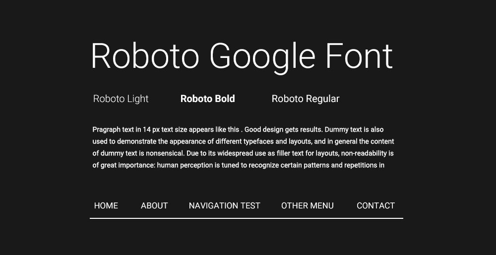
Roboto serves Android and most Google products.
Google Sans (Product Sans variant) appears in marketing and branded materials. Both optimized for screen readability across device types.
Microsoft (Segoe UI)
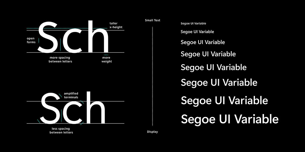
Windows’ primary interface font since Vista.
Humanist sans-serif designed for ClearType rendering. Recently supplemented by Segoe UI Variable for improved scaling.
How to Test Font Readability
Subjective impressions matter, but measurable testing provides concrete answers.
Tools and Methods
- Eye-tracking studies: Measure fixation duration and saccade patterns
- Reading speed tests: Compare words-per-minute across typefaces
- Comprehension testing: Verify readers retain information accurately
- A/B testing: Deploy different fonts to real users and measure engagement
Quick Manual Tests
Check the “Il1” test (uppercase I, lowercase l, number 1) for character distinction.
Read several paragraphs at target size to identify fatigue. Test on multiple devices and screen types before committing.
Which Google Fonts Rank Highest for Readability
Free fonts from Google’s library power millions of websites.
Usage statistics from the Google Fonts API reveal which readable options designers trust most.
Top Performers
- Roboto: 87 billion+ views, Android’s default
- Open Sans: 42 billion+ views, versatile humanist sans
- Lato: 12 billion+ views, warm and professional
- Montserrat: 11 billion+ views, geometric but readable
- Source Sans Pro: Adobe’s first open-source font, excellent for UI
Underrated Options
Inter was designed specifically for computer screens with features like contextual alternates for better character distinction.
Work Sans offers a clean alternative to Roboto with slightly more personality.
How to Pair Readable Fonts
Font pairing combines typefaces for visual hierarchy without sacrificing readability.
Classic Combinations
- Heading + Body: Montserrat + Open Sans
- Serif + Sans: Georgia + Verdana
- Modern pairing: Roboto Slab + Roboto
Contrast Principles
Pair fonts with different classifications (serif with sans-serif) for clear hierarchy.
Keep the same mood across choices. A playful display font clashes with a formal serif body. Match the tone to your color scheme and overall brand identity.
Limit combinations to two fonts maximum on simple websites. Three feels cluttered.
FAQ on The Easiest Fonts To Read
What is the easiest font to read on screen?
Verdana ranks as the easiest screen font due to its large x-height, wide letter spacing, and open counters. Matthew Carter designed it specifically for digital displays in 1996. Arial and Open Sans follow closely for screen legibility.
What is the easiest font to read in print?
Garamond remains the top choice for printed materials. Its balanced proportions and low stroke contrast reduce eye fatigue during extended reading. Times New Roman and Caslon also perform well in books, magazines, and documents.
Is serif or sans-serif easier to read?
Sans-serif fonts like Verdana and Arial work better on screens, especially at small sizes. Serif fonts like Georgia perform better in print where higher resolution captures fine details. Context determines the best choice.
What font size is easiest to read?
For screens, 16-18 pixels serves as the baseline for body text. Print materials use 10-12 point sizes. WCAG guidelines recommend 16px minimum for accessible web content. Larger audiences need bigger sizes.
What makes a font readable?
Key factors include generous x-height, open counter spaces, consistent stroke width, adequate character spacing, and clear distinction between similar letters like “l,” “I,” and “1.” These characteristics prevent reading fatigue and confusion.
What is the best font for dyslexic readers?
OpenDyslexic uses weighted bottoms and unique letterforms to prevent letter flipping. Lexie Readable offers similar benefits with a more conventional appearance. Both reduce confusion between similar characters like b/d and p/q.
What fonts do big companies use for readability?
Apple uses San Francisco, Google uses Roboto, and Microsoft uses Segoe UI. These companies invested heavily in typography research to create system fonts optimized for their specific screen technologies and user interfaces.
What is the most readable Google Font?
Roboto leads with over 87 billion views, designed for Android’s interface. Open Sans follows with 42 billion views as a versatile humanist sans-serif. Both offer excellent legibility across devices and screen sizes.
Does letter spacing affect readability?
Yes. Research shows slightly increased tracking (2-5% wider) improves reading speed. A 2012 study found 20% faster reading for dyslexic children with expanded spacing. Default tracking works for most standard body text.
What line height works best for readable text?
Optimal line height falls between 1.4-1.6 times the font size. A 16px font needs 22-26px line height. Tighter leading works for headlines while body text needs more breathing room between lines.
Conclusion
Selecting the easiest fonts to read comes down to understanding your medium, audience, and context.
For screen display, humanist sans-serif options like Verdana, Open Sans, and Roboto deliver consistent legibility across devices. Print projects benefit from time-tested serifs like Garamond and Caslon.
Remember the fundamentals: generous x-height, open counters, adequate tracking, and proper line height between 1.4-1.6x your font size.
Test your choices on multiple screens. Check character distinction with the “Il1” test. Consider accessibility needs, including dyslexia-friendly alternatives when appropriate.
Typography isn’t decoration. It’s the foundation of how people experience your content.
Pick fonts that disappear into the reading experience rather than distract from it.


