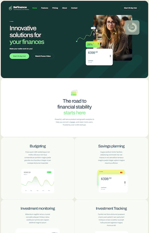
Stunning Gradient Website Design Showcase
October 18, 2023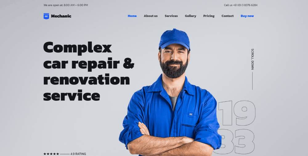
The Best Plumber Website Design Examples
January 24, 2024Landing on the perfect funeral website design is like finding solace in a digital embrace—comfort in a click. Each website tells a story, a narrative of life that deserves a gentle, respectful sharing. In this space, we're going beyond mere pages; we're crafting havens for memories and legacies to live on.
As you journey through this article, expect to uncover not just designs but experiences that resonate with the heart. I'm talking obituary templates seamlessly woven with memorial services, online tribute videos hitting the right emotional chords, and condolence message forms that bridge distances. We'll walk you through galleries of coffin selections to virtual funeral service options—showcasing how these digital sanctuaries can become pillars for the grieving.
By the end, you'll have a blueprint etched in compassion and expertise for creating an online space that embodies dignity—a place where celebration of life webpages and bereavement resources come together to honor the departed, offering solace to those who mourn.
Examples of Funeral Websites
Greenwood Funeral Homes and Cremation
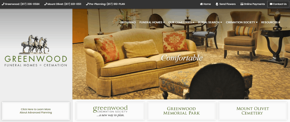
Greenwood quickly catches the attention of all visitors. It comes with a bright layout and attractive photos. By highlighting the emotional benefits of the funeral home, families feel that they find a solution in times of despair. Check out this funeral home website and see how they use the pre-planning approach. They offer peace of mind, the possibility to save money, and a guaranteed end-of-life request.
Be Funeral Home
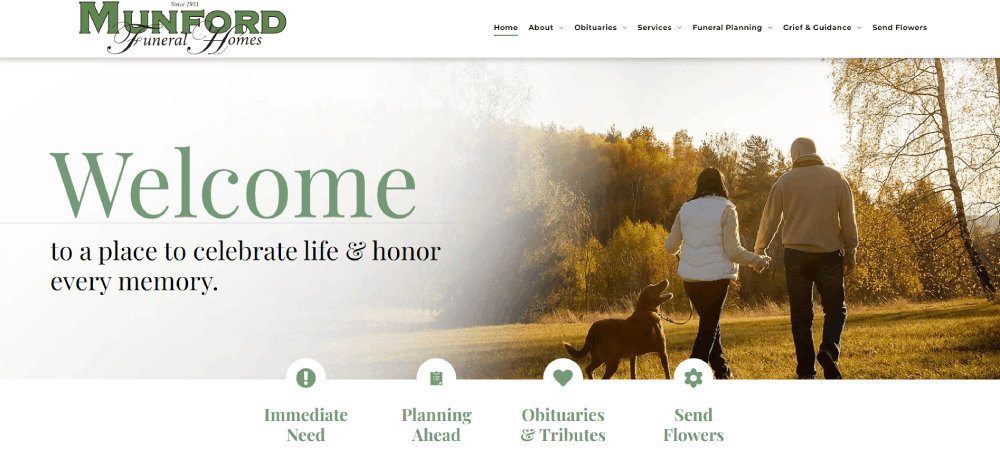
Digital marketing needs to have a careful approach when it comes to funeral websites. Take a look at Munford and see how they do it. You’ll see lots of white space so you can find information quickly. The clear calls to action are also a big plus. They’re strategically placed on the top of the page, making navigation easier.
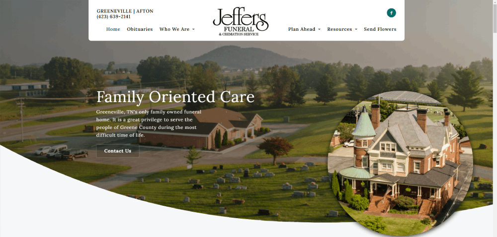
Jeffers Funeral Home
Jeffers Funeral Home is one of the most beautiful funeral home websites. Thanks to the navigation bar, families can find what they are looking for hassle free. Planning a funeral for a loved one is not easy. People need to order flowers, choose a cemetery, and write obituaries. Thanks to their funeral website, Jeffers makes these processes easier. It also comes with a beautiful obituary section.
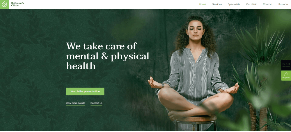
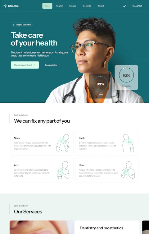
Be Theme's Clinic
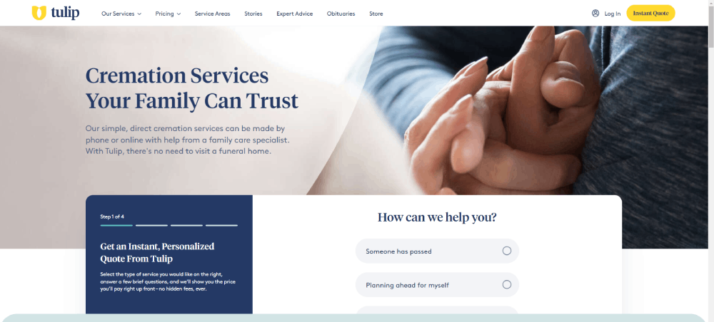
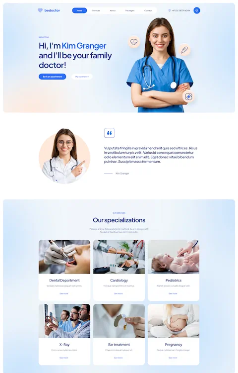
Visitors will find a clean and minimalist design on this funeral home website. A custom layout like this one can make a difference in your audience. Customers can create their cremation packages seamlessly. All elements are arranged neatly and the homepage includes compelling content. With the smart use of white space, Tulip includes nice visuals to present its services.
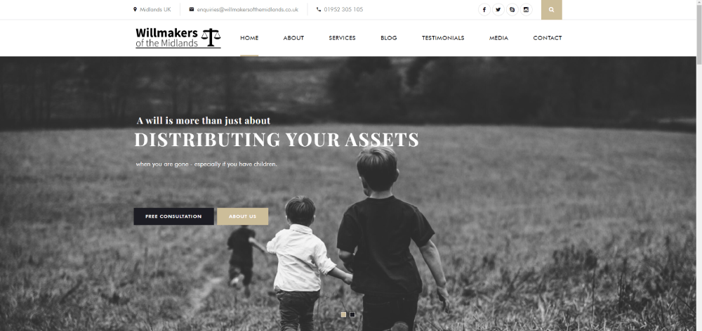
Will Makers of the Midlands
From all funeral home websites, this option presents one of the cleanest layouts. Its simple design fits perfectly with its straightforward navigation. Scroll down and you’ll see all the services and prices. All information is clear, and the page ends up with a clear call to action. The tagline at the top of the homepage is one of the site’s best features.
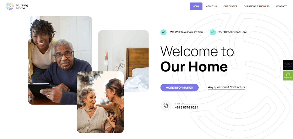
Be Nursing Home
With a unique and modern website design, Gathered Here is one of the first funeral websites in Australia. It compares reviews, prices, and management of different funeral homes. This site brings helpful features and functionalities. All visitors and potential customers can find the right services for them. Its advanced search option is definitely a plus.
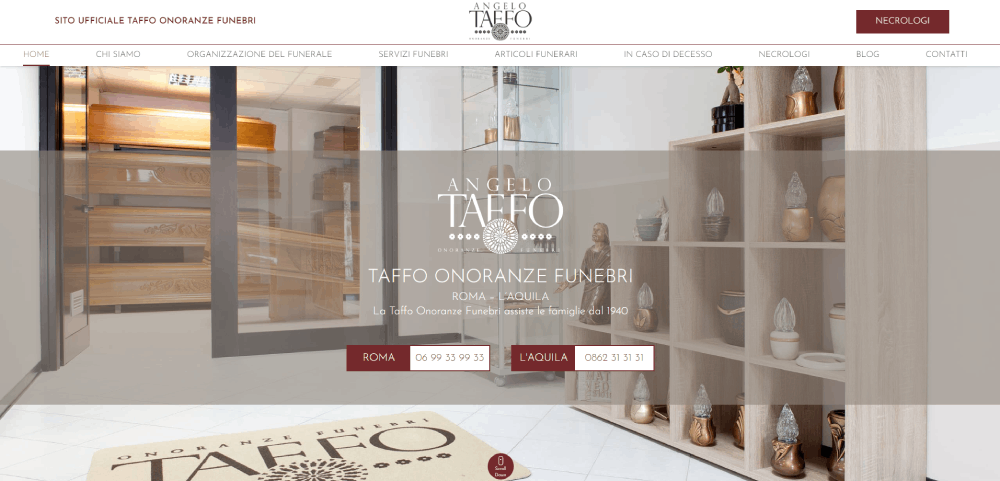
Taffo Onoranze Funebri
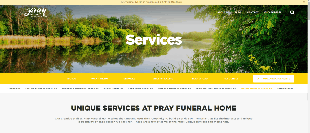
This funeral home has unprecedented value in the industry. It provides tailored services through a stunning website. They present a unique page with photos and videos of real clients. During difficult times, Pray Funeral Home celebrates life, opens up your heart, and brings hope.
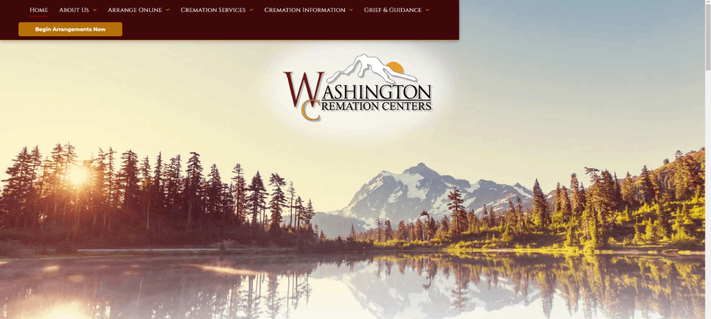
Washington Cremation Centers
All the family must stay together to overcome grief. In line with this, Washington Cremation Centers lays out all the information that they need. A bright section offers further details about their aqua cremation options. Finally, the vibrant images on the heading and the homepage are inspiring.
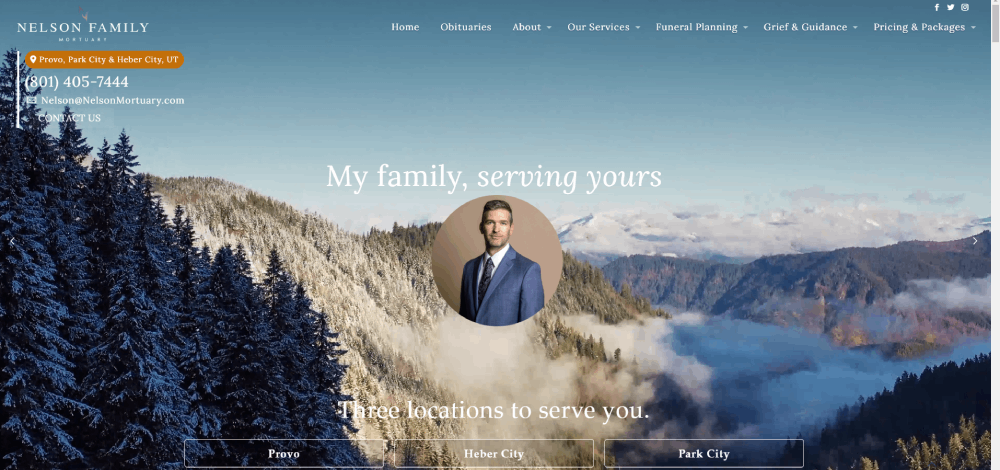
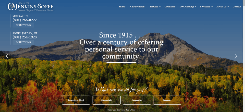
Jenkins-Soffe Utah Funeral Home
Hosting a funeral is more than finding local florists. Moreover, the era of digital marketing brings innovative solutions. Jenkins-Soffe Funeral Chapels & Cremation Center knows how to use these advancements. Offering live streaming services, this funeral home brings an alternative to those relatives who can’t attend in person.
InvoCare
A great advantage of this funeral home website is its community page. They present themselves with an inclusive invitation that states, “You’re invited.” Such an invitation helps bring their message not only to the families they help, but even to the community. Also, check out their clean design with a video and beautiful imagery.
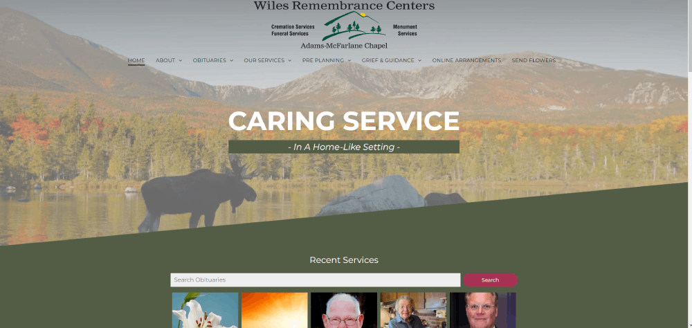
Wiles Remembrance Centers
If you have a funeral home business, you’ll want to take inspiration from this website. One of its best features is the video background, which brings a unique feel to the page. The accessibility widget at the top of the homepage is one of a kind. Providing a superb user experience, Wendt Funeral Home includes smooth animations.
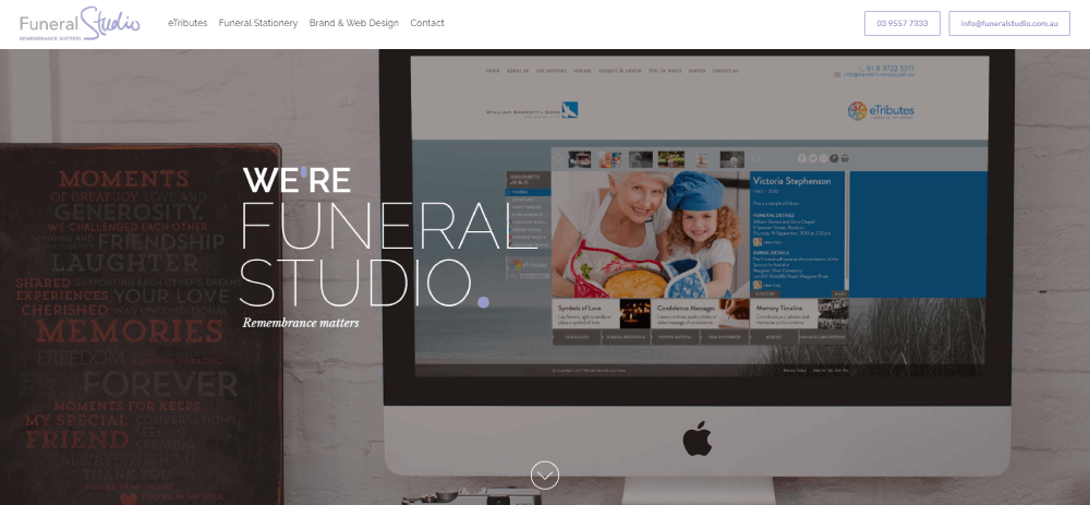
Funeral Studio
Promote your funeral home in an innovative way. Funeral Studio features a welcoming homepage and interesting functionalities. This is an ideal design to make a brand stand out from its competitors. The website has a minimal layout, yet it catches the attention of the viewer. Follow this example if you want to have a professional funeral home website.
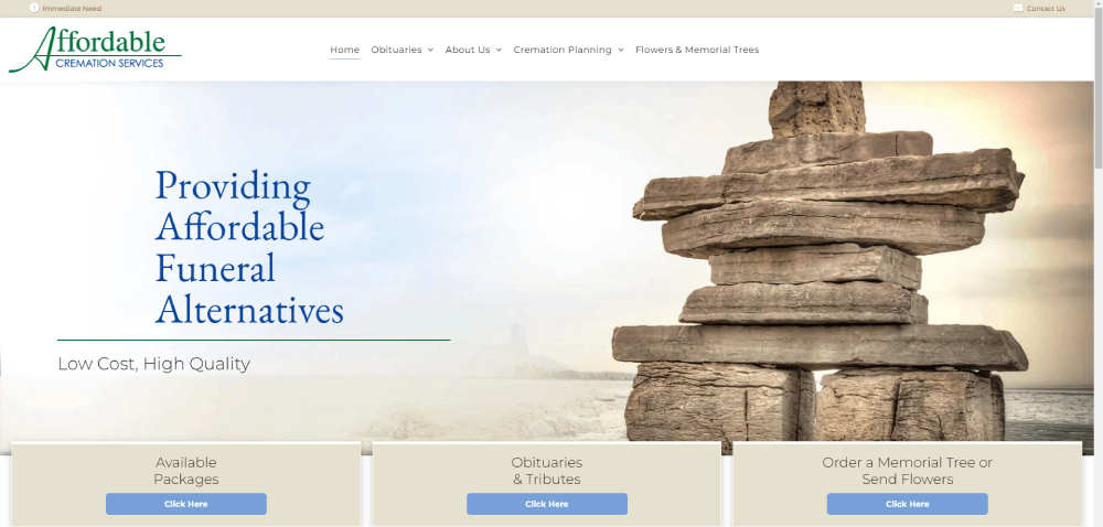
Keep It Simple Cremation
With perfect use of white space and smooth animations, this website boasts style and simplicity. Scroll down the page and enjoy the cool effects. The large call to action at the top of the page is quite visible, with a clear anchor text: Preplan Online. When users click, the system shows them a quotation system so that they can put together their plans.
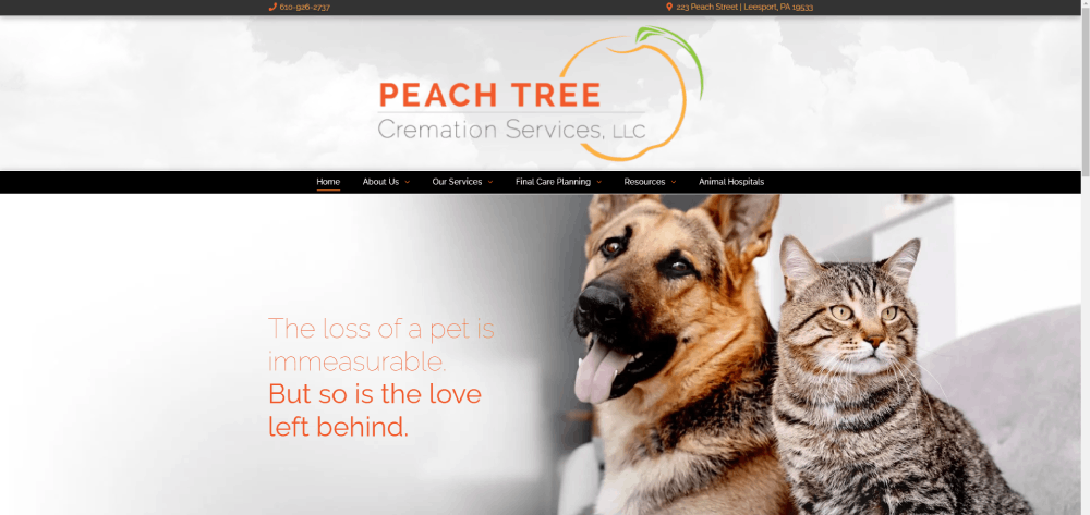
Peach Tree Cremation Services
Here is a pet cremation website for families who lose their best friends. Thus, Peach Tree Cremation Services is one of the most unique options on this list. The website offers plenty of information in a tasteful design. It’s also quite helpful for finding prices and other important data. Most people don’t know what to do when their pet dies, so Peach Tree offers lots of resources, including testimonials and links to pet hospitals.
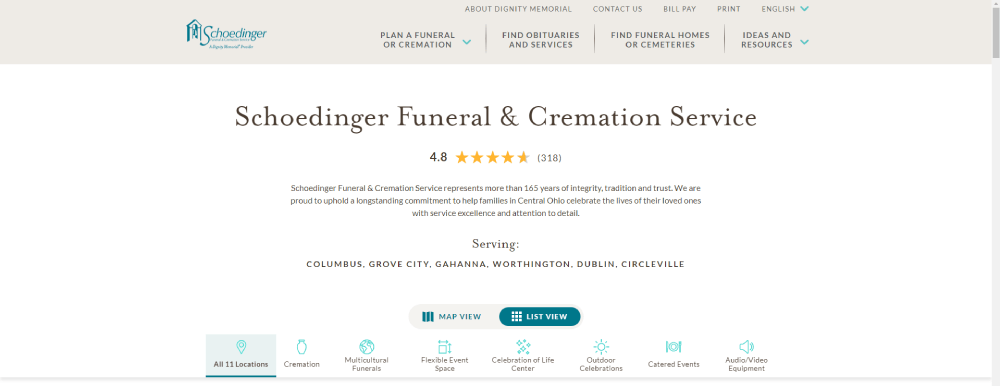
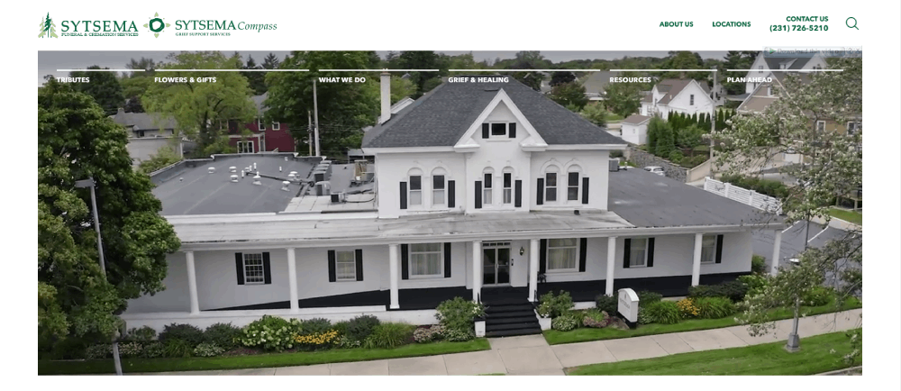
Sytsema Funeral & Cremation Services
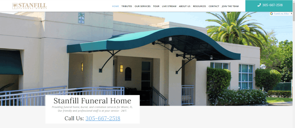
Here is a website that families will find inspiring. Stanfill Funeral Home can give you plenty of ideas for your own funeral business. The hero image on the heading is simple, yet it has everything: introduction, name, contact, and phone. Each customer can navigate the site easily thanks to the sticky header.
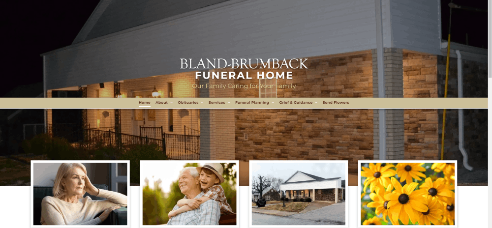
Bland-Brumback Funeral Home
With local imagery to ornament the heading, this website brings a beautiful design. All the photos are stunning, helping to create a great first impression. Check out the sliding gallery with pictures of the facilities. Scroll down and you’ll see four distinct sections so that you can navigate the funeral home website.
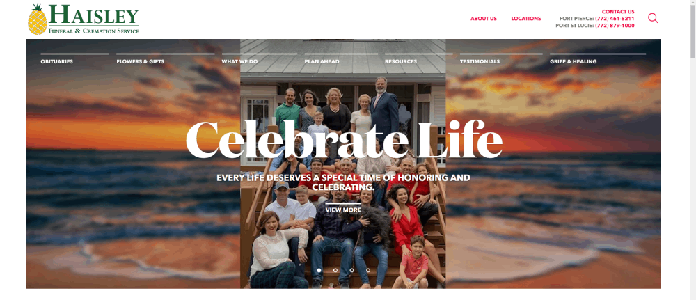
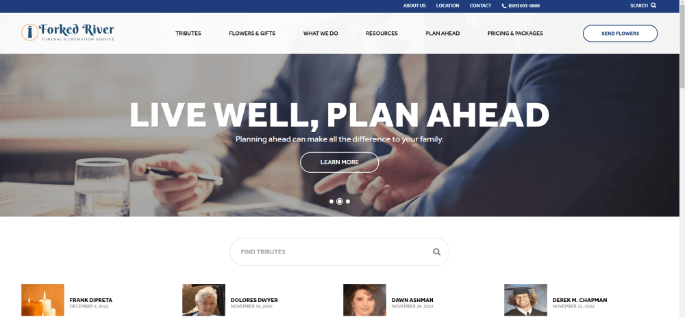
Forked RiverFuneral & Cremation Service
One of the most functional options on this list, Forked River offers support to the family by providing various resources. This company brings top-notch yet affordable services that are reflected on the site’s presentation. Families can access all sections easily thanks to the card layout. You’ll also find advantages over other funeral homes and touching testimonials.
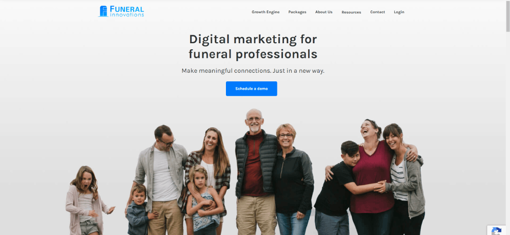
Funeral Innovations
A funeral home business needs a good digital marketing strategy. In this sense, it’s no different than any other industry. Check out this website and see their stunning hero header. Moreover, you’ll find catchy headlines and calls to action. All in all, Funeral Innovations brings a great website to combine email marketing and social media.
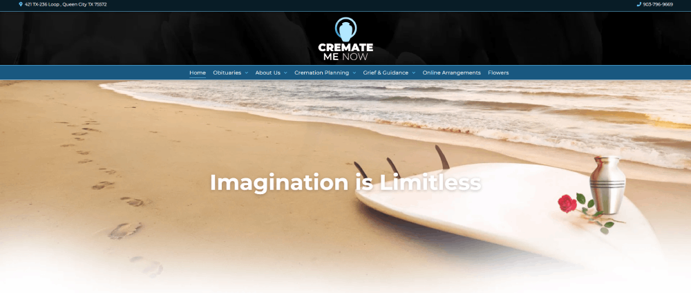
Cremate Me Now
With Cremate Me Now, families will find a good way to pay their tributes. The calls to action are there to generate more conversions, and information is right at hand. Also, their distinctive motto reflects the spirit of the business: “There are no limits when it comes to honoring your loved ones.” In line with this, you can see hero images with people surfing, skiing, and parachuting. With Cremate Me Now, they can spread the ashes under the most unique conditions.
The Springs Funeral Services
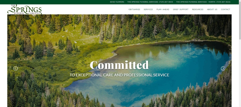
The last website on our list is special. Inspiring the funeral business, The Springs Funeral Services has an excellent website. You’ll find cool features like hover effects, sliders, and stunning photos. Also, this website shows a clear advantage over others: an impressive hero header. You’ll see taglines and full-width images. When scrolling down, you’ll find a helpful menu with large, clear boxes. In other words, families can find everything they need easily.
FAQ on Funeral Website Design
What makes a funeral website design feel respectful and comforting?
The vibe? It's about balance. Soft colors, serene images—think obituary templates that blend in, not shout out. Add in bereavement resources, you're golden—showing care while keeping it straightforward. It's that sense of a memorial service on screen, quiet, there for you without needing to ask.
How can you integrate online memorials into a funeral website?
Imagine a wall of remembrance, digital yet touching. Online tribute videos, stories shared. It’s like a warm corner where visitors can light a candle from afar. Giving space for those heartfelt "you should've known them" anecdotes—that's the sweet spot right there.
What should be considered for user experience on a funeral website?
Picture easing a burden in tough times. No puzzling navigation or loud pop-ups, thank you very much. A condolence message form that's just a click away, information that's clear cut. You know, a design so intuitive, even your tech-challenged Uncle Jim can send his love without fuss.
How do you handle e-commerce for funeral services sensitively?
It's tricky, but think of it this way: You’re guiding, not pushing a sale. Display casket selections and funeral flower arrangements like you're offering options, not upselling. Provide helpful info, clear costs. It's all about helping folks make choices they're at peace with.
What features are essential for a funeral home website?
Must-haves? Right off the bat—service descriptions, coffin galleries, maybe a tasteful celebration of life webpage. Then there's the nitty-gritty: pre-planning funeral services, aftercare services info. Let's not forget a virtual funeral service option—'cause these days, being there doesn't always mean being there there.
Can you incorporate personal stories or eulogies on a funeral website?
Absolutely—makes it personal, ya know? Let the tales flow. Digital guestbooks, a spot for eulogies, they turn a website into a community, a space to connect. It’s the online equivalent of a warm hug, a fond memory shared over a cuppa joe at the wake.
How important is mobile responsiveness for funeral websites?
With everyone glued to their phones, super important. Folks need that responsive web design to access info on-the-go, maybe share a story or two while riding the bus. It's about being there for them no matter where they are, 'cause grief doesn’t exactly have office hours, does it?
What role does SEO play in funeral website design?
SEO's like your online guiding star. For funeral website design examples, it’s about popping up when someone's looking for support. Use those semantically relevant keywords—grief counseling support, burial options—to reach hearts in need. It’s doing a solid by being easy to find, in the context that’s helpful.
How can you reflect different religious or cultural practices in a website?
Diversity—it’s a big world out there. Showcase religious funeral customs pages, maybe spotlight green burials for the eco-conscious. The key here is relevance and respect. From Jewish Shiva customs to a good ol' Irish wake, it's all about honoring the departed, their way.
Can you include aftercare and grief resources on a funeral website?
This is huge—like a beacon in the fog. Plug in grief counseling support links, list local support groups, maybe toss in some grief and mourning rituals. It’s about extending a hand, even after the last goodbye, showing that the care doesn’t stop at the grave.
Conclusion
Wrapping up—these funeral website design examples, they're a lighthouse in the stormy seas of grief. Think of them as templates, but with soul. A blend of form and function, draped in dignity. Putting together pieces like obituary templates, virtual funeral services, and aftercare resources—they make for a space that's both comforting and useful.
The key takeaway? In the wake of loss, a perfectly crafted site stands as a sanctuary. It's where memories are housed, and goodbyes whisper softly between the lines of code. Design here isn't just aesthetics; it's empathy in pixels.
So when the last word is read, the last image skimmed over, remember this. What's been shared here, this guide through halls of digital remembrance—it's more than a fingerprint on the web. It's a touch of compassion, a whisper of "you're not alone," echoing long after the screen dims.
If you enjoyed reading this article about funeral websites, you should read these as well:

