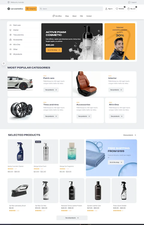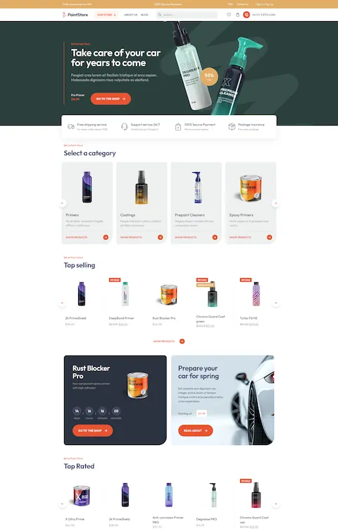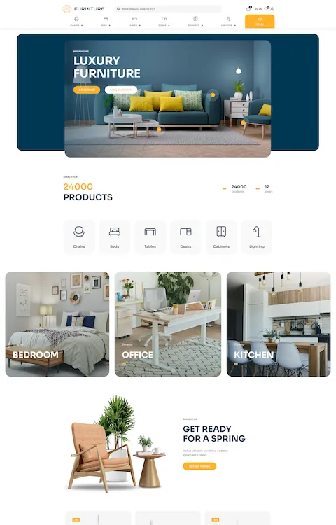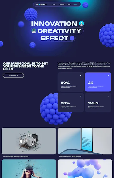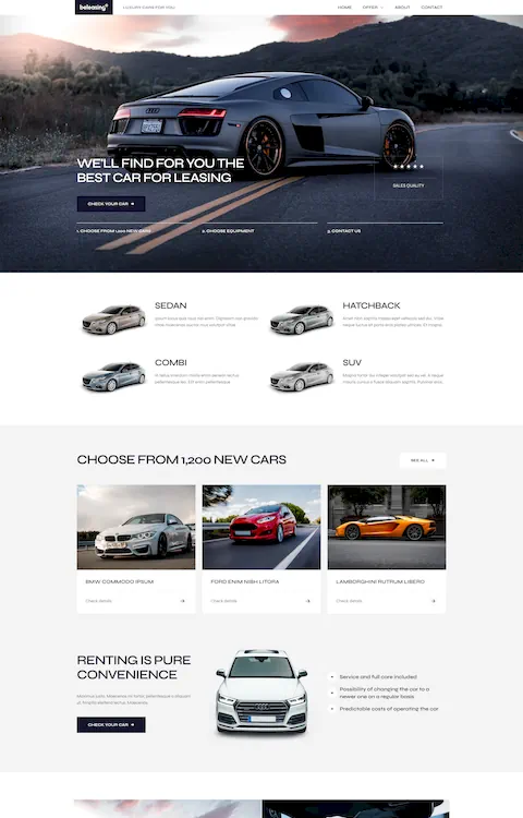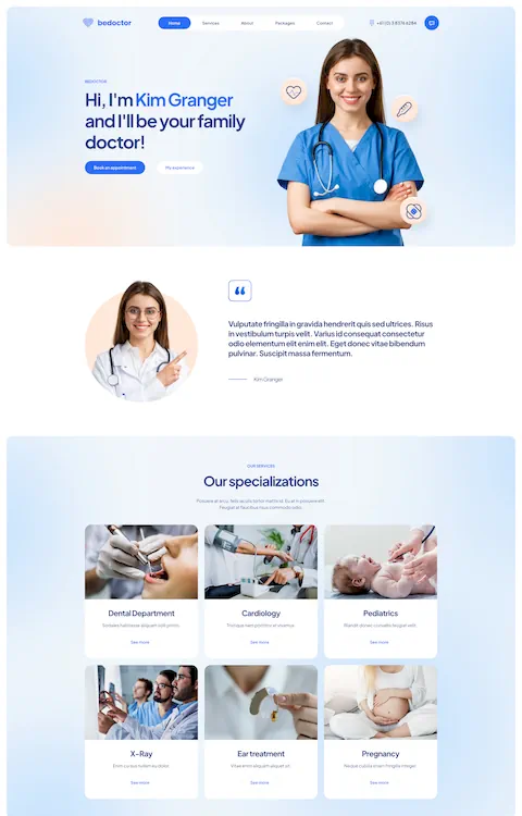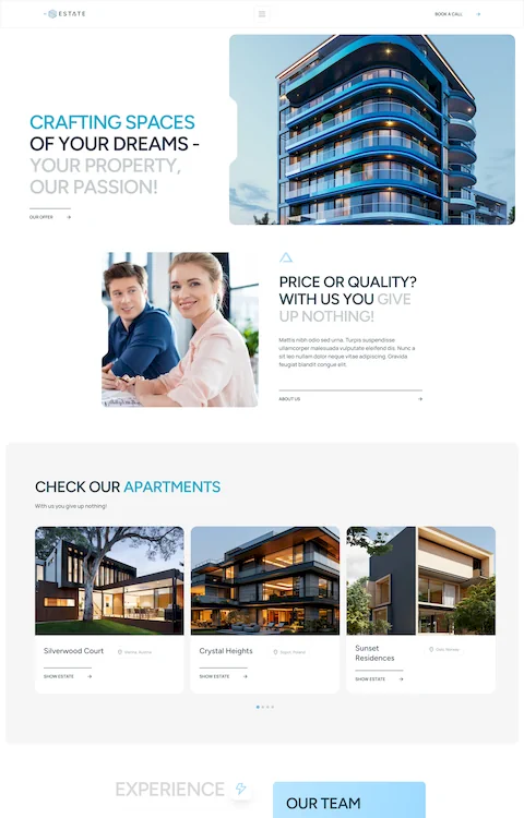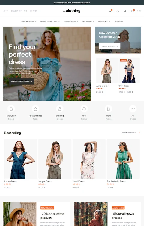
Captivating Automotive Website Design Examples
July 18, 2024
WordPress Stuck in Maintenance Mode: How to Fix It Quickly
July 23, 2024Creating effective government websites is no simple feat. Today, with digital government services continually advancing, it's essential to learn from the best examples.
Governments are not only expanding their online presence but they're also embracing cutting-edge web design practices to better connect with citizens. From municipal site layouts to federal web solutions, understanding successful government website design examples is key to developing user-friendly, responsive public websites.
In this article, we'll discover the aspects that contribute to top-notch public sector web design. You'll find insights into digital transformation in government, user-centered designs, and how public sector websites ensure accessibility and security.
By the end, you'll know exactly what it takes to craft intuitive, compliant, and visually appealing civic web design.
Whether you're interested in state agency web portals or city councils, we've focused on highlighting modern, easy-to-navigate platforms that prioritize citizen engagement and transparency.
Government Website Design Examples
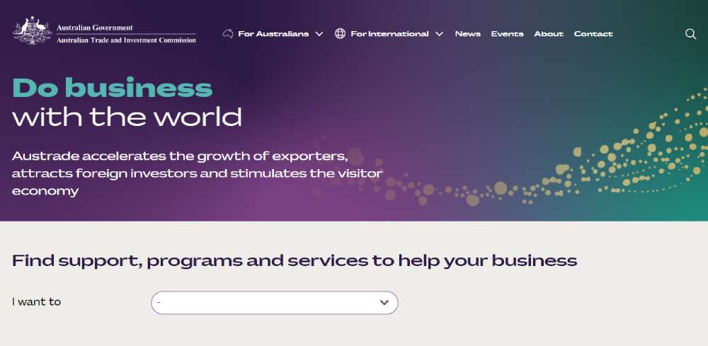
Austrade
A pivotal contributor to Australia's economic prosperity, the Austrade website, hosts a plethora of pages dedicated to helping Australian businesses, education institutions, tourism operators, governments, and citizens.
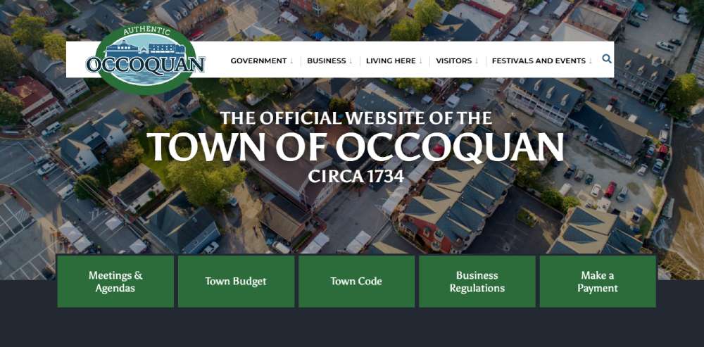
The Town of Occoquan
A classic representation of simplicity paired with pleasing visuals, it adopts a "less is more" approach. The subtle color grading complements the homepage's aerial landscape and grabs attention right from the start.
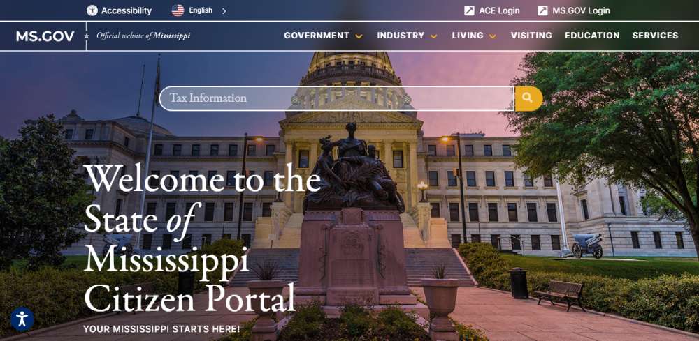
State of Mississippi
The Mississippi Interactive, a subsidiary of the eGovernment firm NIC, revamped the official web portal in 2013. Its remarkable design continues to stand out among US state websites even a decade later.
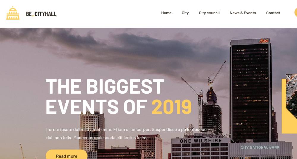
BeCityHall
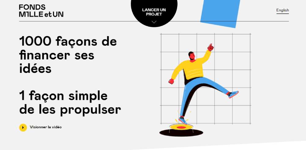
Mille et UN Fund
An innovative initiative that brings crowdfunding, business contributions, and public sector support together for the benefit of young people.
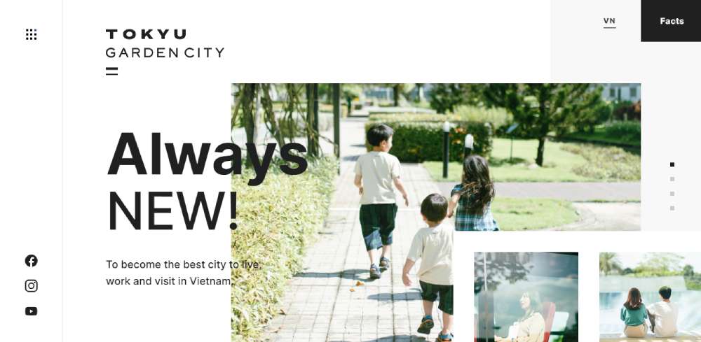
TOKYU Garden City
An urban development project in the north of Ho Chi Minh City, Vietnam.
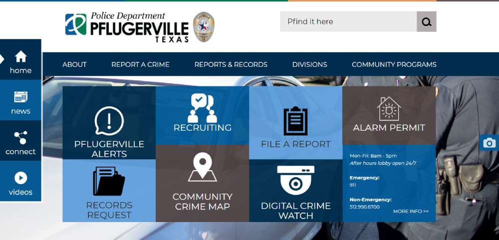
Pflugerville Police Department
Its design highlights the department's professional, approachable, and transparent law enforcement approach. The welcoming homepage presents the department in a positive and professional light.
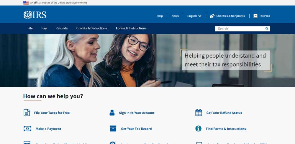
US Internal Revenue Service
The agency responsible for collecting taxes and funding other websites. A well-designed, visually appealing site makes civic duties a bit less daunting. Some governments are doing a splendid job with this.
The White House
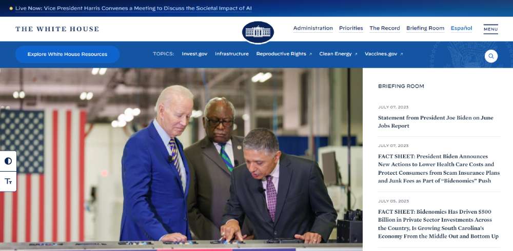
The design of this site is straightforward and easy to navigate. It caters to a range of devices, from mobile phones to large desktop monitors. The streamlined layout of web forms also enhances mobile accessibility.
BeNGO
Respektiere deine Grenzen
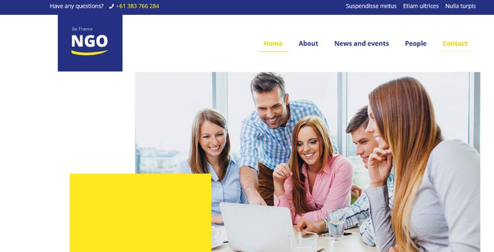
A public initiative with a website that acts as a problem-solving notice board, raising awareness about nature and wildlife preservation through innovative branding tactics.
Sorel City
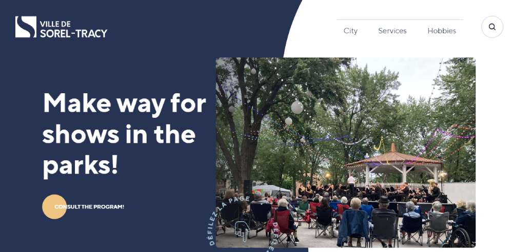
The city's website is modern, intuitive, ergonomic, and breathes a fresh air while meeting high-level accessibility standards.
Bonjour Québec
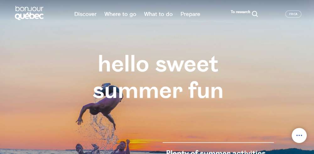
A tourism-focused website that spotlights the diversity of Quebec’s tourism landscape with an engaging new design.
Chania - A City Of Many Tales
An experience-based portal for travelers interested in visiting Chania, Crete.
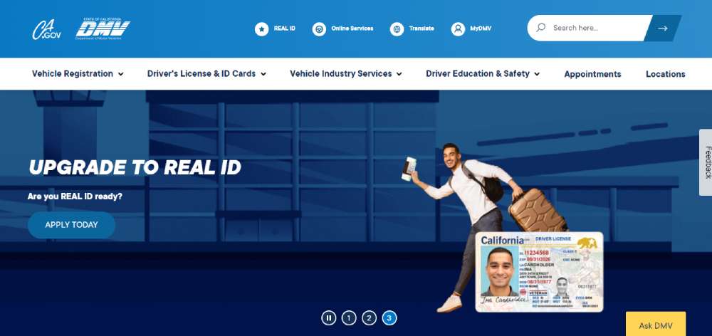
California DMV
A well-rounded website with a great blend of clear communication, illustrations, and interaction cues.
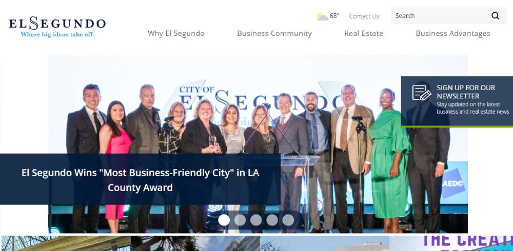
El Segundo Economic Development
A website that encourages business growth in El Segundo, California, by prioritizing user perspective.
Minnesota State Transportation Center of Excellence
This platform truly stands out, hitting you right off the bat with a stunning full-screen, high-resolution video. The main menu opens to an impressively striking screen, with aircraft navigation instruments taking center stage.
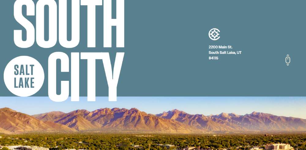
South City
Meet South City - the creative nucleus of Salt Lake City. The new downtown urban district, pulsating in the heart of South Salt Lake.
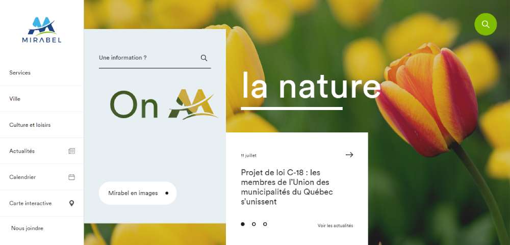
City Of Mirabel
Nestled off the island suburb of Montreal, in southern Quebec, Mirabel unfolds a rich living atmosphere. The region is decked with lush green spaces and showcases robust economic development.
Sydney As A Smart City
The site presents an interactive storyline of mobility and housing in Sydney, offering suburb-specific insights. An integral part of the mission to democratize data for everyone.
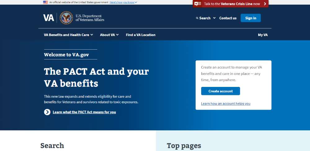
U.S. Department of Veterans Affairs
The platform offers a clear-cut list of actions for managing benefits and health care services. By employing an active voice, the site offers clarity on what actions visitors can take. The entire design focuses on delivering relevant information and context to guide users towards the right information.
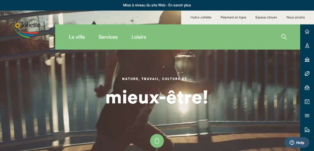
Joliette City
Welcoming you to Joliette - the heart of northern Lanaudière, Quebec, Canada. Known for its family-oriented environment and a history that echoes in its corners.
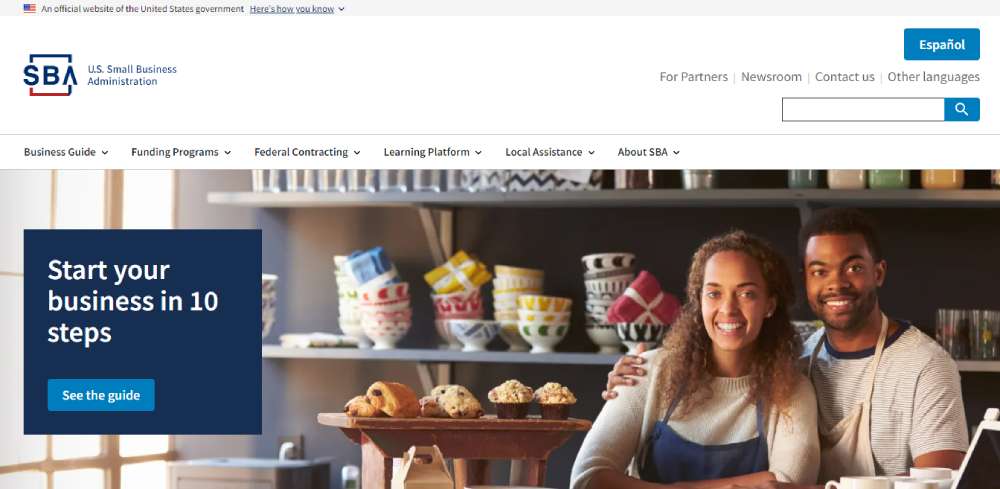
U.S. Small Business Administration
Beyond offering an attractive guide for novice business founders, this website delivers handy interactive tools to help both newbies and experienced business owners navigate and grow their businesses. It's all wrapped in a clean, minimalist interface, free of distractions.
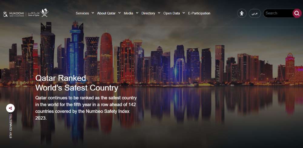
Hukoomi
Hukoomi, Qatar's eGovernment website, employs a pleasing color scheme drawn from the Qatari flag - a blend of dark red and white. Dominated by white, the site presents an easily readable and understandable interface. It neatly curates all major information concerning the country's citizens in a coherent manner.
FAQ on Government Website Design
What makes a government website effective?
An effective government website focuses on user experience with intuitive navigation and accessibility for all users. It needs to balance visual design with functionality, ensuring easy access to public services and information. Compliance with data privacy laws and security standards is also crucial for protection and trust.
How can government websites improve citizen engagement?
By providing interactive services, such as forms and payment portals, government websites can improve citizen engagement. Features like feedback forms and live chat support also encourage interaction. Consistent updates and social media integration can keep citizens informed about community news and policies.
What are some common design mistakes on government websites?
Common mistakes include cluttered layouts and outdated interfaces that can confuse users. Ignoring mobile responsiveness results in poor user experience on smartphones. Lack of clear content organization and ignoring accessibility standards can also hinder usability, excluding users with different needs.
Why is accessibility important for government sites?
Accessibility ensures that all users, including those with disabilities, can access information and services. It’s a legal requirement and a key aspect of modern web development. Accessible design enhances usability, showing commitment to inclusivity and improving the overall user experience.
How do government websites handle data security?
Security features like secure login systems and data encryption protect sensitive information on government websites. Regular audits and updates help maintain robust security measures. Compliance with data protection laws and employing cybersecurity experts are essential to safeguarding against potential threats.
What are the best practices for government website design?
Best practices include user-centered design, ensuring compatibility with various devices, and maintaining a streamlined content management system. Consistent branding and clear visual identity are essential. Regular usability testing and citizen feedback loops help to refine and improve web services.
How can government websites be optimized for search engines?
Optimizing content with relevant keywords, using structured data, and ensuring fast load times help improve search visibility for government websites. A well-organized site structure with descriptive meta tags and header tags also contributes to better indexing and more targeted search results.
What are interactive features that can enhance government websites?
Interactive features such as customizable dashboards, community forums, and newsletters enhance user engagement. Providing real-time updates and notifications keeps users informed. Online public applications and portals for accessing services quickly make the site more valuable to visitors.
How do government sites balance aesthetics and functionality?
Balancing aesthetics and functionality involves using clean design principles without sacrificing ease of use. Consistent typography and color schemes support branding while clear calls to action guide users efficiently. Testing designs with real users ensures both look and practicality are maintained.
Why is mobile-friendliness critical for government websites?
With growing mobile usage, mobile-friendliness is necessary for accessibility and reach. Government websites must load quickly and display correctly on smaller screens. Responsive design ensures all functions work seamlessly, meeting the expectations of users who rely on mobile devices for information.
How critical is website security?
Website security is like the bouncer at a club, but for your website. It keeps the bad guys out and the good stuff in. For government sites, it's even more important. We're dealing with sensitive data here, people's personal info, like debit card numbers.
So, yeah, it's kind of important to implement various security measures such as utilizing VPN for network security and conducting frequent website vulnerability tests, along with employing firewalls, encryption, and multi-factor authentication to ensure comprehensive protection.
Conclusion
Exploring government website design examples shows a mix of usability and innovation within public sector websites. These examples highlight successful approaches that public agencies use to engage citizens effectively.
By prioritizing accessibility, clear information, and intuitive navigation, these sites connect communities efficiently while maintaining security and data privacy standards.
Government websites that integrate interactive features and responsive design are key to enhancing user experience across all devices.
This ensures citizens can access services effortlessly, regardless of their tech preference. These website templates and solutions serve as guides for others striving to improve digital government services.
By understanding elements—such as visual identity, public sector usability, and compliance with regulations—you see how these fit into a cohesive web development strategy.
As you apply these insights, creating a civic web design that supports citizen interaction and transparency becomes easier. Moving forward, focus on building scalable, user-centered platforms that reflect evolving community needs.
If you enjoyed reading this article about Government Websites, you should read these as well:

