Dietitian Website Design Examples That Build Credibility
January 7, 2026
The Best Fitness Website Design Examples
January 7, 2026Industrial buyers make decisions before they ever contact your sales team. Your website is the first sales conversation.
Most manufacturing website design examples online look outdated. Stock photos of handshakes. Vague capability statements. RFQ forms buried in footers.
The best industrial web design works differently. It communicates technical expertise, displays certifications like ISO 9001 and AS9100, and converts engineers into qualified leads.
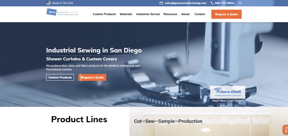
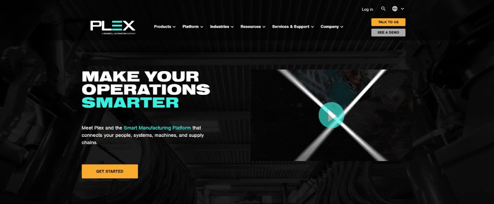
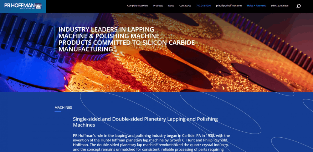
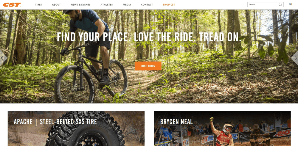
This guide breaks down manufacturing websites that actually perform. You'll see what makes their product catalogs, quote systems, and specification pages effective.
Whether you run a CNC machining shop or a contract manufacturing operation, these examples show what B2B buyers expect in 2025.
What is Manufacturing Website Design
Manufacturing website design is the practice of building digital interfaces for industrial companies, fabrication plants, and production facilities.
These sites serve a different purpose than your typical e-commerce store or service business page.
B2B buyers arrive with technical questions. They want spec sheets, tolerance charts, and ISO 9001 certification badges. Not lifestyle imagery.
A CNC machining company needs pages that display equipment capabilities, material options, and lead time calculators. A metal fabrication shop requires RFQ forms that capture project specifications without endless back-and-forth emails.
The goal? Convert engineers, procurement managers, and operations directors into qualified leads.
Most B2B websites focus on relationship building. Manufacturing sites take this further by providing technical depth that proves expertise before the first sales call happens.
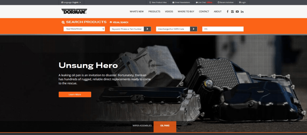
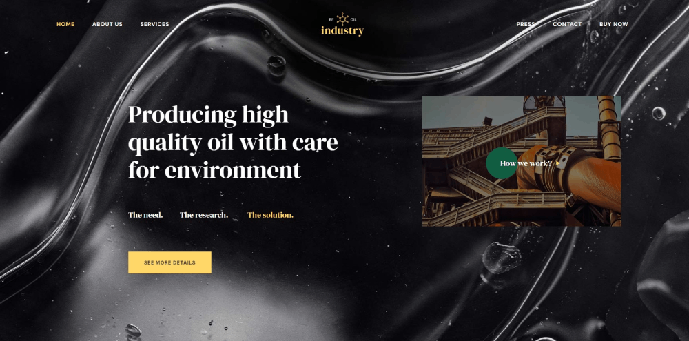
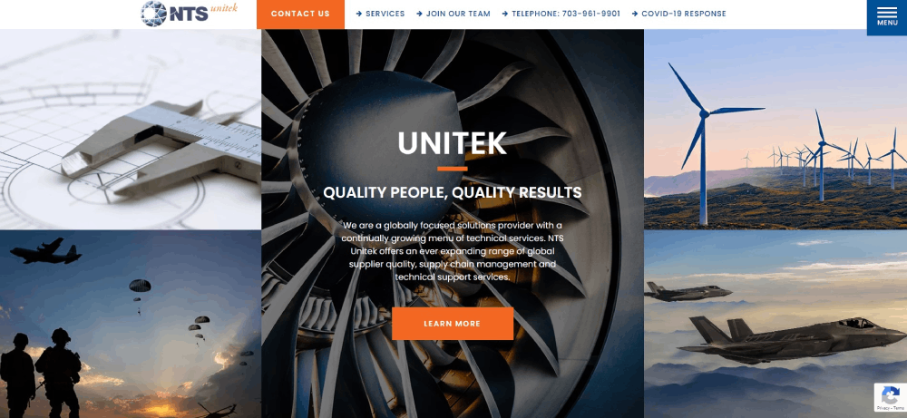
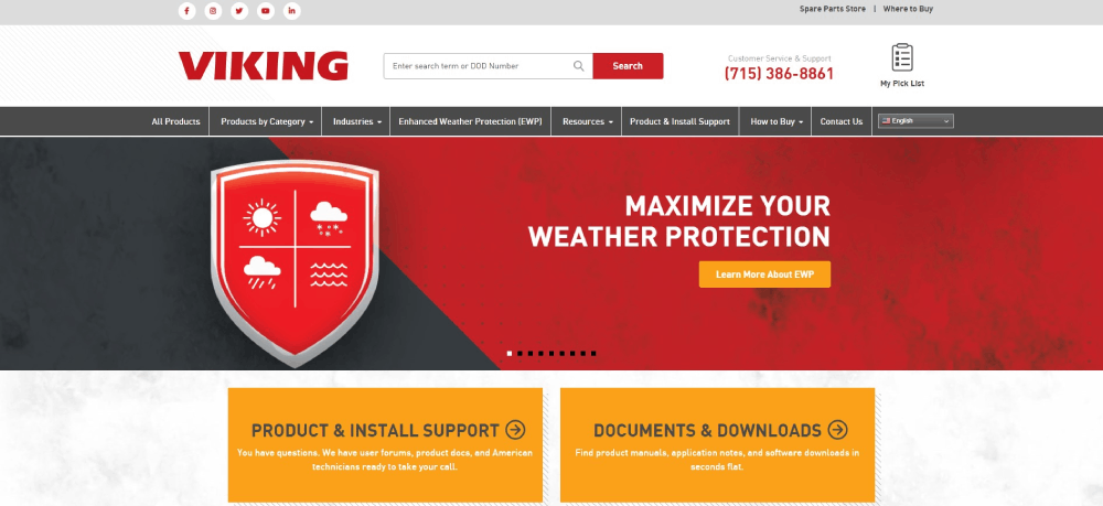
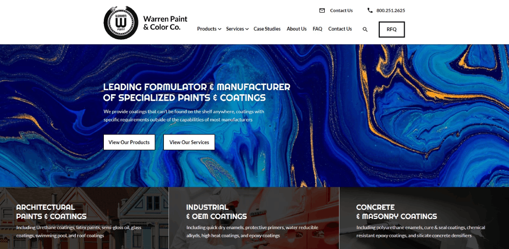
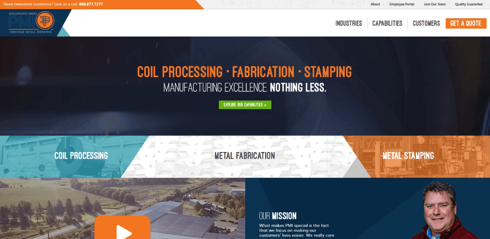
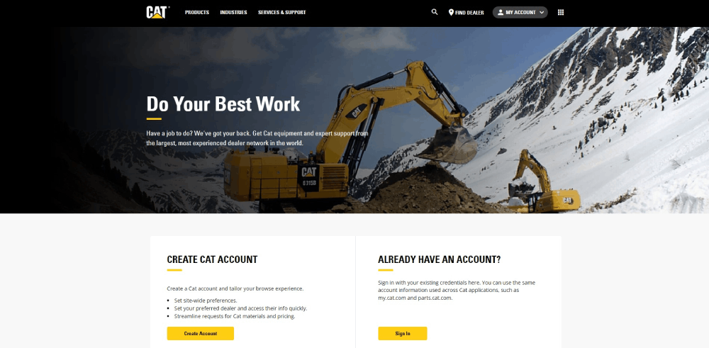
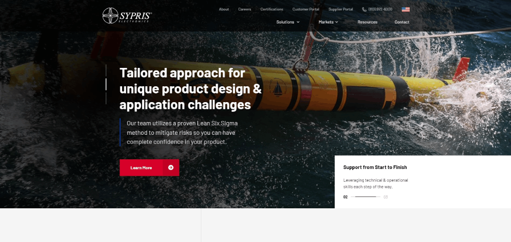
Examples of Manufacturing Websites
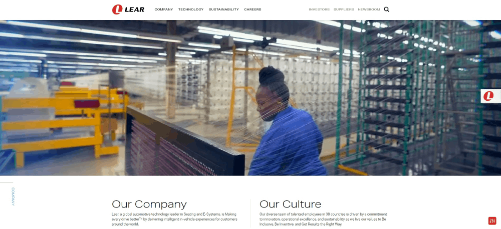
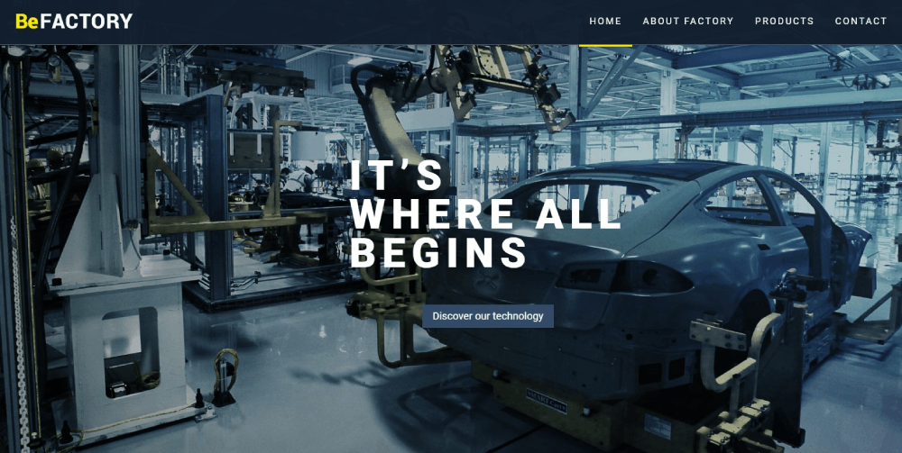
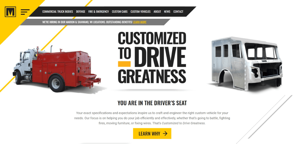
Dorman Products
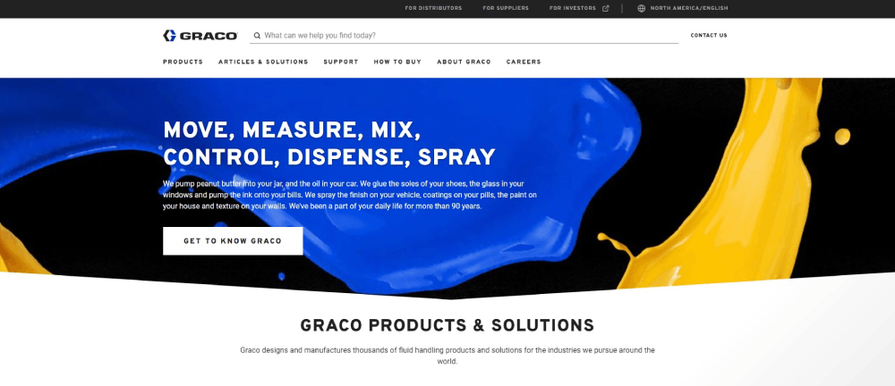
Graco
How Does Manufacturing Website Design Differ From Other Industries
Manufacturing web design operates under constraints that other industries never face.
A clothing website sells emotion. A factory website sells capability and trust.
Here are the key differences:
- Technical specification displays replace product descriptions; buyers need tolerances, materials, and certifications
- RFQ systems replace shopping carts; quotes require custom pricing based on volume, material, and complexity
- Compliance documentation matters more than reviews; AS9100, IATF 16949, and NADCAP certifications close deals
- Equipment pages showcase machinery capabilities, not just pretty photos
- CAD file downloads and bill of materials integration become standard features
Retail websites optimize for impulse purchases. Manufacturing sites optimize for considered decisions that take weeks or months.
The sales cycle changes everything about how these sites function.
What Makes a Manufacturing Website Effective
An effective manufacturing website converts technical visitors into sales conversations.
Speed matters more than you think. Engineers checking suppliers during lunch breaks abandon slow sites fast.
Google PageSpeed scores above 90 correlate with lower bounce rates across industrial sectors.
Core Performance Factors
Mobile responsiveness catches many manufacturers off guard. Procurement managers browse on phones between meetings; tablets appear on factory floors during vendor reviews.
Your product catalog structure determines whether visitors find what they need. Filtering by material type, industry application, and certification level saves time.
Conversion Elements That Work
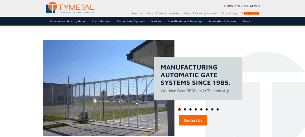
Clear call to action buttons placed above the fold. Quote request forms that capture project details without overwhelming users.
Case study sections with specific results. Not vague claims, actual numbers: "Reduced client tooling costs by 34%" beats "We save you money" every time.
Trust signals placed strategically throughout. ISO certification badges, customer logos, facility photos showing real equipment.
What Design Elements Do Top Manufacturing Websites Use
Patterns emerge when you analyze high-converting manufacturing sites.
These elements appear consistently across successful industrial web design projects.
Hero Sections That Convert
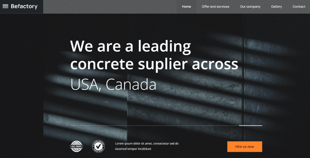
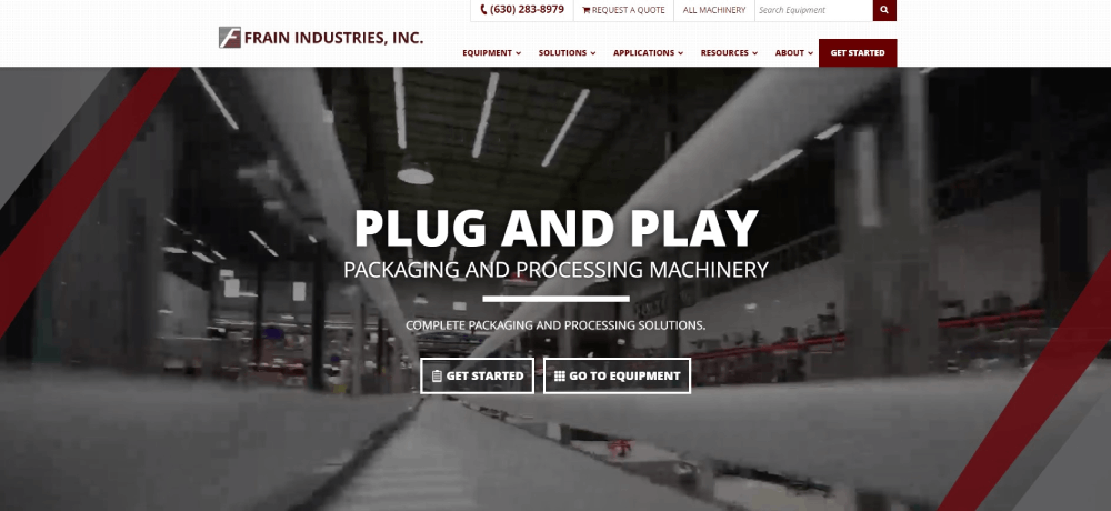
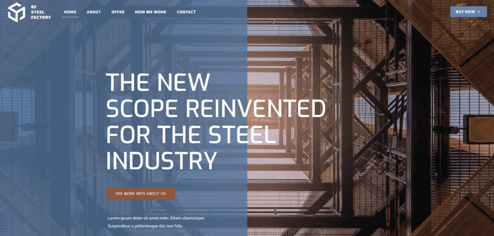
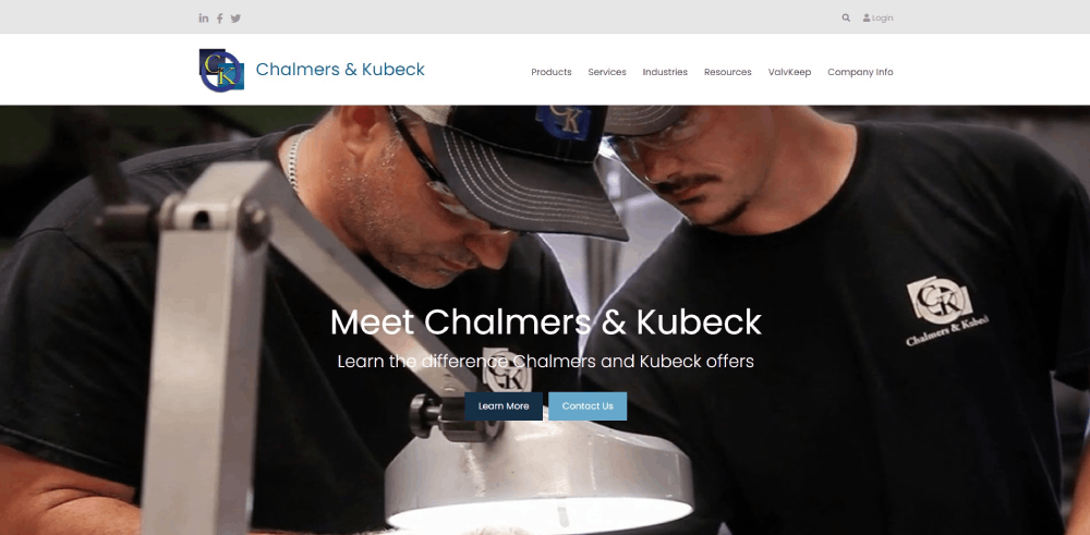
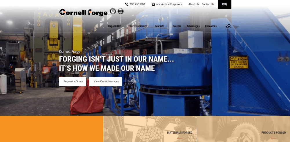
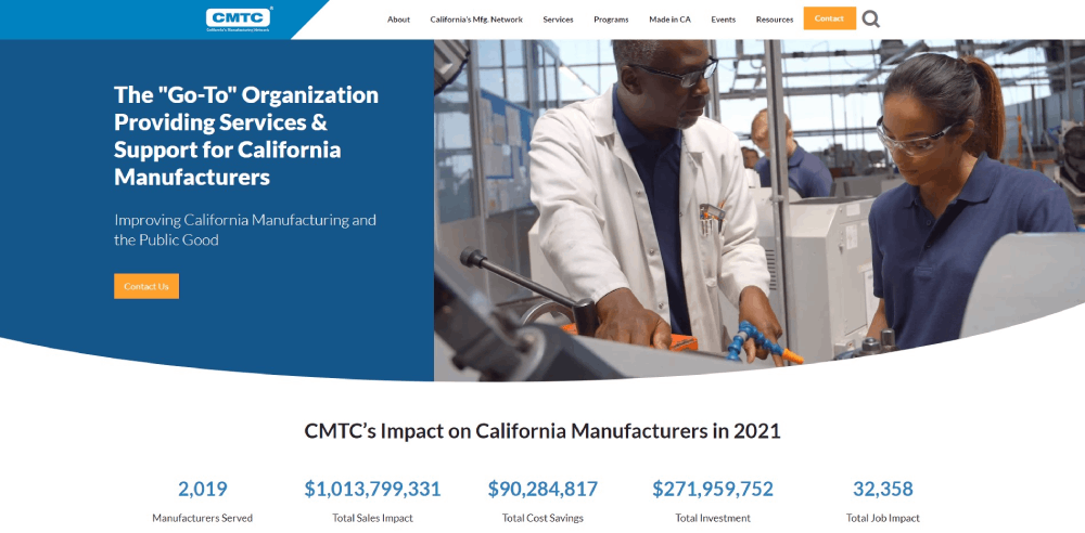
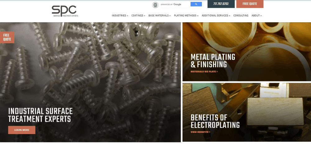
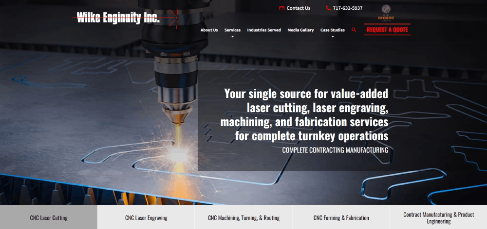
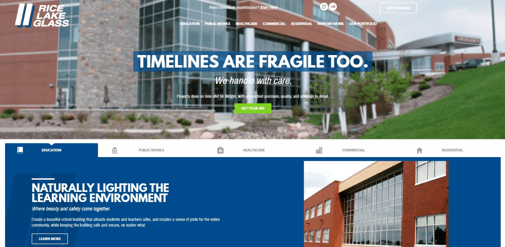
Top manufacturing sites skip generic stock photos. They show actual facilities, real equipment, finished parts.
Headlines communicate capability in specific terms. "CNC Machining with +/-0.001" Tolerances" beats "Quality Manufacturing Solutions" every time.
Navigation Structures
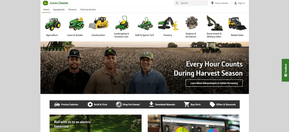
Mega menus organize complex product catalogs. Visitors find capabilities, industries served, and resources without hunting.
Sticky headers keep contact options visible during long scrolling sessions. This matters when spec sheets run thousands of words.
Product Catalog Pages
Filtering systems handle the complexity. Sort by material, tolerance, certification, industry application.
Comparison tools let engineers evaluate options side by side. Downloadable spec sheets in PDF format remain standard.
Trust Building Elements
Certification badges appear in headers, footers, and dedicated compliance pages. ISO 9001, AS9100, IATF 16949 logos signal quality management.
Customer logos from recognized brands build credibility. Testimonial pages feature specific project outcomes rather than generic praise.
Visual Design Choices
Industrial sites tend toward clean layouts with generous white space. Technical information needs room to breathe.
Color schemes lean professional. Blues, grays, and blacks dominate. Accent colors highlight CTAs and important information.
Photography shows scale. People standing next to machinery communicates size better than isolated product shots.
FAQ on Manufacturing Website Design Examples
What makes a good manufacturing website?
A good manufacturing website loads fast, displays technical specifications clearly, and includes RFQ forms above the fold. Certification badges like ISO 9001 and AS9100 build trust. Product catalogs with filtering by material and tolerance help engineers find information quickly.
How much does manufacturing website design cost?
Template-based sites cost $3,000 to $10,000. Custom manufacturing web design runs $15,000 to $50,000. Enterprise solutions with ERP integration, product configurators, and CAD file handling exceed $75,000. Complexity drives price more than page count.
Which CMS works best for manufacturing companies?
WordPress handles most manufacturing sites affordably. HubSpot suits companies prioritizing lead generation. Drupal works for complex product catalogs. Custom development becomes necessary when integrating with SAP or proprietary inventory systems.
What pages should a manufacturing website include?
Core pages include capabilities, equipment list, industries served, certifications, and contact with RFQ form. Add case studies, facility photos, and a careers section. Technical documentation downloads and supplier portals serve specific B2B needs.
How do I showcase equipment on a manufacturing website?
Create dedicated equipment pages listing machine specifications, tolerances, and capacity. Include photos showing scale with operators present. Video walkthroughs of facilities perform well. Link equipment capabilities to relevant product websites or service pages.
Should manufacturing websites have e-commerce functionality?
Depends on your business model. Standard parts and consumables suit e-commerce. Custom fabrication requires quote systems instead. Hybrid approaches work when selling both catalog items and custom services through the same professional website.
What certifications should appear on a manufacturing website?
Display ISO 9001 for quality management. Add AS9100 for aerospace, IATF 16949 for automotive, NADCAP for special processes. FDA registration matters for medical device manufacturing. Place badges in headers, footers, and dedicated compliance pages.
How important is mobile responsiveness for industrial websites?
Critical. Procurement managers browse suppliers on phones between meetings. Engineers check specs on tablets during floor discussions. Google ranks responsive websites higher. Over 40% of B2B research happens on mobile devices now.
What lead generation features work for manufacturing sites?
RFQ forms capturing project specifications convert best. Quote calculators provide instant engagement. Downloadable spec sheets and CAD files collect email addresses. Live chat handles technical questions. Contact forms alone underperform compared to interactive tools.
How often should a manufacturing website be updated?
Review quarterly at minimum. Update equipment lists when adding machinery. Refresh case studies annually. Check certifications for expiration dates. Blog content about industry trends and technical topics improves organic traffic from engineers searching for solutions.
Conclusion
These manufacturing website design examples share common threads. Clear navigation, technical depth, and conversion-focused layouts.
Your site competes against Protolabs and Xometry now. Procurement managers compare you side by side with global suppliers.
Start with the fundamentals. Fast load times, mobile responsiveness, and RFQ forms that capture project specifications without friction.
Add equipment galleries showing real machinery. Display IATF 16949 and NADCAP certifications where buyers look for them. Build product configurators if your offerings support customization.
WordPress or HubSpot handle most manufacturing sites well. Custom development makes sense when ERP integration or CAD file downloads become requirements.
The investment pays off. A professional industrial website generates qualified leads while your sales team sleeps.
Engineers research at midnight. Make sure your site answers their questions.

