

HTML vs. HTML5: What’s the Difference and What’s New?
April 23, 2023
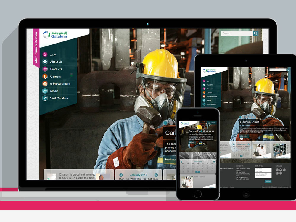
B2B Website Design Showcase: Examples To Check Out
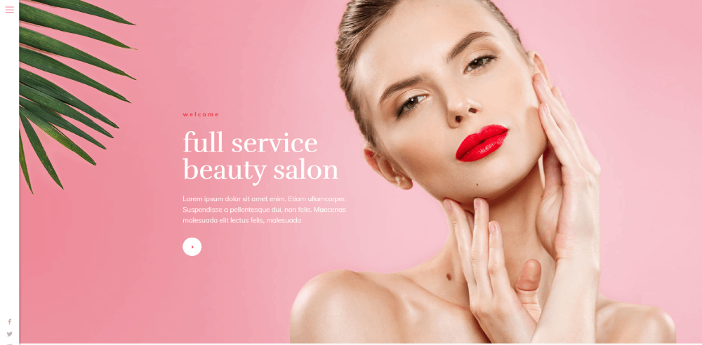
September 1, 2023Sophisticated. Simple. Compelling. These are essential epithets to any effective beauty website. From beauty stores to spas, your business website is a window to your style. That means you always need to showcase your best on your website.
This is why so many brands in the beauty world follow specific central design policies. Since the beauty industry is especially fierce for competition, standing out is essential. Very few website visitors will be interested in a generic, run-of-the-mill website. Instead, the best and most popular beauty websites use their websites as a medium to showcase their individuality and creativity.
This article will showcase some of the best beauty websites online today. Each one is innovative, beautiful, and functional in its own way. Hopefully, this article can help inspire new ideas for your website and beauty brand.
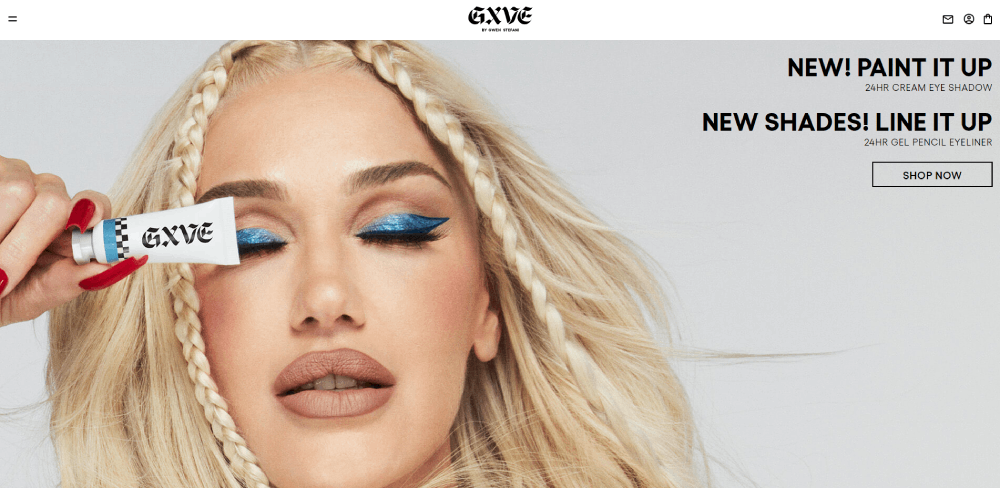
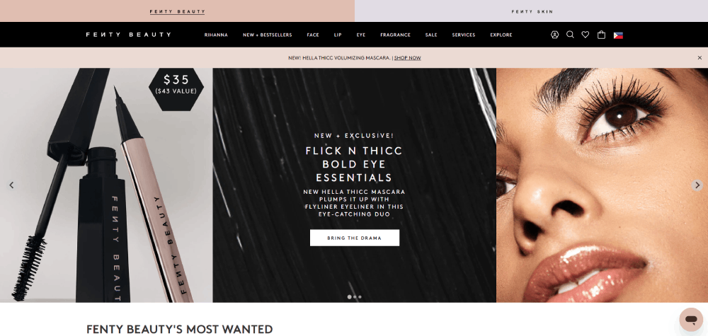
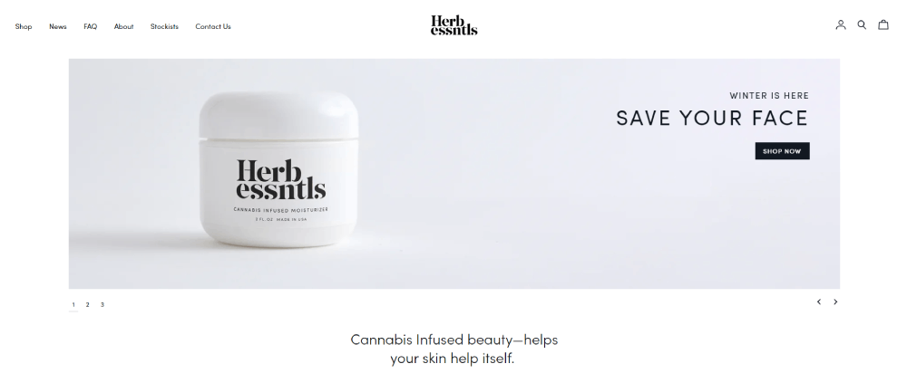
GXVE Beauty
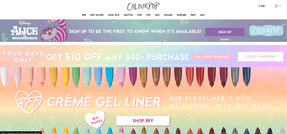
ColourPop is one of the most popular beauty websites on this list, and for good reason. They utilize bright and colorful imagery and externally themed sections to interest their website viewers. Right now, they have a Legend of Korra theme, even going so far as to call their store page “The Republic City.”
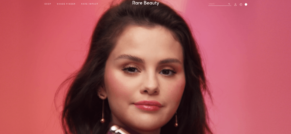
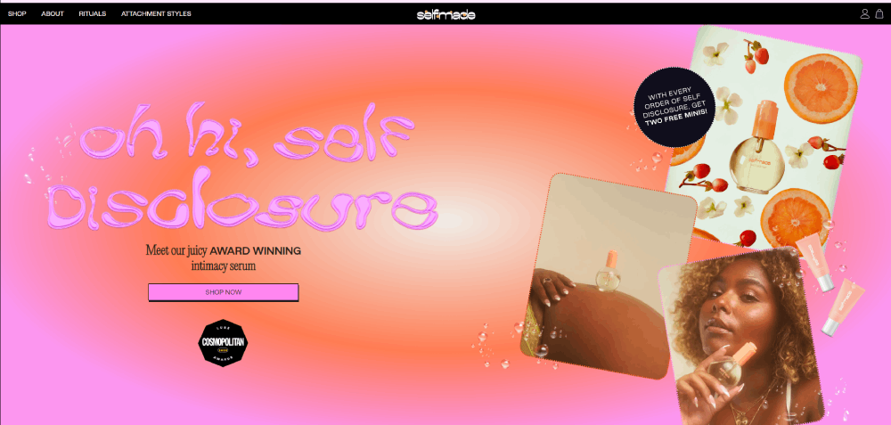
Rare Beauty
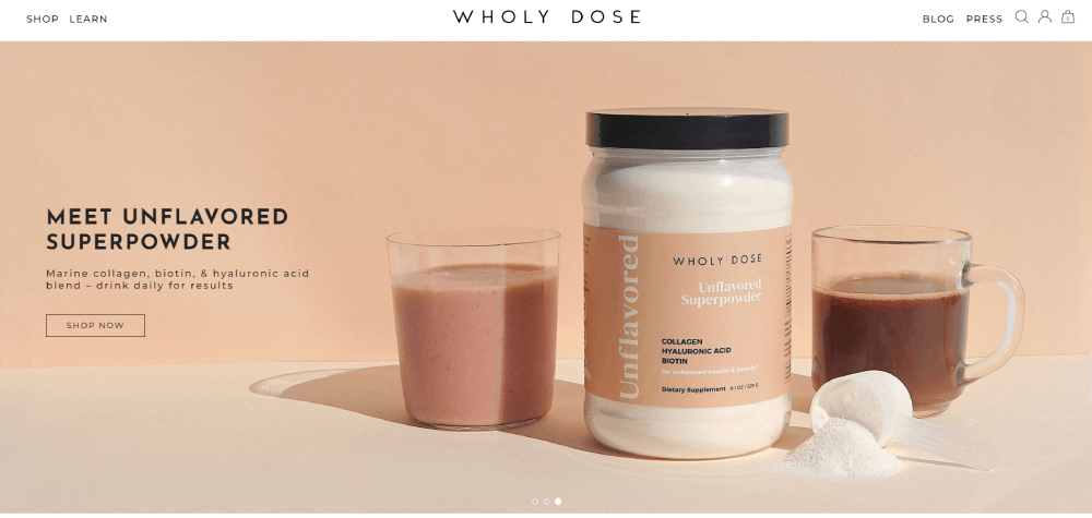
Wholy Dose offers an entirely different style of beauty products: superfood supplements. Although this site may differ in themes from the rest on this list, this site uses a strong white background and powerful content to demonstrate the unique benefits and ingredients in their products.
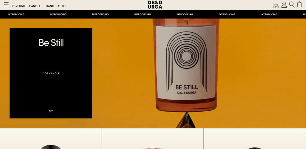
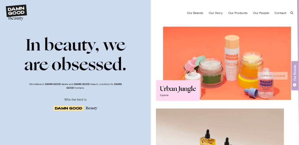
D.S. & DURGA
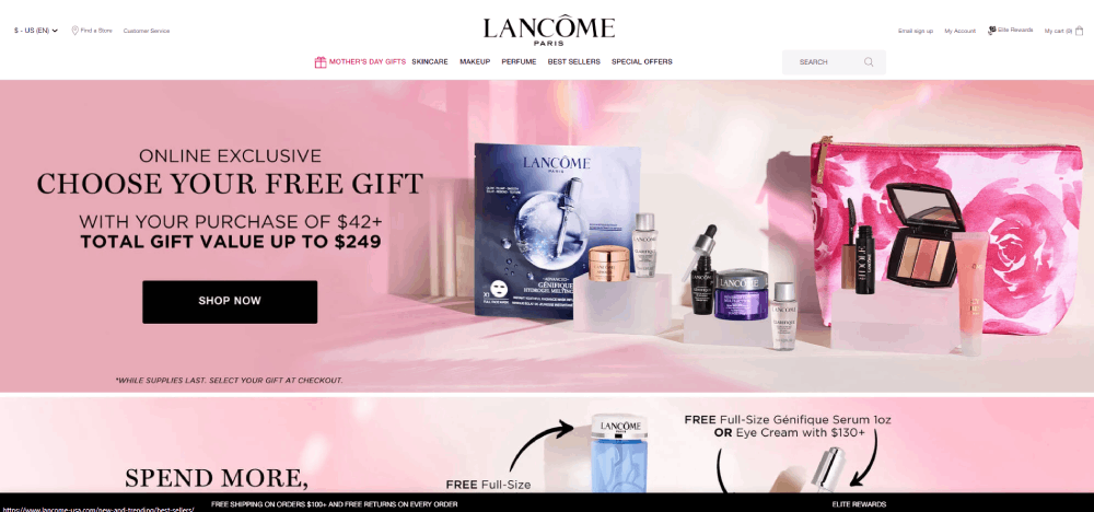
Lancôme’s website uses an interesting new feature that lets customers try out products without spending any money, a “virtual try-on.” With it, customers can try out beauty products, see whether they work for them, and then make the purchase. This reduces many issues caused by conventional eCommerce sales, such as return costs and negative online reviews.
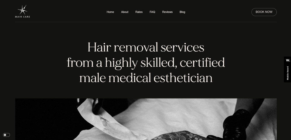
Peach & Lily
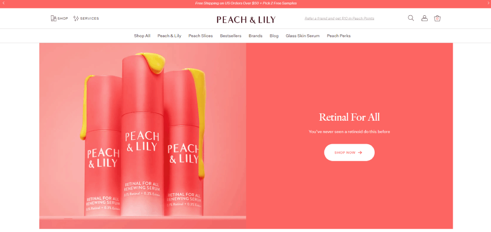
Instead of simply guiding customers to the product type, Peach and Lily uses a centralized navigation system that helps users find products useful for their specific skincare-related issue. As an example, if someone struggles with dark spots, they would be able to find a plethora of tailored suggestions and recommendations, regardless of product type.
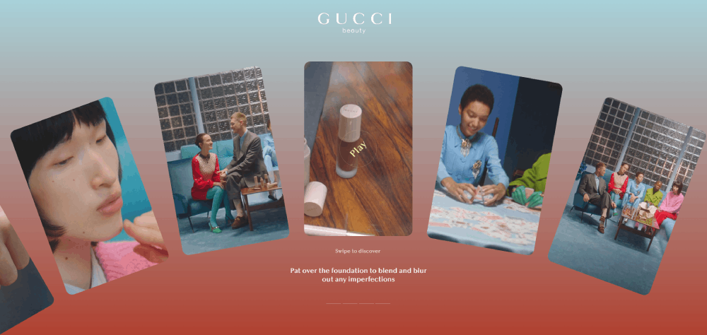
Arcade Beauty
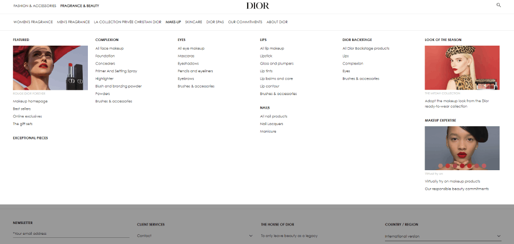
Since Dior is a household beauty brand, it can relocate much of its web space away from images of products and instead showcase models wearing their makeup. Since most visitors already know their products, they can focus more on marketing their lifestyle, instead of trying to convince customers to buy makeup online.
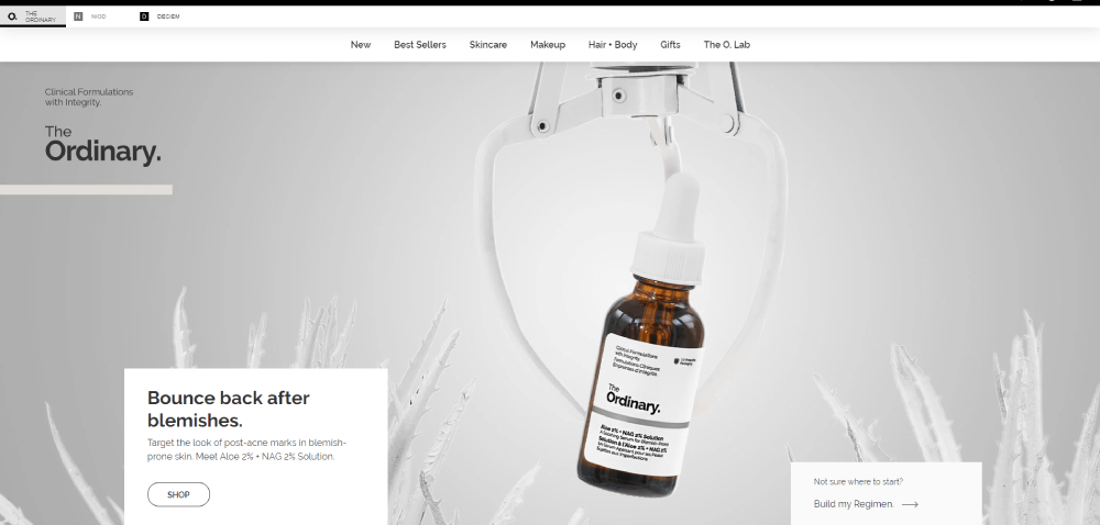
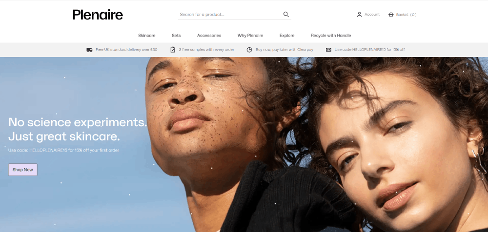
The Ordinary
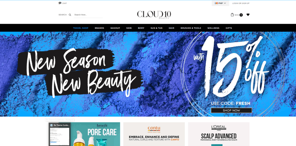
Cloud 10 Beauty’s website is easily one of the best online beauty stores on this list, mainly due to its simplicity. Instead of complicating the site with product description deals, Cloud 10 instead chooses to simply showcase a few products and direct first-time customers to their newsletter.
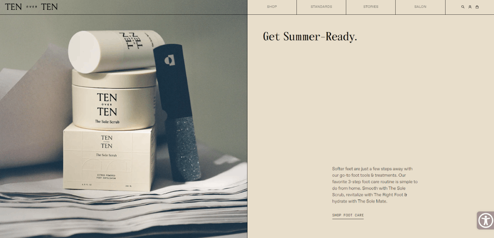
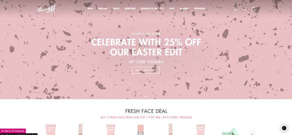
Tenoverten
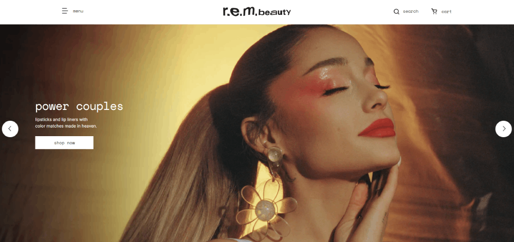
Ariana Grande’s cosmetics brand, r.e.m. beauty, uses many interesting features to separate their website from other beauty brands, such as image carousels and a detailed search system. Since the beauty industry is naturally competitive, the most popular beauty websites need new, interesting features to stand out from the rest.
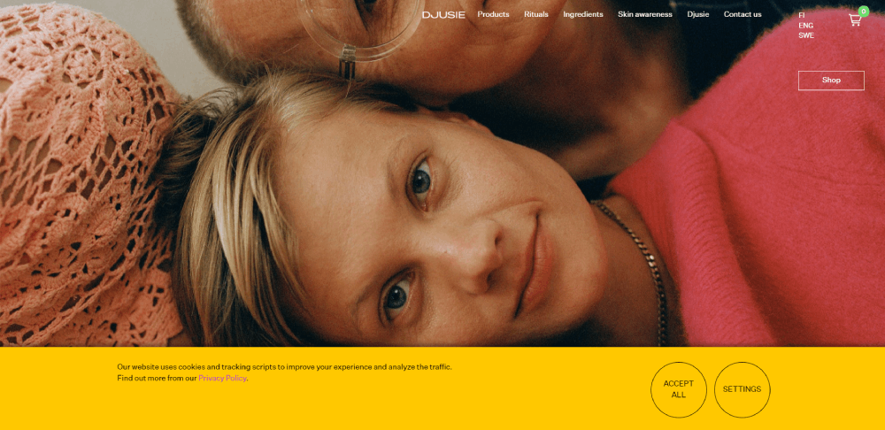
Ulé
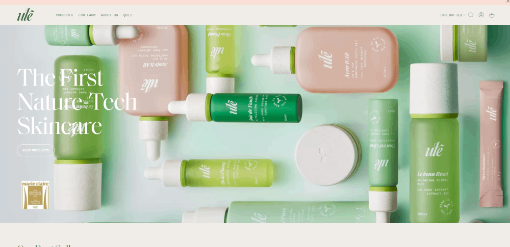
Mitsui uses moving text and colorful images to catch visitors’ attention, while convincing calls-to-action work towards keeping visitors for longer. This combination creates a powerful synergy where visitors stay interested throughout the entirety of their journey through the website.
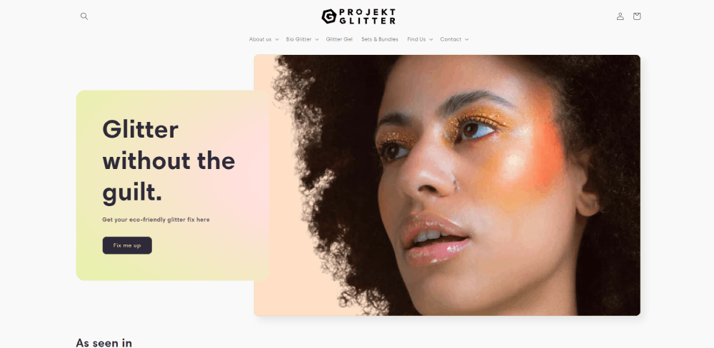
Projekt Glitter
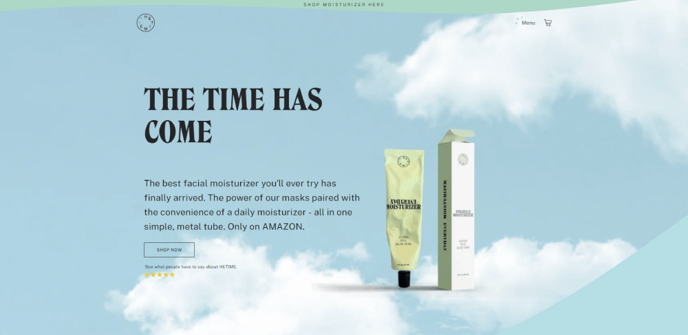
HETIME’s website starts out with a blended design, the hero image easily blending into the rest of the page with the website’s curved, wavy lines. It also uses moving elements to keep visitors’ attention for longer, while dynamic photography works at converting visitors into buyers.
Hey Pretty! Beauty
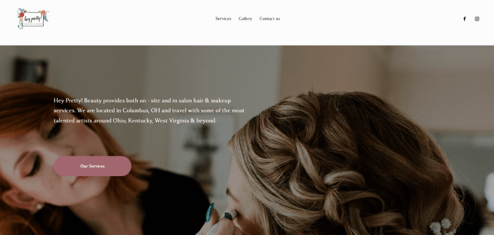
This website is attractive and easy to use, making searching for information a breeze for potential clients. Since Hey Pretty! Beauty specializes in weddings, they know that the planning process can be stressful. Their simple website navigation takes away what could be an added stress from their customers, helping them to have a good time on their special day.
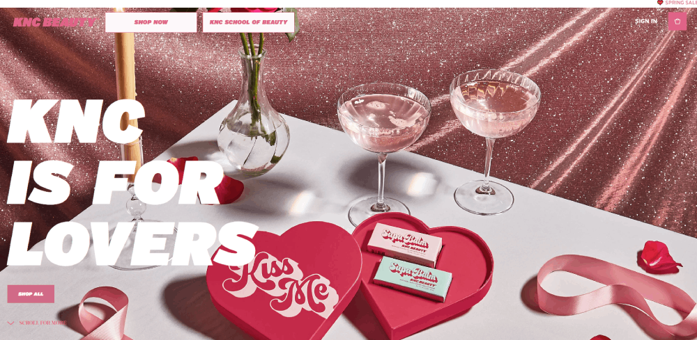
KNC BEAUTY

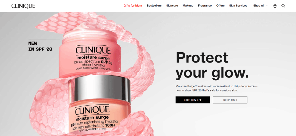
Clinique includes many groundbreaking features to create a new experience for their website visitors, the greatest of which is their virtual skincare diagnosis and foundation applicator. This feature combines over 8o data points in a single scan using over 50 years of dermatological research and millions of example face scans.
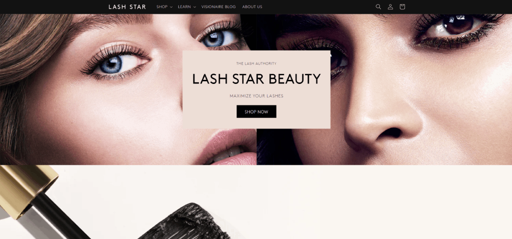
Lash Star Beauty
Beyond Beauty makes the brave decision of opening their website with a video, but the rewards much outweigh the risks in this case. Their video homepage succinctly explains the website’s purpose, while not overstaying its welcome for visitors with a purpose.
How Can You Follow the Most Popular Beauty Website Examples?
Since the beauty industry is naturally diverse and complex, it makes sense that there can be no one-mold-fits-all solution to an effective website. The websites on this list prove this point. While they all differ in many ways, each of them finds their own ways to attract, engage, and convert their audiences.
But do remember, the sites listed here are not just the most popular beauty websites because of the brands they represent. The sites listed here all stand out due to their easy navigation, great user experiences, and effective audience targeting.
This is to say that no matter how large your beauty brand is now, you have what it takes to create an amazing online presence. All you have to do is get started. Have fun!
If you enjoyed reading this article about most Popular Beauty Websites, you should read these as well:


