


How to Choose the Best Affordable Website Template for Small Business?
April 9, 2026
What is WordPress? 5 reasons why it’s the best choice for website
April 14, 2026Sports fans make split-second decisions. They check scores mid-game, buy tickets on impulse, and leave any site that can't keep up. That behavior makes sports website design one of the most demanding categories in web development.
The best sports websites solve a tricky problem: delivering real-time data, video highlights, merchandise, and team branding in a layout that works on a phone screen during halftime.
This collection of sports website design examples breaks down what actually works across league sites, team pages, media platforms, fantasy dashboards, and event hubs. You'll see specific design patterns, real stats on user behavior, and the tools behind the sites that handle millions of game-day visitors without breaking.
What Makes a Sports Website Design Effective
A sports website lives and dies by how fast it delivers information. Fans don't browse casually. They check scores during halftime, look up player stats mid-argument, and buy tickets on impulse.
That behavior shapes every design decision. If the layout can't keep up with a fan's pace, they're gone.
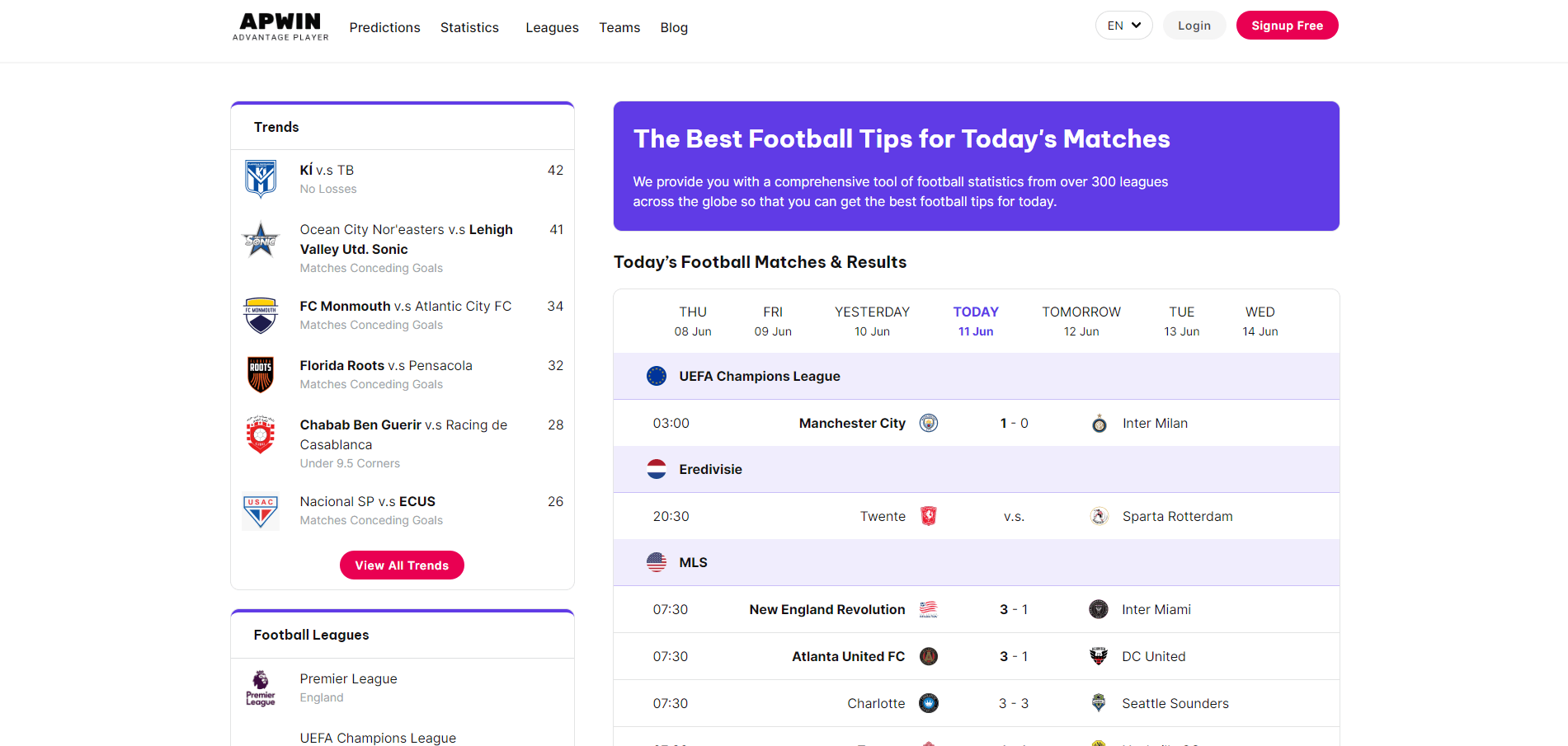
Similarweb data from December 2024 shows ESPN.com averaging 3.71 pages per visit with an 8-minute, 53-second session duration. That's a lot of page depth for a content site, and it's entirely driven by design that puts real-time data front and center.
Speed as the Baseline Requirement
Sports audiences are less forgiving than almost any other vertical when it comes to load times. ToolTester's analysis of 4 billion web visits found that the sports industry logs over 200 million mobile sessions year-on-year, the highest of any industry they tracked.
Google's own research puts the numbers bluntly: bounce probability jumps 32% when load time goes from 1 to 3 seconds. At 5 seconds, the bounce rate hits 38%.
Sports sites that load heavy hero videos without lazy loading or CDN distribution are asking for trouble. The BBC found it loses 10% of visitors for every additional second of load time. For a site pushing live scores during an NFL Sunday, that math gets ugly fast.
Mobile-First Is Not Optional
StatCounter reported that mobile devices accounted for 62.54% of global website traffic in Q4 2024. For sports specifically, the split skews even further toward phones.
Most fans check scores on their phone while watching a game on TV. Some are at the stadium pulling up stats on mobile data. The whole interaction model assumes a vertical screen, a thumb, and spotty connectivity.
A mobile first design approach isn't a nice-to-have here. It's the starting point. Desktop layouts come second, if they come at all.
Visual Hierarchy Built for Scanning
High-contrast layouts dominate the best sports websites. Scores need to pop. Team logos need instant recognition. Navigation has to be obvious at a glance.
The pattern I've noticed across most top-performing sports sites: oversized score displays, bold team color accents, and minimal body text on the homepage. The content structure assumes nobody is reading top to bottom. They're scanning, clicking, and jumping between sections.
UserGuiding research notes that roughly 73% of readers skim blog posts and content pages. On sports sites, that percentage is probably higher, since the audience is there for data, not prose.
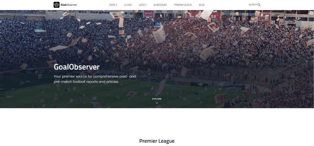
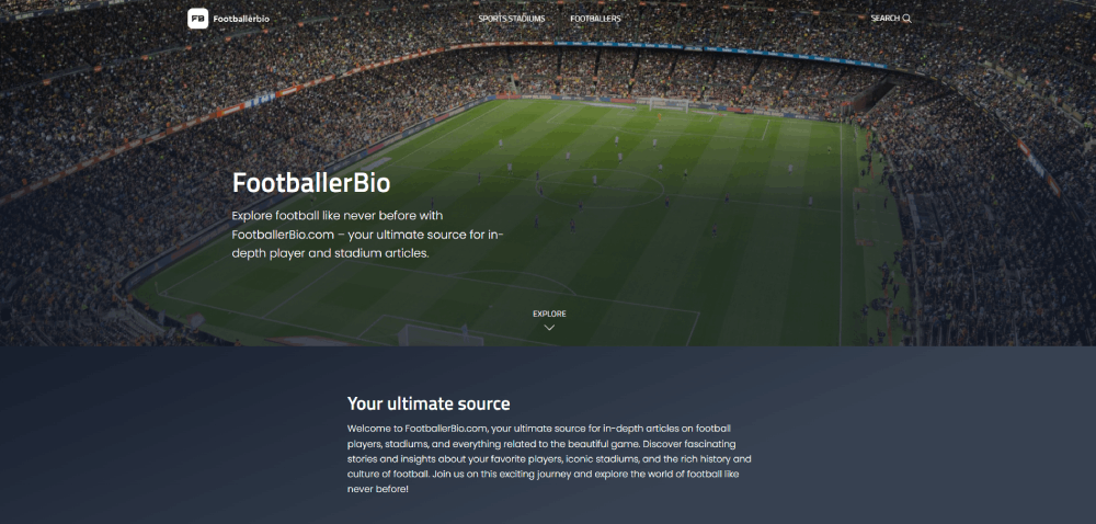
Sports Website Design Examples
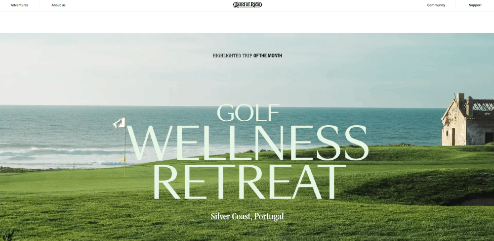
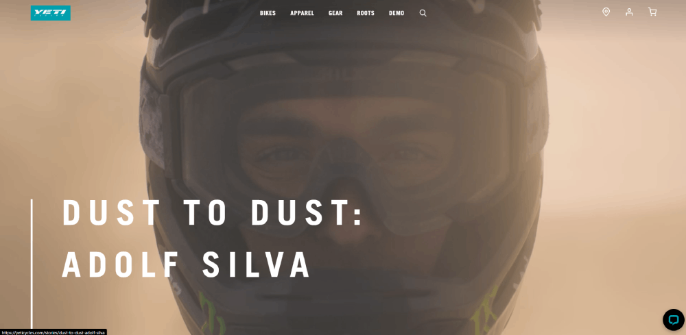
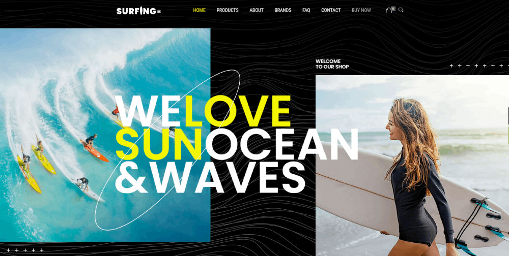
Land of Ride


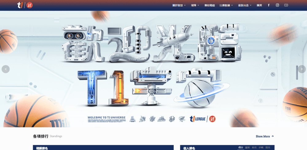

Professional League Websites That Set the Standard
The big league sites set the bar for what sports web design can look like at scale. NFL.com, NBA.com, and PremierLeague.com each serve millions of visitors during peak game days, and their design decisions ripple down to every team and fan site that follows.
What makes these interesting isn't just the budget behind them. It's how differently each one solves the same problem: getting fans to scores, highlights, and schedules without friction.
How League Sites Handle Live Game Experiences
Stats Perform found that sports websites see pageview growth of 91.7% on the first day of major tournaments compared to the day before. By the weekend, that number jumps past 103%.
NFL.com handles this with a modular content grid that completely transforms on game day. The homepage shifts from editorial content to a live scoreboard layout. Score tickers run across the top. Individual game cards expand into mini dashboards with play-by-play data.
NBA.com takes a different route. The design is video-first, with a dark mode web design that makes highlight clips and player imagery the centerpiece. The dark background does double duty here: it reduces eye strain during evening viewing and makes colorful team branding stand out.
PremierLeague.com leans heavily into statistics. Fixture lists, standings tables, and player comparison tools take priority over video. The layout is denser, more data-driven, and clearly built for fans who want numbers over narratives.
Navigation Patterns Across Major League Websites
| League Site | Primary Nav Style | Key Design Feature |
| NFL.com | Mega menu with team dropdowns | Game-day layout transformation |
| NBA.com | Horizontal sticky nav | Video-first dark interface |
| PremierLeague.com | Tabbed content sections | Stat-heavy fixture integration |
| UEFA.com | Tournament-driven hierarchy | Multilingual architecture |
UEFA.com stands apart because its navigation completely restructures around active tournaments. During the Champions League group stage, the entire site funnels visitors toward bracket tracking, match schedules, and group standings. Between tournaments, it pivots to editorial and historical content.
That kind of adaptive website navigation is tricky to pull off. Most sports sites stick with a static menu structure year-round. UEFA's approach takes more development effort, but the payoff is clear: visitors always land close to the content that matters most at that moment.
NFL.com's mega menu deserves its own mention. It organizes 32 teams across a dropdown that somehow doesn't feel overwhelming. Each team links out to a sub-site with its own design skin matching team colors. The consistency of the template combined with the flexibility of team branding is something smaller leagues should study.
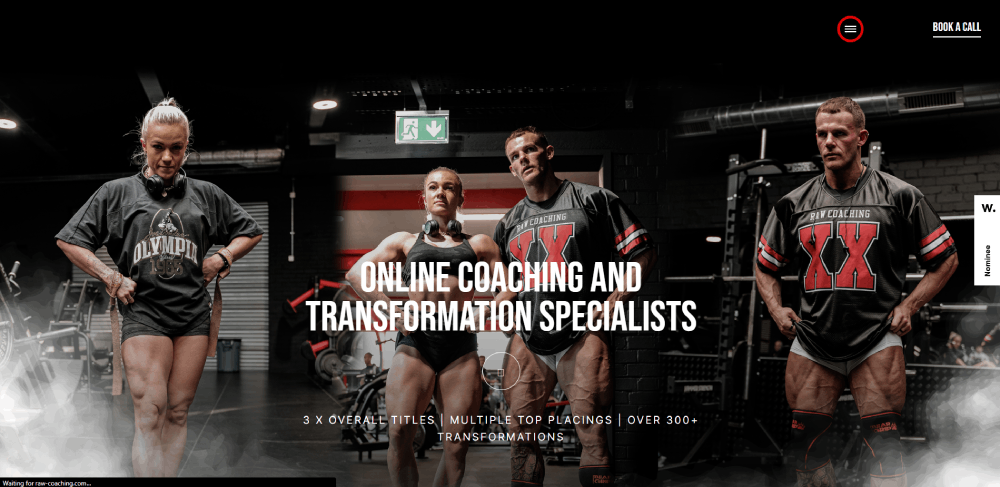
Team and Club Website Designs Worth Studying
Individual team websites face a different challenge than league portals. They need to serve hardcore fans who visit daily, casual supporters who show up on game day, and ticket buyers who might visit once a year. All in one layout.
The best ones manage this balancing act without feeling cluttered. The worst ones try to put everything on the homepage and end up looking like a newspaper from 2008.
Big-Budget Team Sites vs. Lower-League Designs
FC Barcelona's website is about as media-heavy as they come. Full-bleed video backgrounds, immersive player profile pages, and a merchandise store that's woven into the content experience rather than tucked away in a separate section. It's clearly expensive to build and maintain.
Manchester City takes a cleaner approach. The site reads more like a digital magazine, with editorial-style layouts, generous white space, and a focus on long-form storytelling alongside match coverage. It feels less like a sports hub and more like a branded publication.
The Golden State Warriors' site is interesting for a different reason. The e-commerce integration is tight. Jersey customization tools, seat selection maps, and merchandise recommendations all live within the same browsing experience as scores and news. That's a good UX decision because it eliminates the friction of sending fans to a separate store domain.
Then there are the smaller clubs. An MLS expansion team or a League Two side in England doesn't have the budget for a custom CMS with real-time data feeds. Many use WordPress with off-the-shelf sports website templates and still manage to look professional.
The gap between big and small is narrowing. Template builders have gotten good enough that a semi-pro club can have a responsive, mobile-friendly site with fixture lists and a ticket integration for under $500 in annual costs. Five years ago, that wasn't possible.
Sports Media and News Website Designs
Sports media sites deal with a design problem that most other websites don't face: overwhelming volume. ESPN alone publishes hundreds of pieces of content daily across dozens of sports. The design has to organize all of that without making the page feel like a firehose.
ESPN's Information Architecture
ESPN.com pulls in 259.98 million monthly visits in the U.S. alone, according to Semrush data from early 2026. That traffic puts it well ahead of any other sports property.
The homepage uses a dense, multi-column layout that would feel claustrophobic on most websites. But it works for ESPN because the audience expects density. They're scanning for their sport, their team, their game. The website layout is built for fast pattern recognition, not leisurely browsing.
Score tickers run persistently across the top. Sport-specific sections stack vertically. Breaking news gets a takeover banner. It's a lot, and it's unapologetically a lot.
The Athletic's Distraction-Free Approach
The Athletic went the opposite direction. Behind its paywall, the reading experience is intentionally stripped down. No sidebar ads. No score tickers. No autoplay videos. Just text, images, and strong typography designed for long reads.
That design philosophy works because The Athletic's business model doesn't depend on ad impressions. Subscribers are paying for depth, so the layout delivers depth without distraction.
It's one of the clearest examples of how minimalistic design can actually be the right call for a content-heavy vertical. Not every sports media site needs to look like ESPN.
Bleacher Report's Mobile-Native Design
Social-first layout. Bleacher Report designs for phones first, social sharing second, and desktop third. The content cards are tall, visual, and built to scroll vertically, just like a social media feed.
Reaction buttons, comment threads, and sharing tools sit alongside every piece of content. The whole experience feels closer to scrolling through Instagram than reading a traditional news website.
This design approach targets a younger demographic. If your audience grew up on TikTok and X (formerly Twitter), the traditional grid layout doesn't resonate the same way.
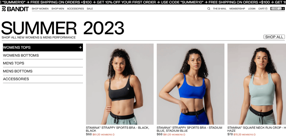
Sports E-Commerce and Merchandise Store Designs
Selling jerseys and gear on a sports website is a different UX challenge than selling shoes or electronics. The emotional attachment is higher. The customization demands are more complex. And the purchase often happens in a context that has nothing to do with shopping. A fan watches their team win, feels the rush, and impulse-buys a championship hat before the confetti even clears.
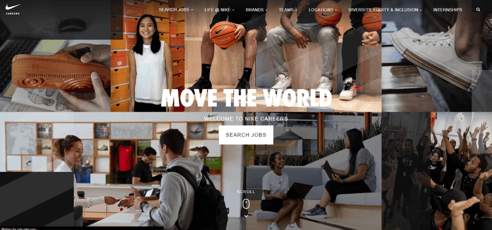
Nike's Athlete-Centric Product Design
Nike.com doesn't just list products. It tells stories through them. A LeBron James shoe page reads like a mini-documentary, with action photography, performance data, and athlete quotes woven around the "Add to Cart" button.
The hero section on Nike's sport-specific landing pages usually features a single athlete in motion, full-bleed, with minimal text overlay. The product is secondary to the emotion. That's a deliberate product website strategy. Make the fan feel something first, then show them what to buy.
Fanatics vs. Single-Team Shops
Fanatics runs the e-commerce backend for the majority of major sports leagues and teams in North America. The catalog is enormous, covering NFL, NBA, MLB, NHL, and college sports merchandise under one roof.
The design challenge: organizing thousands of SKUs across hundreds of teams without the browsing experience becoming a chore. Fanatics solves this with aggressive filtering (team, player, product type, size) and contextual merchandising. If the Lakers just won, Lakers gear moves to the top.
Individual team shops have less inventory but more branding control. A single-team store can drench every page in team colors, build the layout around that season's roster, and push game-day-specific promotions. The color scheme becomes a design feature rather than just a styling choice.
Jersey Customization UX
Customizing a jersey online is one of the trickiest product configuration flows in e-commerce. The buyer chooses a player (or enters a custom name), picks a number, selects home vs. away, and adds patches. Every choice changes the visual preview in real time.
The best implementations use a 3D jersey mockup that rotates as the buyer builds their order. The worst ones show a flat template that doesn't update until checkout. The difference in conversion between those two experiences is significant.
Good form design matters here too. Name fields that reject special characters, number selectors that flag retired numbers, size guides that actually use body measurements instead of S/M/L. Took me forever to figure out why some of these configurators feel so frustrating to use, and it almost always comes down to the form inputs being an afterthought.
Sports Event and Tournament Website Designs
Event websites are temporary by nature. A World Cup site has a shelf life of maybe 18 months. An Olympic Games site might get 2 years of active use. A local marathon's website peaks for 3 months before going dormant until next year.
That short lifespan changes everything about how these sites get designed. There's less room for iteration and more pressure to get the UX right from launch.
Olympic and World Cup Sites
The Olympic Games website has to handle multi-sport, multi-venue, multi-timezone complexity that no other sports site comes close to. Dozens of sports running simultaneously, each with their own bracket structures, qualification rules, and medal events.
The 2024 Paris Olympics site used a modular card system that surfaced live events based on the visitor's timezone and followed sports. That kind of personalized content delivery is what separates a good event website from a basic schedule page.
FIFA's World Cup sites lean heavily on bracket visualization. The group stage tracker, knockout bracket, and goal-scoring tables are the backbone of the design. Everything else (editorial, ticket info, venue details) orbits around that central tournament structure.
Bracket and Tournament Tracker Design Patterns
Horizontal brackets work on desktop but collapse poorly on mobile. Most modern tournament trackers use a vertically stacked format on phones, with expandable matchup cards that show scores, times, and venue info.
The best bracket designs I've seen do three things well:
- Show completed matches with final scores and winning team highlighted
- Display upcoming matches with countdown timers or local kick-off times
- Let users tap into any matchup for a deeper stats view without leaving the bracket page
Some interactive websites now let users fill in their own predictions alongside the actual bracket. That kind of engagement feature turns passive viewers into active participants, which is the whole point of a tournament tracker.
Local Event and Race Sites
Marathon and triathlon websites have simpler structures but often struggle with registration UX. The sign-up flow for a local 10K shouldn't feel like filing taxes, but many of them do.
The standout race sites keep the registration form short (name, emergency contact, t-shirt size), surface the route map prominently, and clearly display pricing tiers with cutoff dates. A well-designed event landing page for a race typically converts better when the registration button sits above the fold alongside the event date and location.
Sponsor logos are another design headache for event sites. Too many sponsors crammed into a footer or sidebar can tank the visual quality of the entire page. The cleaner approach: a dedicated sponsors section with a consistent logo grid, separated from the core event content.
Fantasy Sports and Betting Platform Designs
Fantasy sports platforms face a design challenge that most websites never deal with: showing massive amounts of data without making the user feel lost. Player stats, projections, lineup builders, live odds, and leaderboard rankings all compete for screen space.
Grand View Research valued the global fantasy sports market at $24.85 billion in 2024, growing at 15.2% annually. That kind of money means the UX has to convert casual fans into paying users, fast.
DraftKings and FanDuel Dashboard Layouts
DraftKings keeps its lobby organized by sport, contest type, and entry fee. The dashboard uses a card-based layout where each contest is a self-contained unit with all the info needed to decide: entry cost, prize pool, spots remaining, start time.
FanDuel takes a slightly cleaner route. Fewer visual elements per screen, more white space between contest cards, and a stronger emphasis on guided entry flows for newer players.
Mordor Intelligence data shows mobile apps accounted for 76.7% of all fantasy sports activity in 2024. Both platforms clearly design for thumbs first, keyboards second.
Data Visualization for Player Stats
| Platform | Stat Display Style | Standout Feature |
| DraftKings | Tabular with sparkline charts | Micro-betting integration |
| FanDuel | Card-based player profiles | Guided lineup builder |
| ESPN Fantasy | Traditional roster grid | Deep historical comparisons |
| PrizePicks | Simplified pick interface | Minimal research required |
PrizePicks ranked 8th on Deloitte's 2024 Technology Fast 500, largely because its simplified UX removed the complexity barrier that keeps casual fans away from traditional fantasy platforms.
Responsible Design Elements
Cool-off timers, deposit limits, and session duration warnings are no longer optional features. Regulators in most U.S. states now require them.
The design question is whether these elements feel like genuine safeguards or legal checkboxes. The better implementations (FanDuel's self-exclusion flow, for instance) integrate these tools into the settings menu without burying them under three layers of navigation.
Sports Website Design Patterns That Actually Work
Some design patterns show up across every strong sports website regardless of the sport, the league, or the budget. These aren't trends. They're functional solutions that survived years of testing across billions of page views.
Score Ticker and Live Update Components
Persistent score tickers sit at the top of almost every major sports website. They scroll horizontally on desktop and collapse into a swipeable card strip on mobile.
The design decisions that matter:
- Show only games currently live or recently completed
- Use team colors or logos instead of full team names (saves space)
- Update without requiring a full page refresh
Stats Perform data shows pageviews spike over 100% on major game days. A broken or laggy score ticker during those peaks means lost engagement at the exact moment it matters most.
Dark Mode and High-Contrast Color Systems
Earthweb reported in 2024 that nearly 82% of smartphone users have dark mode enabled. Sports sites adopted this earlier than most industries, and for good reason.
Why dark mode dominates sports design:
- Team colors and photography pop harder against dark backgrounds
- Most fans check scores in the evening or in dimly lit rooms
- Video thumbnails and highlight clips look better without white chrome around them
Netflix and Spotify locked into permanent dark themed interfaces for similar reasons. The visual content does the talking, and the UI steps back. Same logic applies to sites like NBA.com.
Schedule and Fixture Display Patterns
Three common approaches, each with trade-offs:
Calendar view: Good for season-long planning. Bad on mobile because month grids get tiny.
List view: Works everywhere. Scrolls well on phones. Lacks visual density for fans who want the big picture.
Card layout: Each game gets its own block with teams, time, venue, and broadcast info. This is where most modern sports sites have landed because cards are flexible and responsive by default.
The Premier League site uses a hybrid, starting with a list view that expands into match cards on click. That kind of progressive disclosure keeps the initial page weight low while giving fans the depth they want on demand.
Tools and Platforms Used to Build Sports Websites
The tech stack behind a sports website affects everything from page speed to how easily the team can publish content during a live game. The right choice depends on the organization's size, budget, and how much real-time data the site needs to handle.
WordPress for Smaller Sports Organizations
W3Techs data shows WordPress powers 43% of all websites on the internet. Its CMS market share sits at roughly 61%.
For a local sports club, a youth league, or a college athletics department, WordPress with a sports-focused theme is usually the fastest and cheapest path to a professional website. Plugins handle fixture lists, player profiles, and even basic live scoring.
Squarespace and Wix work too, though with less flexibility for custom data displays. If the site mostly needs schedules, news posts, and a ticket link, those responsive website templates do the job.
Headless CMS for Larger Properties
Contentful: API-first content management that lets front-end teams build custom interfaces while editors manage content in a familiar dashboard.
Sanity: Real-time collaborative editing with a flexible schema, which matters when multiple editors are publishing simultaneously during a game.
Strapi: Open-source headless option that's gained traction with mid-size sports media sites that want the flexibility without the SaaS cost.
The headless approach separates content from presentation. That's a big deal for sports properties that publish the same content across web, mobile apps, and in-stadium displays. One content entry, multiple outputs.
Real-Time Data Providers
Live scores and player stats don't come from nowhere. Behind the scenes, data providers like Sportradar, Opta Sports, and Data Sports Group feed structured JSON or XML to sports websites in real time.
| Provider | Coverage | Best For |
| Sportradar | 60+ sports globally (Official Data) | Enterprise betting operators, league-level hubs, broadcasters |
| Opta (Stats Perform) | 30+ sports; deep soccer & cricket focus | Performance analytics, AI-driven storytelling, media publishers |
| Data Sports Group | 80+ sports; 5,000+ competitions | Plug-and-play widgets, niche sports, Olympic/World Cup hubs |
| SportsDataIO | North American major leagues (NFL, NBA, MLB) | Fantasy platforms, predictive markets, fan engagement apps |
Choosing a data provider is one of the first decisions any sports site builder needs to make if they want live updates. The cost ranges from a few hundred dollars a month for basic feeds to six-figure annual contracts for full play-by-play coverage. The web design tools you pick for the front end need to support real-time data ingestion, or those feeds are worthless.
Performance and CDN Choices
Sports websites face traffic spikes that would crash most standard hosting setups. A playoff game or a transfer deadline can multiply traffic by 5x or 10x within minutes.
Cloudflare handles CDN distribution for many of the largest sports properties. Its edge caching keeps static assets close to users, which is critical when fans across dozens of countries are refreshing the same page simultaneously.
Google's research found that 53% of mobile visitors leave if a page takes more than 3 seconds to load. During a live game, that patience drops even further. Speed isn't a design preference. It's the foundation everything else sits on.
Common Mistakes in Sports Website Design
Looking at what works is useful. Looking at what fails is faster. These are the patterns that keep showing up on sports websites that underperform, and most of them are avoidable with basic planning.
Homepage Overload
The temptation to put every sport, every league, and every team on the homepage is real. And it almost always backfires.
A homepage that tries to serve NFL, NBA, MLB, NHL, and college sports fans simultaneously ends up serving none of them well. The scanning load becomes too high. UserGuiding data shows 73% of readers skim content pages, so if the homepage doesn't surface relevant content within 2-3 seconds, the visitor bounces.
ESPN gets away with density because of brand recognition and years of user conditioning. A newer sports site trying the same approach will just look cluttered. Start narrow. Expand as the audience grows.
Auto-Playing Media Without Consent
Nothing annoys me more than landing on a sports site and getting hit with a video I didn't ask for. Audio blasting. Data burning on mobile. It's a guaranteed way to lose a visitor.
The better approach: thumbnail with a play button. Let the user choose. YouTube embeds handle this correctly by default, which is why most sites with video backgrounds that work well use muted autoplay at most, never audio autoplay.
Ignoring Accessibility
AudioEye reported that ADA lawsuits hit 8,800 filings in 2024, a 7% increase year-over-year. WebAIM's 2025 analysis found that 94.8% of homepages still have at least one detectable WCAG failure.
Sports sites are especially vulnerable because they rely heavily on:
- Color contrast for team branding (which often fails WCAG minimums)
- Images without alt text (player photos, infographics)
- Complex navigation menus that screen readers can't parse
Building accessible websites isn't just a legal issue. About 1.3 billion people worldwide live with a disability. That's a huge chunk of the potential sports audience that gets locked out when contrast ratios are wrong and keyboard navigation doesn't work.
Poor Mobile Navigation
A sports site with 15 top-level menu items and no clear hierarchy on a 375px screen is asking for trouble. StatCounter data puts mobile at over 62% of global web traffic. On sports sites, that ratio tilts even higher during live events.
The fix isn't complicated. Collapse secondary items behind a hamburger or bottom tab bar. Keep the primary actions (scores, schedule, tickets) always visible. Test with actual thumbs, not just mouse cursors. A clean website menu matters more on sports sites than almost any other category because the navigation needs change depending on whether the user arrives on a game day or an off day.
FAQ on Sports Website Design
What makes a good sports website design?
A good sports website prioritizes fast load times, real-time score updates, and mobile responsiveness. High-contrast visuals, clear navigation, and team branding integration are baseline requirements. The layout should let fans find scores, schedules, and tickets within seconds of landing.
Which sports websites have the best design?
NBA.com, NFL.com, PremierLeague.com, and The Athletic consistently stand out. Each solves the same problem differently. NBA.com leads with video and dark mode. The Athletic focuses on distraction-free reading behind its paywall.
Why do most sports websites use dark mode?
Dark backgrounds make team colors, action photography, and video thumbnails pop visually. Most fans check scores in the evening or on phones. Dark mode reduces eye strain and saves battery on OLED screens, which matters during long game sessions.
How do sports websites handle live scores?
Most use persistent score tickers powered by data providers like Sportradar or Opta. These tickers update via API without requiring a full page refresh. On mobile, they typically appear as swipeable card strips at the top of the screen.
What CMS do sports websites use?
Smaller clubs and local leagues typically run on WordPress with sports-focused themes. Larger properties like league and media sites use headless CMS platforms such as Contentful or Sanity, which allow content publishing across web, apps, and stadium displays simultaneously.
How important is mobile design for sports websites?
Critical. Over 62% of global web traffic comes from mobile devices, and sports sites skew even higher during live events. Fans check scores on their phones at stadiums, on couches, and during commutes. Mobile-first design is the starting point, not an afterthought.
What design patterns work best for fantasy sports platforms?
Card-based contest lobbies, simplified lineup builders, and clear data visualization for player stats. Platforms like DraftKings and FanDuel organize by sport, entry fee, and contest type. The trend is toward reducing complexity to attract casual fans.
How do sports e-commerce sites differ from regular online stores?
Sports merchandise stores deal with higher emotional attachment and more complex product configuration. Jersey customization (name, number, patches) requires real-time visual previews. Purchase decisions are often impulse-driven by game outcomes, so the path from homepage to checkout must be short.
What are common mistakes in sports website design?
Homepage overload with too many sports at once, auto-playing videos with sound, poor mobile navigation, and ignoring accessibility standards. These issues directly increase bounce rates and alienate users who need fast, focused access to scores and content.
How do sports event websites differ from team websites?
Event sites like those for the Olympics or World Cup are temporary and built around a tournament structure. They prioritize bracket tracking, schedules, and countdown timers. Team websites are permanent and balance daily news, merchandise, ticketing, and fan engagement year-round.
Conclusion
The sports website design examples covered here share a common thread: they all prioritize speed, real-time data delivery, and mobile usability over decoration. From NFL.com's game-day layout shifts to PrizePicks' simplified fantasy interface, the winners are the sites that respect how fans actually behave.
Dark mode, responsive score tickers, and card-based fixture displays aren't aesthetic choices. They're functional responses to an audience that checks scores at halftime on a phone screen.
The tools matter too. WordPress handles local clubs well. Headless CMS platforms like Contentful and Sanity power the larger properties. And data providers like Sportradar keep everything updating in real time.
Start with your audience's pace. Build the sports web design around that, and the layout decisions get a lot simpler. Skip accessibility and page speed, and nothing else you build will matter.


