


How to Uninstall WordPress And Reinstall It Safely
June 19, 2024
The Best B2C Website Design Examples to Inspire
June 20, 2024Ever found yourself staring at an online map, wondering how it fits so seamlessly into a web page? Adding a responsive Google Maps widget to your site can elevate your user experience, transforming mundane location information into an interactive, mobile-friendly journey.
Context is everything in today’s digital landscape. With users demanding dynamic map integration and geo-location services, embedding a Google Maps widget tailored to both desktop and mobile users is crucial. Let’s face it: a static map just doesn’t cut it anymore.
Imagine the possibilities: pinpointing addresses with a stylish, custom Google Maps iframe or offering seamless navigation with just a few lines of code. Whether you're enhancing user engagement or optimizing for front-end development, this guide is your ultimate toolkit.
By the end, you'll master embedding a responsive map, utilizing Google Maps API, and tweaking CSS for your unique design. Ready to transform your site’s web optimization prowess? Let's dive in and make those maps come alive!
Why Responsive Google Maps?

Google Maps are very familiar, but the term responsive is largely unknown, and it is important to know what it means. If something is called responsive, we expect a complete performance based on user’s behavior and an environment that will work regardless of the screen size, platform, or device type.
A responsive widget works with the same, high standard of quality, whether it’s accessed by your phone, laptop, or computer.
However, the website actually needs to adapt to these various settings and resolutions utilizing the CSS design and the concept of flexible grids and layouts. Your site should automatically adapt to the changes in the device, so the site should work if you try to access it from your phone and then go to your iPad or computer.
The website needs to adapt to the user’s changes. It is crucial for the website to do so in order to prevent various site versions and different design phases. Responsive Google Maps are no different, and in many cases, they can be a vital part of a website.
How to Add a Responsive Google Maps Widget to Your Site With Code
Embed the Map
The first step is to add the maps to your site and embed them, which will allow the widget to appear. This process is easy and only takes a few simple steps. You can opt to do it manually, however this does not yet mean that the maps will be responsive.
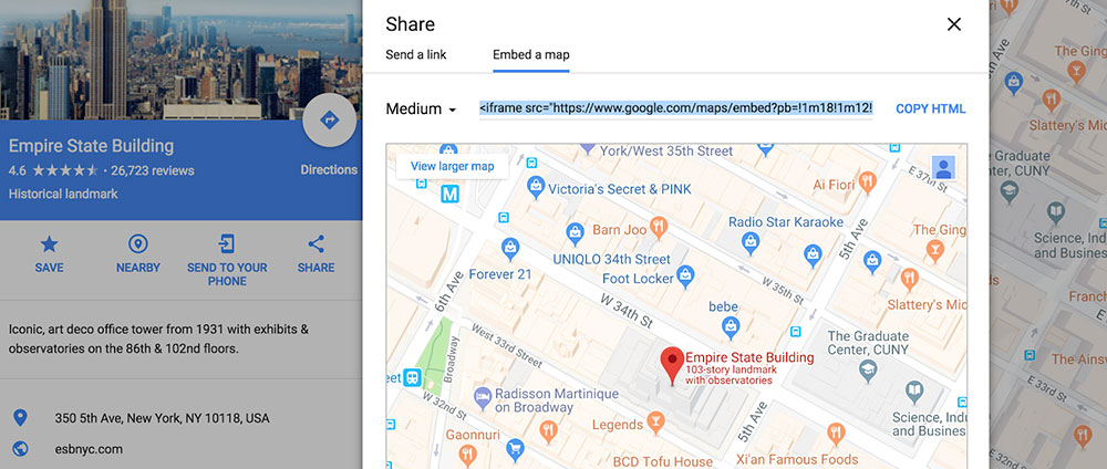
- Go to Google Maps, enter the location
- Click search
- On the right-hand side, click on Share
There you will find the embedded code. Copy the Embed code, and it should look something like this (this is the default embed code for Google Maps)
<!-- Height=450px; Width=600px -->

<iframe src="https://www.google.com/maps/embed?pb=!1m14!1m12!1m3!1d7098.94326104394!2d78.0430654485247!3d27.172909818538997!2m3!1f0!2f0!3f0!3m2!1i1024!2i768!4f13.1!5e0!3m2!1sen!2s!4v1385710909804" width="600" height="450" frameborder="0" style="border:0"></iframe>
Add the Map in WordPress
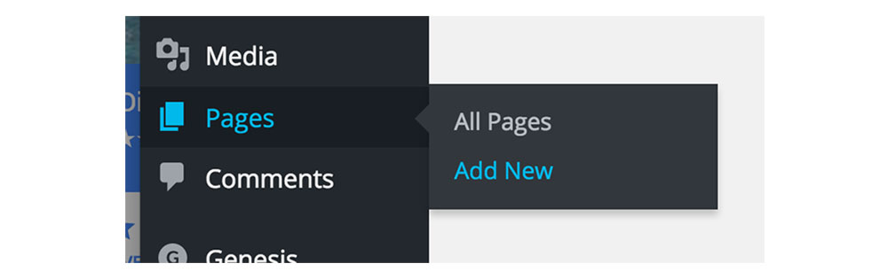
The next step is to add the map within WordPress.This is very easy and you will have to edit a post or a page. Adding the maps to the specific pages works for most people, especially if it is a page where the user talks about their location. Add it this way:
Go to Posts > Add or Pages > Add
Next, open the HTML editor in text code and add the embedded code where you want the map to be displayed.
Click on Save Draft, then Update, and Publish whenever you are ready.
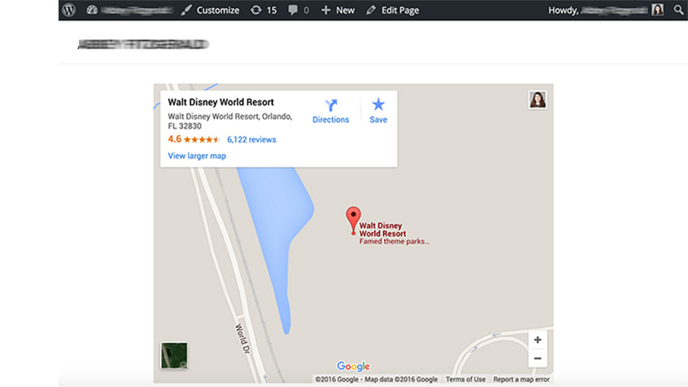
Now you should see the map on your page or site however the process is not yet complete, as we also need to make it responsive. If the maps are not visible, check twice if you made any mistakes with the code.
Making the Map Responsive
You have your maps and you can now make them responsive. This is desirable to enable a better user experience and show the map from wherever it is viewed, and from whichever device. Responsive Google Maps are important for your site.
At the moment, the default size of the embedded maps is 450px, which is 75% of the default width at 600px. It is specified so within the embedded code.
To make the maps responsive, you will have to change a few codes of your CSS design. This includes adding a couple of rules to your CSS code and wrapping the IFRAME inside the rules.
This is an example of the responsive Google Maps CSS code. You can freely change the value of the aspect ratio with changing line #4 (padding-bottom). Here is the code:
<style>

.google-maps {

        position: relative;

        padding-bottom: 75%; // This is the aspect ratio

        height: 0;

        overflow: hidden;

    }

.google-maps iframe {

        position: absolute;

        top: 0;

        left: 0;

        width: 100% !important;

        height: 100% !important;

    }

</style>


<div class="google-maps">

<iframe src="https://www.google.com/maps/embed?pb=!1m14!1m12!1m3!1d7098.94326104394!2d78.0430654485247!3d27.172909818538997!2m3!1f0!2f0!3f0!3m2!1i1024!2i768!4f13.1!5e0!3m2!1sen!2s!4v1385710909804" width="600" height="450" frameborder="0" style="border:0"></iframe>

</div>
This will make the maps responsive, and means they will adapt to various screen sizes and other different devices.
Adding Responsive Google Maps with Themes
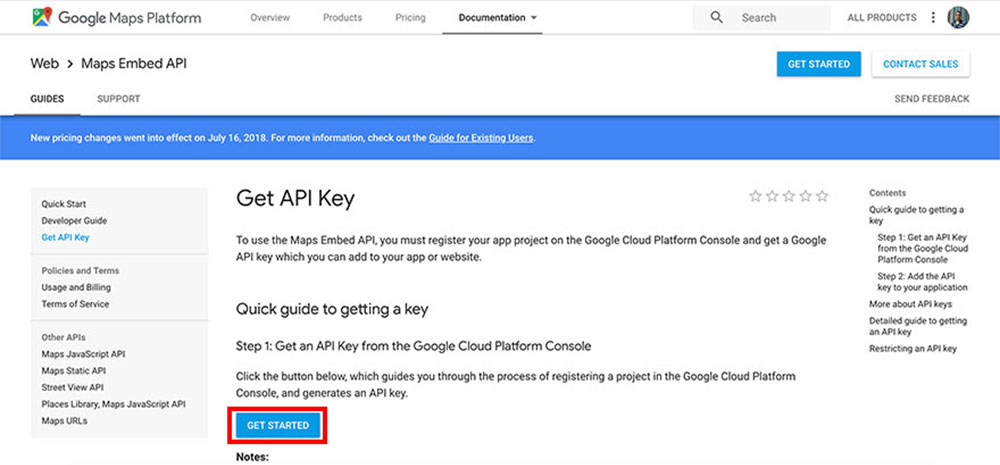
Some themes enable Google Maps to embed very easily, because many users need these maps, and they already have various themes and pre-made designs built-in.. This is good news for those who want responsive Google Maps already embedded however, you will still need a Google API to get the maps to work. The following guide will show how to add responsive Google Maps with themes.
Begin the API process on the Google website.
- Click on Get Started (the blue button).
- In the top left, select the menus indicated by three lines.
- Click on APIs & Services, and select Credentials.
- Select Create Credentials, then API key.
- Select Restrict Key and choose HTTP referrers.
- Save.
- Copy your API key, paste it into the design options page.
You can now add Google Maps to your theme using the theme design tools. If the theme is responsive, then you will also have your maps responsive.
Using Plugins to Add Responsive Google Maps
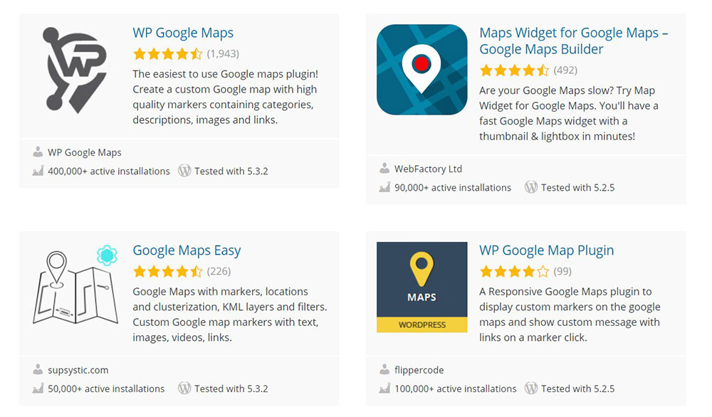
Plugins are a very easy way to add responsive Google Maps to your site, if you don’t want to change the code, or if your theme doesn’t offer the implementation.
In addition to adding the Google Maps, these plugins will also enable you to create a filterable store locator, and display posts or custom post types on your map.
They are user-friendly because they use shortcodes.
This is how to add maps with plugins:
- Go to WordPress, go to Plugins, click on Add New.
- Look for Google Maps, and select the plugin.
- Enable it with plugins, go to Settings.
- Where you want to add the map, you can add the plugin.
These maps will still need the Google API to work properly, so make sure you take care of that first.
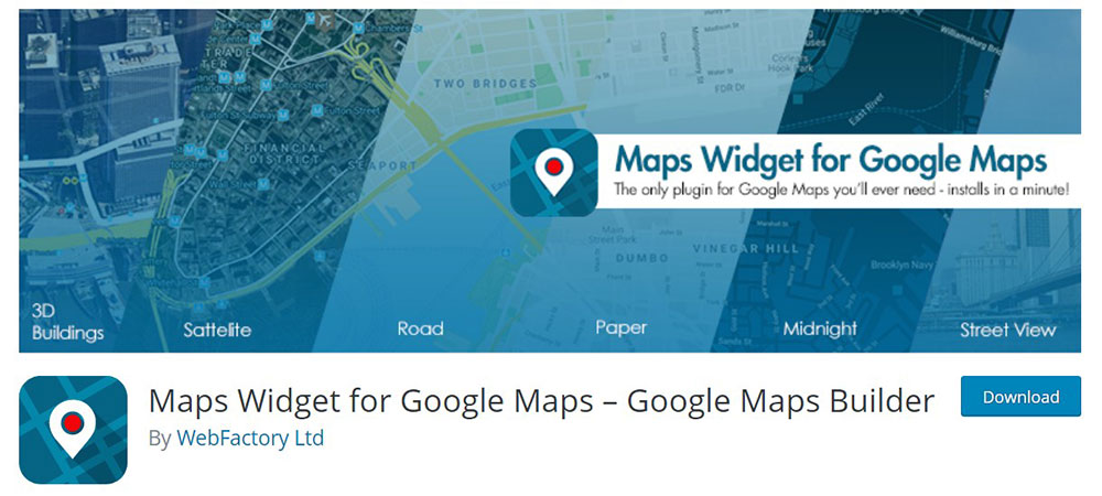
Some recommended WordPress Google Maps plugins are:
WP Google Map Plugin
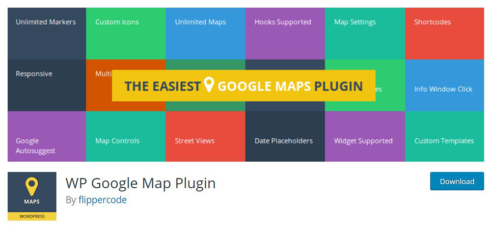
This plugin is full of features and functionalities.
FAQs about responsive Google Maps
How can I embed a responsive Google Maps widget on my website?
To embed a responsive Google Maps widget, get your Google Maps iframe code. Wrap it in a div with a class to handle your responsive styles via CSS. Use media queries to ensure the map scales appropriately across different devices, ensuring a mobile-friendly experience.
What’s the easiest way to add Google Maps to my site?
The simplest method involves the Google Maps API. Generate an embed map code directly from Google Maps, then copy-paste it into your website's HTML. This provides a quick, interactive solution for front-end development without heavy coding.
How do I make the Google Maps widget mobile-friendly?
To ensure mobile-responsive design, use CSS to set percentages for the map container. Utilize media queries to adjust the map’s dimensions on smaller screens. This approach guarantees mobile optimization for a seamless user experience on smartphones and tablets.
Can I customize the look of my Google Maps widget?
Yes, you can style your custom Google Maps using the Google Maps styling feature. Utilize different controls, themes, and colors to align the map with your site's design. This level of map customization enhances the overall visual appeal.
Is it necessary to use the Google Maps API?
Not always. While the Google Maps API offers deeper customization and functionality, simpler methods like using an iframe via the map's share feature can suffice for basic needs. For customization and interactive elements, the API is invaluable.
How do I get an API key for Google Maps?
Visit the Google Cloud Platform Console, create a new project, and navigate to the Credentials page. Generate an API key for the Google Maps API, and integrate it into your embed code. Detailed instructions are available on Google’s documentation.
What if the Google Maps widget is not loading?
Check for issues with your API key or embed code. Ensure you have the necessary permissions and quotas on the Google Cloud Platform. Sometimes the problem may be a blocked script, so verify if your site blocks external JavaScript.
How do I add multiple markers on a Google Maps widget?
Multiple markers require using the Google Maps JavaScript API. Initialize the map, then add markers with their respective latitudes and longitudes. This feature is beneficial for showcasing various locations, like multiple store branches on a single interactive map.
Is it possible to add interactive directions to the Google Map?
Yes, use the Directions service within the Google Maps JavaScript API. This involves more coding, but it enables you to provide turn-by-turn navigation and enhanced interactive directions, enriching the user experience on your site.
Can I embed Google Maps without coding knowledge?
Definitely. Use platforms like Google Maps' share feature to generate an iframe code. Copy and paste this directly into your HTML editor. Even without coding expertise, you can embed a responsive map widget, enhancing your site’s digital mapping capabilities.
Conclusion
By now, you've seen firsthand how transformative it can be to add a responsive Google Maps widget to your site. Interactive maps aren’t just a pretty feature; they significantly enhance user experience, making your site more informative and engaging. Whether you're utilizing Google Maps API for sophisticated customization or going the simple iframe route, you’re well-equipped to make your site dynamic and mobile-friendly.
Key takeaways to keep in mind:
- Embedding Google Maps brings essential geo-location services to your audience.
- Custom styling aligns the map with your website's design aesthetics.
- Multiple markers and interactive features enrich user interactions.
Ultimately, mastering this frontend development skill ensures your site is not only visually appealing but also technically robust. From HTML embedding to leveraging CSS for a responsive design, your website is now ready to host an engaging, mobile-optimized Google Maps widget.
Embrace these steps and watch your digital map integration elevate your site to new heights.
If you enjoyed reading this article about responsive Google Maps, you should read these as well:


