Freelancers, Don’t Forget These Tips If You Want to Land New Clients
September 7, 2016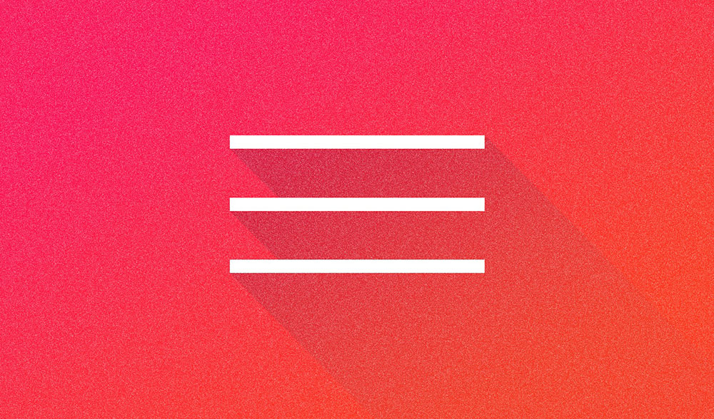
Trends in Pre-Built Websites: The Hamburger Menu
September 20, 2016Minimalist design is not a new concept. Minimalism has been in vogue in various areas of art, design, and architecture for years. It has only appeared recently in web design as a design trend, and consequently, it is often looked upon as being a new and modern trend. While the concept has been practices for many years, the look is definitely a modern one.
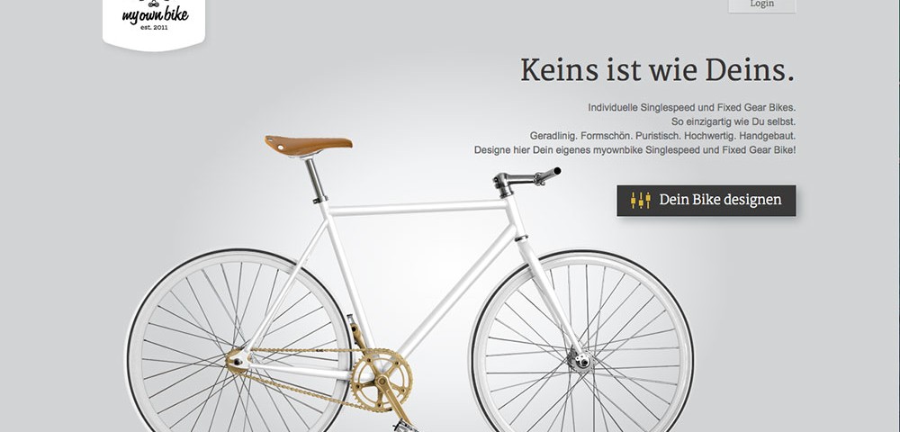
Minimalism is one of several modern design trends put into play when designing pre-built websites. It focuses on using only those elements necessary for functionality and usability. Navigation buttons, footers, and the like are typically kept in the background, or their presence is muted.
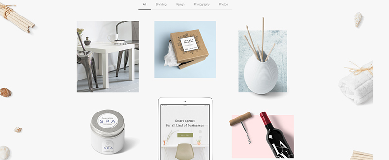
Even though it is often characterized by simple lines and a generous use of whitespace, minimalist design can be a challenge, and often requires a great deal of skill to produce a professional-looking, engaging minimalist pre-built website.
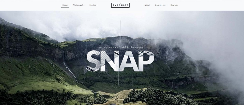
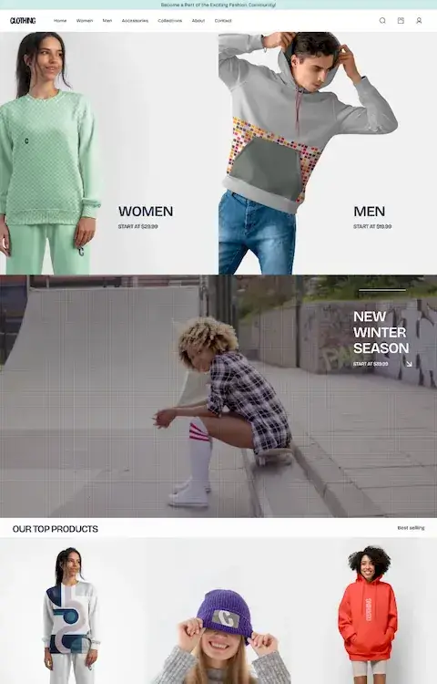
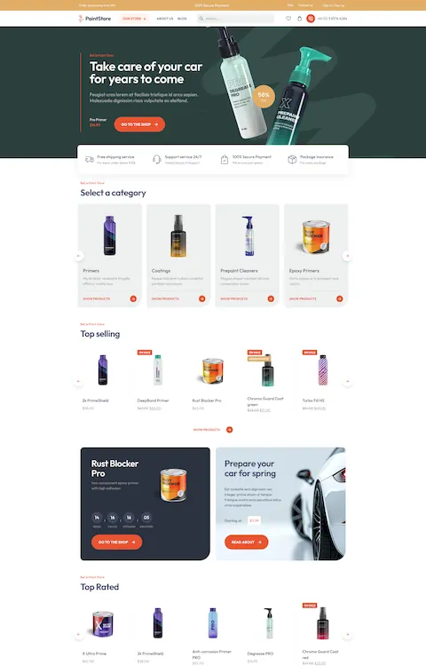
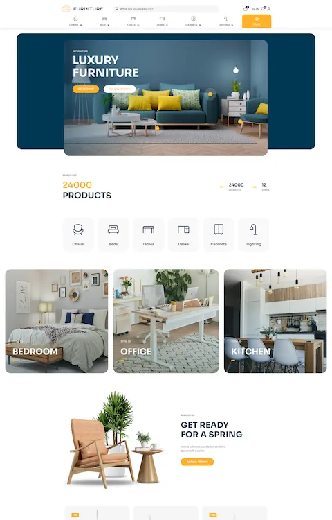
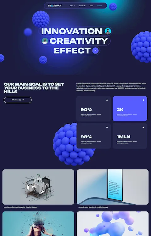
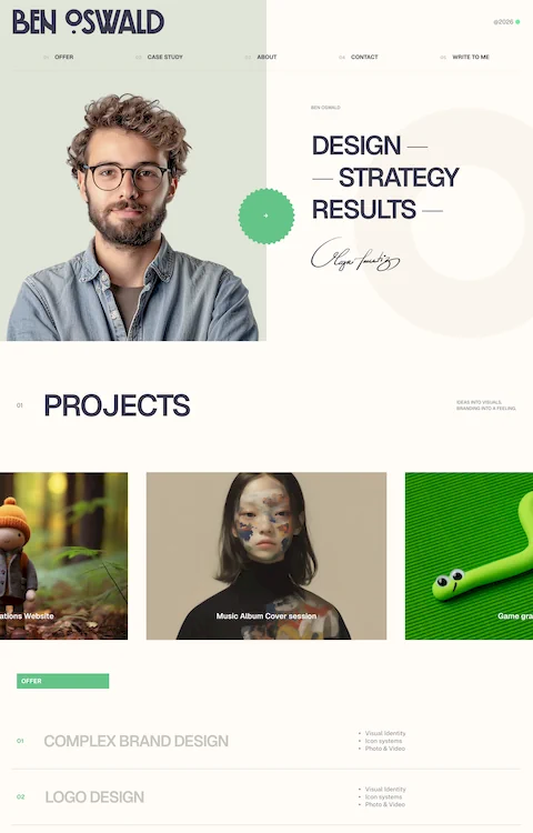
This Be Theme pre-built website is an elegant example of a minimalist portfolio.
The Benefits of Minimalist Web Design
- The design elements surrounding the content, draw user attention to the content. Even if a design element only consists of white space, it still focuses on the content; a primary objective of minimalism.
- Simple objects, or fewer objects, makes responsive design easier. The fewer elements there are to work with, the less there are that will require shrinking or stretching.
- Speed. The smaller the number of elements that require loading, the faster a page can load.
The Principles of Minimalist Web Design
- Less is more – The goal of minimalism is to achieve more with less. By doing so, the aforementioned benefits, focus, responsiveness, and speed, are more readily realized.
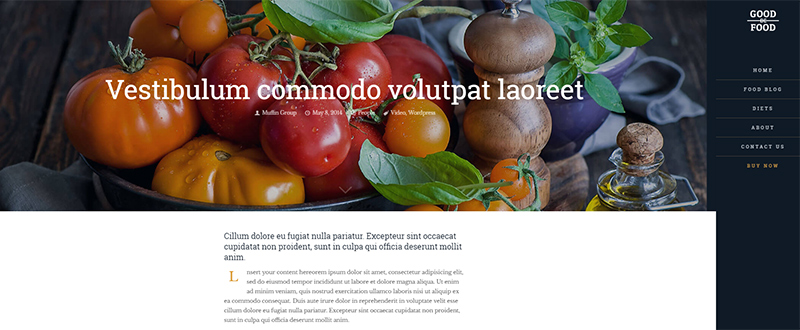
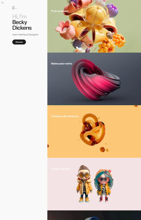
Only the essentials – nothing more, on this article page.
- Stick to the essentials – If a design element isn’t necessary, why use it? Unless usability or readability will be adversely impacted, omit anything that doesn’t directly contribute to your site’s look and feel.
- Omit needless things until it breaks – Try subtracting elements until the design stops functioning the way it is supposed to, both technically, and in terms of usability. You don’t want to remove elements that might make your website less user friendly.
- Every detail that remains is important – That’s the ultimate goal of minimalist design. Every part remaining is vital, and should contribute in some way to the site’s look and feel.
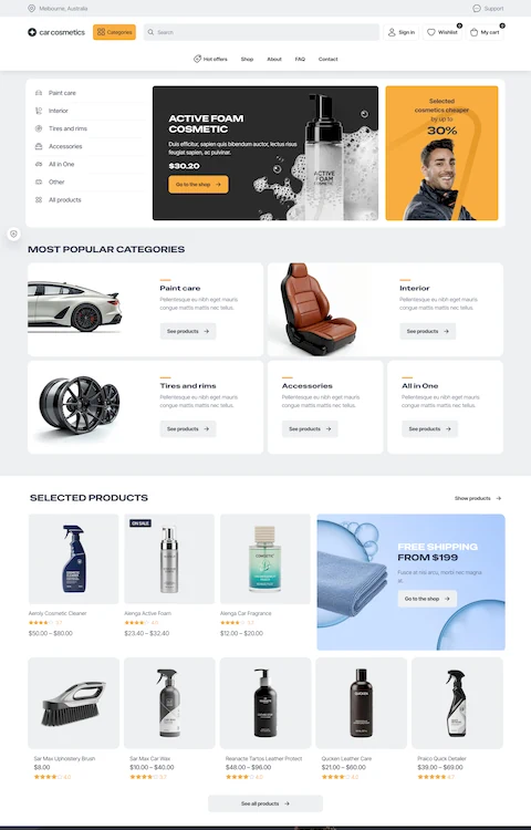
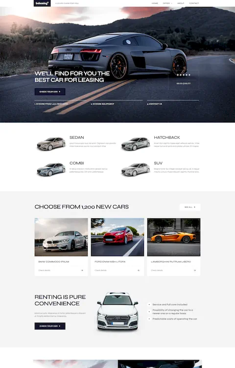
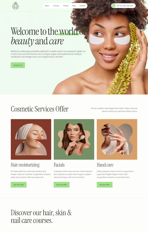
This Be Car web design illustrates the power of a subtle hover effect.
- Color contributes – As the number of design elements in a minimalist design is reduced, color takes on added significance. Any color can be used effectively, but many web designers find a black or grey and white combination particularly engaging.
- White space is the backbone – As curious as it may sound, empty or negative space can contribute just as much as what is left in the design. In the world of minimalist design, white space is as much of a design element as anything else; it is in fact, a key element.
A Brief History of Minimalist Design
Minimalist design has been with us for a long time. It has been practiced by many different designers in various artistic and design arenas. Three key areas that deserve attention in order to better understand how minimalism can be applied, are art, architecture, and landscaping.
Art – the De Stijl Art Movement
De Stijl – Dutch for “The Style” had its beginnings around the outbreak of WWI. Early proponents of De Stijl were a painter, Theo van Doesburg, a writer, Piet Mondrian, and an architect, Gerrit Peitveld.
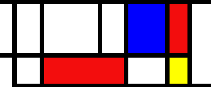
Mondrian’s minimalist sense of simplicity, symmetry, and the use of color.
In all three of these fields, design elements were reduced to pure geometric forms and primary colors. This reduction of form and color to create simplicity, and the less is more effect, have influenced this type of design to this day. The “modern” minimalist design example shown above was created nearly a century ago.
Architecture – van der Rohe, and others.
Ludwig Mies van der Rohe ranks with Frank Lloyd Write as a pioneer of modern architecture. A contemporary with the Dutch minimalist masters, van der Rohe created a new architectural style based on modern materials, such as industrial steel and plate glass, as opposed to the Classical and Gothic architecture styles in vogue at the time. His design concepts took the form of minimal, ordered, structural frameworks, carefully balanced against free-flowing open space. He is associated with the “less is more” quotation and school of thought.
Landscaping – The Japanese Garden
With strong roots in Zen philosophy and aesthetics, a typical Japanese garden can be a perfect example of minimalist landscaping – it is carefully structured, though never symmetrical, and it is never cluttered in appearance.
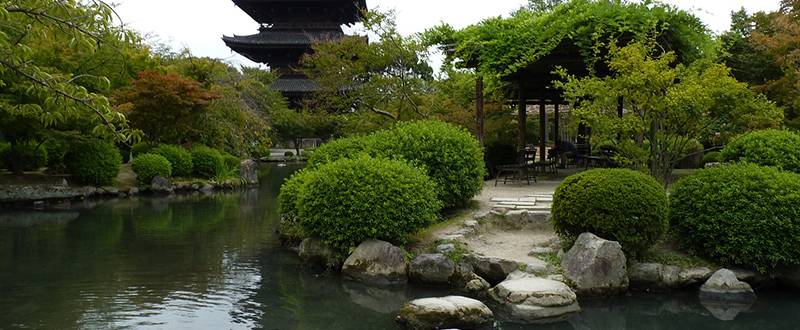
Seven important design principles that can be seen in this garden, and in other Japanese art forms as well. They should be to today’s minimalist web designers:
- Simplicity and the elimination of clutter – Kanso (簡素)
- The use of asymmetry to control balance – Enso Fukinsei (不均整)
- Elegant simplicity, understated, and understandable, without being elaborated on – Shibui/Shibumi (渋味)
- A sense of naturalness and unforced creativity – Shizen (自然)
- Suggesting and implying, rather than revealing, thorugh the use of symbols and subtleties – Yugen (幽玄)
- Freedom from habit, formula, or routine – Datsuzoki (脱俗)
- Tranquility and solitude, as opposed to distraction and disturbance – Seijaku (静寂)
Main Features of Be Theme
It is easy to see how minimalist design principles have been effectively put into play in Be Theme’s 210+ pre-built websites, one of the major core features that make up this, the largest WordPress theme ever.
- These pre-built websites take but one click to install, they are completely customizable, and key UX functionality is embedded in them. They cover most of the commonly used business themes, plus a number are dedicated to blogs, portfolios, one page websites, and other special uses.
- Page and website building is fast and easy, thanks to the drag and drop Muffin Builder, Be’s Admin Panel with its wealth of options, and the Shortcode generator, which eliminates any need for coding.
- If you choose to start your design from a blank canvas, the Layout Configurator, plus a variety of grid structures and 20 customizable header styles, allows you to incorporate your design ideas nearly as quickly as you can think of them.
- Be is responsive, retina, WPML, and RTL ready. It is SEO optimized, and optimized for speed.
- Other core features include parallax effect and video background, unlimited colors, and advanced typography. User support is excellent, and you will receive free lifetime updates.

