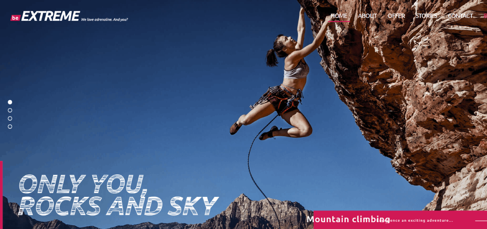
Jaw-Dropping Sports Website Design Examples
June 21, 2023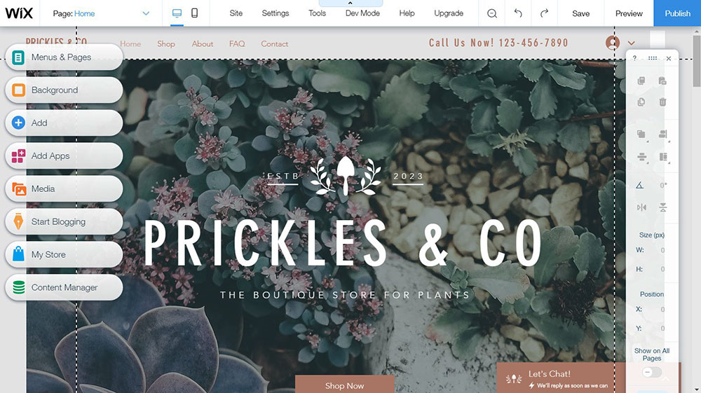
Wix or WordPress: What to Build Your Website With
September 2, 2023Alright, so let's get this straight. When we're talking about b2b website design, we're diving into a world where businesses chat with other businesses. It's not your everyday online shopping spree. It's more like... a sophisticated dance between professionals.
Imagine a room full of business pros, all dressed to impress. Now, your website is like the stage they're dancing on. It's gotta be top-notch, right? Not just pretty, but also smart. It's gotta speak to the big bosses, the managers, and even the interns. And it's gotta do it without missing a beat.
Why? Because in the b2b world, the dance goes on for a while. There are multiple steps, turns, and twirls. Your website? It's the lead dancer, guiding prospects through this intricate dance, making sure they stay engaged.
And hey, it's not just about looking good. It's about feeling good too. A well-thought-out b2b website design can boost your audience vibes and even make your site pop up more on search engines. And you know what that means? More eyeballs, more interest, and more chances to make that sale.
Now, if you're looking for some real-world inspo, I've got you covered.
Check out these rockstars of the B2B website design world
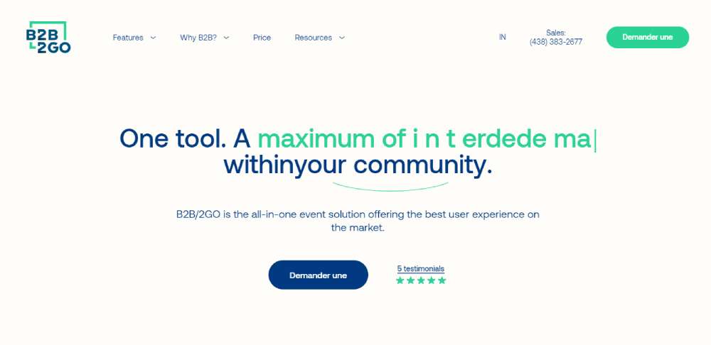
B2B/2GO
Think of it as the ultimate event hub. All things events, all in one place.
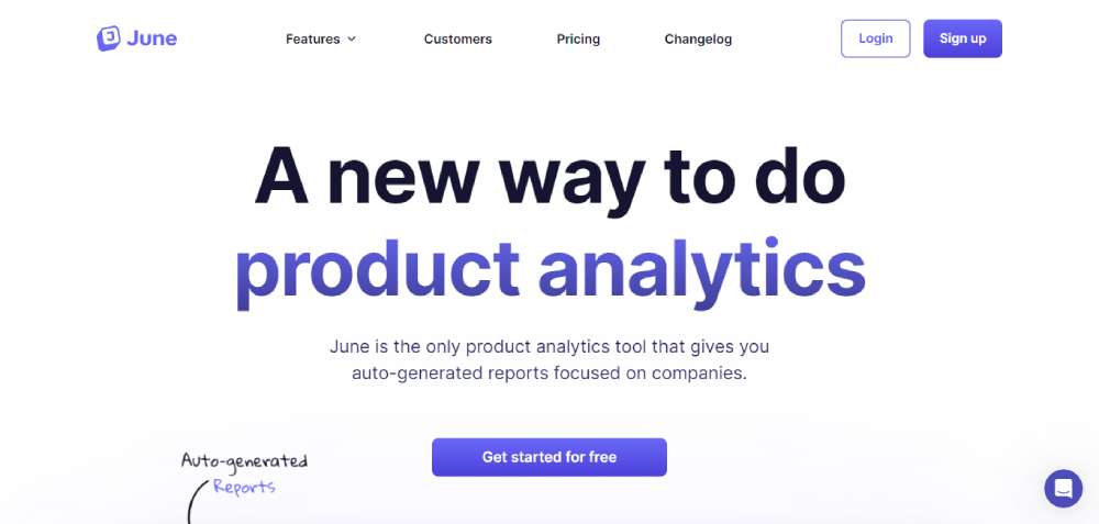
June
June's got the deets on product analytics for B2B SaaS. It's like having a super-smart buddy who gives you insights in a snap.
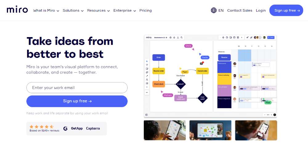
Miro
Okay, so you know those CTAs (Call to Actions) on websites? They're kinda like the main event. Miro nails it with a standout purple button, making it super easy for visitors to know what's up.
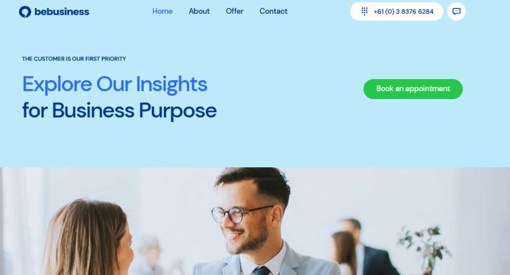
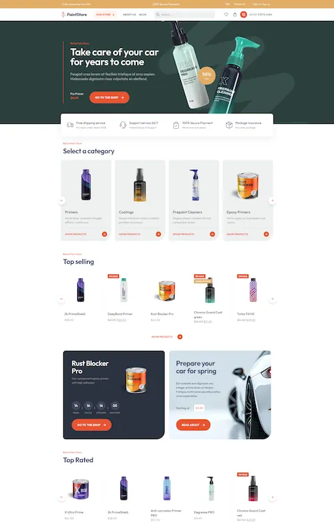
BeBusiness7
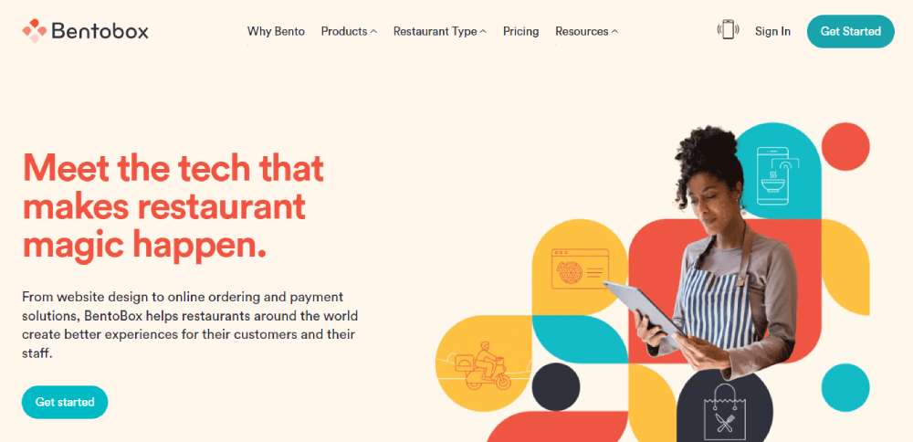
Bentobox
Bentobox is all about that minimalist life. No fluff, just straight-up info. It's a breath of fresh air in a world where some b2b sites just throw everything at you.
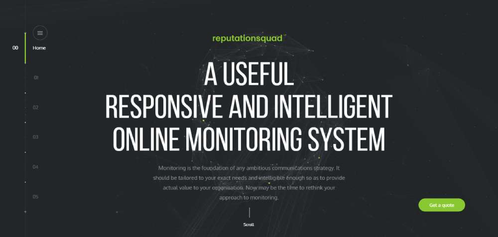
Reputation Squad
Ever wanted a sneak peek into the future? Reputation Squad gives you that vibe. Their site is like a journey into tomorrow, with dynamic backgrounds and super-readable content.
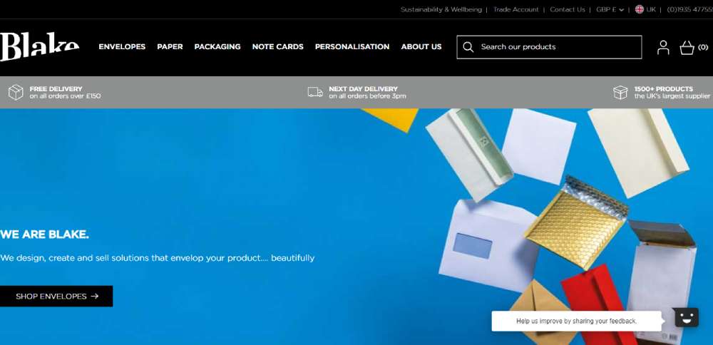
Blake Envelopes
Blake's site is a visual treat. It's lively, colorful, and showcases their top-tier products in style. It's like they've sprinkled a bit of magic to make even the most ordinary products come alive.
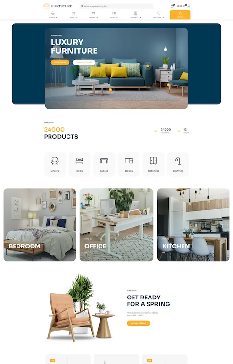
BeBusiness6
Square
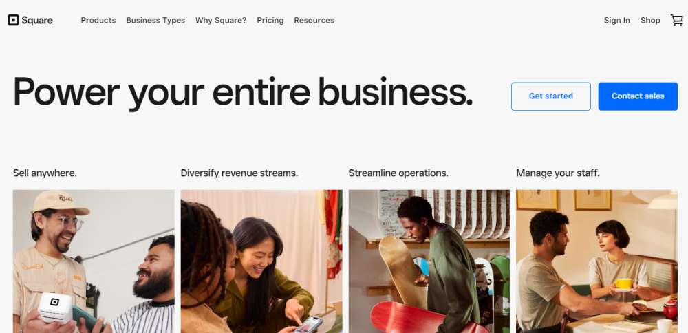
Imagine walking into a room and knowing exactly where everything is. That's Square for ya. Super clean, no fuss, just straight to the point. It's like they've decluttered the digital space for you.
Clearbit
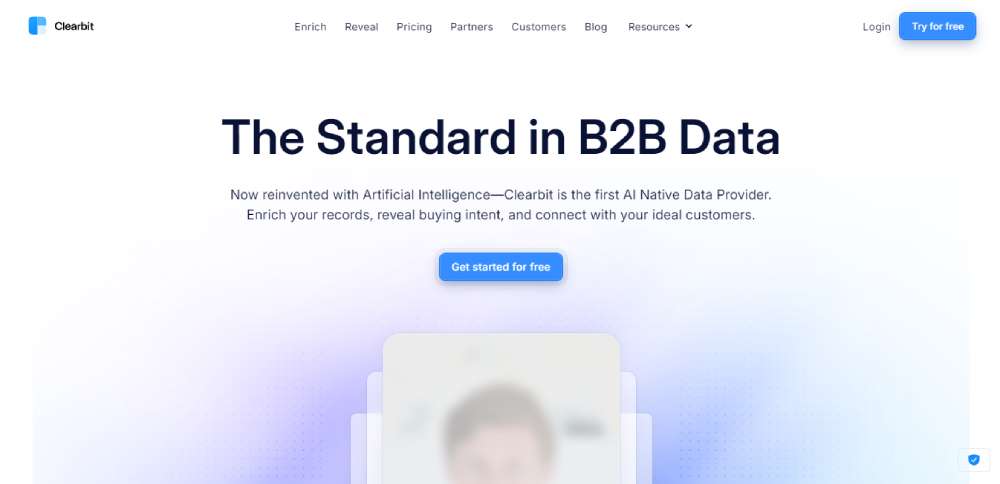
Clearbit is like that genius friend who knows everything about everyone. They've got this massive treasure trove of B2B data that can totally power up your business game.
11Sight
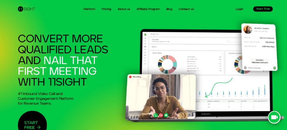
Ever wanted to just hit a button and start a video call? 11Sight's got you. Their site is interactive and lets you dive straight into a video chat. It's like a virtual handshake.
Shepper
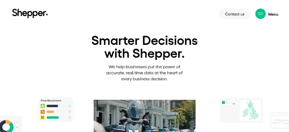
Data, data, and more data. Shepper is like your personal detective, gathering all the info you need. Whether it's about products, ads, or customer vibes, they're on it.
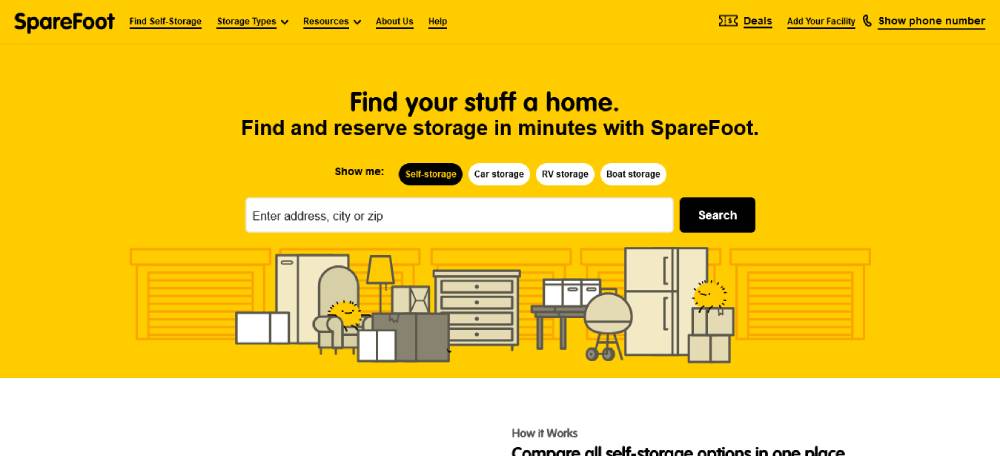
SpareFoot
Okay, so SpareFoot's got a lot to say, but they do it with style. They break up the info with some fun visuals and make sure you find what you're looking for without getting lost.
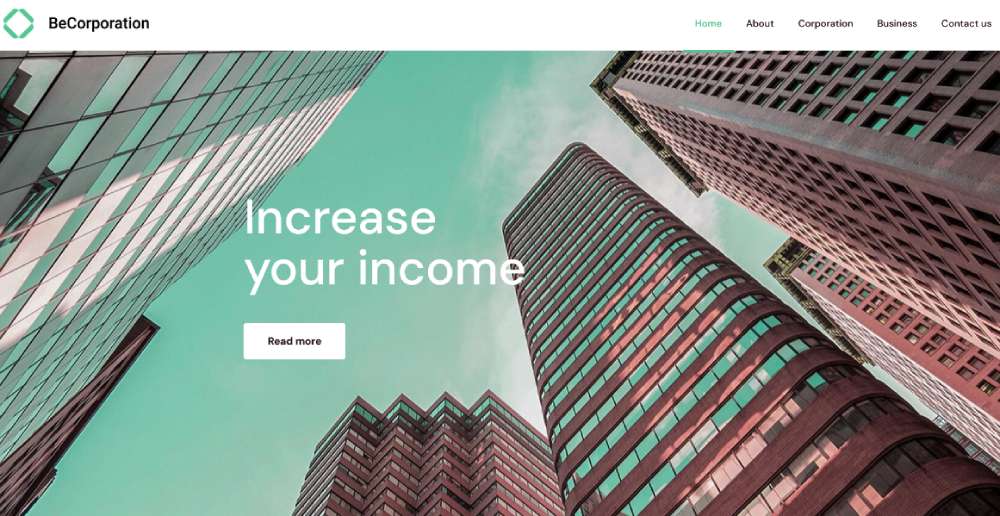
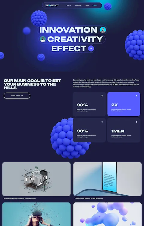
BeCorporation 3
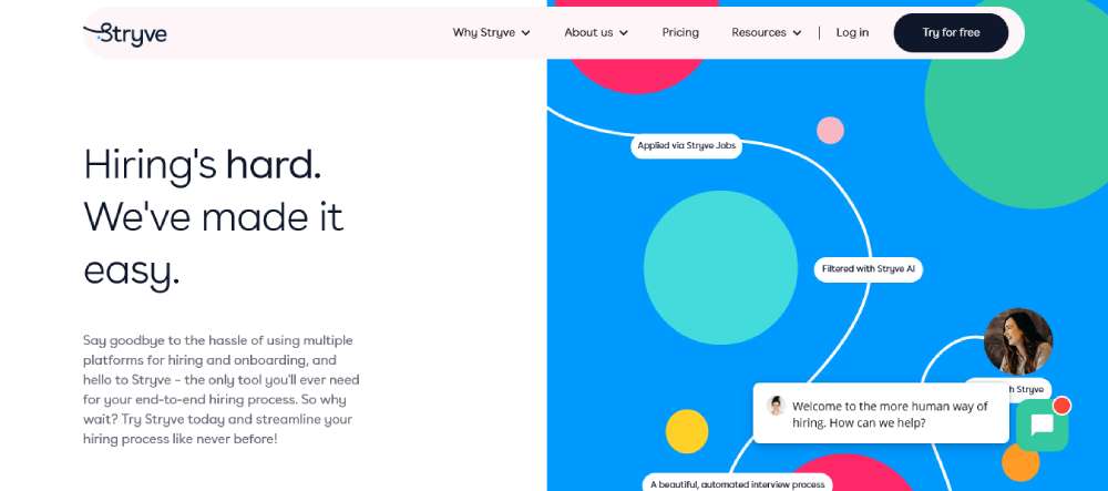
Stryve
Stryve is like that cool artist friend with a wild sense of style. Their site pops with vibrant colors and a unique font that screams, "We're pros, but we're also a blast to work with!"
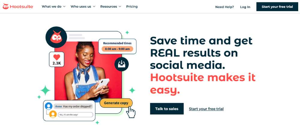
Hootsuite
Hootsuite keeps it sleek and modern. Their focus? Social media mastery. The site is a visual treat with popping colors and graphics that just pull you in.
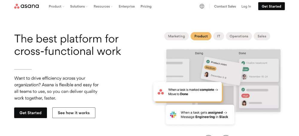
Asana
Asana's like that confident person who knows exactly what they want. Their homepage has this massive "Hey, look at me!" button that guides you right where they want you to go.
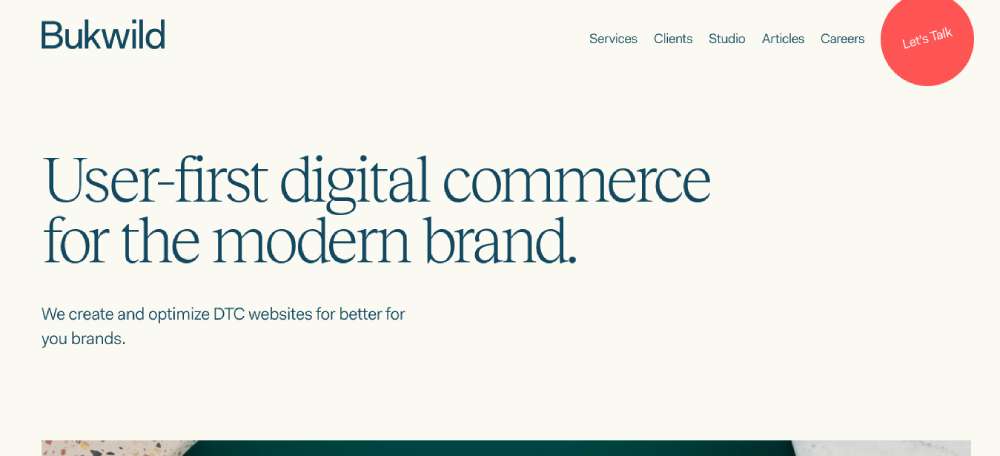
Bukwild
Meet Bukwild. They're this agile squad of thinkers and doers, crafting some stunning B2B and DTC e-commerce experiences. It's like they've got this magic touch.
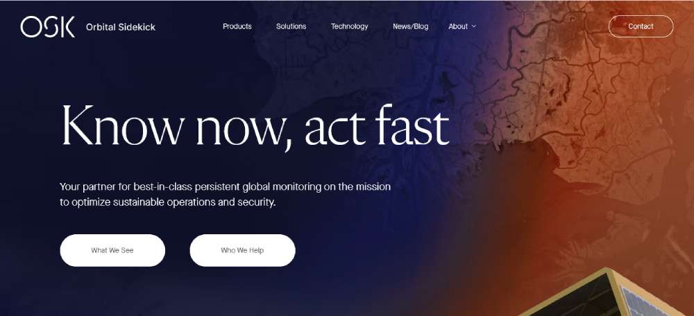
Orbital Sidekick
Space geeks, unite! Orbital Sidekick is all about fetching info from the stars. Using some next-level tech, they provide data that can totally change the game for businesses.
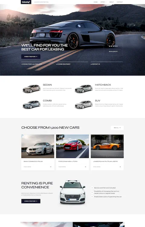
BeCompany6
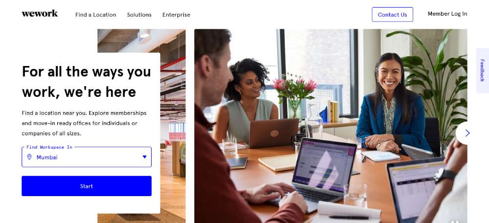
WeWork
WeWork's site is like a digital art gallery of workspaces. It's clean, it's fresh, and it's got this cool feature that kinda knows where you are and shows you spaces nearby. Super handy, right?
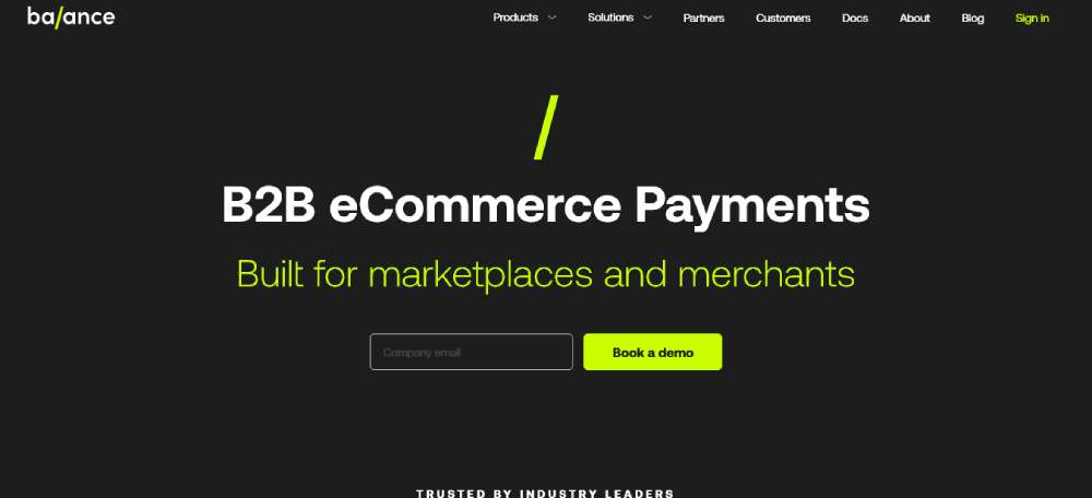
Balance
Imagine a checkout counter, but like, in the digital world. That's Balance for ya. The OG of B2B checkouts.
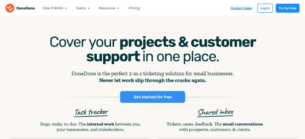
DoneDone
DoneDone is like that friend who doesn't just talk but shows. Their site? A visual treat. They've got these rad illustrations that tell you what they're all about. And oh, that video at the top? Pure gold.
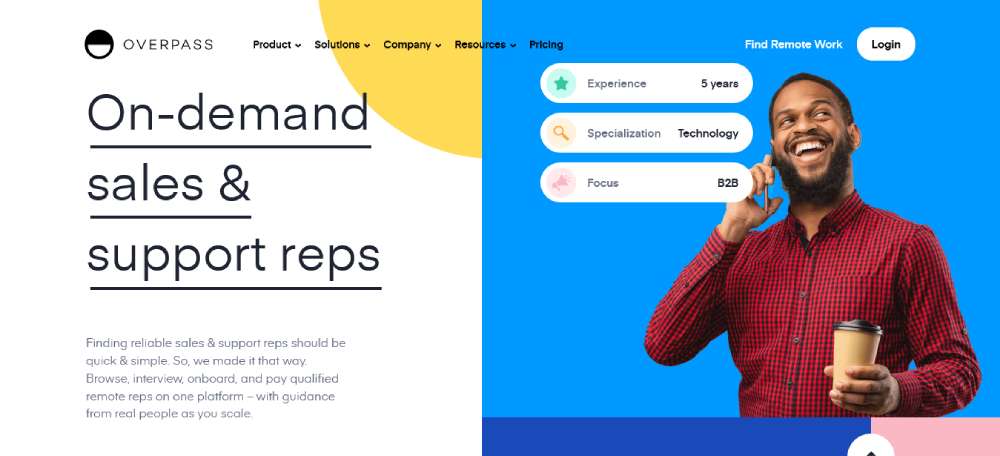
Overpass
Overpass is all about making a statement. Bold colors, funky fonts, and lots of breathing space. And the best part? That vibe carries through, whether you're checking out their blog or scoping out career opportunities.
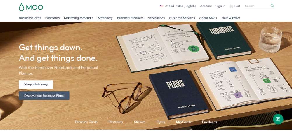
MOO
MOO is like the hipster of the printing world. Business cards? They make 'em look like a piece of art. Their site is a blend of cool visuals and chatty copy. Definitely not your grandpa's printing service.
BeFirm
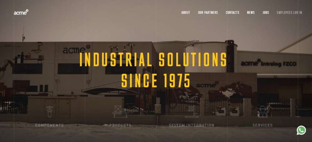
Acme
Acme's got this minimalist thing going on, but it's like magic. Hover around, and the site comes alive. It's like a digital puzzle, with each piece leading you deeper into their world.
LearnUpon
LearnUpon is your go-to for all things learning. They've got this hub where you can whip up learning programs for, well, everyone. And they make it look so easy. It's all about boosting performance, keeping folks around, and growing big.
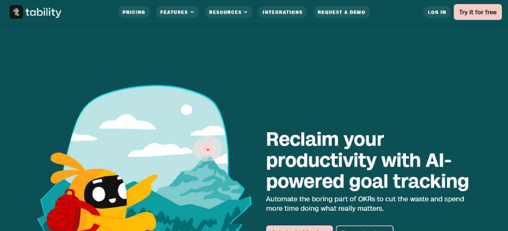
Tability
Tability is like that super-organized friend who's always on top of their game. Set goals, track 'em, crush 'em. Whether it's OKRs, KPIs, or projects, they've got your back.
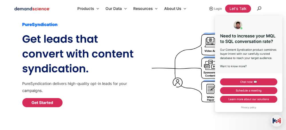
PureB2B
PureB2B is in the business of, well, business. They're all about lead generation, and they've got this killer mix of solutions to help B2B folks out. It's like they've got the secret sauce.
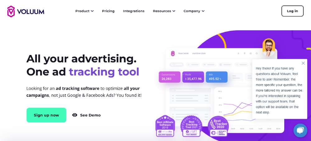
Voluum
Voluum breaks down the complex world of ad tracking. Scroll through their site, and it's clear as day. They're not just about the big players like Facebook and Google. They're in it for the whole shebang.
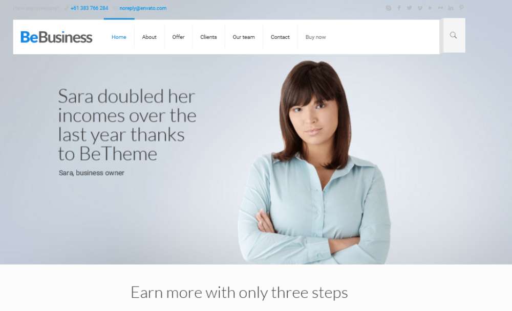
BeBusiness
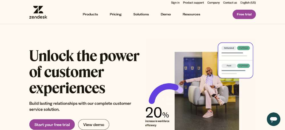
Zendesk
Zendesk is like that friend who's always got your back. Their site? All about top-notch customer support. Right off the bat, you can dive into a free trial, catch a demo, or have a chit-chat with a real-life sales rep.
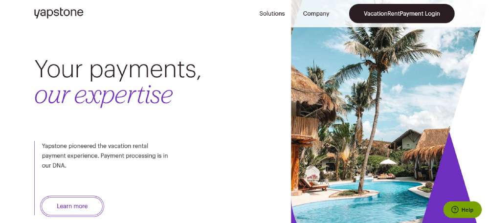
Yapstone
Yapstone sounds quirky, but their game is strong. Think local vibes for global business moves. Their tagline? It's like a warm hug, telling you they've got the power to amp up your payment game, no matter where you're at.
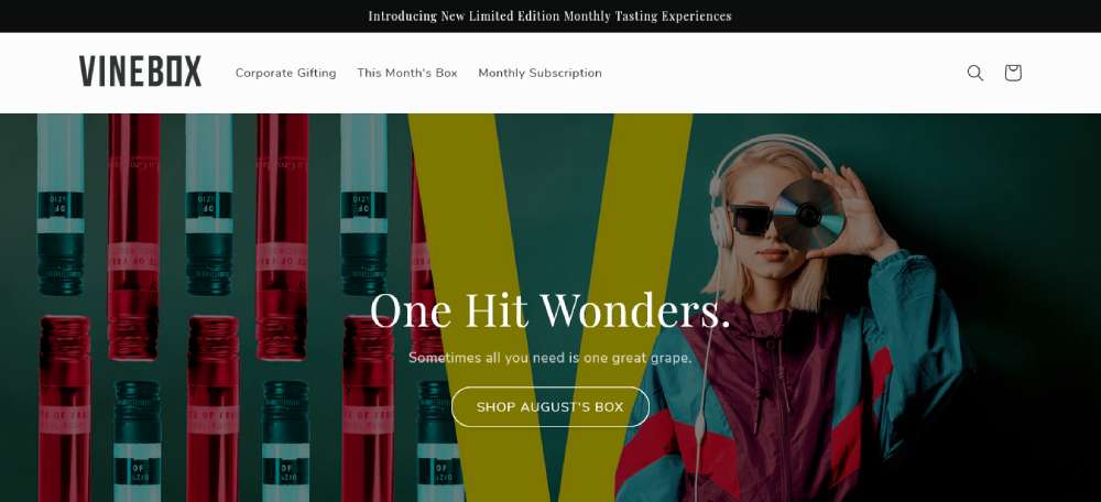
Vinebox
Vinebox keeps it sleek and simple. One line of copy, one bold "Shop Now" button. It's like they've stripped away the fluff, letting you see the real deal without any distractions.
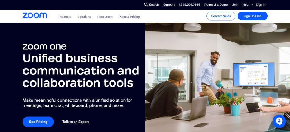
Zoom
Zoom is all business, no play. Their site is crisp, clear, and straight to the point. Want to sign up? They've got you. Need the 411 on their offerings? It's all there, no frills attached.
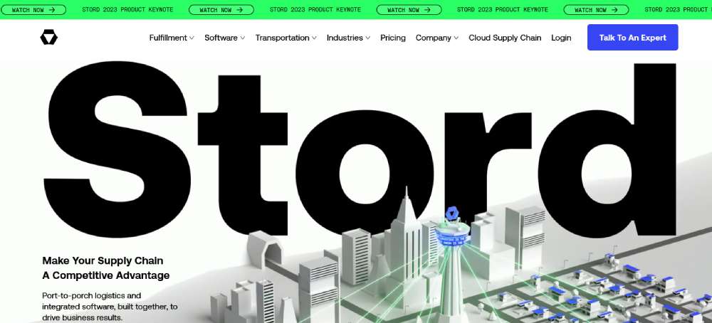
Stord
Stord is like the Swiss Army knife of supply chains. Whether it's B2C or B2B, they've got the tools and the tech to make things run smooth.
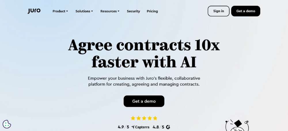
Juro
Juro is all about turning contracts into magic moments. Their vibe? Create, collaborate, and conquer. It's like they've sprinkled some AI fairy dust to make contract management a breeze.
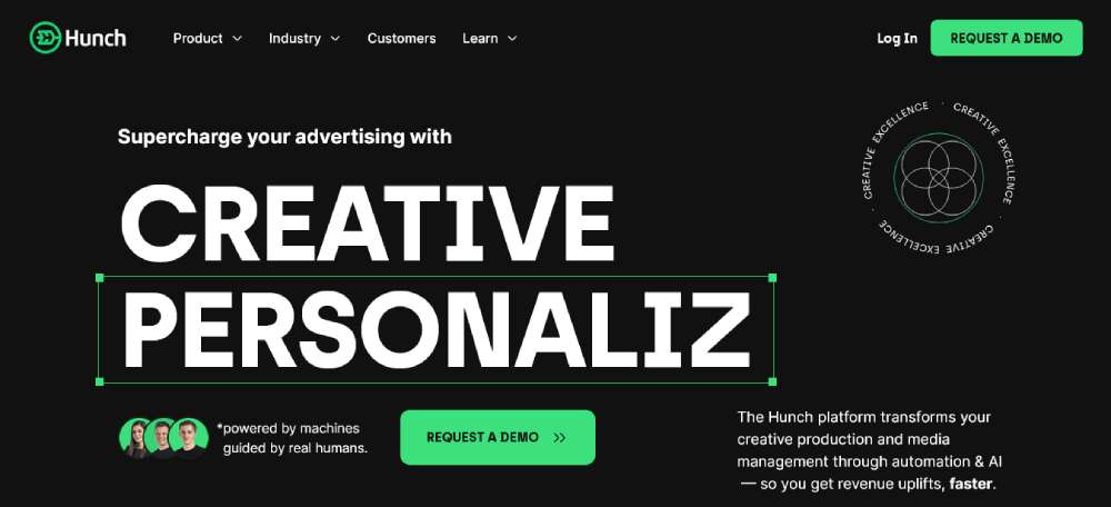
Hunch
Hunch is all about showing and telling. Their homepage? A blend of cool features and real-deal testimonials. It's like they're saying, "Don't just take our word for it, see what the peeps are saying."
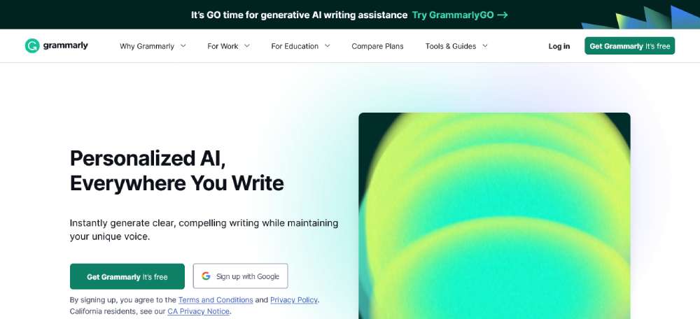
Grammarly
Grammarly's site is like a masterclass in clarity. Their headline? A crystal-clear snapshot of their value. And those animations? A fun way to show how they sprinkle some grammar magic on your content.
Riello Sistemi
Riello Sistemi is all about the visuals. Their homepage video? A mesmerizing dance that pulls you into their world, setting them a notch above the rest in the industrial equipment scene.
Mailchimp
Welcome to Nandez Design Studio. Architecture, construction, renovation in Miami, FL. It's not just a website; it's a portfolio of dreams.
Tammi Montgomery
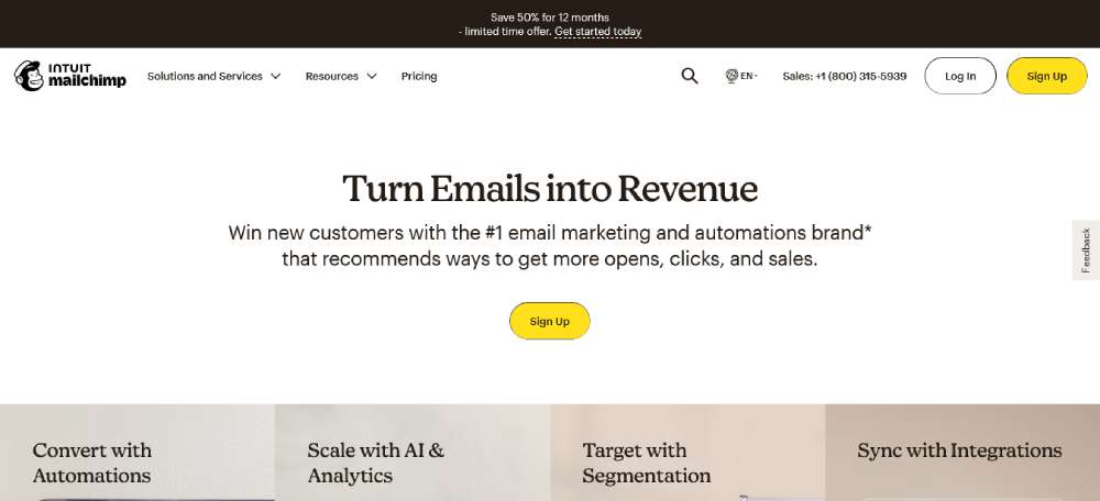
Mailchimp is the big kahuna of email marketing. Their site? A blend of tools, tips, and a promise to help you outdo your last campaign. It's like they're handing you the playbook to B2B success.
Aiia
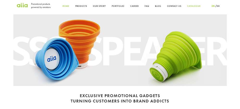
Aiia? They're all about that show, don't tell life. Boom! A massive image right when you land. It's like they're screaming, "We're all about those out-of-the-box promotional goodies."
B2B Site: Engineering Services
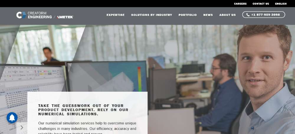
Leonard's got this microsite that's all jazzed up to flaunt their client's engineering prowess. It's like a digital billboard for the global engineering scene.
Intellum
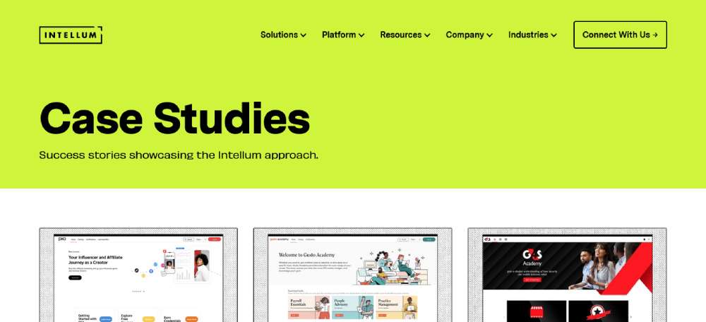
Intellum is that friend who always has receipts. Their case studies? A deep dive into their genius moves. It's like a behind-the-scenes tour of their rockstar moments.
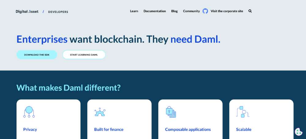
DAML
DAML is the go-to for those looking to craft some wicked smart contracts. They're all about that open-source life, ensuring apps are future-ready and privacy-tight.
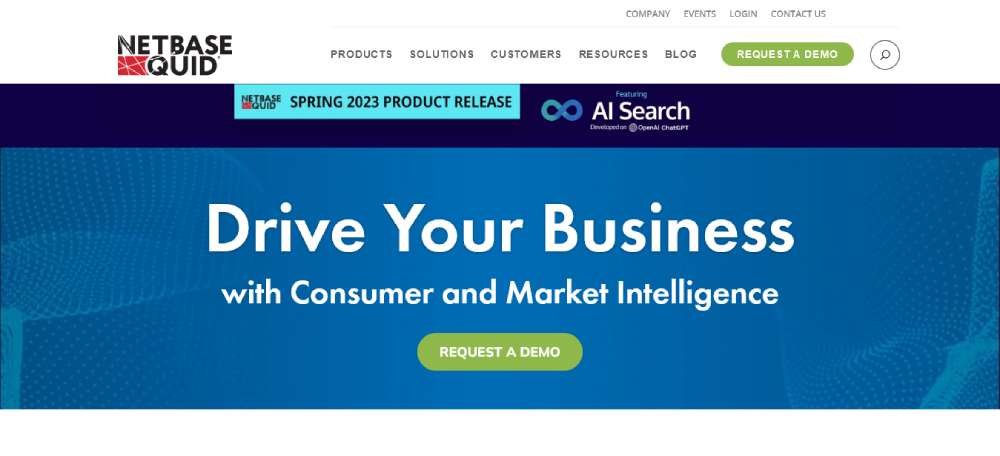
Netbase Quid
Netbase Quid is like the Sherlock Holmes of consumer insights. Those colorful tabs? A roadmap to their detective skills, from trend spotting to crisis dodging.
Rocka
Rocka's site is like a fresh splash of paint in the B2B world. Experimental? Heck yeah! It's like they've taken the rulebook and tossed it out the window, making waves with their bold vibes.
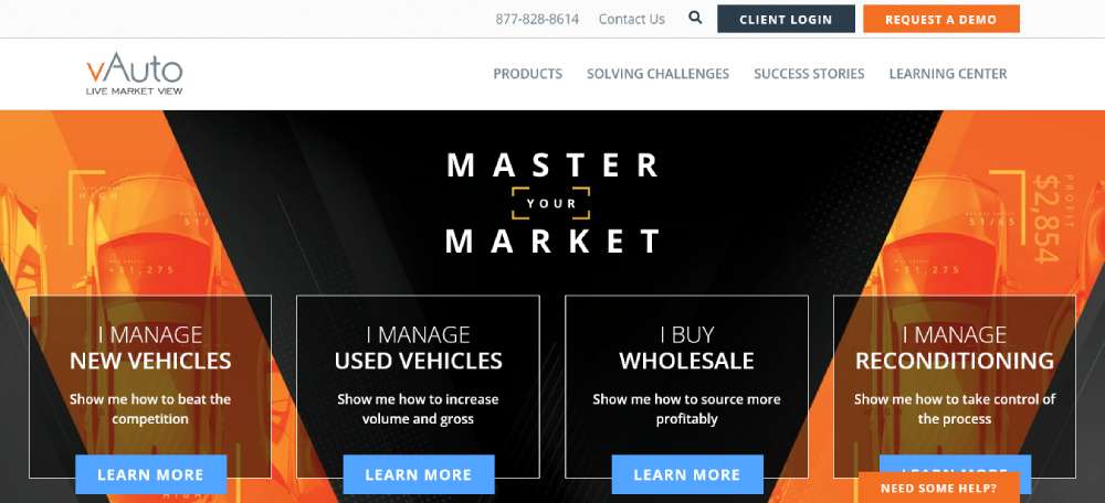
vAuto
vAuto's got this cool thing going on where they let you pick your own adventure. Tiny text snippets guide you, like breadcrumbs on a trail, leading you straight to their treasure trove of offerings. It's like a choose-your-own-story, but for car peeps.
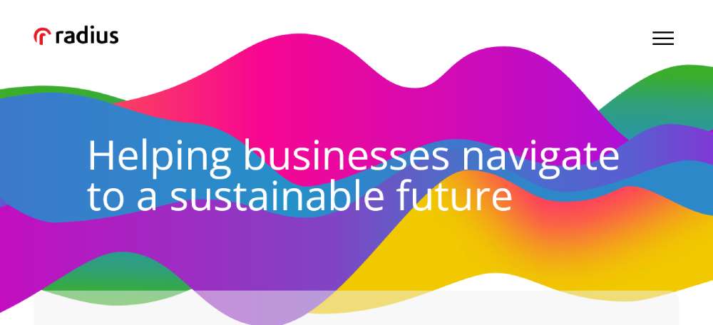
Radius
Radius? They're the wizards helping businesses find their tribe. With them, it's not just about data; it's about finding that golden nugget of truth.
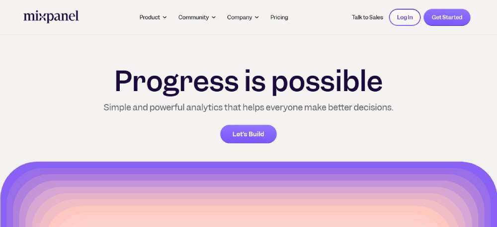
Mixpanel
Mixpanel is like that detective friend who knows why folks do what they do. Dive deep, analyze, and then shoot out messages based on those juicy insights. It's all happening right there.
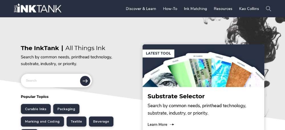
Kao Collins InkTank
Kao Collins? They're the ink masters with an eye for design. Their homepage? A visual feast with links that feel like an invite to a secret club.
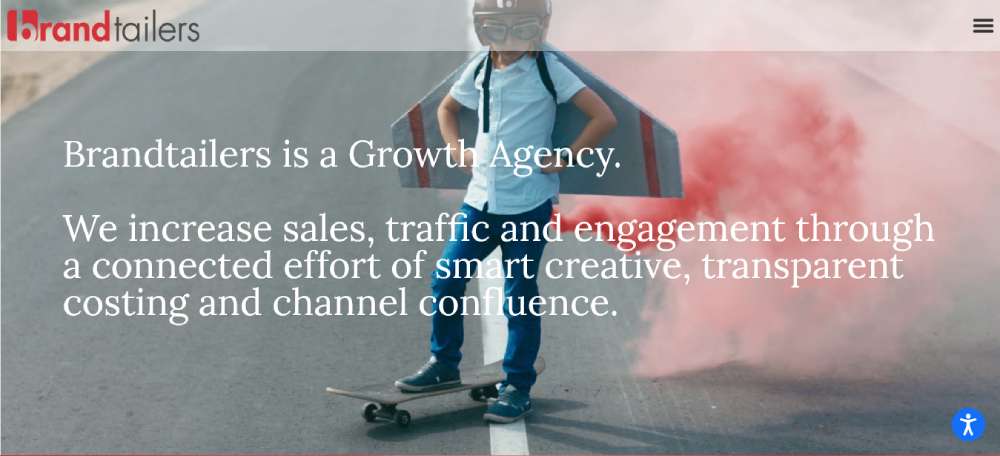
Brandtailers
Brandtailers? Think of them as the growth gurus. They mix up some smart creative juice, transparent vibes, and channel magic to boost everything up.
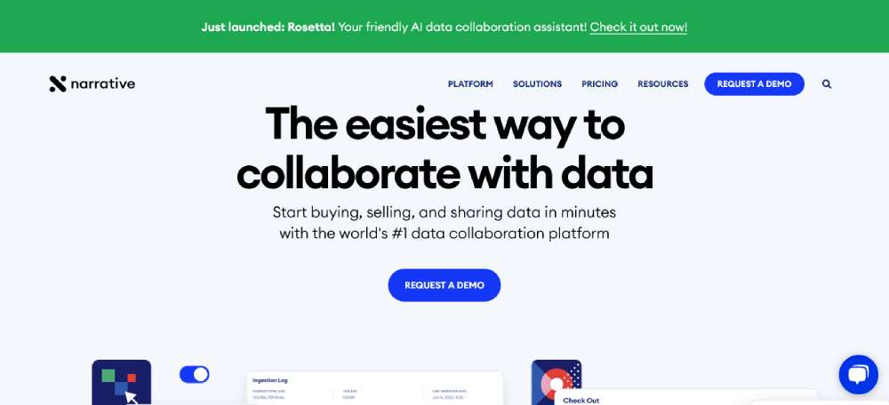
Narrative
Narrative? They're all about that raw data life. Scoop it up, monetize it, and let the software do its thing.
Pixelgrade
Pixelgrade plays with colors and themes like a kid in a candy store. Their homepage? A visual journey that keeps you scrolling for more. And that color pop? It's like a cherry on top.
Festina
Festina? They're the investment rockstars from Framer. Investing in those software gems with killer user experience? That's their jam.
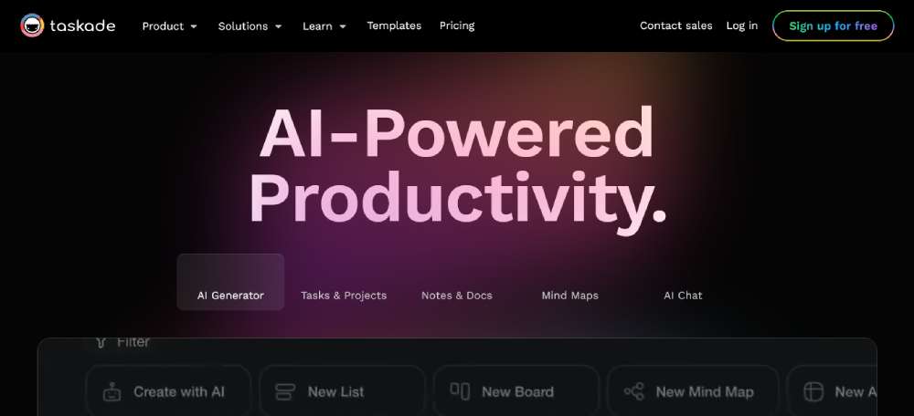
Taskade
Taskade is like that visual board where ideas come to life. Organize, flow, and bullet point your way to team awesomeness.
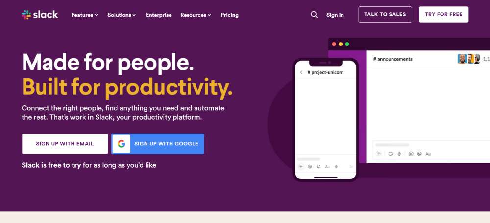
Slack
Slack? It's where work chats turn into epic brainstorming sessions. It's the digital watercooler where ideas brew and decisions take shape.
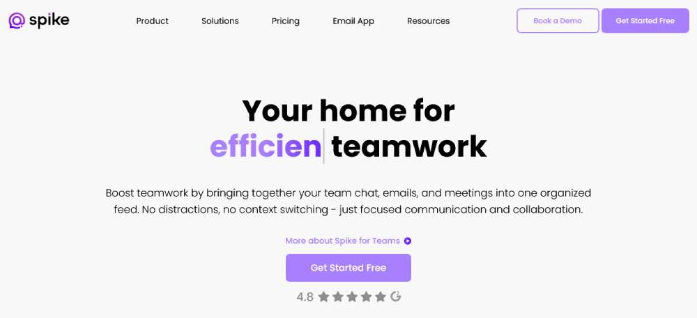
Spike
Spike turns emails into chit-chats. It's like having a convo over coffee, minus the coffee. And the best part? No more email headaches.
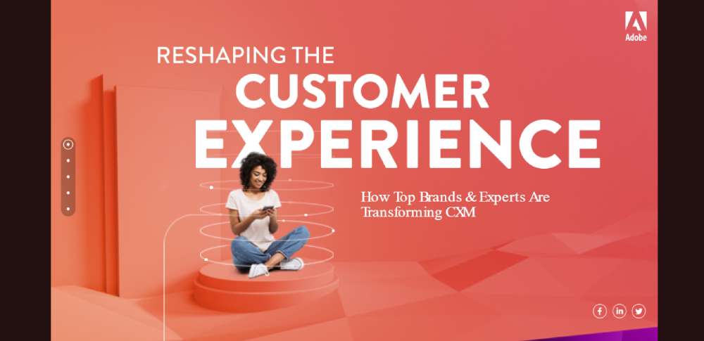
Adobe CXM
Adobe's CXM? It's less about content and more about having a heart-to-heart. As you scroll, you're in for a treat with animated tales and stories of how they make magic happen.
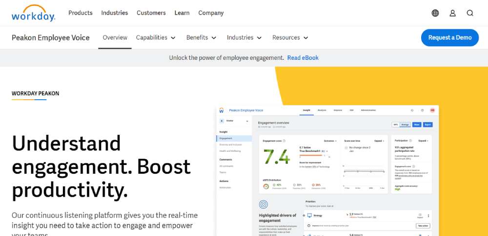
Peakon
Imagine having a superpower to understand what your peeps at work feel. That's Peakon for you. It's like the ultimate tool to vibe with your team, understand them, and make some epic decisions.
Crafting the Perfect B2B Web Content
Alright, so you've got this rad b2b website design. But what's a killer design without some dope content to back it up? It's like having a pizza without the cheese. Here's how you can sprinkle that magic:
Your Site, Their Story
Let's flip the script. Instead of going on and on about how cool you are, let's make it about them. Give them the mic. Let them share their story, their dreams, their goals.
No Beating Around the Bush
When someone lands on your site, they're on a mission. Don't make them dig for gold. Lay it out, clear and crisp. What you offer, why it rocks, and how it can change their world.
Show Them the Dream
It's all about painting a picture. A picture of success, of goals met, of dreams realized. Talk their language, show them the outcomes they crave, and make it all about the wins they can score with you.
Every Pixel Counts
Think of your content as pieces of a puzzle. Every word, every image, every button - it's got a spot. And it's got to be perfect. It's not just about looking good; it's about guiding them, showing them the way, making them click that button.
And hey, while we're at it, let's keep it sleek. Modern vibes, easy navigation, and those oh-so-important calls to action that pop.
FAQ about b2b website design
What's the Big Deal with Responsive Design?
Oh, responsive design? That's like the bread and butter of modern web design. You've got all these devices, right? Phones, tablets, desktops, you name it.
Your site has to look good on all of 'em. If it doesn't, you're losing customers. So, responsive design ensures that no matter what gadget they're using, your site's looking sharp.
How Can I Optimize My Site for SEO?
SEO, or Search Engine Optimization, is a tricky beast. But it's essential for a B2B site. You want to be found, don't you? Keywords, meta tags, quality content - these are your friends.
Work 'em into your site, but don't overdo it. Keep it natural, and the search engines will love you for it.
What's the Best Way to Showcase My Products or Services?
Showcasing your products or services? That's where the magic happens. Use high-quality images, videos if you can. Write descriptions that tell a story.
Don't just list features; explain how you solve problems. Make it personal, make it engaging. That's how you turn visitors into customers.
How Do I Make My Site User-Friendly?
User-friendly? That's all about the experience, my friend. Navigation should be a breeze. No one wants to get lost in a maze. Clear menus, simple layout, easy-to-find contact info.
Think like a visitor. If you were them, what would you want? That's your roadmap to a user-friendly site.
How Much Will It Cost to Design a B2B Website?
Ah, the money question. It's like asking how long a piece of string is. It depends on what you need. Custom design? That'll cost you.
Templates? Cheaper, but maybe not as unique. Talk to a designer, get some quotes. But remember, you get what you pay for. Don't skimp if you want quality.
How Long Does It Take to Build a B2B Website?
Time's a funny thing, isn't it? Building a B2B site can be quick, or it can take ages. Depends on what you want. Simple site? A few weeks, maybe. Something complex? Could be months. Communication's key here. Stay in touch with your designer, and you'll keep things moving.
What Should I Include in the About Us Page?
The "About Us" page, that's your chance to shine. Tell your story. Who are you? What do you believe in? What makes you different? Include some bios, maybe a company history. Photos too, if you've got 'em. Make it real, make it you. That's how you connect.
How Can I Make My Website Mobile-Friendly?
Mobile-friendly, that's not just a nice-to-have anymore. It's a must. Most folks are browsing on their phones these days. So, make sure your site scales down nicely. Test it on different devices. Use tools if you need to. If it's not mobile-friendly, you're leaving money on the table.
How Do I Choose the Right Platform for My Website?
Choosing the right platform, now that's a big decision. WordPress, Joomla, Drupal - they've all got their pros and cons. Think about what you need.
E-commerce? Blogging? Custom features? Talk to a pro if you're unsure. They'll steer you in the right direction. It's like picking a car; you've got to find the one that fits.
How Can I Secure My B2B Website?
Security, that's a big one. You don't want to mess around with that. SSL certificates, strong passwords, regular updates. Keep an eye on things, and don't ignore warnings.
Maybe get a security audit if you're really serious. It's like locking your doors at night; you've got to do it. No excuses.
Wrapping It Up
So, as you jazz up your B2B site, maybe steal a few tricks from the big players. It's all about making it easy for your peeps, speaking their lingo, and guiding them to the treasure.
Remember, in the world of B2B website design, it's a mix of staying fresh with the trends and really, truly getting your audience. It's a dance, and you gotta find your rhythm.
If you enjoyed reading this article about B2B website design, you should read these as well:

